This is a thing I’ve been trying to figure out in my spare time, mostly noodling about in my head with various ideas when I have some down time, and now I want to know if there’s a formal answer of some sort. It goes like this: in a lot of situations, ranging from airplane autopilots to self-driving cars (I think) to videogames, there are times when you want a moving object to get itself as precisely as possible with a known path. For example, having the autopilot line up with the approach path for a runway.
So how is that done? What’s the general approach to programming a moving thing to find, with decent efficiency, its way onto a given path in 3D space? Or in 2D space, if that’s easier to understand? I can think of a few naïve approaches, but none of them seem anywhere near robust enough to be trusted.
Anil Dash was kind enough to write a wonderful foreword for the book, in which he perfectly describes the background we were working against:
Two billion people now have some kind of access to internet technologies, and almost all of them are spending more and more time with their thumbs flicking across their phones. And the technology they’re using has a real impact on their lives. They don’t use an app to “share photos”; they use it to maintain a relationship with distant family. They don’t need to do “online banking”; they need to lend a friend money to help them out of a jam. Nobody wants to learn a complicated set of privacy controls; they just want to be able to express themselves without antagonizing bosses or in-laws.
Our thesis, against that, was to say, “As personal and digital lives become closer and effectively merge, the things we design will have to work harder and harder to deal with real people in all their messy complexity. How can we start people thinking about this, and what tools can we give them?” That’s what we strove to create, and now you can judge for yourself whether we succeeded.
I’ll be honest: we were pretty scared as we wrote it. This is not a topic area that’s gotten a ton of attention, and in a lot of ways we were breaking new ground — but, at the same time, we were very aware that there was existing research and knowledge in related areas, so we wanted to be sure we were inclusive or, and respectful of, that work. We talked to a lot of people in a variety of disciplines, trying to make sure we brought in information that would help the reader and not flying in the face of things that were already known.
So you can imagine our relief and gratitude as we’ve heard glowing reactions from people who read preview drafts — among them Kim Goodwin, Indi Young, Sara Soueidan, Caren Litherland, and Karen McGrane. Paul Ford said, “Anyone who aspires to build global products that people love should read this book now,” and Kate Kiefer Lee said, “It will be required reading on my team.”
You might think cover blurbs like those are pure marketing fluff, and maybe in some genres they are. For us, they serve double duty: to let you know that people who know what they’re talking about believe we know what we’re talking about, and also to let us know that. There were days we weren’t entirely certain.
To be clear, this isn’t a book about forever treating people with kid gloves. We say “compassion isn’t coddling”, and that’s absolutely the case. An error message still needs to convey the error; an account lockout still needs to keep the account locked. But how we convey errors or lockouts, and how we make people aware of the possible ramifications of their actions, is critical. Just as there are good ways and bad ways to commiserate with a grieving friend or handle a difficult work situation, there are good ways and bad ways to approach people in our designs.
As I said before, we need to deal with real people, in all their messy complexity. We hope Design for Real Life is the start of a whole new conversation within our field, one that will teach Sara and me just as much as anyone else about how we can be more thoughtful and humane in what we create.
On March 8th, 2016 — just eight days from the day I’m writing this — Design for Real Life will be available from A Book Apart. My co-author Sara Wachter-Boettcher and I are really looking forward to getting it into people’s hands.
The usual fashion is to say something like “getting it into people’s hands at long last”, but in this case, that’s not really how it went down. Just over a year ago now, Sara published “Personal Histories”, and it was a revelation. In her post, I could see the other half of the book that was developing in my head, a book that was growing out of “Designing for Crisis” and “Inadvertent Algorithmic Cruelty”. So I emailed Sara and opened with:
Your post was like a bolt of lightning for me. In the same way the Year in Review thing opened my eyes to what lay beyond “Designing for Crisis”, your post opened my eyes to how far that land beyond reaches.
After research and some intense discussions, we started writing in the spring of 2015, and finished before summer was over. Fall of 2015 was devoted to rewrites, revisions, additions, and editing. Winter 2015-2016 was spent in collaborative editorial and production work by the amazing team at A Book Apart. And now…here we are. The book is just a week away from being in people’s hands.
To celebrate, Sara and I will be hosting, with incredibly generous support from A Book Apart and PhillyCHI, a launch party at Frankford Hall in Philadelphia. We’ll be providing some munchies, some tasty adult beverages, and there will be giveaways of both paper and digital copies of the book. We’d love to see you there! If you can make it, please do RSVP at that link, so we know how much food to order.
We chose Philadelphia as the site for our launch party for a few reasons. For one, Sara lives there, so only one of us had to travel. But to me, it brings some very personal histories full circle, because Philadelphia is where this really all got started. It’s where Rebecca first went to be treated, where she was given the best possible shot at life, and where I started to notice the failures and successes of user experience design when it collided with the stresses of real life.
In a number of ways, this book has been a labor of love. The most important, I think, is the love Sara and I have for our field, and how we would love to see it become more humane — really, more human. That’s why we packed the book not just with examples of good and bad design choices, but of how we can do better. The whole second part of the book is about how to take the principles we explore in the first part and put them to work right now — not by throwing out your current process and replacing it with a whole new, but by bringing them into your existing practice. It’s very much about enhancing what you already do.
It’s been an intense process, both emotionally and work-wise. We pushed as hard as we could to get this to you as soon as we could. Now the time is almost here. We’re really looking forward to hearing what you think of it.
Back in October of 2014, at An Event Apart Orlando, I returned to public speaking with “Designing for Crisis”, my first steps toward illuminating how and why design needs to consider more than just the usual use cases. I continued refining and delivering that talk throughout 2015, and it was recorded in October 2015 at An Event Apart Austin. As of late last week, you can see the entire talk for free.
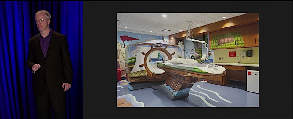
There were a lot of strange confluences that went into that talk, some of them horrific, others just remarkable. One that stands out for me, as I look at that screenshot, is how a few years ago, Jared Spool gave a talk at AEA where he discussed the GE Adventure Series, in a segment that never failed to choke me up (and often choked up Jared). I remember being completely floored by that example, and at one point, based solely on what he’d said about the GE Adventure Series, I remarked to Jared that I occasionally thought about switching career tracks to become an experience designer.
Less than two years later, I stood in one of the first Adventure Series rooms at the University of Pittsburgh Medical Center, standing in the middle of a design I’d only ever seen on a projector screen, the same room you can see in the screenshot above, as my daughter’s head was scanned to see if the experimental medicine we’d been giving her had slowed her tumors.
Six months after that, I was talking about it on stage in Orlando, as an example of how designing for crisis can have spectacularly positive results. The video we released last week came a year later, and is a much better version of that first talk. I’m very happy that we can now share it with the world.
As I’ve said before, I came to realize that “Designing for Crisis” was just one piece of a larger puzzle. To start exploring and understanding the whole puzzle, I recently finished co-authoring Design for Real Life with Sara Wachter-Boettcher, to be published by A Book Apart, possibly as soon as March (but there’s not an official date yet, so that could change). In it, Sara and I explore a small set of principles to use in approaching design work, and talk about how to incorporate those principles into your existing design practice. The book is the foundation for a new talk I’ll be presenting at every An Event Apart in 2016 — including this year’s Special Edition show in Orlando.
As soon as the book is available for order, we’ll let everyone know — but for now, I hope you’ll find last year’s talk useful and enlightening. Several people have told me it changed the way they approach their work, and it serves as a pretty good introduction to the ideas and themes I’ve built on it for the book and this year’s talk, so I hope it will be an hour well spent.
Grid layout is a pretty darned fantastic thing. I’ve been digging into it as I write the grid layout chapter of CSS:TDG4e, and there are more things in here than have been dreamt of in our layout philosophies. One of the things I’ve recently come to realize is the power and necessity of subgrids.
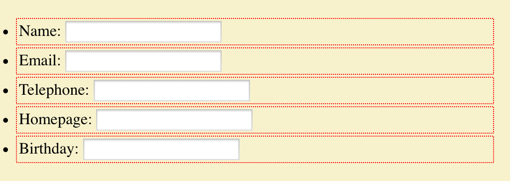
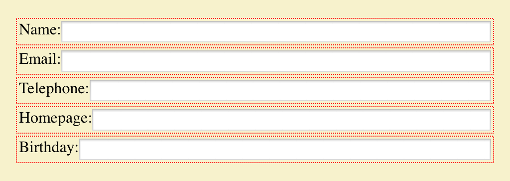
To understand why, let’s explore a use case, which you can see in various forms on this test page. I cribbed this use case pretty directly from Fantasai, but I’m going to be analyzing it a little differently. The basis is a form with the various fields and labels in unordered list items, to help with accessibility and to be basically readable and usable if the CSS somehow fails to be applied. The markup looks like this:
Ideally, we’d like the form fields to all line up into a column, and the labels to be in another column. Furthermore, we’d like the label column to be only as wide as the widest label’s element box, and no more; the rest of the grid can be taken up by the input column.
This seems like a case tailor-made for grid layout, but there’s a problem. Because grid items are only ever the child elements of a grid container, we can’t just apply a grid to the ul element and go from there. Instead, we have to make each li element a grid container, in order to make each label and input element a grid item. But that means each list item’s grid affects its children, with no reference to the other list items’ grids. We can write the template we want, like so:
form ul li {display: grid;
  grid-template-columns: [start label] max-content [input] 1fr [end];}
Each list item a grid, but to what end?
That will get us a result almost precisely as if we’d applied no grids at all. The only difference is that the input elements will all be as wide as their columns, according to the CSS Grid specification. Chrome fails to do this last bit correctly, whereas Firefox Nightly gets it right, but otherwise the layout is essentially the same. You can see this in the #form1 example on the test page. (Remember, you have to have a current grid-supporting browser for the examples to correspond to what I’m talking about here.)
We can get closer to our goal by experimenting with a fixed-width grid column for the labels, figuring out the width of the widest label, and then just making all the label columns be that wide. That would be written something like this:
form ul li {display: grid;
  grid-template-columns: [start label] 7em [input] 1fr [end];}
Using fixed-width columns to simulate a single column.
That works pretty well so long as none of the labels ever change — if a label is added (or edited) to be wider, it will wrap to multiple lines. Alternatively, if the longest label is dropped or edited to be shorter, the label column won’t resize down. It will just stay the same dumb fixed width until someone hand-adjusts it. And honestly, at that point I may as well be using flexbox, which would do this version of the layout just as well, and would be more widely supported for the near to intermediate future. At any rate, you can see the grid version of this in the #form2 example on the test page.
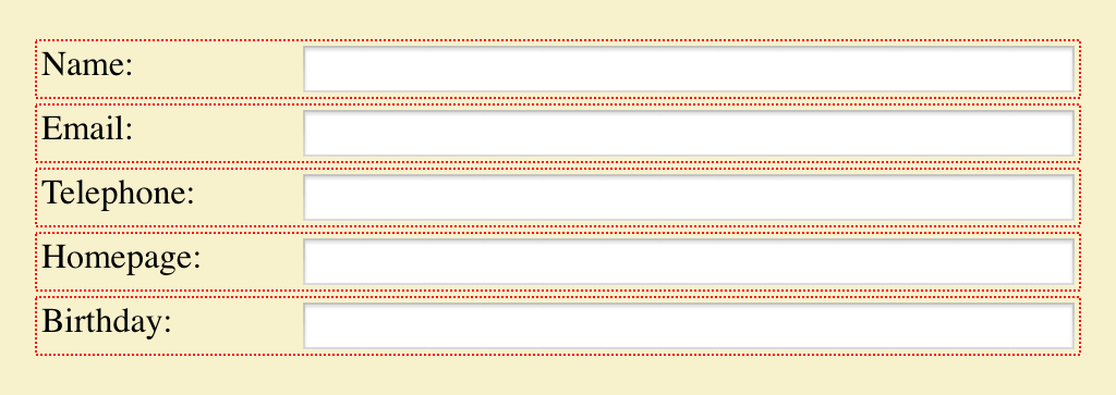
But what if we could set a grid on the ul element, and then make all the li elements grids that use their parents’ grid for the layout of their children? That’s exactly what subgrids do. This is the solution we’ve been seeking, in basic form:
form ul {display: grid;
  grid-template-columns: [start label] max-content [input] 1fr [end];}
form ul li {display: grid; grid: subgrid; grid-column: start / end;}
Here the list items establish grid containers, thus making the label and input elements into grid items like before, but are stretched across the two columns of the ul while using those very grid lines for laying out their child elements, plus those children influence the placement of their grandparent’s grid lines. Thus, we can specify things like max-content for the label column size and have it Just Work™.
Or it would Just Work™, except that as I write this, none of the grid implementations have subgrid support. Authors who want to create the kind of layout we’re after have to compromise in one way or another — either by faking the content-sizing with a fixed-width column, or by stripping down the markup until there’s barely anything left — thus sacrificing accessibility, progressive enhancement, and general best practices, as Fantasai illustrated in her article.
You can probably see a lot of other ways in which subgrids would be useful. Take defining a full-page grid, the kind with a bunch of regularly repeating grid lines onto which various elements can be attached, like this one or this one. In this scenario, being able to designate each section of the page a subgrid would let you have all the pieces inside that section participate in, and lay out in relation to, the overall page grid. Without subgrids, you’d either have to make every element you want to lay out a child of the body element (or whatever you used to create the page grid), or you’d have to recreate segments of the page grid in each nested grid, and give up any hope of columns that can flex with the contents of multiple page sections. Neither solution is appealing.
This is why I’ve come to the same conclusion other grid experts (like Rachel) already have: subgrids are a major component of grid layout, and should be a part of any grid layout implementation when it emerges from developer-preview status. If that means delaying the emergence of grids, I think it’s worth it.
I say that because our field has a tendency to glom onto the first iteration of a technology, learn it inside out, hack around its limitations, and then ignore any future improvements unless somehow forced to do so. If grid layout is released without subgrid support, we’re risking shoving subgrids into the back of the author-practices cupboard for a long time to come. And along with it, potentially, grids themselves. The frustration of trying to build layouts without subgrids will quickly become overwhelming for all but the simplest cases, leading authors to try and then discard grids as a serious tool.
First impressions matter. CSS itself suffered for years from the initial impressions designers formed of “boring, boxy” layouts, and it still suffers from the handicap of being a presentation system without a layout engine at its core. Grid layout is the first serious candidate to fill that hole in the past two decades, and I don’t want to see them hamstrung from the outset. Subgrids are essential to the adoption of grids. I hope they’ll be implemented as soon as possible, and before grids are pushed into public release channels.