Formal Weirdness
Published 19 years, 3 weeks pastAs I described and tweaked my version of reset styling, a fair number of people asked (with varying degrees of politeness) why I didn’t just use a universal selector instead of that big ugly grouped selector. I said that I wanted to avoid styling form controls (inputs, textareas, and so on), and the only way to do that, given the state of selector support in today’s browsers, is to list all the elements I want to reset while leaving out those I don’t want to touch—like all the form controls.
This led to a fair number of questions as to why I’d bother avoiding form controls, and I said it was due to their “inherent weirdness”. By this, I meant that form controls are impossible to describe with current CSS; and if they were treated the way CSS says they should be, we’d all hate the results. Furthermore, the handling of form control styling is going to be a very unstable branch of our field for the foreseeable future.
Herein, I scratch the surface of this entire mess. Fair warning up front: this is going to be a long one. Also, as Bette Davis once proclaimed, buckle your seat belts: it’s going to be a bumpy ride.
Let’s start with a (seemingly) simple form element: a checkbox. Here are two in Firefox, one checked and one unchecked.

All right, now here’s a question: what should happen if I assign these checkboxes padding: 10px;? Take a moment and think through the details.
“That’s an easy one,” you may say. “There’s 10 pixels of padding between the checkmark and the borders of the box.” And maybe you’re right. But let’s consider the same question for these checkboxes from Safari.

Notice how the checkmark hangs jauntily out of the box? If we add padding, does the checkmark become contained within the box—in other words, does the checkmark stay the same size while the box visually expands—or does it stretch in size so that it’s still sticking out of the box? You don’t even have to think about what to do with the drop shadow or the glassy beveled highlight effect; just worry about what to do with the checkmark. Again, take a few moments to think through all the implications.
All right, you should have an answer by now. Bully! The sad truth is that no matter what you’ve decided, you’re wrong. Okay, I admit that’s unnecessarily harsh: more properly, you aren’t right. You can’t be, because there are no defined answers to these questions.
Thus, if a browser lets you style a form element, it’s doing so blindly, from a specification-compliance point of view. The people who wrote that browser code were guessing. No doubt they were intelligent guesses, but they’re guesses all the same.
So why not just define the answers? That turns out to be a good deal trickier than we might hope. Take checkboxes (please!). They’re replaced elements, right? You have an input element that ends up placing a symbol, in much the same way an img element places an image file. The symbol changes based on whether the checkbox has been checked or not, something like a JavaScript-driven image-swap. The appearance of the checkbox isn’t defined in any way, so browsers are free to do whatever they want, as we saw above.
That means that the “interior” of this kind of input element—the checkbox (filled or not)—is a black box from a CSS point of view. There’s nothing in the document structure or content that represents the actual checkmark, for example. You can’t in good conscience define the checkmark as content and the checkbox as the element that surrounds it. So should padding apply at all? Maybe.
But if it does, and the checkbox is a replaced element, then defining a background color and padding for the checkbox would put the defined background color around the symbol—the whole symbol, checkmark and checkbox and all—instead of inside the checkbox. That’s a completely reasonable conclusion given the assumption that the checkbox symbol is replaced. It’s just completely unreasonable if you’re a visual type and you want that checkbox to be filled in with red, for the love of Bob!
So: is a checkbox a combination of an element box surrounding content, or a completely replaced element? Which padding-and-background effect should take hold?

Just to muddy the waters a bit further, consider the following:
- What happens to the checkmark when the input is italicized, either directly or by inheritance? How about when it’s boldfaced? (Assume the checkmark comes from a font family that has italic and boldfaced versions of the checkmark available.) What, if anything, should happen to the checkbox under either condition?
- If
text-decoration: underlineis applied to the checkbox, should the whole box be underlined, or just the checkmark? Does your answer change when you consider the effects of padding? - Should
vertical-alignapply to the checkmark, or to the checkbox as a whole in relation to the line of text in which it sits? - What effect should
line-heighthave on the checkbox and its contents? For example, what should happen if you sayinput[type="checkbox"] {line-height: 3em;}? Don’t forget that the most common way for an element to experience altered line height is by inheritance. - Should
heightandwidthbe honored on a checkbox? If so, should they apply to the whole box, or to the “content” (the checkmark)? If the former, what should happen to the checkmark as a result–should it stay the same size and be aligned in some way, or should its size scale along with the checkbox?
In my experience, the most common answers to these questions tend to be contradictory—some implying a box-and-content model, others implying a replaced model. I mean, just look at the poser buried in the middle of that last point. What does width even mean when it comes to a form control? Is it just the content, like with non-replaced elements; or is it the whole element box, borders and all, like in replaced elements?
As far as the latest draft of CSS 2.1 is concerned, all inputs (really, all form controls) are replaced, the same as images. So no background inside the checkbox; no change due to italics or boldfacing or line heights; vertical-align shifting the box as a whole; and height and width applying to the entire box.
You might feel that’s acceptable, overall, but remember that I said CSS 2.1 regards all form controls as replaced. So all that would be just as true for text inputs and textareas as it is for checkboxes. That’s probably not acceptable to most people. For example, that would mean that vertical-align: baseline would put a text input’s bottom edge on the baseline of the text that surrounds it, instead of aligning the text inside the input with the text around it. Almost everyone prefers the second to the first, and most browsers conform to that preference, but that’s not what should happen. In fact, when it comes to form controls, nearly all known browsers ignore the specification’s assertion that form controls are replaced elements.
And we haven’t even touched the hard cases, like select boxes. Here’s one from Firefox in the “closed” and “open” states.

Let’s jump straight to the obvious puzzler: what should happen if you declare select {padding: 10px;}? Here are three different possibilities for just the closed select.
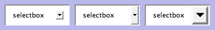
Go ahead, pick your favorite. Got it? Now, should the same thing happen when the select is “open”, showing all the options? For that matter, should the same thing happen given this select box from Safari?
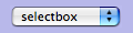
It does no good to say that your choice would be just fine if Safari would only just go along with everyone else. There is no pre-defined appearance for select boxes, or for any other form control. In Safari’s case, it’s pulling these things right out of OS X and placing them in the document—the very definition of replaced-element behavior. (And yet, browsers keep treating them as if they’re non-replaced.) Explorer does the same thing, actually, and is the reason why form controls seemed to have infinite z-index in IE6 and earlier—they were drawn by the OS after everything else on the document had been laid out. Firefox, on the other hand, draws its own form controls, which is why they’re more consistent across operating systems, but also don’t suffer from draw-order issues like Explorer did. (It’s also part of the reason Firefox takes longer to launch on many systems; rather than making use of the OS for things like form controls, it has to carry its own around with it.)
We could get into a very long discussion about whether form elements should always reflect the operating system or not, which usually breaks down to HCI advocates on one side of the debate and designers on the other. Let’s not, though (at least not here). Let’s just assume that form controls should be styleable, because that brings us right back to the central dilemma: how, exactly?
After all, we can make the previous select box riddle even more interesting. Suppose you declare this:
select {padding: 10px;}
option {padding: 10px;}
Now what? After all, there’s an option element visible there in the select box from the moment it’s drawn—or is it? Maybe that’s a special feature of a select element that copies content from an option element to display when no option elements are visible. We don’t know. But let’s assume that what we see there is an option element visible inside the select element. It’ll be either the first one in the list, or the one with a proper selected attribute. Hey, what about this rule set?
select {padding: 10px;}
option {padding: 10px; border-bottom: 1px solid gray;}
option[selected] {font-style: italic; background: yellow;}
Yee haw! There are a ton of questions I could pose here, but I’ll go with one of the trickier ones: should the gray option bottom border be visible inside the select box when the select is “closed”, or should it only appear on option elements when the select is “open”? Oh, and here’s another good one: does the padding on the select element apply to the drop-down menu made up of option elements, or no?
The beauty is that whichever answers are perfectly obvious to you, it’s perfectly obvious to someone else that your answers are completely wrong. And vice versa.
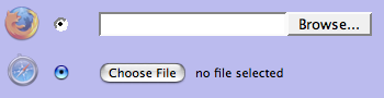
And remember, these are some of the simpler cases. When you start considering things like how to style radio buttons and file inputs, things get really hairy. I mean, just look at the differences between Safari and Firefox.
Merely sticking to questions of padding and background colors is vexing enough. Start throwing in text/font styling, borders, and even foreground colors; they quickly generate a cornucopia of complex control condundra. The pain!
And don’t think the entire issue of styling form controls is going to get any easier; in fact, the Safari team is about to make it a good deal harder. If you read their post “Text Fields“, you’ll see that Safari will soon make it possible to do all kinds of stuff to text inputs. (If you’re downloading nightly builds of Safari, it already allows these.) Of the nine example images, only two have any hope of being described using current CSS—and even those have to dodge questions like exactly how a text input should be baseline-aligned (as mentioned earlier).
So in order to style form controls in any sort of meaningful way, it will be necessary to invent a whole bunch of new properties and pseudo-classes (and most likely pseudo-elements) and describe how they behave and interact. That’s much more easily said than done. It’s taken more than five years to not finish CSS 2.1, and that’s just a reduced and clarified version of CSS 2. Just imagine how much longer it could take to not finish inventing a whole new branch of CSS.
Not that anyone’s really working on it right now. The closest we have is the Basic User Interface Module, which became a Candidate Recommendation on 11 May 2004 (yes, three years ago) and has not moved since. There is no other form controls module. There are things that could apply in a variety of other modules (like “The box model“, “Generated and replaced elements“, and “line“), but none of them are explicitly about form controls and so their relevance is at best debatable.
In that vacuum, browsers are acting to different degrees. As we saw earlier, Safari is pushing forward in a major way. Explorer allows some form control styling, but not much. Firefox allows a little more—but not all that long ago, it ignored all attempts to style form controls. Opera blocks attempts at form styling, the last I checked.
Because there are no agreed answers, and each browser is making its own guesses, there are inevitably going to be conflicts. If one out of five browsers uses (for example) padding to set the separation between the content and borders of text inputs, then * {padding: 0;} is going to make them seriously scrunchy, while the other four will completely ignore it. I might then declare input[type="text"] {padding: 2px;}, but what happens when one of the other four starts applying styles to form controls, but treats padding on text inputs differently, adding padding to the default form control layout because it treats the whole interior of the input, instead of just the text, as the content?
As veterans of meyerweb have already guessed, this is not a post with answers. Like many of my longer entries, it poses only questions and (I hope) provokes thought. What I hope it also does is explain my aversion to applying CSS to form controls, and thus why I constructed a great big grouped selector for my reset style sheet instead of using the universal selector. I understand why so many people want to go the universal route: it’s a lot simpler to type and uses a lot fewer characters. I’m usually one for saving characters, but this is one case where I think extra characters are more than worth the possible cost.