How to Verify Site Ownership on Mastodon Profiles
Published 2 years, 7 months pastLike many of you, I’ve been checking out Mastodon and finding more and more things I like. Including the use of XFN (XHTML Friends Network) semantics to verify ownership of sites you link from your profile’s metadata! What that means is, you can add up to four links in your profile, and if you have an XFN-compliant link on that URL pointing to your Mastodon profile, it will show up as verified as actually being your site.
Okay, that probably also comes off a little confusing. Let me walk through the process.
First, go to your home Mastodon server and edit your profile. On servers like mastodon.social, there should be an “Edit profile” link under your user avatar.
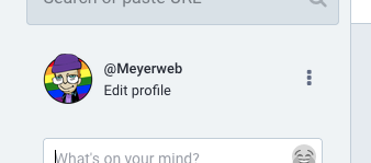
I saw the same thing on another Mastodon server where I have an account, so it seems to be common to Mastodon in general. I can’t know what every Mastodon server does, though, so you might have to root around to find how you edit your profile. (Similarly, I can’t be sure that everything will be exactly as I depict it below, but hopefully it will be at least reasonably close.)
Under “Appearance” in the profile editing screen, which I believe is the default profile editing page, there should be a section called “Profile metadata”. You’ll probably have to scroll a bit to reach it. You can add up to four labels with content, and a very common label is “Web” or “Homepage” with the URL of your personal server. They don’t all have to be links to sites; you could add your favorite color or relationship preference(s) or whatever
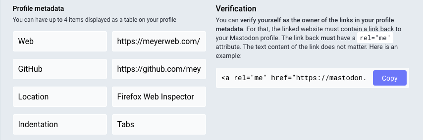
But look, over there next to the table, there’s a “Verification” section, with a little bit of explanation and a field containing some markup you can copy, but it’s cut off before the end of the markup. Here’s what mine looks like in full:
<a rel="me" href="https://mastodon.social/@Meyerweb">Mastodon</a>If I take this markup and add it to any URL I list in my metadata, then that entry in my metadata table will get special treatment, because it will mean I’ve verified it.
The important part is the rel="me", which establishes a shared identity. Here’s how it’s (partially) described by XFN 1.1:
A link to yourself at a different URL. Exclusive of all other XFN values. Required symmetric.
I admit, that’s written in terse spec-speak, so let’s see how this works out in practice.
First, let’s look at the markup in my Mastodon profile’s page. Any link to another site in the table of profile metadata has a me value in the rel attribute, like so:
<a href="https://meyerweb.com/" rel="nofollow noopener noreferrer me">That means I’ve claimed via Mastodon that meyerweb.com is me at another URL.
But that’s not enough, because I could point at the home page of, say, Wikipedia as if it were mine. That’s why XFN requires the relationship to be symmetric, which is to say, there needs to be a rel="me" annotated link on each end. (On both ends. However you want to say that.)
So on the page being pointed to, which in my case is https://meyerweb.com/, I need to include a link back to my Mastodon profile page, and that link also has to have rel="me". That’s the markup Mastodon provided for me to copy, which we saw before and I’ll repeat here:
<a rel="me" href="https://mastodon.social/@Meyerweb">Mastodon</a>Again, the important part is that the href points to my Mastodon profile page, and there’s a rel attribute containing me. It can contain other things, like noreferrer, but needs to have me for the verfiication to work. Note that the content of the link element doesn’t have to be the text “Mastodon”. In my case, I’m using a Mastodon logo, with the markup looking like this:
<a rel="me" href="https://mastodon.social/@Meyerweb">
 	<img src="/pix/icons/mastodon.svg" alt="Mastodon">
</a>
With that in place, there’s a “me” link pointing to a page that contains a “me” link. That’s a symmetric relationship, as XFN requires, and it verifies that the two pages have a shared owner. Who is me!
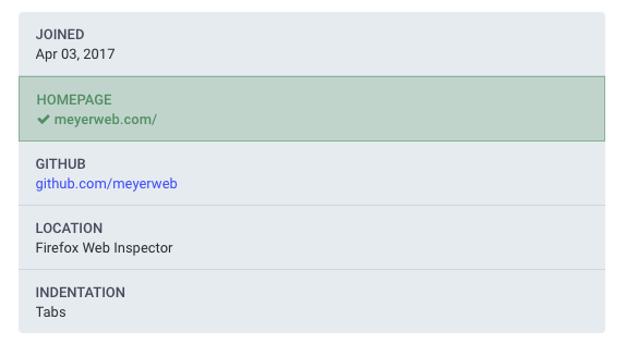
Thus, if you go to my Mastodon profile page, in the table of my profile metadata, the entry for my homepage is specially styled to indicate it’s been verified as actually belonging to me.
And that’s how it works.
Next question: how can I verify my GitHub page? At the moment, I’d have to put my Mastodon profile page’s URL into the one open field for URLs in GitHub profiles, because GitHub also does the rel="me" thing for its profile links. But if I do that, I’d have to remove the link to my homepage, which I don’t want to do.
Until GitHub either provides a dedicated Mastodon profile field the way it provides a dedicated Twitter profile field, or else allows people to add multiple URLs to their profiles the way Mastodon does, I won’t be able to verify my GitHub page on Mastodon. Not a huge deal for me, personally, but in general it would be nice to see GitHub become more flexible in this area. Very smart people are also asking for this, so hopefully that will happen soon(ish).