Posts in the Design Category

Once Upon a Browser

Published 3 months, 2 weeks past

Once upon a time, there was a movie called Once Upon a Forest.  I’ve never seen it.  In fact, the only reason I know it exists is because a few years after it was released, Joshua Davis created a site called Once Upon a Forest, which I was doing searches to find again.  The movie came up in my search results; the site, long dead, did not.  Instead, I found its original URL on Joshua’s Wikipedia page, and the Wayback Machine coughed up snapshots of it, such as this one.  You can also find static shots of it on Joshua’s personal web site, if you scroll far enough.

That site has long stayed with me, not so much for its artistic expression (which is pleasant enough) as for how the pieces were produced.  Joshua explained in a talk that he wrote code to create generative art, where it took visual elements and arranged them randomly, then waited for him to either save the result or hit a key to try again.  He created the elements that were used, and put constraints on how they might be arranged, but allowed randomness to determine the outcome.

That appealed to me deeply.  I eventually came to realize that the appeal was rooted in my love of the web, where we create content elements and visual styles and scripted behavior, and then we send our work into a medium that definitely has constraints, but something very much like the random component of generative art: viewport size, device capabilities, browser, and personal preference settings can combine in essentially infinite ways.  The user is the seed in the RNG of our work’s output.

Normally, we try very hard to minimize the variation our work can express.  Even when crossing from one experiential stratum to another  —  that is to say, when changing media breakpoints  —  we try to keep things visually consistent, orderly, and understandable.  That drive to be boring for the sake of user comprehension and convenience is often at war with our desire to be visually striking for the sake of expression and enticement.

There is a lot, and I mean a lot, of room for variability in web technologies.  We work very hard to tame it, to deny it, to shun it.  Too much, if you ask me.

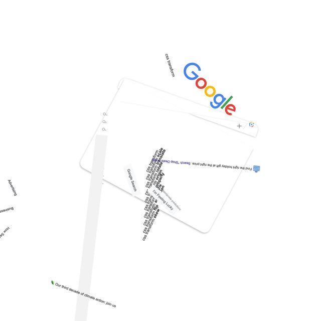
About twelve and half years ago, I took a first stab at pushing back on that denial with a series posted to Flickr called “Spinning the Web”, where I used CSS rotation transforms to take consistent, orderly, understandable web sites and shake them up hard.  I enjoyed the process, and a number of people enjoyed the results.

google.com, late November 2023

In the past few months, I’ve come back to the concept for no truly clear reason and have been exploring new approaches and visual styles.  The first collection launched a few days ago: Spinning the Web 2023, a collection of 26 web sites remixed with a combination of CSS and JS.

I’m announcing them now in part because this month has been dubbed “Genuary”, a month for experimenting with generative art, with daily prompts to get people generating.  I don’t know if I’ll be following any of the prompts, but we’ll see.  And now I have a place to do it.

You see, back in 2011, I mentioned that my working title for the “Spinning the Web” series was “Once Upon a Browser”.  That title has never left me, so I’ve decided to claim it and created an umbrella site with that name.  At launch, it’s sporting a design that owes quite a bit to Once Upon a Forest  —  albeit with its own SVG-based generative background, one I plan to mess around with whenever the mood strikes.  New works will go up there from time to time, and I plan to migrate the 2011 efforts there as well.  For now, there are pointers to the Flickr albums for the old works.

I said this back in 2011, and I mean it just as much in 2023: I hope you enjoy these works even half as much as I enjoyed creating them.


Designing the Igalia Chats Logo

Published 8 months, 1 day past

One of the things I’ve been doing at Igalia of late is podcasting with Brian Kardell.  It’s called “Igalia Chats”, and last week, I designed it a logo.  I tried out a number of different ideas, ran them past the Communication team for feedback, and settled on this one.

The Igalia Chats logo, which combines the official full Igalia logo of a many-colored circle and the name of the company with the word “Chats” below the logo in a slightly larger font size than that used for the name of the company.  Next to them is a large stylized icon of a microphone.  
D&AD Awards committee, you know where to find me.

And there you have it, the first logo I’ve designed in… well, in quite a while.  My work this time around was informed by a few things.

  • Podcast apps, sites, etc.  expect a square image for the podcast’s logo.  This doesn’t mean you have to make the visible part of it square, exactly, but it does mean any wide-and-short logo will simultaneously feel cramped and lost in a vast void.  Or maybe just very far away.  The version shown in this post is not the square version, because this is not a podcast app and because I could.  The square version just adds more empty whitespace at the top and bottom, anyway.
  • I couldn’t really alter the official logo in any major way: the brand guidelines are pretty strong and shouldn’t be broken without collective approval.  Given the time that would take, I decided to just work with the logo as-is, and think about possible variants (say, the microphone icon in the blank diamond of the logo) in a later stage.  I did think about just not using the official logo at all, but that felt like it would end up looking too generic.  Besides, we hav e a pretty nifty logo there, so why not use it?
  • A typeface for the word “Chats” that works well with Igalia’s official logo.  I used Etelka, which is a font we already use on the web site, and I think is the basis of the semi-serifed letters in the official logo anyway.  Though I could be wrong about that; while I definitely have opinions about typefaces these days, I’m not very good at identifying them, or being able to distinguish between two similar fonts.  Call it typeface blindness.
  • Using open-source resources where possible; thus, the microphone icon came from The Noun Project.  I then modified it a bit (rounded the linecaps, shortened the pickup’s brace) to balance its visual weight with the rest of the design, and not crowd the letters too much.  I also added a subtle vertical gradient to the icon, which helped the word “Chats” to stand out a little more.  Gotta make the logo pop, donchaknow?

There are probably some adjustments I’ll make after a bit of time, but I was determined not to let perfect be the enemy of shipping.  As for how I came to create the logo, you’re probably thinking fancy CSS Grid layout and custom fonts and all that jazz, but no, I just dumped everything into Keynote and fiddled with ideas until I had some I liked.  It’s not a fantastic environment for this sort of work, I expect, but it’s Good Enough For Me™.

So, if you’re subscribed to Igalia Chats via your listening channel of choice, you should be seeing a new logo.  If you aren’t subscribed… try us, won’t you?  Brian and I talk about a lot of web-related stuff with a lot of really interesting people  —  most recently, with Kilian Valkhof about the web development application Polypane, with Stephen Shankland about undersea data cables, with Zach Leatherman about open-source work and funding, and many more.  Plus sometimes we just talk with each other about what’s new in Web land, things like Google Baseline or huge WebKit updates.  And, yes, sometimes we talk about what Igalia is up to, like our work on the Servo engine or the Steam Deck.

This is one of the things I quite enjoy about working for Igalia  —  the way I can draw upon all the things I’ve learned over my many (many) years to create different things.  A logo last week, a thumbnail-building tool the week before, writing news posts, recording podcasts, doing audio production, figuring out transcription technology, and on and on and on.  It can sometimes be frustrating in the way all work can be, but it rarely gets boring. (And if that sounds good to you, we are hiring for a number of roles!)


Nuclear Targeted Footnotes

Published 1 year, 7 months past

One of the more interesting design challenges of The Effects of Nuclear Weapons was the fact that, like many technical texts, it has footnotes.  Not a huge number, and in fact one chapter has none at all, but they couldn’t be ignored.  And I didn’t want them to be inline between paragraphs or stuck into the middle of the text.

This was actually a case where Chris and I decided to depart a bit from the print layout, because in print a chapter has many pages, but online it has a single page.  So we turned the footnotes into endnotes, and collected them all near the end of each chapter.

Originally I had thought about putting footnotes off to one side in desktop views, such as in the right-hand grid gutter.  After playing with some rough prototypes, I realized this wasn’t going to go the way I wanted it to, and would likely make life difficult in a variety of display sizes between the “big desktop monitor” and “mobile device” realms.  I don’t know, maybe I gave up too easily, but Chris and I had already decided that endnotes were an acceptable adaptation and I decided to roll with that.

So here’s how the footnotes work.  First off, in the main-body text, a footnote marker is wrapped in a <sup> element and is a link that points at a named anchor in the endnotes. (I may go back and replace all the superscript elements with styled <mark> elements, but for now, they’re superscript elements.)  Here’s an example from the beginning of Chapter I, which also has a cross-reference link in it, classed as such even though we don’t actually style them any differently than other links.

This is true for a conventional “high explosive,” such as TNT, as well as for a nuclear (or atomic) explosion,<sup><a href="#fnote01">1</a></sup> although the energy is produced in quite different ways (<a href="#§1.11" class="xref">§ 1.11</a>).

Then, down near the end of the document, there’s a section that contains an ordered list.  Inside that list are the endnotes, which are in part marked up like this:

<li id="fnote01"><sup>1</sup> The terms “nuclear” and atomic” may be used interchangeably so far as weapons, explosions, and energy are concerned, but “nuclear” is preferred for the reason given in <a href="#§1.11" class="xref">§ 1.11</a>.

The list item markers are switched off with CSS, and superscripted numbers stand in their place.  I do it that way because the footnote numbers are important to the content, but also have specific presentation demands that are difficult  —  nay, impossible — to pull off with normal markers, like raising them superscript-style. (List markers are only affected by a very limited set of properties.)

In order to get the footnote text to align along the start (left) edge of their content and have the numbers hang off the side, I elected to use the old negative-text-indent-positive-padding trick:

.endnotes li {
	padding-inline-start: 0.75em;
	text-indent: -0.75em;
}

That works great as long as there are never any double-digit footnote numbers, which was indeed the case… until Chapter VIII.  Dang it.

So, for any footnote number above 9, I needed a different set of values for the indent-padding trick, and I didn’t feel like adding in a bunch of greater-than-nine classes. Following-sibling combinator to the rescue!

.endnotes li:nth-of-type(9) ~ li {
	margin-inline-start: -0.33em;
	padding-inline-start: 1.1em;
	text-indent: -1.1em;
}

The extra negative start margin is necessary solely to get the text in the list items to align horizontally, though unnecessary if you don’t care about that sort of thing.

Okay, so the endnotes looked right when seen in their list, but I needed a way to get back to the referring paragraph after reading a footnote.  Thus, some “backjump” links got added to each footnote, pointing back to the paragraph that referred to them.

<span class="backjump">[ref. <a href="#§1.01">§ 1.01</a>]</span>

With that, a reader can click/tap a footnote number to jump to the corresponding footnote, then click/tap the reference link to get back to where they started.  Which is fine, as far as it goes, but that idea of having footnotes appear in context hadn’t left me.  I decided I’d make them happen, one way or another.

(Throughout all this, I wished more than once the HTML 3.0 proposal for <fn> had gone somewhere other than the dustbin of history and the industry’s collective memory hole.  Ah, well.)

I was thinking I’d need some kind of JavaScript thing to swap element nodes around when it occurred to me that clicking a footnote number would make the corresponding footnote list item a target, and if an element is a target, it can be styled using the :target pseudo-class.  Making it appear in context could be a simple matter of positioning it in the viewport, rather than with relation to the document.  And so:

.endnotes li:target {
	position: fixed;
	bottom: 0;
	padding-block: 2em 4em;
	padding-inline: 2em;
	margin-inline: -2em 0;
	border-top: 1px solid;
	background: #FFF;
	box-shadow: 0 0 3em 3em #FFF;
	max-width: 45em;
}

That is to say, when an endnote list item is targeted, it’s fixedly positioned against the bottom of the viewport and given some padding and background and a top border and a box shadow, so it has a bit of a halo above it that sets it apart from the content it’s overlaying.  It actually looks pretty sweet, if I do say so myself, and allows the reader to see footnotes without having to jump back and forth on the page.  Now all I needed was a way to make the footnote go away.

Again I thought about going the JavaScript route, but I’m trying to keep to the Web’s slower pace layers as much as possible in this project for maximum compatibility over time and technology.  Thus, every footnote gets a “close this” link right after the backjump link, marked up like this:

<a href="#fnclosed" class="close">X</a></li>

(I realize that probably looks a little weird, but hang in there and hopefully I can clear it up in the next few paragraphs.)

So every footnote ends with two links, one to jump to the paragraph (or heading) that referred to it, which is unnecessary when the footnote has popped up due to user interaction; and then, one to make the footnote go away, which is unnecessary when looking at the list of footnotes at the end of the chapter.  It was time to juggle display and visibility values to make each appear only when necessary.

.endnotes li .close {
	display: none;
	visibility: hidden;
}
.endnotes li:target .close {
	display: block;
	visibility: visible;
}
.endnotes li:target .backjump {
	display: none;
	visibility: hidden;
}

Thus, the “close this” links are hidden by default, and revealed when the list item is targeted and thus pops up.  By contrast, the backjump links are shown by default, and hidden when the list item is targeted.

As it now stands, this approach has some upsides and some downsides.  One upside is that, since a URL with an identifier fragment is distinct from the URL of the page itself, you can dismiss a popped-up footnote with the browser’s Back button.  On kind of the same hand, though, one downside is that since a URL with an identifier fragment is distinct from the URL of the page itself, if you consistently use the “close this” link to dismiss a popped-up footnote, the browser history gets cluttered with the opened and closed states of various footnotes.

This is bad because you can get partway through a chapter, look at a few footnotes, and then decide you want to go back one page by hitting the Back button, at which point you discover have to go back through all those footnote states in the history before you actually go back one page.

I feel like this is a thing I can (probably should) address by layering progressively-enhancing JavaScript over top of all this, but I’m still not quite sure how best to go about it.  Should I add event handlers and such so the fragment-identifier stuff is suppressed and the URL never actually changes?  Should I add listeners that will silently rewrite the browser history as needed to avoid this?  Ya got me.  Suggestions or pointers to live examples of solutions to similar problems are welcomed in the comments below.

Less crucially, the way the footnote just appears and disappears bugs me a little, because it’s easy to miss if you aren’t looking in the right place.  My first thought was that it would be nice to have the footnote unfurl from the bottom of the page, but it’s basically impossible (so far as I can tell) to animate the height of an element from 0 to auto.  You also can’t animate something like bottom: calc(-1 * calculated-height) to 0 because there is no CSS keyword (so far as I know) that returns the calculated height of an element.  And you can’t really animate from top: 100vh to bottom: 0 because animations are of a property’s values, not across properties.

I’m currently considering a quick animation from something like bottom: -50em to 0, going on the assumption that no footnote will ever be more than 50 em tall, regardless of the display environment.  But that means short footnotes will slide in later than tall footnotes, and probably appear to move faster.  Maybe that’s okay?  Maybe I should do more of a fade-and-scale-in thing instead, which will be visually consistent regardless of footnote size.  Or I could have them 3D-pivot up from the bottom edge of the viewport!  Or maybe this is another place to layer a little JS on top.

Or maybe I’ve overlooked something that will let me unfurl the way I first envisioned with just HTML and CSS, a clever new technique I’ve missed or an old solution I’ve forgotten.  As before, comments with suggestions are welcome.


Better Image Optimization by Restricting the Color Index

Published 4 years past

Let’s talk about image optimization.  There are a few images used in meyerweb’s new design, and while I wanted them to be pleasing to the eye, I also wanted them to be lightweight.  My rough goal was to not have the design elements (images plus CSS) be more than half the total page weight for a typical blog post, not counting any post-specific images like photos or diagrams.  Thus, if a typical blog post’s page weight was 500KB, I didn’t want the images and CSS to add up to more than 250KB or so.

Spoiler: I achieved my goal, but at the same time fell short.  What I had overlooked was custom fonts, which I’ll get to in a later post.

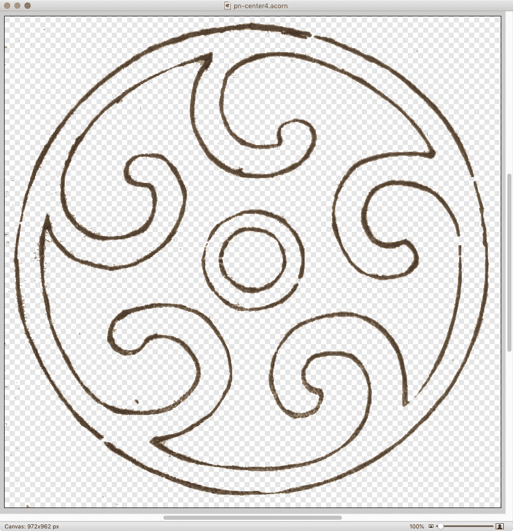
I found out that how you optimize images matters a whole lot.  Let’s consider one example: the spiral-like image (which, yes, is a quiet callback to past work) at the center of the previous-next links at the bottom of blog posts and archive pages.  After I extracted a full-resolution copy of that particular sketch from pages 13-14 of Hamonshū, Vol. 1 and did a little cleanup with filters and so on, it became a 1.4MB Acorn file.

The full-size image in Acorn.

(Side note: Acorn’s “Transparentomatic” filter was an enormous time-saver on this project — it made dropping out the page texture a breeze, and easily adjustable, without forcing me to create and retouch mask layers and whatnot.  Thanks, Flying Meat!)

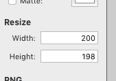
With the image ready to be tested in-browser, I would use Acorn’s Web Export dialog to save it as a PNG.  The nice thing about this dialog is its built-in Resize feature, which let me keep the Acorn file at its native size (almost a thousand pixels on each side) and export it to the size I wanted — in this case, 200 pixels across.  I did this sort of thing a lot, because I tested a variety of images for every design element.

Once I settled on the image I wanted, I’d drop it on ImageOptim to optimize it.  This usually slammed all eight cores in my aged laptop’s CPU for a good few seconds, and resulted in up to 5% size savings.

That last paragraph probably looks like an indictment of ImageOptim, but wait!  It’s fully redeemed by the end of the post, by which time I will have indicted myself instead.

At this point, my spiral image had gone from a 1.4MB Acorn file to a 30KB PNG.  That’s pretty good, even if 30KB feels a tad bulky for a 200×200 image.  I just assumed, what with all the transparency and shades of color and all that, it wasn’t too far out of line.  But as the whole design started to come together, I discovered that when you added up all the illustration images on, say, the home page, I’d let image bloat sneak up on me in the worst way.  They were totalling close to a megabyte, and they’d all been through ImageOptim already.

I went back to Acorn to see if I could squeeze any more out of the file size, maybe convert some of the images to JPGs if they didn’t need the transparency.  As I flipped between file formats in the Web Export dialog, I noticed something I’d previously overlooked in the PNG export options: a bit depth slider.  I’d been saving the PNGs with no bit depth restrictions, meaning the color table was holding space for 224 colors.  That’s… a lot of colors, roughly 224 of which I wasn’t actually using.

When I clicked the “Index PNG Colors” checkbox and changed the slider until I started getting dithers or obvious color loss, then brought it up a notch or two, the difference was astounding.  Instead of a 30KB file, I got a 4.4 KB file.  Instead of saving at 75% the original size, it was now 11%.

Wait a second… how long has THAT been there?

So I went back through the directory with all my design elements and repeated the process.  I do have batch image processing software installed, but I elected to do this manually so I could pick the best color depth for each file by eye.  It could be that some would be okay at 4 colors instead of 8; others might need 16 or 32 to retain visual fidelity.  Fortunately for me, I only had a couple dozen images to go through, but it would have been worth it even at 10 times that many.

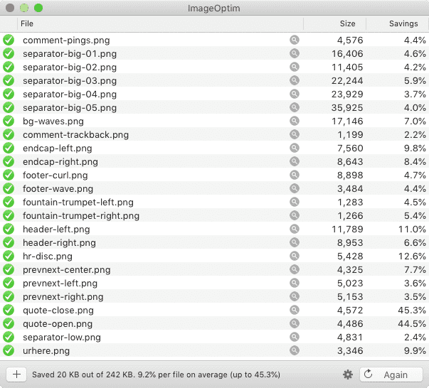
Once I’d gone through all the images and saved them with restricted color depth, my theme’s image directory was down to 242KB total.  The biggest of them, the separator wave illustrations, had gone from being ~150KB each to ~25KB each — all five of them together now totalled less than just one of them had before I did the color indexing.

The directory, well and fully smooshed.

At this point, I thought, “All right, let’s see what ImageOptim does with these.”  It squeezed them down even further, taking my total from 242KB to 222KB, a nine percent reduction.  Which is to say, the percentage savings I got on these already-small files was larger than I’d been getting on the much bigger files — plus, ImageOptim processed them quickly and with a minimum of CPU slamming.  Which is honestly pretty great, given the age of my laptop (about seven years).

So: did I meet my performance goal?  As I said at the outset, yes, but also no.  For a single blog post with around 10KB of text content and no embedded media, the page weight is around 460KB, with the size varying a bit depending on how much markup is needed for the 10KB of text.  (Here’s one recent example with some content variety.)  Of that, the CSS, split across two files, totals 35.2KB.  The images add up to 102.9KB.  Add them together, and you get just a hair over 138KB, or right around 30%.  Huge success!

Except I hadn’t factored in custom fonts, which all by themselves currently total 203.6KB (44% total page weight), mostly due to the three faces of IM Fell I’m using.  That’s right: The fonts weigh more than the CSS and images put together.  Once they’re added in with the CSS and images, the design elements end up being almost 75% the total page weight — about 341.6KB of the 460KB total.  Most of the rest is the 104.4KB chewed up by showdown.js, the enhancement script I’m using to allow the use of Markdown in post comments.

Thus, next up on my performance quest is looking into subsetting the fonts I’m using in order to get their weight down, and finding out if there’s anything I can do to subset Showdown as well.

But as of now, I’m well pleased with where I ended up on image optimization.  I just need to go back and do the same for post-specific images I’d left at unrestricted color depths, where I anticipate a similar 90% savings in file sizes.  If you’ve got a lot of images, particularly PNGs, try running them through a process that lets you restrict the color depth, and see how much it saves.  The results might surprise you!


Pseudo-Randomly Adding Illustrations with CSS

Published 4 years, 1 week past

I’ve been incredibly gratified and a bit humbled by the responses to the new design.  So first of all, thank you to everyone who shared their reactions!  I truly appreciate your kindness, and I’d like to repay that kindness a bit by sharing some of the techniques I used to create this design.  Today, let’s talk about the ink-study illustrations placed between entries on the site, as well as one other place I’ll get to later.

Very early in the process, I knew I wanted to separate entries with decorations of some sort, as a way of breaking up the stream of text.  Fortunately, Hamonshū provided ample material.  A little work in Acorn and I had five candidate illustrations ready to go.

The five illustrations.

The thing was, I wanted to use all five of them, and I wanted them to be picked on a random-ish basis.  I could have written PHP or JS or some such to inject a random pick, but that felt a little too fiddly.  Fortunately, I found a way to use plain old CSS to get the result I wanted, even if it isn’t truly random.  In fact, its predictability became an asset to me as a designer, while still imparting the effect I wanted for readers.

(Please note that in this article, I’ve simplified some aspects of my actual CSS for clarity’s sake; e.g., removing the directory path from url() values and just showing the filenames, or removing declarations not directly relevant to the discussion here.  I mention this so that you’re prepared for the differences in the CSS shown in this piece versus in your web inspector and/or the raw stylesheet.)

Here’s how it starts out:

#thoughts .entry + .entry::before {
   content: "";
   display: block;
   height: 10em;
   background:
      url(separator-big-05.png) 50% 100% / contain no-repeat;
}

That means, for every blog entry except the first, a block-level bit of generated content is inserted at the beginning of the entry, given a height, and the image separator-big-05.png is dropped into the generated box and sized to be contained within it, which means no part of the image will spill outside the background area and thus be clipped off.  (The file has the number 05 because it was the fifth I produced.  It ended up being my favorite, so I made it the default.)

With that in place, all that remains is to switch up the background image that’s used for various entries.  I do it like this:

#thoughts .entry:nth-of-type(2n+1)::before {
   background-image: url(separator-big-02.png);
}
#thoughts .entry:nth-of-type(3n+1)::before {
   background-image: url(separator-big-03.png);
}
#thoughts .entry:nth-of-type(4n+1)::before {
   background-image: url(separator-big-04.png);
}
#thoughts .entry:nth-of-type(5n+1)::before {
   background-image: url(separator-big-01.png);
}

So every second-plus-one entry (the third, fifth, seventh, etc.) that isn’t the first entry will use separator-big-02.png instead of -05.png.  Unless the entry is an every-third-plus-one (fourth, seventh, tenth, etc.), in which case separator-big-03.png is used instead.  And so on, up through every-fifth-plus-one.  And as you can see, the first image I produced (separator-big-01.png) is used the least often, so you can probably guess where it stands in my regard.

This technique does produce a predictable pattern, but one that’s unlikely to seem too repetitious, because it’s used to add decoration separated by a fair amount of text content, plus there are enough alternatives to keep the mix feeling fresh.  It also means, given how the technique works, that the first separator image on the home page (and on archive pages) is always my favorite.  That’s where the predictability of the approach helped me as a designer.

I use a similar approach for the separator between posts’ text and their comments, except in that case, I add a generated box to the end of the last child element in a given entry:

.single #thoughts article .text > *:last-child:after {
   content: "";
   display: block;
   height: 10em;
   background:
      url(separator-big-05.png) 50% 100% / contain no-repeat;
}

That is, on any page classed single (which is all individual post pages) after the last child element of a .text element (which holds the text of a post), the decoration box is generated.  The default, again, is separator-big-05.png — but here, I vary the image based on the number of elements in the post’s body:

.single #thoughts article .text > *:nth-child(2n+1)::after {
   background-image: url(separator-big-02.png);
}
.single #thoughts article .text > *:nth-child(3n+1)::after {
   background-image: url(separator-big-03.png);
}
.single #thoughts article .text > *:nth-child(4n+1)::after {
   background-image: url(separator-big-04.png);
}
.single #thoughts article .text > *:nth-child(5n+1)::after {
   background-image: url(separator-big-01.png);
}

In other words: if the last child element of the post text is a second-plus-one, separator-big-02.png is used.  If there are 3n+1 (one, four, seven, ten, thirteen, …) HTML elements in the post, separator-big-03.png is used.  And so on.  This is an effectively random choice from among the five images, since I don’t count the elements in my posts as I write them.  And it also means that if I edit a piece enough to change the number of elements, the illustration will change!  (To be clear, I regard this as a feature.  It lends a slight patina of impermanence that fits well with the overall theme.)

I should note that in the actual CSS, the two sets of rules above are merged into one, so the selectors are actually like so:

#thoughts .entry + .entry::before,
   .single #thoughts article .text > *:last-child:after {…}

#thoughts .entry:nth-of-type(2n+1)::before,
   .single #thoughts article .text > *:nth-child(2n+1)::after {…}

#thoughts .entry:nth-of-type(3n+1)::before,
   .single #thoughts article .text > *:nth-child(3n+1)::after {…}

In all honesty, this technique really satisfies me.  It makes use of document structure while having a random feel, and is easily updated by simply replacing files or changing URLs.  It’s also simple to add more rules to bring even more images to the mix, if I want.

And since we’re talking about using structure to vary layout, I also have this @media block, quoted here verbatim and in full:

@media (min-width: 50em) {
   #thoughts .entry:nth-of-type(2n) {
      transform: translate(-1vw,0);
   }
   #thoughts .entry:nth-of-type(3n) {
      transform: translate(3vw,0);
   }
}

This means on the home page and blog archive pages, but only at desktop-browser widths, some entries are shifted a bit to the left or right by fractions of the viewport width, which subtly breaks up the strict linearity of the content column on long pages, keeping it from feeling too grid-like.

To be honest, I have no idea if that side-shifting effect actually affects visitors’ experience of using meyerweb, but I like it.  Sometimes the inter-entry wave art fits together with the side-shift so that it looks like the art flows into the content.  That kind of serendipity always delights me, whether it comes by my hand or someone else’s.  With luck, it will have delighted one or two of you as well.


Hamonshu

Published 4 years, 1 week past

I ended my observance of CSS Naked Day 2020 by launching an entirely new design for meyerweb.  I’m calling it Hamonshū after the source from which I adapted most of the graphic elements.  I’ve been working on it sporadically in my free time since mid-January, finally coming to a place I thought was ready to launch in late March.

Naked Day was a convenient way to change over the structure of pages while there was no design, which probably makes it sound like that’s the only reason I even observed it.  To the contrary, I hadn’t planned to launch the new design until June 8th of this year — but once I decided on going style-naked, I realized it was the perfect opportunity to make the switch.

I might still have delayed, if not for everything happening in the world right now.  But Cameron Moll said it best as he recently launched a new design: “Deploying in the middle of a pandemic seems so unimportant at the moment. Or maybe there’s no better time for it.”  That last sentence resonated with me unexpectedly deeply, and came to mind again as I took the CSS away for Naked Day.

I’ll have quite a few things to say about the design in the future: things I learned, techniques I used, bits I really like, that sort of thing.  In this post, I want to say a bit about its genesis.

It all started when someone — I’ve since lost track of who, or even where it happened — brought my attention to Hamonshū, Vols. 1-3, available on the Internet Archive thanks to the Smithsonian Institution.  Hamonshū, a word which I understand roughly translates into English as “wave forms” or “wave design”, is a three-volume set of art studies of water.  Created by Yūzan Mori and published in 1903, I had never heard of it before, but the sketches immediately appealed to me.  You can get an preview of some of Yūzan’s art in this article from Public Domain Review, or just go to the source (linked previously, as well as in the footer of the site) and immerse yourself in it.

As I absorbed Yūzan’s ink studies of ocean waves, rivers, fountains, and more, the elements of a design began to form in my head.  I won’t say I saw it — being aphantasic, I couldn’t — but certain sketches suggested themselves as components of a layout, and stuck with me.

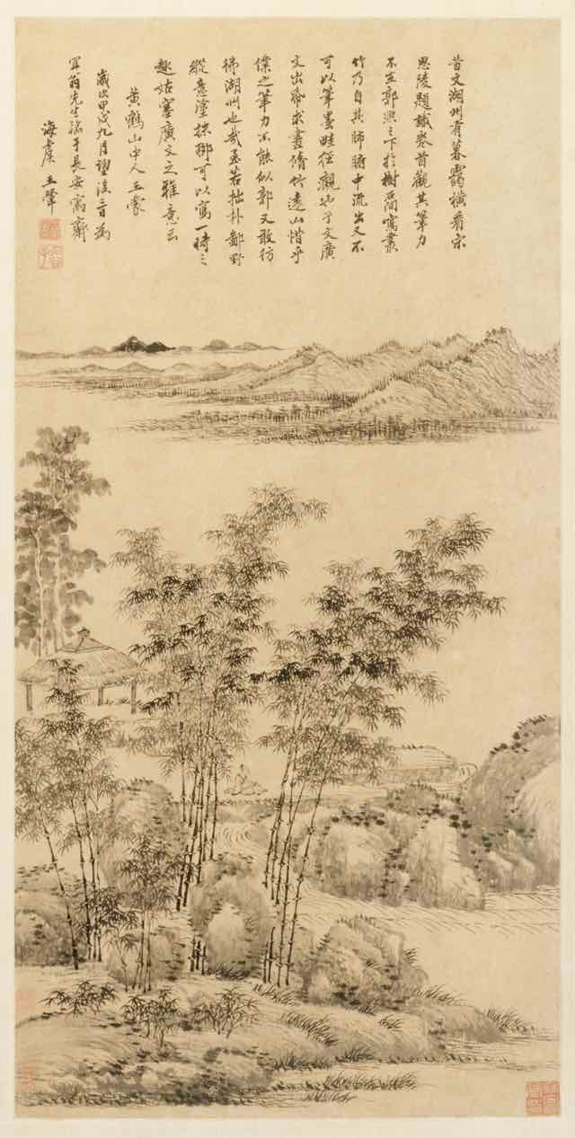
Tall Bamboo and Distant Mountains, after Wang Meng, Wang Hui 王翬, 1694

Early on, I had thought to combine elements from Hamonshū with other artwork, primarily ink landscape paintings from the Qing Dynasty and Edo periods: two such examples being Tall Bamboo and Distant Mountains, after Wang Meng (Wang Hui 王翬, 1694) and View of West Lake (Ike Taiga, 1700s).  I made attempts, but the elements never really combined properly.  I eventually realized I was trying to combine close-up studies of water with adaptations of much larger works, and the scale of the brush strokes was clashing.  At that point, I abandoned the paintings and concentrated exclusively on Hamonshū.

As the various design elements came together, I went looking for fonts to use.  I originally thought to use variable fonts, but I kept coming back to IM Fell, a typeface I’d seen Simon St. Laurent use and had put to my own purposes in an experimental typeset of Neal Stephenson’s Mother Earth Mother Board.  IM Fell has a sort of nautical feel to it, at least to me, which fit nicely with the water elements I was adapting from Hamonshū, so I ended up using it as a “site elements” typeface.  It’s what’s used for the site name in the header, the main navigation links, metadata for posts, sidebar heading text, the h1 on most pages, and so on.

Originally I used IM Fell for the titles of blog posts like this one, but it didn’t feel quite right.  I think it caused the titles to blend into the rest of the design a little too much unless I kept it relatively huge.  I needed something that felt consistent, but distinguished itself at the smaller sizes I needed for post titles.  I went back to Google Fonts and scrolled through the choices until I narrowed down to a few faces, of which Eczar was the eventual winner.  In addition to using Eczar for post titles, I also employ it in the site’s footer, at least wherever IM Fell isn’t used.  The general body copy of the site is Georgia Pro, falling back to Georgia or a generic serif as needed.

One of the limitations I set for myself was to be reasonably lightweight, and that was a major part of the process.  The details merit a post or two of their own, but my overall goal was to get even the post archive pages under a megabyte in total.  I’m pleased to say I was able to get there, for the most part.  As an example, the main post archive page is, as I write this (but before I posted it) 910.98KB, and that includes the various photographs and other images embedded in posts.  The time to DOMContentLoaded over WiFi is consistently below 200ms, 400-500ms on “Regular 3G”, and 500-600ms on “Regular 2G”, all with the local cache disabled, at least when the server is responding well.  I still have work to do in this area, but I was comfortable enough with the current state to launch the design publicly.

Since I was redesigning anyway, I did some sprucing up of various subpages.  Most notable are the Toolbox and Writing pages, which use a number of techniques to improve organization and appearance.  I still think the top part of the Writing page could use some work, but it’s leagues better than it used to be.  The one major page I’d like to further upgrade is CSS Work, but I’m still looking for an approach that is distinct from the other pages, yet thematically consistent.  If I can’t find one, I’ll probably take the same general approach I did for Toolbox.  I also rewrote some of the microcopy, such as the metadata (publication date, categories, etc.) at the bottom of blog posts, to be more evocative of the feel I was going for.

Late in the process, I got a welcome assist from Jesse Gardner, who had seen a preview of article design.  He had the idea to make a traced SVG version of the “Hand Made With Love” necklace charm from the masthead of the previous design, and then he just up and did it and sent me the file.  You’ll find it in the footer of the site.  It isn’t interactive, although it may in the future.  I haven’t decided yet.

I really hope you enjoy the new look.  It’s the first design I’ve done that wasn’t cribbed off someone else’s site in, oh, 15-20 years, give or take, and I’m rather proud of it.  It won’t win any awards, but it makes the statement I want it to make, and visiting my own site gives me a little glow of satisfaction.  I don’t know if I could ask for more than that.


Headings and Labels

Published 6 years, 3 months past

Following on my last two posts about accessibility improvements to meyerweb, I’ve made two more adjustments: better heading levels and added ARIA labels.

For the heading levels, the problem I face is one familiar to many authors: what makes sense as an <h1> in some situations needs to be an <h2> in others.  The most common example is the titles of blog posts like this one.  On its permalink page, the title of the page is the title of the post.  There, it should be an <h1>.  On archive pages, including the home page of meyerweb, there are a number of posts shown one after the other.  In those situations, each post title should be an <h2>.

Part of the redesign’s changes were to write a single PHP routine that generated posts and their markup, which I could then simply call from wherever.  So I added an optional function parameter that allowed me to indicate the context in which a post was being placed.  It goes something like this:

<?php blogpostMarkup("archive"); ?>
function blogpostMarkup($type = "standalone") {
    if ($type == "archive") $titletag = "h2"; else $titletag = "h1";
    // …markup is all generated here…
    echo $output;
}

Or code to that effect.  (I did not go copy-paste from my actual code base.)

So now, heading levels are what they should be, at least on most pages (I may have missed updating some of my old static HTML pages; feel free to point them out in the comments if you find one).  As a part of that effort, I removed the <h1> from the masthead except on the home page, being the one place it makes sense to be an <h1>.

As for ARIA labels, that came about due to a comment from Phil Kragnes on my last post, where he observed that pages often have multiple elements with a role of navigation.  In order to make things more clear to ARIA users, I took Phil’s suggestion to add aria-label attributes with clarifying values.  So for the page-top skiplinks, I have:

<nav role="navigation" aria-label="page" id="skiplinks">

Similarly, for the site-navigation bar, I have:

<nav role="navigation" aria-label="site" id="navigate">

The idea is that screen readers will say “Page navigation region” and “Site navigation region” rather than just repeating “Navigation region” over and over.

Other than cleaning up individual pages’ heading levels and the occasional custom layout fix (e.g., the Color Equivalents Table needed a local widening of the content column’s maximum size), I think the redesign has settled into the “occasional tinkering” phase.  I may do something to spruce up my old Web Review articles (like the very first, written when HTML tags were still uppercase!) and I’m thinking about adding subnavigation in certain sections, but otherwise I think this is about it.  Unless I decide to go really over the top and model my Tools page after Simon St. Laurent’s lovely new Grid design, that is…

Of course, if you see something I overlooked, don’t hesitate to let me know!  I can’t guarantee fast response, but I can always guarantee careful consideration.


Increasing Accessibility

Published 6 years, 3 months past

Thanks to the fantastic comments on my previous post, I’ve made some accessibility improvements.  Chief among them: adding WAI-ARIA role values to various parts of the structure.  These include:

  • role="banner" for the site’s masthead
  • role="navigation" added to the navigation links, including subnavigation links like previous/next posts
  • role="main" for the main portion of a page
  • role="complementary" for sidebars in the blog archives
  • role="article" for any blog post, whether there are several on a page or just one

In addition, I restored skip links to the masthead of most pages (the rest will get them soon).  The links are revealed on keyboard focus, which I’m not sure I like.  I feel like these aren’t quite where they need to be.  A big limitation is the lack of :matches() (or similar) support in browsers, since I’d love to have any keyboard focus in the masthead or navigation links bring up the skip links, which requires some sort of parent selection.  I may end up using a tiny bit of enhancing Javascript to make the links’ UX more robust in JS situations, but still obviously available if JS fails.  And I may replicate them in the footer, as a way to quickly jump back up the page, especially to the navigation.

Speaking of the navigation links, they’ve been moved in the source order to match their place in the visual layout.  My instincts with regard to source order and layout placement were confirmed to be woefully out of date: the best advice now is to put the markup where the layout calls for the content to be.  If you’re putting navigation links just under the masthead, then put their markup right after the masthead’s markup.  So I did that.

The one thing I didn’t change is heading levels, which suffer all the usual problems.  Right now, the masthead’s “meyerweb.com” is always an <h1> and the page title (or blog post titles) are all <h2>.  If I demoted the masthead content to, say, a plain old <div>, and promoted the post headings, then on pages like the home page, there’d be a whole bunch of <h1>s.  I’ve been told that’s a no-no.  If I’m wrong about that, let me know!

There’s still more to do, but I was able to put these into place with no more than a few minutes’ work, and going by what commenters told me, these will help quite a bit.  My thanks to everyone who contributed their insights and expertise!


Browse the Archive

Earlier Entries