Posts in the Rants Category

Ventura Vexations

Published 11 months, 2 weeks past

I’ve been a bit over a month now on my new 14” MacBook Pro, and I have complaints.  Not about the hardware, which is solid yet lightweight, super-quiet yet incredibly fast and powerful, long-lived on battery, and decent enough under the fingertips.  Plus, all the keyboard keys Just Work™, unlike the MBP it replaced!  So that’s nice.

No, my complaints are entirely about the user environment.  At first I thought this was because I skipped directly from OS X 10.14 to macOS 13, and simply wasn’t used to How The Kids Do Things These Days®, but apparently I would’ve felt the same even if I’d kept current with OS updates.  So I’m going to gripe here in hopes someone who knows more than me will have recommendations to ameliorate my annoyance.

DragThing Dismay

This isn’t on Apple, but still, it’s a huge loss for me.  I know I already complained about the lack of DragThing, but I really, really do miss what it did for me.  You never know what you’ve got ’til it’s gone, right?  But let me be clear about exactly what it did for me, which so far as I can tell no macOS application does, nor does macOS itself.

The way I used DragThing was to have a long shelf down the right side of my monitor containing small-but-recognizable icons representing my most-used folders (home directory, Downloads, Documents, Applications, a few other folders) and a number of applications.  It stayed there all the time, and the icons were always there whether or not the application was running.

When I launched, say, Firefox, then there would be a little indicator next to its application icon in DragThing to indicate it was running.  When I quit Firefox, the indicator went away but the Firefox icon stayed.  And also, if I launched an application that wasn’t in the DragThing shelf, it did not add an icon for that application to the shelf. (I used the Dock at the bottom of the screen to show me that.)

There are super-powered application switchers available for macOS, but as far as I’ve seen, they only list the applications actually running.  Launch an application, its icon is added.  Quit an application, its icon disappears.  None of these switchers let me keep persistent static one-click shortcuts to launch a variety of applications and open commonly-used folders.

Dock Folder Disgruntlement

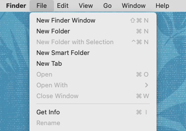
Now I’m on to macOS itself.  Given the previous problem, the Dock is the only thing available to me, and I have gripes about it.  One of the bigger ones is rooted in folders kept on the Dock, to the right of the bar that divides them from the application icons.  When I click on them, I get a popup (wince) or a Stack (shudder) instead of them just opening the target folder in the Finder.

In the Before Times, I could create an alias to the folder and drop that in the Dock, the icon in the Dock would look like the target folder, and clicking on the alias opened the folder’s window.  If I do that now, the click-to-open part works, but the aliases all look like blank text documents with tiny arrows.  What the hell?

If I instead add actual folders (not aliases) to the Dock, holding down ⌥⌘ (option-command) when I click them does exactly what I want.  Only, I don’t want to have to hold down modifier keys, especially when using the trackpad.  I’ve mostly adapted to the key combo, but even on desktop I still sometimes click a folder and blink in irritation at the popup thingy for a second before remembering that things are stupider now.

Translucency Tribulation

The other problem with the Dock is that mine is too opaque.  That’s because the nearly-transparent Finder menu bar was really not doing it for me, so acting on a helpful tip, I went and checked the “Reduce Transparency” option in the Accessibility settings.  That fixed the menu bar nicely, but it also made the Dock opaque, which I didn’t actually want.  I can pretty easily live with it, but I do wish I could make just the menu bar opaque (without having to resort to desktop wallpaper hacks, which I suspect do not do well with changes of display resolution).

Shortcut Stupidity

Seriously, Apple, what the hell.

And while I’m on the subject of the menu bar: no matter the application or even the Finder itself, dropdown menus from the menu bar render the actions you can do in black and the actions you can’t do in washed-out gray.  Cool.  But also, all the keyboard shortcuts are now a washed-out gray, which I keep instinctively thinking means they’ve been disabled or something.  They’re also a lot more difficult for my older eyes to pick out, and I have to flick my eyes back and forth to make sure a given keyboard shortcut corresponds to a thing I actually can do.  Seriously, Apple, what the hell?

Trash Can Troubles

I used to have the Trash can on the desktop, down in the lower right corner, and now I guess I can’t.  I vaguely recall this is something DragThing made possible, so maybe that’s another reason to gripe about the lack of it, but it’s still bananas to me that the Trash can is not there by default.  I understand that I may be very old.

Preview Problems

On my old machine, Preview was probably the most rock-solid application on there.  On the new machine, Preview occasionally hangs on closing heavily-commented PDFs when I choose not to save changes.  I can force-quit it and so far haven’t experienced any data corruption, but it’s still annoying.


Those are the things that have stood out the most to me about Ventura.  How about you?  What bothers you about your operating system (whichever one that is) and how would you like to see it fixed?

Oh, and I’ll follow this up soon with a post about what I like in Ventura, because it’s not all frowns and grumbles.


The Broken Physics of “The Umbrella Academy” Finale

Published 4 years, 10 months past

Not long ago, Kat and I got around to watching The Umbrella Academy’s first season on Netflix.  I thought it was pretty good!  It was a decent mix of good decisions and bad decisions by people in the story, I liked most of the characters and their portrayals, and I thought the narrative arcs came to good places. Not perfect, but good.

Except.  I have to talk about the finale, people.  I have to get into why the ending, the very last few minutes of season one, just didn’t work for me.  And in order to do that, I’m going to deploy, for the first time ever, a WordPress Spoiler Cut™ on this here blog o’ mine, because this post is spoilerrific.  Ready?  Here we go.

Massive, massive spoilers and a fair amount of science ahead!

Artisanal Bereavement Spam

Published 9 years, 6 months past

On the last day of shiva, this past June, we got a letter in the mail.  Just by looking at the envelope, I could see that it was a note of condolence, and from a nearby address to boot — yet the name was entirely unfamiliar.  When I opened it, I discovered a handwritten note that started with a perfunctory condolence and then immediately turned to extended proselytizing.  Enclosed was a religious tract specifically about the afterlife.

From the actual text, it was clear the person who wrote it didn’t know us at all, didn’t know the first thing about us or what we had just gone through.  They had simply trawled that week’s obituaries to get our names and address, and proselytized by mail.

I wish I were making this up.  But no, someone really did decide that the occasion of our daughter’s death was the perfect time to thrust their religious recruitment efforts into our lives.  Artisanal bereavement spam, basically.

I tweeted about it, leaving out identifying information, but otherwise let it go.  An unfortunate one-off, I figured; someone with more fervor than sense, not to be taken as representative of the group as a whole.

Except it just happened again.  Different person, same religion, same basic approach.  This letter isn’t as glaringly obvious about the obituary trawling, no hollow claims of sympathy or condolence this round, but the handwritten emphasis on seeing dead loved ones again makes it pretty obvious that this is of a piece.

DSC05033

So, yes.  The Jehovah’s Witnesses apparently think it is a fine idea to vulturously circle the misery of others and then swoop in to deposit a load of tract on the dining room tables of grieving families.  And what’s more, to keep doing it.

I disagree.  I don’t even beg to differ, I simply disagree.  If there were an opt-out mechanism, I would most certainly make use of it.  In so doing, I would include a number of comments regarding their apparent need to hide their intent with misdirection and to prey on the extreme pain and emotional vulnerability of others.  Since no such mechanism appears to exist, this post will have to do.

Of course, just as I did the first time this happened, I handled the note, the tracts, and the envelope itself with every bit of the care and respect they deserved.

DSC05053

I Googled around a bit and only found two posts about this practice (“Are Jehovah Witness Members Trolling Obituaries for New Recruits?” (2009), “Letters from Jehovah’s Witnesses” (2013).  Well, here’s a third, this one backed up with visual evidence.

I’m posting this in case others experience the same thing and wonder if they caught a lone crazy.  I’m sorry, but no, they aren’t “lone”.  If you got one, you may well get more.  I very much wish it were otherwise.


Cracks Appear

Published 9 years, 9 months past

I cracked last night, and I mean that two senses: that of a structural crack, and a crack of the whip.  Over something admittedly important, yet still not immediately critical, I just lost it.  Angry lost it.  I yelled at my wife and child, at the top of my lungs, my voice cracking, venting frustration and rage.  I ended up leaving the house for a while, right in the middle of bedtime, because if I’d stayed I would have kept making things worse.

Part of me feels like I failed them and myself, because I was adding to the stress and upset of loved ones.  It radiated outward, a wave of anger passing from me to them and from them to others in the house.  We don’t need any more upset than we already have.  I shouldn’t have been the flashpoint.  I expect more of myself.

But more of me, maybe most of me, knows that strength always has its limits, and that last night, I reached mine.  There were too many weights from too many sources, and I broke.  It was, perhaps, understandable — the breaking, and maybe even the manner of breaking.

Whether you think the manner of breaking was okay probably depends a lot on the kind of household that raised you.  Some families think yelling in anger is merely a louder form of conversation.  Others think it’s a fundamental betrayal of respect, trust, and love.  The calculus often changes if children are involved, and how involved they were in whatever precipitated the anger.

I’m not here to ask for absolution, nor to be condemned.  Nobody else could do that anyway.  Only I know all the specific pressures involved, the mitigating factors, and the paths not taken.  I’m more than capable of judging myself and my actions (and inactions), and deciding whether I deserve harshness or leniency.  Or some combination of both.  I might err a little bit on the side of harshness; I always have, when it comes to me.  If anything, the past nine months have pushed me away from that.

Afterward, when the kids were (mostly) asleep and I had returned home, Kat and I talked, and I set a limit I didn’t want to set, but had to set.  I said exactly that to her, that this was not something I wanted, that I actually wanted the opposite, but it was something that I had to have, or else I would just keep breaking, day after day.  I asked forgiveness for what I was saying.  Asked us both for forgiveness, really.  She gave me hers.  I’m still working on fully getting mine, but I will.

Why am I even telling you this?

Because blogging is a heavily filtered view of reality, just like any other medium.  Here, I choose what to share, what to hold back, and what to lie about.  I do my best to avoid the lying, but to some extent it’s unavoidable, because I’m not going to record every conversation and every incident in precisely the way it happened.  Not even documentaries do that; every jump cut is a falsehood, by omission if nothing else.

It’s too easy to edit out the rough patches.

So many people keep telling us how strong we are, how amazing, how incredibly we’re coping with all this.  There’s a sort of imposed romanticism about it.  I’d always noticed, before we had cancer or even kids, that stories of people who discover they’re dying always get an aura of nobility applied to them.  In the shadow of death, the victim somehow always attains a special glow, one that spreads to those nearest them, bathed in a light of wisdom and clarity and rightness.

And I’ve fed it.  I’ve fed that aura in our own story, in what I’ve talked about and how I’ve presented it.  I didn’t consciously set out to do it, but it’s there.  I read back through the archives, and I can see it.  I shared the best parts, and skipped the bad parts; or, when sharing the bad news, did it in a way that made us, all of us, seem strong, amazing, incredible.

Maybe we are all those things, but we’re human.  Flawed, struggling humans, just like everyone else, just as prone to error, just as capable of hurting loved ones with our words and outbursts.  Inside the aura, there is no nobility.  We don’t get a special, knowing inner light.  There is no melancholy beauty, no surplus of grace.  We don’t get bonus abilities.  We have more help than anyone could ever dream likely, all the hundreds people who lend and have lent their hands, their ears, and their encouragement, and still we struggle imperfectly with ourselves and each other and the demands we must meet.

We’re human, with every drop of beauty and ugliness that label carries with it.  The angel and the demon, all rolled up together.

We cry and we crack, inside and outward.  We stumble and fall and fail and flail.  We simmer and seethe, and also we soothe.  We give and forgive.  We hold to each other and hold ourselves tight.  We do what we can, as best as we can, as long as we can.

And when we falter, we patch the cracks as best we can, make our apologies, and try again.  That’s what keeps our failings from making us failures.  We try again, one day at a time.

That’s not noble.  It’s not even all that remarkable.  It’s simply what has to be done, over and over.  Just like everyone else.


Kill Bill

Published 10 years, 1 month past

Sometimes, it feels like the whole system is stacked against you and your peace of mind.  (Some would say that’s because it is.)

For example, this evening after dinner I opened up the mail.  One of the envelopes was clearly a hospital bill.  That’s not unusual, despite our having very good insurance, because there are co-pays and so forth.  Even if you regularly go see a specialist who is managing your radiation therapy, say, that’s an office visit.  Co-pay.  So we’re used to getting bills for $30 or $75 or whatever.

Anyway, I opened this one up and it took me a few seconds to find the amount due, because I thought it was yet another opaque identification number and my eyes kept skipping over it.  Once I finally managed to focus on the right spot, using the text labels as a guide, I confirmed that it said we owed the hospital $122,519.95.

Yeah.

Before anyone rushes off to set up a fundraising campaign, let me explain that I believe this is a billing error, and we won’t actually have to pay it.  You see, I was able to track down two entries on my most recent benefits statement from our insurance company that directly relate to this bill.  For a collection of procedures and treatments, the hospital had billed the insurance company a total of $350,057.01.  (Which is a little more than a fifth of the total ‘retail’ cost of treatment to date, as it happens.)  The insurance company indicated that the provider had accepted $227,537.06 as payment in full, and that we were responsible for $0.00.  The difference between the billed (retail) cost and the accepted cost is, surprise surprise, $122,519.95.

So this is most likely some sort of coding error at the hospital’s billing department, and once I talk to them, it’ll be cancelled.  I HOPE.  Because I really would dislike being erroneously sent to collections for a six-figure sum, and my credit rating would probably hate it too.

This has of course added to my stress, because even the faint prospect of having to cough up $122,519.95 is worrisome, and the possibility of being sent to collections due to someone’s screw-up is even more worrisome.  And I can’t even get started on dealing with it until Tuesday morning, because the billing department has very white-collar hours and Monday is President’s Day.  It’s not going to drive me bat-guano crazy, but it is going to annoy me, having that very large figure sit there, unaddressed, for three days.  Three days out of nine, by the way: the due date on the bill is February 23rd.

Oh, but — and this is actually the part where my mouth twisted into an ugly line — if the bill is paid within 30 days of receipt, it qualifies for a 20% “prompt pay” discount.  Because hey, we say it’s due by such-and-so date, but if you pay by a date later than that but still soon, we’ll only make you pay $98,015.96!  Such a bargain!  Act now, before this amazing deal is history!  Because if we can entice you into quickly paying us money that’s not actually owed, we can take our sweet, sweet time giving it back to you when it turns out the bill was wrong.

Assuming it’s wrong, that is.

So come Tuesday morning, I have to call the hospital’s billing department to see if they agree with my assessment and can clear everything up, and if they don’t then I call the advocate at my insurer to see if they can help me out, and probably have to fax document to one or both places, and generally burn time I don’t have to deal with stress I don’t need.  Because why not add more stress to the situation?  It’s not like dealing with potentially life-threatening pediatric cancer wasn’t stressful enough, heavens no.  Why not add the specter of credit ruination and/or bankruptcy to the proceedings?  You know, for the lulz.

Yes, if it turns out that I actually do have to pay this bill, I will indeed set up a fundraising page.  I know there are people ready and willing to help us, and that makes all this a lot easier to cope with.  You can’t even imagine how much that helps mitigate the stress.  But I keep thinking about all the people in similar situations who don’t have that kind of posse at their back, and who can’t afford good (or any) insurance.  What do they do when a bill for $350,057.01 arrives, and they know that it’s all theirs?


Wanted: Layout System

Published 15 years, 4 weeks past

(This is part of the Feedback on ‘WaSP Community CSS3 Feedback 2008’ series.)

Not surprisingly, there was a lot of community feedback asking for better layout mechanisms.  Actually, people were asking for any decent layout mechanism at all, which CSS has historically lacked.  Floats mostly work, but they’re a hack and can be annoyingly fragile even when you ignore old-browser bugs.  Positioning works in limited cases, but does not handle web-oriented layout at all well.

Why do we use floats for layout, anyway?  clear.  That’s pretty much the whole answer.  The unique in-flow/out-of-flow nature of floats means they interact with each other and with the normal flow, which means they can be cleared, which makes them useful.  Because with clear, we can float layout blocks around and then push other non-floated blocks, like footers, below the floats.

Positioning, of course, permits total layout freedom in the sense that you can put a layout block anywhere with respect to its containing block.  The downfall is that absolutely positioned elements are entirely out of the normal flow, so they can’t stay out of each others’ way like floats do, and you can’t clear anything with respect to a positioned element.  If there had been a position-clear or its equivalent from the outset, we’d never have bothered with floats.

(And if we can just add position-clear to CSS, that would be completely awesome.  It’s been done with JavaScript and it will most likely be done again and better.  It wouldn’t even be that hard to implement, at least for 99.5% of cases.)

All this is why the old “only use tables for layout” argument keeps coming up over and over: strip away the overheated rhetoric and obvious link-baiting, and you find the core of a real need.  Because as powerful as CSS can be, table cells do certain things very easily that CSS makes very, very hard.  Cells stretch vertically, keeping equal heights as a matter of their intrinsic nature.  They stay out of each others’ way, while still being allowed to sit next to each other and use any sizing dimensions.  They tie their layout to their parent elements, and vice versa.

There are no equivalents in CSS.  There have been various very clever attempts to replicate bits and pieces of those capabilities using CSS.  What CSS does, it does very well: if you don’t need equal-height layout blocks, then no problem.  If you do, it’s a massive pain.  Clever techniques provide substitutes, but can’t replace what tables already do.

And please, let’s put the whole “display: table-cell will grant those abilities through CSS” to rest.  Saying that is just saying “use tables for layout” with different words.  Turning a bunch of divs or list items or whatever into table-role boxes is no better than just using table markup in the first place, and it’s arguably worse.  Using element names other than table and td to create layout tables, and then claiming it’s not using tables for layout, borders on self-deception.

Not to mention doing things that way means you’re doing your layout in a highly source-order-dependent fashion, which was one of the things about table layout we were trying to get away from in the first place.

So how do we get really powerful source-order-independent layout?  I wish I knew.  The Advanced Layout module has been sitting around for a while now, and even if you’re a fan of defining layout as ASCII art—which I find repels and appeals in equal measure, but that’s probably just me—there appears to be close to zero implementor interest.  So how do we get those abilities in a form that implementors will, y’know, implement?  I don’t know.  I don’t care.  We just need it, and have needed it for a good decade or so.  Without it, CSS is a styling language but not a layout language.  We’ve bent it into being something close to a layout language, which is nice but not really ideal.

Maybe CSS isn’t the place for this.  Maybe there needs to be a new layout language that can be defined and implemented without regard to the constraints of the existing CSS syntax rules, without worrying about backwards compatibility.  Maybe that way we can not only get strong layout but also arbitrary shapes, thus leaving behind the rectangular prison that’s defined the web for almost two decades.

I don’t have a concrete idea to propose here, because it’s not up to us any more.  A solution was worked out over the course of several years and then found wanting by the implementors.  Really, it’s up to the implementors to figure it out now.  I personally would like to just lock the browser teams from Microsoft, Mozilla, Opera, and Apple in a room and not let them out until they’ve defined something that works and they’ve all agreed to implement soonest.  I might even supply food and water.

And yes, I just advocated doing this outside the W3C process.  Why wouldn’t I?  The process has, in the last decade, not produced anything even remotely resembling an answer to this problem.  Time to try another path and see if it gets any closer to the goal.

No doubt someone’s going to spin this as “See, even noted standards zealot Eric Meyer now says CSS is flawed!”—only they’ll be wrong because this isn’t a now thing.  I’ve been saying this for years in interviews, in person, and in general.  Any time someone asks me what CSS is missing or should do better, the answer has always been a variant on “a strong layout system”.  I’ve been saying it for at least a decade.  So I’m not saying it now.  I’m saying it again.  And again and again and again and…

If I sound frustrated, it’s because I am, and have been for a good long while.  I’m not the only one.  It rankles to have CSS be, as Winston Churchill would have put it, the worst form of layout except for all the others that have been tried.


Manhattan Problem

Published 16 years, 1 month past

It’s not every day I uncover a case involving the botched theft of information about nuclear weapons.

Here’s how it went down: in the infosthetics feed was an entry about a video regarding nuclear stockpiles around the world and the effects of a nuclear explosion in New York City.  The video was produced by Chimp on a Chain for Good Magazine.

That’s a long-standing area of interest for me, so I watched it.  When I got to the New York City portion, something started to bother me beyond the obvious horror of the scenario.  The point of detonation, the explosive yield, the elapsed-time intervals, the radius distances—all seemed very familiar, like I’d seen them somewhere before.  And I had.

They were nearly all taken verbatim from the New York City scenario found at the Atomic Archive.  I could find only two differences.  The first is that the total death toll given in the video is slightly higher than that in the Atomic Archive’s scenario.  Otherwise, all the numbers matched up.

The second difference is really a major error on the part of the video’s makers: they dramatically under-represent the areas of damage.  For example, the ten-second ring’s (found at 2:33 in the movie) radius is labeled with the correct distance (2.5 miles) but the circle placed on the map is much, much too small to be 2.5 miles in radius.  The circle doesn’t even cover the breadth of Manhattan Island, whereas an accurate plot would have it stretch across the Hudson River on both sides into New Jersey and Long Island.  You can see this in part 5 of the Atomic Archive’s scenario, or on a HYDEsim plot of the same scenario.

The video seriously misrepresents the area of damage that would result from such an incident, making it appear much smaller than it would be, and I just can’t fathom how or why they would get that so wrong.  Even assuming they mixed up the meanings of “radius” and “diameter” doesn’t appear to explain it.  The ring distances shown correspond to a three-kiloton explosion at most, not to 150KT.

That’s the botched part.  So where’s the theft?  There is no credit whatsoever given in the video for the material’s source.  There is a reference to the Archive on the video’s page at Good in the “Resources” box, but the material in the video has been used without permission—I checked this with the custodian of the Archive—as required by the site’s policy.  Even if one could argue this is a case of not needing permission on non-profit grounds, attribution is still required.

It would almost be worth subscribing to Good so that 100% of my payment could go to the non-profit of my choice, as the site promises, except I’m limited to their choices of non-profits and none of them appear to be charged with educating magazine publishers or video artists about the niceties of copyright law, intellectual property rights, or even just plain common courtesy.


The Veteran’s Charge

Published 16 years, 7 months past

“This page best viewed in…”

If that phrase doesn’t provoke a shudder of horror and loathing, it should.  It’s the battle cry of the Browser Wars, those terrible and ultimately futile years at the end of the last milennium.  It’s the rallying cry of those who would take the open ubiquity of the web and fragment it into a collection of gated communities, where entrance to each is predicated on running a specific browser.

“Your browser is not compatible and must be upgraded…”

All too often, because developers are too fearful or prideful or just plain lazy, they put up unnecessary barriers to entrance.  They prevent people from using their sites based on choice of browser.  Of course there are situations where the experience will be different—nobody expects Netscape 4 users to be able to see all 2007’s pretty CSS effects, just like table-based sites look beyond bizarre in Mosaic.  That’s no excuse for sites that intentionally lock users out just because their choice of browser doesn’t line up with the developer’s expectations.  It’s regressive, short-sighted, and just plain unprofessional.

“This site is for iPhone users only.”

STOP IT.  Stop it right now.

The fact that optimizing pages for an iPhone makes the development of such specialized pages attractive in no way excuses lockout of other users.  I might be willing to entertain the argument if the iPhone’s browser were some specialized non-web contraption.  It’s not.  It’s a full-fledged XHTML+CSS+DOM browser that happens to lag a bit in some implementation areas and won’t run some plugins.

Besides, if you’ve developed a version of your site (or application or whatever) that works well on the iPhone, then why in the name of Tim Berners-Lee would you deny other people that optimized experience?  You might find that they prefer to interact with the site that way no matter what platform they’re using.  You might find that you don’t need a separate iPhone version after all.  The iPhoned version might be the only version you need.

Designers will argue that pages optimized for the iPhone screen will look bad on a desktop browser.  Maybe, and maybe not, but stop preventing your users from making that decision for themselves.  Nobody says you have to convert your whole site to be iPhoney.  But your lockout of non-iPhone users is worse than rude.  It’s stupid.

We finally learned, after much sweat and a fair number of tears, that “best viewed in” is a fool’s errand.  Are we so eager to rush back into that morass and fight the war all over again?

Please.  Just stop.


Browse the Archive

Earlier Entries