Highlighting Accessible Twitter Content
Published 4 years, 6 months pastFor my 2020 holiday break, I decided to get more serious about supporting the use of alternative text on Twitter. I try to be rigorous about adding descriptive text to my images, GIFs, and videos, but I want to be more conscientious about not spreading inaccessible content through my retweets.
The thing is, Twitter doesn’t make it obvious whether someone else’s content has been described, and the way it structures (if I can reasonably use that word) its content makes it annoyingly difficult to conduct element or accessibility-property inspections. So, in keeping with the design principles that underlie both the Web and CSS, I decided to take matters into my own hands. Which is to say, I wrote a user stylesheet.
I started out by calling out things that lacked useful alt text. It went something like this:
div[aria-label="Image"]::before {
	content: "WARNING: no useful ALT text";
	background: yellow;
	border: 0.5em solid red;
	border-radius: 1em;
	box-shadow: 0 0 0.5em black;
	…
…and so on, layering on some sizing, font stuff, and positioning to hopefully place the text where it would be visible. This failed to satisfy for two reasons:
- Because of the way Twitter nests it dozens of repeatedly utility-classes
divs, and the styles repeatedly applied thereby, many images were tall (but cut off) or wide (ditto) in ways that pulled the positioned generated text out of the visible frame shown on the site. There wasn’t an easily-found human-readable predictable way to address the element I wanted to use as a positioning context. So that was a problem. - Almost every image in my feed had a big red and yellow WARNING on it, which quickly depressed me.
What I realized was that rather than calling out the failures, I needed to highlight the successes. So I commented out the Big Red Angry Text approach above and got a lot more simple.
div[aria-label="Image"] {
	filter: grayscale(1) contrast(0.5);
}
div[aria-label="Image"]:hover {
	filter: none;
}
Just that. De-emphasize the images that have the default alt text by way of their enclosing divs, and remove that effect on hover so I can see the image as intended if I so choose. I like this approach better because it de-emphasizes images that aren’t properly described, while those which are described get a visual pop. They stand out as lush islands in a flat sea.
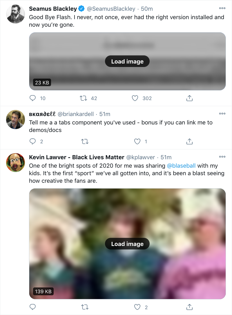
In case you’ve been wondering why I’m selecting divs instead of img and video elements, it’s because I use the Data Saver setting on Twitter, which requires me to click on an image or video to load it. (You can set it via Settings > Accessibility, display and languages > Data usage > Data saver. It’s also what’s blurring the images in the screenshot shown here.) I enable this setting to reduce network load, but also to give me an extra layer of protection when disturbing images and videos circulate. I generally follow people who are careful about not sharing disturbing content, but I sometimes go wandering outside my main timeline, and never know what I’ll find out there.
After some source digging, I discovered a decent way to select non-described videos, which I combined with the existing image styles:
div[aria-label="Image"],
div[aria-label="Embedded video"] {
	filter: grayscale(1) contrast(0.5);
}
div[aria-label="Image"]:hover,
div[aria-label="Embedded video"]:hover {
	filter: none;
}
The fun part is, Twitter’s architecture spits out nested divs with that same ARIA label for videos, which I imagine could be annoying to people using screen readers. Besides that, it also has the effect of applying the filter twice, which means videos that haven’t been described get their contrast double-reduced! And their grayscale double-enforced! Fun.
What I didn’t expect was that when I start playing a video, it loses the grayscale and contrast reduction effects even when not being hovered, which makes the second rule above a little over-written. I don’t see the DOM structure changing a whole lot when the video loads and plays, so either videos are being treated differently for filter purposes, or I’m missing something in the DOM that’s invalidating the selector matching. I might poke at it over time to find a fix, or I may just let it go. The user experience isn’t too far off what I wanted anyway.
There is a gap in my coverage, which is GIFs pulled from Twitter’s GIF pool. These have default alt text other than Image, which makes selecting for them next to impossible. Just a few examples pulled from Firefox’s Accessibility panel when I searched the GIF panel for “this is a test”:
testing GIF
This Is ATest Fool GIF
Corona Test GIF by euronews
Test Fail GIF
Corona Virus GIF by guardian
Its ATest Josh Subdquist GIF
Corona Stay Home GIF by INTO ACTION
Is This A Test GIF
Stressed Out Community GIF
A1b2c3 GIF
I assume these are Giphy titles or something like that. In nearly every case, they’re insufficient, if not misleading or outright useless. I looked for markers in the DOM to be able to catch these, but didn’t find anything that was obviously useful.
I did think briefly about filtering for any aria-label that contains the string GIF ([aria-label*="GIF"]), but that would improperly catch images and videos that have been described but happen to have the string GIF inside them somewhere. This might be a relatively rare occurrence, but I’m loth to gray out media that someone went to the effort of describing. I may change my mind about this, but for now, I’m accepting that GIFs which appear in full color are probably not described, particularly when containing common memes, and will try to be careful.
I apply the above styles in Firefox using Stylus, which also available for Chrome, and they’re working pretty well for me. I wish I could figure out a way to apply them in mobile contexts, but that’s a (much bigger) problem for another day.
I’m not the first to tread this ground, nor do I expect to be the last, sadly. For a deeper dive into all the details of Twitter accessibility and the pitfalls that can occur, please read Adrian Roselli’s excellent article Improving Your Tweet Accessibility from just over two years ago. And if you want apply accessibility-aid CSS to your own Twitter experience but can’t or won’t use Stylus, Adrian has a bookmarklet that injects Twitter alt text all set up and ready to go — you can use it as-is, or replace the CSS in his bookmarklet with mine above or your own if you want to take a different approach.
So that’s how I’m upping my awareness of accessible content on Twitter in 2021. I’d love to hear what y’all are using to improve your own experiences, or links to tools and resources on this same topic. If you have any of that, please drop the links in a comment below, so that everyone who reads this can benefit. Thanks!