Today is my first day as a full-time employee at Igalia, where I’ll be doing a whole lot of things I love to do: document and explain web standards at MDN and other places, participate in standards work at the W3C, take on some webmaster duties, and play a part in planning Igalia’s strategy with respect to advancing the web. And likely other things!
I’ll be honest, this is a pretty big change for me. I haven’t worked for anyone other than myself since 2003. But the last time I did work for someone else, it was for Netscape (slash AOL slash Time Warner) as a Standards Evangelist, a role I very much enjoyed. In many ways, I’m taking that role back up at Igalia, in a company whose values and structure are much more in line with my own. I’m really looking forward to finding out what we can do together.
If the name Igalia doesn’t ring any bells, don’t worry: nobody outside the field has heard of them, and most people inside the field haven’t either. So, remember when CSS Grid came to browsers back in 2017? Igalia did the implementation that landed in Safari and Chromium. They’ve done a lot of other things besides that — some of which I’ll be helping to spread the word about — but it’s the thing that web folks will be most likely to recognize.
This being my first day and all, I’m still deep in the setting up of logins and filling out of forms and general orienting of oneself to a new team and set of opportunities to make a positive difference, so there isn’t much more to say besides I’m stoked and planning to say more a little further down the road. For now, onward!
For my 2020 holiday break, I decided to get more serious about supporting the use of alternative text on Twitter. I try to be rigorous about adding descriptive text to my images, GIFs, and videos, but I want to be more conscientious about not spreading inaccessible content through my retweets.
The thing is, Twitter doesn’t make it obvious whether someone else’s content has been described, and the way it structures (if I can reasonably use that word) its content makes it annoyingly difficult to conduct element or accessibility-property inspections. So, in keeping with the design principles that underlie both the Web and CSS, I decided to take matters into my own hands. Which is to say, I wrote a user stylesheet.
I started out by calling out things that lacked useful alt text. It went something like this:
…and so on, layering on some sizing, font stuff, and positioning to hopefully place the text where it would be visible. This failed to satisfy for two reasons:
Because of the way Twitter nests it dozens of repeatedly utility-classes divs, and the styles repeatedly applied thereby, many images were tall (but cut off) or wide (ditto) in ways that pulled the positioned generated text out of the visible frame shown on the site. There wasn’t an easily-found human-readable predictable way to address the element I wanted to use as a positioning context. So that was a problem.
Almost every image in my feed had a big red and yellow WARNING on it, which quickly depressed me.
What I realized was that rather than calling out the failures, I needed to highlight the successes. So I commented out the Big Red Angry Text approach above and got a lot more simple.
Three consecutive tweets from my timeline on Friday, January 1st, 2021. The blurring of the images in the top and bottom tweets is an effect of the Data Saver preference, not my CSS.
Just that. De-emphasize the images that have the default alt text by way of their enclosing divs, and remove that effect on hover so I can see the image as intended if I so choose. I like this approach better because it de-emphasizes images that aren’t properly described, while those which are described get a visual pop. They stand out as lush islands in a flat sea.
In case you’ve been wondering why I’m selecting divs instead of img and video elements, it’s because I use the Data Saver setting on Twitter, which requires me to click on an image or video to load it. (You can set it via Settings > Accessibility, display and languages > Data usage > Data saver. It’s also what’s blurring the images in the screenshot shown here.) I enable this setting to reduce network load, but also to give me an extra layer of protection when disturbing images and videos circulate. I generally follow people who are careful about not sharing disturbing content, but I sometimes go wandering outside my main timeline, and never know what I’ll find out there.
After some source digging, I discovered a decent way to select non-described videos, which I combined with the existing image styles:
The fun part is, Twitter’s architecture spits out nested divs with that same ARIA label for videos, which I imagine could be annoying to people using screen readers. Besides that, it also has the effect of applying the filter twice, which means videos that haven’t been described get their contrast double-reduced! And their grayscale double-enforced! Fun.
What I didn’t expect was that when I start playing a video, it loses the grayscale and contrast reduction effects even when not being hovered, which makes the second rule above a little over-written. I don’t see the DOM structure changing a whole lot when the video loads and plays, so either videos are being treated differently for filter purposes, or I’m missing something in the DOM that’s invalidating the selector matching. I might poke at it over time to find a fix, or I may just let it go. The user experience isn’t too far off what I wanted anyway.
There is a gap in my coverage, which is GIFs pulled from Twitter’s GIF pool. These have default alt text other than Image, which makes selecting for them next to impossible. Just a few examples pulled from Firefox’s Accessibility panel when I searched the GIF panel for “this is a test”:
testing GIF
This Is ATest Fool GIF
Corona Test GIF by euronews
Test Fail GIF
Corona Virus GIF by guardian
Its ATest Josh Subdquist GIF
Corona Stay Home GIF by INTO ACTION
Is This A Test GIF
Stressed Out Community GIF
A1b2c3 GIF
I assume these are Giphy titles or something like that. In nearly every case, they’re insufficient, if not misleading or outright useless. I looked for markers in the DOM to be able to catch these, but didn’t find anything that was obviously useful.
I did think briefly about filtering for any aria-label that contains the string GIF ([aria-label*="GIF"]), but that would improperly catch images and videos that have been described but happen to have the string GIF inside them somewhere. This might be a relatively rare occurrence, but I’m loth to gray out media that someone went to the effort of describing. I may change my mind about this, but for now, I’m accepting that GIFs which appear in full color are probably not described, particularly when containing common memes, and will try to be careful.
I apply the above styles in Firefox using Stylus, which also available for Chrome, and they’re working pretty well for me. I wish I could figure out a way to apply them in mobile contexts, but that’s a (much bigger) problem for another day.
I’m not the first to tread this ground, nor do I expect to be the last, sadly. For a deeper dive into all the details of Twitter accessibility and the pitfalls that can occur, please read Adrian Roselli’s excellent article Improving Your Tweet Accessibility from just over two years ago. And if you want apply accessibility-aid CSS to your own Twitter experience but can’t or won’t use Stylus, Adrian has a bookmarklet that injects Twitter alt text all set up and ready to go — you can use it as-is, or replace the CSS in his bookmarklet with mine above or your own if you want to take a different approach.
So that’s how I’m upping my awareness of accessible content on Twitter in 2021. I’d love to hear what y’all are using to improve your own experiences, or links to tools and resources on this same topic. If you have any of that, please drop the links in a comment below, so that everyone who reads this can benefit. Thanks!
For years, I’ve had a bash alias that re-runs the previous command via sudo. This is useful in situations where I try to do a thing that requires root access, and I’m not root (because I am never root). Rather than have to retype the whole thing with a sudo on the front, I just type please and it does that for me. It looked like this in my .bashrc file:
alias please='sudo "$BASH" -c "$(history -p !!)"'
But then, the other day, I saw Kat Maddox’s tweet about how she aliases please straight to sudo, so to do things as root, she types please apt update, which is equivalent to sudo apt update. Which is pretty great, and I want to do that! Only, I already have that word aliased.
What to do? A bash function! After commenting out my old alias, here’s what I added to .bash_profile:
please() {
	if [ "$1" ]; then
		sudo $@
	else
		sudo "$BASH" -c "$(history -p !!)"
	fi
}
That way, if I remember to type please apachectl restart, as in Kat’s setup, it will ask for the root password and then execute the command as root; if I forget my manners and simply type apachectl restart, then when I’m told I don’t have privileges to do that, I just type please and the old behavior happens. Best of both worlds!
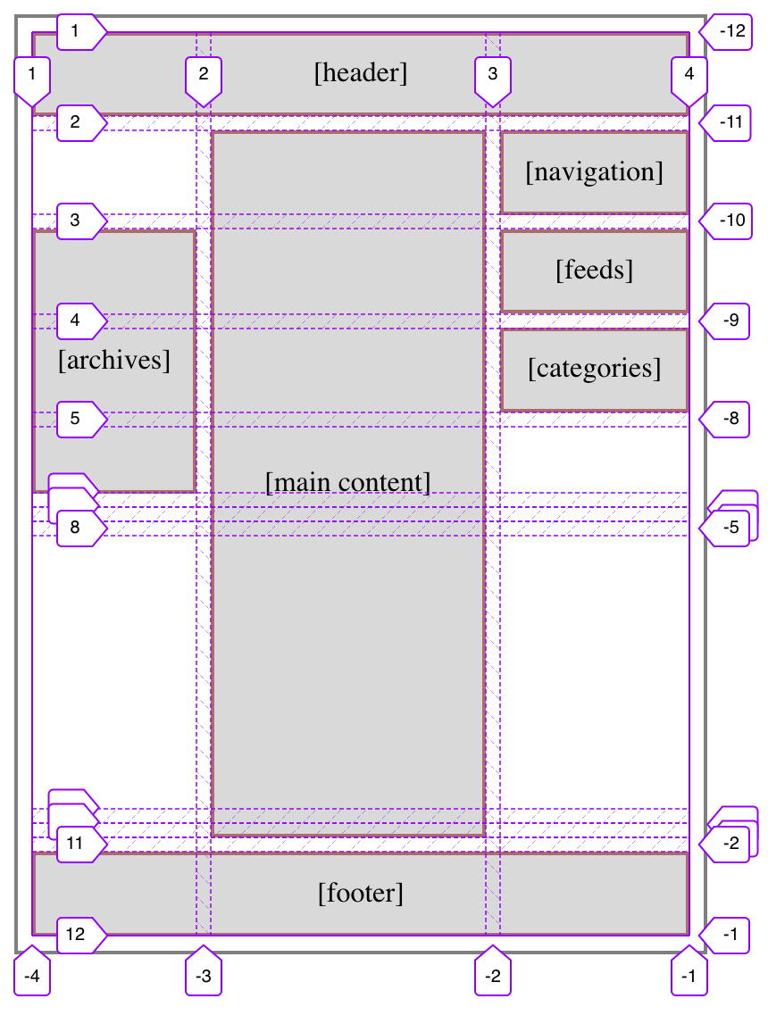
Another aspect of the meyerweb redesign I’d like to explore is the way I’m using CSS Grid rows to give myself more layout flexibility.
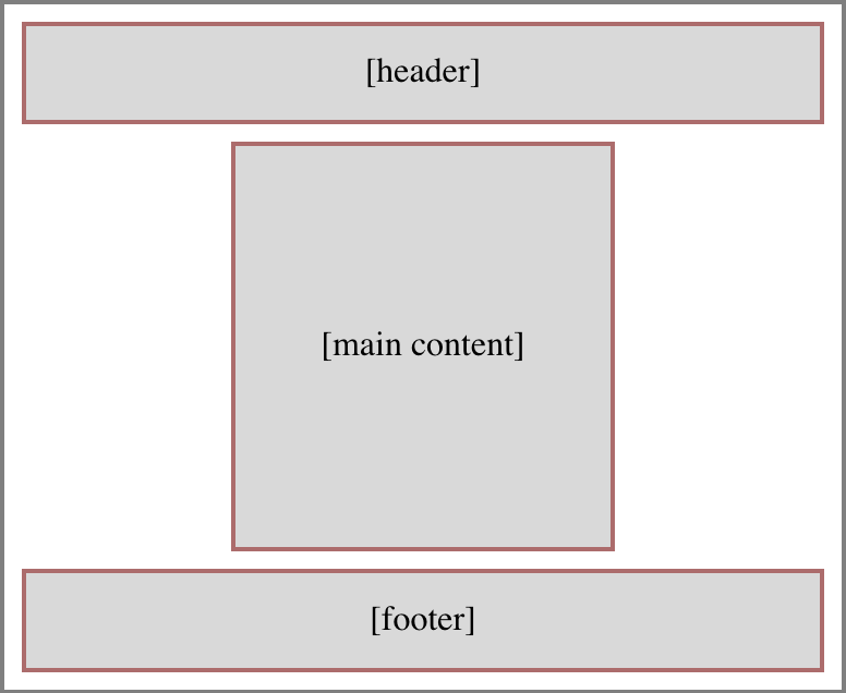
First, let’s visualize the default layout of a page here on meyerweb. It looks something like this:
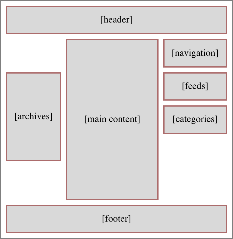
So simple, even flexbox could do it! But that’s only if things always stay this simple. I knew they probably wouldn’t, because the contents in those two sidebars were likely to vary from one part of the site to another — and I would want, in some cases, for the sidebar pieces to line up vertically. Here’s an example:
That’s the basic layout of archive pages. See how the left sidebar’s Archives lines up with the top of the Feeds box in the right sidebar? That’s Grid for you. I thought about lumping the Feeds and Categories into a the same grid cell (thus making them part of the same grid row), which would have meant wrapping them in a <div>, but decided keeping them separate allows more flexibility in terms of responsive rearrangement of content. I can, for example, assign the Feeds to be followed by Archives and then Categories at mobile sizes. Or to reverse that order.
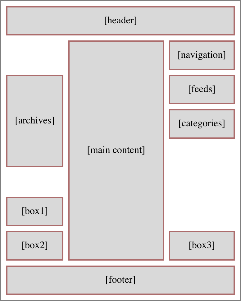
More to the point, I also wanted the ability to place things along the bottoms of the sidebars, down near the footer but still next to the main content column, like so:
An early design prototype for the blog archives put the “Next post” and “Previous post” links in some of those spots, before I moved the links into the bottom of the main content column. So at the moment, I don’t have anything making use of those spots, although the capability is there. I could cluster content along the tops and the bottoms of the sidebars, as needed.
But here’s the important thing, and really the point of this article: I’m not rewriting the row structure and grid cell assignments for each page type. There’s a unified row template applied to the body on every page that uses the Hamonshū design. It is:
The general idea here is, the first seven rows are sized to be the minimum necessary to contain content inside those rows. This is also true of the last three rows. And in between those sets, a 1fr row that takes up the rest of the grid container’s height, pushing the two sets apart.
In the simplest case, where there’s just a header, main content column, and a footer, with nothing in the sidebars (the layout has three columns, remember), the content will fill the rows like so:
Thus: The header fills all of row one. The content expands row two from its placement in the center column. The footer fills all of the last row, which is specified via grid-row: -2 (because grid-row: -1 would align its top with the bottom edge of the grid container). There’s no more content, so all the other min-content rows have no content, so their height is zero. And there’s no leftover height to soak up, so the 1fr row also has a height of zero. Seems like a lot of rows specified to no real purpose, doesn’t it?
But now, let’s add some sidebar content to columns one and three; that is, the sidebars. For example, you might remember this layout from before:
Given this setup, we can’t just assign the main content column to grid-row: 2 and leave it at that — it’s going to have to span rows. Really, it needs to span all but the last, thus ensuring it reaches down to the footer. So the CSS ends up like this:
Grid-line visualization courtesy the Firefox Web Inspector.
The first set of min-content rows are all gathered up against the bottom of the top part of the layout, and the second set are all pushed down at the bottom. Between them, the 1fr row eats up all the leftover space, which is what pushes the two sets of min-content rows apart.
I like this pattern. It feels good to me, having two sets of rows where the individual rows accordion open to accept content when needed, and collapse to zero height when not, with a “blank” row in between the sets that pushes them apart. It’s flexible, and even allows me to add more rows to the sets without having to rewrite all my layout styles.
As an example, suppose I decided I needed to add a few more rows to the bottom set, for use in a few specialty templates. Because of the way things are set up, all I have to do is change the row template like this:
That’s everything. I just changed the number of repeats in the second set of rows. All the existing pages will continue on just fine, no layout changes, no CSS changes. In the few (currently hypothetical) pages where I need to put a bunch of stuff along the bottom of the main content column, I just plug them in using grid-row values, whether positive or negative. It all just works.
The same is true if more rows are added to the first set, for whatever reason. Everything gets managed in a single CSS rule, where you can add rows for the whole site instead of having to write, track, and maintain a bunch of variants for various page types. (Subtracting rows is harder without causing layout upset, but could still be done in some scenarios.)
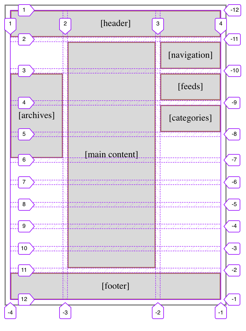
As a final note, you’re probably wondering: Is that one 1fr row actually necessary to get a layout like this one? Not really, no. Let’s take it out, like this:
grid-template-rows: repeat(11,min-content);
What happens as a result is the rows that aren’t directly occupied by content (the ones that previously collapsed to zero height), but are still spanned by content (the center column), divvy up the leftover space the 1fr row used to consume. This leads to a situation like so:
To the user, there’s no practical difference. Things go to the same places either way. You just get the “extra” rows stretching out, instead of being pushed apart by the 1fr row.
I certainly could have left it at that, and it arguably would have been cleaner to do so. But something about this approach doesn’t sit quite right with me; there’s a tickly feeling in the back of my instinct that tells me there’s a downside to this. Admittedly, it could be a vestigial instinct from the Age of Floats; I doubtless have many things I still have not unlearned. On the other hand, it could be something about Grid I’ve picked up on subconsciously but haven’t yet brought into full realization.
If I ever pin the tickle down enough to articulate it, I’ll update the post to include it.
Let’s talk about image optimization. There are a few images used in meyerweb’s new design, and while I wanted them to be pleasing to the eye, I also wanted them to be lightweight. My rough goal was to not have the design elements (images plus CSS) be more than half the total page weight for a typical blog post, not counting any post-specific images like photos or diagrams. Thus, if a typical blog post’s page weight was 500KB, I didn’t want the images and CSS to add up to more than 250KB or so.
Spoiler: I achieved my goal, but at the same time fell short. What I had overlooked was custom fonts, which I’ll get to in a later post.
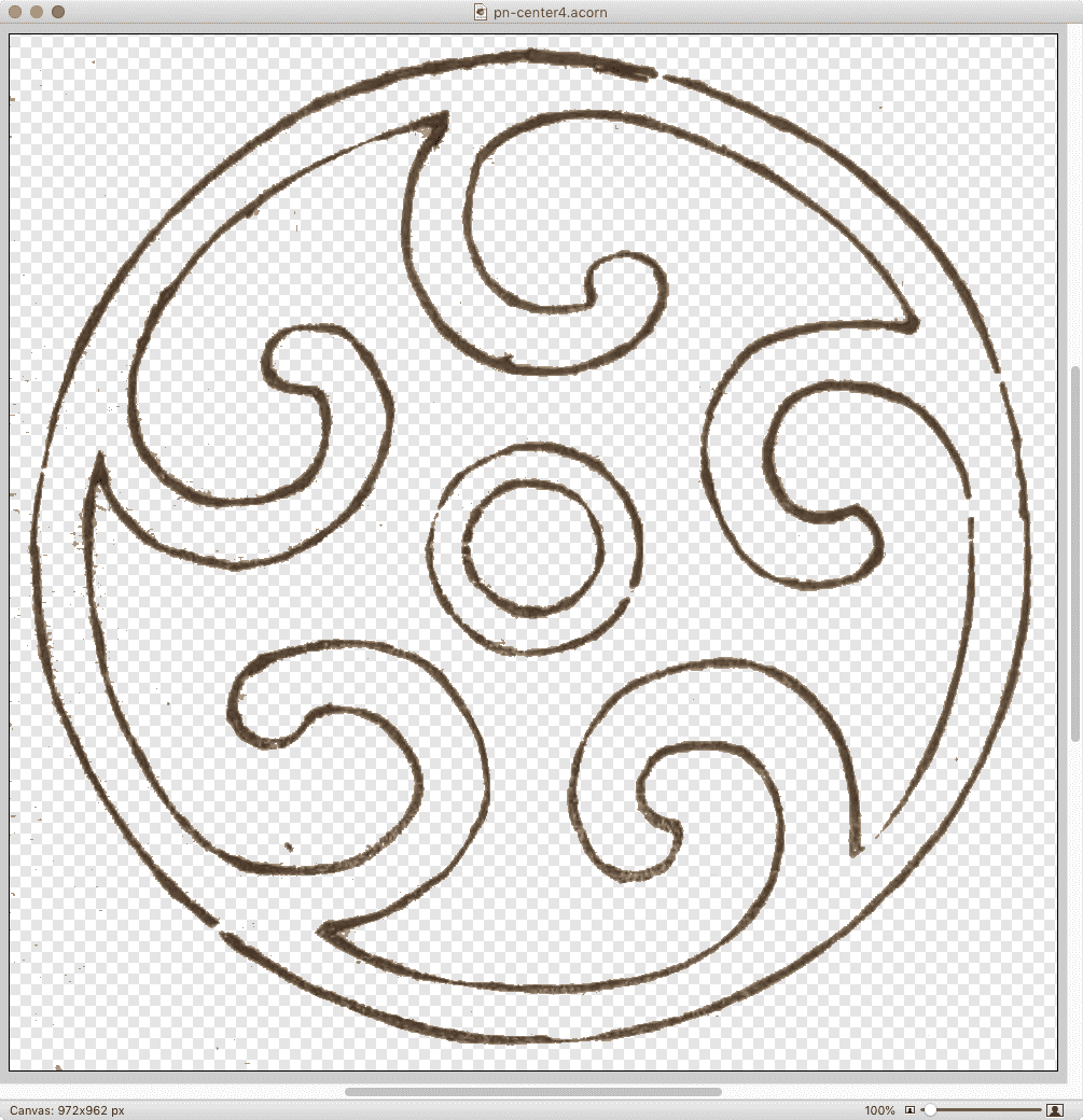
I found out that how you optimize images matters a whole lot. Let’s consider one example: the spiral-like image (which, yes, is a quiet callback to past work) at the center of the previous-next links at the bottom of blog posts and archive pages. After I extracted a full-resolution copy of that particular sketch from pages 13-14 of Hamonshū, Vol. 1 and did a little cleanup with filters and so on, it became a 1.4MB Acorn file.
The full-size image in Acorn.
(Side note: Acorn’s “Transparentomatic” filter was an enormous time-saver on this project — it made dropping out the page texture a breeze, and easily adjustable, without forcing me to create and retouch mask layers and whatnot. Thanks, Flying Meat!)
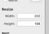
With the image ready to be tested in-browser, I would use Acorn’s Web Export dialog to save it as a PNG. The nice thing about this dialog is its built-in Resize feature, which let me keep the Acorn file at its native size (almost a thousand pixels on each side) and export it to the size I wanted — in this case, 200 pixels across. I did this sort of thing a lot, because I tested a variety of images for every design element.
Once I settled on the image I wanted, I’d drop it on ImageOptim to optimize it. This usually slammed all eight cores in my aged laptop’s CPU for a good few seconds, and resulted in up to 5% size savings.
That last paragraph probably looks like an indictment of ImageOptim, but wait! It’s fully redeemed by the end of the post, by which time I will have indicted myself instead.
At this point, my spiral image had gone from a 1.4MB Acorn file to a 30KB PNG. That’s pretty good, even if 30KB feels a tad bulky for a 200×200 image. I just assumed, what with all the transparency and shades of color and all that, it wasn’t too far out of line. But as the whole design started to come together, I discovered that when you added up all the illustration images on, say, the home page, I’d let image bloat sneak up on me in the worst way. They were totalling close to a megabyte, and they’d all been through ImageOptim already.
I went back to Acorn to see if I could squeeze any more out of the file size, maybe convert some of the images to JPGs if they didn’t need the transparency. As I flipped between file formats in the Web Export dialog, I noticed something I’d previously overlooked in the PNG export options: a bit depth slider. I’d been saving the PNGs with no bit depth restrictions, meaning the color table was holding space for 224 colors. That’s… a lot of colors, roughly 224 of which I wasn’t actually using.
When I clicked the “Index PNG Colors” checkbox and changed the slider until I started getting dithers or obvious color loss, then brought it up a notch or two, the difference was astounding. Instead of a 30KB file, I got a 4.4 KB file. Instead of saving at 75% the original size, it was now 11%.
Wait a second… how long has THAT been there?
So I went back through the directory with all my design elements and repeated the process. I do have batch image processing software installed, but I elected to do this manually so I could pick the best color depth for each file by eye. It could be that some would be okay at 4 colors instead of 8; others might need 16 or 32 to retain visual fidelity. Fortunately for me, I only had a couple dozen images to go through, but it would have been worth it even at 10 times that many.
Once I’d gone through all the images and saved them with restricted color depth, my theme’s image directory was down to 242KB total. The biggest of them, the separator wave illustrations, had gone from being ~150KB each to ~25KB each — all five of them together now totalled less than just one of them had before I did the color indexing.
The directory, well and fully smooshed.
At this point, I thought, “All right, let’s see what ImageOptim does with these.” It squeezed them down even further, taking my total from 242KB to 222KB, a nine percent reduction. Which is to say, the percentage savings I got on these already-small files was larger than I’d been getting on the much bigger files — plus, ImageOptim processed them quickly and with a minimum of CPU slamming. Which is honestly pretty great, given the age of my laptop (about seven years).
So: did I meet my performance goal? As I said at the outset, yes, but also no. For a single blog post with around 10KB of text content and no embedded media, the page weight is around 460KB, with the size varying a bit depending on how much markup is needed for the 10KB of text. (Here’s one recent example with some content variety.) Of that, the CSS, split across two files, totals 35.2KB. The images add up to 102.9KB. Add them together, and you get just a hair over 138KB, or right around 30%. Huge success!
Except I hadn’t factored in custom fonts, which all by themselves currently total 203.6KB (44% total page weight), mostly due to the three faces of IM Fell I’m using. That’s right: The fonts weigh more than the CSS and images put together. Once they’re added in with the CSS and images, the design elements end up being almost 75% the total page weight — about 341.6KB of the 460KB total. Most of the rest is the 104.4KB chewed up by showdown.js, the enhancement script I’m using to allow the use of Markdown in post comments.
Thus, next up on my performance quest is looking into subsetting the fonts I’m using in order to get their weight down, and finding out if there’s anything I can do to subset Showdown as well.
But as of now, I’m well pleased with where I ended up on image optimization. I just need to go back and do the same for post-specific images I’d left at unrestricted color depths, where I anticipate a similar 90% savings in file sizes. If you’ve got a lot of images, particularly PNGs, try running them through a process that lets you restrict the color depth, and see how much it saves. The results might surprise you!
I’ve been incredibly gratified and a bit humbled by the responses to the new design. So first of all, thank you to everyone who shared their reactions! I truly appreciate your kindness, and I’d like to repay that kindness a bit by sharing some of the techniques I used to create this design. Today, let’s talk about the ink-study illustrations placed between entries on the site, as well as one other place I’ll get to later.
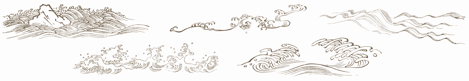
Very early in the process, I knew I wanted to separate entries with decorations of some sort, as a way of breaking up the stream of text. Fortunately, Hamonshū provided ample material. A little work in Acorn and I had five candidate illustrations ready to go.
The five illustrations.
The thing was, I wanted to use all five of them, and I wanted them to be picked on a random-ish basis. I could have written PHP or JS or some such to inject a random pick, but that felt a little too fiddly. Fortunately, I found a way to use plain old CSS to get the result I wanted, even if it isn’t truly random. In fact, its predictability became an asset to me as a designer, while still imparting the effect I wanted for readers.
(Please note that in this article, I’ve simplified some aspects of my actual CSS for clarity’s sake; e.g., removing the directory path from url() values and just showing the filenames, or removing declarations not directly relevant to the discussion here. I mention this so that you’re prepared for the differences in the CSS shown in this piece versus in your web inspector and/or the raw stylesheet.)
That means, for every blog entry except the first, a block-level bit of generated content is inserted at the beginning of the entry, given a height, and the image separator-big-05.png is dropped into the generated box and sized to be contained within it, which means no part of the image will spill outside the background area and thus be clipped off. (The file has the number 05 because it was the fifth I produced. It ended up being my favorite, so I made it the default.)
With that in place, all that remains is to switch up the background image that’s used for various entries. I do it like this:
So every second-plus-one entry (the third, fifth, seventh, etc.) that isn’t the first entry will use separator-big-02.png instead of -05.png. Unless the entry is an every-third-plus-one (fourth, seventh, tenth, etc.), in which case separator-big-03.png is used instead. And so on, up through every-fifth-plus-one. And as you can see, the first image I produced (separator-big-01.png) is used the least often, so you can probably guess where it stands in my regard.
This technique does produce a predictable pattern, but one that’s unlikely to seem too repetitious, because it’s used to add decoration separated by a fair amount of text content, plus there are enough alternatives to keep the mix feeling fresh. It also means, given how the technique works, that the first separator image on the home page (and on archive pages) is always my favorite. That’s where the predictability of the approach helped me as a designer.
I use a similar approach for the separator between posts’ text and their comments, except in that case, I add a generated box to the end of the last child element in a given entry:
That is, on any page classed single (which is all individual post pages) after the last child element of a .text element (which holds the text of a post), the decoration box is generated. The default, again, is separator-big-05.png — but here, I vary the image based on the number of elements in the post’s body:
In other words: if the last child element of the post text is a second-plus-one, separator-big-02.png is used. If there are 3n+1 (one, four, seven, ten, thirteen, …) HTML elements in the post, separator-big-03.png is used. And so on. This is an effectively random choice from among the five images, since I don’t count the elements in my posts as I write them. And it also means that if I edit a piece enough to change the number of elements, the illustration will change! (To be clear, I regard this as a feature. It lends a slight patina of impermanence that fits well with the overall theme.)
I should note that in the actual CSS, the two sets of rules above are merged into one, so the selectors are actually like so:
In all honesty, this technique really satisfies me. It makes use of document structure while having a random feel, and is easily updated by simply replacing files or changing URLs. It’s also simple to add more rules to bring even more images to the mix, if I want.
And since we’re talking about using structure to vary layout, I also have this @media block, quoted here verbatim and in full:
This means on the home page and blog archive pages, but only at desktop-browser widths, some entries are shifted a bit to the left or right by fractions of the viewport width, which subtly breaks up the strict linearity of the content column on long pages, keeping it from feeling too grid-like.
To be honest, I have no idea if that side-shifting effect actually affects visitors’ experience of using meyerweb, but I like it. Sometimes the inter-entry wave art fits together with the side-shift so that it looks like the art flows into the content. That kind of serendipity always delights me, whether it comes by my hand or someone else’s. With luck, it will have delighted one or two of you as well.
I ended my observance of CSS Naked Day 2020 by launching an entirely new design for meyerweb. I’m calling it Hamonshū after the source from which I adapted most of the graphic elements. I’ve been working on it sporadically in my free time since mid-January, finally coming to a place I thought was ready to launch in late March.
Naked Day was a convenient way to change over the structure of pages while there was no design, which probably makes it sound like that’s the only reason I even observed it. To the contrary, I hadn’t planned to launch the new design until June 8th of this year — but once I decided on going style-naked, I realized it was the perfect opportunity to make the switch.
I might still have delayed, if not for everything happening in the world right now. But Cameron Moll said it best as he recently launched a new design: “Deploying in the middle of a pandemic seems so unimportant at the moment. Or maybe there’s no better time for it.” That last sentence resonated with me unexpectedly deeply, and came to mind again as I took the CSS away for Naked Day.
I’ll have quite a few things to say about the design in the future: things I learned, techniques I used, bits I really like, that sort of thing. In this post, I want to say a bit about its genesis.
It all started when someone — I’ve since lost track of who, or even where it happened — brought my attention to Hamonshū, Vols. 1-3, available on the Internet Archive thanks to the Smithsonian Institution. Hamonshū, a word which I understand roughly translates into English as “wave forms” or “wave design”, is a three-volume set of art studies of water. Created by Yūzan Mori and published in 1903, I had never heard of it before, but the sketches immediately appealed to me. You can get an preview of some of Yūzan’s art in this article from Public Domain Review, or just go to the source (linked previously, as well as in the footer of the site) and immerse yourself in it.
As I absorbed Yūzan’s ink studies of ocean waves, rivers, fountains, and more, the elements of a design began to form in my head. I won’t say I saw it — being aphantasic, I couldn’t — but certain sketches suggested themselves as components of a layout, and stuck with me.
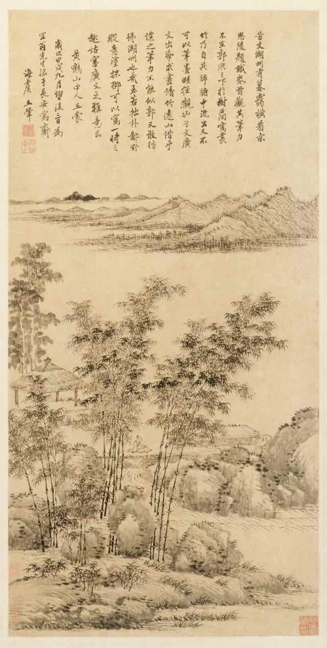
Tall Bamboo and Distant Mountains, after Wang Meng, Wang Hui 王翬, 1694
Early on, I had thought to combine elements from Hamonshū with other artwork, primarily ink landscape paintings from the Qing Dynasty and Edo periods: two such examples being Tall Bamboo and Distant Mountains, after Wang Meng (Wang Hui 王翬, 1694) and View of West Lake (Ike Taiga, 1700s). I made attempts, but the elements never really combined properly. I eventually realized I was trying to combine close-up studies of water with adaptations of much larger works, and the scale of the brush strokes was clashing. At that point, I abandoned the paintings and concentrated exclusively on Hamonshū.
As the various design elements came together, I went looking for fonts to use. I originally thought to use variable fonts, but I kept coming back to IM Fell, a typeface I’d seen Simon St. Laurent use and had put to my own purposes in an experimental typeset of Neal Stephenson’s Mother Earth Mother Board. IM Fell has a sort of nautical feel to it, at least to me, which fit nicely with the water elements I was adapting from Hamonshū, so I ended up using it as a “site elements” typeface. It’s what’s used for the site name in the header, the main navigation links, metadata for posts, sidebar heading text, the h1 on most pages, and so on.
Originally I used IM Fell for the titles of blog posts like this one, but it didn’t feel quite right. I think it caused the titles to blend into the rest of the design a little too much unless I kept it relatively huge. I needed something that felt consistent, but distinguished itself at the smaller sizes I needed for post titles. I went back to Google Fonts and scrolled through the choices until I narrowed down to a few faces, of which Eczar was the eventual winner. In addition to using Eczar for post titles, I also employ it in the site’s footer, at least wherever IM Fell isn’t used. The general body copy of the site is Georgia Pro, falling back to Georgia or a generic serif as needed.
One of the limitations I set for myself was to be reasonably lightweight, and that was a major part of the process. The details merit a post or two of their own, but my overall goal was to get even the post archive pages under a megabyte in total. I’m pleased to say I was able to get there, for the most part. As an example, the main post archive page is, as I write this (but before I posted it) 910.98KB, and that includes the various photographs and other images embedded in posts. The time to DOMContentLoaded over WiFi is consistently below 200ms, 400-500ms on “Regular 3G”, and 500-600ms on “Regular 2G”, all with the local cache disabled, at least when the server is responding well. I still have work to do in this area, but I was comfortable enough with the current state to launch the design publicly.
Since I was redesigning anyway, I did some sprucing up of various subpages. Most notable are the Toolbox and Writing pages, which use a number of techniques to improve organization and appearance. I still think the top part of the Writing page could use some work, but it’s leagues better than it used to be. The one major page I’d like to further upgrade is CSS Work, but I’m still looking for an approach that is distinct from the other pages, yet thematically consistent. If I can’t find one, I’ll probably take the same general approach I did for Toolbox. I also rewrote some of the microcopy, such as the metadata (publication date, categories, etc.) at the bottom of blog posts, to be more evocative of the feel I was going for.
Late in the process, I got a welcome assist from Jesse Gardner, who had seen a preview of article design. He had the idea to make a traced SVG version of the “Hand Made With Love” necklace charm from the masthead of the previous design, and then he just up and did it and sent me the file. You’ll find it in the footer of the site. It isn’t interactive, although it may in the future. I haven’t decided yet.
I really hope you enjoy the new look. It’s the first design I’ve done that wasn’t cribbed off someone else’s site in, oh, 15-20 years, give or take, and I’m rather proud of it. It won’t win any awards, but it makes the statement I want it to make, and visiting my own site gives me a little glow of satisfaction. I don’t know if I could ask for more than that.
If you’re here on meyerweb on April 9th, 2020, then you’re seeing the site without the CSS I wrote for its design and layout. Why? It’s CSS Naked Day! To quote that site:
The idea behind this event is to promote Web Standards. Plain and simple. This includes proper use of HTML, semantic markup, a good hierarchy structure, and of course, a good old play on words. It’s time to show off your <body> for what it really is.
So last night, I removed the links to the main stylesheets for the site. There are, I should note, scattered pages where local CSS is still in play. I could have tracked them all down and removed their CSS as well, and I considered doing so, but in the end I decided against it.
There’s a history to this day. In the late Aughts, it was an annual thing, not unlike Blue Beanie Day, to draw attention to web standards and reinforce among the community that good, solid, robust development practices are a good thing. Because after all, if your site isn’t usable without the CSS, then it almost certainly has structure and accessibility problems you probably haven’t been thinking about.
In all honesty, I had forgotten about it until just a couple of days prior, I suddenly thought, “Wait, early April, isn’t that when CSS Naked Day was observed?” I went looking, and discovered that yes, it was. I had remembered April 7th, but apparently April 9th was the actual date. Or became it over time. Either way, here we are, feeling fancy-free!
What’s been interesting has been what CSS Naked Day has revealed about browsers as well as about our HTML. To pick one example, suppose you have a very large SVG logo, which you size to where you want it with CSS. This is ordinarily a best practice: the SVG is the same file size whether it renders huge or tiny, so there’s no downside to having an SVG that renders 1200 x 1000 when you view it directly — thus allowing you to see all the little details — but is sized to 120 x 100 via CSS for layout purposes.
But take away the CSS, and the SVG will become 1200 x 1000 again. That might tell you to resize it for production, sure, and you probably should. But it also points out that browsers will not constrain that image, not even to the viewport. If your window is only 900 pixels wide, the SVG could well spill outside, forcing a horizontal scrollbar. Is that good? Maybe! Maybe not! We might wish browsers would bake something like img {max-width: 100%; height: auto;} into their user-agent stylesheet(s), but maybe that would have unforeseen downsides. The point is, this is a thing about browsers that CSS Naked Day reveals, and it’s worth knowing.
Similarly, this reveals that browsers don’t have a way to restrict the width of lines of text. Thus, if the browser window is wide, the lines get very long — long enough to make reading more difficult. This isn’t a problem on handheld devices like smartphones, but on desktop (use of which has risen significantly in areas locked down to limit the spread of SARS-CoV-2) it can be a problem. Again, if browsers had something like body {max-width: 70em;} or max-width: 100ch or suchlike, this wouldn’t be a problem. Should they? Maybe! It’s worth thinking about for your own work, if nothing else.
(For much more thinking about these kinds of browser behaviors and how to address them, you should absolutely check out the CSS Remedy project. “CSS Remedy sets CSS properties or values to what they would be if the CSSWG were creating the CSS today, from scratch, and didn’t have to worry about backwards compatibility.”)
If I’d remembered sooner, I might have contacted the maintainers of the CSS Naked Day site and posted about it ahead of time and thought about stuff like a hashtag to spread the word. Maybe that will happen next year. Until then, enjoy all the nudity!