Posts in the Redesign Category

Ephemera

Published 20 years, 2 months past

More and more over the past few days, Carolyn has started smiling—they’re usually quick and fleeting, but more often she’s broken into wide grins that crinkle her eyes and pull her cheeks back.  When I’m holding her and she does it, I can feel a flood of endorphins surging into my body, attempting to get me addicted to her smiles.  There are certainly worse addictions to have.  We don’t have a picture yet, and when we do it will probably show up on her soon-to-be-created page.  Meanwhile, we do have a picture of her getting ready to head outdoors; A picture of Carolyn's eyes peeking out from under a snowsuit hood and over a fluffy blanket, the two of which are surrounding her in an attempt to keep the cold at bay. 
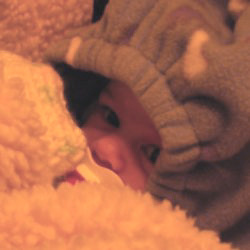
hopefully that will satisfy people’s picture cravings for a few days.

With the amount of time I’ve been spending in iPhoto these days, downloading new Carolyn pictures from our camera, there’s been a slowly strengthening impulse to publish my favorite pictures as a gallery of sorts.  I was getting pretty close to doing it when, fortunately for us all, Derek Powazek launched ephemera.org.  Five minutes looking through the site woke me up and completely disabused me of any notion that a gallery of the photographs I take would be in any way necessary.  I want to order large prints of several of Derek’s photos and hang them in my office.  The same’s true of many pictures that Heather has taken, and now that the two of them are engaged (for which I humbly offer my very belated congratulations!), I foresee the formation of a photographic powerhouse of previously unimagined proportions.  How do they get their pictures to be so vivid, anyway?  The colors are just so deep and perfect; they make me want to cry when I look at my own pictures.

You’ll still get to experience some small portions of my photography, though.  I’m slowly working through the final steps of a meyerweb redesign, and you can see the wireframe if you’re at all interested.  If you hit major layout errors, you can let me know, but four things to keep in mind:

  • The font size is what it is, or at least will be what it will be.  In other words, I’m going to size fonts as I think appropriate for my site, taking into account everything I know about browsers, users, CSS, and the pros and cons of various font-sizing approaches.  Telling me that I’ve made the wrong choice will not change anything, because there are almost no objectively wrong choices in this area.  There are only tradeoffs.
  • If your browser window is too narrow in the IE/Win series, then the sidebar will likely start overlapping the content.  This is due to the bugs in IE/Win’s handling of width, so try widening or maximizing your browser window to see if any observed overlaps are fixed.  If not (and your resolution is higher than 640×480) then let me know.
  • I know that some of the sidebar content repeats, is badly out of date, or points to non-existent resources.  It’s mostly there as a placeholder so I can resolve layout issues without having to get all the data assembled first.
  • The journal entries aren’t very well laid out yet.  I’ll get there soon.

The new design will let you experience (some would say suffer through) bits of my photography because the masthead will contain slices of pictures I’ve taken.  I apologize in advance.


Rolling On

Published 20 years, 4 months past

As an experiment, I’ve added a ‘blogroll’ to the home page of meyerweb.  Those of you using IE/Win and the default theme (Eos) won’t see it because of positioning bugs in IE/Win, and you’ll get slightly incorrect display in a couple of other themes, but people using more conformant browsers should have no trouble.  This isn’t the list’s final form by any means—as I say, it’s an experiment.  It’s actually pushing me toward YAR (Yet Another Redesign), truth be told, one that compacts the sidebar content so that I can introduce new stuff.

Suddenly I have an idea for an update of the classic “Yar’s Revenge.”  In this new version, you control a Web designer who runs around the screen avoiding validation errors, font-sizing bugs, table-layout fanatics, CSS-layout fanatics, wandering usability experts, and snarky bloggers while trying to collect as many design components, standards powerups, and “help points” as possible in pursuit of your ultimate goal: a new redesign that’s accessible, attractive, and uses very lightweight markup.  Every level is a new redesign, each one requiring more standards and components than the last one.  Anyone who makes it past five redesigns without giving up in frustration earns the title “Web design guru.”  Once you attain that rank, you’ll have about ten times as many bloggers trying to tear you down in subsequent levels.  Have fun!

For some reason, I’m strongly reminded of the writing I’ve been doing this weekend.  I said a while back I had one chapter left to write in the second edition of Cascading Style Sheets: The Definitive Guide.  I still do, although said chapter is (at the moment) about 80% done.  It’s the chapter on table presentation, and let me tell you, it’s definitely my least favorite chapter.  I think I did a decent job explaining things, but the subject matter itself is… well, I don’t like it.  Both of my technical reviewers expressed their sympathies to me before I started writing it; that ought to tell you something.

Regardless, the chapter should be done by the end of the weekend.  Then all I’ll have to do is write/create the last few appendixes (no big deal) and go through the author review stage, where I look over the copyeditor and technical review comments and make any necessary changes.  And then it will be really and truly done.  I’m no longer sure how long it will take to finish up those last few bits, but I still hope we’ll have the book on shelves before next summer.  Keep your digits crossed…


We Live To Serve

Published 20 years, 10 months past

Yesterday, Jeffrey Zeldman was nice enough to point people toward meyerweb’s redesign, and also to say some kind words about yours truly that he’ll probably regret some day.  I know I have already, because when goofy rendering errors were reported in IE6/Win, I kind of felt obligated to do something about them instead of just shrugging and saying, “Eh, not my problem.”  Curse you, El Jefe!  I shall be revenged!

Two days ago, I got an e-mail message that had me falling out of my chair, I was laughing so hard, and I simply can’t resist sharing it with you.  I’ve edited the text a bit for clarity, and the name has been removed to protect—well, the guilty, really.  In a legal sense, I mean.

I’ve spent some time reading and working with several CSS books….  and I have to tell you that Eric Meyer on CSS is the best…. if I want to know how to do something and refer to the pile of books near my left hand, it is the one that most easily produces the answer.

It has one other great advantage over all the others as well:  it is by far the best book to roll a joint on.  Shape, size, thickness, glossiness, flexibility, and color are all excellent and [far] ahead of the competition.

It’s amazing how a well designed book serves all purposes.

Well.  Glad I could help out.

A day or two before that fascinating bit of e-mail arrived, I was standing in clothing store located in a brand-new shopping mall just recently built a couple of miles from our house, when the following lyrics came over the store speakers:

Don’t it always seem to go That you don’t know what you’ve got till it’s gone? They paved paradise and put up a parking lot.
—Joni Mitchell, “Big Yellow Taxi”

…and I thought to myself, “Is someone trying to be ironic?”


Eos Rising

Published 20 years, 10 months past

Yep, I finally did what I’ve hinted at for some time now and updated the site design.  Behold: Eos.  It’s sort of an in-joke, one that I would expect exactly four other people to get straightaway, along with perhaps a few others who happened to see the pictures.  Checking the styles might help those who are really curious to unravel the mystery, but trust me, it’s not really that interesting if you weren’t there in the first place.

So anyway… the new design is based around positioning, as opposed to the old one, which was based on floats.  The underlying structure of the site has barely change, with one exception.  The navigation/presentation portion of the pages is now found at the end of the document, instead of the beginning.  This seems more accessible to me.  If you want to see what the raw, unstyled page looks like, pick the theme “void(style);” from the menu.

Note that not every theme is guaranteed to work in your browser.  I stuck to the CSS standards as much as possible, and I did do cross-browser testing.  This uncovered some weird whitespace-sensitive bugs in some browsers.  It also showed that not every technique works well in all browsers.  I’m open to hearing about workarounds for broken displays in browsers, should you find them, so long as they’re based on standard CSS and don’t break the display in too many other browsers.

A few other notes:

  • Unlike the old design, the new themes are intended to have notably distinct layout approaches.  Almost all of them put the sidebar on the right, but that’s just because I prefer righthand navigation.  With the old themes, each one was basically a different set of colors and backgrounds for the same layout.  This time, I wanted to be a little more original.  I’d credit the CSS Zen Garden with prompting this, but I’ve been slowly working at this change since last fall.
  • The cookies that store the theme name and base text size (if you change it) changed their names to be a little more verbose.  You can of course deny said cookies; the site will be completely navigable without them.  The theme switcher won’t work, that’s all.
  • Only one of the themes uses pixel-sized text: “Classic MW.”  Since the theme is intended to reproduce the old design as closely as possible, I figured I’d leave its 11px baseline text.  You can always override it with text-zoom features, or else on the advanced setup page, like before.
  • Some themes use ems or percentages to set the body element’s text size to be smaller than the user’s default.  I did this to prevent the sans-serif fonts employed in those themes from looking stupidly big in default browser installs.  If you object to this approach, then pick a theme that doesn’t override text size—the default theme, “Eos,” is one of these—or set your preferred base text size on the advanced setup page.  Or both.
  • When switching from one theme to another, you may run afoul of bugs in various browsers that let styles leak from one theme to another.  If you see a totally horked display, reload the page to see if that fixes it.
  • Although I was tempted, I didn’t end up using any PNGs to create the translucency effects in various themes.  I didn’t use background-attachment: fixed, either.  It was a lot more challenging to figure out ways to let IE/Win users see the translucent effects with scrolling backgrounds and regular old JPEGs.  I may write a tutorial on how I managed this, but anyone who can’t wait is free to tear into my CSS and figure it out for themselves.  And to copy the technique, if they so desire.
  • Despite it not being the default theme, I think my favorite is Aware.  The name is not necessarily the English word meaning “having knowledge or cognizance,” but is instead a Japanese word meaning “the sense of poignant beauty arising from an ephemeral thing.”  Since I think the latter is only possible with the former, I find this to be a wonderful intersection of cross-linguistic meaning.  Thus you can take the title to mean whichever of the definitions appeals to you most.  For me, it changes back and forth over time.

There may be adjustments to the themes in the future as I find techniques I like better, or as I fix up oddities in and add extra visual frosting to the more experimental themes (like “Matrix”).  Meanwhile, please feel free to share and enjoy.


The Nature of Progress

Published 21 years, 2 months past

A redesigned Netscape DevEdge has been launched.  Look, ma, no tables.  Well, hardly any, and none in the basic design.  I was a primary project manager for this one, and the design is a from-scratch effort.  It’s nothing visually groundbreaking, and of course using positioning for a major site has been done, but we’ve gone a step further into using positioning to make the design come together.  The site didn’t quite validate at launch thanks to some deeply stupid oversights on my part, but hopefully they’ll have been fixed by the time you read this entry.

As for the design approach we took… that’s a subject for another day, and also the subject of an article I wrote.  I predict that we’ll draw fire for using HTML 4.01 Transitional, for not validating when we launched, for our font sizing approach, and for our dropdown menus.  On the other hand, we’ll probably draw praise for making the markup accessible (once one of my stupid mistakes is fixed), for using CSS in a sophisticated manner, for pushing the envelope in reasonable ways, and for our dropdown menus.  For myself, I’m very much satisfied with and proud of the result, and very grateful for all the effort and help I got from the other members of the team.

On a less important but possibly more amusing front, yesterday I hacked together a color-blending tool after Matt Haughey asked on Webdesign-L how to calculate the midpoint between two colors, and Steve Champeon explained how to do it in some detail.  The JavaScript is no doubt inefficient and clumsy, the tool may not work in your browser, and for all I know it will lock up your computer.  It was just a quick hack.  Well, not quick, actually; I’m not very skilled at JavaScript.  Enjoy it, or don’t, as you like.  Just don’t expect me to fix or add anything unless you mail me the code needed to do whatever you want the tool to do.

Lucas Gonze over the O’Reilly Network mentioned a fascinating paper on “cascade attacks” and how they can be used to take down a distributed network.  So the Internet can suffer cascade failure, eh?  I wonder how much effort would be required to take down the Internet’s starboard power coupling.  Or, worse yet, trigger a coolant leak.

It’s been revealed that the blurry, grainy image of the Space Shuttle Columbia wasn’t taken using any advanced telescopes or military systems after all, but three engineers who used some off-the-shelf parts to put together a personal experiment.  CNN says: ‘Hi-tech’ shuttle pic really low-tech.  Let’s think about that for a second.  Three guys took an eleven-year-old Macintosh, hooked it up to a telescope that probably cost no more than a couple hundred dollars, and took a picture of an object almost 40 miles away moving 18 times the speed of sound.  That’s low-tech?  The fact that you can even recognize the object they imaged is astounding.  Hell, the fact that they imaged anything at all is astounding.  No criticism of the three men intended; I’m sure they’re brilliant guys who know what they’re doing.  But think about it!

I refer to moments like this as “technological vertigo.”  They’re those points where you suddenly come to a dead halt while you realize the incredible complexity of the world, and just how much we take for granted.  For that one moment, you stop taking it for granted.  Here’s an example: a couple of years ago, I was driving south through suburban Columbus.  In the back yard of a house just off the interstate, I spotted an old satellite dish lying on its side, obviously no longer in use.  Then it hit me: whoever lived there once had the ability to receive information from orbit, and decided to throw it away.  Their garbage was so much more advanced than anything their parents had ever even envisioned that the gap was barely comprehensible.  Any general in the Second World War would have given anything, including men’s lives, to have the kind of communication capability that now lay discarded in somebody’s back yard.

The even more remarkable thing about this trashed satellite dish is that there was nothing remarkable about it.  So somebody threw out an old satellite dish—so what?  They can always get another one, and one that’s a lot smaller, better, and more capable than the piece of junk they tossed, right?

And that is perhaps the most incredible part of it all.


Catching Up

Published 21 years, 4 months past

The World Wide Web Consortium‘s Web site has been redesigned, although visually it looks almost the same as before.  The change is that they’ve dropped tables-for-layout and are instead using CSS to set up the three columns and style the content.  It’s nice to see them trying to live up to the motto “Leading the Web to its Full Potential…” or, at the very least, finally catching up with the present.

It turns out they’re using a design approach I personally dislike, where all three columns are floated left (leaving none of them fully in the normal flow), but it’s not an inherently bad approach.  I just prefer other ways of achieving the same effect… but, as David Powers once pointed out to me, CSS is a lot like Perl in that it often embodies the spirit of TMTOWTDI—that is, there’s more than one way to do it.  That may be one of the reasons I find CSS so compelling, even though its open-endedness makes it a bit harder to learn.


Digging Out

Published 21 years, 4 months past

Things are relatively quiet for the first time in several weeks.  Outside, there’s close to a foot of powdery snow covering everything, which was fairly easy to clean off the driveway—it’s light enough that I used a push-broom instead of a shovel.  Inside, Kat and I have been enjoying hot cider in front of our fireplace and reconnecting with each other after all the stress of the last few weeks.  Occasionally I play with Gravity, the household cat.  It’s a markedly more peaceful mode of living, and I’m enjoying it while I can, because it won’t last.

It seems like there were things I was going to post, really cool stuff, but it all got buried while I was off at conferences, memorial services, and so forth.  I did notice that Tantek has redesigned his weblog, and the new look was broken in Mozilla for a few hours.  It’s fixed now, but I wonder if that was due to him working around browser bugs, or just tightening up his CSS?  Knowing Tantek, it could very easily be either one.  Regardless, it’s a very interesting design; very paperish.

I’d dig through my e-mail for more stuff, but the fireplace is softly calling my name, and I hate to disappoint anything that could theoretically burn down my house.


Redesigns and Rebounding Praise

Published 21 years, 7 months past

It turns out that my praise for Scott‘s recent redesign was unintentionally self-serving: he’s said that some of ideas were inspired by this page.  In the interests of credit being given where it’s due, I should point out that the idea of making h2 elements inline was not taken from this site.  The dates here do use that trick, but they’ve only done so since Sunday.  Scott came up with that himself.  I set up the inline-heading trick for this site last week and pushed it this past weekend, coincidentally the same day Scott changed his design.

Speaking of redesigns, CNN has changed their site design.  It’s… interesting.  Kind of K10K.  Needlessly overwhelming, in my opinion, but then I thought the last redesign was a mistake and then got used to it very quickly.  I’ll probably get used to this one too.

There are even more interesting redesigns looming on the horizon, however.  I wish I could talk about them here, but I can’t yet.  Soon, very soon…


Browse the Archive

Earlier Entries

Later Entries