Posts in the Standards Category

Mistakes Were Made

Published 4 months, 3 weeks past

Late last week, I posted a tiny hack related to :has() and Firefox.  This was, in some ways, a mistake.  Let me explain how.

Primarily, I should have filed a bug about it.  Someone else did so, and it’s already been fixed.  This is all great in the wider view, but I shouldn’t be offloading the work of reporting browser bugs when I know perfectly well how to do that.  I got too caught up in the fun of documenting a tiny hack (my favorite kind!) to remember that, which is no excuse.

Not far behind that, I should have remembered that Firefox only supports :has() at the moment if you’ve enabled the layout.css.has-selector.enabled flag in about:config.  Although this may be the default now in Nightly builds, given that my copy of Firefox Nightly (121.0a1) shows the flag as true without the Boldfacing of Change.  At any rate, I should have been clear about the support status.

Thus, I offer my apologies to the person who did the reporting work I should have done, who also has my gratitude, and to anyone who I misled about the state of support in Firefox by not being clear about it.  Neither was my intent, but impact outweighs intent.  I’ll add a note to the top of the previous article that points here, and resolve to do better.


CSS Wish List 2023

Published 1 year, 1 month past

Dave asked people to share their CSS wish lists for 2023, and even though it’s well into the second month of the year, I’m going to sprint wild-eyed out of the brush along the road, grab the hitch on the back of the departing bandwagon, and try to claw my way aboard. At first I thought I had maybe four or five things to put on my list, but as I worked on it, I kept thinking of one more thing and one more thing until eventually I had a list of (checks notes) sixt — no, SEVENTEEN?!?!?  What the hell.

There’s going to be some overlap with the things being worked on for Interop 2023, and I’m sure there will be overlap with other peoples’ lists.  Regardless, here we go.


Subgrid

Back in the day, I asserted Grid should wait for subgrid.  I was probably wrong about that, but I wasn’t wrong about the usefulness of and need for subgrid.  Nearly every time I implement a design, I trip over the lack of widespread support.

I have a blog post in my head about how I hacked around this problem for wpewebkit.org by applying the same grid column template to nested containers, and how I could make it marginally more efficient with variables.  I keep not writing it, because it would show the approach and improvement and then mostly be about the limitations, flaws, and annoyances this approach embodies.  The whole idea just depresses me, and I would probably become impolitic.

So instead I’ll just say that I hope those browser engines that have yet to catch up with subgrid support will do so in 2023.

Masonry layout

Grid layout is great, and you can use it to create a masonry-style layout, but having a real masonry layout mechanism would be better, particularly if you can set it on a per-axis basis.  What I mean is, you could define a bunch of fixed (or flexible) columns and then say the rows use masonry layout.  It’s not something I’m likely to use myself, but I always think the more layout possibilities there are, the better.

Grid track styles

For someone who doesn’t do a ton of layout, I find myself wanting to style grid lines a surprising amount.  I just want to do something like:

display: grid;
gap: 1em;
grid-rules-columns: 1px dotted red;

…although it would be much better to be able to style separators for a specific grid track, or even an individual grid cell, as well as be able to apply it to an entire grid all at once.

No, I don’t know exactly how this should work.  I’m an idea guy!  But that’s what I want.  I want to be able to define what separator lines look like between grid tracks, centered on the grid lines.

Anchored positioning

I’ve wanted this in one form or another almost since CSS2 was published.  The general idea is, you can position an element in relation to the edges of another element that isn’t a containing block.  I wrote about this a bit in my post on connector lines for wpewebkit.org, but another place it would have come in handy was with the 
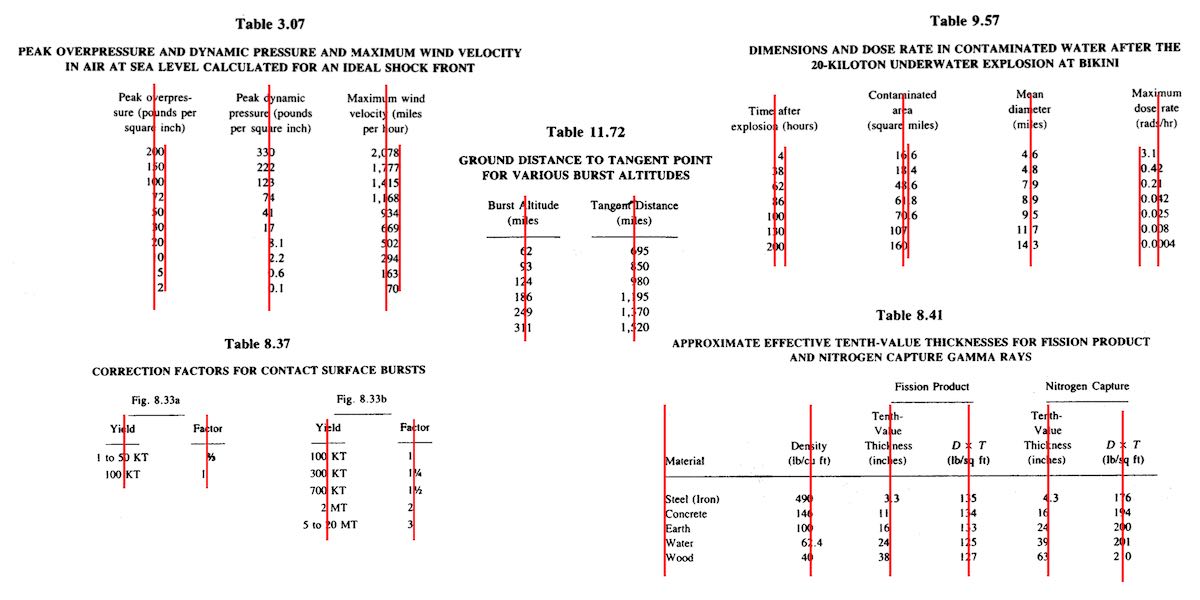
footnotes on The Effects of Nuclear Weapons.

See, I wanted those to actually be sidenotes, Tufteee-styleee.  Right now, in order to make sidenotes, you have to stick the footnote into the text, right where its footnote reference appears  —  or, at a minimum, right after the element containing the footnote reference.  Neither was acceptable to me, because it would dork up the source text.

What I wanted to be able to do was collect all the footnotes as endnotes at the end of the markup (which we did) and then absolutely position each to sit next to the element that referenced them, or have it pop up there on click, tap, hover, whatever.  Anchored positioning would make that not just possible, but fairly easy to do.

Exclusions

Following on anchored positioning, I’d love to have CSS Exclusions finally come to browsers.  Exclusions are a way to mark an element to have other content avoid it.  You know how floats move out of the normal flow, but normal-flow text avoids overlapping them?  That’s an exclusion.  Now imagine being able to position an element by other means, whether grid layout or absolute positioning or whatever, and then say “have the content of other elements flow around it”.  Exclusions!  See this article by Rob Weychert for a more in-depth explanation of a common use case.

Element transitions

The web is cool and all, but you know how futuristic interfaces in movies have pieces of the interface sliding and zooming and popping out and all that stuff?  Element transitions.  You can already try them out in Chrome Canary, Batman, and I’d love to see them across the board.  Even more, I’d love some gentle, easy-to-follow tutorials on how to make them work, because even in their single-page form, I found the coding requirements basically impossible to work out.  Make them all-CSS, and explain them like I’m a newb, and I’m in.

Nested Selectors

A lot of people I know are still hanging on to preprocessors solely because they permit nested selectors, like:

main {
	padding: 1em;
	background: #F1F1F0;
	
	h2 {
		border-block-end: 1px solid gray;
	}
	p {
		text-indent: 2em;
	}
}

The CSS Working Group has been wrestling with this for quite some time now, because it turns out the CSS parsing rules make it hard to just add this, there are a lot of questions about how this should interact with pseudo-classes like :is(), there are serious concerns about doing this in a way that will be maximally future-compatible, and also there has been a whole lot of argument over whether it’s okay to clash with Sass syntax or not.

So it’s a difficult thing to make happen in native CSS, and the debates are both wide-ranging and slow, but it’s on my (and probably nearly everyone else’s) wish list.  You can try it out in Safari Technology Preview as I write this, so here’s hoping for accelerating adoption!

More and better :has()

Okay, since I’m talking about selectors already, I’ll throw in universal, full-featured, more optimized support for :has().  One browser doesn’t support compound selectors, for example.  I’ve also thought that maybe some combinators would be nice, like making a:has(> b) can be made equal to a < b.

But I also wish for people to basically go crazy with :has().  There’s SO MUCH THERE.  There are so many things we can do with it, and I don’t think we’ve touched even a tiny fraction of the possibility space.

More attr()

I’ve wanted attr() to be more widely accepted in CSS values since, well, I can’t remember.  A long time.  I want to be able to do something like:

p[data-size] {width: attr(data-width, rem);}

<p data-size="27">…</p>

Okay, not a great example, but it conveys the idea.  I also talked about this in my post about aligning table columns. I realize adding this would probably lead to someone creating a framework called Headgust where all the styling is jammed into a million data-*attributes and the whole of the framework’s CSS is nothing but property: attr() declarations for every single CSS property known to man, but we shouldn’t let that stop us.

Variables in media queries

Basically I want to be able to do this:

:root {--mobile: 35em;}

@media (min-width: var(--mobile)) {
	/* non-mobile styles go here */
}

That’s it.  This was made possible in container queries, I believe, so maybe it can spread to media (and feature?) queries.  I sure hope so!

Logical modifiers

You can do this:

p {margin-block: 1em; margin-inline: 1rem;}

But you can’t do this:

p {margin: logical 1em 1rem;}

I want to be able to do that.  We should all want to be able to do that, however it’s made possible.

Additive values

You know how you can set a bunch of values with a comma-separated list, but if you want to override just one of them, you have to do the whole thing over?  I want to be able to add another thing to the list without having to do the whole thing over.  So rather than adding a value like this:

background-clip: content, content, border, padding; /* needed to add padding */

…I want to be able to do something like:

background-clip: add(padding);

No, I don’t know how to figure out where in the list it should be added.  I don’t know a lot of things.  I just know I want to be able to do this.  And also to remove values from a list in a similar way, since I’m pony-wishing.

Color shading and blending

Preprocessors already allow you to say you want the color of an element to be 30% lighter than it would otherwise be.  Or darker.  Or blend two colors together.  Native CSS should have the same power.  It’s being worked on.  Let’s get it done, browsers.

Hanging punctuation

Safari has supported hanging-punctuation forever (where “forever”, in this case, means since 2016) and it’s long past time for other browsers to get with the program.  This should be universally supported.

Cross-boundary styles

I want to be able to apply styles from my external (or even embedded) CSS to a resource like an external SVG.  I realize this sets up all kinds of security and privacy concerns.  I still want to be able to do it.  Every time I have to embed an entire inline SVG into a template just so I can change the fill color of a logo based on its page context, I grit my teeth just that little bit harder.  It tasks me.

Scoped styling (including imports)

The Mirror Universe version of the previous wish is that I want to be able to say a bit of CSS, or an entire style sheet (embedded or external), only applies to a certain DOM node and all its descendants. “But you can do that with descendant selectors!” Not always.  For that matter, I’d love to be able to just say:

<div style="@import(styles.css);">

…and have that apply to that <div> and its descendants, as if it were an <iframe>, while not being an <iframe> so styles from the document could also apply to it.  Crazy?  Don’t care.  Still want it.

Linked flow regions(?)

SPECIAL BONUS TENTATIVE WISH: I didn’t particularly like how CSS Regions were structured, but I really liked the general idea.  It would be really great to be able to link elements together, and allow the content to flow between them in a “smooth” manner.  Even to allow the content from the second region to flow back into the first, if there’s room for it and nothing prevents it.  I admit, this is really a “try to recreate Aldus PageMaker in CSS” thing for me, but the idea still appeals to me, and I’d love to see it come to CSS some day.


So there you go.  I’d love to hear what you’d like to see added to CSS, either in the comments below or in posts of your own.


Table Column Alignment with Variable Transforms

Published 1 year, 7 months past

One of the bigger challenges of recreating The Effects of Nuclear Weapons for the Web was its tables.  It was easy enough to turn tab-separated text and numbers into table markup, but the column alignment almost broke me.

To illustrate what I mean, here are just a few examples of columns that had to be aligned.

A few of the many tables in the book and their fascinating column alignments.  (Hover/focus this figure to start a cyclic animation fading some alignment lines in and out. Sorry if that doesn’t work for you, mobile readers.)

At first I naïvely thought, “No worries, I can right- or left-align most of these columns and figure out the rest later.”  But then I looked at the centered column headings, and how the column contents were essentially centered on the headings while having their own internal horizontal alignment logic, and realized all my dreams of simple fixes were naught but ashes.

My next thought was to put blank spacer columns between the columns of visible content, since table layout doesn’t honor the gap property, and then set a fixed width for various columns.  I really didn’t like all the empty-cell spam that would require, even with liberal application of the rowspan attribute, and it felt overly fragile  —  any shifts in font face (say, on an older or niche system) might cause layout upset within the visible columns, such as wrapping content that shouldn’t be wrapped or content overlapping other content.  I felt like there was a better answer.

I also thought about segregating every number and symbol (including decimal separators) into separate columns, like this:

<tr>
  <th>Neutrinos from fission products</th>
  <td>10</td> 
  <td></td>
  <td></td>
</tr>
<tr class="total">
  <th>Total energy per fission</th>
  <td>200</td>
  <td>±</td>
  <td>6</td>
</tr>

Then I contemplated what that would do to screen readers and the document structure in general, and after the nausea subsided, I decided to look elsewhere.

It was at that point I thought about using spacer <span>s.  Like, anywhere I needed some space next to text in order to move it to one side or the other, I’d throw in something like one of these:

<span class="spacer"></span>
<span style="display: inline; width: 2ch;"></span>

Again, the markup spam repulsed me, but there was the kernel of an idea in there… and when I combined it with the truism “CSS doesn’t care what you expect elements to look or act like”, I’d hit upon my solution.

Let’s return to Table 1.43, which I used as an illustration in the announcement post.  It’s shown here in its not-aligned and aligned states, with borders added to the table-cell elements.

Table 1.43 before and after the cells are shifted to make their contents visually align.

This is exactly the same table, only with cells shifted to one side or another in the second case.  To make this happen, I first set up a series of CSS rules:

figure.table .lp1 {transform: translateX(0.5ch);}
figure.table .lp2 {transform: translateX(1ch);}
figure.table .lp3 {transform: translateX(1.5ch);}
figure.table .lp4 {transform: translateX(2ch);}
figure.table .lp5 {transform: translateX(2.5ch);}

figure.table .rp1 {transform: translateX(-0.5ch);}
figure.table .rp2 {transform: translateX(-1ch);}

For a given class, the table cell is translated along the X axis by the declared number of ch units.  Yes, that means the table cells sharing a column no longer actually sit in the column.  No, I don’t care — and neither, as I said, does CSS.

I chose the labels lp and rp for “left pad” and “right pad”, in part as a callback to the left-pad debacle of yore even though it has basically nothing to do with what I’m doing here.  (Many of my class names are private jokes to myself.  We take our pleasures where we can.)  The number in each class name represents the number of “characters” to pad, which here increment by half-ch measures.  Since I was trying to move things by characters, using the unit that looks like it’s a character measure (even though it really isn’t) made sense to me.

With those rules set up, I could add simple classes to table cells that needed to be shifted, like so:

<td class="lp3">5 ± 0.5</td>

<td class="rp2">10</td>

That was most of the solution, but it turned out to not be quite enough.  See, things like decimal places and commas aren’t as wide as the numbers surrounding them, and sometimes that was enough to prevent a specific cell from being able to line up with the rest of its column.  There were also situations where the data cells could all be aligned with each other, but were unacceptably offset from the column header, which was nearly always centered.

So I decided to calc() the crap out of this to add the flexibility a custom property can provide.  First, I set a sitewide variable:

body {
	--offset: 0ch;
}

I then added that variable to the various transforms:

figure.table .lp1 {transform: translateX(calc(0.5ch + var(--offset)));}
figure.table .lp2 {transform: translateX(calc(1ch   + var(--offset)));}
figure.table .lp3 {transform: translateX(calc(1.5ch + var(--offset)));}
figure.table .lp4 {transform: translateX(calc(2ch   + var(--offset)));}
figure.table .lp5 {transform: translateX(calc(2.5ch + var(--offset)));}

figure.table .rp1 {transform: translateX(calc(-0.5ch + var(--offset)));}
figure.table .rp2 {transform: translateX(calc(-1ch   + var(--offset)));}

Why use a variable at all?  Because it allows me to define offsets specific to a given table, or even specific to certain table cells within a table.  Consider the styles embedded along with Table 3.66:

#tbl3-66 tbody tr:first-child td:nth-child(1),
#tbl3-66 tbody td:nth-child(7) {
	--offset: 0.25ch;
}
#tbl3-66 tbody td:nth-child(4) {
	--offset: 0.1ch;	
}

Yeah. The first cell of the first row and the seventh cell of every row in the table body needed to be shoved over an extra quarter-ch, and the fourth cell in every table-body row (under the heading “Sp”) got a tenth-ch nudge.  You can judge the results for yourself.

So, in the end, I needed only sprinkle class names around table markup where needed, and add a little extra offset via a custom property that I could scope to exactly where needed.  Sure, the whole setup is hackier than a panel of professional political pundits, but it works, and to my mind, it beats the alternatives.

I’d have been a lot happier if I could have aligned some of the columns on a specific character.  I think I still would have needed the left- and right-pad approach, but there were a lot of columns where I could have reduced or eliminated all the classes.  A quarter-century ago, HTML 4 had this capability, in that you could write:

<COLGROUP>
	<COL>
	<COL>
	<COL align="±">
</COLGROUP>

CSS2 was also given this power via text-align, where you could give it a string value in order to specify horizontal alignment.

But browsers never really supported these features, even if some of them do still have bugs open on the issue.  (I chuckle aridly every time I go there and see “Opened 24 years ago” a few lines above “Status: NEW”.)  I know it’s not top of anybody’s wish list, but I wouldn’t mind seeing that capability return, somehow. Maybe as something that could be used in Grid column tracks as well as table columns.

I also found myself really pining for the ability to use attr() here, which would have allowed me to drop the classes and use data-* attributes on the table cells to say how far to shift them.  I could even have dropped the offset variable.  Instead, it could have looked something like this:

<td data-pad="3.25">5 ± 0.5</td>

<td data-pad="-1.9">10</td>

figure.table *[data-pad] {transform: translateX(attr(data-pad,'ch'));}

Alas, attr() is confined to the content property, and the idea of letting it be used more widely remains unrealized.

Anyway, that was my journey into recreating mid-20th-Century table column alignment on the Web.  It’s true that sufficiently old browsers won’t get the fancy alignment due to not supporting custom properties or calc(), but the data will all still be there.  It just won’t have the very specific column alignment, that’s all.  Hooray for progressive enhancement!


When or If

Published 2 years, 5 days past

The CSSWG (CSS Working Group) is currently debating what to name a conditional structure, and it’s kind of fascinating.  There are a lot of strong opinions, and I’m not sure how many of them are weakly held.

Boiled down to the bare bones, the idea is to take the conditional structures CSS already has, like @supports and @media, and allow more generic conditionals that combine and enhance what those structures make possible.  To pick a basic example, this:

@supports (display: grid) {
	@media (min-width: 33em) {
		…
	}
}

…would become something like this:

@conditional supports(display: grid) and media(min-width: 33em) {
	…
}

This would also be extended to allow for alternates, something like:

@conditional supports(display: grid) and media(min-width: 33em) {
	…
} @otherwise {
	…
}

Except nobody wants to have to type @conditional and @otherwise, so the WG went in search of shorter names.

The Sass-savvy among you are probably jumping up and down right now, shouting “We have that! We have that already! Just call them @if and @else and finally get on our level!”  And yes, you do have that already: Sass uses exactly those keywords.  There are some minor syntactic differences (Sass doesn’t require parentheses around the conditional tests, for example) and it’s not clear whether CSS would allow testing of variable values the way Sass does, but they’re very similar.

And that’s a problem, because if CSS starts using @if and @else, there is the potential for syntactic train wrecks.  If you’re writing with Sass, how will it tell the difference between its @if and the CSS @if?  Will you be forever barred from using CSS conditionals in Sass, if that’s what goes into CSS?  Or will Sass be forced to rename those conditionals to something else, in order to avoid clashing — and if so, how much upheaval will that create for Sass authors?

The current proposal, as I write this, is to use @when and @else in CSS Actual.  Thus, something like:

@when supports(display: grid) and media(min-width: 33em) {
	…
} @else {
	…
}

Even though there is overlap with @else, apparently starting the overall structure with @when would allow Sass to tell the difference.  So that would sidestep clashing with Sass.

But should the CSS WG even care that a third-party code base’s syntax gets trampled on by CSS syntax?  I imagine Sass authors would say, “Uh, hell yeah they should”, but does that outweigh the potential learning hurdle of all the non-Sass authors, both now and over the next few decades, learning that @when doesn’t actually have temporal meaning and is just an alias for the more recognizable if statement?

Because while it’s true that some programming languages have a when conditional structure (kOS being the one I’ve used most recently), they usually also have an if structure, and the two sometimes mean different things.  There is a view held by some that using the label when when we really mean if is a mistake, one that will stand out as a weird choice and a design blunder, 10 years hence, and will create a cognitive snag in the process of learning CSS.  Others hold the view that when is a relatively common programming term, it’s sometimes synonymous with if, every language has quirks that new learners need to learn, and it’s worth avoiding a clash with tools and authors that already exist.

If you ask me, both views are true, and that’s the real problem.  I imagine most of the participants in the discussion, even if their strong opinions are strongly held, can at least see where the other view is rooted, and sympathize with it.  And it’s very likely the case that even if Sass and other tools didn’t exist, the WG would still be having the same debate, because both terms work in context.  I suspect if would have won by now, but who knows?  Maybe not.  There have been longer debates over less fundamental concepts over the years.

A lot of my professional life has been spent explaining CSS to people new to it, so that may be why I personally lean toward @if over @when.  It’s a bit easier to explain, it looks more familiar to anyone who’s done programming at just about any level, and semantically it makes a bit more sense to me.  It’s also true that I come from a place of not having to worry about Sass changing on me, because I’ve basically never used it (or any other CSS pre-processor, for that matter) and I don’t have to do the heavy lifting of rewriting Sass to deal with this.  So, easy for me to say!

That said, I have an instinctive distrust of arguments by majority.  Yes, the number of Sass developers who’d have to adapt Sass to @if in CSS Actual is vanishingly small compared to the population of current and future CSS authors, and the number of Sass authors is likely much smaller than the number of total CSS authors.  That doesn’t automatically mean they should be discounted. It’s good to keep CSS as future-proof as possible, but it should also be kept as present-proof as possible.

The rub comes in with “as possible”, though.  This isn’t a situation where all things are possible. Something’s going to give, and there will be a group of people ill-served by the result.  Will it be Sass authors?  Future CSS learners?  Another group?  Everyone?  We’ll see!


Back in the CSSWG

Published 2 years, 9 months past

As you might have noticed, I recently wrote about how I got started with CSS a quarter century ago,  what I’ve seen change over that long span of time, and the role testing has played in both of those things.

After all, CSS tests are most of how I got onto the Cascading Style Sheets & Formatting Properties Working Group (as it was known then) back in the late 1990s.  After I’d finished creating tests for nearly all of CSS, I wrote the chair of the CSS&FP WG, Chris Lilley, about it.  The conversation went something like, “Hey, I have all these tests I’ve created, would the WG or browser makers be at all interested in using them?”  To which the answer was a resounding yes.

Not too much later, I made some pithy-snarky comment on www-style about how only the Cool Kids on the WG knew what was going on with something or other, and I wasn’t one of them, pout pout.  At which point Chris emailed me to say something like, “We have this role called Invited Expert; how would you like to be one?”  To which the answer was a resounding (if slightly stunned) yes.

I came aboard with a lot of things in mind, but the main thing was to merge my test suite with some other tests and input from smart folks to create the very first official W3C test suite.  Of any kind, not just for CSS.  It was announced alongside the promotion of CSS2 to Recommendation status in December 1998.

I stayed an Invited Expert for a few years, but around 2003 I withdrew from the group for lack of time and input, and for the last 17-some years, that’s how it’s stayed.  Until now, that is: as of yesterday, I’ve rejoined the CSS Working Group, this time as an official Member, one of several representing Igalia.  And fittingly, Chris Lilley was the first to welcome me back.

I’m returning to take back up the mantle I carried the first time around: testing CSS.  I intend to focus on creating Web Platform Test entries demonstrating new CSS features, clarifying changes to existing specifications, and filling in areas of CSS that are under-tested.  Maybe even to draft tests for things the WG is debating, to explore what a given proposal would mean in terms of real-world rendering.

My thanks to Igalia for enabling my return to the CSS WG, as well as supporting my contributions yet to come.  And many thanks to the WG for a warm welcome.  I have every hope that I’ll be able to once more help CSS grow and improve in my own vaguely unique way.


Ancestors and Descendants

Published 2 years, 9 months past

After my post the other day about how I got started with CSS 25 years ago, I found myself reflecting on just how far CSS itself has come over all those years.  We went from a multi-year agony of incompatible layout models to the tipping point of April 2017, when four major Grid implementations shipped in as many weeks, and were very nearly 100% consistent with each other.  I expressed delight and astonishment at the time, but it still, to this day, amazes me.  Because that’s not what it was like when I started out.  At all.

I know it’s still fashionable to complain about how CSS is all janky and weird and unapproachable, but child, the wrinkles of today are a sunny park stroll compared to the jagged icebound cliff we faced at the dawn of CSS.  Just a few examples, from waaaaay back in the day:

  • In the initial CSS implementation by Netscape Navigator 4, padding was sometimes a void.  What I mean is, you could give an element a background color, and you could set a border, but if you adding any padding, in some situations it wouldn’t take on the background color, allowing the background of the parent element to show through.  Today, we can recreate that effect like so:
    border: 3px solid red;
    padding: 0.5em;
    background-color: cornflowerblue;
    background-clip: content-box;
    

    Padding as a void.

    But we didn’t have background-clip in those days, and backgrounds weren’t supposed to act like that.  It was just a bug that got fixed a few versions later. (It was easier to get browsers to fix bugs in those days, because the web was a lot smaller, and so were the stakes.)  Until that happened, if you wanted a box with border, background, padding, and content in Navigator, you wrapped a <div> inside another <div>, then applied the border and background to the outer and the padding (or a margin, at that point it didn’t matter) to the inner.
  • In another early Navigator 4 version, pica math was inverted: Instead of 12 points per pica, it was set to 12 picas per point — so 12pt equated to 144pc instead of 1pc.  Oops.
  • Navigator 4’s handling of color values was another fun bit of bizarreness.  It would try to parse any string as if it were hexadecimal, but it did so in this weird way that meant if you declared color: inherit it would render in, as one person put it, “monkey-vomit green”.
  • Internet Explorer for Windows started out by only tiling background images down and to the right.  Which was fine if you left the origin image in the top left corner, but as soon as you moved it with background-position, the top and left sides of the element just… wouldn’t have any background.  Sort of like Navigator’s padding void!
  • At one point, IE/Win (as we called it then) just flat out refused to implement background-position: fixed.  I asked someone on that team point blank if they’d ever do it, and got just laughter and then, “Ah no.” (Eventually they relented, opening the door for me to create complexspiral and complexspiral distorted.)
  • For that matter, IE/Win didn’t inherit font sizes into tables.  Which would be annoying even today, but in the era of still needing tables to do page-level layout, it was a real problem.
  • IE/Win had so many layout bugs, there were whole sites dedicated to cataloging and explaining them.  Some readers will remember, and probably shudder to do so, the Three-Pixel Text Jog, the Phantom Box Bug, the Peekaboo Bug, and more.  Or, for that matter, hasLayout/zoom.
  • And perhaps most famous of all, Netscape and Opera implemented the W3C box model (2021 equivalent: box-sizing: content-box) while Microsoft implemented an alternative model (2021 equivalent: box-sizing: border-box), which meant apparently simple CSS meant to size elements would yield different results in different browsers.  Possibly vastly different, depending on the size of the padding and so on.  Which model is more sensible or intuitive doesn’t actually matter here: the inconsistency literally threatened the survival of CSS itself.  Neither side was willing to change to match the other — “we have customers!” was the cry — and nobody could agree on a set of new properties to replace height and width.  It took the invention of DOCTYPE switching to rescue CSS from the deadlock, which in turn helped set the stage for layout-behavior properties like box-sizing.

I could go on.  I didn’t even touch on Opera’s bugs, for example.  There was just so much that was wrong.  Enough so that in a fantastic bit of code aikido, Tantek turned browsers’ parsing bugs against them, redirecting those failures into ways to conditionally deliver specific CSS rules to the browsers that needed them.  A non-JS, non-DOCTYPE form of browser sniffing, if you like — one of the earliest progenitors of feature queries.

I said DOCTYPE switching saved CSS, and that’s true, but it’s not the whole truth.  So did the Web Standards Project, WaSP for short.  A group of volunteers, sick of the chaotic landscape of browser incompatibilities (some intentional) and the extra time and cost of dealing with them, who made the case to developers, browser makers, and the tech press that there was a better way, one where browsers were compatible on the basics like W3C specifications, and could compete on other features.  It was a long, wearying, sometimes frustrating, often derided campaign, but it worked.

The state of the web today, with its vast capability and wide compatibility, owes a great deal to the WaSP and its allies within browser teams.  I remember the time that someone working on a browser — I won’t say which one, or who it was — called me to discuss the way the WaSP was treating their browser. “I want you to be tougher on us,” they said, surprising the hell out of me. “If we can point to outside groups taking us to task for falling short, we can make the case internally to get more resources.”  That was when I fully grasped that corporations aren’t monoliths, and formulated my version of Hanlon’s Razor: “Never ascribe to malice that which is adequately explained by resource constraints.”

The original Acid Test.

In order to back up what we said when we took browsers to task, we needed test cases.  This not only gave the CSS1 Test Suite a place of importance, but also the tests the WaSP’s CSS Action Committee (aka the CSS Samurai) devised.  The most famous of these is the first CSS Acid Test, which was added to the CSS1 Test Suite and was even used as an Easter egg in Internet Explorer 5 for Macintosh.

The need for testing, whether acid or basic, lives on in the Web Platform Tests, or WPT for short.  These tests form a vital link in the development of the web.  They allow specification authors to create reference results for the rules in those specifications, and they allow browser makers to see if the code they’re writing yields the correct results.  Sometimes, an implementation fails a test and the implementor can’t figure out why, which leads to a discussion with the authors of the specification, and that can lead to clarifications of the specification, or to fixing flawed tests, or even to both.  Realize just how harmonious browser support for HTML and CSS is these days, and know that WPT deserves a big part of the credit for that harmony.

As much as the Web Standards Project set us on the right path, the Web Platform Tests keep us on that path.  And I can’t lie, I feel like the WPT is to the CSS1 Test Suite much like feature queries are to those old CSS parser hacks.  The latter are much greater and more powerful than than the former, but there’s an evolutionary line that connects them.  Forerunners and inheritors.  Ancestors and descendants.

It’s been a real privilege to be present as CSS first emerged, to watch as it’s developed into the powerhouse it is today, and to be a part of that story — a story that is, I believe, far from over.  There are still many ways for CSS to develop, and still so many things we have yet to discover in its feature set.  It’s still an entrancing language, and I hope I get to be entranced for another 25 years.

Thanks to Brian Kardell, Jenn Lukas, and Melanie Sumner for their input and suggestions.


25 Years of CSS

Published 2 years, 9 months past

It was the morning of Tuesday, May 7th and I was sitting in the Ambroisie conference room of the CNIT in Paris, France having my mind repeatedly blown by an up-and-coming web technology called “Cascading Style Sheets”, 25 years ago this month.

I’d been the Webmaster at Case Western Reserve University for just over two years at that point, and although I was aware of table-driven layout, I’d resisted using it for the main campus site.  All those table tags just felt… wrong.  Icky.  And yet, I could readily see how not using tables hampered my layout options.  I’d been holding out for something better, but increasingly unsure how much longer I could wait.

Having successfully talked the university into paying my way to Paris to attend WWW5, partly by having a paper accepted for presentation, I was now sitting in the W3C track of the conference, seeing examples of CSS working in a browser, and it just felt… right.  When I saw a single word turned a rich blue and 100-point size with just a single element and a few simple rules, I was utterly hooked.  I still remember the buzzing tingle of excitement that encircled my head as I felt like I was seeing a real shift in the web’s power, a major leap forward, and exactly what I’d been holding out for.

Page 4, HTML 3.2.

Looking back at my hand-written notes (laptops were heavy, bulky, battery-poor, and expensive in those days, so I didn’t bother taking one with me) from the conference, which I still have, I find a lot that interests me.  HTTP 1.1 and HTML 3.2 were announced, or at least explained in detail, at that conference.  I took several notes on the brand-new <OBJECT> element and wrote “CENTER is in!”, which I think was an expression of excitement.  Ah, to be so young and foolish again.

There are other tidbits: a claim that “standards will trail innovation” — something that I feel has really only happened in the past decade or so — and that “Math has moved to ActiveMath”, the latter of which is a term I freely admit I not only forgot, but still can’t recall in any way whatsoever.

My first impressions of CSS, split for no clear reason across two pages.

But I did record that CSS had about 35 properties, and that you could associate it with markup using <LINK REL=STYLESHEET>, <STYLE>…</STYLE>, or <H1 STYLE="…">.  There’s a question — “Gradient backgrounds?” — that I can’t remember any longer if it was a note to myself to check later, or something that was floated as a possibility during the talk.  I did take notes on image backgrounds, text spacing, indents (which I managed to misspell), and more.

What I didn’t know at the time was that CSS was still largely vaporware.  Implementations were coming, sure, but the demos I’d seen were very narrowly chosen and browser support was minimal at best, not to mention wildly inconsistent.  I didn’t discover any of this until I got back home and started experimenting with the language.  With a printed copy of the CSS1 specification next to me, I kept trying things that seemed like they should work, and they didn’t.  It didn’t matter if I was using the market-dominating behemoth that was Netscape Navigator or the scrappy, fringe-niche new kid Internet Explorer: very little seemed to line up with the specification, and almost nothing worked consistently across the browsers.

So I started creating little test pages, tackling a single property on each page with one test per value (or value type), each just a simple assertion of what should be rendered along with a copy of the CSS used on the page.  Over time, my completionist streak drove me to expand this smattering of tests to cover everything in CSS1, and the perfectionist in me put in the effort to make it easy to navigate.  That way, when a new browser version came out, I could run it through the whole suite of tests and see what had changed and make note of it.

Eventually, those tests became the CSS1 Test Suite, and the way it looks today is pretty much how I built it.  Some tests were expanded, revised, and added, plus it eventually all got poured into a basic test harness that I think someone else wrote, but most of the tests — and the overall visual design — were my work, color-blindness insensitivity and all.  Those tests are basically what got me into the Working Group as an Invited Expert, way back in the day.

Before that happened, though, with all those tests in hand, I was able to compile CSS browser support information into a big color-coded table, which I published on the CWRU web site (remember, I was Webmaster) and made freely available to all.  The support data was stored in a large FileMaker Pro database, with custom dropdown fields to enter the Y/N/P/B values and lots of fields for me to enter template fragments so that I could export to HTML.  That support chart eventually migrated to the late Web Review, where it came to be known as “the Mastergrid”, a term I find funny in retrospect because grid layout was still two decades in the future, and anyway, it was just a large and heavily styled data table.  Because I wasn’t against tables for tabular data.  I just didn’t like the idea of using them solely for layout purposes.

You can see one of the later versions of Mastergrid in the Wayback Machine, with its heavily classed and yet still endearingly clumsy markup.  My work maintaining the Mastergrid, and articles I wrote for Web Review, led to my first book for O’Reilly (currently in its fourth edition), which led to my being asked to write other books and speak at conferences, which led to my deciding to co-found a conference… and a number of other things besides.

And it all kicked off 25 years ago this month in a conference room in Paris, May 7th, 1996.  What a journey it’s been.  I wonder now, in the latter half of my life, what CSS — what the web itself — will look like in another 25 years.


First Month at Igalia

Published 3 years, 3 days past

Today marks one month at Igalia.  It’s been a lot, and there’s more to come, but it’s been a really great experience.  I get to do things I really enjoy and value, and Igalia supports and encourages all of it without trying to steer me in specific directions.  I’ve been incredibly lucky to experience that kind of working environment twice in my life — and the other one was an outfit I helped create.

Here’s a summary of what I’ve been up to:

  • Generally got up to speed on what Igalia is working on (spoiler: a lot).
  • Redesigned parts of wpewebkit.org, fixed a few outstanding bugs, edited most of the rest. (The site runs on 11ty, so I’ve been learning that as well.)
  • Wrote a bunch of CSS tests/demos that will form the basis for other works, like articles and videos.
  • Drafted a few of said articles.  As I write this, two are very close to being complete, and a third is almost ready for editing.
  • Edited some pages on the Mozilla Developer Network (MDN), clarifying or upgrading text in some places and replacing unclear examples in others.
  • Joined the Open Web Docs Steering Committee.
  • Reviewed various specs and proposals (e.g., Miriam’s very interesting @scope proposal).

And that’s not all!  Here’s what I have planned for the next few months:

  • More contributions to MDN, much of it in the CSS space, but also branching out into documenting some up-and-coming APIs in areas that are fairly new to me.  (Details to come!)
  • Contributions to the Web Platform Tests (WPT), once I get familiar with how that process is structured.
  • Articles on topics that will include (but are not limited to!) gaps in CSS, logical properties, and styling based on writing direction.  I haven’t actually settled on outlets for those yet, so if you’d be interested in publishing any of them, hit me up.  I usually aim for about a thousand words, including example markup and CSS.
  • Very likely will rejoin the CSS Working Group after a (mumblecough)-year absence.
  • Assembling a Raspberry Pi system to test out WPEWebKit in its native, embedded environment and get a handle on how to create a “setting up WPEWebKit for total embedded-device noobs”, of which I am one.

That last one will be an entirely new area for me, as I’ve never really worked with an embedded-device browser before.  WPEWebKit is a WebKit port, actually the official WebKit port for embedded devices, and as such is aggressively tuned for performance and low resource demand.  I’m really looking forward to not only seeing what it’s like to use it, but also how I might be able to leverage it into some interesting projects.

WPEWebKit is one of the reasons why Igalia is such a big contributor to WebKit, helping drive its standards support forward and raise its interoperability with other browser engines.  There’s a thread of self-interest there: a better WebKit means a better WPEWebKit, which means more capable embedded devices for Igalia’s clients.  But after a month on the inside, I feel comfortable saying most of Igalia’s commitment to interoperability is philosophical in nature — they truly believe that more consistency and capability in web browsers benefits everyone.  As in, THIS IS FOR EVERYONE.

And to go along with that, more knowledge and awareness is seen as an unvarnished good, which is why they’re having me working on MDN content.  To that end, I’m putting out an invitation here and now: if you come across a page on MDN about CSS or HTML that confuses you, or seems inaccurate, or just doesn’t have much information at all, please get in touch to let me know, particularly if you are not a native English speaker.

I can’t offer translation services, unfortunately, but I can do my best to make the English content of MDN as clear as possible.  Sometimes, what makes sense to a native English speaker is obscure or unclear to others.  So while this offer is open to everyone, don’t hold back if you’re struggling to parse the English.  It’s more likely the English is unclear and imprecise, and I’d like to erase that barrier if I can.

The best way to submit a report is to send me email with [MDN] and the URL of the page you’re writing about in the subject line.  If you’re writing about a collection of pages, put the URLs into the email body rather than the subject line, but please keep the [MDN] in the subject so I can track it more easily.  You can also ping me on Twitter, though I’ll probably ask you to email me so I don’t lose track of the report.  Just FYI.

I feel like there was more, but this is getting long enough and anyway, it already seems like a lot.  I can’t wait to share more with you in the coming months!


Browse the Archive

Earlier Entries