Posts in the Commentary Category

A “Year in Review” Review

Published 8 years, 10 months past

A year ago today, I went onto Facebook and was shocked by what I saw.  After a few moments, I started thinking through what had happened, and why, and decided to quickly blog about it.  Before a week had gone by, that post had become a news story covered around the world, showing up in newsprint and on web sites, leading to interviews and more.  There was a moment where I was sitting in my office with my daughter when she looked over, took in my expression, and asked me if I was okay.  I couldn’t speak for a minute.  The story had just hit TIME Magazine and the New York Times.  It was a truly surreal experience.

From out of that experience, a lot of things grew.  I realized that “Designing for Crisis” was one piece of a larger topic, started to get a handle on that topic, and teamed up with Sara Wachter-Boettcher to create a book which we just finished writing, title to be announced shortly, and expect to be on shelves within a few months.

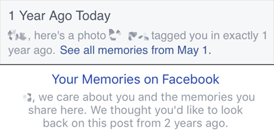
In parallel to that, I was asked to talk with the design and content teams at Facebook, which I did in the spring of 2015.  It was an incredibly productive and honest discussion, entirely because the team at Facebook was truly concerned and open to change.  You can see how this has evolved over time in On This Day, whose messaging has become more human and sensitive to the possibility of harm.  And you can especially see it in the 2015 edition of Year in Review.

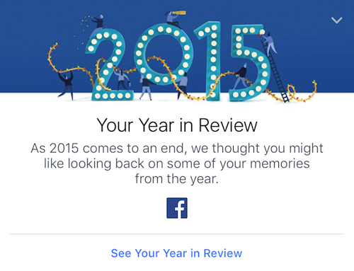
Year in Review’s timeline ad for 2015.

Whereas last year, the YiR feature was clearly designed around awesome years and happy people, this year’s is a lot more respectful and careful.  It isn’t as dynamic, but when it comes to memories, this seems entirely appropriate.  As Sara and I say in our book, this is “what it looks like when an organization embeds caring into its product, and is willing to own up to mistakes”.

I know the Facebook copy “we care about you and the memories you share” has been derided in some quarters, because people reflexively assume that no company (least of all Facebook) actually cares about you as anything more than a sales unit.  Maybe that’s true of some parts of Facebook — it’s a very large company, after all, with a lot of competing fiefdoms — but the design and content teams were writing from the heart.  They honestly do care about the people who use their products, and they care very much about how their work affects people.  They know they’ll stumble sometimes, but they’re committed to trying anyway and learning from their stumbles.  For that alone, they have my deepest respect.  To forge ahead in front of an audience of well over a billion people takes an incredible amount of courage.

Year in Review will be a part of the talk I’ll be giving in 2016 at An Event Apart, just as it was of Sara’s and my forthcoming book.  In brief, the assessment that you’ll find in both places: Year in Review 2015 is a significant step forward, a great example of compassionate design at scale.  I applaud Facebook for forging a path forward.


I’m Probably Wrong

Published 9 years, 2 weeks past

If there’s one thing that’s made it possible for me to learn as much as I have, and create as much as I have, it’s that my default attitude about things, especially technical things, is that I’m probably wrong about them.

When I first took up CSS and it didn’t do what I expected from reading the spec, I started creating simple, focused tests of each property and its values, to figure out what I was getting wrong.  Because I wanted to be sure, I built tests for all the properties, even the ones I was confident about understanding — and, in places, found out my confidence was misplaced.  Eventually, those tests became the CSS1 Test Suite.  Since I had discovered that, in a lot of cases, the browsers were actually wrong, I decided to document CSS support in browsers.  That became the CSS Mastergrid (long since gone).  On the strength of that resource, I started writing articles to explain how things worked, or didn’t, which led to writing my first book.  And so on.

But it all started because I assumed I was wrong about how CSS should work, not that the browsers were fundamentally broken.  Simple test cases seemed like the best way to find out.  One thing led to another.  In a lot of ways, you could say that my career was made possible by me assuming I was wrong, and setting out to determine exactly how wrong I was.

It’s not that I want to be wrong; in fact, I dislike being wrong.  But I dislike continuing to be wrong much more, so I try to find out how I’m wrong, in hopes of becoming less wrong.  It’s not even “strong opinions, weakly held” — it’s more “strong suspicion of error, strongly pursued”.  In public, when necessary.  (This is where it helps to be willing to look like a dork, or even a fool, as Kitt wrote about yesterday.)

When asking for help, this is the approach I take.  When I post to mailing lists or forums, it usually comes out as, “Here’s what I think is so, but results don’t match that understanding.  What am I missing?  Please help me get it right.”

How am I wrong?  Because I’m probably wrong.

This article was originally published at The Pastry Box Project on 2 November 2015.


A More Compassionate Facebook

Published 9 years, 1 month past

It’s been a busy couple of weeks for Facebook, in terms of compassionate design decisions.

First they announced that they aren’t adding a Dislike button, but they are adding a set of six emoji reactions to the “Like” button, so you can indicate a wider range of emotion.  Some people immediately linked this to Slack, as if emoji reactions hadn’t been a thing on social media for the last couple of years.  I happened to see Sally Herships asking “what are your thoughts?” about it on Twitter (heh), and oh, I had thoughts.  I ended up sharing some of those thoughts by phone, and one of them was part of a segment on American Public Media’s Marketplace.

It’s funny, in a way, that my thought on marketing and advertisers was what made it into the piece, because I think that was literally my whole thought about that side of things.  Most of the rest of my conversation with Sally was about how Facebook could use these reactions as a way to avoid insensitive design choices.  As an example, a status update that gets lots of interaction in the frowny-face or sad-face realm could be avoided when it comes to things like Year in Review.  I said something to the effect of:

People are sharing everything about their lives, positive and negative, billions of us every day.  That isn’t going to stop, so it’s great to see Facebook making changes to meet us where we are, or at least meet us partway.

These reaction emoji almost certainly aren’t the last word on this, but they’re a credible initial attempt.  In more than one sense, they’re a first step into a larger world.


Next, Facebook introduced filtering for its On This Day (OTD) feature.  This is another step in the evolution of On This Day, one that’s very welcome.  Facebook had already been revising its language to be more humane, shifting from simple “Relive this memory” to nuanced language expressing care and openness.

The original and more recent copy at the top of an On This Day memory.

With its new OTD preferences, Facebook now lets you define ranges of dates you’d like to be blacklisted, in effect, as well as people you don’t want to see memories about.  I’d commented on the lack of this, back when OTD launched:

…what I notice here is what’s missing:  I don’t see any reference to an ability to opt out of On This Day, either for certain days or altogether.

So far as I can tell, you still can’t opt out entirely; even if you turn off all notifications, you can still get memories inserted into your timeline.  For me, I see about one a month, more or less.  But here’s the interesting thing: they’re almost never my memories.  In what I still regard as a major gamble by Facebook, On This Day will show you posts, pictures, and videos posted by someone else, but on which you were tagged.  I presume (though I have no simple way to test) that adding a person in the OTD filtering preferences will prevent you from seeing memories in which they’re tagged as well as memories they posted.

If so, that’s a really smart step, as I can only imagine how a spiteful ex might abuse OTD.  It still leaves open the possibility of old posts that you don’t remember being tagged on suddenly appearing.  In many cases, that will be a delightful moment, but in many others, the exact opposite of that.  This is why I regard Facebook’s decision to show you posts from other people a gamble.  Even if they show unwanted memories to just 1% of their user base — a ridiculously low percentage — that’s literally 10 million people a day.

Still: wrinkles or no, flaws or no, the presence of filtering preferences is a major enhancement to On This Day.  I could block out all of June 2014, if I so chose.  There might be years where I blocked it, and others where I removed the block.  The important thing is that I’m being given that capability, in an environment that’s already designed to show me memories and acknowledge that it’s easy to get that wrong.  The user experience for adding filters is still clunky, but much like the reaction emoji, I view this as a credible first try, not the final word.

All this has made for some interesting Slack discussions between me and Sara, as we literally just finished the manuscript for our forthcoming, still-not-quite-titled-but-we’re-really-close-honest book on compassion in design.  Which has references to things like On This Day, so we’re already revising a book that hasn’t even been published yet.  And when will it be published?  We’re pulling for early next year, which sounds like a long way away until you remember that 2015 is getting close to done.

Kudos to Facebook, both for its efforts to be kinder in what they do and for its willingness to try.  Not many businesses, let alone social-media titans, have had the courage to think about what can go wrong in this realm, let alone actually acknowledge missteps and work to do better.  Well done.


The Stages of Fear

Published 9 years, 1 month past

How many talks have I given over the years?  How many times have I stood at the front of a room, on a stage or in front of a chalkboard or otherwise before an audience, and talked at them for an hour or so?

Lanyrd says 72 as I write this, with two more coming this year.  But Lanyrd only goes back to 2003, so I already know it’s missing some of my past appearances.  Everything from 1995 (or was it 1996?) through 2003, for example.  The talks I’ve done for college classes and user groups in Cleveland.  Probably others as well.  So let’s round it off to an even one hundred, and pretend like that’s a meaningful milestone or something.

I used to talk about code, style, standards, all that stuff.  It was all, as the cliché goes, subjects for which I had prepared not my talk, but myself.  I knew the subject so thoroughly, I pretty much never wrote out a script.  I wrote an outline, assembled slides or demos or whatever to support that outline, and then mostly improvised my way through the talk.  The closest I got to rehearsal was back in 2007, I think, when my talk was two slides in Keynote and then a bunch of pre-created style snippets that I dropped into a live web page, saving and reloading, talking about the changes as I went.  Live-coding, except without relying on my sloppy typing skills.

(That one was called “Secrets of the CSS Jedi”, where I took a table of data, marked up as such, and turned it into a bar graph live on stage, the summary line of which I still remember: “CSS does not care what you think an element should look or act like.  You have far more power than you realize.”  That was a revolutionary thing to say back then.  We were coders once, and young.)

These days, my talks are nearly or entirely code-free, as I explore topics like compassion in design, and the ways that our coding has a profound influence on society now and into the future.  The talks generally start life as 9,000-word essays that I edit, rearrange, patch up, re-edit, polish, and then rehearse.  After the first two rehearsals, I re-re-edit and re-polish.  Then I rehearse several more times.

The point of all this being:

I stumble through my rehearsals, getting more and more incoherent, getting more frustrated every time I have to start over, certain I’ll never get the words to work, increasingly convinced it means the ideas behind them have no merit at all, until I want to curl up in a cushion fort and never come out.  I grapple with the fear that even if by some miracle I do have one or two worthwhile things to say, they’ll be buried in a flood of stuttered half-sentences and self-protective rhetorical tricks.

So I get nervous before my talks.  Adrenaline surges through me, elevating my pulse and making my palms sweat as they get prickly, the cold fire washing up my arms and into my cheeks.  I pace and fidget, concentrating on my breathing so I don’t hyperventilate.  Or hypoventilate, for that matter.

I do this before every talk I give at An Event Apart, even when I’ve given the talk half a dozen times previously.  I did it before I hit the stage at XOXO 2015.  I did it before I started my talks at Rustbelt Refresh.

A hundred public talks or more, and it’s still not easy.  I’m not sure it ever will be easy.  I’m not sure it ever should be easy.

The further point being:

Every speaker I know feels pretty much exactly the same.  We don’t all get the same nervous tics, but we all get nervous.  We struggle with our fears and doubts.  We all feel like we have no idea what we’re doing.

So if you’re afraid to get up in front of people and share what you know: you’re in very, very good company.  I know this, because I am too.

If you have something to share — and you do — try not to let the fear stop you.

We’re all afraid up there.

This article was originally published at The Pastry Box Project on 2 October 2015.

Content Blocking Primer

Published 9 years, 2 months past

Content blockers have arrived, as I’m sure you’re aware by now.  They’re more commonly referred to as ad blockers, but they’re much more than that, really.  In fact, they’re a time machine.

Consider: a user who runs a content blocker can prevent the loading of Javascript, CSS, cookies, and web fonts.  (They can block more than that, but those asset types seem to be the main targets thus far.)  A person loading an article or other page from a web site gets the content, and that’s it, assuming the publisher hasn’t put some sort of “go away” server-side script in place.

Sound familiar?  It should.  We’ve been here before.  It’s 1995 all over again.

And, just as in 1995, publishers are faced with a landscape where they’re not sure how to make money, or even if they can make money.

Content blockers are a two-decade reset button.  We’re right back where we were, twenty years ago.  Except this: we already know a bunch of stuff that doesn’t work.

I don’t mean that ads don’t work.  Ads can work.  We’ve seen small, independent ad networks like The Deck do pretty okay.  They didn’t make anyone a billionaire, but they provided a good audience to advertisers via a low-impact mechanism, and some earnings for those who ran the ads and the network.

The ads that are at risk now are the ones delivered via bloated, badly managed, security-risk mechanisms.  In other words: what’s at risk here is terrible web development.

Granted, the development of these ads was so terrible that it made the entire mobile web ecosystem appear far more broken that it actually is, and prompted multiple attempts to rein it in.  Now we have content blockers, which are basically the nuclear option: if you aren’t going to even attempt to respect your customers, they’re happy to torch your entire infrastructure.

Ethical?  Moral?  Rational?  Hell if I know or care.  Content blockers became the top paid apps within hours of iOS9’s release, and remain so.  The market is speaking incredibly loudly.  It’s almost impossible not to hear it.  The roar is so loud, in fact, it’s difficult to make out what people are actually saying.

I have my interpretation of their shouting, but I’m going to keep it to myself.  The observation I really want to make is this: the entire industry is being given a do-over here.  Not the ad industry; the web industry.

Remember, this isn’t just about ads.  Ads are emblematic of the root problem, but they’re not the actual root problem.  If ads were the sole concern of content blockers, then the blockers (mostly) wouldn’t bother to block web fonts.  It’s possible to use web fonts smartly and efficiently, but most sites don’t, so web fonts are a major culprit in slow mobile load times.  The same is true for Javascript, whether it’s served by an ad network, an analytics engine, or some other source.  So they’re both targeted by blockers — not for enabling ads, but for disabling the web.

Content blockers strip the web back to what it was 20 years ago.  All the same challenges and questions are back, full force.  How do we make sites better, smarter, and cooler?  How do we make money by publishing online?

There are reputations and probably fortunes to be made by learning from our many mistakes and finding new, smarter ways to move forward.  I would advocate that people start with the core principles of the web standards movement, particularly progressive enhancement, but those are starting points, a foundation — just as they always were.

It’s not often that an entire industry gets an almost literal do-over.  We have two decades of hindsight to work with now, as we try to figure out how to (re)build a web where users don’t feel like they need content blockers just to be online.  This is an incredibly rare and exciting juncture.  Let’s not waste it.


The Shape of Things to Come

Published 9 years, 2 months past

Software may be eating the world, but we are shaping it.  What we do now — what we build, how we act, what we tolerate — will profoundly influence how society develops over the next few generations.

That’s not because what happens now will change you or me.  We’re unlikely to change much, if at all.  We’re set in our ways, most of us.

Our children are not.

What they see online will seem normal to them, just as what we saw growing up seemed normal to us.  And because there is no meaningful distinction between online and offline, what they come to accept as normal online will be seen as normal offline.

So the way we build our networks matters in the most profound possible way.  If we build networks that make it easy to abuse and harass, and make it difficult to defend against abuse and harassment, our children will come to see that as normal, even desirable.  Similarly, if we build networks where it’s hard to abuse and harass, and easy to defend against such attempts, that will become the norm.

System design is social design.  The question is, what kind of society do we want to design?

And the more important question is, when are we going to start?

This article was originally published at The Pastry Box Project on 2 September 2015.


Dislike

Published 9 years, 3 months past

Facebook is emotionally smarter than we give it credit for, though perhaps not as algorithmically smart as it could be.

I’ve been pondering this for a few weeks now, and Zeynep Tufekci’s “Facebook and the Tyranny of the ‘Like’ in a Difficult World” prodded me to consolidate my thoughts.

(Note: This is not about what Tufekci writes about, exactly, and is not meant as a rebuttal to her argument.  I agree with her that post-ranking algorithms need to be smarter.  I also believe there are design solutions needed to compensate for the unthinking nature of those algorithms, but that’s a topic for another time.)

Tufekci’s piece perfectly describes the asymmetrical nature of Facebook’s “engagement” mechanisms, commented on for years: there is no negative mirror for the “Like” button.  As she says:

Of course he cannot like it. Nobody can. How could anyone like such an awful video?

What happens then to the video? Not much. It will mostly get ignored, because my social network has no way to signal to the algorithm that this is something they care about.

What I’ve been thinking of late is that the people in her network can comment as a way to signal their interest, caring, engagement, whatever you want to call it.  When “Like” doesn’t fit, comments are all that’s left, and I think that’s appropriate.

In a situation like Tufekci describes, or any post that deals with the difficult side of life, comments are exactly what’s called for.  Imagine if there were a “Dislike” button.  How many would just click it without commenting?  Before you answer that question, consider: how many click “Like” without commenting?  How many more would use “Dislike” as a way to avoid dealing with the situation at hand?

When someone posts something difficult — about themselves, or someone they care about, or the state of the world — they are most likely seeking the support of their community.  They’re asking to be heard.  Comments fill that need.  In an era of Likes and Faves and Stars and Hearts, a comment (usually) shows at least some measure of thought and consideration.  It shows that the poster has been heard.

Many of those posts can be hard to respond to.  I know, because many of the Facebook posts my wife and I were making two years (and one year) ago right now were doubtless incredibly hard to read.  I remember many people leaving comments along the lines of, “I don’t know what to say, but I’m thinking of you all.”  And even that probably felt awkward and insufficient to those who left such comments.  Crisis and grief and fear in others can make us very uncomfortable.  Pushing past that discomfort to say a few words is a huge show of support.  It matters.

Adding “Dislike” would be a step backward, in terms of emotional intelligence.  It could too easily rob people who post about the difficult parts of life of something they clearly seek.


Marvelous

Published 9 years, 3 months past

I’m typing this as North America slowly unwinds below me, fleeing the rising sun that will still overtake us, light-headed and a touch giddy from a sustained shortness of sleep.  If this all sounds a little bit familiar, you’re right, and thank you for following my meanderings over so many months.  Anyone can write, but not everyone is read, and it’s always an honor.

I’m not going to write about my obsessions this time, at least not directly.  But as it happens, I’m watching a movie about someone else’s obsession: Tim’s Vermeer.  In short, it’s about the inventor of Video Toaster and Lightwave, Tim Jenison, and his quest to figure out how Johannes Vermeer did what he did so incredibly well.  Tim hypothesizes that Vermeer used high 16th-Century technology in a novel and long-forgotten fashion.

In the process of making his case, Tim not only reverse-engineers the technique, he decides to recreate Vermeer’s studio, employing 3D CAD modeling and visualization, not to mention computer-driven lathes and mills and routers to build the furniture to exacting precision.  It’s a fascinating contrast to the constraint he sets himself of only using materials that would have been available in the 16th century for the room and the painting itself.  He puts a piece of wood into an industrial tool the size of a 1970s DEC mainframe and sends it commands to fashion a chair leg in the style of 16th-Century Europe, and then picks up a pestle to grind the pigments for his paint by hand.

In the end, he produces a painting that bears all the hallmarks of a Vermeer, a very close copy of The Music Lesson, even though Tim has never studied or even practiced painting of any kind.  In the process, he uncovers a clue in Vermeer’s original, something not noticed in the 350 years since its production, that provides very strong evidence he’s gotten it right.  It’s a really fascinating story.

And there I sat, seven miles above the earth, moving at a significant fraction of the speed of sound, watching the whole story unfold on my iPhone 4S plugged into a compact charging device, the movie streaming over wifi from a media server stowed away somewhere in the airframe.  Far above me, a constellation of beacons circled in polar orbit, helping to keep the plane on course and on time as it hurled itself through the thin air.

Bathed in marvels, I watched a man who had birthed or helped birth some of those marvels resurrect a forgotten marvel and produce a marvel of his own.

Then I cued up Marvel’s Guardians of the Galaxy, because the antics of an anarchic sentient raccoon are never not funny.

This article was originally published at The Pastry Box Project on 2 August 2015.


Browse the Archive

Earlier Entries

Later Entries