Hamonshu
Published 6 years, 2 months pastI ended my observance of CSS Naked Day 2020 by launching an entirely new design for meyerweb. I’m calling it Hamonshū after the source from which I adapted most of the graphic elements. I’ve been working on it sporadically in my free time since mid-January, finally coming to a place I thought was ready to launch in late March.
Naked Day was a convenient way to change over the structure of pages while there was no design, which probably makes it sound like that’s the only reason I even observed it. To the contrary, I hadn’t planned to launch the new design until June 8th of this year — but once I decided on going style-naked, I realized it was the perfect opportunity to make the switch.
I might still have delayed, if not for everything happening in the world right now. But Cameron Moll said it best as he recently launched a new design: “Deploying in the middle of a pandemic seems so unimportant at the moment. Or maybe there’s no better time for it.” That last sentence resonated with me unexpectedly deeply, and came to mind again as I took the CSS away for Naked Day.
I’ll have quite a few things to say about the design in the future: things I learned, techniques I used, bits I really like, that sort of thing. In this post, I want to say a bit about its genesis.
It all started when someone — I’ve since lost track of who, or even where it happened — brought my attention to Hamonshū, Vols. 1-3, available on the Internet Archive thanks to the Smithsonian Institution. Hamonshū, a word which I understand roughly translates into English as “wave forms” or “wave design”, is a three-volume set of art studies of water. Created by Yūzan Mori and published in 1903, I had never heard of it before, but the sketches immediately appealed to me. You can get an preview of some of Yūzan’s art in this article from Public Domain Review, or just go to the source (linked previously, as well as in the footer of the site) and immerse yourself in it.
As I absorbed Yūzan’s ink studies of ocean waves, rivers, fountains, and more, the elements of a design began to form in my head. I won’t say I saw it — being aphantasic, I couldn’t — but certain sketches suggested themselves as components of a layout, and stuck with me.
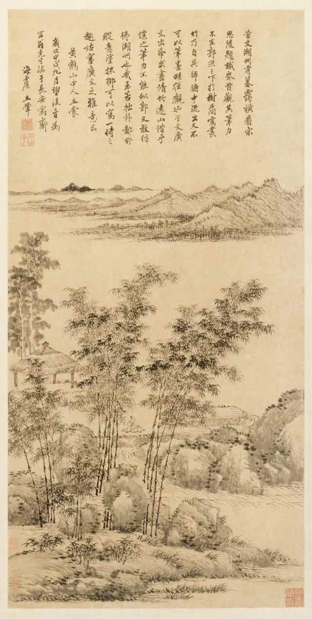
Early on, I had thought to combine elements from Hamonshū with other artwork, primarily ink landscape paintings from the Qing Dynasty and Edo periods: two such examples being Tall Bamboo and Distant Mountains, after Wang Meng (Wang Hui 王翬, 1694) and View of West Lake (Ike Taiga, 1700s). I made attempts, but the elements never really combined properly. I eventually realized I was trying to combine close-up studies of water with adaptations of much larger works, and the scale of the brush strokes was clashing. At that point, I abandoned the paintings and concentrated exclusively on Hamonshū.
As the various design elements came together, I went looking for fonts to use. I originally thought to use variable fonts, but I kept coming back to IM Fell, a typeface I’d seen Simon St. Laurent use and had put to my own purposes in an experimental typeset of Neal Stephenson’s Mother Earth Mother Board. IM Fell has a sort of nautical feel to it, at least to me, which fit nicely with the water elements I was adapting from Hamonshū, so I ended up using it as a “site elements” typeface. It’s what’s used for the site name in the header, the main navigation links, metadata for posts, sidebar heading text, the h1 on most pages, and so on.
Originally I used IM Fell for the titles of blog posts like this one, but it didn’t feel quite right. I think it caused the titles to blend into the rest of the design a little too much unless I kept it relatively huge. I needed something that felt consistent, but distinguished itself at the smaller sizes I needed for post titles. I went back to Google Fonts and scrolled through the choices until I narrowed down to a few faces, of which Eczar was the eventual winner. In addition to using Eczar for post titles, I also employ it in the site’s footer, at least wherever IM Fell isn’t used. The general body copy of the site is Georgia Pro, falling back to Georgia or a generic serif as needed.
One of the limitations I set for myself was to be reasonably lightweight, and that was a major part of the process. The details merit a post or two of their own, but my overall goal was to get even the post archive pages under a megabyte in total. I’m pleased to say I was able to get there, for the most part. As an example, the main post archive page is, as I write this (but before I posted it) 910.98KB, and that includes the various photographs and other images embedded in posts. The time to DOMContentLoaded over WiFi is consistently below 200ms, 400-500ms on “Regular 3G”, and 500-600ms on “Regular 2G”, all with the local cache disabled, at least when the server is responding well. I still have work to do in this area, but I was comfortable enough with the current state to launch the design publicly.
Since I was redesigning anyway, I did some sprucing up of various subpages. Most notable are the Toolbox and Writing pages, which use a number of techniques to improve organization and appearance. I still think the top part of the Writing page could use some work, but it’s leagues better than it used to be. The one major page I’d like to further upgrade is CSS Work, but I’m still looking for an approach that is distinct from the other pages, yet thematically consistent. If I can’t find one, I’ll probably take the same general approach I did for Toolbox. I also rewrote some of the microcopy, such as the metadata (publication date, categories, etc.) at the bottom of blog posts, to be more evocative of the feel I was going for.
Late in the process, I got a welcome assist from Jesse Gardner, who had seen a preview of article design. He had the idea to make a traced SVG version of the “Hand Made With Love” necklace charm from the masthead of the previous design, and then he just up and did it and sent me the file. You’ll find it in the footer of the site. It isn’t interactive, although it may in the future. I haven’t decided yet.
I really hope you enjoy the new look. It’s the first design I’ve done that wasn’t cribbed off someone else’s site in, oh, 15-20 years, give or take, and I’m rather proud of it. It won’t win any awards, but it makes the statement I want it to make, and visiting my own site gives me a little glow of satisfaction. I don’t know if I could ask for more than that.