Posts in the Standards Category

(X)HTML Validator Upgrade in Beta

Published 22 years, 1 month past

The W3C has released a public beta of a major upgrade to their HTML validator, and authors are very much encouraged to try it out—I did!  It adds a lot of new things to the service, including better handling of document MIME types (like application/xhtml+xml) and more.  One of the validator’s lead developers e-mailed me about it, and then dropped this comment in at the end of the message:

The new CSS is loosely inspired by your stuff (well, that’s probably true for most CSS these days I suppose).

Pardon me while my ego starts beating its chest and howling.  (And Kat’s not home to keep it under control, either.)


Wired With Standards

Published 22 years, 1 month past

Wired News has redesigned their site, and not just the front end, either: the really important stuff all happened behind the scenes.  Using no tables to lay out the page, but instead applying CSS to XHTML, the site is a stunning example of how standards can be made to work today.  They have an article with some details (and a few quotes from yours truly).

There are a few flies in this ointment, but they’re fairly understandable.  The pages don’t always validate, in part because of third-party advertisement code (which is notoriously horrible) and in part because converting seven-plus years of pages isn’t a simple task.  Actually, most of their validation errors seem to involve unencoded ampersands in URLs, which ought to be easy enough to fix.

The Web Standards Project calls this a gutsy move, and I agree.  A site with their kind of traffic has to make a big commitment to do something like this and stick to it.  The management of Wired is to be applauded for approving this move, and the men behind the scenes deserve even more applause for their work.  Look for a DevEdge article soon where we interview Douglas Bowman, the point man on the Wired redesign.


Catching Up

Published 22 years, 1 month past

In all the head-pounding over learning XSLT last week, I let some things slide by without comment, so I’ll try to cover them all in a single post.  (And remember, if you have an RSS aggregator, you can syndicate these posts via my RSS feed!)

In early November, I’ll be appearing at Meet The Makers New York on a “standards mini-panel” with Jeffrey Zeldman, so I’d better get around to calling Moishe.  There will also be a San Francisco Meet The Makers where my co-worker Arun will be on a panel with Tantek Çelik of Microsoft.  You might be able to score a free VIP ticket to either event if you hurry (and are willing to fill out the questionnaire).

I’ve added more information to the upcoming events on my Speaking page, including promotional codes for events that have them.  I disclose when using a code will make me money, and have been thinking about ways to turn those into community-building exercises.  Maybe I’ll take everyone who used my code(s) to a group dinner, assuming I can come up with a way to verify code use.

Last week, we published a CSS2.1 Quick Reference sidebar tab for Gecko-based browsers, and French translations of the CSS2 and DOM2 sidebar tabs, to the Sidebars area of the DevEdge Toolbox.  I also published a technical note on fixing list-item marker size in the NS6.x series.

Over the weekend, I not only dug into more XSLT (which almost made me pound my head against a wall, again), but I wrote some Javascript bookmarklets to help manage the administration of css-discuss.  It’s been a while since I thought of myself as a programmer, and I certainly am no expert—but it’s been good to stretch those mental muscles again, after so long.  The neural paths needed for exploring and using CSS and structural markup aren’t the same as those needed for programming.  The sense of achievement I felt when I figured out how to do what I wanted to do was a welcome change of pace.

It’s really cold in our house right now, but at least the shaking and banging of workmen dismantling our 82-year-old boiler has stopped.  Kat and I are sort of sad to see the old beast go, but since it had suddenly started leaking enough carbon monoxide to form its own atmospheric system, we don’t exactly regret replacing it.  The replacement boiler is almost ridiculously smaller than our old boiler.  I have trouble believing that it can heat the basement, let alone the whole house.


KPMG Revisited

Published 22 years, 2 months past

A point of followup on the KPMG fix: It turns out that the fix works almost completely in Opera 6/Win, even when it identifies itself as Opera (as my copy does).  The little yellow-box navbar thing zips along quite speedily, but the drop-downs for “Search,” “Contact Us,” and “Country Selector” can be really slow, while other times very zippy.  Also, one of the “close dropdown” buttons doesn’t work.  I don’t know why, but I suspect these are easy to fix.

Here’s the kicker: I didn’t do any Opera testing until this afternoon.  As I carried out my fixes, I didn’t make one single coding change with Opera in mind, and yet the page is 95% fixed for that browser.  That’s the whole point of using standards—you can be almost completely browser agnostic.  The other 5% that doesn’t work in Opera is probably due to either a DOM bug in Opera—no browser is perfect—or (more likely) my fumbling attempts to get the code based on the W3C DOM wasn’t a complete job, and I left some non-standards stuff in there.

Will it work in Konqueror?  In OmniWeb?  I don’t know, but if they support the correct W3C standards, then the answer is “yes.”  It’s the same answer for any browser that supports Web standards.

I’d also like to reiterate for those of you planning to dig into the source of the fix that it’s not an example of completely  standards compliant design.  It’s merely an example of how one person, with a modicum of effort, was able to take an outdated design method and hack in some semblance of standards support in order to take a broken site and make it work in multiple browsers.  It isn’t perfect, but maybe it’s a start.  Share and enjoy.


It’s Like KPMG.com, Except It Works

Published 22 years, 2 months past

In the course of about two and a half hours yesterday afternoon, I hacked together a fixed version of KPMG.com.  It works consistently in Gecko-based browsers and Internet Explorer for both Macintosh and Windows (at least in IE5.5/Win, which is what I have).  This despite the fact that my version does no browser sniffing at all: the same scripts are handed to whatever browser comes to visit.  I would have posted all this yesterday, except KPMG’s Web site (from which I pull all the images) went offline yesterday afternoon, just as I uploaded my fixed version.  Weird.

My fix is not, I should point out, a full makeover into total standards-compliant code and markup.  I left the poorly structured HTML more or less alone, save for the minimal changes I had to make to get the page cross-browser savvy, like converting name attributes to id attributes.  Similarly, I touched only those pieces of the Javascript that needed to be changed.  And I didn’t try to make the DHTML effects more efficient, or speed them up for Gecko, whose dynamic performance still lags behind Explorer.  Thus in Gecko-based browsers the effects will seem sluggish.  Nevertheless, they do work and the page does lay out correctly in the Explorer and Gecko families, which is a heck of a lot more than we can say for the actual site.  I don’t know about other browsers because, in all honesty, I was only willing to sink so much time into a non-paying project.

As I say, this took me about 150 minutes to accomplish, and it would have been less if I hadn’t had to research DOM-compliant event handling (thank to kirun for hooking me up with the answer!).  Remember, I’m a CSS guru, not a DOM and Javascript expert, so it took me longer to figure everything out.  A full makeover to a no-font, minimal-table, optimized, and fully DOM-based script version would have taken a couple of days, most likely.  Add another day to make the way the page is put together rational, since right now the way the script routines fit together is a little frightening.  And there are other problems with the site, like serving CSS files with the MIME type application/x-pointplus, but those seem like incidentals.  Correction: kpmg.com’s CSS files are in fact served up as text/css; it’s kpmg.ca‘s CSS files that are the wrong MIME type.  My apologies to the server adminsitrator(s) at kpmg.com for my incorrect assertion.

In total, a complete makeover lasting three days would still be—even at top-drawer consultancy rates—around US$6000.  Compared to what the site probably cost to develop badly, that’s an amazing bargain.  If even one customer using, oh, let’s say AOL for OS X, was able to browse the site and decided to sign a contract with KPMG, the work would more than pay for itself.

Oh, and I almost forgot: KPMG.com has been broken for well over a year now, as detailed in Bugzilla entry 83846.  We know from that entry that KPMG got e-mail about the problem on 10 July 2001.

With any luck, they’ll take the work I’ve done and use it, seeing how as I’ve written them and offered it at no charge.  Feel free to add your own voice to the process; you could even use the contact form on the fixed version, and if you’re using a Gecko browser, you’ll have to since the actual KPMG site is, you know, broken in your browser.  If they’re afraid of what it might do in Explorer, they could still use their server-side sniffing to give any Gecko agent the fixed version (DevEdge has a good article on Gecko detection).  Of course, I think they should just offer up a standards-based site as the default, but hey, I’m only one guy.  No doubt a large corporation that couldn’t fix its own site problems knows far better than I do.  Hmmm… was that too bitter?

KPMG.com Fall Down, Go Boom

Published 22 years, 2 months past

Life is so damned ironic sometimes I have to pause in wonder.  While taking a break from doing technical review on a book exhorting standards-based site design, I spotted on Zeldman (and he spotted it at Supafamous) a note that KPMG‘s Web site (as well as its Canadian counterpart) completely shatters in Mozilla, Netscape 6+, and basically any other non-IE browser.  (Unless it’s Opera, in which case the Canada site doesn’t even let you in at all.)

Why does this happen?  Bad browser sniffing.  Somewhere on KPMG’s server(s), a script looks at the user agent string of the browser asking for a page.  For Gecko-based browsers like Mozilla et.al., this script decides that it’s dealing with Netscape 4.x, and so hands over a script that’s tuned for said browsers.  An tiny little excerpt:

if (tar == 'A') {
  document.layers['search_form'].document.forms['searchFormA'].submit();
} else {
  document.layers['search_nav'].document.forms['searchFormB'].submit();	
}

There’s plenty of other broken stuff, like dynamically writing out layer elements and setting the visibility of said layers to hide, instead of the correct value, hidden.

This is a perfect example of why browser sniffing is nearly always a terrible idea: failure is never more than an unrecognized (or misidentified) browser away.  I’ve taken a look at the page in Explorer, and I’m pretty sure the page can be rendered the way they want it in Gecko-based browsers.  The question is this: should I invest the personal time and energy to offer them, for free, what Razorfish probably charged them a very large sum of money to not deliver?

In the end, thanks to my annoyingly ingrained sense of community good, I probably will.  I’ll let you know how it turns out.  In the meantime, I have to get back to that technical review.


Inaccessible Accessiblity Information

Published 22 years, 3 months past

Remember the flap, back in April, when the Section 508 site‘s markup didn’t validate?  Guess what: it still doesn’t, but that’s not what I’m here to talk about.  I just found, thanks to a co-worker, a story almost as good.  It involves Microsoft’s Accessibility page.  Think it’s accessible, let alone legible in anything other than Explorer?  Hah!

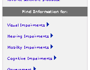
Given my employer, I thought about taking a pass, but you know what?  To heck with it.  I’d be taking Microsoft to task over this if I worked for myself, so I’m going to do it now.  So here’s the deal: go to the page using a Gecko-based browser like Mozilla.  Or use Opera, which has its own display problems, but which aren’t the ones I’m about to describe. A screenshot showing poorly styled links on Microsoft's Accessibility page. Okay, take a look at the links on the right side of the page.  Nice.  Even someone with my eyesight can’t read that text without major squinting.  I suppose there’s a witty remark to be made about forcing the user to squint at a link to a page on “Visual Impairments,” but in a rare display of moderate taste, I’m not going to make it.  Now look at the left rail.  A few of the links, and all of the search area, are completely gone (you may have to compare the page in Explorer to see what I mean).  They’ve been pushed out of the top of the left rail.

Are these display errors due to bugs in Gecko?  No.  They’re due to sloppy authoring practices made possible by bugs in Explorer.  To wit:

  • The teensy link text is due to the site’s use of font-size: x-small for the table that encloses the links.  IE thinks x-small is one “step” below the user’s default font, when in fact it’s two “steps.”  To give some rough approximations, IE thinks it’s 80% normal whereas it should be 60% normal.  (Those percentages are close to reality, but remember that CSS doesn’t define how big or small the keywords should be.)  Changing the value to small gets you a decent display in Gecko, but of course the text gets bigger in IE, which thinks that small is the same size as the user’s text.  As opposed to, say, medium, which is clearly defined to be the same size as unstyled text.  Todd Fahrner has written about this topic far better than I ever could; see “Toward a standard font size interval system” and “Size Matters” for details and good advice.
  • The cut-off links and search area are due to stupid table tricks.  The entire left rail is a single table cell with a bunch of stuff inside it—no great surprise there.  But how does Microsoft try to get the content of the rail up against the top of the cell?  By sticking in a table with a height of 100% below the rest of the cell’s contents.  IE assumes that if an element is too tall, then it should be resized.  Gecko, on the other hand, properly calculates the height of this table to be equal to the height of the entire left rail.  So you have a table as tall as the whole rail, and then more content above it, and all of it is vertically centered in the rail… which means the visible content gets pushed out of the cell.  The fix?  What most any Web designer would have done in the first place: add valign="top" to the rail’s cell.

In addition, the page’s markup comes nowhere close to validating (of course!) and is composed of so many convoluted, nested tables, spacer GIFs, and font tags that I shudder to contemplate what a screen reader, or a text-mode browser, might end up displaying.

It’s not like these particular authoring errors were difficult to spot, or even to fix.  Tracking down the source of the problems and fixing them took me about 20 minutes, tops.  I think I’ve spent more time writing and editing this rant than I did on the diagnosis and testing of the fixes described above.  Of course, there are doubtless other problems on the page, but if so they weren’t immediately obvious—and as much as I’d love to spend my days fixing obvious authoring mistakes for other people, I only have 50 or 60 more years to live.  I hate to start a project when I know I can’t finish it.

What is it about accessibility sites that brings out the absolute worst in the Web and its authors?


Tuesday, 11 June 2002

Published 22 years, 5 months past

Today, on the fifth anniversary of Navigator 4.x’s release, the Web Standards Project rebirthed itself.  Check it out—the sprightly new site is remarkably free of birthing fluid!  And even this soon out of the womb, the WaSP has some things to say to you, not all of them soothing.

Speaking of NN4.x turning five, Scott Andrew has some things to say about that.  Go now, before the day is over.  In addition to some lovely digital artwork, it’s haikuriffic!


Browse the Archive

Earlier Entries

Later Entries