CWRU2K
Published 6 years, 2 months pastBefore I tell you this story of January 1st, 2000, I need to back things up a few months into mid-1999. I was working at Case Western Reserve University as a Hypermedia Systems Specialist, which was the closest the university’s job title patterns could get to my actual job which was, no irony or shade, campus Webmaster. I was in charge of www.cwru.edu and providing support to departments who wanted a Web presence on our server, among many other things. My fellow Digital Media Services employees provided similar support for other library and university systems.
So in mid-1999, we were deep in the throes of Y2K certification. The young’uns in the audience won’t remember this, but to avoid loss of data and services when the year rolled from 1999 to 2000, pretty much the entire computer industry was engaged in a deep audit of every computer and program under our care. There’s really been nothing quite like it, before or since, but the job got done. In fact, it got done so well, barely anything adverse happened and some misguided people now think it was all a hoax designed to extract hefty consulting fees, instead of the successful global preventative effort it actually was.
As for us, pretty much everything on the Web side was fine. And then, in the middle of one of our staff meetings about Y2K certification, John Sully said something to the effect of, “Wouldn’t it be funny if the Web server suddenly thought it was 1900 and you had to use a telegraph to connect to it?”
We all laughed and riffed on the concept for a bit and then went back to Serious Work Topics, but the idea stuck in my head. What would a 1900-era Web site look like? Technology issues aside, it wasn’t a complete paradox: the ancestor parts of CWRU, the Case Institute of Technology and the Western Reserve University, had long existed by 1900 (founded 1880 and 1826, respectively). The campus photos would be black and white rather than color, but there would still be photos. The visual aesthetic might be different, but…
I decided so make it a reality, and CWRU2K was born. With the help of the staff at University Archives and a flatbed scanner I hauled across campus on a loading dolly, I scanned a couple dozen photos from the period 1897-1900 — basically, all those that were known to be in the public domain, and which depicted the kinds of scenes you might put on a Web site’s home page.
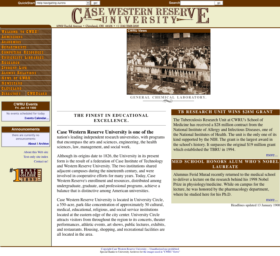
Then I reskinned the home page to look more “old-timey” without completely altering the layout or look. Instead of university-logo blues and gold, I recolored everything to be wood-grain. Helvetica was replaced with an “Old West” font in the images, of which there were several, mostly in the form of MM_swapimage-style rollover buttons. In the process, I actually had to introduce two Y2K bugs to the code we used to generate dates on the page, so that instead of saying 2000 they’d actually say 1899 or 1900. I altered other things to match the time, like altering the phone number to use two-letters-then-numbers format while still retaining full international dialing information and adding little curlicues to things. Well before the holidays, everything was ready.
The files were staged, a cron job was set up, and at midnight on January 1st, 2000, the home page seamlessly switched over to its 1900 incarnation. That’s a static snapshot of the page, so the picture will never change, but I have a gallery of all the pictures that could appear, along with their captions, which I strove to write in that deadpan stating-the-obvious tone the late 19th Century always brings to my mind. (And take a close look at the team photo of The Rough Riders!)
In hindsight, our mistake was most likely in adding a similarly deadpan note to the home page that read:
Year 2000 Issues
Despite our best efforts at averting Y2K problems, it seems that our Web server now believes that it is January of 1900. Please be advised that we are working diligently on the problem and hope to have it fixed soon.
I say that was a mistake because it was quoted verbatim in stories at Wired and The Washington Post about Y2K glitches. Where they said we’d actually suffered a real, unintentional Y2K bug, with Wired giving us points for having “guts” in publicly calling “a glitch a glitch”. After I emailed both reporters to explain the situation and point them to our press release about it, The Washington Post did publish a correction a few days later, buried in a bottom corner of page A16 or something like that. So far as I know, Wired never acknowledged the error.
CWRU2K lasted a little more than a day. Although we’d planned to leave it up until the end of January, we were ordered to take it down on January 2nd. My boss, Ron Ryan, was directed to put a note in my Permanent Record. The general attitude Ron conveyed to me was along the lines of, “The administration says it’s clever and all, but it’s time to go back to the regular home page. Next time, we need to ask permission rather than forgiveness.”
What we didn’t know at the time was how close he’d come to being fired. At Ron’s retirement party last year, the guy who was his boss on January 2nd, 2000, Jim Barker, told Ron that Jim had been summoned that day to a Vice President’s office, read the riot act, and was sent away with instructions to “fire Ron’s ass”. Fortunately, Jim… didn’t. And then kept it to himself for almost 20 years.
There were a number of other consequences. We got a quite a bit of email about it, some in on the joke, others taking it as seriously as Wired. There’s a particularly lovely note partway down that page from the widow of a Professor Emeritus, and have to admit that I still smile over the props we got from folks on the NANOG mailing list. I took an offer to join a startup a couple of months later, and while I was probably ready to move on in any case, the CWRU2K episode — or rather, the administration’s reaction to it — helped push me to make the jump. I was probably being a little juvenile and over-reacting, but I guess you do that when you’re younger. (And I probably would have left the next year regardless, when I got the offer to join Netscape as a Standards Evangelist. Actual job title!)
So, that’s the story of how Y2K affected me. There are some things I probably would have done differently if I had it to do over, but I’m 100% glad we did it.