One of the first rules of life is that first-hand information is always better than second-hand information. You can be more certain of something if you’ve seen it with your own eyes. Anything else is hearsay, rumor, conjecture—an article of faith, if you will. At the very minimum, you have to have faith that your source is reliable. The problems begin when sources aren’t reliable.
No, this isn’t a rant about the intelligence screw-ups previous to the invasion of Iraq. Instead, it’s a warning that inspector programs and saving as “Web page, complete” features can lead you astray.
One such example came up recently, shortly after I mentioned the launch of the new Technorati design. A question came in:
I did want to ask about the use of -x-background-{x,y}-position as opposed to background-position. If I understand correctly, the -x prefix indicates an experimental CSS attribute, so in what circumstances should one use this sort of experimental attribute instead of an official one?
I’d have been glad to answer the question, if only I’d known what the heck he was talking about. Those certainly weren’t properties I’d added to the style sheets. They weren’t even properties I’d ever heard of, proprietary or otherwise.
Just to be sure, I loaded the CSS files found on the Technorati site into my browser and searched them for the reported properties. No results. I inquired as to where the reporter had seen them, and it turned out they were showing up in Firefox’s DOM Inspector.
Now, the DOM Inspector is an incredibly useful tool. You can use it to look at the document tree after scripts have run and dynamically added content. You can get the absolute (that is, root-relative) X and Y coordinates of the top left corner of every element, as well as its computed dimensions in pixels. You can see the CSS rules that apply to a given element… not just the everyday CSS properties, but the stuff that the Gecko engine maintains internally.
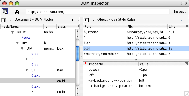
That’s where the problem had come in. The DOM Inspector was showing special property names, splitting the background-position values into two different pseudo-properties, and not showing the actual background-position declaration. This, to me, is a flaw in the Inspector. It should do two things differently:
- It should show the declaration found in the style sheet. There should be a line that shows
background-position and bottom left (or whatever), because that’s what the style sheet contains.
- It should present the internally-computed information differently than the stuff actually taken from the style sheet. One possibility would be to show any internal property/value pair as gray italicized text. I’d also like an option to suppress display of the internal information, so that all I see is what the style sheet contains.
The person who asked why I was using those properties wasn’t stupid. He was just unaware that his tool was giving him a distorted picture of the style sheet’s contents.
Don’t think Firefox is the only culprit in unreliable reporting, though. Anyone who uses Internet Explorer’s save as “Web page, complete” feature to create a local copy for testing purposes isn’t getting an actual copy. Instead of receiving local mirrors of the files found on the Web server, they’re getting a dump from the browser’s internals. So an external style sheet will actually be what the browser computed, not what the author wrote. For example, this:
body {margin: 0; padding: 0;
  background: white url(bodybg.gif) 0 0 no-repeat; color: black;
  font: small Verdana, Arial, sans-serif;}
…becomes this:
BODY {
	PADDING-RIGHT: 0px; PADDING-LEFT: 0px;
BACKGROUND: url(bodybg.gif) white no-repeat 0px 0px;
PADDING-BOTTOM: 0px; MARGIN: 0px; FONT: small Verdana, Arial, sans-serif;
COLOR: black; PADDING-TOP: 0px
}
Okay, so it destroys the authoring style, but it isn’t like it actually breaks anything, right? Wrong. For some reason, despite IE treating the universal selector correctly, any rule that employs a universal selector will lose the universal selector when it’s saved as “Web page, complete”. Thus, this:
#sidebar {margin: 0 74% 3em 35px; padding: 0;}
#sidebar * {margin: 0; padding: 0;}
…becomes this:
#sidebar {
	PADDING-RIGHT: 0px; PADDING-LEFT: 0px; PADDING-BOTTOM: 0px;
MARGIN: 0px 74% 3em 35px; PADDING-TOP: 0px
}
#sidebar  {
	PADDING-RIGHT: 0px; PADDING-LEFT: 0px; PADDING-BOTTOM: 0px;
MARGIN: 0px; PADDING-TOP: 0px
}
Oops. Not only can this mean the local copy renders very differently as compared to the “live” version, it’s also very confusing for anyone who’s saved the page in order to learn from it. Why in the world would anyone write two rules in a row with the same selector? Answer: nobody would. Your tool simply fooled you into thinking that someone did.
Incidentally, if you want to see the IE-mangled examples I showed in a real live set of files on your hard drive, go save as “Web page, complete” the home page of Complex Spiral Consulting using IE/Win. And from now on, I’ll always put “Web page, complete” in quotes because it’s an inaccurate label. It should really say that IE will save as “Web page, mutated”.
So if you’re Inspecting a page, or viewing a saved copy, remember this: nothing beats seeing the original, actual source with your own eyes. If you see something odd in your local copy, your first step should be to go to the original source and make sure the oddness is really there, and not an artifact of your tools.