Posts from 2004

Exceeding Expectations

Published 20 years, 9 months past

When I praised Apple yesterday for their repair service, I didn’t realize just how much praise was due.  I was so excited to get my laptop back with working hinges, I hadn’t looked closely at the rest of the exterior.  As TiBook owners know, the finish has a tendency to scratch.  I’m not sure why that is, although I’m sure a Google search could yield all manner of answer, but the upshot is that the back of the display panel had a few nicks and dings; even a small dimple that prompted someone to ask if the laptop had stopped a bullet for me.

Now it doesn’t.  The unknown technician replaced not only the hinges, but also the whole panel backing… and maybe even the whole display panel, screen and all.  Now the machine looks as sharp and smooth as the day I bought it.

Let me be clear: those scrapes had nothing to do with the hinge problem.  They were the result of “normal wear and tear.”  There was absolutely no obligation on Apple’s part to do anything about them, any more than it would be Dell’s responsibility to replace a plastic surface on a Windows laptop that had gotten a scratch after half a year of ownership.  While fixing the major problem, the unknown technician noticed that there was something else that could be fixed, and just went ahead and did it.  No fuss.  It wasn’t even noted on my repair history.  It was just done.

I’ve never been sorry to buy Apple products.  Now I’m actually proud to be a customer.

As a postscript, I’d like to point out that mine is an older-model Powerbook.  The new ones have a much more scratch-resistant surface, and a totally different hinge system.  On the new ones, there’s a single large and sturdy hinge that runs most of the width of the machine, occupying about the same amount of space as the gap between my hinges.  They have other improvements too, like a backlit keyboard and ports on the sides instead of in the back, and I wish I could have waited another two months to buy my laptop so I’d have one of the new ones.  Nothing wrong with mine—the new ones are just cooler.

For those of you using an RSS aggregator, you’re probably going to see all of my entries turn up as new a few more times.  I’m adjusting the way I produce the feeds to include an indication of the post length and the categories to which the post belongs as text at the end of the feed description.  I may also modify it to include the first sentence of each paragraph instead of just the first sentence of the entire post.

Incidentally, a few of you have asked why I don’t provide the complete post content in my feeds.  For me, it’s a bandwidth issue.  I was looking over the access statistics for January, and was astonished to find that the two RSS feeds together were accessed over 189,000 times.  The home page, by comparison, was hit over 53,000 times.  The latter accounts for 9.3% of the outgoing bandwidth; the two feeds together add up to 1.54%.  If I were to have the feeds contain full posts, that would increase RSS-feed bandwidth by an order of magnitude at least.  It would also reduce the number of 304 (Not Modified) responses the server returns for the RSS files, because I do go back and correct spelling errors and such.  The feeds don’t have to be updated when I do, but they would if I provided full post content.

I do have sympathy for those of you using aggregators like NetNewsWire (I’m using the Lite version, myself) and FeedDemon.  I’d have more sympathy for LiveJournal users if the LJ server returned 304s, but it never does, forcing me to download the whole feed every time I ask for updates.  So I did consider the syndication experience from the user’s point of view.  I also have to consider the impact on the server, and frankly, given the way RSS is designed, the potential impact is just too high for me to move to full-content feeds.

So now you know.


Unhinged

Published 20 years, 9 months past

Ordinarily, you’d think that an almost weeklong absence indicates a major project, or maybe an illness, or some other major life event.  Not this time.  This time it was a major computer hardware failure.  Not a hard drive, nor a monitor, nor anything you might usually suspect.  No, this was far more basic.

Not too long after I posted the previous entry, I was working on my TiBook in the living room.  Kat asked me to get something—probably a milk blanket or a pacifier or something baby related—and so I put the laptop, still open, down on the ottoman.

There was a sharp cracking sound.

As it turned out, it had actually been two cracking sounds.  Both hinges that connect the laptop’s display panel to the body had snapped clean away from the panel.  A broken display hinge on a 15-inch TiBook Longtime readers may recall I had a similar experience about this time last year while in Santa Fe, New Mexico.  Apparently that wasn’t some bizarre and isolated incident.  In both cases, I had let go of the laptop panel when it was an inch or two above a well-padded surface.  In both cases, something had given way.  Amazingly, in both cases the laptop screen continued to function.  The extra problem with this latest breakage was that since both hinges had failed, there was nothing to hold up the screen.

Luckily, a few months back an Apple Store opened up in a new mall about five miles from my house.  I’d been meaning to get up there and check it out; last Wednesday, I finally did.  I would have preferred better circumstances, obviously.  So I took my broken laptop to the Genius Bar.  As I opened it up and laid it flatter than a TiBook should really ever be, a guy standing nearby said, “Gosh, I’ve always wished I could open my PowerBook up that far.”

“I can show you how,” I said with an arched eyebrow.  He declined the offer.

So after looking over the whole machine and hearing my description of how it had happened, the Genius’ guess was that the hinges had been over-torqued.  They had been rather stiff ever since I got the machine, actually; it was almost impossible to open the laptop with one hand.  So Alan (the Genius) made some notes to the effect that it was a hardware failure, and not the result of abuse, and that it was a covered repair.  I changed the administrator password so they could get to the desktop if need be, shut down the system, and then handed the machine over to be shipped to a repair center.

It arrived back at the Apple Store today.  That’s five days to ship, repair, and return.  It’s one more day than the last time, but there was a weekend involved.  The new hinges are a lot smoother than the old ones, too.  I’m once more impressed by the speed and service Apple provides.  So thanks to Alan at the Genius Bar, to the unknown technician who repaired my poor baby’s spine, and to Apple for continuing to make me glad I’m a customer.  Of course I’d rather the laptop had never had any problems, but there will always be problems.  The mark of a good company is that they address those inevitable problems professionally and with a minimum of hassle for the customer.  As far as I’m concerned, that describes Apple in full.

  • Unhinged was published on .
  • It was assigned to the Mac category.
  • There have been no replies.

Confess! Confess!

Published 20 years, 9 months past

Okay, so I can’t count.  I claimed yesterday that there were three new XFN tools, and then listed four.  Plus I missed one.  So… among our many XFN tools are rubhub; Rubhub It; Autoxfn; the MT template; Daniel Glazman‘s Nvu, which supports the editing of XFN values on links as part of the UI; and an almost fanatical devotion to the Pope.

Based on the feedback to my question yesterday, it seems the #1 reason to link to your Amazon wish list is to help out family members who can’t seem to remember what you like whenever a birthday rolls around.  The other reason given was to provide a window into your interests, which is felt to help foster a sense of familiarity in what can sometimes seem an impersonal medium.  Fair enough.  I did something along those lines when I added the “Reading” feature (with archive) to my personal page.  Perhaps the only real difference is that I’m giving a current and backward glace at my interests, whereas the wish list link provides a forward look.

A couple of people also wrote to say that they actually have had random passers-by send them something off of the wish list, sometimes in thanks for a favor they’d done online, and that it was pretty neat.  I’m not sure I’d feel the same way, but I thought I’d pass along their feelings on the matter.

Speaking of passing things along, I promised that I’d summarize the suggestions I received regarding books presenting reasonable arguments for the conservative point of view.  Here’s the summary.

  • Letters to a Young Conservative by Dinesh D’Souza
  • Radical Son by David Horowitz
  • The Content of Our Character by Shelby Steele
  • The Death of Right and Wrong by Tammy Bruce
  • First Principles: A Primer of Ideas for the College-Bound Student by Hugh Hewitt
  • The Revenge of Conscience: Politics and the Fall of Man by J. Budziszewski
  • A National Party No More: The Conscience of a Conservative Democrat by Zell Miller

I also received e-mail from liberals who had been looking at the same issue, and wanted to mention some books they thought were good.  They are:

  • Conflict of Visions by Thomas Sowell (for a look at both sides)
  • The 2% Solution by Matthew Miller
  • The Politics of Rich and Poor and other books by Kevin Philips

Please note that I have not read any of the books I just listed, and so am neither recommending nor condemning any of them.  Similarly, I’m passing along an unchecked recommendation for The Weekly Standard, not to be confused with The Weekly Standards.

Those of you more interested in the latter of those two links will probably also be interested in the Web Standards Awards, with three awards to be given every month.  You can submit any site for consideration, whether it be your work or someone else’s, but be sure to check the competition criteria first.  The first three winners are already listed on the site.  Check them out—there’s some great work there—and then go check out Wasabicube.  It’s elegant, lovely, and I love the current-page effect in the sidebar.  Now I want to redesign meyerweb again, except if I did it would be a ripoff of Peter’s design.  So I’d probably better refrain.


Feeling Friendly

Published 20 years, 9 months past

The Web is getting more and more friendly.  In the past two weeks, there have been three XFN tools that were announced: 

Can you feel the love?

While I was trawling personal sites. I kept seeing something I that I just don’t get.  There seems to be a small trend toward posting a link to one’s Amazon wish list.  What’s the goal?  Is it just a convenient way to say, “Here’s what I like”?  Do you assume, or hope, that a random passerby will decide to buy you something off of the list?  And wouldn’t it be kind of creepy if they did?  Somebody clue me in.  I mean, yeah, social networking is interesting and I’m all for the spread of information, but this seems like it might have crossed a line.  I only wish I could decide which one.


Au Naturel

Published 20 years, 9 months past

The masthead has changed, as those of you dropping by will probably notice but those of you depending on RSS might not.  Like the first week’s masthead, this one is based on an old meyerweb theme (“Natural”).  At this point I plan to change the masthead every Sunday until I run out of new ones, at which point I’ll start randomly cycling through the old ones on a weekly or twice-weekly basis.  I’ll decide when the time comes.

I got several screenshots from helpful correspondents pointing out that the Redesign Watch and Platelets modules either do sit next to each other, or don’t, apparently depending on your native time zones.  Or maybe whether your house’s street address is even or odd, I don’t know.  So when you get right down to it, this seems to be a pseudo-random problem at best.  The layout works for me in every browser I tested, both Mac and Windows.  At this point, I guess it’s up to the whims of the Layout Gods.

I’ve spent the past week feeling more and more downcast about the state of America.  Why?  Janet Jackson, of course.  A one-second glimpse of half a woman’s chest has lead to an FCC probe (which seems an unfortunate choice of words), the possibility of several million dollars in fines for CBS, digital delay for the Grammys and Oscars, an enforced edit of ER by network executives, and a complete change to the Pro Bowl’s halftime show.  Apparently, Ms. Jackson’s right breast wields more power than we could possibly comprehend.  What would happen if she revealed them both at the same time?  The world trembles in fear.

No word on whether the FCC also plans to investigate CBS in relation to the rapes, murders, assaults, thefts, and other ‘immoral’ behavior depicted on CSI and CSI: Miami, or for its willingness to charge enormous sums of money to run advertisements featuring flatulent horses and crotch-savaging dogs.


It’s Always Something Else

Published 20 years, 9 months past

According to a correspondent, the Redesign Watch and Platelets columns don’t actually sit side by side in Linux, but instead the Platelets drop down to start after the end of Redesign Watch.  This is, apparently, consistent across his various Linux browsers, including IE/Win (using crossover).  I’m not sure I can explain this.  The widths of the two divs that contain those modules are set to 9.5em and 5.5em, respectively, and they have neither margins nor padding (nor side borders).  Add them together, and you get 15em, the exact width value of div#extra.  I was going to claim a rounding error, except it’s happening in all his browsers, so now I’m thinking maybe a font thing.  I might suspect that the Platelets float is expanding its width to enclose the content, except explicit-width floats shouldn’t change width even if its content won’t fit.  IE/Win might do that, but I wouldn’t expect it from Firebird/Mozilla, which apparently also has the problem.

As with any experiment, the design here will probably slowly evolve as I run into such things.  As an example, I may adjust the widths of the two modules slightly, perhaps to 9.25em and 5.75em, just to see if it causes more problems or not.  I knew that, in setting widths so closely to each other and to their inherent content widths, I was taking a risk.  I don’t see the risk as any greater than using a table, though: if I did drop those modules into a two-cell table, then the content might push the table to be wider, thus having it stick out of the sidebar entirely.  That would be fairly awful.  So, as usual, it’s all about tradeoffs.  Here, I traded away “always stay next to each other” to get “always stay within the sidebar.”

As silly as this progression of creeping fixes might seem, it’s nothing compared to what Morbus Iff went through in an attempt to make Panther act the way he wanted it to act, and indeed the way Jaguar acted.  I suspect there are similar tales of woe from any major power user of any operating system, or any technology for that matter.  The more you know, the easier it is to get yourself trapped by unexpected changes.

For example, there have been some problems with the CSS validator of late; Mr. Zeldman has all the details.  As a result, there’s been some confusion here and there about the validity of the Box Model Hack.  Let me be clear up front: the hack is valid.  It always was, and always will be unless the CSS grammar undergoes some fairly radical changes.  This is an entirely different question than whether or not you should use it, or any other hack—that’s much less clear.  I’m not saying that the hack is Good or Bad.  I’m saying that it is completely valid according to the CSS grammar.

Historical note: the Box Model Hack was derived from test p.twentyb in section 7.1 of the CSS1 Test Suite.

Here’s the heart of the matter, the part that causes most people to assume that the hack isn’t valid:

voice-family: ""}"";

I know, it looks like a burst of line noise, or maybe a regexp (but I repeat myself).  It’s still quite valid.  It’s an attempt to supply a voice-family value of "}", while quoting that value.  This is analagous to:

font-family: "New Century Schoolbook";

Now suppose we had a font family named Joe "Average" Public, with the quotes being a part of the name.  We’d likely want to quote the name when making it part of a value.  Thus, we’d need to escape the quotation marks that are in the family name itself, like so:

font-family: "Joe "Average" Public";

In order to keep the quotes in the name from breaking the value up, they’ve been escaped using a back-slash.  That’s part of the CSS grammar.  In that light, then, reconsider the name "}".  If it’s to be quoted, then the quotes in the family name have to be escaped.  Thus, highlighted part of the following example is the escaped voice family name:

voice-family: ""}"";

Therefore: a valid hack.  Again, I’m making no claims that using the hack, or indeed any hack, is a good idea or a bad idea.  I just wanted to make clear how this particular hack works, and that it conforms fully to the CSS grammar.

This is at any rate better than the recent FrontPage ad that’s making the rounds of standards-aware folks.  I’ll just point to Dave Shea‘s post, which contains both a link to the ad in question and a useful hint to understanding why it’s so funny.


It’s Always Something

Published 20 years, 9 months past

Anyone visiting the main page of meyerweb with IE6 in the last fifteen hours (it’s now about 1300 EST) may have noticed the sidebar was intruding into the main content column, and generally looking icky.  The problem has now been fixed.  It happened thanks to, of all things, a bug in IE/Win’s rendering engine.  (Gasp! No!  How can this be?)

Here’s what happened.  I added the “Redesign Watch” and “Platelets” lists to the sidebar, which is actually marked with an id of extra in the source because it’s what I regard as extra material; it comes after the page’s content in the source.  I wanted the two lists to be side by side, and here’s how I originally did it:

#extra #redesigns {float: left; width: 9.5em;}
#extra #platewatch {margin-left: 9.5em;}

Simple enough, or so you’d think.  Instead, this caused IE6 to push the sidebar about half an em to the left, which is what led to the overlap.  The (previous) link at the bottom of the Platelets column was also way out of joint.  If I removed the two lists, then everything went back to normal.  So clearly IE/Win was having trouble with the floats, or perhaps with floats inside a positioned element.  At any rate, it was the new material that was triggering a bug.

I seriously considered doing this:

#extra>#redesigns {float: left; width: 9.5em;}
#extra>#platewatch {margin-left: 9.5em;}

By using the child-selection combinator (>), which IE/Win doesn’t understand, I could have entirely hidden both rules from IE/Win.  That would have meant the Redesign Watch and Platelets lists would simply follow one another, as Destinations does Navigation, because none of the floating or margin-modification would have been allowed to confuse Trident (IE/Win’s layout engine).  This solution, while practical, didn’t really satify me, so I decided to try another approach.  Perhaps floating both elements will be sufficient, I thought.  So:

#extra #redesigns {float: left; width: 9.5em;}
#extra #platewatch {float: right; width: 5.5em;}

It worked: the two lists ended up side by side as I wished, and the sidebar was no longer pushing its way into the main content column.

This should not have been a real surprise to me, as I’d been aware that IE/Win has trouble with floats overlapping the margins of normal-flow elements that follow them in the document source.  I just forgot, which I seem to do pretty regularly—it’s the one IE/Win bug I can’t seem to permanently store in long-term memory.  I have some hopes that writing it up will help affix it in my brain, in addition to helping out anyone who’s had similar problems with their layouts.

Thanks to The Ferrett for pointing out the layout problem, so I could track down and fix it.  I hadn’t sworn at IE enough this week anyway.

I also rediscovered Explorer’s lack of support for the keyword inherit.  So the “previous” link in the Platelets column will use a monospace font in IE.  Other browsers will properly see it in the site’s default font (Arial, as of this writing).  I could write a rule or two to make the display more visually consistent, but I decided against it.  In this case, I’ll accept the visual evidence of limitations in IE over needlessly complicating my CSS.

Oh, by the way… did you notice that I added HTML+CSS redesign and license-plate information to the sidebar?  My personal page also has a new sidebar feature, one which will be of particular interest to anyone who wants to know what I’m reading in my few spare moments.  These are all the result of my working on creating “blogmark”-type data structures and pushing them live via XSLT (<shudder />).  I haven’t bothered to set up individual RSS feeds for them, but it wouldn’t be difficult.  I may extend this to a real “blogmark” area where I point at stuff that I find interesting, but don’t want to spend time writing about.  Most of the things I’d be likely to link I’d be getting from other people’s blogmarks anyway, and somehow the process of taking someone else’s blogmark and turning it into a local blogmark just seems silly.


Love, Feline Style

Published 20 years, 9 months past

Ever since the day after Carolyn came home, our cat Gravity has mostly ignored Carolyn’s presence.  We’d been somewhat concerned that there would be hostility between them in the months to come, which wouldn’t really end well because Gravity still has claws.  Those concerns are now, for the most part, erased.  This afternoon, we discovered that not only has Gravity gotten used to Carolyn’s presence, but now regards her as a part of the family.

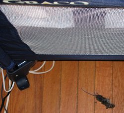
We know this because Gravity left Carolyn a gift—a freshly killed mouse, lying on the floor right next to the bassinet where Carolyn sleeps during the day.  A small mouse carcass lies on the floor next to the bassinet.  From what I understand, this is typically how mother-cats feed their children, and start training them to hunt for their own food.  I wished there were some way to communicate to Gravity that she could have her hunting spoils back, since Carolyn’s fairly well fed even without rodent supplements.  When you think about all this, it’s really rather touching, in a morbid way.  Kat and I both got a pretty good laugh out of it.

Of course, then I had to dispose of the carcass.

So Safari 1.2 is out, and of course was released just two days after I changed designs.  So the fix for the first-letter bug that occurred with “Thoughts From Eric” in the previous design is in place, but you can’t see it working here.  On the other hand, my recently constructed test page demonstrating Safari 1.1’s bugs with :hover and generated content show that 1.2 fixed the problem.  So, that’s cool.

What is even cooler is John Gruber’s in-depth exploration of the OmniWeb beta.  The “tabbed” interface, although not what I personally think of as tabbed, is still a welcome addition; I’ve found that I basically can’t live without tabs.  (I do a sweep of all my regularly read blogs by opening them all in tabs, via a bookmark group.)  What sounds really outstanding, though, is OmniWeb’s workspaces and site-specific preferences.  It’s probably enough for me to tolerate the obsolescence of the rendering engine, which is equivalent to Safari 1.0, but we’ll see.  You should see, too—go read John’s review of the browser, which is comprehensive and detailed.  Truly excellent.

Complete topic shift: back in September, Molly was aghast at the Quizno’s television commercial featuring an adult male human suckling at the teat of a wolf.  Well, their new ad campaign has launched, and if anything it’s more wrong.  Sure, it’s a complete ripoff of the Spongmonkeys, mostly because it turns out the same guy did bothWarning: if you follow the Spongmonkeys link, I am not responsible for any psychological damage you may suffer, but it is very much like the commercial.

Is it just me, or are commercials in general getting a lot weirder of late?


Browse the Archive

Earlier Entries

Later Entries