Posts from 2015

Friday Figure

Published 9 years, 2 months past

Just for fun, and maybe for a little bit of edification, I present to you one of the figures from the chapter on color, backgrounds, and gradients I’ve just finished writing for CSS: The Definitive Guide, 4th Edition.

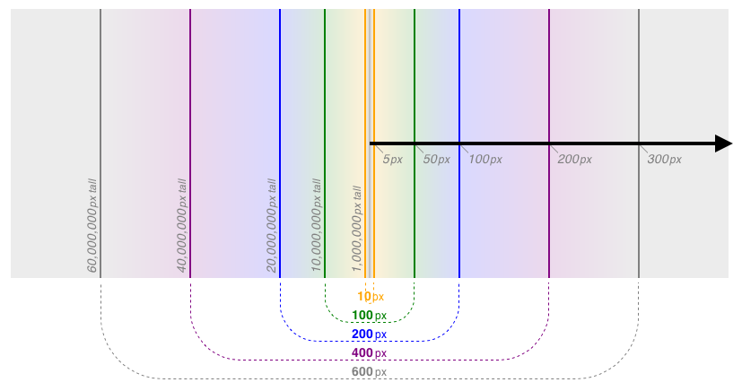
This figure is (at the moment) captioned “Very, very tall ellipses”; it’s a diagram of what happens if you create a radial gradient with no horizontal sizing.  (Whether you also have vertical sizing is actually irrelevant.)  The ellipses all get so incredibly tall that you only see the sides at their most vertical, which results in the appearance of a mirrored horizontal linear gradient.  This is of course explained in more detail in the chapter, and builds on a whole lot of previous text.

I had a much simpler version of this figure before, and shared it with Sara Soueidan, who had some very smart feedback that helped me get to what you see above.  The figure was finished not too long before i posted it; once it was done, I realized really liked the look, so decided on the spur of the moment to post it.  Thus the late-Friday timestamp on the post.

While the figure is a PNG, it’s actually a screenshot of an HTML+CSS file displayed in a browser — Safari, in this particular case, though most are done in Firefox.  All of the figures in the book will be created using HTML+CSS whenever possible.  Doing so lets me make sure I understand what I’m illustrating, and also allows me to change the look and arrangement of figures without too much difficulty.

So that’s fun with edge cases for this Friday.  If people like it, or more likely I just feel like doing it, I’ll post more in the future.


Run, Salmon, Run

Published 9 years, 2 months past

I was recently asked on Twitter about the status of the fourth edition of CSS: The Definitive Guide.  A fair question, given how long the project has lain dormant!  I have two things to announce on that front.

The first is that I’m really excited to say that Estelle Weyl has joined me as co-author for the fourth edition.  We’re working in parallel, tackling individual chapters and doing technical review of each other as we work.  Sharing the load, especially with someone as sharp and knowledgable as Estelle, will help get chapters out faster, and the overall book done sooner.

The second is that writing is once again underway, with four chapters in process.  I’ve got the transforms chapter done, and the backgrounds and gradients (and maybe foreground colors too) chapter almost done.  Estelle is nearing the end of transitions and animations, with flexbox up next.  What comes after that for each of us is a little bit up in the air, though I’ll probably tackle basic visual formatting next.  Unless I get distracted by something more interesting, of course — truth be told, I’ve been eyeing grid layout with some covetousness in my heart.

So, the book is once again underway, and actually has been for a little while now.  I can’t say with certainty when we’ll be done and ready to compile everything into the Doorstop Edition, but we’re pushing for this year or early next.

As an offshoot of this renewed push, I’ve been expanding and revising my CSS test files so that I can check my understanding of the specification, as well as test the fine details of browser support.  Over the holidays I decided, more or less on a whim, to commit the whole kit ‘n’ kaboodle to Github.  There’s no license and no readme, mostly because I didn’t think to establish either when I set up the repository.  Sorry, I guess?  In any case, I regard the CSS in the tests to be public domain, but the actual content (whether inline or replaced) of the HTML files may or may not be, so a single license would have been hard to assert anyway.  I mostly put the files up there as a form of open backup, and also to smooth out the process of managing updates to the tests between my local machine and meyerweb.  Feel free to make use of the tests for your personal education, though!


Writing for The Pastry Box

Published 9 years, 2 months past

I’m beyond pleased to note that my second piece for The Pastry Box, “Words, Words”, was published last week.  The first, “Sunrise, Sunset”, was published a month before that.  (It’s not about what you might think — and yet, and the same time, it is.)

For those who aren’t familiar with The Pastry Box, it describes itself thusly:

Each year, The Pastry Box Project gathers 30 people who are each influential in their field and asks them to share thoughts regarding what they do. Those thoughts are then published every day throughout the year at a rate of one per day, starting January 1st and ending December 31st.

It’s become much more than that, in my eyes.  In a lot of ways, The Pastry Box has become a place where writers feel free to stretch themselves and their writing, and to look at themselves and what they do in new lights.  It’s an incredibly valuable resource.  There are thoughts in their archives that touched, moved, and changed me.

I was invited late last year to be a contributor to The Pastry Box in 2015, and of course I said yes.  I accepted the invitation for a couple of reasons.  The foremost reason is, of course, the honor of being a Pastry Box contributor.  Over the past few years, they’ve had some of the greatest minds and writers of our field participate.  That’s even more true of this year’s roster, and I am completely humbled to join them.  The fact that this is the last year of The Pastry Box wasn’t actually a factor, as I’d have said yes in any year.

The second reason is that I’m very interested to see how I write in an environment where there are no comments.  No doubt this marks me for an anachronism, but it has literally been decades since I wrote for an online outlet that didn’t support reader comments.  That ever-present feedback channel is something I value, which is why I still support comments here, but I’m sure it’s affected how I write.  Not negatively, or even necessarily positively — it just affects the writing, or so I believe.  Over the course of 2015, I hope to find out if I’m right about that.

If you’d like to follow along, please follow The Pastry Box via RSS or Twitter (or both, as I do).  Not just for my few thoughts, of course, but for all the amazing contributors this year.  Already there have been insightful, funny, and deeply personal stories, and a new thought comes fresh-baked every day.  That’s why I’ve followed them in year past, and why I am still amazed and honored to be a part of their final year.


Gradient List Bullets

Published 9 years, 2 months past

CSS gradients are kind of fun.  I know, they’re a little clumsy at first, but I’ve found that with just a little practice, you can hand-author them without more than a brief refresher course on exactly how to structure the first part.  At least for me, as long as I can get the setup right, the color stops are a breeze.

As I’ve said in previous posts, gradients are images, just like a PNG or SVG or whatever.  That’s why you can write them directly into background properties and have them display.  The thing is, though, that you can use them anywhere a property accepts an image value.  Like, say, list-item-image and list-item.

Yes, that’s right: you can define gradient list bullets.  A test page I set up last week (and the screenshot shown nearby) demonstrates a few different possibilities, but there are so many more.

There are two major limitations I can see: one, you can’t layer multiple gradients together, the way you can with backgrounds.  You get one gradient image, and that’s it.  Two, this isn’t supported in Firefox, not even the nightly builds.  Every other desktop browser appears to support this, usually at least a couple of versions back, and a fair number of mobile browsers as well.  A bug has been filed by Boris — thanks, Boris! — so hopefully this limitation will fall away soon.

Fortunately, this is a textbook case of progressive enhancement.  You set the basic bullet style, then define something snazzier for browsers that can handle it (which is, again, most of them).  If your design somehow critically depends on the appearance of the list bullets, then you’ll need to use another approach.  Also, rethink your design.

A third limitation, one not nearly so momentous, is that the list bullets are kind of small as compared to the list items’ font size in most browsers, but a bit bigger in others (as Ana Tudor pointed out; thanks, Ana!).  So if you’re going to express yourself with list bullets, be bold and not too complex, and realize there will be some sizing differences across browsers.

A fourth limitation is performance.  If you make your gradients too complex, especially if they’re radial gradients, you may degrade the user experience, particularly on mobile.  As always, use your new-found power responsibly.  Thank you.


Words, Words

Published 9 years, 2 months past

R: “What are you playing at?”

G: “Words, words.  They’re all we have to go on.”

 — Tom Stoppard, Rosencrantz & Guildernstern Are Dead

My recent-inbox counter incremented by one, and I was between tasks, so I went to take a look.  It was a notification from Facebook:

Jesse Gardner commented on a link you shared.

"*gets some popcorn*"

Thanks,
The Facebook Team

I couldn’t figure out what would have provoked that sort of comment, so I went to look at the link I’d shared and came away even more confused.  What about the link was popcorn-worthy?  It wasn’t even a case of being an inappropriate response: it was so out of left field, it seemed literally disconnected from the post.  I seriously wondered whether it was a reply meant for some other post, accidentally dropped onto mine by some combination of multiple browser tabs and mental distraction.

So I asked, and it turned out Jesse was actually replying to an earlier comment on that link.  Once he clarified, his comment made perfect sense, and it was in fact quite funny.  What had seemed like a complete non sequitur was revealed to fit seamlessly into the conversation.

Words have such power, but none of it their own.  The words “commented on a link you shared” are so neutral, they make the Swiss look hyperpartisan, and yet they were sufficient to fit into my mental state in such a way that I was led completely astray.  I was so taken in by the idea that Jesse was commenting on the link, I never stopped to ask if he was participating in a conversation.

It wasn’t the words that led me astray, but my interpretation of them.  I led me astray.  Everything I brought to that moment of reading, all my experiences and biases, took the incredibly banal concepts encoded in those arbitrary marks and came to a conclusion that had nothing to do with Jesse’s original intent.  An entire flowering construct of incorrect, misleading assumptions grew out of that simple moment of unconscious interpretation.

No matter how hard we work to be clear, no matter how many words we spend on precision, no matter how carefully we choose our words, what people find in our words is more a product of their views than our efforts.

This is the dilemma of communication: we cannot control how people hear us, and yet cannot declaim all responsibility for what they hear.  If we express ourselves badly, or in a way that is misinterpreted by many, that is on us.

This is the dilemma of communication: we cannot control how people speak to us, and yet cannot declaim all responsibility for what we hear.  If we misinterpret another’s intent, or listen in bad faith, that is on us.

Words have such power, but none of it their own.  We invest them with all the power they have, each in our own way.  We rarely think about it, rarely make conscious decisions about what power we invest in which words.  I think we think far less about what we hear than what we say, and still less about why we hear what we hear.

Nothing about communication can be entirely one-sided.  We bring ourselves to the words that pass between us, every node in the network running on a unique protocol, striving for clarity in a landscape that seems built for confusion.

This is dilemma of communication: words.  Words.

This article was originally published at The Pastry Box Project on 2 February 2015.


Media Queries

Published 9 years, 3 months past

Thanks to a combination of my slow process of re-integrating into the web community and the Year in Review explosion at the end of 2014, I actually have some media appearances to tell you about.  (This is at least four times as weird for me as it is for you.)

Since I love the written word, I’ll start with the fact that I’ve been published at Slate Magazine.  As the whole Year in Review thing was going crazy viral, an editor at Slate emailed to ask if I’d consider republishing “Inadvertent Algorithmic Cruelty” with them.  I said I’d love to as long as I could revise the piece a bit, to which they readily agreed.  So I reworked the opening to be extra-clear about what had actually happened, gave it a closing that was better attuned to a wider audience than the few hundred web designers I assumed would read the original post, and they ran it.  (The headline was, I have to say, not my idea, but that’s how it goes in most magazines: editors write headlines.  I was at least able to suggest some tweaks.)

Shortly after that piece went live, I was asked to be part of a piece on Huffington Post Live about Year in Review (of course).  I was still in Tennessee when the segment aired, and our hotel’s wifi wasn’t up to the task of streaming video, but thankfully they were willing to have me on by phone.

I saved what I consider to be the best for last.  Jen Simmons just recently had me as a guest on The Web Ahead, where we talked for two hours about what my family has been through in the past two years, designing for crisis, Year in Review, what it’s like to have a story go viral on you, being intentional in the age of social media, new details about my AEA talk “Designing for Crisis”, the Metafilter dot, and a whole lot more.  Parts of it are emotionally difficult, but not too many.  We got pretty deep into what I’m thinking about design and where it should go, and in a few cases Jen posed questions that I couldn’t really answer, because they’re at or beyond the edge of what I’ve figured out so far.

Jen is such a great interviewer.  Not only did she ask great questions and then patiently let me ramble my way to answers, she brought really smart perspectives to everything we were talking about.  Listening to her observations and thoughts gave me several new insights into designing for crisis, and more.  You should listen to the episode, or to any of the shows in her archives, just to hear a master of the craft at work.

So, yeah.  This has all been very interesting for me.  At some point, I’ll probably write something about what it’s like to watch a story about you go viral, but for now, I’m enjoying the return to anonymity.  It’s left me time to think more about empathetic design, and to catch up with work and other people’s thoughts.  That’s the best part of this whole web thing: learning from others.  It’s why I got started with the web in the first place.  It’s why I’m still here.


Ramping Up

Published 9 years, 3 months past

We were driving back home from our impromptu surprise family vacation in Tennessee, winding our way through the Appalachian Mountains, when I pointed out a long, steep ramp to nowhere branching off the side of the highway.  “What do you think it’s for?” I asked the kids.

Photo by Bidgee (CC BY-SA 3.0 AU)

They made some guesses, some quite clever, but none correct.  So I told them about runaway truck ramps and how they work.  I think they were vaguely interested for a few seconds; I got a well-isn’t-that-interesting grunt, which I’ll take as a win.  We swept on past, the kids went back to whatever they were doing before I’d interrupted them, and I kept my eyes on the road.

But I was still thinking about the runaway truck ramp, and how it’s a perfect physical example of designing for crisis.

I also wondered about the history of runaway ramps — when they were first implemented, and how many runaway vehicles crashed before the need was recognized and a solution found.  After I got home, I looked it up and discovered that ramps didn’t really exist until the 1970s or so.  Even if we assume that no vehicles lost control in the U.S. until the Eisenhower Interstate System was established in the 1950s (just go with it), that’s still two decades of what were probably some pretty horrible crashes, before a solution was implemented.

This is not to say that the ramps are a perfect solution.  A runaway vehicle can certainly crash before reaching the next ramp, and using a ramp is likely to damage the vehicle even under the best of circumstances.  A badly-designed ramp can be almost as dangerous as no ramp at all.  Still, a solution exists.

I feel like web design is at the pre-ramp phase.  We’ve created a huge, sprawling system that amplifies commerce and communication, but we haven’t yet figured out how to build in some worst-case-scenario features that don’t interfere with the main functioning of the system.  We’ve laid down the paths and made some of them look pretty or even breathtaking, but we’re still not dealing with the crashes that happen when an edge case comes onto our stretch of the road.

I’m trying really hard to avoid “information superhighway” clichés here, by the way.

I’ve been pondering whether to incorporate this particular example into my 2015 talk, “Designing for Crisis” — much will depend on how the talk stands after I go back through it one more time to tighten it up, and start rehearsing again.  If there’s room and a good hook, I’ll add it in as a brief illustration.  If not, that’s okay too.  It’s still given me another way to look at designing for crisis, and how that topic fits into the broader theme that the Facebook imbroglio brought to light.

I’m still trying to get a good handle on what the broader theme is, exactly.  “Designing for Crisis” is a part of it, but just a part.  Several people have told me I should turn that talk into a book, but it never quite felt like a book.  Sure, I could have stretched it to fill a book, but something was missing, and I knew it.  I thought there was a hole in the idea that I needed to identify and fill; instead, the idea was filling a hole in a context I hadn’t seen.

Now I have.  It will take some time to see all of it, or even just more of it, but at least now I know it’s there and waiting to be explored and shared.


Sunrise, Sunset

Published 9 years, 3 months past

Everything begins, and everything ends.  Sometimes the beginnings are hard to define, and the endings are hard to accept.  Other times the beginnings are clear, and the endings are welcome.

We have a lot of beginnings and endings in our lives.  Beginnings are usually easier than endings.  In fact, some of us dislike endings so much that we avoid them by any means possible.  How many projects have you started, and then let fade from attention, denying them a proper finish?  I’ve done that so many times, I should be ashamed.

This is so common to our industry, though.  Plenty of projects and even programming languages get launched, gain favor, start a buzz, and then gradually fall by the wayside, but they never really end.  There are still people making a living writing COBOL.  There are so few of them left, in fact, they’re probably making a better living than you and me.  COBOL will only die when the last machine shuts down, or else when the last COBOL programmer does.

We see the same dynamics at play in design.  Remember drop shadows?  Some day, we’ll say the same thing about flat design, even responsive design as we now understand it.  Something will build from them, whether as a reaction or an evolution, be given a snappy new name (snappy names are critical to the adoption of design trends), and we’ll look back and say, “Remember…?”

But there is no standard definition of what constitutes the end of a trend.  It’s probably just as well, since in the absence of such a definition, we can support a thriving industry of thinkpieces on The Death Of whatever the thinkpiecer wants to declare dead.  They’re never definitive, but they do generate traffic, which generates ad revenue, which generates higher stock prices for Google.

That is, until some confluence of factors causes Google’s stock to drop, which will in turn launch a thousand breathless thinkpieces on The Death of Google.  They’ll sail off toward the intellectual horizon, questionable axioms and unquestioned assumptions fluttering gaily in the hot air, following in the wakes of the fleets of thinkpieces on The Death of Apple, The Death of Microsoft, The Death of Dell, The Death of IBM, The Death of Kodak, and The Death of Digital Equipment Corporation.

If you live long enough, you start to get a sense that it’s all just a little bit of history repeating, as Shirley Bassey once put it.  The towering crises of youth, both the personal and global, are eventually seen to be iterations on a long-running theme.  When our elders say that youth is wasted on the young, a big part of that observation is the realization that the time of life at which you are the most energetic is also the time in which you’re most likely to expend all that energy taking everything so damn seriously, as if the world is coming to an end.

Which it will, at some point.  Everything does.

The best we can hope for is that an ending comes at the right time, for the right reasons.  We don’t always have the ability to make that happen.  Other times, we do.

Here’s to the last year of The Pastry Box.

This article was originally published at The Pastry Box Project on 2 January 2015.


Browse the Archive

Later Entries