It has been one thousand days since our daughter took her last breath.
I don’t know if it’s a cruel irony or a fortunate happenstance that this coincides with an upward adjustment in my antidepression medication. It was necessary, because I was losing the will to do anything but the bare necessary minimum to function. Now I can actually initiate conversation, and see life as something other than a state to be passively endured. But the surge in serotonin reuptake inhibitors has also distanced me from grief.
I can feel, distantly, the despair that accompanies this milestone and its root cause. I can feel, distantly, the instinct that I should bring that despair closer, to mourn a little more and honor Rebecca’s memory. It stays on the horizon of my awareness, something to be noticed when my gaze happens to turn that direction. Not more.
I can feel, distantly, the conviction that this is abnormal and should be unacceptable. Maybe that’s true. Maybe it isn’t.
I still miss her. I still, from time to time, wonder how I managed to get this far in the wake of so shattering a loss. I honestly didn’t think I’d have the strength. Maybe I was born with it. Maybe it’s paroxetine.
I don’t know how I’ll feel toward the end of the month, when I reach 210 days, and I guess in some ways it doesn’t matter. The day will come, the day will go, and it will be whatever it is.
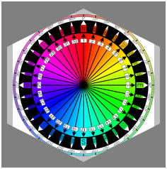
I’ve been working a lot with the clip-path property recently, as I write the chapter on filters, blends, clipping, and masking for CSS: The Definitive Guide’s long-delayed 4th edition (available now in early-release format!). One of the nifty things you can do with clipping paths is define them with percentage-based coordinates. For example, here’s a hexagon-like clipping path:
It didn’t work because, as I discovered to my horror, SVG does not allow percentage coordinates. I could just strip all the percent signs out, but that would be the same as saying this in CSS:
I didn’t want pixels, though. I want percentages, darn it all!
So I asked around on Twitter, and Markus Stange pointed me to the solution: converting all the SVG coordinates to the range 0–1 and using the clipPathUnits attribute. The working version looks like this:
That yields the same result as the polygon() CSS shape with the percentages I showed before.
All that is great if you’re writing your own SVG shapes and can make sure you set it up properly, but what if someone hands you a shape to be used as a clip path and it’s in absolute coordinates like 100 75? If you’re really lucky, the shape has a viewbox of 0 0 100 100 (or all the coordinate points are in that range) and you can just divide all the coordinate points by 100 to get the proper values. But that’s really tedious for any but the simplest of shapes, and besides, what if it has some other viewbox? That’s where the transform attribute saves the day.
For example, suppose you get an SVG file that looks like this (with the actual path coordinates removed because there are a lot of them):
Next, look at the viewBox attribute on the <svg> element itself. The value there is 329.6667 86. That means 329.6667 coordinate units horizontally, and 86 units vertically. So all you need to do now is divide all the horizontal values by 329.6667, and the vertical values by 86. Which would be super tedious, except we have scaling transforms at our disposal:
Those two values are 1/329.6667 and 1/86, respectively, and they effectively scale every point in the d attribute to fit into the needed 0–1 range. (That’s not precisely what happens, but the outcome is the same.) Thus we have an SVG clipping path that scales with the element and fits to its dimensions!
This works just as well for other markup patterns. To return to the hexlike path from before, assume it was written like this:
If that were applied as-is, via clip-path: url(#hexlike), it would create a hex-like clipping path that fits a 100px by 100px box, positioned in the top left of the element (in left-to-right languages, I presume). The quick fix:
Bingo bango bongo, it will now scale to the element’s dimensions, whatever those turn out to be.
Of course, if you apply that to something like a short paragraph, it will be verrrrry stretched out, but the same would be true with a percentage-based polygon() shape. The beauty here is that you can scale any coordinate set, so if you have a tiny path that you want to blow up, or a huge path you want to shrink down, you can transform it without using clipPathUnits to stretch it over the bounding box. Something like this:
That gets you a hexlike shape that fits a 400px by 400px box, for example.
Now all CSS needs is the ability to size and position clipping paths in a manner similar background images, and we’ll be in clover. I hope such properties are in the WG’s mind, because I’d love to be able to just point an at SVG clipping path, and then say something like clip-path-position: center; clip-path-size: contain;. That would remove the need for fiddling with SVG attributes altogether.
Thanks to Markus Stange for the technique and his invaluable assistance in proofreading this article.
I ran into an interesting conceptual dilemma yesterday while I was building a test page for the filter property. In a way, it reminded me a bit of Dan Cederholm’s classic SimpleQuizzes, even though it’s not about HTML.
First, a bit of background. When I set up test suites, directories of example files, or even browser-based figures for a book, I tend to follow a pattern of having all the HTML (or, rarely, XML) files in a single directory. Inside that directory, I’ll have subdirectories containing the style sheets, images, fonts, and so on. I tend to call these c/, i/, and f/, but imagine they’re called css/, images/, and fonts/ if that helps. The names aren’t particularly important — it’s the organizational structure that matters here.
So, with that groundwork in place, here’s what happened: I wrote some SVG filters, and put them into an SVG file for referencing via the url(filters.svg#fragment) filter function pattern. So I had this SVG file that didn’t actually visually render anything; it was just a collection of filters to be applied via CSS.
I clicked-and-held the mouse button, preparing to drag the file into a subdirectory…and suddenly stopped. Where should I put it? css/, or images/? It clearly wasn’t CSS. Even if I were to rename css/ to styles/, are filter definitions really styles? I’m not sure they are. But then, what is an image that has no visual output?
(Insert “one hand clapping” reference here.)
Sure, I could set up an svg/ subdirectory, but then I’d just end up with SVG images (as in, SVGs that actually have visual output) mingled in with the filter-file… and furthermore, segregated from all the other images, the PNGs and JPGs still hanging out in images/. That seems weird.
I could establish a filters/ subdirectory, but that seems like overkill when I only planned to have a single file containing all the filters; and besides, I’m not in the habit of creating subdirectories that relate to only a single HTML file.
I could dodge the whole question by establishing a generic assets/ subdirectory, although I’ve long been of the opinion assets/, when it isn’t used to toss in all of your assets classes in their own subdirectories, is just a fancy alias for misc/. And I dislike tossing stuff into misc/, the messy kitchen junk drawer of any project.
I came to a decision in the end, but I’m not going to tell you what it was, because I’m curious: what would you do in that situation?
We’re about halfway through February, he said with some deliberate vagueness, and that means the launch-month special on my Udemy course “Design for Humanity” is also half-done. If you haven’t taken advantage yet, use the code MW_BLOG to get a nice little discount off the list price.
You may be wondering if this course is really for you. There are some videos available as free previews on Udemy. I’m including one here, which is a single “lecture” (as they’re called by the Udemy) from early in the course. It explores a single concept and also establishes some of the landscape for the course, which is one of the reasons I chose it.
Again, the discount code above ends at the end of February, so if you’re interested bu haven’t signed up yet, don’t delay too much longer. And if you have already taken the course, could you do me a favor and leave an honest review at Udemy? It will help other people. whether they find the course from me or through Udemy, decide whether the course is right for them or not. Thank you!
As longtime readers know, my professional focus has been very different the past couple of years. Ever since the events of 2013-2014, I started focusing on design and meeting the needs of people — not just users, but complete people with complex lives. I teamed up with Sara Wachter-Boettcher to write Design for Real Life, and presented talks at An Event Apart called “Designing for Crisis” (2015) and “Compassionate Design” (2016; video to come). I’m not done with CSS — I should have news on that front fairly soon, in fact — but a lot of my focus has been on the practice of design, and how we approach it.
To that end, I’ve been spending large chunks of the last few months creating and recording a course for Udemy called “Design for Humanity”, and it’s now available. The course is based very heavily on Design for Real Life, following a similar structure and using many of the examples from the book, plus new examples that have emerged since the book was published, but it takes a different approach to learning. Think of it as a companion piece. If you’re an auditory processor as opposed to a visual processor, for example, I think the course will really work for you.
Who is the course for? I put it like this:
This course will help you if you are part of the design process for a product or service, whether that’s a website, an app, an overall experience, or a physical product. You might be a product designer or product manager, an entrepreneur or work in customer service or user research, an experience designer or an information architect. If you have been impacted by bad design and want to do better, this course is for you.
I know a lot of courses promise they’re just right for whoever you are, no really, but in this case I honestly feel like that’s true for anyone who has an interest in design, whether that’s visual design, system design, or content design. It’s about changing perspective and patterns of thinking — something many readers of the book, and people who’ve heard my talks, say they’ve experienced.
If you’ve already bought the book, then thank you! Be on the lookout for email from A Book Apart containing a special code that will give you a nice discount on the course. If you haven’t picked up the book yet, that’s no problem. I have a code for readers of meyerweb as well: use MW_BLOG to get 20% off the sale price of the course, bringing it down to a mere $12, or slightly less than $3 per hour! (The code is good through February 28th, so you have a month to take advantage of it.)
If you like the course, please do consider picking up the book. It’s a handy format to have close to hand, and to lend to others. On the flip side, if you liked the book, please consider checking out the course, containing as it does new material and some evolution of thinking.
And either way, whether it’s the book or the course, if you liked what you learned, please take a moment to write a short review, say something on the interwebs, and generally spread the word to colleagues and co-workers. The more people who hear the message, the better we’ll become as an industry at not just designing, but designing with care and humanity.
For a number of reasons, I’ve been thinking a lot recently about the two and a half months between Rebecca’s second tumor being discovered and her death.
I remember the looming senses of dread and paralyzing horror, which we shoved down as much as possible in order to get through each day. Partly it was for the kids, all of them, to give them as much stability as we could in a profoundly destabilizing time. Partly it was for everyone around us, who looked to us as much as they looked out for us. And partly it was for ourselves. Faced with the unceasing sense that nothing made sense, that the world was nothing like what we’d hoped or believed, we had to find ways to get out of bed each day and move forward.
Time was precious, and time was the enemy. As the quite literal deadline approached, we would find ourselves looking for ways to just stop time, to freeze the moments a bit longer, somehow. To hold short of the final day, to stretch out the time we’d have with her. But we kept being carried toward the future at one second per second, as if slowly, slowly dragged by a monstrous grip and only being able to look around to focus on what glints of beauty we could before finally being consumed.
And then the day came, and we lived through it while our daughter did not.
If you’re a parent, then you know the feeling of being bound to your child’s being. When they’re sick, you feel their fever in your own body, even if no thermometer could register it. When they cough, your throat seizes with theirs. When they pause between breaths, you pause too, holding yourself in perfect stillness, not drawing in your next breath until they do.
But when their breathing stops forever, you keep breathing, and can never quite figure out how. Or why.
The same inexorable passage of time that dragged you to the moment your child died keeps dragging you on past it, away from the last time you held them, the last time they smiled at you, the last time they said your name or that they loved you or that they wanted another popsicle or another kiss or another bedtime story. The last time their eyes were open for you to peer into, and see their spark.
The numb shock of all those absences perverts the world in profound ways. You can barely comprehend that your life continues, let alone what’s happening around you. It’s almost impossible to understand why the world continues at all. There seems no point to it. You can find your way past that in moments, focused on loved ones like surviving children, but then those moment pass and you stand up and look at the world as if it’s a soap-bubble illusion that will pop and vanish at any moment.
And sometimes, you numbly reach out, one finger extended, waiting for the moment you finally touch the bubble.
Other times, your shock gives way to flashes of rage, angry with the world for continuing as if nothing had happened, as if the clocks should not have been stopped and the mocking facade not torn apart and burned to ash. Angry with yourself for not finding a better timeline. Angry with existence itself.
I remember the moment I realized that pediatric hospitals and the people within them remain unburnt and unshot by grieving parents, and regained an iota of faith in humanity. It didn’t matter that Rebecca had died of biology run amok, and the people in her oncology wards had done everything they thought was right in an attempt to keep her alive. The rage of grief obliterates all hope of rationality, and seeks only to inflict the same pain it feels on whatever targets it seizes on. When Michael Brown’s father shouted to burn everything down, a month or so later, I nodded in bleak recognition.
I can say that the rage can fade over time. I’m sure some people take it in, nurture it, stoke it, burning it for warmth in the cold hollow where their child’s love used to be. Using it for fuel, just to keep going. But it’s also possible to let it go, one way or another, through whatever slow mechanisms of healing can be found.
Although I do wonder how I will react if I ever run into the doctors at the grocery store, or at the airport. Perhaps there will be a sad reconnection. Or perhaps I will simply turn and walk away, stiff and silent. I honestly don’t know. I hope, most of the time, that it’s the first one.
But the numbness, the pervasive sense of disconnect and artifice — those may have receded somewhat, but they have never left. I read recently that research shows that the worst period of hopelessness and despair in grieving parents often comes two to three years after their child’s death, which for us is right now, right as our remaining children pass significant life milestones: Carolyn passing out of childhood, and Joshua becoming older than Rebecca.
A world where a youngest child can become older than their sibling can never, ever make sense. Time seems illusory, and there is a corner of my mind that is always looking for a way to go back, to unwind the clock and undo the changes, to go back to when things were right and find a way to stop them ever becoming wrong.
But I can’t. There is no way back, just as there is no way to skip forward. I can only be dragged forward at one second per second, and look around whenever I can rouse myself to find what glints of beauty there may be. There can be many, if I look in the right places, and I try to do so. It does nothing to slow the dragging, but it can sometimes ease the grip.
Yesterday, I was looking at an existing page, wondering if it would be improved by rearranging some of the elements. I was about to fire up the git engine (spawn a branch, check it out, do edits, preview them, commit changes, etc., etc.) when I got a weird thought: could I just drag elements around in the Web Inspector in my browser of choice, Firefox Nightly, so as to quickly try out various changes without having to open an editor? Turns out the answer is yes, as demonstrated in this video!
Youtube: “Dragging elements in Firefox Nightly’s Web Inspector”
Since I recorded the video, I’ve learned that this same capability exists in public-release Firefox, and has been in Chrome for a while. It’s probably been in Firefox for a while, too. What I was surprised to find was how many other people were similarly surprised that this is possible, which is why I made the video. It’s probably easier to understand to video if it’s full screen, or at least expanded, but I think the basic idea gets across even in small-screen format. Share and enjoy!