Posts in the Design Category

Welcome to the Grid

Published 7 years, 6 months past

Grid is public.  It’s live right now in the latest Firefox release, Firefox 52.

It will similarly be live in the next public Chrome release, due in the next week or so.

It’s here.  I almost can’t believe it.

For well more than a decade now, when asked what CSS needs more than anything, I’ve said it needs real, actual layout.  “A layout-shaped hole at its heart” is a phrase I may have used a fair few times.

Rachel Andrew had a great article last week about “Learning CSS Grid Layout”, which charts a sensible course for getting used to grid.  It also busted a few myths about grid.  I recommend it highly.

There’s one more myth I’d like to do my best to bust, which I’ll summarize as a comment I’ve seen many times: “Ugh, tables again?”

The underlying assumption here is: grids are just tables with a new syntaxThis is entirely untrue.

I mean, yes, you can recreate 1990s-era table-based layout techniques with grid, in much the same way you can recreate the submit button with two JS libraries and a complex front-end framework.  The ability to do it doesn’t necessarily make it a good idea.

(Though you might, from time to time, find the ability useful.  Here’s what I mean: you can take a bunch of data contained in arbitrary markup someone else is producing, and lay it out in a tabular format.  It would be far preferable to have the data in actual table markup, but if that’s not an option, grid will give you a potential solution.)

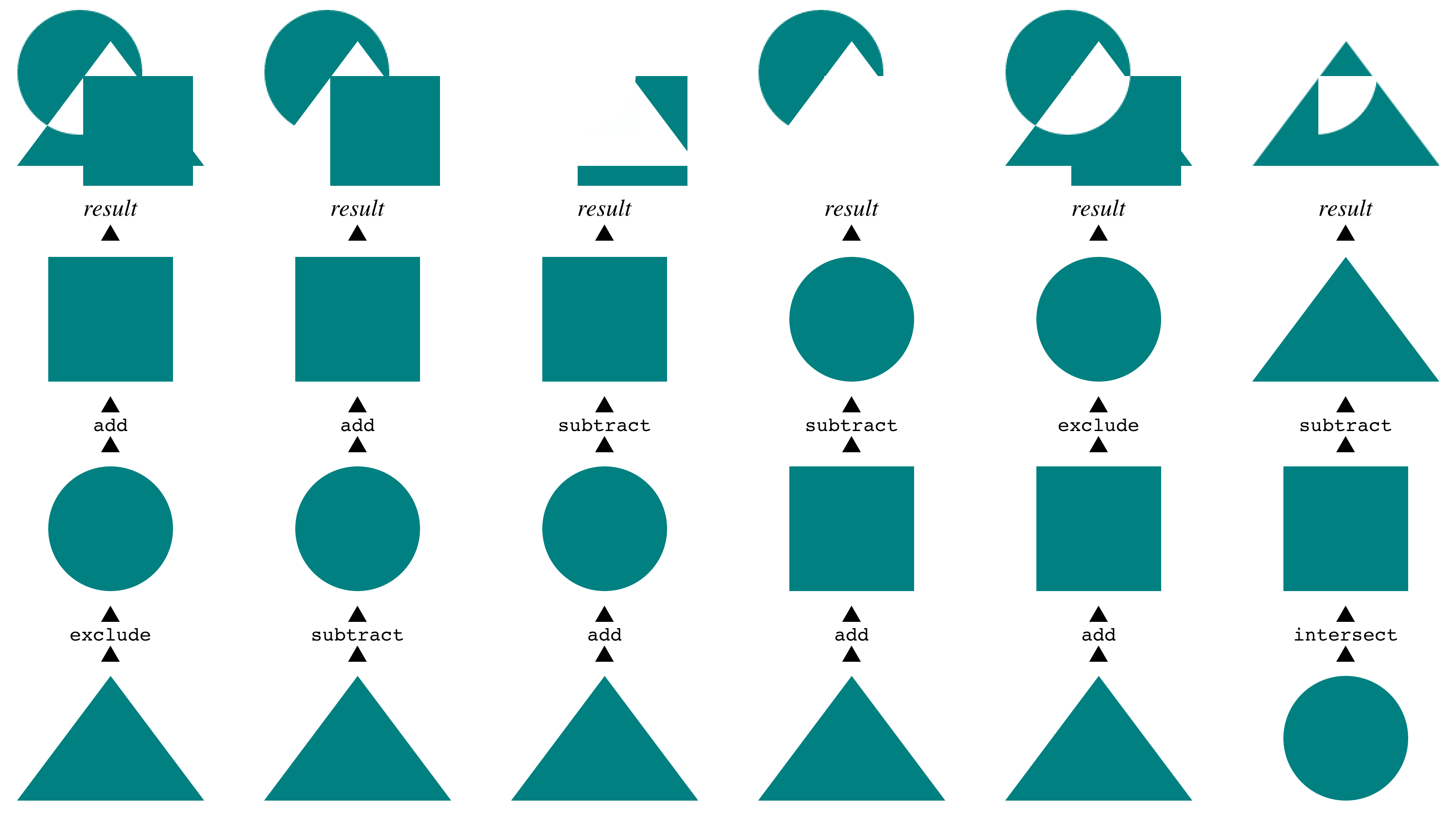
I have an example of just one way grids are different than tables.  I just last Friday finished writing the last chapter of CSS: The Definitive Guide, 4th Edition, covering filters, blending, clipping, and masking.  (I finished the grid chapter late last year, so it’s already available in the early-access title.)  Almost all the figures in the book were created by building HTML+CSS pages, and taking high-resolution screen captures with Firefox’s screenshot command.  Here’s one.

Compositing masks

The way these are displayed is actually the inverse of their source order.  I wanted them to be in document source such that the compositing steps were in chronological order, so that’s how I wrote them.  Once I laid them out that way in the figure, using grid, I realized it made more sense to arrange them visually, with the bottom layer at the bottom of the figure, the next above that, all leading up to the result at the top.

So I just rearranged them on the grid, by assigning grid row numbers.  The document source wasn’t touched.  A bit simplified, the CSS to do that looked something like this:


ol li:nth-child(1) {grid-row: 4;}
ol li:nth-child(2) {grid-row: 3;}
ol li:nth-child(3) {grid-row: 2;}
ol li:nth-child(4) {grid-row: 1;}

Because the compositing examples (the “columns” in the layout) were represented as ordered lists, with the grid set up to place each image with some captioning, I could just change their order.  So yes, it looks like a table, but the underlying structure is anything but table-like.  Just to get each column of examples grouped together with tables, I’d have to nest tables, or accept a one-row table with each cell containing some other structure.  Rearranging the columns would mean doing markup surgery, instead of just reassigning their layout placement via CSS.

Instead, I was able to represent the content in the best available structure (ordered lists) and then arrange them on a grid in the best way I could visually.  For that matter, I could responsively change the layout from a six-column grid to a three-column grid to un-gridded lists as the viewport got more and more narrow.  As, in fact, I did — check it out.  If you make the window narrow enough, Grid is dropped entirely so you can see the base structure and content.

This ability to place grid items without respect to source order is a powerful tool, and like all powerful tools it can be used for good or ill.  It’s possible to assemble a visually usable layout out of the most inaccessible, horrible markup structures imaginable.  It’s also possible to assemble a visually usable layout from clean, accessible markup in ways we’ve never even dared dream.

Combine grids with other CSS features, and you can really create art.  Jen Simmmons has a layout lab site, and her 2016 main-page design is… well, go see it in a grid-capable browser, like today’s release of Firefox.  Realize it’s all text, no images, no scripting.  Just markup and style.

And the style is remarkably simple for what’s being accomplished.  It’s not too alien a syntax, but it will likely take some time to adjust to using it.  It’s taken me some time, as I’ve experimented and written about it.  Unlearning my float habits has taken some work, and I don’t know that I’m completely done.  I do know that it’s been worth it many times over.

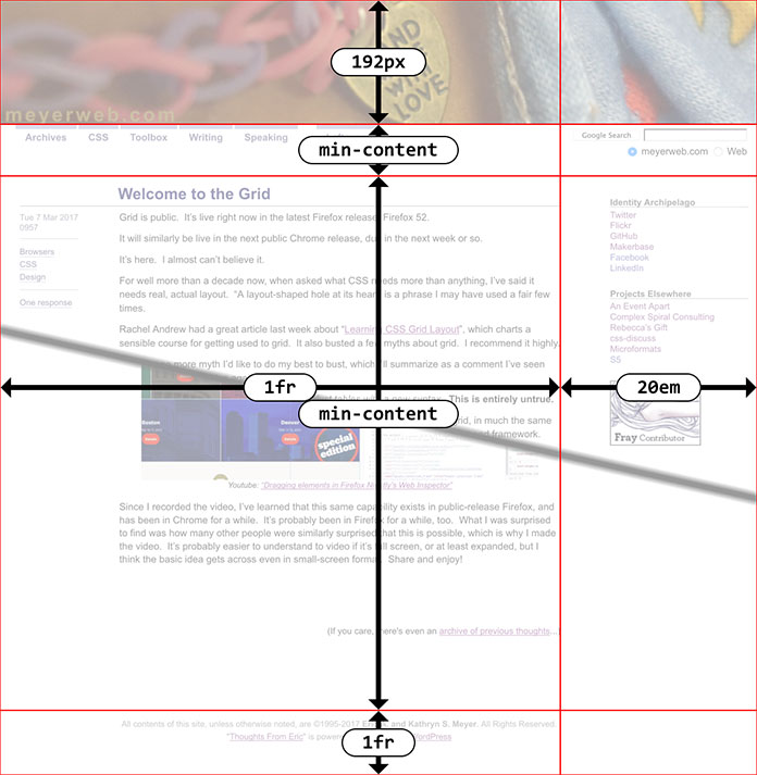
I’ve done a few experiments with the layout of a local copy of meyerweb, and done some frankly goofy things to the design along the way.  I’m hoping to convert what’s up here to a simple grid layout in the next few days, make it a slightly more complex grid shortly after that, and then maybe — maybe — actually do some redesigning for the first time in over a decade, to take advantage of grid more fully.  Jen has a great six-minute video exploring a few features of grid and the grid inspection tool now built into Firefox, which I recommend to anyone curious to know more.

So if you’re thinking of grid as tables 2.0, please, stop.  Table-style layouts are the first one percent of what grid offers.  There are works of art and undiscovered techniques waiting in the other 99 percent.


Preview Video: What Would a Human Do?

Published 7 years, 6 months past

We’re about halfway through February, he said with some deliberate vagueness, and that means the launch-month special on my Udemy course “Design for Humanity” is also half-done.  If you haven’t taken advantage yet, use the code MW_BLOG to get a nice little discount off the list price.

You may be wondering if this course is really for you.  There are some videos available as free previews on Udemy.  I’m including one here, which is a single “lecture” (as they’re called by the Udemy) from early in the course.  It explores a single concept and also establishes some of the landscape for the course, which is one of the reasons I chose it.

Youtube: “What Would a Human Do?”

Again, the discount code above ends at the end of February, so if you’re interested bu haven’t signed up yet, don’t delay too much longer.  And if you have already taken the course, could you do me a favor and leave an honest review at Udemy?  It will help other people. whether they find the course from me or through Udemy, decide whether the course is right for them or not.  Thank you!


A New Online Course: Design for Humanity

Published 7 years, 7 months past

As longtime readers know, my professional focus has been very different the past couple of years.  Ever since the events of 2013-2014, I started focusing on design and meeting the needs of people — not just users, but complete people with complex lives.  I teamed up with Sara Wachter-Boettcher to write Design for Real Life, and  presented talks at An Event Apart called “Designing for Crisis” (2015) and “Compassionate Design” (2016; video to come).  I’m not done with CSS — I should have news on that front fairly soon, in fact — but a lot of my focus has been on the practice of design, and how we approach it.

To that end, I’ve been spending large chunks of the last few months creating and recording a course for Udemy called “Design for Humanity”, and it’s now available.  The course is based very heavily on Design for Real Life, following a similar structure and using many of the examples from the book, plus new examples that have emerged since the book was published, but it takes a different approach to learning.  Think of it as a companion piece.  If you’re an auditory processor as opposed to a visual processor, for example, I think the course will really work for you.

Who is the course for?  I put it like this:

This course will help you if you are part of the design process for a product or service, whether that’s a website, an app, an overall experience, or a physical product. You might be a product designer or product manager, an entrepreneur or work in customer service or user research, an experience designer or an information architect. If you have been impacted by bad design and want to do better, this course is for you.

I know a lot of courses promise they’re just right for whoever you are, no really, but in this case I honestly feel like that’s true for anyone who has an interest in design, whether that’s visual design, system design, or content design.  It’s about changing perspective and patterns of thinking — something many readers of the book, and people who’ve heard my talks, say they’ve experienced.

If you’ve already bought the book, then thank you!  Be on the lookout for email from A Book Apart containing a special code that will give you a nice discount on the course.  If you haven’t picked up the book yet, that’s no problem.  I have a code for readers of meyerweb as well: use MW_BLOG to get 20% off the sale price of the course, bringing it down to a mere $12, or slightly less than $3 per hour!  (The code is good through February 28th, so you have a month to take advantage of it.)

If you like the course, please do consider picking up the book.  It’s a handy format to have close to hand, and to lend to others.  On the flip side, if you liked the book, please consider checking out the course, containing as it does new material and some evolution of thinking.

And either way, whether it’s the book or the course, if you liked what you learned, please take a moment to write a short review, say something on the interwebs, and generally spread the word to colleagues and co-workers.  The more people who hear the message, the better we’ll become as an industry at not just designing, but designing with care and humanity.


CSS Grid!

Published 7 years, 9 months past

The Grid code is coming!  The Grid code is coming!  It’s really, finally coming to a browser near you!  Woohooooo!

Whoa, there.  What’s all the hubbub, bub?

CSS Grid is going to become supported-by-default in Chrome and Firefox in March of 2017.  Specifically, Mozilla will ship it in Firefox 52, scheduled for March 7th.  Due to the timing of their making Grid enabled-by-default in Chrome Canary, it appears Google will ship it in Chrome 57, scheduled for March 14th.  In each case, once the support is enabled by default in the public-release channels — that is to say, the “evergreen” browser releases that the general public uses — every bit of Grid support now in place in the developer editions of the browsers will become exposed in the public releases.  Anything Grid will Just Start Working™®©.

Are those dates an ironclad guarantee?

Heck no.  Surprise problems could cause a pushback to a later release.  The release schedule could shift.  The sun could explode.  But we know the browsers already have running code for Grid, and when they mark something as ready for public release, it usually gets released to the public on schedule.

So Grid support in March, huh?

Yep!

How long until I can actually use Grid, then?  Two or three years?

March 2017.  So about four months from now.

But it won’t be universally supported then!

Rounded corners aren’t universally supported even now, but I bet you’ve used them.

Now you’re just being disingenuous.

Look, I get it.  Base layout’s a little different than shaving pixels off corners, it’s true.  If you have a huge IE9 user base, converting everything to Grid, and only Grid, might be a bit much.  But I’m guessing that you do have a layout that functions in older browsers, yes?

Of course.

Then my original answer stands: March 2017.  Because any browsers that understand Grid will also understand @supports(), and you can use that to have a Grid layout for Grid-enabled browsers while still feeding a float-and-inline-block layout to browsers that don’t understand Grid.  Jen Simmons wrote a comprehensive article about @supports(), and I wrote a short article demonstrating its use to add layout enhancements.  The same principles will apply with Grid: you can set up downlevel rules, and then encapsulate the hot new rules in @supports().  You can retroactively enhance the layouts you already have, or take that approach with any new designs.

Writing two different layouts for the same page doesn’t sound like a good use of my time.

I get that too.  Look at it this way: at some point, you’re going to have to learn Grid.  Why not learn it on the job, experimenting with layouts you already understand and know how you want to have behave, instead of having to set aside extra time to learn it in a vacuum using example files that have nothing to do with your work?  You’ll be able to take it at your own pace, build up a new set of instincts, and future-proof your work.

Can’t I just wait until someone creates a framework for me?

You could, except here’s the thing: as Jen Simmons has observed, Grid is a framework.  Using a framework to abstract a framework seems inefficient at best.  I mean, sure, people are going to do it.  There will be Gridstraps and GAMLs and 1280.gses and what have you.  And when those are out, if you decide to use one, you’ll have spend time and energy learning how it works.  I recommend investing that time in learning Grid Actual, so that you can build your own layouts and not be constrained by the assumptions that are inevitably baked into frameworks.

Grid sounds like tables 2.0.  I thought we all agreed tables for layout were a bad idea.

We agreed table markup for layout was a bad idea, particularly because at the time it was popular, it required massive structural hacks just to get borders around boxes, never mind rounded corners.  The objection was that it took 50KB of HTML tags and three server calls just to do anything, and 100 times that to set up a whole page’s layout, plus table markup locked everything into a very precise source order that played merry hell with any concept of accessible, searchable content.  The objection wasn’t to the visual result.  It was to what it took to get those results.

With Grid, you get the ability to take simple, accessible markup, and lay it out pretty much however you want.  You can put the last element in the source first in layout, for example.  You can switch a couple of adjacent bits of the page.  Questions like “how do I order these elements to get them to lay out right?” become a thing of the past.  You order them properly, and then lay them out.  It’s the closest we’ve ever gotten to a clean separation between structure and presentation.

Not only that, but thanks to CSS transforms, clipping paths, float shapes, and more, you don’t have to make everything into a perfectly-edged grid layout.  There is so much room for visual creativity, you can’t even imagine.  I can’t even imagine.  Nobody can.

So Grid solves every single layout question we’ve ever had, huh?  Layout Nerdvana for all?

Oh, no, there are still things missing.  Subgrid didn’t make it into these releases, so there will still be some gridlike layouts that seem like they should be simple, but will actually be difficult or impossible.  You can’t style a grid cell or area directly; you have to have a markup element of some sort to hang there and style.  All grid areas and cells have to be rectangular — you can’t have an L-shaped area, for example.  Grid gaps (“gutters”) can only be of uniform size on a given axis, very much like border-spacing in table CSS.

You can usually fake your way around these limitations, but they’re still limitations, at least for now.  And yeah, there will probably be bugs found.  If not bugs, probably unexpected use cases that the spec doesn’t adequately cover.  But a lot of people have worked really hard over an extended period of time on stamping out bugs and supporting a variety of use cases.  This is solid work, and it’s going to ship in that state.

What happens if Firefox or Chrome pushes Grid back a release or two, but the other ships on schedule?

In that case, it will take a little longer for your @supports()-encapsulated Grid rules to be recognized by the tardy browser.  No big deal.  The same applies to MS Edge, which hasn’t caught up to the new Grid syntax even though it was the first to ship a Grid implementation — with different rules, all behind prefixes.  Once Edge gets wise to the new syntax and behaviors, your CSS will just start working there, same as it did in Firefox and Chrome and any other browser that adds Grid.

All right, so where can I go to learn how to use it?

There are several good resources, with more coming online even now.  Here are just a few:

  • The Experimental Layout Lab of Jen Simmons  —  great for seeing layout examples in action using a variety of new technologies.  If you’re laser-focused on just Grid, then start with example #7, “Image Gallery Study”, but the whole site is worth exploring.  Bonus: make sure to responsively test the top of the page, which has some great Grid-driven rearrangements as the page gets more narrow.
  • Rachel Andrews’ Grid By Example  —  a large and growing collection of examples, resources, tutorials, and more.  There’s a whole section titled “Learn Grid Layout” that’s further broken up into sections like “UI Patterns” and “Video tutorial”.
  • CSS-Tricks’ A Complete Guide to Grid — a boiled-down, pared-down, no-nonsense distillation of Grid properties and values.  It might be a bit bewildering if you’re new to Grid, but it’s the kind of resource you’ll probably come back to again and again as you’re getting familiar with Grid.
  • CSS Grid Layout specification — if all else fails, you can always go to the source, Luke.

But remember!  If you hit these sites before March 2017, you’ll need to make sure you have Grid support enabled in your browser so that you can make sense of the examples (not to mention anything you might create yourself).  Igalia has a brief and handy how-to page at Enable CSS Grid Layout, and Rachel also has a Browsers page with more information.

I’ve been hurt by layout promises before, and I’m afraid to trust.

I feel you.  Oh, do I feel you.  But this really looks like the real thing.  It’s coming.  Get ready.

Pokéstop and Think

Published 8 years, 1 month past

As I write this, Pokémon Go is still huge.  One of the latest moments was the stampede that occurred when a rare Pokémon spawned in Central Park.  And one of the stories that’s fascinated me the most has been that of Boon Sheridan, who lives in a converted church that’s marked as a Gym — so now he has random people hanging around outside his home at all hours.  (The Gym has since been removed by Niantic.)

There’s a lot I could say about Niantic’s apparent lack of foresight regarding how Pokémon Go play might intersect badly with the physical world and the people who inhabit it.  Spawning a water Pokémon in the middle of New York City’s 9/11 Memorial, for example, comes off as a little bit…callous?  Disrespectful?  To say nothing of the reports of Pokémon Go play disrupting the Holocaust Museum in Washington, DC, or Auschwitz.

But that’s not what I want to ponder right now.

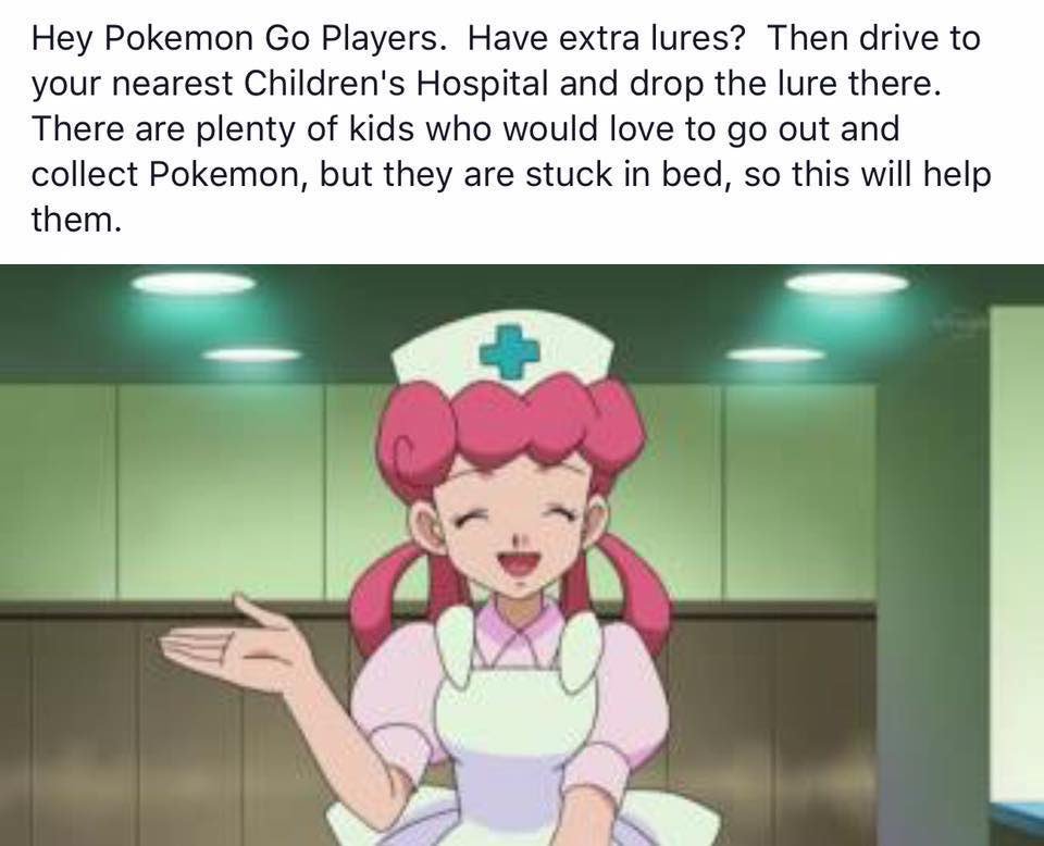
I’ve seen a meme circulating around Twitter and Facebook, encouraging Pokémon Go players with extra lures to drive down to the local children’s hospital, in order to draw more creatures to the sick kids, confined to their beds, who might want to play. A picture of a nurse from an anime video, probably a television show, with the caption: “Hey Pokemon Go Players.  Have extra lures?  Then drive to your nearest Children’s Hospital and drop the lure there.  Ther eare plenty of kids who would love to go out and collect Pokemon, but they are stuck in bed, so this will help them.” And, indeed, at least one children’s hospital in Michigan is embracing Pokémon Go to get their patients up, moving around, and interacting with each other.  Hospitals generally have multiple Pokéstops in them already, so luring in creatures is even easier.  Why not jump in the car, as the meme suggests, and bring a few tears of joy to a bedridden child’s face?

Because it might have the opposite effect.  Not every bed in the hospital is within range of the Pokéstops, which means that you might condemn a child unable to leave their bed to watch the creatures spawn and spawn, just beyond their ability to collect them.  Their tears won’t be of joy — and their misery might be prolonged by having other patients talk excitedly about all the Pokémon they caught and levels they gained.

Beyond that, if the Pokéstops in a hospital are constantly in Lure mode, they’ll lure more than just Pokémon: members of the general public will start showing up and trying to gain access to the hospital for no other reason than to “catch ‘em all”.  This can create a number of problems, from the simple disruption to people’s work to adding extra strain on the hospital’s security personnel.  The surge in random visitors at all hours could force the hospital to spend money on extra security staff hours — money which is then not available for other things.  Like medicine.  And children in hospitals are often immune-compromised, which means all it takes is one infectious Pokémon player to cause a serious medical crisis.  A whole crowd of them represents every NICU’s nightmare.

What’s the societally correct thing to do?  Here’s the thing: we don’t know.  We haven’t figured this out yet; in fact, we’ve barely started to think about figuring it out.  When it comes to luring monsters for the benefit of sick kids, please, call the hospital first to ask if your act of generosity will be welcome.  Maybe it will!  Or maybe not, and for very good reasons.  In the absence of better experience design on Niantic’s part, the players need to step up and think through the possible ramifications of their choices, positive and negative.

I can easily imagine some hospitals asking players to only drop Lures at certain times, such as only during daylight hours, or to spread them out so as to maintain a constant supply.  They might request specific Pokéstops be enhanced, and others left alone.  (Remember, Pokéstops’ locations are defined by Niantic, not the physical place that ‘hosts’ them.)

And I can just as easily imagine hospitals having absolutely no idea what to say to people who ask them what they would prefer.  This is all happening at internet-game speed, and large organizations can be slow to react.  So call ahead — and in the absence of a clear “yes, please, come on down!”, assume that the Lures would not be welcome.

I know this isn’t tidy.  In a just world, the idea of dropping Lures for sick kids would be pure and right, with no potential downsides.  But then, in a just world, there would be no need of children’s hospitals.


Talking Shop

Published 8 years, 4 months past

Sara and I are guests on the most recent Shop Talk Show, espiode #212, where we talked with Chris and Dave about Design for Real Life, Google Mic Drop, and more.  We had a good time with it, and hope you will too.

In a moment of slight coincidence, the episode was released almost exactly a year after my first appearance on Shop Talk (espisode #161), where I covered similar topics.  At that point, Sara and I were still researching and tossing ideas for the book back and forth.  Now here we are, a year later, with the book out.  It’s a little wild to contemplate, honestly.  It was a lot of work in a pretty short time frame… but so very much worth it.


In The Manual: “We Are What We Build”

Published 8 years, 4 months past

I’m honored to be included in Issue 5 of The Manual, doubly so because it may well be the last issue of The Manual, triply so because I spoke at the very first Build Conference, the event that gave birth to The Manual.

I have two pieces, as is traditional for The Manual: an article titled “We Are What We Build”, and a short, untitled ‘life lesson’ about a whiny 12-year-old me and my grandfather’s quiet wisdom.

A quote from “We Are What We Build”:

The challenge now is in how those fragments of our lives are treated. This is as much a social question as a technological problem, but the two are not separable. What Facebook and Twitter and Instagram and every other at-scale social network does now — everything they make possible or impossible, everything they make easier or harder — will shape what we think of as normal in a decade or two.

Past readers may recognize this sentiment (as well as the title) from my talk at XOXO 2015, which was heavily intertwined with the article for The Manual.  One led to the other, in fact.  I proposed the talk, which Andy B. accepted, and then Andy M. asked me if I’d write it for The Manual.  So I did.

I was glad to write both, and I hope you enjoy them… and more importantly, I hope they provoke some reflection.


New Article: “Compassionate UX”

Published 8 years, 4 months past
Sara and I wrote an article for UX Booth, “Compassionate UX”, and it was published last week.  Two quotes (out of a ~1,750-word article):

When we get laser-focused on positive outcomes, we often fail to notice how things might go terribly wrong. But whether you’re working on something as complex as artificial intelligence or as simple as a line of microcopy, you’ll create the best products when you intentionally set aside your goals of “delight” or “engagement,” and make time to think critically about where your product might break.

It’s easy to see this as an uncomfortable restriction on the creative process, and that’s actually a pretty accurate description. Of course thinking about users’ varied identities and emotional states creates limiting factors. But that’s what design is: it is a creative solution to a set of constraints.

Read the whole thing over at UX Booth.


Browse the Archive

Earlier Entries

Later Entries