Posts in the Guide Category

From Filaments to Semiconductors

Published 12 years, 1 month past

Thanks to last summer’s home renovation project, the new kitchen is lit by six interior flood bulbs.  We were using the diffuse incandescent bulbs our contractors put in, which were nice and warm and soft.  And also, being essentially freebies, not long for this world.  We recently had three burn out within two weeks.

We decided to take the opportunity to switch from incandescents to something far more energy-efficient.  Having used a number of CFLs around the house, I knew I wanted no part of that scene.  The subtle flicker they generate isn’t subtle enough for me, and I hate the wan quality of the light.  I’m not really thrilled with the warm-up time, either.

So we went with LEDs.  This wasn’t as straightforward as I might have liked, but we’ve now switched and are really happy to have done so.  I’d like to share the most important thing we learned in hopes of helping others through the transition.

It’s this:  if you’re going from “warm” incandescents straight to LED, find bulbs that have a color temperature of 2700K.  The first test bulb we bought was 3000K, and the difference was enormous.  By comparison to the incandescents, it was a harsh white.  In a Modernist design setting, like say at the Guggenheim, 3000K is probably a good choice.  In our wood-and-grain center-hall Colonial home, it was all wrong.

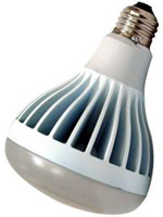
So I ran up to Home Depot and picked up a couple of EcoSmart BR30 diffuse floodlight bulbs, which are 2700K.  I put in one as a test, and when we flipped on the lights, I couldn’t see a difference in the light given off by the LED and incandescent bulbs.  The LED gave off a little bit more light than the incandescents around it (more on that in a minute) but the quality of light was essentially the same.  I put in the other test bulb with the same results.  Now we have all six cans fitted with the EcoSmarts, and the kitchen is just as warm as it was before.

One slightly noticeable difference is that there are more lumens bouncing around the kitchen than before, because we had 65W incandescents and the LEDs are equivalent to 75W (they actually consume 14W).  There weren’t any 65W equivalents in the floods, at least when I went looking, so I picked the 75W equivalents.  The new bulbs put out 800 lumens each, whereas the old ones likely shed 650-700 lumens each.  I do notice the difference, but it’s not so extra-bright that it’s bothersome.  That said, if I track down some bright white 2700Ks in the 650-700 lumen range, I may swap out half the kitchen bulbs in a staggered pattern to see how it feels.  Whichever ones I don’t use in the kitchen, I can always reuse in the cans in our basement.

The really noticeable difference is that when you flip the wall switch, it takes half a second for the bulbs to actually light up.  It’s a bit unusual when you switch straight from incandescent, but it’s no worse than the “on time” for most CFLs, and there’s no slow warm-up time for LEDs like you get with CFLs.  Once they’re on, they’re on.  And they don’t hum or flicker they way CFLs are prone to doing.

In closing, I just want to reiterate that color temperature is absolutely crucial, and if you’re coming over from incandescents, you want to be at 2700K.  Beyond that, match up the wattage as best you can, grit your teeth through the purchase price, and bask in the knowledge that your electricity bills will be lower, plus you shouldn’t have to replace the bulb any time in the next decade or even two.  That last part alone nearly makes LEDs worth the up-front cost.

If you have experiences or tips to share with regards to LED bulbs, by all means leave a comment!


Fixing Font Display in Thunderbird 3.1

Published 13 years, 9 months past

If you upgraded Thunderbird and discovered that the fonts used to display messages suddenly changed, and worse still, you were unable to get all messages to obey your font display settings, then this post is most likely for you.

Here’s what happened to me: I upgraded to Thunderbird 3.1, and suddenly all my messages were in a font I didn’t recognize or appreciate.  I insist on seeing only the plain text version (technically, the text/plain part) of all my e-mail; and what’s more, that it be displayed in a monospace font.  Courier 13, in my case.

So I made sure “View > Message Body As” was still set to “Plain Text”, which it was.  Then I went into the preferences and messed around for a bit.  Eventually I set every font setting I could in “Preferences… > Display > Formatting > Advanced…” to be Courier and have a size of 13, and also to make sure that “Allow messages to use other fonts” was not checked.  All this was done, and Thunderbird relaunched to make sure the preferences stuck.  They did, and most of my mail was displayed as I intended.  And yet a number of messages, such as those generated by Basecamp, were still displaying in this new, thoroughly unwanted font.

A screenshot showing that all the relevant preferences have been set over top of a mail message which clearly violates the preference settings by displaying the message in a different font and font size.

At first I thought it was happening with any HTML mail, but after viewing source on a bunch of messages (using command-U, same as in any Gecko browser) that didn’t seem to be true.  I Googled about and came across a post on Daniel Glazman’s blog which decried the problem in terms very similar to those I’d have used.  Unfortunately, all the comments on the post told me was that the interloping font is Menlo, that this was a deliberate decision by the Thunderbird team, and that they didn’t seem to understand why anyone might be annoyed as hell to have their font settings changed out from under them with no apparent recourse.  What they didn’t tell me was how to fix the problem.

Eventually, I tweeted a complaint—you know, the way you do—and Bryan Watson got me pointed in the right direction.  Something just told me that if I dug around in the hidden preferences, I’d find what I needed.  So I went to “Preferences… > Advanced > Config Editor…” and searched for “Menlo”.  I got three hits, and it suddenly became clear what was happening:  Menlo was being used for Unicode-based mail.  Further, it would seem, the GUI options in “Preferences… > Display > Formatting” don’t affect the settings for Unicode mail.  For whatever reason.

A screenshot of about:config (a.k.a. the Config Editor) showing the results of a search for the term

So I ran a new search in the Config Editor, this time for “unicode”.  That got me several results, but it also got me what I needed: the settings for both the font face and the font size used to display monospace and “fixed” type in Unicode mail.

Accordingly, I changed three lines in the Config Editor—the ones in the screenshot which are boldfaced and have a “user set” value for the “Status” column—and with that, my mail was displayed the way I wanted it, which is to say the way it had been displayed for years, which is to say the way it would have continued to have been displayed if Thunderbird hadn’t silently changed the settings on me and then refused to honor my reasserted preferences.

The 'about:config' window showing the results of a search for the term 'unicode'.  The three preferences changed are 'font.name-list.monospace.x-unicode', 'font.name.monospace.x-unicode', and 'font.size.fixed.x-unicode'.  There are thirteen other preferences listed along with the three changed, for a total of sixteen.

If you’ve encountered a similar problem, now you can do what I did and hopefully avoid some of the annoyance I experienced in trying to get my mail client to behave properly.

[Update 8 Jul 10: Mook wrote in to point out where this setting is buried in the preferences UI, for those who might want to set it without diving into the Config Editor.  Thanks, Mook!]

I’m also really rather annoyed that Thunderbird can’t seem to remember that I don’t ever want to see the Message Pane, but that’s a reported bug and I only hope that they fix it sooner rather than later.

Translations


Browse the Archive

Later Entries