Posts in the Projects Category

Announcing Followerlap

Published 15 years, 4 months past

Last week, I got an interesting inquiry from Velda Christensen:

@meyerweb *wondering just how many of your followers follow @zeldman and vice-versa*

I had no idea.  Furthermore, I didn’t know of a tool that could tell me.  So I built one: Followerlap.

As it turned out, the Twitter API made answering the specific question pretty ridiculously easy, thanks to followers/ids.  All it takes is two API requests, one for each username.  The same would be true of friends/ids, on top of which I suspect I’ll fairly shortly build a tool quite similar to Followerlap.

Since I announced Followerlap’s existence on (where else?) Twitter, I’ve had a few repeated (and not unexpected) bits of feedback.

  • Why not list the common followers?  Because followers/ids returns a list of numeric IDs.  Resolving those IDs as usernames would require one API hit per ID.  If there are 15 followers in common, that’s not such a big deal, but if there are 1,500, well, I’ll run out of my hourly allotment of API requests very quickly.  Maybe there’s a better way; if so, I’d love to hear about it, because that would be a great addition.

  • Why can’t I find out how many people follow both Stephen Fry and Shaquille O’Neal?  Past a certain number of followers, somewhere in the 200,000–250,000 range, the API just dies.  You can’t even count on getting a consistent error message back.  There are ways around this, but I didn’t want to stress the API that way, so it just fails.  Sorry.

  • How can I link to a specific comparison?  At the moment, you can’t.  I hope to make that happen soon, but I decided that a tool this simple should have a similarly simple launch.  Ship early, ship often, right?  Anyway, it’s on the list of things to add soon.  Use the new “Livelink to this result” link underneath a result.  (See update below for more.)

So that’s Followerlap.  Any other questions?  I’ll do my best to answer them in the comments, though for a number of reasons I may be slow to respond.

Update 6 Jul 09: as noted in the edited point above, livelinking of comparison results is now, um, live.  So now you can pass around results like the number of people who follow both God and the Devil (thanks to Paul M. Watson for coming up with that one!).  I call this “livelinking” because hitting a result URL will get you the very latest results for that particular comparison.  “Permalinking” to me implied that it would link to a specific result at a specific time, which the tool doesn’t do and very likely never, ever will.

Findings of the A List Apart Survey 2008

Published 15 years, 7 months past

At last—at long, long last!—the results of the A List Apart Survey 2008 are available, along with the anonymized raw data we collected.

There are a great many reasons why it took so long to get this out the door.  A big part is that it’s almost entirely a volunteer effort, which means it happens in our “free time” (and there the word “free” has a couple of meanings).  I say it’s almost entirely a volunteer effort because the detailed analysis is actually done by a pair of professional statisticians, who are paid for their time and expertise.  They did a great job once more, and did it in a reasonable time frame.  It just took us a while to get them the data to analyze, and then a while longer to take their report and findings and process them into report form.

The biggest change this year is that we’re publishing the results as HTML+CSS instead of a PDF.  This greatly increased the challenge, because it was important to me that the data be presented using styled tables, not images.  That’s easy like cake if all you’re doing is putting them up as visual tables, and we certainly do that for some of the figures.  In the other cases, where we have bar charts of varying kinds, things got difficult.  I managed to devise solutions that are 99.9% effective, and I’m both proud of and frustrated by those solutions.  Proud, of course, because I managed to wring three-stack bars out of table markup; frustrated because of the markup I had to construct to make them possible.  I think this report represents more than half my lifetime usage of the style attribute, but unfortunately there’s no way (using just CSS) to say {width: content;}.

So why not use JavaScript to do that, or to just replace the tables with canvas-drawn charts?  I did consider both, but decided that I would push as far as I could with plain HTML+CSS. 

A few implementation notes:

  • I used HTML 5 in order to step around some previously unrealized limitations of HTML 4—did you know tfoot has to come before tbody in HTML 4?  I didn’t.  I did not use elements like header and footer due to known problems in Firefox 2 and related browsers, which mangle pages containing those elements.  Instead, I took the same path Jon Tan recommends, and classed divs using those names for later, easier conversion.

  • The tables which underlie the charts do not have summary attributes.  If a group of civic-minded individuals would like to write useful summaries, please let me know in the comments and I’ll let you know how best to submit them.  Similarly, I did my very best to make sure all the table headers had accurate scope values, but if I botched any, let me know.

  • I’m aware that Opera shows horizontal scrollbars on most chapters of the report.  This is due to its refusal to apply overflow to table boxes, which according to my recent reading of the CSS 2.1 specification is the correct thing to (not) do.  Every other browser I tested does apply overflow to table boxes, though, which I found most useful.  I tried applying overflow: hidden to a few other boxes, and that got rid of Opera’s horizontal scrollbars, but it also cut off actual content in some other browsers.  I chose a cosmetic problem in one browser over loss of content in others.  The best fix I’ve devised is to wrap the tables in divs and apply overflow: hidden to those divs, but I didn’t want to rush the fix and botch it, so it didn’t make it in time for first publication.  I expect to get it in shortly after publication.

  • In a like vein, there are a few combo charts where a bar goes shooting off the right side of the chart in IE7.  This appears to be due to some kind of width-doubling problem that’s only invoked on elements with a style attribute when the row header goes to two lines instead of being just one.  Googling for an explanation yielded no joy, and a lengthy series of attempts to hack around the problem came to nothing.  If anyone knows how to counteract that problem other than preventing the header text from going past a single line, I’d love to hear it.  (Update: I’ve implemented the “fix” of preventing line-wrapping in the report, so there aren’t any off-the-page bars right now, but you can see an example of the problem on this test page.)

  • Surprisingly, the charts mostly work in IE6.  The exception is some of the triple-stack charts, where data points overlap when the rightmost sub-bars get too small, and also the double-width bars mentioned in the previous point.  I don’t really have a fix for this short of upgrading the browser, but if somebody finds one, I’d be happy to test it out.

On that last point, if there are questions or suggestions surrounding the implementation of the report, we can certainly discuss them here.  With regard to the survey and report itself, though—that is, the questions asked and the results we’re publishing—please direct those thoughts to the comments section of the ALA article announcing the report.  I’m hoping that we’ll have the 2009 survey up within a few months, so comments on what we asked and how we asked it, what we didn’t ask but should have, and that sort of thing could well have a direct impact on the next survey.  But please put those on the ALA site, where more people are likely to see them.

It’s done, it’s out, it’s yours—both the report and the data, about which I’ll soon write a little bit more.  Read the report, or produce your own report using the data.  Just always know that when we publish these reports, we do not mean for them to be the final word.  No, what we always mean is for them to be the first words, a starting point, a place from which to grow.  What comes next is as much up to you as anyone else, and I can’t wait to see what you do.


Seeking JavaScript Help

Published 15 years, 10 months past

Even though it turned out that there is no simple solution for the math problem I posted, I learned a fair amount from the fantastic responses—thanks, everyone!—and eventually came up with a solution that worked for me.  (I’d like to say it was one of the iterative approaches posted, but none of them worked for me.  In the end, I brute-forced it.)  I’m hoping for a different outcome with my next question, which is about JavaScript.

Consider the following structure, which is a much-edited-down version of part of the HYDEsim code:

function Detonation(name,lat,lon,yield) {
    var scale = Math.pow(yield,1/3);
    var gz = new GLatLng(lat,lon);
    this.name = name;
    this.lon = lon;
    this.lat = lat;
    this.gz = gz;
    this.yield = yield;
    this.overpressure = {
        p30 : 0.108 * scale,
        p15 : 0.153 * scale,
        p10 : 0.185 * scale,
         p5 : 0.281 * scale,
         p1 : 0.725 * scale
    };
    this.psi30 = {
        radius: 0.108 * scale,
        overlay : {
            points: makePoints(this.gz,0.108 * scale)
        }
    };
    this.psi15 = {
        radius: 0.153 * scale,
        overlay : {
            points: makePoints(this.gz, 0.153 * scale)
        }
    };
    this.therm20 = {
        radius: thermDist(20,this.yield,0.33,conditions.visibility),
        overlay : {
            points: makePoints(
                this.gz,
                thermDist(20,this.yield,0.33,conditions.visibility)
            )
    };
    // ...and so on...
}

There are two things I’ve tried and failed to do.  And tried, and tried, and tried; and failed, and failed, and failed.

  1. Eliminate the redundant calculations of radii.  Note how I define a radius property in each case?  And then have to not use it when I create the overlay?  It seems like there must be a way to just define the value once for each subsection and then use it as many times as needed within that context.  How?
  2. How do I make it so that all those properties and overlays and such automatically recalculate any time one of the “upper-level” terms changes?  As in, once I’ve created a new Detonation object det, how can I set things up so declaring det.yield = 250; will trigger recalculation of all the other pieces of the object?  At present, I’m just blowing away the existing det and creating a whole new one, which just seems clumsy and silly.  I have to believe there’s a better way.  I just can’t find it.

Please note: tossing off comments like “oh, just instantiate a mixin constructor with an extra closure” will be of no help at all, because I don’t understand what those terms mean.  Hell, I’m not even sure I used the words “object” and “property” correctly in my explanation above.  Similarly, pointing me to tutorials that use those terms liberally is unlikely to be of help, since the text will just confuse me.  Sample code (whether posted or in a tutorial) will help a great deal, because it will give me something to poke and prod and dissect.  That’s how I’ve always learned to program.  Actually, it’s how I’ve always learned anything.

As well, I’m absolutely willing to believe that there are much, much better ways to structure the object, but right now I really need to learn how those two things are accomplished in the context of what I already have.  Once I get familiar with those and finish up some other work, I can start thinking about more fundamental overhauls of the code (which needs it, but not now).

I really appreciate any concrete help you can give me.

Addendum: if you leave code in a comment, please just wrap it in a code element and use whatever indentation you like.  The indentation won’t show up when the post goes up, but I’ll go in after and wrap the code in a pre and then everything will be fine.  Sorry to those who’ve already gone to the effort of posting with indents or nbsp entities to try to preserve indentation!  As soon as I can dig up the right preference panel or plugin to allow pre in comments, I’ll do that, but for now I’ll manually edit in the needed pres as comments are added.  THanks, and again, apologies to those who posted before I made this clear!


Seeking Math Help

Published 15 years, 10 months past

So I have this equation that’s great for finding one term.  Problem is, I need to solve for another term that’s scattered all across the right side.  I’m hoping someone here has the mad algebra skills I managed to lose in the two decades since I last took a math class and can help me out.

Here’s the original equation:

Q = (3.07 × F × Y × (1 + 1.4 × ((D/V) × e(-2 × D/V)))) / D2

I want to be able to solve for D, not Q; in other words, have a single D on the left and everything else on the right of the equation.  F, Y, and V are all variable terms; the e is the classic irrational constant.  I tried for quite a while to do this and ran very firmly aground.  The best I managed was this minor simplification:

Q = (3.07 × F × Y × (1 + 1.4 × (D / (V × e(2 × D/V)))) / D2

…and even that assumes that I did things correctly.  Here’s the original equation in pretty shoulda-done-it-in-MathML-but-oh-well form:

I can shuffle the chairs around, as it were, but never really get anywhere close to having a single D on the left.  “But it’s so easy!“, you may well be shouting.  That’s why you’re working for Google and I’m not.

I remember having questions just like this on tests back in college: “Given this equation, solve for blah”.  It’s been too long, though, and in all honesty I was never that great at this sort of thing in the first place. Help, please?

[Update 14 Jan 09]: several commenters have shown that what I’m trying to do is impossible.  Frustrating, but that’s math for you.  Looks like I’ll have to take another approach.


Fixing Postcodes

Published 16 years, 5 days past

In case anyone’s interested, I finally updated the ZIP archive of all the countries and postcodes from the 2008 ALA survey.  The two files are sorted like before, but this time leading-zero postcodes haven’t had their leading zeroes stripped by Excel.  Oh, Excel.

I have learned way more about Excel’s “helpful” handling of CSV and text imports than I ever wanted to know.  The basic drill is, if you want to open a CSV or text file but don’t want Excel to be “helpful”, don’t drop the file onto Excel or double-click the file icon.  No no!  That would be too easy.

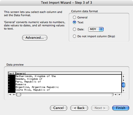
Instead, launch Excel, select “File > Open”, and then select the CSV or text file you want to open in the file browser.  Go through the Text Import Wizard carefully:

  1. Tell Excel that the file is delimited on the first screen.  (Or, if it isn’t, then don’t.  I bet it is, though.)
  2. Tell Excel what delimiter you’re using on the second screen.
  3. Then—this is the crucial bit—on the third Wizard screen, select the columns you don’t want Excel to “help” you with and set them to “Text”.  Be careful about setting all the columns as “Text”, though: if you have non-ASCII characters, Excel will “helpfully” replace their contents with octothorpes when you try to export the data later.  Such “help”!  It’s so “helpful”!

Yay!  An open file where the data is all in its original state!

Now you can save the file as an Excel workbook and it should (but please note my use of the word should) leave your data alone.  Ditto if you do “Save As…” to export to CSV or text again, which you might do if you run some calculations and want to capture the result in a basic, portable format.  But remember!  If you ever want to open those CSV/text files in Excel, you can’t just open them.  You have to go through the whole text-import process again.

So the survey files now contain actual useful data, especially for countries where postcodes can start with zeroes.  (Which is a lot of them.)  The files also have the usual bits of abuse that come along with daring to ask people to supply optional information, because I didn’t even try to filter that stuff out.  So, you know, naughty words ahead.

In part, I’m posting this to leave a record for anyone else who runs into the same problems I had, and also to remind myself of what has to be done next year.  Also to provide a heads-up to anyone who’d like to grab the fixed-up data and do fun mapping stuff with it, as did some commenters on the previous post.


Survey Mapping

Published 16 years, 2 months past

An anonymized copy of the data collected in the 2008 Survey has been turned over to some professional statisticians, as we did last year, and we’re waiting to hear back from them before moving into writing the full report.  But there’s no reason we can’t have a little fun while we wait, right?

So, calling all mapping ninjas: here’s a 136KB zip archive containing two tab-separated text files listing the countries and postcodes supplied by takers of the survey.  Before anyone has a privacy-related aneurysm, though, let me explain how they’re structured.

One of the two files is sorted alphabetically by country, with the postcodes as the second “column of data” (it’s country name, tab, postcode).  The second is the reverse: it’s sorted alphabetically by postcode, with the country names following each postcode.  This sorting should break any association they might have with the released data set, given that we won’t be including the postcodes in the released set.  (More on that in a moment.)

A word of warning: though I cleaned out some of the more obvious cases of people heaping abuse on us for even daring to ask the question, I can’t guarantee that the data set is perfectly clean.  There may be drops of bile here and there along with the usual collection of mistyped postcodes.  I know there’s at least one bit of obvious humor that I chose to leave in, so enjoy that when you find it.

We have two reasons to release this data this way at this point.  The first is to see what people do with it—heatmaps, perhaps, or one of those proportion-distortion maps, or a list of top-ten global postcodes or cities (or both).  Hey, go crazy!  I’d love to see a number of Google Maps/Yahoo! Maps/OpenMap/whatever mashups with this data.  That would be awesome.

The second reason is to ask for help with an API challenge.  Like I said, we’re not including the postcodes into the released data set.  What I would like to do instead is translate the postcodes into administrative regions (states, provinces, etc.) and put those in the data set.  That way, we can include things like “Ohio” and “British Columbia” and “Oaxaca”—thus providing a little bit better granularity in terms of geography, which was area of weakness in the 2007 survey.

Thanks to reading a couple of articles, I know how to do this for a single postcode.  But how does one do it for 26,457 postcode-and-country combinations without having to submit every single postcode as a separate request?  I’ve yet to see an explanation, and maybe there isn’t one, but I’d like to know either way.  And please, if someone does come up with a way, please show the work instead of just spitting out the result!  I’m hoping to learn a few things from the solution, but I obviously can’t do that without seeing the code.

One note: in cases where a postcode isn’t recognized or some kind of an error is returned, I’d like to have a little dash or “ERR” or something put in the result file.  That way we can get a handle on what percentage of the responses were resolvable.  Thanks.

Anyway, map and enjoy!


Survey Halfway

Published 16 years, 3 months past

Okay, so yes, I posted about this two weeks ago and haven’t said anything since, but still: we’re halfway to the close of this year’s survey, so if you haven’t already done so, please devote ten minutes to taking it now!  You’ll make your voice heard along with literally thousands of fellow web professionals, hobbyists, and other people who make websites.  My copy of Excel is already weeping at the thought of having to crunch all that data, and I think that if there’s one thing on which we can all agree, it’s that anything which makes Excel cry is a good thing.

I TOOK IT! and so should you: The Survey for People Who Make Websites

Thank you.


I Took the 2008 ALA Survey

Published 16 years, 3 months past

Ladies and gentlemen, it’s back, bigger and better than ever.  Please read Jeffrey’s wonderful introduction, and then start answering!  It shouldn’t take much more than 10 minutes to complete (it took me 6 minutes, 44 seconds, but who’s counting?).

I TOOK IT! and so should you: The Survey for People Who Make Websites

Last year, we had an astonishing 32,831 responses; I can only imagine where we’ll end up this year.  And just as with last year, we will report our findings and release an anonymized raw data set.

The more people who take the survey, the better the results will be, so please—post the link on any relevant sites, mailing lists, discussion boards, or other communities.  Print up flyers and post them around your town.  Anything we can do to get the word out!

Thank you.


Browse the Archive

Earlier Entries

Later Entries