Posts in the Writing Category

CSS: The Definitive Guide, 4th Edition

Published 7 years, 6 months past

On Monday, July 3rd, as I sat in the living room of a house just a bit north of New York City, I pushed the last writing and editing changes to CSS: The Definitive Guide, Fourth Edition and notified the production department at O’Reilly that it was ready.

All twenty chapters, three appendices, and associated front matter are now in their hands.

It’s been a long and difficult journey to get here.  Back in 2011-2012, I started updating chapters and releasing them as standalone books, for those who wanted to grab specific topics early.  In mid-2013, I had to stop all work on the book, and wasn’t really able to get back into it until mid-2015.  At that point, I realized that several new chapters had to be added — for example, when I started out on this edition, Flexbox and Grid were pie-in-the-sky ideas that might or might not come to pass.  Feature queries weren’t a thing, back then.  Filters and masks and blend modes were single-browser at best, when I started out.  And forget about really complex list counters.

Now all those topics (and more!) have chapters, or at least major sections.  Had I not been delayed two years, those topics might not have made it into the fourth edition.  Instead, they’re in there, and this edition may well end up twice as long as the previous edition.

I also might not have brought on a co-author, the inestimable Estelle Weyl.  If not for her contribution in new material and her close, expert review of the chapters I’d already written, this book might have been another year in the making.  The Guide was always my baby, but I couldn’t be happier that I decided to share it with Estelle, nor prouder that her name will be on the cover with mine.

Speaking of major changes, I probably wouldn’t have learned AsciiDoc, nor adopted Atom as an authoring environment (I still use BBEdit for heavy-lift text processing, as well as most of my coding).  O’Reilly used to be a “give us your Word docs!” shop like everyone else, but that toolchain doesn’t really exist any more, from what I can tell.  In fact, the first few chapters I’d given them were in Word.  When I finally returned to writing, they had to give me those chapters back as AsciiDoc exports, so I could make updates and push them to O’Reilly’s internal repository.  The files I created to create figures in the book went into their own public repository, which I’ll get to reorganizing once the text is all settled and the figure numbers are locked in.  (Primary to do: create chapter lists of figures, linked to the specific files that were used to create those figures.  Secondary to do: clean up the cruft.)

As of this moment, the table of contents is:

  • Preface
  1. CSS and Documents
  2. Selectors
  3. Specificity and the Cascade
  4. Values, Units, and Colors
  5. Fonts
  6. Text Properties
  7. Basic Visual Formatting
  8. Padding, Borders, Outlines, and Margins
  9. Colors, Backgrounds, and Gradients
  10. Floating and Shapes
  11. Positioning
  12. Flexible Box Layout
  13. Grid Layout
  14. Table Layout in CSS
  15. Lists and Generated Content
  16. Transforms
  17. Transitions
  18. Animation
  19. Filters, Blending, Clipping, and Masking
  20. Media-Dependent Styling
  • Appendix A: Animatable Properties
  • Appendix B: Basic Property Reference
  • Appendix C: Color Equivalence Table

Disclaimer: the ordering and titles could potentially change, though I have no expectation of either.

I don’t have a specific timeline for release as yet, but as soon as I get one, I’ll let everyone know in a post here, as well as the usual channels.  I expect it to be relatively speedy, like the next couple of months.  Once production does their thing, we’ll get it through the QC process — checking to make sure the figures are in the right places and sizes, making sure no syntax formatting got borked, that kind of thing — and then it’ll be a matter of getting it out the door.

And just in case anyone saw there was news about O’Reilly’s change in distribution and is wondering what that means: you can still buy the paper book or the e-book from your favorite retailer, whether that’s Amazon or someone else.  You just won’t be able to buy direct from O’Reilly any more, except in the sense that subscribing to their Safari service gives you access to the e-book.  That does mean a tiny bit less in royalties for me and Estelle, since direct paper sales were always the highest earners.  Then again, hardly anyone ever bought their paper copies direct from O’Reilly, so honestly, the difference will be negligible.  I might’ve been able to buy an extra cup of coffee or two, if I drank coffee.

It feels…well, honestly, it feels weird to have finally reached this point, after such a long time.  I wish I’d gotten here sooner for a whole host of reasons, but this is where we are, and regardless of anything else, I’m proud of what Estelle and I have created.  I’m really looking forward to getting into your hands.

Practical CSS Grid

Published 7 years, 9 months past

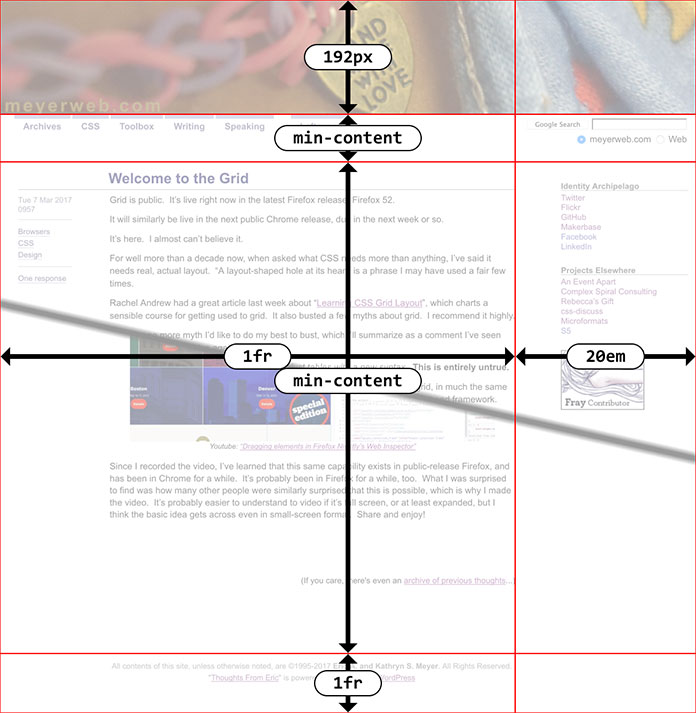
…In the run-up to Grid support being released to the public, I was focused on learning and teaching Grid, creating test cases, and using it to build figures for publication.  And then, March 7th, 2017, it shipped to the public in Firefox 52.  I tweeted and posted an article and demo I’d put together the night before, and sat back in wonderment that the day had finally come to pass.  After 20+ years of CSS, finally, a real layout system, a set of properties and values designed from the outset for that purpose.

And then I decided, more or less in that moment, to convert my personal site to use Grid for its main-level layout.

Me, writing for A List Apart, taking you on a detailed, illustrated walkthrough of how I added CSS Grid layout to meyerweb.com, while still leaving the old layout in place for non-Grid browsers.  As I write this, Grid is available in the latest public releases of Firefox, Chrome, and Opera, with Safari likely to follow suit within the next few weeks.  Assuming the last holds true, that’s four major browsers shipping major support in the space of one month.  As Jen Simmons hashtagged it, it’s a new day in browser collaboration.

As I’ve said before, I understand being hesitant.  Based on our field’s history, it’s natural to assume that Grid as it stands now is buggy, incomplete, and will have a long ramp-up period before it’s usable.  I am here to tell you, as someone who was there for almost all of that history, Grid is different.  There are areas of incompleteness, but they’re features that haven’t been developed yet, not bugs or omissions.  I’m literally using Grid in production, right now, on this site, and the layout is fine in both Grid browsers and non-Grid browsers (as the article describes).  I’m very likely to add it to our production styles over at An Event Apart in the near future.  I’d probably have done so already, except every second of AEA-related work time I have is consumed by preparations for AEA Seattle (read: tearing my new talk apart and putting it back together with a better structure).

Again, I get being wary.  I do.  We’re used to new CSS stuff taking two years to get up to usefulness.  Not this time.  It’s ready right now.

So: dive in.  Soak up.  Enjoy.  Go forth, and Grid.


Scaling SVG Clipping Paths for CSS Use

Published 7 years, 10 months past

I’ve been working a lot with the clip-path property recently, as I write the chapter on filters, blends, clipping, and masking for CSS: The Definitive Guide’s long-delayed 4th edition (available now in early-release format!).  One of the nifty things you can do with clipping paths is define them with percentage-based coordinates.  For example, here’s a hexagon-like clipping path:

clip-path: polygon(50% 0, 100% 25%, 100% 75%, 50% 100%, 0 75%, 0 25%);

That starts at the center top (50% 0), goes to the right edge, quarter-down (100% 25%), and so on.

When I got to SVG-based clipping, which you can use with the CSS pattern clip-path: url(#pathID), I tried and failed with this:

<clipPath id="hexlike">
  <polygon points="50% 0, 100% 25%, 100% 75%, 50% 100%, 0 75%, 0 25%" />
</clipPath>

It didn’t work because, as I discovered to my horror, SVG does not allow percentage coordinates.  I could just strip all the percent signs out, but that would be the same as saying this in CSS:

clip-path: polygon(50px 0, 100px 25px, 100px 75px, 50px 100px, 0 75px, 0 25px);

I didn’t want pixels, though.  I want percentages, darn it all!

So I asked around on Twitter, and Markus Stange pointed me to the solution: converting all the SVG coordinates to the range 0–1 and using the clipPathUnits attribute.  The working version looks like this:

<clipPath id="hexlike" clipPathUnits="objectBoundingBox">
  <polygon points="0.5 0, 1 0.25, 1 0.75, 0.5 1, 0 0.75, 0 0.25"/>
</clipPath>`
A hexlike clipping path.

That yields the same result as the polygon() CSS shape with the percentages I showed before.

All that is great if you’re writing your own SVG shapes and can make sure you set it up properly, but what if someone hands you a shape to be used as a clip path and it’s in absolute coordinates like 100 75?  If you’re really lucky, the shape has a viewbox of 0 0 100 100 (or all the coordinate points are in that range) and you can just divide all the coordinate points by 100 to get the proper values.  But that’s really tedious for any but the simplest of shapes, and besides, what if it has some other viewbox?  That’s where the transform attribute saves the day.

For example, suppose you get an SVG file that looks like this (with the actual path coordinates removed because there are a lot of them):

<svg version="1.1" xmlns="http://www.w3.org/2000/svg"
  xmlns:xlink="http://www.w3.org/1999/xlink" viewBox="0 0 329.6667 86">
  <clipPath id="cloud02">
    <path d="…(coordinates go here)…"/>
  </clipPath>
</svg>

First, add the clipPathUnits attribute to the <clipPath> element:

<svg version="1.1" xmlns="http://www.w3.org/2000/svg"
 xmlns:xlink="http://www.w3.org/1999/xlink" viewBox="0 0 329.6667 86">
  <clipPath id="cloud02" clipPathUnits="objectBoundingBox">
    <path d="…(coordinates go here)…"/>
  </clipPath>
</svg>

Next, look at the viewBox attribute on the <svg> element itself.  The value there is 329.6667 86.  That means 329.6667 coordinate units horizontally, and 86 units vertically.  So all you need to do now is divide all the horizontal values by 329.6667, and the vertical values by 86.  Which would be super tedious, except we have scaling transforms at our disposal:

<svg version="1.1" xmlns="http://www.w3.org/2000/svg"
  xmlns:xlink="http://www.w3.org/1999/xlink" viewBox="0 0 329.6667 86">
  <clipPath id="cloud02" clipPathUnits="objectBoundingBox"
   transform="scale(0.003033 0.0116279)">
    <path d="…(coordinates go here)…"/>
  </clipPath>
</svg>

Those two values are 1/329.6667 and 1/86, respectively, and they effectively scale every point in the d attribute to fit into the needed 0–1 range.  (That’s not precisely what happens, but the outcome is the same.)  Thus we have an SVG clipping path that scales with the element and fits to its dimensions!

This works just as well for other markup patterns.  To return to the hexlike path from before, assume it was written like this:

<svg version="1.1" xmlns="http://www.w3.org/2000/svg"
 xmlns:xlink="http://www.w3.org/1999/xlink" viewBox="0 0 100 100">
  <clipPath id="hexlike">
    <polygon points="50 0, 100 25, 100 75, 50 100, 0 75, 0 25" />
  </clipPath>
</svg>

If that were applied as-is, via clip-path: url(#hexlike), it would create a hex-like clipping path that fits a 100px by 100px box, positioned in the top left of the element (in left-to-right languages, I presume).  The quick fix:

<svg version="1.1" xmlns="http://www.w3.org/2000/svg"
 xmlns:xlink="http://www.w3.org/1999/xlink" viewBox="0 0 100 100">
  <clipPath id="hexlike" clipPathUnits="objectBoundingBox"
   transform="scale(0.01)">
    <polygon points="50 0, 100 25, 100 75, 50 100, 0 75, 0 25" />
  </clipPath>
</svg>

Bingo bango bongo, it will now scale to the element’s dimensions, whatever those turn out to be.

Of course, if you apply that to something like a short paragraph, it will be verrrrry stretched out, but the same would be true with a percentage-based polygon() shape.  The beauty here is that you can scale any coordinate set, so if you have a tiny path that you want to blow up, or a huge path you want to shrink down, you can transform it without using clipPathUnits to stretch it over the bounding box.  Something like this:

<svg version="1.1" xmlns="http://www.w3.org/2000/svg"
 xmlns:xlink="http://www.w3.org/1999/xlink" viewBox="0 0 100 100">
  <clipPath id="hexlike" transform="scale(4)">
    <polygon points="50 0, 100 25, 100 75, 50 100, 0 75, 0 25" />
  </clipPath>
</svg>

That gets you a hexlike shape that fits a 400px by 400px box, for example.

Now all CSS needs is the ability to size and position clipping paths in a manner similar background images, and we’ll be in clover.  I hope such properties are in the WG’s mind, because I’d love to be able to just point an at SVG clipping path, and then say something like clip-path-position: center; clip-path-size: contain;.  That would remove the need for fiddling with SVG attributes altogether.

Thanks to Markus Stange for the technique and his invaluable assistance in proofreading this article.


Talking Shop

Published 8 years, 9 months past

Sara and I are guests on the most recent Shop Talk Show, espiode #212, where we talked with Chris and Dave about Design for Real Life, Google Mic Drop, and more.  We had a good time with it, and hope you will too.

In a moment of slight coincidence, the episode was released almost exactly a year after my first appearance on Shop Talk (espisode #161), where I covered similar topics.  At that point, Sara and I were still researching and tossing ideas for the book back and forth.  Now here we are, a year later, with the book out.  It’s a little wild to contemplate, honestly.  It was a lot of work in a pretty short time frame… but so very much worth it.


In The Manual: “We Are What We Build”

Published 8 years, 9 months past

I’m honored to be included in Issue 5 of The Manual, doubly so because it may well be the last issue of The Manual, triply so because I spoke at the very first Build Conference, the event that gave birth to The Manual.

I have two pieces, as is traditional for The Manual: an article titled “We Are What We Build”, and a short, untitled ‘life lesson’ about a whiny 12-year-old me and my grandfather’s quiet wisdom.

A quote from “We Are What We Build”:

The challenge now is in how those fragments of our lives are treated. This is as much a social question as a technological problem, but the two are not separable. What Facebook and Twitter and Instagram and every other at-scale social network does now — everything they make possible or impossible, everything they make easier or harder — will shape what we think of as normal in a decade or two.

Past readers may recognize this sentiment (as well as the title) from my talk at XOXO 2015, which was heavily intertwined with the article for The Manual.  One led to the other, in fact.  I proposed the talk, which Andy B. accepted, and then Andy M. asked me if I’d write it for The Manual.  So I did.

I was glad to write both, and I hope you enjoy them… and more importantly, I hope they provoke some reflection.


New Article: “Compassionate UX”

Published 8 years, 9 months past
Sara and I wrote an article for UX Booth, “Compassionate UX”, and it was published last week.  Two quotes (out of a ~1,750-word article):

When we get laser-focused on positive outcomes, we often fail to notice how things might go terribly wrong. But whether you’re working on something as complex as artificial intelligence or as simple as a line of microcopy, you’ll create the best products when you intentionally set aside your goals of “delight” or “engagement,” and make time to think critically about where your product might break.

It’s easy to see this as an uncomfortable restriction on the creative process, and that’s actually a pretty accurate description. Of course thinking about users’ varied identities and emotional states creates limiting factors. But that’s what design is: it is a creative solution to a set of constraints.

Read the whole thing over at UX Booth.


Design For Real Life Now Available

Published 8 years, 10 months past

A banner showing ‘Design for Real Life’ in various media

Available as of this morning from A Book Apart in both digital and paper formats: Design for Real Life, the book Sara Wachter-Boettcher and I started writing not quite a year ago.

Anil Dash was kind enough to write a wonderful foreword for the book, in which he perfectly describes the background we were working against:

Two billion people now have some kind of access to internet technologies, and almost all of them are spending more and more time with their thumbs flicking across their phones. And the technology they’re using has a real impact on their lives. They don’t use an app to “share photos”; they use it to maintain a relationship with distant family. They don’t need to do “online banking”; they need to lend a friend money to help them out of a jam. Nobody wants to learn a complicated set of privacy controls; they just want to be able to express themselves without antagonizing bosses or in-laws.

Our thesis, against that, was to say, “As personal and digital lives become closer and effectively merge, the things we design will have to work harder and harder to deal with real people in all their messy complexity.  How can we start people thinking about this, and what tools can we give them?”  That’s what we strove to create, and now you can judge for yourself whether we succeeded.

I’ll be honest: we were pretty scared as we wrote it.  This is not a topic area that’s gotten a ton of attention, and in a lot of ways we were breaking new ground — but, at the same time, we were very aware that there was existing research and knowledge in related areas, so we wanted to be sure we were inclusive or, and respectful of, that work.  We talked to a lot of people in a variety of disciplines, trying to make sure we brought in information that would help the reader and not flying in the face of things that were already known.

So you can imagine our relief and gratitude as we’ve heard glowing reactions from people who read preview drafts — among them Kim Goodwin, Indi Young, Sara Soueidan, Caren Litherland, and Karen McGrane.  Paul Ford said, “Anyone who aspires to build global products that people love should read this book now,” and Kate Kiefer Lee said, “It will be required reading on my team.”

You might think cover blurbs like those are pure marketing fluff, and maybe in some genres they are.  For us, they serve double duty: to let you know that people who know what they’re talking about believe we know what we’re talking about, and also to let us know that.  There were days we weren’t entirely certain.

To be clear, this isn’t a book about forever treating people with kid gloves.  We say “compassion isn’t coddling”, and that’s absolutely the case.  An error message still needs to convey the error; an account lockout still needs to keep the account locked.  But how we convey errors or lockouts, and how we make people aware of the possible ramifications of their actions, is critical.  Just as there are good ways and bad ways to commiserate with a grieving friend or handle a difficult work situation, there are good ways and bad ways to approach people in our designs.

As I said before, we need to deal with real people, in all their messy complexity.  We hope Design for Real Life is the start of a whole new conversation within our field, one that will teach Sara and me just as much as anyone else about how we can be more thoughtful and humane in what we create.


A More Compassionate Facebook

Published 9 years, 3 months past

It’s been a busy couple of weeks for Facebook, in terms of compassionate design decisions.

First they announced that they aren’t adding a Dislike button, but they are adding a set of six emoji reactions to the “Like” button, so you can indicate a wider range of emotion.  Some people immediately linked this to Slack, as if emoji reactions hadn’t been a thing on social media for the last couple of years.  I happened to see Sally Herships asking “what are your thoughts?” about it on Twitter (heh), and oh, I had thoughts.  I ended up sharing some of those thoughts by phone, and one of them was part of a segment on American Public Media’s Marketplace.

It’s funny, in a way, that my thought on marketing and advertisers was what made it into the piece, because I think that was literally my whole thought about that side of things.  Most of the rest of my conversation with Sally was about how Facebook could use these reactions as a way to avoid insensitive design choices.  As an example, a status update that gets lots of interaction in the frowny-face or sad-face realm could be avoided when it comes to things like Year in Review.  I said something to the effect of:

People are sharing everything about their lives, positive and negative, billions of us every day.  That isn’t going to stop, so it’s great to see Facebook making changes to meet us where we are, or at least meet us partway.

These reaction emoji almost certainly aren’t the last word on this, but they’re a credible initial attempt.  In more than one sense, they’re a first step into a larger world.


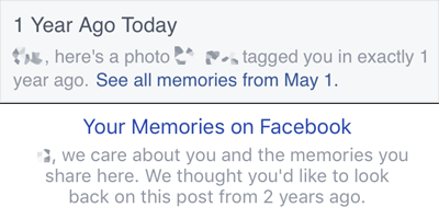
Next, Facebook introduced filtering for its On This Day (OTD) feature.  This is another step in the evolution of On This Day, one that’s very welcome.  Facebook had already been revising its language to be more humane, shifting from simple “Relive this memory” to nuanced language expressing care and openness.

The original and more recent copy at the top of an On This Day memory.

With its new OTD preferences, Facebook now lets you define ranges of dates you’d like to be blacklisted, in effect, as well as people you don’t want to see memories about.  I’d commented on the lack of this, back when OTD launched:

…what I notice here is what’s missing:  I don’t see any reference to an ability to opt out of On This Day, either for certain days or altogether.

So far as I can tell, you still can’t opt out entirely; even if you turn off all notifications, you can still get memories inserted into your timeline.  For me, I see about one a month, more or less.  But here’s the interesting thing: they’re almost never my memories.  In what I still regard as a major gamble by Facebook, On This Day will show you posts, pictures, and videos posted by someone else, but on which you were tagged.  I presume (though I have no simple way to test) that adding a person in the OTD filtering preferences will prevent you from seeing memories in which they’re tagged as well as memories they posted.

If so, that’s a really smart step, as I can only imagine how a spiteful ex might abuse OTD.  It still leaves open the possibility of old posts that you don’t remember being tagged on suddenly appearing.  In many cases, that will be a delightful moment, but in many others, the exact opposite of that.  This is why I regard Facebook’s decision to show you posts from other people a gamble.  Even if they show unwanted memories to just 1% of their user base — a ridiculously low percentage — that’s literally 10 million people a day.

Still: wrinkles or no, flaws or no, the presence of filtering preferences is a major enhancement to On This Day.  I could block out all of June 2014, if I so chose.  There might be years where I blocked it, and others where I removed the block.  The important thing is that I’m being given that capability, in an environment that’s already designed to show me memories and acknowledge that it’s easy to get that wrong.  The user experience for adding filters is still clunky, but much like the reaction emoji, I view this as a credible first try, not the final word.

All this has made for some interesting Slack discussions between me and Sara, as we literally just finished the manuscript for our forthcoming, still-not-quite-titled-but-we’re-really-close-honest book on compassion in design.  Which has references to things like On This Day, so we’re already revising a book that hasn’t even been published yet.  And when will it be published?  We’re pulling for early next year, which sounds like a long way away until you remember that 2015 is getting close to done.

Kudos to Facebook, both for its efforts to be kinder in what they do and for its willingness to try.  Not many businesses, let alone social-media titans, have had the courage to think about what can go wrong in this realm, let alone actually acknowledge missteps and work to do better.  Well done.


Browse the Archive

Earlier Entries

Later Entries