Canvas-ing the Web
Published 2 weeks, 2 days pastOver the years, I’ve created an experiment or two that drew stuff to a <canvas> element: a wave function collapse experiment here, a crystallizing palette there. After a while, I found a way to wire up a button so that clicking it would save the canvas’s contents to my computer as a PNG file. Pretty cool, I thought. Can I do the same thing with HTML+CSS structures?

Turns out, no. I could use, and often have used, Firefox’s “Screenshot node” menu entry in the web inspector, or the :screenshot command in Firefox’s console, but not do it with an in-page button. Because HTML nodes don’t go in <canvas>, you see, let alone styled and scripted ones.
Or they didn’t, until just recently, when Chrome shipped a flag-gated preview of the HTML-in-canvas API. How it works is, you add a layoutsubtree attribute to a <canvas> element, and then you can put whatever HTML you want in there, with whatever CSS and JS you would normally apply to it, add a couple of magic JScantations, and what the browser would normally have painted to the page is painted to the canvas, at whatever speed the browser can manage (usually 60 frames per second or more, because web browsers are high-end first-person scrollers).
If you want to try all this out for yourself, I commend you to Amit Sheen’s “The Web Is Fun Again” over at the Frontend Masters blog, where he details how to get yourself set up for the wackiness this makes possible, and then shows some experiments. Water ripples over your pages, lens distortions that follow the mouse pointer, chromatic aberrations!
Which, I admit, all sound really off-putting to the “I just want to use the web” folks among us. What possible utility is there in having an input form that, say, makes ripples spread out from every character you type? Or having dropdown menus fall to the bottom of the page, but still actually work? Probably not a lot, unless you’re an expensive design studio working on a brag page.
But remember, this is how any new graphic advancement goes: we, by which I mean the collective web industry, start by doing really outré and eye-catching stuff that we later have cause to regret. Remember parallax scrolling effects? The early days of CSS animation? Drop shadows? There will be an initial period of excess, and then it will all settle down.
I’ve already skipped straight to the settle down part, though.
See, when I asked myself if I could render HTML+CSS on a <canvas> and then save the image to my computer, it wasn’t just me doing that “push at the limits of web features” thing I do sometimes. I had an actual, practical use case in mind: I wanted to save social media banners and thumbnails from a browser-based tool I built for my work at Igalia, just by clicking or otherwise triggering a button.
If you’re subscribed to our YouTube channel, you’ve seen these thumbnails; ditto if you’re following us on Mastodon or Bluesky. To produce those, I have an in-browser thing I built out of custom elements. It’s where the super-slider pattern developed
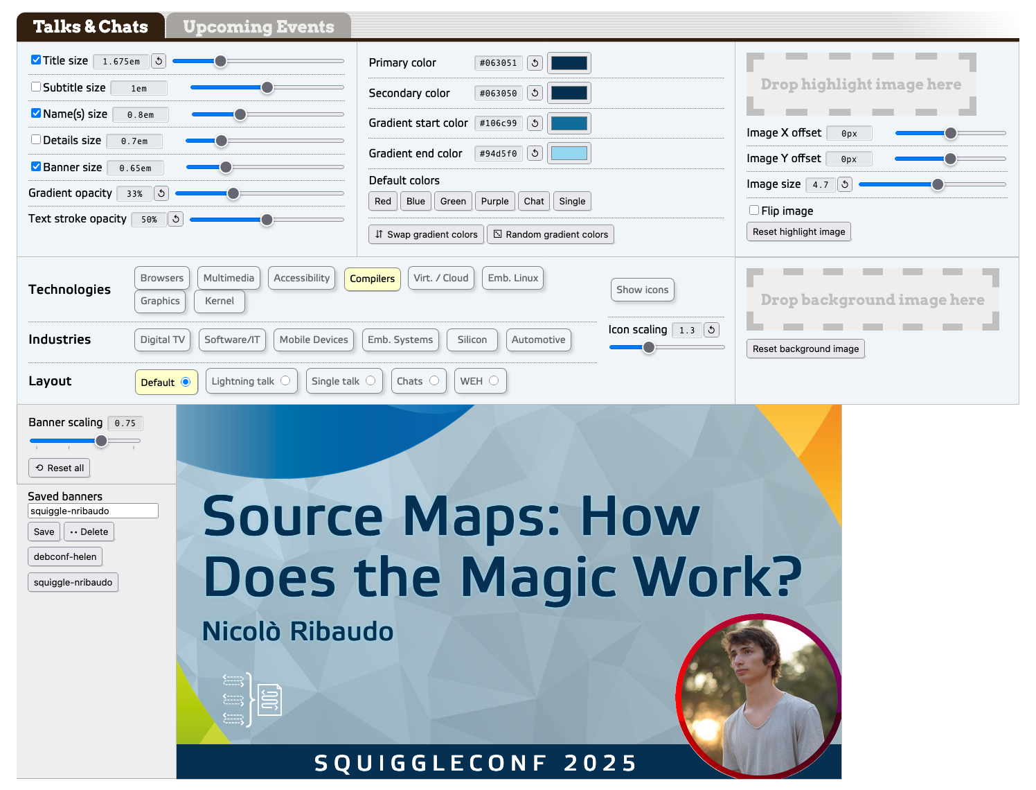
The text bits in the banner are all contenteditable HTML elements, and the various themes are managed with various blocks of CSS. (And yeah, those range inputs are all “super sliders”.) The point of all this being, I built it so that anyone at work could use it to make
banners whenever they needed, without having to wait on me to do so.
What I’ve always wanted, in order to make things easy for anyone who isn’t me, is a “click this button to save the banner as an image” feature. Anyone at Igalia could easily learn (if they didn’t already know) the web-inspector-or-console stuff I was using, of course, but it just felt so janky. A touch embarrassing, if I’m being honest.
Well, now I have what I wanted. In any browser that supports HTML-in-canvas, there is a button labeled “Download banner image”. Right now, that’s recent Chrome with the proper developer flag enabled. For all other browsers, there’s no button, and you just use the same web inspector screenshot tricks we’ve always relied on.
Making this happen wasn’t as easy as maybe that sounded, though. I hit a couple of snags along the way, one of which was quite frustrating. Those are what I actually brought you here to talk about.
The first snag was that I had to get the thumbnail preview into a <canvas> element without blowing the call stack. To explain that, let me show you a rough skeleton of the tool’s markup.
<section id="youtube_talks">
	<thumb-panel class="text"> … </thumb-panel>
	<thumb-panel class="colors"> … </thumb-panel>
	<thumb-panel class="highlightImage"> … </thumb-panel>
	<thumb-panel class="backgroundImage"> … </thumb-panel>
	<thumb-panel class="icons"> … </thumb-panel>
	<thumb-panel class="scaler"> … </thumb-panel>
	<thumb-panel class="loader"> … </thumb-panel>
	<thumb-preview> … </thumb-preview>
</section>
As you can read, it’s basically all custom elements, each with their own connectedCallback() function to do whatever scripting magic needs to be done when the browser first encounters them. To wrap that last element, the <thumb-preview>, inside a <canvas>, I needed to create a new canvas element, shift the preview element into the new canvas, and then insert the preview-bearing canvas, ending up with this structure.
<section id="youtube_talks">
	<thumb-panel class="text"> … </thumb-panel>
	<thumb-panel class="colors"> … </thumb-panel>
	<thumb-panel class="highlightImage"> … </thumb-panel>
	<thumb-panel class="backgroundImage"> … </thumb-panel>
	<thumb-panel class="icons"> … </thumb-panel>
	<thumb-panel class="scaler"> … </thumb-panel>
	<thumb-panel class="loader"> … </thumb-panel>
	<canvas layoutsubtree>
		<thumb-preview> … </thumb-preview>
	</canvas>
</section>
Thus, when the <thumb-preview> was loaded in, I had its connectedCallback() run a check to see if HTML-in-canvas is supported. In situations where it is supported, I did what was needed to get to the above result.
At which point, since the <thumb-preview> is a custom element that was being placed into the DOM, it fired its connectedCallback(), thus starting the process again, creating a canvas and inserting the <thumb-preview> into the new canvas, which started the process again, recursing toward infinity. Within milliseconds, the call stack was exceeded.
So… that wasn’t going to work.
I thought for a moment that I could avoid this by setting a flag variable to true and then checking for its existence in order to skip the whole canvas-creation-preview-insertion part, but I couldn’t figure out how to make that actually work. Then I thought maybe I could sidestep the whole imbroglio using connectedMoveCallback(), but this wasn’t a move, it was a (re-)creation.
That callback was the route to fixing this problem, though. You see, there is a way to move elements from one part of the DOM to another: Element.moveBefore(). There’s no moveAfter() or moveInto(), sadly, just “move this node to the spot right before some other node”.
Here’s how I made use of that feature:
let canvas = document.createElement('canvas');
canvas.setAttribute('layoutsubtree','');
canvas.setAttribute('width','1280');
canvas.setAttribute('height','720');

this.closest('section').appendChild(canvas);

let beacon = document.createElement('span');
canvas.appendChild(beacon);
canvas.moveBefore(this,beacon);
beacon.remove();
Yep. I created a canvas, stuck the canvas into the closest ancestor section, created a span, stuck the span into the canvas, moved the preview element to right before the span, and then deleted the span. (There may well be a better way to do this, one that my DuckDucking failed to turn up. If so, please comment below!)
Oh, and here’s what gets executed when the preview is moved, instead of append-created:
connectedMoveCallback() {
	return;
}
Heckuva way to run a railroad.
At that point, I had the canvas where I wanted it and the preview where I wanted it, and the call stack remained un-blown. Huzzah! I then recited the magic JScantations to make the canvas actually render its subtree
Almost.
Because the second snag, you see, is that canvases have an explicit size. Are in effect required to do so, because otherwise they default to zero pixels tall and wide. So if you want to see anything, you need to give them some dimensions. I did that, as the code before showed, making the canvas 1280×720 setAttribute() methods.
The problem is, the default scale factor on the thumbnail preview is 0.75, which translates to 960×540. Thus, when I clicked the image capture button, my browser downloaded a 1280×720 image with the thumbnail in the top left, and transparency below and to its right.
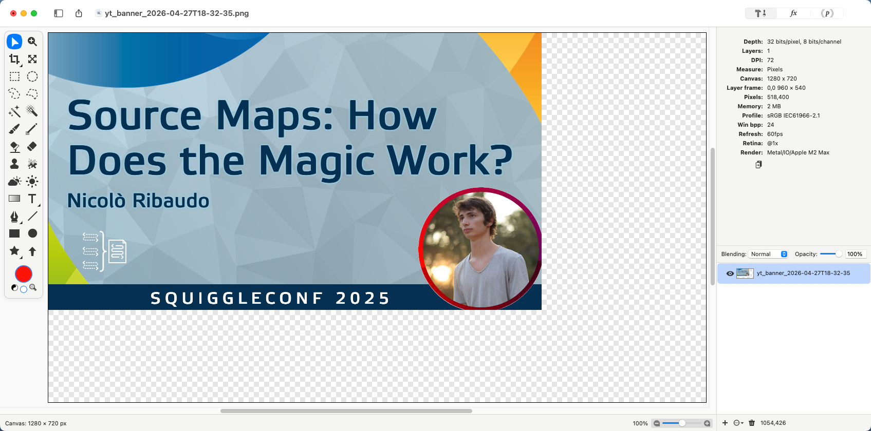
“Just resize the canvas, ya dork!” you might say. I certainly did (say that, I mean). But if I set it to 960 wide and 540 tall, then when the scale was increased to 1, I got a 1280×720 DOM node cropped to its top left 960×540. I needed to dynamically resize the canvas element to have its size match the size of the thumb-preview.
And this is where I ran headfirst into several brick walls, because orcing a canvas element to resize in all the situations you want it to, including when it’s spawned, is not nearly as easy as you’d think. It wasn’t for me, anyway. I bulled my way through to a solution, eventually, painfully, but I got there.
(As I write this, I’m wondering if I should have also created a <div>, appended the canvas to that, and then used CSS to change the div’s size while the canvas was set to have 100% height and width. Or maybe have the DOM subtree pinned to 1280×720 and use CSS scale to change the canvas size visually. Or perhaps some kind of resizeObserver shenanigans. Or probably just pass some parameters to the HTML-in-canvas drawElementImage method. Hmmm.)
Regardless of whether I overlooked a less frustrating way do what I wanted, this does still point to a fundamental tension in the HTML-in-canvas approach: sizing.
Canvases do not, as a rule, grow or shrink to fit their contents. DOM elements, as a rule, very much do, unless you force them not to. HTML-in-canvas is taking a very fluid, flexible, mostly unbounded layout paradigm and rasterizing it, or at least some of it, into a very bounded window of a given size. Sixty times (or more) every second, the browser is taking a screenshot the size of the canvas’s content box and pasting said screenshot into that content box. You can do fun stuff to it along the way, with filters or shaders or canvas draw calls or whatever you can code up, so that each one of those screenshots gets jazzed up in some fashion, but at base, it’s still fundamentally screenshot, paste, screenshot, paste, over and over.
For use cases like mine, this isn’t really a big problem. I am, in the end, trying to get a screenshot of a static part of the page. HTML-in-canvas is very good for that. It could completely revolutionize the browser-based slideshow genre. The Reveal.js plugin landscape alone could be a sight to behold.
But in the general cases — the kinds of things we mostly do most every day — I don’t think this is likely to catch on. We might develop some patterns to make it easier, some interesting hacks to overcome the mismatch, but I don’t think that will significantly move the needle. On the other hand, if canvases can be made as flexible and content-wrapping as a bog-standard <div>, then I would expect to see a lot more usage.
Although if that can be done, then we wouldn’t really need to stay chained to HTML-in-canvas. Instead, we could define a syntax to mark standard HTML elements as more visually manipulable, via an HTML attribute or CSS property or DOM method or all three.
We’ve gotten close to that before: CSS Houdini and Microsoft’s original filter property, to pick two examples. We could try again. Maybe the HTML-in-canvas period is how we figure out what that simpler syntax should look like, by figuring out what it should make possible, and what it should make easy.
I’d be okay with that. How about you?
Many thanks to my colleagues Brian Kardell and Stephen Chenney for their early review and feedback on this post.