Posts in the CSS Category

The Font of Frustration

Published 22 years, 5 months past

I’m still wrestling with the entire issue of fonts and font sizing.  A lot of this arises from a meyerweb redesign on which I’ve been occasionally working for the last few weeks.  My last redesign switched font styling from the user default to 11-pixel Verdana.  This is not a choice without its detractors; apparently I’ve earned the nickname “Mr. Microfonts” in some circles.  It’s also a choice I made knowing full well its benefits and drawbacks.

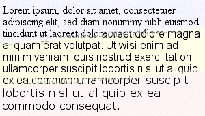
An image showing 'lorem ipsum' text in three different fonts (Times New Roman, Arial, and Verdana) at the browser's default font size, which works out to be 16 pixels.

When I decided to go to a sans-serif font, it became almost mandatory to crank down the size.  Take a look at the accompanying image, which shows a comparison of the default-size text in IE5/Mac in Times New Roman, Arial, and Verdana.  To produce the text, all I did was set the font family, not the size.  They’re all effectively at font-size: 1em;, which given the browser’s default setting is the same as if I’d set them all to font-size: 16px;.  The same size value but a changing family means huge differences in the text’s appearance.  This is why font-size-adjust was invented, by the way.  Too bad only Mozilla for Windows supports it.  The lack of cross-browser implementation led to its removal from the CSS 2.1 Working Draft.

Nonetheless, when I started fiddling with the new design—which is more an evolutionary change than a revolutionary makeover, so don’t get too excited—I decided to see if I could go back to the user-default approach and still be happy with the result.  I think I’ve managed it, but what’s been interesting to me has been how that choice has influenced the entire design process.  What I have now is something that I think works well with a serif font, but if I were to switch to a sans-serif font, I’d have to change other things as well.  More proof of the fundamental importance of text styling, as if any more were needed.  Those of you who went to design school have known this for years, I suppose.  Nothing I studied in the pursuit of my B.A. in History really taught me the importance of typography.

Speaking of redesigns, Scott Andrew just launched one, and I really like it.  There are some interesting behaviors at my default window size, which is apparently smaller than his, but overall my thumbs are up.  The warm tones and nice use of sunflowers make a nice antidote to the recent trend of minimalist white-backed redesigns, which are all fine but were starting to get a bit monotonous.

Looking over Scott’s new design, I realized how much I envy people who can come up with attractive color combinations; all my designs tend to be monochromatic variations (gee, really?).  People like me need EasyRGB‘s Color Harmonizer just to get started.


Out of Character

Published 22 years, 5 months past

After more than a year of sitting bolt upright in a chair whose back was about 20 degrees from horizontal, Kat finally got me to buy a new chair on Saturday.  I assembled it this morning, which anyone who knows me will tell you is astonishing on two counts:

  1. I put it together less than a month after I bought it.  Usually I let a project like that sit for a while, to let it come to the proper sense of fullness.  Or else because I’m lazy.
  2. I put it together, period.  I’m not what you would call handy with a toolbox.

I did put the armrests on backwards, but I did that on purpose.  They look cooler this way.

A screenshot of text on the O'Reilly Network which has some severe character-encoding problems.

Font and text handling seem to occupy more and more of my attention of late.  Here’s another good example of the problems we face: character encoding.  This morning I dropped by the O’Reilly Network and spotted some badly mangled text.  Apparently that’s supposed to be a “ü” in there, since that’s what the referenced article shows.  How did this happen?  No doubt somebody copy-and-pasted the text from a word processor into a CMS interface, and it looked fine on their machine when they previewed the text.  Unfortunately, in my Web browser, no such luck.  (This was in IE5.1.4/MacOS9.1, but a quick check in a recent Mozilla build showed the same problem.)  It may have gone through some XSLT for extra munging, for all I know.

I have a little experience with the encoding problems that can arise when you’re working with XML and XSLT.  If you want to use HTML-style character entities, you have to write a stylesheet that defines every last entity you might use, which is kind of weighty, although I do it for this journal’s XML files.  For the new DevEdge, we wrote a separate namespaced transform based on the old entities.  In our world, a “u” with an umlaut is <ent:uuml/>; an “A” with a ring is <ent:Aring/>.  Of course we also have documents that are encoded for localization (e.g., DevEdge Japan) by their authors, and nobody else can touch them for fear that we’ll break the encoding.  For that matter, when we had an inline JavaScript alert for our printer-friendly links, the spaces in the value were encoded as %20.  Every browser showed those as spaces in the link, except Opera, which showed the raw text (“This%20page%20is%20already…”).  Is it right to do this?  Is it wrong?  I don’t know.  Do I care?  Not really.

In a like vein, I recently found out why recent e-mail message from a certain well-known CSS luminary look like an encoded binary to me, while his responses to other authors’ messages on listservs look just fine: he’s sending out 8-bit text in ISO-8859-1, and something between his fingers and my eyes is munging the text into 7-bit ASCII.  If he sends a message as 7-bit text, there are no problems.  I’m not sure if it’s my aging mail client or a server along the message’s path from him to me.  Again, I don’t care.  I shouldn’t have to care.

It seems that the more powerful our tools become, the more ways we have to break the flow of information.  This to me is exactly opposite of what should be happening.  It’s not that hard to implement character encoding, and it’s not that hard to agree on a character format.  We (as an industry) just haven’t done it to the necessary extent, and there’s really no excuse for this fact.  A character should be a character.  If Unicode is the answer, then great, let’s do it.

As is common for my little technology rants, I don’t have a solution, only questions.  My biggest question is, “How long until we fix this basic problem?”  I don’t even care about how, really.  Just when.

Today is a triple-three, for those of you who care and use two-digit date formatting: 03/03/03.  I wonder if any lotteries will have that number come up tonight.  I still remember when the American Embassy hostages were released by Iran after 444 days in captivity, and that night one state lottery’s Pick 3 came up 444.  Those kinds of coincidences are always fascinating to me.


Upgrading Designs

Published 22 years, 5 months past

The Amaya team has recently said they’re very willing to accept contributions of redesigned icons and color choices for the browser.  So those of you with talent in that area, get to it!  Since the WThRemix contest closes today, you should have plenty of time to devote to Amaya, right?  Right?  Right.

I recently had a very interesting conversation with Ian Hickson about fonts and font-sizing.  Both of us have thought a lot about fonts in CSS and Web typography over the years, but I think we both realized that we had more thinking to do.  When you get right down to it, there is no good solution regarding font sizing on the Web today.  Every authorial choice has a drawback for some visitors, and every choice has a lot of benefits.  Pixels penalize high-resolution visitors who can’t (or won’t) use text zooming.  Percentages and ems can penalize visitors who have changed their default font size.  Leaving the text at user default looks stupidly big for visitors who haven’t changed their default font size.

It doesn’t help matters that there are huge differences in how serif and sans-serif fonts look at the same value of font-size, and that the commonly-available fonts on the Web today are not suitable for really nice typography.  I know some people think typography isn’t something we need to worry about, but it’s critical to good visual design and our current capabilites are laughably crude.  In fiddling with some test pages, I rapidly came to the conclusion that there just isn’t a good answer.  I’m not entirely thrilled with how this site’s typography is handled, for example, but I was even less thrilled by the other approaches I tested.

Is waiting for a downloadable-font mechanism our only hope?  I wish there were another answer, but right now, I don’t see one.  It seems we’ll have to accept and work with what little typographic control we have, and cede the rest of our textual desires to future improvements in both specifications and the browsers that implement them.


Try This On For Size

Published 22 years, 6 months past

Ian Hickson complains that he can’t read meyerweb.com due to his high-resolution display being placed too far away.  Two words, Ian: Text Zoom.  Two more words: user stylesheet.  (Three words, if you prefer “style sheet.”)  You can make the Web more legible with this simple rule:

html, body {font-size: 1em !important;}

That will reset this site’s text to match your browser’s default font size setting, because I do use ems and percentages for all elements that descend from the body element.  On the body, I use a pixel value for font-size, thus establishing the basic size of text for the site, and every other element scales from there.  Reset that element’s size, and you change the baseline from which the rest of the site is sized (which is how the “advanced setup” text-sizing feature works).  The same will happen on the new DevEdge, as it happens, and on any other site that intelligently uses inheritance and CSS to size text.  The tools are there.  Use them to your advantage.

(Aside: I find it weirdly funny that Ian’s complaining about not being able to read my site, which uses valid CSS, when his site is almost completely unreadable in IE5/Mac thanks to his valid CSS.)

I’ve been trying to come up with a name for this font-sizing approach.  “Baseline sizing” is too evocative of the baseline used to lay out lines of text, which has nothing to do with this technique.  “Body sizing” sounds like it’s a weight-loss program.  “Right sizing” probably hits too close to home for a lot of unemployed IT folks.  Something to mull over as I nurse back muscles sore from shoveling wet, heavy snow and ice.


The Nature of Progress

Published 22 years, 6 months past

A redesigned Netscape DevEdge has been launched.  Look, ma, no tables.  Well, hardly any, and none in the basic design.  I was a primary project manager for this one, and the design is a from-scratch effort.  It’s nothing visually groundbreaking, and of course using positioning for a major site has been done, but we’ve gone a step further into using positioning to make the design come together.  The site didn’t quite validate at launch thanks to some deeply stupid oversights on my part, but hopefully they’ll have been fixed by the time you read this entry.

As for the design approach we took… that’s a subject for another day, and also the subject of an article I wrote.  I predict that we’ll draw fire for using HTML 4.01 Transitional, for not validating when we launched, for our font sizing approach, and for our dropdown menus.  On the other hand, we’ll probably draw praise for making the markup accessible (once one of my stupid mistakes is fixed), for using CSS in a sophisticated manner, for pushing the envelope in reasonable ways, and for our dropdown menus.  For myself, I’m very much satisfied with and proud of the result, and very grateful for all the effort and help I got from the other members of the team.

On a less important but possibly more amusing front, yesterday I hacked together a color-blending tool after Matt Haughey asked on Webdesign-L how to calculate the midpoint between two colors, and Steve Champeon explained how to do it in some detail.  The JavaScript is no doubt inefficient and clumsy, the tool may not work in your browser, and for all I know it will lock up your computer.  It was just a quick hack.  Well, not quick, actually; I’m not very skilled at JavaScript.  Enjoy it, or don’t, as you like.  Just don’t expect me to fix or add anything unless you mail me the code needed to do whatever you want the tool to do.

Lucas Gonze over the O’Reilly Network mentioned a fascinating paper on “cascade attacks” and how they can be used to take down a distributed network.  So the Internet can suffer cascade failure, eh?  I wonder how much effort would be required to take down the Internet’s starboard power coupling.  Or, worse yet, trigger a coolant leak.

It’s been revealed that the blurry, grainy image of the Space Shuttle Columbia wasn’t taken using any advanced telescopes or military systems after all, but three engineers who used some off-the-shelf parts to put together a personal experiment.  CNN says: ‘Hi-tech’ shuttle pic really low-tech.  Let’s think about that for a second.  Three guys took an eleven-year-old Macintosh, hooked it up to a telescope that probably cost no more than a couple hundred dollars, and took a picture of an object almost 40 miles away moving 18 times the speed of sound.  That’s low-tech?  The fact that you can even recognize the object they imaged is astounding.  Hell, the fact that they imaged anything at all is astounding.  No criticism of the three men intended; I’m sure they’re brilliant guys who know what they’re doing.  But think about it!

I refer to moments like this as “technological vertigo.”  They’re those points where you suddenly come to a dead halt while you realize the incredible complexity of the world, and just how much we take for granted.  For that one moment, you stop taking it for granted.  Here’s an example: a couple of years ago, I was driving south through suburban Columbus.  In the back yard of a house just off the interstate, I spotted an old satellite dish lying on its side, obviously no longer in use.  Then it hit me: whoever lived there once had the ability to receive information from orbit, and decided to throw it away.  Their garbage was so much more advanced than anything their parents had ever even envisioned that the gap was barely comprehensible.  Any general in the Second World War would have given anything, including men’s lives, to have the kind of communication capability that now lay discarded in somebody’s back yard.

The even more remarkable thing about this trashed satellite dish is that there was nothing remarkable about it.  So somebody threw out an old satellite dish—so what?  They can always get another one, and one that’s a lot smaller, better, and more capable than the piece of junk they tossed, right?

And that is perhaps the most incredible part of it all.

The Silence of the Fat Lady

Published 22 years, 6 months past

Fabian Valkenburg sent in e-mail letting me know that my comments on Opera 7’s CSS support got used in the talkback to an evolt.org article, and that I’m wrong about Opera 7’s display of the dates on this page being a bug.  As it turns out, the answer to that is “maybe.”

First, a word on how I set up the title and date styling in the basic site theme.  Both are contained in successive h5 elements, each with an appropriate class value (title and date, in fact).  I make the title inline so I can wrap a border around it that “shrink-wraps” the text.  Then, since I want to move it upward, I relatively position it upward two-third of an em.  Since it has been relatively positioned, for the purposes of laying out other elements, browsers should act as though the element wasn’t positioned at all.  (See CSS2:9.4.3 for details.)  So, in that sense, the relative positioning should have no impact on how the date is laid out, and in fact it doesn’t in the browsers I tested; I only brought it up to show that the title wasn’t floated.  On the other hand, I float the date to the right and right-align its text.  Since I’m floating the date to the right from below the place where the date’s h5 would have been (because the date comes after the title), I give it a negative top margin to pull it upward, so that it sits just below the top border on the entry.

Now here’s where things get fuzzy.  According to CSS2:9.5.1, the outer top edge of a float may not be any higher than the top of preceding float or block boxes.  It doesn’t say anything about inline boxes.  Remember that with CSS, it’s possible to have inline and block boxes for sibling elements.  So the effect of that portion of CSS2 is to allow floats to ignore preceding inline boxes when they float.  Or not ignore them, as the case may be.

Let me frame it another way: here’s a testcase that shows h3 and h4 elements in the normal flow, and then with the h4 elements floated.  To my way of thinking, both floats should sit below the h3 elements that precede them, regardless of the type of box those h3 elements generate.  This is because my conception of floats is that they start from their place in the normal flow, and then move to the right (or left).  From there, they move downward if they must, but not up.  Unless I give them a negative top margin to move them up, of course.

The behavior I just described is what IE5.5/Win and Gecko-based browsers do, to pick two examples.  But what Opera 7 (and, in many cases, IE5/Mac) does is not a bug, because it doesn’t violate the CSS specification, so I retract my earlier statement.  I believe that what it does is not what  site authors would want, but it isn’t wrong.  Thanks to the wording in CSS2:9.5.1, neither are the browsers that don’t agree with Opera 7 wrong, although I would accept that they’re further away from the letter of the specification.  Whether or not they violate its spirit isn’t clear, and it’s in cases like this that browsers tend to do whatever their programmers thought best.

So what we have here is a gray area in which I believe the letter and spirit of CSS are pulling in different directions, and browsers are splitting over which path they choose.  Hopefully CSS2.1 will be clarified to address what should happen, and we won’t have to bother arguing about who’s doing what better in which way for whom.

As for css/edge, yes, I hear you.  Opera 7 gets most or all of the demos correct, and may in fact reveal some erroneous assumptions on my part in the pure CSS menus demo (or maybe not; I don’t know yet).  When I get time to actually run Opera 7 through all the demos and evaluate its behavior, I’ll see if I can get the support information updated.  Unless of course I finally decide that the support information is becoming too much trouble to have around, in which case I’ll update it into oblivion.  It never really helped prevent people from misrepresenting what the demos were supposed to do anyway.

Personally, I like Opera 7 (or did once I switched its skin to the classic look), and my comments weren’t meant to cast it into the junkbin of bad browsers.  If I were a Windows user, I’d probably use it a lot more than I do.  There are rough edges, as with any browser, but overall it’s quite good—I think I said that already, but some people don’t seem to have heard that part.  Opera 7 handles a site redesign project I’m working on a lot better than Opera 6 does, I’ll say that much.


Restyling Madness!

Published 22 years, 6 months past

Just a quick reminder that the WThRemix competition closes in eleven days.  Here’s your chance to remake the face of the W3C Web site, and maybe win some peer accolades and a few prizes along the way.  I’ll be impressed by any entry that gives the W3C site a bold new look without changing its markup structure at all, personally, but I’m not a judge so impressing me won’t get you anywhere in the competition.

Did I mention that the different thematic choices for adactio.com are really, really impressive when you visit the author’s journal?

I somehow missed the announcement of the winners of AllTheWeb‘s restyling competition, so I’m going to mention now that the contest is over and the winners’ entries publicly available.  There are some really good entries.  I worked (remotely) with one of the runners-up when he was an intern at Netscape last year.  Speaking of which, I hope to have some good (or at least interesting) news in the near future.

I’m off to be a geek or a guru, or maybe even both, at Tri-C’s Western campus tonight, where I’ll talk about (among other things) how CSS can be used to restyle any site, regardless of what the site author has to say about it.  Hope to see you there!


Increasing Circulation

Published 22 years, 6 months past

I’ve watched word of the Web Standards Meetup work its way through various blogs like a slow conceptual pulse, so I may as well keep it going.  I seem to be the only one in my area signed up so far, and I’m slightly bummed that there are cool people like Nick and Molly signed up in cities far away from me.  Of course it was only after I signed up that I realized the meetup is the same night I’m presenting at a local community college, so I’d be incredibly late or in absentia anyway.  Of course, people interested in standards could come meet at the talk, and then we could all go to a nearby place afterwards.  It’s an idea.  It might even be a good one.  You be the judge.

I’d been toying with the idea of trying to get local Web folks to assemble for socialization and (human-relation) networking for a while now, but thanks to Meetup I don’t have to undertake the organizational effort.  That’s pretty cool.  It just makes sense someone named Eric would be involved in something that cool.  We’re everywhere, and everywhere we go is cool.  That’s the kind of cool we are.

Some time yesterday, someone asked how my new book was coming along.  I asked which one they meant.  It turned out they meant Eric Meyer on CSS, and that they’d spotted a mention of it on MozillaZine.  So I went over to see what they had to say, and discovered they were saying that evolt had posted an interview with me last Saturday.  Well, shoot the horse and slap me silly!  I’m always the last to know.

Actually, said interview was already available in Italian, and I forgot to mention that fact until now.  I sense a karmic balancing here.

So, Opera 7.  It’s out, and yes, it does wonderfully well on css/edge, so you can all stop e-mailing me now.  I’ll update the demo pages one of these days to say so, I promise.  Just not today.  Opera 7 still suffers from some disappointing CSS bugs, though.  One is on this page right here, assuming you’re using the default page stylesheet or one of its variants.  The entry dates should be appearing below the horizontal line at the top of each entry, not above the borders.  Also, on my Speaking page, the :first-line underlining of li children of ul#upcoming is being applied to more content than it should.  Neither is really tragic, but they are a touch annoying.  Opera 7 also has some problems with negative text-indent values on block-level links; it seems to be flipping the sign on the value, so that it’s positive.  But I could be wrong about that, since I haven’t invested a lot of time in detailed analysis of the behavior.

There have also been some changes that make OperaShow do odd things to some of the files available on my Speaking page.  It’s probably a case of my writing my projection-media CSS to cater to Opera 6 bugs, and Opera 7 having fixed said bugs.  I probably won’t get around to fixing up old talk files, so if you really want to see them as first written, keep a copy of Opera 6 around.  Hey, at least you can have multiple versions of Opera on your computer, just like most browsers.

These are just the things I’ve noticed from a little surfing around.  To a degree, I’m just picking nits, but I also wonder how many other “combinatorial” problems I’m going to encounter.  It’s one thing to pass a test suite, which is a set of controlled circumstances that is easily predictable.  Dealing with the wonderfully wacky ways authors like to combine bits of CSS in pursuit of a given effect is something else entirely.

Is Opera 7 better than Opera 6?  Yes.  Does it have a good CSS engine?  Yes.  Is it the best CSS engine I’ve seen?  No.  Close, but not quite.

On a completely different front, the interface on this medical detector is really cool, not to mention the technology itself is pretty nifty.  Give ’em about 15 years to wedge in more advanced scanners and extra features, and we’ll have tricorders after all.


Browse the Archive

Earlier Entries

Later Entries