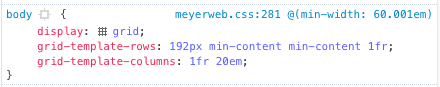
Chrome 57 released yesterday, not quite a week ahead of schedule, with Grid support enabled. So that’s two browsers with Grid support in the space of two days, including the most popular browser in the world right now. Safari has it enabled in Technology Preview builds, and just blogged an introduction to Grid, so it definitely feels like it’ll be landing there soon as well. No word from Edge, so far as I know.
I did discover a Chrome bug in Grid this morning, albeit one that might be fairly rare. I filed a bug report, but the upshot is this: most or all of an affected page is rendered, and then gets blanked. I ran into a similar bug earlier this year, and it seemed to affect people semi-randomly — others with the same OS as me didn’t see it, and others with different OSes did see it. This leads me to suspect it’s related to graphics cards, but I have no proof of that at all. If you can reproduce the bug, and more importantly come up with a reliable way to fix it, please comment on the Chromium bug!
I said yesterday I would write up the process of adding Grid to meyerweb, and I did. I started it last night and I finished it this morning, and when I was done with the first draft I discovered I’d written almost four thousand words.
So I pitched it to an online magazine, and they accepted, so it should be ready in the next couple of weeks. Probably not long after Chrome ships its Grid implementation into public release, in fact. I’ll certainly share the news when it’s available.
In the meantime, you can inspect live grids for yourself, whether here or at Grid by Example or The Experimental Layout Lab of Jen Simmons or wherever else. All you need is Firefox 52, though Firefox Nightly is recommended for reasons I’ll get to in a bit.
In Firefox 52, if you inspect an element that has display: grid assigned to it, you’ll get a little waffle icon in the inspector, like so:
Mmmmmm, waffles.
Click it, and Firefox will draw the grid lines on the page for you in a lovely shade of purple. It will even fill in grid gaps (which are a thing) with a crosshatch-y pattern. It’s a quick way to visualize what the grid’s template values are creating.
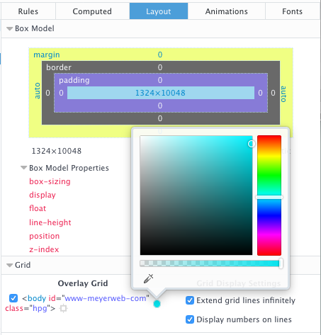
If you have Firefox Nightly, there’s an even more powerful tool at your disposal. First, go into the inspector’s settings, and make sure “Enable layout panel” is checked. You may or may not have to restart the browser at this point — I did, but YEMV — but once it’s up and running, there will be a “Layout” panel to go with the other panels on the right side of the Inspector. There you get the box model stuff, as well as a checklist of grids on the current page.
The Layout panel
For each grid on the page — not just the element you’re inspecting — you can set your own color for the gridlines, though those color choices do not currently persist, even across page reloads. You can also turn on number labels for the grid lines, which are currently tiny and black no matter what you do. And if you allow grid lines to extend into infinity, you can turn the page into a blizzard of multicolored lines, assuming there are several grids present.
This panel is very much in its infancy, so we can expect future enhancements. Things like color persistence and better grid line labels are already on the to-do list, I’m told, as well as several more ambitious features. Even as it is, I find it valuable in constructing new grids and diagnosing the situation when things go sideways. (Occasionally, literally sideways: I was playing with writing-mode in grid contexts today.)
There’s another, possibly simpler, way to enable the Layout panel, which I learned about courtesy Andrei Petcu. You type about:config into the URL bar, then enter layoutview into the search field. Double-click “devtools.layoutview.enabled” to set it to “true”, and it will be ready to go. Thanks, Andrei!
Grid is public. It’s live right now in the latest Firefox release, Firefox 52.
It will similarly be live in the next public Chrome release, due in the next week or so.
It’s here. I almost can’t believe it.
For well more than a decade now, when asked what CSS needs more than anything, I’ve said it needs real, actual layout. “A layout-shaped hole at its heart” is a phrase I may have used a fair few times.
Rachel Andrew had a great article last week about “Learning CSS Grid Layout”, which charts a sensible course for getting used to grid. It also busted a few myths about grid. I recommend it highly.
There’s one more myth I’d like to do my best to bust, which I’ll summarize as a comment I’ve seen many times: “Ugh, tables again?”
The underlying assumption here is: grids are just tables with a new syntax. This is entirely untrue.
I mean, yes, you can recreate 1990s-era table-based layout techniques with grid, in much the same way you can recreate the submit button with two JS libraries and a complex front-end framework. The ability to do it doesn’t necessarily make it a good idea.
(Though you might, from time to time, find the ability useful. Here’s what I mean: you can take a bunch of data contained in arbitrary markup someone else is producing, and lay it out in a tabular format. It would be far preferable to have the data in actual table markup, but if that’s not an option, grid will give you a potential solution.)
The way these are displayed is actually the inverse of their source order. I wanted them to be in document source such that the compositing steps were in chronological order, so that’s how I wrote them. Once I laid them out that way in the figure, using grid, I realized it made more sense to arrange them visually, with the bottom layer at the bottom of the figure, the next above that, all leading up to the result at the top.
So I just rearranged them on the grid, by assigning grid row numbers. The document source wasn’t touched. A bit simplified, the CSS to do that looked something like this:
ol li:nth-child(1) {grid-row: 4;}
ol li:nth-child(2) {grid-row: 3;}
ol li:nth-child(3) {grid-row: 2;}
ol li:nth-child(4) {grid-row: 1;}
Because the compositing examples (the “columns” in the layout) were represented as ordered lists, with the grid set up to place each image with some captioning, I could just change their order. So yes, it looks like a table, but the underlying structure is anything but table-like. Just to get each column of examples grouped together with tables, I’d have to nest tables, or accept a one-row table with each cell containing some other structure. Rearranging the columns would mean doing markup surgery, instead of just reassigning their layout placement via CSS.
Instead, I was able to represent the content in the best available structure (ordered lists) and then arrange them on a grid in the best way I could visually. For that matter, I could responsively change the layout from a six-column grid to a three-column grid to un-gridded lists as the viewport got more and more narrow. As, in fact, I did — check it out. If you make the window narrow enough, Grid is dropped entirely so you can see the base structure and content.
This ability to place grid items without respect to source order is a powerful tool, and like all powerful tools it can be used for good or ill. It’s possible to assemble a visually usable layout out of the most inaccessible, horrible markup structures imaginable. It’s also possible to assemble a visually usable layout from clean, accessible markup in ways we’ve never even dared dream.
Combine grids with other CSS features, and you can really create art. Jen Simmmons has a layout lab site, and her 2016 main-page design is… well, go see it in a grid-capable browser, like today’s release of Firefox. Realize it’s all text, no images, no scripting. Just markup and style.
And the style is remarkably simple for what’s being accomplished. It’s not too alien a syntax, but it will likely take some time to adjust to using it. It’s taken me some time, as I’ve experimented and written about it. Unlearning my float habits has taken some work, and I don’t know that I’m completely done. I do know that it’s been worth it many times over.
I’ve done a few experiments with the layout of a local copy of meyerweb, and done some frankly goofy things to the design along the way. I’m hoping to convert what’s up here to a simple grid layout in the next few days, make it a slightly more complex grid shortly after that, and then maybe — maybe — actually do some redesigning for the first time in over a decade, to take advantage of grid more fully. Jen has a great six-minute video exploring a few features of grid and the grid inspection tool now built into Firefox, which I recommend to anyone curious to know more.
So if you’re thinking of grid as tables 2.0, please, stop. Table-style layouts are the first one percent of what grid offers. There are works of art and undiscovered techniques waiting in the other 99 percent.
I’ve been working a lot with the clip-path property recently, as I write the chapter on filters, blends, clipping, and masking for CSS: The Definitive Guide’s long-delayed 4th edition (available now in early-release format!). One of the nifty things you can do with clipping paths is define them with percentage-based coordinates. For example, here’s a hexagon-like clipping path:
It didn’t work because, as I discovered to my horror, SVG does not allow percentage coordinates. I could just strip all the percent signs out, but that would be the same as saying this in CSS:
I didn’t want pixels, though. I want percentages, darn it all!
So I asked around on Twitter, and Markus Stange pointed me to the solution: converting all the SVG coordinates to the range 0–1 and using the clipPathUnits attribute. The working version looks like this:
That yields the same result as the polygon() CSS shape with the percentages I showed before.
All that is great if you’re writing your own SVG shapes and can make sure you set it up properly, but what if someone hands you a shape to be used as a clip path and it’s in absolute coordinates like 100 75? If you’re really lucky, the shape has a viewbox of 0 0 100 100 (or all the coordinate points are in that range) and you can just divide all the coordinate points by 100 to get the proper values. But that’s really tedious for any but the simplest of shapes, and besides, what if it has some other viewbox? That’s where the transform attribute saves the day.
For example, suppose you get an SVG file that looks like this (with the actual path coordinates removed because there are a lot of them):
Next, look at the viewBox attribute on the <svg> element itself. The value there is 329.6667 86. That means 329.6667 coordinate units horizontally, and 86 units vertically. So all you need to do now is divide all the horizontal values by 329.6667, and the vertical values by 86. Which would be super tedious, except we have scaling transforms at our disposal:
Those two values are 1/329.6667 and 1/86, respectively, and they effectively scale every point in the d attribute to fit into the needed 0–1 range. (That’s not precisely what happens, but the outcome is the same.) Thus we have an SVG clipping path that scales with the element and fits to its dimensions!
This works just as well for other markup patterns. To return to the hexlike path from before, assume it was written like this:
If that were applied as-is, via clip-path: url(#hexlike), it would create a hex-like clipping path that fits a 100px by 100px box, positioned in the top left of the element (in left-to-right languages, I presume). The quick fix:
Bingo bango bongo, it will now scale to the element’s dimensions, whatever those turn out to be.
Of course, if you apply that to something like a short paragraph, it will be verrrrry stretched out, but the same would be true with a percentage-based polygon() shape. The beauty here is that you can scale any coordinate set, so if you have a tiny path that you want to blow up, or a huge path you want to shrink down, you can transform it without using clipPathUnits to stretch it over the bounding box. Something like this:
That gets you a hexlike shape that fits a 400px by 400px box, for example.
Now all CSS needs is the ability to size and position clipping paths in a manner similar background images, and we’ll be in clover. I hope such properties are in the WG’s mind, because I’d love to be able to just point an at SVG clipping path, and then say something like clip-path-position: center; clip-path-size: contain;. That would remove the need for fiddling with SVG attributes altogether.
Thanks to Markus Stange for the technique and his invaluable assistance in proofreading this article.
I ran into an interesting conceptual dilemma yesterday while I was building a test page for the filter property. In a way, it reminded me a bit of Dan Cederholm’s classic SimpleQuizzes, even though it’s not about HTML.
First, a bit of background. When I set up test suites, directories of example files, or even browser-based figures for a book, I tend to follow a pattern of having all the HTML (or, rarely, XML) files in a single directory. Inside that directory, I’ll have subdirectories containing the style sheets, images, fonts, and so on. I tend to call these c/, i/, and f/, but imagine they’re called css/, images/, and fonts/ if that helps. The names aren’t particularly important — it’s the organizational structure that matters here.
So, with that groundwork in place, here’s what happened: I wrote some SVG filters, and put them into an SVG file for referencing via the url(filters.svg#fragment) filter function pattern. So I had this SVG file that didn’t actually visually render anything; it was just a collection of filters to be applied via CSS.
I clicked-and-held the mouse button, preparing to drag the file into a subdirectory…and suddenly stopped. Where should I put it? css/, or images/? It clearly wasn’t CSS. Even if I were to rename css/ to styles/, are filter definitions really styles? I’m not sure they are. But then, what is an image that has no visual output?
(Insert “one hand clapping” reference here.)
Sure, I could set up an svg/ subdirectory, but then I’d just end up with SVG images (as in, SVGs that actually have visual output) mingled in with the filter-file… and furthermore, segregated from all the other images, the PNGs and JPGs still hanging out in images/. That seems weird.
I could establish a filters/ subdirectory, but that seems like overkill when I only planned to have a single file containing all the filters; and besides, I’m not in the habit of creating subdirectories that relate to only a single HTML file.
I could dodge the whole question by establishing a generic assets/ subdirectory, although I’ve long been of the opinion assets/, when it isn’t used to toss in all of your assets classes in their own subdirectories, is just a fancy alias for misc/. And I dislike tossing stuff into misc/, the messy kitchen junk drawer of any project.
I came to a decision in the end, but I’m not going to tell you what it was, because I’m curious: what would you do in that situation?
Heck no. Surprise problems could cause a pushback to a later release. The release schedule could shift. The sun could explode. But we know the browsers already have running code for Grid, and when they mark something as ready for public release, it usually gets released to the public on schedule.
So Grid support in March, huh?
Yep!
How long until I can actually use Grid, then? Two or three years?
March 2017. So about four months from now.
But it won’t be universally supported then!
Rounded corners aren’t universally supported even now, but I bet you’ve used them.
Now you’re just being disingenuous.
Look, I get it. Base layout’s a little different than shaving pixels off corners, it’s true. If you have a huge IE9 user base, converting everything to Grid, and only Grid, might be a bit much. But I’m guessing that you do have a layout that functions in older browsers, yes?
Of course.
Then my original answer stands: March 2017. Because any browsers that understand Grid will also understand @supports(), and you can use that to have a Grid layout for Grid-enabled browsers while still feeding a float-and-inline-block layout to browsers that don’t understand Grid. Jen Simmons wrote a comprehensive article about @supports(), and I wrote a short article demonstrating its use to add layout enhancements. The same principles will apply with Grid: you can set up downlevel rules, and then encapsulate the hot new rules in @supports(). You can retroactively enhance the layouts you already have, or take that approach with any new designs.
Writing two different layouts for the same page doesn’t sound like a good use of my time.
I get that too. Look at it this way: at some point, you’re going to have to learn Grid. Why not learn it on the job, experimenting with layouts you already understand and know how you want to have behave, instead of having to set aside extra time to learn it in a vacuum using example files that have nothing to do with your work? You’ll be able to take it at your own pace, build up a new set of instincts, and future-proof your work.
Can’t I just wait until someone creates a framework for me?
You could, except here’s the thing: as Jen Simmons has observed, Grid is a framework. Using a framework to abstract a framework seems inefficient at best. I mean, sure, people are going to do it. There will be Gridstraps and GAMLs and 1280.gses and what have you. And when those are out, if you decide to use one, you’ll have spend time and energy learning how it works. I recommend investing that time in learning Grid Actual, so that you can build your own layouts and not be constrained by the assumptions that are inevitably baked into frameworks.
Grid sounds like tables 2.0. I thought we all agreed tables for layout were a bad idea.
We agreed table markup for layout was a bad idea, particularly because at the time it was popular, it required massive structural hacks just to get borders around boxes, never mind rounded corners. The objection was that it took 50KB of HTML tags and three server calls just to do anything, and 100 times that to set up a whole page’s layout, plus table markup locked everything into a very precise source order that played merry hell with any concept of accessible, searchable content. The objection wasn’t to the visual result. It was to what it took to get those results.
With Grid, you get the ability to take simple, accessible markup, and lay it out pretty much however you want. You can put the last element in the source first in layout, for example. You can switch a couple of adjacent bits of the page. Questions like “how do I order these elements to get them to lay out right?” become a thing of the past. You order them properly, and then lay them out. It’s the closest we’ve ever gotten to a clean separation between structure and presentation.
Not only that, but thanks to CSS transforms, clipping paths, float shapes, and more, you don’t have to make everything into a perfectly-edged grid layout. There is so much room for visual creativity, you can’t even imagine. I can’t even imagine. Nobody can.
So Grid solves every single layout question we’ve ever had, huh? Layout Nerdvana for all?
Oh, no, there are still things missing. Subgrid didn’t make it into these releases, so there will still be some gridlike layouts that seem like they should be simple, but will actually be difficult or impossible. You can’t style a grid cell or area directly; you have to have a markup element of some sort to hang there and style. All grid areas and cells have to be rectangular — you can’t have an L-shaped area, for example. Grid gaps (“gutters”) can only be of uniform size on a given axis, very much like border-spacing in table CSS.
You can usually fake your way around these limitations, but they’re still limitations, at least for now. And yeah, there will probably be bugs found. If not bugs, probably unexpected use cases that the spec doesn’t adequately cover. But a lot of people have worked really hard over an extended period of time on stamping out bugs and supporting a variety of use cases. This is solid work, and it’s going to ship in that state.
What happens if Firefox or Chrome pushes Grid back a release or two, but the other ships on schedule?
In that case, it will take a little longer for your @supports()-encapsulated Grid rules to be recognized by the tardy browser. No big deal. The same applies to MS Edge, which hasn’t caught up to the new Grid syntax even though it was the first to ship a Grid implementation — with different rules, all behind prefixes. Once Edge gets wise to the new syntax and behaviors, your CSS will just start working there, same as it did in Firefox and Chrome and any other browser that adds Grid.
All right, so where can I go to learn how to use it?
There are several good resources, with more coming online even now. Here are just a few:
The Experimental Layout Lab of Jen Simmons — great for seeing layout examples in action using a variety of new technologies. If you’re laser-focused on just Grid, then start with example #7, “Image Gallery Study”, but the whole site is worth exploring. Bonus: make sure to responsively test the top of the page, which has some great Grid-driven rearrangements as the page gets more narrow.
Rachel Andrews’ Grid By Example — a large and growing collection of examples, resources, tutorials, and more. There’s a whole section titled “Learn Grid Layout” that’s further broken up into sections like “UI Patterns” and “Video tutorial”.
CSS-Tricks’ A Complete Guide to Grid — a boiled-down, pared-down, no-nonsense distillation of Grid properties and values. It might be a bit bewildering if you’re new to Grid, but it’s the kind of resource you’ll probably come back to again and again as you’re getting familiar with Grid.
But remember! If you hit these sites before March 2017, you’ll need to make sure you have Grid support enabled in your browser so that you can make sense of the examples (not to mention anything you might create yourself). Igalia has a brief and handy how-to page at Enable CSS Grid Layout, and Rachel also has a Browsers page with more information.
I’ve been hurt by layout promises before, and I’m afraid to trust.
I feel you. Oh, do I feel you. But this really looks like the real thing. It’s coming. Get ready.
I’m criminally behind in sharing this with everyone, so I’m jumping straight to the bottom line here: I’m teaching a workshop on advanced CSS layout techniques in October, and co-teaching another workshop on CSS animation in November with the inestimable Val Head. Both are courtesy O’Reilly & Associates, and will be conducted at their offices in Boston.
A few more details:
New CSS Layout (October 17-18) is two days of deep diving into flexbox, multicolumn, grid, and related technologies. There will be a heavy emphasis on Things You Can Use Today, including bugs and how to handle them, with a keen focus on using everything in a progressively enhancing way. In other words, you should walk away knowing how to use new technologies right away, without leaving behind users of older browsers, and have a good sense of what you’ll be able to do in the next 6-12 months. This will be hands-on, interactive, and very much a dialogue with technical instruction. If you’re looking for two days of watching me drone in front of a slide show, this is not that. I’m not even sure I’ll have any slides at all — I’ll probably spend the entire time in BBEdit and a browser instead. The class size is limited to 40 people.
CSS Animation (November 17-18) is another two days of diving deep into the topic. For this one, I’ll spend the first day going through every last piece of CSS transition and animation syntax, with generous helping of transform. On the second day, Val will show how to put that syntax to use in a way that serves and strengthens your design, instead of undermining it. It’s basically a day of learning how the tools work, and a day of learning how to properly use the tools. Again, class size of 40; and again, very much hands-on and interactive.
So that’s what’s up. Looking for ways to seriously expand your skills in layout or animation or both? Come, join us!
Grid layout is a pretty darned fantastic thing. I’ve been digging into it as I write the grid layout chapter of CSS:TDG4e, and there are more things in here than have been dreamt of in our layout philosophies. One of the things I’ve recently come to realize is the power and necessity of subgrids.
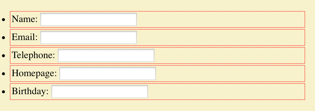
To understand why, let’s explore a use case, which you can see in various forms on this test page. I cribbed this use case pretty directly from Fantasai, but I’m going to be analyzing it a little differently. The basis is a form with the various fields and labels in unordered list items, to help with accessibility and to be basically readable and usable if the CSS somehow fails to be applied. The markup looks like this:
Ideally, we’d like the form fields to all line up into a column, and the labels to be in another column. Furthermore, we’d like the label column to be only as wide as the widest label’s element box, and no more; the rest of the grid can be taken up by the input column.
This seems like a case tailor-made for grid layout, but there’s a problem. Because grid items are only ever the child elements of a grid container, we can’t just apply a grid to the ul element and go from there. Instead, we have to make each li element a grid container, in order to make each label and input element a grid item. But that means each list item’s grid affects its children, with no reference to the other list items’ grids. We can write the template we want, like so:
form ul li {display: grid;
  grid-template-columns: [start label] max-content [input] 1fr [end];}
Each list item a grid, but to what end?
That will get us a result almost precisely as if we’d applied no grids at all. The only difference is that the input elements will all be as wide as their columns, according to the CSS Grid specification. Chrome fails to do this last bit correctly, whereas Firefox Nightly gets it right, but otherwise the layout is essentially the same. You can see this in the #form1 example on the test page. (Remember, you have to have a current grid-supporting browser for the examples to correspond to what I’m talking about here.)
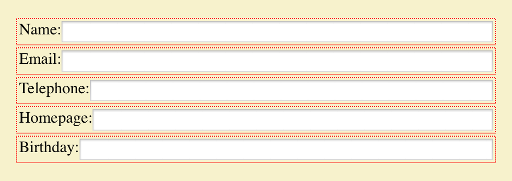
We can get closer to our goal by experimenting with a fixed-width grid column for the labels, figuring out the width of the widest label, and then just making all the label columns be that wide. That would be written something like this:
form ul li {display: grid;
  grid-template-columns: [start label] 7em [input] 1fr [end];}
Using fixed-width columns to simulate a single column.
That works pretty well so long as none of the labels ever change — if a label is added (or edited) to be wider, it will wrap to multiple lines. Alternatively, if the longest label is dropped or edited to be shorter, the label column won’t resize down. It will just stay the same dumb fixed width until someone hand-adjusts it. And honestly, at that point I may as well be using flexbox, which would do this version of the layout just as well, and would be more widely supported for the near to intermediate future. At any rate, you can see the grid version of this in the #form2 example on the test page.
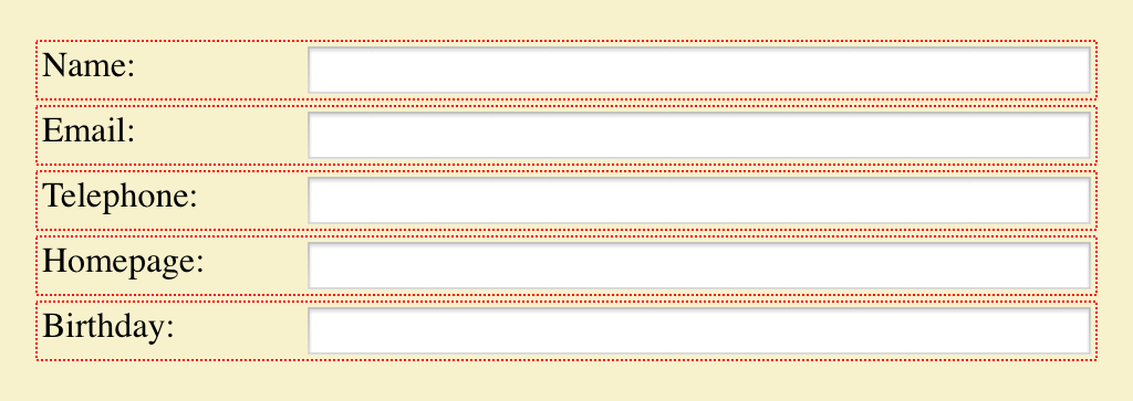
But what if we could set a grid on the ul element, and then make all the li elements grids that use their parents’ grid for the layout of their children? That’s exactly what subgrids do. This is the solution we’ve been seeking, in basic form:
form ul {display: grid;
  grid-template-columns: [start label] max-content [input] 1fr [end];}
form ul li {display: grid; grid: subgrid; grid-column: start / end;}
Here the list items establish grid containers, thus making the label and input elements into grid items like before, but are stretched across the two columns of the ul while using those very grid lines for laying out their child elements, plus those children influence the placement of their grandparent’s grid lines. Thus, we can specify things like max-content for the label column size and have it Just Work™.
Or it would Just Work™, except that as I write this, none of the grid implementations have subgrid support. Authors who want to create the kind of layout we’re after have to compromise in one way or another — either by faking the content-sizing with a fixed-width column, or by stripping down the markup until there’s barely anything left — thus sacrificing accessibility, progressive enhancement, and general best practices, as Fantasai illustrated in her article.
You can probably see a lot of other ways in which subgrids would be useful. Take defining a full-page grid, the kind with a bunch of regularly repeating grid lines onto which various elements can be attached, like this one or this one. In this scenario, being able to designate each section of the page a subgrid would let you have all the pieces inside that section participate in, and lay out in relation to, the overall page grid. Without subgrids, you’d either have to make every element you want to lay out a child of the body element (or whatever you used to create the page grid), or you’d have to recreate segments of the page grid in each nested grid, and give up any hope of columns that can flex with the contents of multiple page sections. Neither solution is appealing.
This is why I’ve come to the same conclusion other grid experts (like Rachel) already have: subgrids are a major component of grid layout, and should be a part of any grid layout implementation when it emerges from developer-preview status. If that means delaying the emergence of grids, I think it’s worth it.
I say that because our field has a tendency to glom onto the first iteration of a technology, learn it inside out, hack around its limitations, and then ignore any future improvements unless somehow forced to do so. If grid layout is released without subgrid support, we’re risking shoving subgrids into the back of the author-practices cupboard for a long time to come. And along with it, potentially, grids themselves. The frustration of trying to build layouts without subgrids will quickly become overwhelming for all but the simplest cases, leading authors to try and then discard grids as a serious tool.
First impressions matter. CSS itself suffered for years from the initial impressions designers formed of “boring, boxy” layouts, and it still suffers from the handicap of being a presentation system without a layout engine at its core. Grid layout is the first serious candidate to fill that hole in the past two decades, and I don’t want to see them hamstrung from the outset. Subgrids are essential to the adoption of grids. I hope they’ll be implemented as soon as possible, and before grids are pushed into public release channels.