Posts in the Microformats Category

How to Verify Site Ownership on Mastodon Profiles

Published 1 year, 11 months past

Like many of you, I’ve been checking out Mastodon and finding more and more things I like.  Including the use of XFN (XHTML Friends Network) semantics to verify ownership of sites you link from your profile’s metadata!  What that means is, you can add up to four links in your profile, and if you have an XFN-compliant link on that URL pointing to your Mastodon profile, it will show up as verified as actually being your site.

Okay, that probably also comes off a little confusing.  Let me walk through the process.

First, go to your home Mastodon server and edit your profile.  On servers like mastodon.social, there should be an “Edit profile” link under your user avatar.
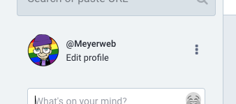
Here’s what it looks like for me.  Yes, I prefer Light Mode.  No, I don’t want to have a debate about it.

I saw the same thing on another Mastodon server where I have an account, so it seems to be common to Mastodon in general.  I can’t know what every Mastodon server does, though, so you might have to root around to find how you edit your profile.  (Similarly, I can’t be sure that everything will be exactly as I depict it below, but hopefully it will be at least reasonably close.)

Under “Appearance” in the profile editing screen, which I believe is the default profile editing page, there should be a section called “Profile metadata”.  You’ll probably have to scroll a bit to reach it.  You can add up to four labels with content, and a very common label is “Web” or “Homepage” with the URL of your personal server.  They don’t all have to be links to sites; you could add your favorite color or relationship preference(s) or whatever

I filled a couple of these in for demonstration purposes, but now they’re officially part of my profile.  No, I don’t want to debate indentation preferences, either.

But look, over there next to the table, there’s a “Verification” section, with a little bit of explanation and a field containing some markup you can copy, but it’s cut off before the end of the markup.  Here’s what mine looks like in full:

<a rel="me" href="https://mastodon.social/@Meyerweb">Mastodon</a>

If I take this markup and add it to any URL I list in my metadata, then that entry in my metadata table will get special treatment, because it will mean I’ve verified it.

The important part is the rel="me", which establishes a shared identity.  Here’s how it’s (partially) described by XFN 1.1:

A link to yourself at a different URL. Exclusive of all other XFN values. Required symmetric.

I admit, that’s written in terse spec-speak, so let’s see how this works out in practice.

First, let’s look at the markup in my Mastodon profile’s page.  Any link to another site in the table of profile metadata has a me value in the rel attribute, like so:

<a href="https://meyerweb.com/" rel="nofollow noopener noreferrer me">

That means I’ve claimed via Mastodon that meyerweb.com is me at another URL.

But that’s not enough, because I could point at the home page of, say, Wikipedia as if it were mine.  That’s why XFN requires the relationship to be symmetric, which is to say, there needs to be a rel="me" annotated link on each end.  (On both ends.  However you want to say that.)

So on the page being pointed to, which in my case is https://meyerweb.com/, I need to include a link back to my Mastodon profile page, and that link also has to have rel="me".  That’s the markup Mastodon provided for me to copy, which we saw before and I’ll repeat here:

<a rel="me" href="https://mastodon.social/@Meyerweb">Mastodon</a>

Again, the important part is that the href points to my Mastodon profile page, and there’s a rel attribute containing me.  It can contain other things, like noreferrer, but needs to have me for the verfiication to work.  Note that the content of the link element doesn’t have to be the text “Mastodon”.  In my case, I’m using a Mastodon logo, with the markup looking like this:

<a rel="me" href="https://mastodon.social/@Meyerweb">
 	<img src="/pix/icons/mastodon.svg" alt="Mastodon">
</a>

With that in place, there’s a “me” link pointing to a page that contains a “me” link.  That’s a symmetric relationship, as XFN requires, and it verifies that the two pages have a shared owner.  Who is me!

Thus, if you go to my Mastodon profile page, in the table of my profile metadata, the entry for my homepage is specially styled to indicate it’s been verified as actually belonging to me.
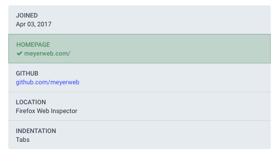
The table as it appears on my profile page for me.  Your colors may vary.

And that’s how it works.

Next question: how can I verify my GitHub page?  At the moment, I’d have to put my Mastodon profile page’s URL into the one open field for URLs in GitHub profiles, because GitHub also does the rel="me" thing for its profile links.  But if I do that, I’d have to remove the link to my homepage, which I don’t want to do.

Until GitHub either provides a dedicated Mastodon profile field the way it provides a dedicated Twitter profile field, or else allows people to add multiple URLs to their profiles the way Mastodon does, I won’t be able to verify my GitHub page on Mastodon.  Not a huge deal for me, personally, but in general it would be nice to see GitHub become more flexible in this area.  Very smart people are also asking for this, so hopefully that will happen soon(ish).

Customizing Your Markup

Published 12 years, 7 months past

So HTML5 allows you (at the moment) to create your own custom elements.  Only, not really.

(Ed. note: this post has been corrected since its publication, and a followup clarification has been posted.)

Suppose you’re creating a super-sweet JavaScript library to improve text presentation — like, say, TypeButter — and you need to insert a bunch of elements that won’t accidentally pick up pre-existing CSS.  That rules span right out the door, and anything else would be either a bad semantic match, likely to pick up CSS by mistake, or both.

Assuming you don’t want to spend the hours and lines of code necessary to push ahead with span and a whole lot of dynamic CSS rewriting, the obvious solution is to invent a new element and drop that into place.  If you’re doing kerning, then a kern element makes a lot of sense, right?  Right.  And you can certainly do that in browsers today, as well as years back.  Stuff in a new element, hit it up with some CSS, and you’re done.

Now, how does this fit with the HTML5 specification?  Not at all well.  HTML5 does not allow you to invent new elements and stuff them into your document willy-nilly.  You can’t even do it with a prefix like x-kern, because hyphens aren’t valid characters for element names (unless I read the rules incorrectly, which is always possible).

No, here’s what you do instead :

  1. Wrap your document, or at least the portion of it where you plan to use your custom markup,Define the element customization you want with an element element.  That’s not a typo.
  2. To your element element, add an extends attribute whose value is the HTML5 element you plan to extend.  We’ll use span, but you can extend any element.
  3. Now add a name attribute that names your custom “element” name, like x-kern.
  4. Okay, you’re ready!  Now anywhere you want to add a customized element, drop in the elements named by extends and then supply the name via an is attribute.

Did you follow all that?  No?  Okay, maybe this will make it a bit less unclear.  (Note: the following code block was corrected 10 Apr 12.)

<element extends="span" name="x-kern"></element>
<h1>
<span is="x-kern" style="…">A</span>
<span is="x-kern" style="…">u</span>
<span is="x-kern" style="…">t</span>
<span is="x-kern" style="…">u</span>
mn
</h1>
<p>...</p>
<p>...</p>
<p>...</p>

(Based on markup taken from the TypeButter demo page.  I simplified the inline style attributes that TypeButter generates for purposes of clarity.)

So that’s how you create “custom elements” in HTML5 as of now.  Which is to say, you don’t.  All you’re doing is attaching a label to an existing element; you’re sort of customizing an existing element, not creating a customized element.  That’s not going to help prevent CSS from being mistakenly applied to those elements.

Personally, I find this a really, really, really clumsy approach — so clumsy that I don’t think I could recommend its use.  Given that browsers will accept, render, and style arbitrary elements, I’d pretty much say to just go ahead and do it.  Do try to name your elements so they won’t run into problems later, such as prefixing them with an “x” or your username or something, but since browsers support it, may as well capitalize on their capabilities.

I’m not in the habit of saying that sort of thing lightly, either.  While I’m not the wild-eyed standards-or-be-damned radical some people think I am, I have always striven to play within the rules when possible.  Yes, there are always situations where you work counter to general best practices or even the rules, but I rarely do so lightly.  As an example, my co-founders and I went to some effort to play nice when we created the principles for Microformats, segregating our semantics into attribute values — but only because Tantek, Matt, and I cared a lot about long-term stability and validation.  We went as far as necessary to play nice, and not one millimeter further, and all the while we wished mightily for the ability to create custom attributes and elements.

Most people aren’t going to exert that much effort: they’re going to see that something works and never stop to question if what they’re doing is valid or has long-term stability.  “If the browser let me do it, it must be okay” is the background assumption that runs through our profession, and why wouldn’t it?  It’s an entirely understandable assumption to make.

We need something better.  My personal preference would be to expand the “foreign elements” definition to encompass any unrecognized element, and let the parser deal with any structural problems like lack of well-formedness.  Perhaps also expand the rules about element names to permit hyphens, so that we could do things like x-kern or emeyer-disambiguate or whatever.  I could even see my way clear to defining an way to let an author list their customized elements.  Say, something like <meta name="custom-elements" content="kern lead follow embiggen shrink"/>.  I just made that up off the top of my head, so feel free to ignore the syntax if it’s too limiting. The general concept is what’s important.

The creation of customized elements isn’t a common use case, but it’s an incredibly valuable ability, and people are going to do it.  They’re already doing it, in fact.  It’s important to figure out how to make the process of doing so simpler and more elegant.


A Question of Identity

Published 17 years, 7 months past

Over the weekend, I reworked meyerweb’s sidebar a bit.  One of the changes is the addition of a section called “Identity Archipelago“, which links to various bit of my online identity and makes use of XFN‘s me value.  I’ve been meaning to do this ever since co-presenting a poster on how me could be used to accomplish identity consolidation, and hey, I’m only thirty months late.

I ran into an interesting dilemma as I assembled the links, though.  Should I link to the Wikipedia entry about me, and if so, does it really merit a me marker?  I’m not so sure.  Yes, the page is about me, but it isn’t something I created, nor is it something I control.  Thanks to the open nature of Wikipedia, it could be altered to state that I’m a paste-eating pederast with pretensions to the Pakistani presidency.  It would be kind of embarrassing to link to something like that, let alone proclaim in a machine-parseable way that the information on the other side of the link represented me in some way.

While I’ve never stated a Wikipedia policy, as others have, I’ve privately maintained a hands-off policy.  Even though I’d like to replace the picture with a better one and flesh out some details of my career, and on occasion have wanted to correct some inaccuracies, I’ve refrained from doing so.  I’m not going to proclaim that I’ll never ever edit my own entry, because if libel (alliterative or otherwise) shows up and I’m the first to notice, I’ll at least roll the page back.  But in general, I’m keeping my hands off.

Nevertheless, it is arguably a piece of my online identity.  Not linking to it feels like a glaring omission—or am I just trying to rationalize an egocentric desire to show off?  I don’t think that I am, but then I’m hardly a neutral party.

So what’s your perspective?  Is a Wikipedia entry created and edited by others properly a part of my archipelago, or is it simply a nearby island?


Mixed Impressions

Published 18 years, 7 months past

Actually, I shamelessly used that title simply because it’s a little play on words.  By and large, my impressions of Mix 06 and what I’ve seen here are positive.  This isn’t my last word on everything going on here, but I wanted to share.  Enjoy!

  • You can drag-rearrange tabs in Firefox just by click-and-dragging the tabs.  Seriously, I had no idea.  Thanks to Dan Short for setting me straight on that score.

  • In his keynote, Bill Gates said “we need microformats”, which I didn’t even know was on his radar.  For more about that, head on over to microformats.org.

  • Microsoft is coming out with a new Windows-only Web design tool called Expression.  It’s pretty slick, with features like visually illustrating margins and padding in the design view and what seemed like smart management of styles.  Unfortunately, I had a little trouble following what it was doing, mostly because I saw it presented in a talk and didn’t have hands-on time.

    Basically, Expression seems to be FrontPage done right, with a relentless focus on standards-oriented design principles. It has its own rendering engine for the design view, and the whole thing was built from the ground up, which means it isn’t trapped by legacy rendering concerns, but it made several of us wonder why that isn’t what they use in IE7.

    I also had trouble mentally distinguishing it from other visual Web design environments like Dreamweaver, but that’s probably because I don’t use a visual design environment.  BBEdit 4-evah, baby!

    Speaking of which, there are no plans to port Expression to the Mac.  Whether that’s good or bad probably  depends on your worldview.  Look for public betas of Expression somewhere in the June 2006 time frame.

  • It was publicly stated that the current build of the IE7 beta available from Microsoft is rendering-behavior complete.  In other words, the only changes to IE7 from now until it goes final will be fixes to security holes, crash bugs, and browser chrome/UI stuff.  Whatever its CSS support does or doesn’t do, that’s how the final version is expected to behave.

    Ladies and gentlemen, start your engines.

I’ll take a few minutes on that last point.  A little while ago, I said that designers should remain calm and not hack their sites to fix them in the IE7 beta because it was a moving target.  That is no longer the case.  It’s now time to start testing sites in the IE7 beta and identifying any layout problems that may occur.  (And there will be problems.  No browser is perfect.)

I’ll be doing this as soon as I can, and I encourage everyone who can to do the same.  Here’s the other key point: IE7 is scheduled to go final in the second half of 2006 (I couldn’t get anything more specific), so we have a calm period of at least three months in which to find out how things stand before IE7 goes final.  This isn’t an accidental circumstance, either.  The IE team has deliberately done this in order to give Web developers time to figure out what’s coming and how to deal with it.

This is entirely in keeping with the new spirit of the IE team, which has impressed me again and again at this conference.  Once upon a time, upgrades to standards support were blocked by the cry “We have customers!”, which was maddening both because it impeded progress and because it was true, as I wrote back in 1998.  The usual counter-argument was that Web designers and developers are customers, too.  We just weren’t (often) treated that way.

Now we are considered customers of the IE team—not the only ones, but important ones.  Not every decision will go our way (even if we had a single “way”, which of course we don’t) but our needs and concerns will be considered.  As further proof besides the “grace period” built into the IE7 timeline, the IE team is creating tools and resources meant to make it easier to update sites for IE7.

I’ll have a good deal more to say about all this in the near future, but those are the big points in my head right now.  I expect to hear Dave‘s, Andy‘s, and Molly‘s takes on all this, and hopefully others will add their thoughts as well.


Adium: Chatting With Style

Published 18 years, 10 months past

Tim Bray, that dashing man-about-town, recently sang the praises of Adium, a multi-service chat client for OS X.  I’d tried it a while back, and been only marginally impressed.  At the time, its presentational inflexibility was too annoying for me to take it seriously.  Okay, yes: it was a damn sight better than Messenger for OS X, which is the only reason I even kept it on my hard drive.  But I hardly ever log onto MSN any more, as everyone I know is on AIM.  So I’d stuck with iChat AV.

Still, Tim’s word is always gold (or at least high-grade palladium) with me, and he said the magic words (“highly skinnable”), so I downloaded the latest copy and poked around for a bit.

Boy howdy!  Adium has definitely come a long, long way since last I visited.  You can change the appearance of your chat sessions (with “message themes”), the dock icons, the contact list, and much more.  Since none of the default message themes really did it for me, I went looking for others.  There are quite a few available at the Adium Xtras site, but none of them were really what I wanted either.  In iChat, I cranked the graphic frippery down to zero so that the chat sessions were as compact as possible, but I still had the text look nice.  If I could recreate that in Adium, it would make the migration much, much simpler.

So I dug into the package contents of a promising message theme… and found out that themes are based on nothing more than XHTML and CSS.

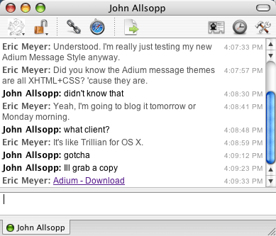
Seriously.  The entirety of an Adium chat window is an XHTML document that’s being dynamically updated via DOM scripting—all of it pumped through WebKit, of course.  In creating a message theme, you define what markup will be used, and write CSS to style it.  You can even define variants on your theme by writing additional style sheets.

So with some quick hacking, I not only radically improved the markup generated during a chat (the markup I saw in the packages I downloaded was, um, sub-optimal), but I basically replicated my old iChat theme with some simple CSS.  And then I created some variants that slightly modify it in various ways, mostly to prove that I could.

I’m now wondering if I could write and attach JavaScript that would make chat sessions even more interactive, more robust.  (Update: Phil says yes.)  Click on a line to copy the whole line to the clipboard, say, or dynamically change the in-session presentation by hitting a button.  Adium may block that kind of thing, but if not, then it’s a chat client extensible beyond anything I’ve so far imagined.

And given how much I love to tinker with my software, that’s like waving a bulging suitcase of money in front of a senator.

Granted, there are some things I’d like to change.  For example, the markup you define in a theme is not used in saving the chat log.  In a log, you just get some basic markup with a case of classitis and very, very poor semantics.  It would be a lot cooler if you could define the log markup (or the log just used the markup you generate during a chat session) and the CSS to present it.

A chat log is also something that, it seems to me, cries out for a microformat.  The markup I’m using for my theme is also a first effort in that direction, recycling some other microformats’ concepts (I stole a bit from hCalendar and am planning to graft in some hCard as well) and setting up some basics.  If I can take this far enough, I might consider pushing to upgrade the markup Adium generates in its logs.  They’re dropping a lot of information on the floor when they write out the logs, and I think that’s a shame.

But then, I can make the effort to fix that and actually have a chance of it paying dividends.  The joys of open source, you know?

I’ll still use iChat AV for videoconferences, which are an essential tool for family cohesiveness when I’m on the road, as well as to keep close to my father down in Florida.  For text, though—which accounts for at least 90% of my instant messaging activity—Adium is my new chat buddy.


microformats.org

Published 19 years, 4 months past

Along with many other people, I’ve been talking about microformats over the past several months.  Now they have a home: microformats.org.  It’s primarily a community site, a place where people interested in microformats can congregate and share ideas.  It’s also a central point from which new microformats can be created and advanced.  There are pointers to mailing lists, an IRC channel, a weblog, and more.

If you’re interested in a quick introduction to microformats, I highly recommend the leadoff comment in the weblog.  It’s a great introduction to the what, whys, and wherefores of microformats.  The collection of links it’s carrying around is pretty nice, too.

I don’t know for certain how the whole microformats effort will turn out, but more to the point I don’t feel I have to know.  Right now, the low entry barrier and amount of promise shown by microformats makes them extremely compelling, as I think the information on the new site demonstrates.  To echo Tantek, I’ll let the market decide how they’re used, whether they’re a good idea at all, and what shape they take over the long term.

All I know is that I feel the same way about microformats as I felt about CSS, back when I first encountered it.  My instincts tell me, as they did then, that this is important, that it has almost undreamt potential, that it can change the way we build and use the Web.


Long-Term Visibility

Published 19 years, 5 months past

A fair portion of the feedback I get whenever I talk about microformats runs along the lines of “How is this any different from stuff like RDF, besides it being written using a far less structured vocabulary?”.  Tantek has laid down the basics of the answer to that question.  In a severely limited nutshell: the more visible the data, the more likely it is to be made relevant and to be kept that way.

What about search engine spamming?  Well, it’s usually easily recognizable as such by a human, so that’s in keeping with visibility and human friendliness.  If we suppose a spammer uses CSS to hide the spam from humans, as many do, it’s become invisible—exactly the same as traditional metadata, and exactly what happened to meta-based keywords before the search engines started ignoring them.  Some day (soon?) the search engines may start ignoring any content that’s been hidden, and as far as I’m concerned that would be just fine.

Now, what about farther down the road—will semantic information always have to be visible?  An interesting question.  Tantek and I have had some pretty energetic arguments about whether the kind of stuff we’re putting into microformats will eventually move into the invisible realm of Semantic Web-style metainformation.  As you might guess from his post, Tantek says no way; I’m more agnostic about it.  Not every case of structured data lends itself to being visible, and in fact making some kinds of strucuring data visible would be distinctly human-unfriendly.  There’s a reason browsers don’t (by default) display a page’s markup.

Besides, to some extent there’s invisible information in microformats, although it’s pretty much always tied to visible information (dates in hCalendar being one such example).  Sure, the class names and title values are there in the markup as opposed to off in some other file, but from a user point of view, they’re as invisible as meta keywords or RDF.  Usually it’s stuff we don’t want to be in the user’s face: markers telling which bits of content correspond to what, ISO versions of human-readable dates, that kind of thing.

Then again, the truth is that the kind of information most people want to consume and manipulate is the kind of information that lends itself to being visible.  Structuring that data in such a way that the same data is useful to both humans and machines—turning the stuff you’re showing to people into the stuff that machines process—is a much more elegant approach, and one that frankly stands a higher chance of success, at least in the short term.

(A quick example: as Andy Baio says, “If hCalendar gets popular, Upcoming.org could scrape events off of websites instead of people entering them directly into Upcoming”.  Bands, who are already maintaining their own touring pages, could mark up said pages using hCalendar, and Upcoming would just suck in the information.  The advantages?  The band’s webmaster doesn’t have to set up the tour page and then go enter all the information into Upcoming; he just creates or updates the page and can then ping Upcoming, or wait for its spider to drop by.  The visible information, which is structured in a machine-parsable way, only has to be updated once.  Of course, the same would be true with regard to any event aggregator, not just Upcoming, and that’s another advantage right there.)

But will the semantic information stay baked into the visible information?  That’s a harder trend to forecast.  I remember when presentation was baked into the structure, and it’s been a massive struggle to get the two even partially separated.  On the other hand, it makes sense to me to pull presentation and structure apart, so that the former can rest upon the latter instead of having them bolted together.  I’m not sure it makes sense to do the same with semantics and structure.  Of course, what that really means is that I don’t think it makes sense to argue for their separation now.  Perhaps we’ll look back in a decade or two and, with new approaches in hand, chuckle over the thought that we’d ever bolted them together.  Alternatively, perhaps we’ll look back from that vantage and wonder why we ever thought the two could, let alone should, be separated.

In either case, it seems clear to me that the way forward is with visible data being used both for human and machine consumption; that is, with the microformat approach.  It’s a lightweight, easily grasped, infinitely extensible, and infinitely flexible solution, totally in keeping with the design principles that underpin the Web itself.


Getting Onto The Calendar

Published 19 years, 6 months past

Over at Complex Spiral Consulting, I maintain a list of upcoming appearances at conferences, workshops, and the like.  These are the “public” events; that is, events which are accessible by members of the public, assuming they pay whatever registration fee is being charged by the people in charge of the event.  This is in contrast to “private” events; that is, client work that isn’t open to anyone except employees of the client.

Occasionally I’m asked if I have an RSS feed of those events, or send out e-mail updates, or otherwise provide any sort of notice other than just changing the web page.  For a long time, the answer was basically “no”.  Now it’s “yes”, and it’s an example of a microformat in action.

If you’re using iCal on OS X, or any other webcal:-aware calendaring program, then all you have to do is hit the following link: Complex Spiral upcoming events calendar.  Your calendar program should come to the foreground and let you add the URI as a subscribed calendar.  And hey presto!  You’re done.  Any changes to the web page will be reflected in your calendar the next time the subscription is refreshed, and iCal lets you set your refresh interval to be 15 minutes, once a day, once a week, and so on.

What’s happening there is you’re pouring the home page of complexspiral.com through an XSLT recipe called X2V written by Brian Suda.  His XSLT pulls out the hCalendar markup and turns it into an ICS file, one fully conformant with RFC 2445.  So I don’t have to figure out how to produce and provide my own ICS file.  Providing the hCalendar markup is enough, thanks to Brian’s work.

Of course, the number of people who would want to subscribe to my professional appearances schedule is fairly small.  This is just a demonstration, though.  Suppose a site like, oh, upcoming.org were to publish their event calendars with hCalendar markup?  Then all you’d have to do is find the page that corresponds to your city, run it through Brian’s script, and you’d have your very own regularly updated local events calendar, just like that.

Guess what?  You can do that right now:  upcoming.org is publishing its information using hCalendar markup.  For example, here’s the calendar for Cleveland, Ohio, ready for one-click subscription: Cleveland events calendar.  If you just want the ICS file to be downloaded to your hard drive, then you can use this link instead: Cleveland events ICS file.  The only difference between the two links is that the former uses the webcal: scheme identifier, whereas the second uses the more familiar http:.

I personally think there needs to be some work done on their hCalendar markup, like properly marking up location information.  The time information for some events seems to be a bit wonky as well, although the dates are accurate.  The great thing is that the hCalendar information could be fixed in very short order.  In fact, from what I’ve heard, they added basic hCalendar markup to the site in under an hour.  Adding more, or fixing any problems in what they have, shouldn’t take much longer.

Imagine how much further this could go.  Suppose Basecamp marked up its project calendars with hCalendar, and used a script like Brian’s to turn it into ICS information.  Its users could have project milestones right there in their personal calendar programs.  Ditto for the To-Do’s lists, because that sort of information is all defined in the iCalendar specification.  The TiVo site could provide customized schedules, like all the showings of American Idol or Masterpiece Theater.  The IMDB could publish movie opening dates in hCalendar format; studios could do the same.  Want a calendar schedule that shows what DVDs are coming out, when?  Or what new albums are being released for the next month?  All it takes is a little slice of a webmonkey’s time.

The point being, there’s nothing for which said webmonkey has to wait.  The tools are already here.  No browser has to be upgraded.  In fact, in many ways this bypasses the browser to send information directly to the calendaring program… but the information is provided in a browser- and search-engine-friendly way, so they can access and use the same data in their own ways.  No alternate files.  Just a single set of information, made more rich and useful through easily understood mechanisms.

How cool is that?


Browse the Archive

Earlier Entries