Posts in the Tech Category

Polishing iChat

Published 21 years, 2 months past

In between fighting with paperwork and other annoyances, I took the same promotional iChat image I used in yesterday’s post (and which I originally pulled from the Tiger iChat page) and faked a series of textured tabletops beneath the video chat windows.  They’re rough approximations of what I think could be done, put together with some texture images I had lying around and off-the-cuff fiddling in Photoshop.  In case you’re wondering, the four textures are “stone” (an indeterminate speckled gray), wood, marble, and what I call “sea foam”.  I didn’t do a water distortion version mostly because I was spending less than an hour on the attempt, and I didn’t feel like trying to recreate the whole scene in a 3D modeling environment just to get the right reflections.

So now you can see it just the way it looked to me when I imagined it.  Well, not precisely, but really close.

As for the idea of having documents show up in that workspace, they could be in-perspective sheets of paper lying on the surface, with a thumbnail preview of the contents visible on the sheet, or they could be little icons floating in space above the tabletop (or else sitting on it).  Either one would work fine for me.  The “sheet of paper” idea extends the visual metaphor Apple’s clearly pursued, but it could also quickly chew up the space available to either side of the little “me” preview window.  Little floating icons (or boxes, whatever) would be more compact, while still participating in the metaphorical space.

Now, if the application let you warp or otherwise texturize the chat windows themselves, then we’d be off to the races.  Imagine putting Etch-A-Sketch frames around the windows—and imagine running a filter that made each frame look like it had been drawn on the Etch-A-Sketch!  Killer.  For that matter, you could turn each chat window into a Gameboy Advance, and run a pixelizing filter on the streams.

Like I said before, if you’re going to have gratuitous eye candy, you may as well go for the gusto.


Tiger Watching

Published 21 years, 2 months past

Over at Daring Fireball, John Gruber pointed out that Tiger‘s Dashboard isn’t quite as much of a Konfabulator rip-off as it first appeared.  His primary point was that the principles in Dashboard and Konfabulator aren’t anything new, and haven’t been for a couple of decades.  However, it was his highlight of a comment by Dave Hyatt that really caught my eye.  Dave said:

I wanted to blog briefly to clear up what the widgets actually are written in.  They are Web pages, plain and simple (with extra features thrown in for added measure).  Apple’s own web site says “build your own widgets using the JavaScript language”, but that’s sort of misleading.  The widgets are HTML+CSS+JS.  They are not some JS-only thing.

So… with the skills I already possess, I can create my own Dashboard gadgets, as can thousands of similarly skilled designers?  How cool is that?  I’m already itching to get my hands on the Dashboard developer information, so I can find out what these things can do and how I can bend them to my will.  As a trivial example, if I can get information via SOAP, and I can’t imagine why I wouldn’t, then I can use the weather data service I recently linkblogged to grab the current and next-seven-days’ forecast for any location in the United States, not to mention present the resulting information in a really beautiful way via the Dashboard.  Since the service returns results for latitude/longitude coordinates, it would be best crossed with a dataset correlating city names to lat/lon coordinates.  That shouldn’t be terribly difficult.

In fact, Web services in general could get a huge boost from the Dashboard.  Search gadgets for Amazon, Google, and any of a thousand other sources would be a snap.  Infoaggregators, pulling in data from various sources into one place, would become very simple.  Creating point-and-click editors for OS and application preferences should be trivial.  You’d also have the ability to grab information about the machine itself (memory usage, disk usage, CPU activity, top listings, etc.) and present it in truly useful and beautiful ways.  The possibilities are nearly endless, and my few fairly pedestrian ideas likely don’t even begin to touch on what can be done by a really creative programmer.

That’s especially true if, extrapolating from Ian Hickson‘s recent comments, the Web Core contains XFormsWebForms 2.0 support, thus making advanced controls available in Dashboard gadgets.

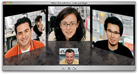
Then there’s iChat AV.  I’d like to see it permit audio chatting with AIM users, as opposed just video chats, but then I think that should have been possible already.  What really got me stoked was (of course) the gratuitious eye candy.  A picture of the iChat AV interface for OS X 10.4.  As Apple says:

iChat for Tiger introduces a new kind of interface for video conferencing. In its three-dimensional view, your buddies seem more like they’re in the room with you, making it easier to follow the conversation. Their images are even reflected in front of them, just as if they were sitting around a conference-room table.

Well, that’s true if you often hold meetings around conference-room tables made entirely of smoked glass.  What Apple really needs to add to iChat is the ability to pick different surfaces for the “tabletop” beneath the video windows.  They could include a highly polished, dark mahogany surface, for example, to really convey that upscale conference room feeling.  Or a reflective granite surface, for a feeling of solidity.  Hell, how about having the video portals hang above rippling water, with the video images reflected in the waves?  It seems like Core Image has all the pieces necessary to make any of those things happen, and then some.

For that matter, making it simple to drag an image file onto that tabletop and have it mapped on seems a snap.  You should be able to put your company logo there, embossed or glazed or otherwise applied to the tabletop, whatever its base surface effect.  Basically, you should be able to make the tabletop look even more killer than it already does.  Why not?  If you’re going to include major eye candy, then no sense holding back.

Addendum: in the comments, Jason Lustig pointed out something I failed to mention, which is that the tabletop is good for much more than just awesome visual effects.  It also makes a great shared workspace, a place where one participant could drop a file for everyone else to pick up.  As he put it, “just like if you were passing out sheets at a real meeting!”.  Exactly—and, of course, the document could even resemble a real document by generating a thumbnail of the document’s actual appearance, and mapping that onto the virtual sheet on the tabletop.  Whee, more eye candy!  I hope the Apple programmers add that ability to iChat before Tiger is released.

Add things like Automator, and this definitely looks like an OS upgrade well worth buying.  I really hope that “the first half of 2005” means “in January, but we wanted to hedge our bets”.


Feeling Distracted

Published 21 years, 2 months past

For no apparent reason other than I can, I’ve redone the sidebar to include a linkblog titled “Distractions.”  I did this by grabbing Markku Seguerra‘s wp-recent-links plugin and then hacking the holy bejeezus out of it.  I needed to add a “via” function, for example, and wanted to make the administrative interface a bit nicer.  That involved finding out how MySQL statements work (mostly by finding all the ways they don’t).  So, hack hack hack.  It was an interesting distraction.  I’ll make the files available in due course.

To make room, I took out the “Socialization” section because it seemed largely worthless; two of the services listed I hardly even look at any more, and the other one was mostly about me puffing up my ego in public, which nobody really needs to see.  I’m also thinking about taking out the Platelets because I don’t get to update it often enough, even though I have really soft spot for it in my heart.  We’ll see what happens.

Keen-eyed observers will notice that I backfilled a few entries from the past few days.  I needed test data, you know?


Structural Naming

Published 21 years, 2 months past

After I threw out my two cents on ID naming conventions, Andy Clarke revisited the subject and made some more detailed proposals.  As I said before, I think this is a good conversation to be having.  However, the reactions of some people make me think that I wasn’t entirely clear about why.

A standard nomenclature offers the ability to restyle sites, sure.  That’s kind of cool in an übergeek kind of way, like making jokes involving TCP/IP terminology or wearing a T-shirt that says SELECT * FROM users WHERE clue > 0.  That isn’t really the primary reason why I support the exploration of ID naming conventions.  I’d like to see those conventions emerge because they will serve as a useful starting point for beginners in the standards-oriented design field.  It would help reinforce the idea of structural naming, as opposed to presentational naming.

We’re all familiar with presentational naming.  It’s things like id="leftbar" and id="pagetop".  In terms of layout, it’s the equivalent of <b> and <font>.  Structural naming, on the other hand, encourages the author to ask “what role does this piece of the document play?”  Rather than obsess over the visual placement of the navigation links, structural naming gets authors to consider the document structure.  This can’t be anything but good, at least for those of us who want to promote improved structures.  To pick one set of examples from Andy’s recent post:

#branding
Used for a header or banner to brand the site.
#branding-logo
Used for a site logo
#branding-tagline
Used for a strapline or tagline to define the site’s purpose

While #branding is described as “Used for a header or banner…” you may note that the actual ID name has nothing to do with visual placement.  It’s all about identifying the (dare we say it?) semantic role of that bit of the document.  By encouraging that thinking, a structural-naming convention keeps the author in that frame of mind when he has to go outside the common set of names.

I see this as being much like the often-promoted ‘rule’ that link-state styles should go in the order link-visited-hover-active.  I even wrote an article explaining why that order is important.  Here’s the thing: once you understand why the order is important, you can break the ‘rule’ in creative ways.  For example, suppose you want your hover effect to apply only to unvisited links, whereas visited links should get no hover.  No problem!  Just put them in the order link-hover-visited-active, or even link-hover-active-visited if you want visited links to get no active styles, either.

(Side note: if you chain pseudo-classes, such as with a:visited:hover, then the ordering problem goes away.  If Explorer supported that syntax, we could all move on from the LVHA rule.  Too bad it doesn’t.)

Conventions and ground rules exist for a reason: to provide a lower barrier to entry, and to help guide those new to the field.  Once you become experienced, you can break the rules in creative ways.  It’s been said that the key to good jazz improvisation is a thorough understanding of the rules of music.  In other words, once you really know those rules, then you know how to break them.  In order to know the rules, though, there have to be rules.

That’s why I’m glad to see them starting to emerge in blog postings and the public thinking of people in the field.  The development of these rules is not a barrier to creativity, but an enabler of it.


Elemental Nomenclature

Published 21 years, 2 months past

A while back (so I’m slow), Andy Clark did a bit of digging and compiled a list of the most common ID names used to label pieces of layouts.  I’m out of step on every count except for the footer.  Does that mean I march to a different drummer?  Probably, given my musical tendencies.

Andy’s work interested me quite a bit, not least because he actually sifted through the markup of forty sites (this one among them) to compile his list.  I was also happy to see someone taking a practical approach to the question of naming conventions.  From time to time people ask me about CSS best practices.  While Andy’s conclusions aren’t necessarily the final word on naming best practices, they are a useful starting point for such inquisitors.  Some complained that by listing the ‘best’ (read: most common) names, Andy is stifling creativity, which strikes me as being faintly absurd.  Does the existence of blueprints for ranch houses stifle architectural creativity?  I mean, yeah, maybe sometimes they should, but in general I think the world is safe for Dutch Colonials and skyscrapers.

There’s certainly room for more detailed and extensive work on the subject of naming conventions, as well as other best practices (apparently people are souring on that term, but until I hear something better I’ll stick with it).  I just hope that more people do work like Andy’s, looking at what’s been done as opposed to endlessly theorizing.

Andy also mused:

Is it right to stick to ‘content’ and ‘main-nav’ for the sake of our users’ control or is that just too boring? And do we want to make it easy for others to change our precious designs on a whim?

I’m all for it; giving users the ability to restyle this site on a whim is what led me to propose CSS signatures, and employ one on this site.  Does my site design not serve your needs, or bore you?  Create something better suited to your tastes!  I promise I won’t mind; in fact, I’d like to see what you devise.  If a set of ID naming conventions does firm up, I’ll likely adopt it here so visitors can restyle my site consistently with others that use the same nomenclature.  This is, it seems to me, the least I can do.


Valid Concerns

Published 21 years, 2 months past

I hate (American) sitcoms and soap operas.  That’s a sweeping generalization, a trend that seems to be sweeping the Web of late.  No choice but to continue.

The majority of American sitcoms derive their humor—or, from my perspective, “humor”—from characters getting into embarrassing situations and then trying frantically to get out of them.  The laughs are generated by watching this person be humilated, often at length.  Generally, the humiliatee is receiving some form of just desserts: they got themselves into the situation through selfishness or arrogance or some other form of hubris, and end up paying the price.  In any event, they get to squirm and flail before our eyes and it’s funny!  Only it isn’t.

I dislike American soap operas not because they’re harshly lit and seem like community theater writ large.  I have no issues with the acting, which is actually fairly impressive in terms of the quality-to-quantity ratio.  I dislike soap operas because they’re nothing but sturm und drang, one melodramatic setpiece after another.  The number one rule is, nobody gets to be happy for long.  Anyone who does find happiness is just being set up for a major, major trauma, likely at the hands of whoever is currently making them happy.  (Although death is far less traumatic in soap operas than in real life, as people come back from the dead and aren’t even zombified when they do.  Which I suppose is good news for the power grid.)  There’s only so much of the constant chest-heaving, garment-rending dramatics I can handle before I glaze over and start to closely contemplate my cuticles.

Now why would I be talking about this when everyone else is talking about validation?  It’s a mystery, I agree.


Code Constraints

Published 21 years, 3 months past

Chris Adamson has an interesting post over at the O’Reilly Network about code in books and articles.  In summation: should code be given a special license, separate from the actual text?

While CSS isn’t code, exactly, the same basic questions apply to the stuff I’ve written.  Let’s take my most recent title, More Eric Meyer on CSS.  It contains a copyright statement that says, in effect, you can’t reproduce the book’s text, in part or in whole, without permission.  There is no distinction there between the explanatory text (“Margin collapsing is an interesting problem in some cases, and here’s why, blah blah blah…”) and the styles.  Taken literally, the copyright statement says that you can’t re-use any of the CSS I created in your own designs.

This is clearly in opposition to what I think most of us would agree is the expectation, which is that you can use styles (or code) as you see fit but you can’t take the ‘narrative’ text and pass it off as your work.  But where’s the dividing line?  Suppose that, for whatever reason, you really like one of the designs in Project 4.  We can agree that you should be able to re-use the styles presented, but a whole design?  Is that fair?  I can imagine many arguments both for and against, many of them variants on the classic slippery-slope argument.

In my particular case, the situation is even less clear.  As anyone who drops by the book’s site will discover, the project files are freely available for anyone to download.  You aren’t even expected to own the book as a condition of using them.  That makes them less protected, I would think, than if they were on a CD that accompanied the book—but how much sense does that make?  Again, I can envision several arguments on both sides of the issue.  The same questions would arise for any author that provided code samples for download, as many do.

There’s also the question of what rights can or should be granted to the reader with regard to code.  I might hypothetically make the styles all freely available to anyone, but only under the condition that attribution be given to the source (either me, the book, or both).  Wouldn’t you, as a reader, find that rather annoying?  I would.  “You mean I have to give Eric credit just to use two CSS rules that create this cool effect?”

I’ve always operated on the principle that any markup or CSS I write about is fair game, because otherwise what would be the point of writing about how to use it?  I can see it now: “use of the CSS presented in this tutorial, including any derivative works, without the written consent of the author is prohibited.”  Yeah, right!  That would be something like a dictionary prohibiting you from using any words you look up, including all modifications and misspellings.

So should books contain an explicit license regarding use of the code?  If so, what kind?  I expect readers and publishers will have different viewpoints, although the more clueful publishers probably won’t be too far away from the typical reader perspective.  There’s a part of me that wonders why we even have to be explicit about this at all—after all, there’s been a sort of tacit acceptance of code re-use to date—but in a litigious DMCA world, this is an issue that probably has to be addressed sooner or later.

As I ponder the subject, I’m currently contemplating putting all my code samples under a Creative Commons ShareAlike 1.0 license, both now and into the future, just to make sure the bases are covered.  Then again, perhaps an explicit Public Domain license would make more sense.  Which one would be better, or is there a superior approach I haven’t considered?  Let me know.


Edged Out Of Contention

Published 21 years, 3 months past

Andrei fired off round two of “Gurus vs. Bloggers”, and good news!  I played on the guru team by proxy, and was defeated by Dave Shea‘s proxy, more or less as I’d hoped I’d have the chance to do after round one was played.  Andrei was nice enough to hem and haw about which one ought to win, but honestly, there wasn’t much contest.  The Zen Garden won two SXSW Web awards including Best In Show, after all, not to mention the awe and respect of Web design folks the world over.  css/edge, at best, earned awe and respect.  In any case, I am honored to have been so thoroughly owned by the man Andrei calls “one of [my] best students.”  Mr. Shea, I bow to you.

In his tongue-in-cheek commentary, Andrei said:

Maybe if Meyer had used orange for CSS Edge, because orange is after all the new black, I would be able to swing the vote the other way.

I don’t know—low-contrast orange doesn’t really seem much better than low-contrast blue, does it?


Browse the Archive

Earlier Entries

Later Entries