Posts in the Web Category

Warning Hashflags

Published 8 years, 11 months past

Over the weekend, I published “Time and Emotion” on The Pastry Box, in which I pondered the way we’re creating the data that the data-miners of the future will use to (literally) thoughtlessly construct emotional minefields — if we don’t work to turn away from that outcome.

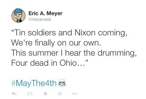
The way I introduced the topic was by noting the calendar coincidence of the Star Wars-themed tradition of “May the Fourth be with you” and the anniversary of the Kent State shootings in 1970, and how I observe the latter while most of the internet celebrates the former: by tweeting some song lyrics with a relevant hashtag, #maythe4th.  I did as I said I would…and Twitter blindly added a layer of commentary with a very simple little content filter.  On twitter.com and in the official Twitter app, a little Stormtrooper helmet was inserted after the hashtag #maythe4th.

So let’s review: I tweeted in remembrance of a group of National Guardsmen firing into a crowd of college students, wounding nine and killing four.  After the date hashtag, there appeared a Stormtrooper icon.  To someone who came into it cold, that could easily read as a particularly tasteless joke-slash-attack, equating the Guardsmen with a Nazi paramilitary group by way of Star Wars reference.  While some might agree with that characterization, it was not my intent.  The meaning of what I wrote was altered by an unthinking algorithm.  It imposed on me a rhetorical position that I do not hold.

In a like vein, Thijs Reijgersberg pointed out that May 4th is Remembrance of the Dead Day in the Netherlands, an occasion to honor those who died in conflict since the outbreak of World War II.  He did so on Twitter, using the same hashtag I had, and again got a Stormtrooper helmet inserted into his tweet.  A Stormtrooper as part of a tweet about the Dutch remembrance of their war dead from World War II on.  That’s…troublesome.

Michael Wiik, following on our observations, took it all one step further by tweeting a number of historical events collected from Wikipedia.  I know several of my British chums would heartily agree with the 1979 tweet’s added layer of commentary, but there are others who might well feel enraged and disgusted.  That could include someone who tweets about the election in celebration, the way people sometimes do about their heroes.

But what about appending a Stormtrooper helment to an observance of the liberation of the Neuengamme concentration camp in 1945?  For that matter, suppose someone tweets May-4th birthday congratulations to a Holocaust survivor, or the child of a Holocaust survivor?  The descendant of a Holocaust victim?

You might think that this is all a bit much, because all you have to do is avoid using the hashtag, or Twitter altogether.  Those are solutions, but they’re not very useful solutions.  They require humans to alter their behavior to accommodate code, rather than expecting code to accommodate humans; and furthermore, they require that humans have foreknowledge.  I didn’t know the hashtag would get an emoji before I did it.  And, because it only shows up in some methods of accessing Twitter, there’s every chance I wouldn’t have known it was there, had I not used twitter.com to post.  Can you imagine if someone sent a tweet out, found themselves attacked for tweeting in poor taste, and couldn’t even see what was upsetting people?

And, as it happens, even #may4th wasn’t safe from being hashflagged, as Twitter calls it, though that was different: it got a yellow droid’s top dome (I assume BB-8) rather than a Stormtrooper helmet.  The droid doesn’t have nearly the same historical baggage (yet), but it still risks making a user look like they’re being mocking or silly in a situation where the opposite was intended.  If they tagged a remembrance of the 2007 destruction of Greensburg, Kansas with #may4th, for example.

For me, it was a deeply surreal way to make the one of the points I’d been talking about in my Pastry Box article.  We’re designing processes that alter people’s intended meaning by altering content and thus adding unwanted context, code that throws pieces of data together without awareness of meaning and intent, code that will synthesize emotional environments effectively at random.  Emergent patterns are happening entirely outside our control, and we’re not even thinking about the ways we thoughtlessly cede that control.  We’re like toddlers throwing tinted drinking glasses on the floor to see the pretty sparkles, not thinking about how the resulting beauty might slice someone’s foot open.

We don’t need to stop writing code.  We do need to start thinking.


Heard and Received

Published 8 years, 11 months past

A week ago today, I stood on a stage in San Francisco and told a couple thousand developers they were doing it wrong.  I mean, I got up there at O’Reilly’s Fluent, The Web Platfom conference, and gave a talk with a slide that literally said, “The Web is NOT a Platform”.  You can see it here, all fifteen minutes of it, in which I borrowed liberally from Jeremy Keith, added a splash of Mike Monteiro, and mixed it all together with things I’ve been saying and thinking for the past, oh, decade or more.

As it turned out, and a little bit to my surprise, a fair number of people completely agreed with what I had to say, judging by the reactions I got both online and in person.  Only a few people disagreed with me in person, which was fine; I actually hoped that there would be some pushback, since I’m not the smartest person in the world by any stretch.  The best part was, our disagreements were friendly, well-sourced, and collegial.  I love having conversations like that.  I don’t know that any of us changed our minds, but we were able to test our assumptions and viewpoints against each other.  In one case, I shook hands on a friendly, no-stakes bet over which of us would prove to be right, five or ten years down the line.

What made it really fun is that not twenty minutes after I stepped off the stage at the end of that talk, I stepped back on to accept a 2015 Web Platform Award alongside Sara Soueidan, Mark Nottingham, and Mikeal Rogers.  Those are some amazing people to stand with, and that it came from O’Reilly made it even more humbling.  In fact, Sara said it best: “This is my first time ever winning a web award, and I feel privileged to have won it from such a prestigious company.”  To which I would only add, and in such prestigious company.

I do want to note that what I said at the very end of my acceptance remarks was woefully insufficient.  What I should have said, and would have said if I hadn’t suddenly felt completely overwhelmed, is that the web has meant more to me, done more for me, and given more to me in the past two years than any one person could ever have any right to expect.  The web and what it makes possible, the ability to reach out and share and hear from you and stay in touch — that kept me sane, and may very well have kept me alive.

Thank you all.


The Pivotal Ways

Published 9 years, 1 week past

Five years ago yesterday, the suave and debonair Ethan Marcotte debuted a talk titled “A Dao of Flexibility” at An Event Apart Seattle.  I still remember the feeling in the room.  Those of us who were there realized that it was a pivotal moment for the web, even before Ethan had left the stage.  It was the moment that responsive web design burst forth into the world.

The title, and content, of Ethan’s talk explicitly paid homage to the rugged and handsome John Allsopp’s “A Dao of Web Design”, published fifteen years ago today at A List Apart.  It’s hard to overstate how much wisdom and prescience is distilled into that deceptively short piece.  As I said in the testimonial I contributed to ALA’s remembrance:

John’s insights are as sharp and relevant as ever, especially when we realize the web’s inherent flexibility isn’t just about layout — that, in fact, layout flexibility is one of the web’s least important features. I try to reread “A Dao of Web Design” at least once a year. You should, too.

There’s not much more I can add, and honestly, anything I tried to add to these seminal works of brilliance would only cheapen them.  Go, read; go, watch.  Remember where we’ve come from, and use that foundation to chart where we’re going.


On This Day

Published 9 years, 3 weeks past

Earlier today, Facebook announced a new feature called “On This Day”.  With On This Day, you see pictures, posts, and other events that occurred on a given day.  If you’re familiar with Timehop, it seems very much like a Facebook-only Timehop.  That will probably seem limited and broken to actual Timehop users, but for the vast majority of Facebook users, it will be a new and potentially very welcome feature.

As you can imagine, given what happened with Year in Review, I’m very interested by On This Day.  I haven’t interacted with the actual product yet, so I don’t know what kinds of opt-in or opt-out features will be present.  If any.  From the screenshots in the Facebook announcement, it looks like they’ve taken a much more neutral direction with the visual design.  There are calendar pages and abstract photos, with few of them expressing much in the way of emotional content.  An exception is seen at the top center of the banner image on the announcement, depicting what appears to be a woman in love, but that’s actually a decoration on the banner, instead of a UI component.  Whether those sorts of things will show up in the UI, I don’t know.

But this is what I wonder: is Facebook about to hurt a bunch of people?  From the announcement:

To see your On This Day page, you can click on the On This Day bookmark, search for “On This Day,” or visit facebook.com/onthisday. You might also see a story in your News Feed.

Putting “a story in the News Feed” is exactly how Year in Review became a viral news story.  And it’s what distinguishes On This Day from Timehop or ThinkUp (which has “your most popular update” features).

If I install Timehop, for example, I know what I’m getting into.  I’m actively, consciously deciding to revisit events from past years by way of Timehop.  I can decide not to launch it at all on certain days, if I know what I see would be too painful.

On This Day, on the other hand, is part of an existing ecosystem.  Dropping On This Day into the Facebook news feed without consent is very much like having Timehop install itself onto your smartphone and then auto-launch, all without asking.  If this happened, we’d (rightly) take the responsible parties to task.  Patronizing dismissals that “you use a smartphone, you get what you deserve” would be relatively thin on the ground, whereas I’m sure there will be plenty of that directed toward any Facebook user upset by what an On This Day new feed entry shows them.  That was certainly the leading line of condescension around the Year in Review news feed post.

There isn’t much more to go on in the announcement, though I did notice:

…you can choose to subscribe to notifications so you’ll be alerted when you have memories to look back on. You can also edit and delete old posts, or decide to share your memories with friends.

Editing or deleting old posts is interesting, if a bit troubling to the historian in me, and the ability to sign up for notifications is a welcome sign of opt-in ethics, but what I notice here is what’s missing:  I don’t see any reference to an ability to opt out of On This Day, either for certain days or altogether.  It might be there and simply not referred to in the product announcement, but I wonder if this is something that Facebook users will simply have to get used to.

The timing of this has a personal resonance.  As I wrote about yesterday, we just passed the first anniversary of the day Kat and I were told about Rebecca’s second tumor.  For the next eleven weeks, both our posts and pictures from last year, wherever they’re housed, will form a chronicle of the last days of our daughter’s life.  How will we react to Facebook, how will we feel about our experience there, if On This Day constantly reminds us of those events?  Will this product increase our affinity with Facebook, or our antipathy?  Perhaps we might go to Facebook to catch up with friends and joke around with them a bit, as a form of mental respite.  Or, perhaps, we would have done that, but now will be unable to do so.  We’ll soon find out.

Lest anyone misunderstand, this isn’t just about Facebook.  It’s about every service or product that seeks to increase user affinity, and avoid user antipathy.  Facebook just happens to be providing some very obvious grounds on which to base these conversations.  Given their line of business and scale of operation, that’s probably to be expected.  I’ll be following this with great professional and personal interest.


Media Queries

Published 9 years, 3 months past

Thanks to a combination of my slow process of re-integrating into the web community and the Year in Review explosion at the end of 2014, I actually have some media appearances to tell you about.  (This is at least four times as weird for me as it is for you.)

Since I love the written word, I’ll start with the fact that I’ve been published at Slate Magazine.  As the whole Year in Review thing was going crazy viral, an editor at Slate emailed to ask if I’d consider republishing “Inadvertent Algorithmic Cruelty” with them.  I said I’d love to as long as I could revise the piece a bit, to which they readily agreed.  So I reworked the opening to be extra-clear about what had actually happened, gave it a closing that was better attuned to a wider audience than the few hundred web designers I assumed would read the original post, and they ran it.  (The headline was, I have to say, not my idea, but that’s how it goes in most magazines: editors write headlines.  I was at least able to suggest some tweaks.)

Shortly after that piece went live, I was asked to be part of a piece on Huffington Post Live about Year in Review (of course).  I was still in Tennessee when the segment aired, and our hotel’s wifi wasn’t up to the task of streaming video, but thankfully they were willing to have me on by phone.

I saved what I consider to be the best for last.  Jen Simmons just recently had me as a guest on The Web Ahead, where we talked for two hours about what my family has been through in the past two years, designing for crisis, Year in Review, what it’s like to have a story go viral on you, being intentional in the age of social media, new details about my AEA talk “Designing for Crisis”, the Metafilter dot, and a whole lot more.  Parts of it are emotionally difficult, but not too many.  We got pretty deep into what I’m thinking about design and where it should go, and in a few cases Jen posed questions that I couldn’t really answer, because they’re at or beyond the edge of what I’ve figured out so far.

Jen is such a great interviewer.  Not only did she ask great questions and then patiently let me ramble my way to answers, she brought really smart perspectives to everything we were talking about.  Listening to her observations and thoughts gave me several new insights into designing for crisis, and more.  You should listen to the episode, or to any of the shows in her archives, just to hear a master of the craft at work.

So, yeah.  This has all been very interesting for me.  At some point, I’ll probably write something about what it’s like to watch a story about you go viral, but for now, I’m enjoying the return to anonymity.  It’s left me time to think more about empathetic design, and to catch up with work and other people’s thoughts.  That’s the best part of this whole web thing: learning from others.  It’s why I got started with the web in the first place.  It’s why I’m still here.


Ramping Up

Published 9 years, 3 months past

We were driving back home from our impromptu surprise family vacation in Tennessee, winding our way through the Appalachian Mountains, when I pointed out a long, steep ramp to nowhere branching off the side of the highway.  “What do you think it’s for?” I asked the kids.

Photo by Bidgee (CC BY-SA 3.0 AU)

They made some guesses, some quite clever, but none correct.  So I told them about runaway truck ramps and how they work.  I think they were vaguely interested for a few seconds; I got a well-isn’t-that-interesting grunt, which I’ll take as a win.  We swept on past, the kids went back to whatever they were doing before I’d interrupted them, and I kept my eyes on the road.

But I was still thinking about the runaway truck ramp, and how it’s a perfect physical example of designing for crisis.

I also wondered about the history of runaway ramps — when they were first implemented, and how many runaway vehicles crashed before the need was recognized and a solution found.  After I got home, I looked it up and discovered that ramps didn’t really exist until the 1970s or so.  Even if we assume that no vehicles lost control in the U.S. until the Eisenhower Interstate System was established in the 1950s (just go with it), that’s still two decades of what were probably some pretty horrible crashes, before a solution was implemented.

This is not to say that the ramps are a perfect solution.  A runaway vehicle can certainly crash before reaching the next ramp, and using a ramp is likely to damage the vehicle even under the best of circumstances.  A badly-designed ramp can be almost as dangerous as no ramp at all.  Still, a solution exists.

I feel like web design is at the pre-ramp phase.  We’ve created a huge, sprawling system that amplifies commerce and communication, but we haven’t yet figured out how to build in some worst-case-scenario features that don’t interfere with the main functioning of the system.  We’ve laid down the paths and made some of them look pretty or even breathtaking, but we’re still not dealing with the crashes that happen when an edge case comes onto our stretch of the road.

I’m trying really hard to avoid “information superhighway” clichés here, by the way.

I’ve been pondering whether to incorporate this particular example into my 2015 talk, “Designing for Crisis” — much will depend on how the talk stands after I go back through it one more time to tighten it up, and start rehearsing again.  If there’s room and a good hook, I’ll add it in as a brief illustration.  If not, that’s okay too.  It’s still given me another way to look at designing for crisis, and how that topic fits into the broader theme that the Facebook imbroglio brought to light.

I’m still trying to get a good handle on what the broader theme is, exactly.  “Designing for Crisis” is a part of it, but just a part.  Several people have told me I should turn that talk into a book, but it never quite felt like a book.  Sure, I could have stretched it to fill a book, but something was missing, and I knew it.  I thought there was a hole in the idea that I needed to identify and fill; instead, the idea was filling a hole in a context I hadn’t seen.

Now I have.  It will take some time to see all of it, or even just more of it, but at least now I know it’s there and waiting to be explored and shared.


Well, That Escalated Quickly

Published 9 years, 3 months past

This post is probably going to be a little bit scattered, because I’m still reeling from the overwhelming, unexpected response to the last post.  I honestly expected “Inadvertent Algorithmic Cruelty” to be read by maybe two or three hundred people over the next couple of weeks, all of them friends, colleagues, and friends who are colleagues.  I hoped that I’d maybe give a few of them something new and interesting to think about, but it was really mostly just me thinking out loud about a shortcoming in our field.  I never expected widespread linking, let alone mainstream media coverage.

So the first thing I want to say: I owe the Year in Review team in specific, and Facebook in general, an apology.  No, not the other way around.  I did get email from Jonathan Gheller, product manager of the Year in Review team at Facebook, before the story starting hitting the papers, and he was sincerely apologetic.  Also determined to do better in the future.  But I am very sorry that I dropped the Internet on his head for Christmas.  He and his team didn’t deserve it.

(And yes, I’ve reflected quite a bit on the irony that I inadvertently made their lives more difficult by posting, after they inadvertently made mine more difficult by coding.)

Yes, their design failed to handle situations like mine, but in that, they’re hardly alone.  This happens all the time, all over the web, in every imaginable context.  Taking worst-case scenarios into account is something that web design does poorly, and usually not at all.  I was using Facebook’s Year in Review as one example, a timely and relevant foundation to talk about a much wider issue.

The people who I envisioned myself writing for — they got what I was saying and where I was focused.  The very early responses to the post were about what I expected.  But then it took off, and a lot of people came into it without the context I assumed the audience would have.

What surprised and dismayed me were the…let’s call them uncharitable assumptions made about the people who worked on Year in Review.  “What do you expect from a bunch of privileged early-20s hipster Silicon Valley brogrammers who’ve never known pain or even want?” seemed to be the general tenor of those responses.

No.  Just no.  This is not something you can blame on Those Meddling Kids and Their Mangy Stock Options.

First off, by what right do we assume that young programmers have never known hurt, fear, or pain?  How many of them grew up abused, at home or school or church or all three?  How many of them suffered through death, divorce, heartbreak, betrayal?  Do you know what they’ve been through?  No, you do not.  So maybe dial back your condescension toward their lived experiences.

Second, failure to consider worst-case scenarios is not a special disease of young, inexperienced programmers.  It is everywhere.

As an example, I recently re-joined ThinkUp, a service I first used when it was install-yourself-and-good-luck alpha ware, and I liked it then.  I’d let it fall by the wayside, but the Good Web Bundle encouraged me to sign up for it again, so I did.  It’s a fun service, and it is specifically designed to “show how well you’re using your social networks at a more human level,” to quote their site.

So I started getting reports from ThinkUp, and one of the first was to tell me about my “most popular shared link” on Twitter.  It was when I posted a link to Rebecca’s obituary.

“Popular” is maybe not the best word choice there.

Admittedly, this is a small wrinkle, a little moment of content clashing with context, and maybe there isn’t a better single word than “popular” to describe “the thing you posted that had the most easily-tracked response metrics”.  But the accompanying copy was upbeat, cheery, and totally didn’t work.  Something like, “You must be doing something right — people loved what you had to say!”

This was exactly what Facebook did with Year in Review: found the bit of data that had the most easily-tracked response metrics.  Facebook put what its code found into a Year in Review “ad”.  ThinkUp put what its code found into a “most popular” box.  Smaller in scale, but very similar in structure.

I’m not bringing this up to shame ThinkUp, and I hope I haven’t mischaracterized them here.  If they haven’t found solutions yet, I know they’re trying.  They really, really care about getting this right.  In fact, whenever I’ve sent them feedback, the responses have been fantastic — really thoughtful and detailed.

My point is that ThinkUp is a product of two of the smartest and most caring people I know, Gina Trapani and Anil Dash.  Neither of them comes anywhere close to fitting the Young Brogrammer stereotype; they are, if anything, its antithesis, in both form and deed.  And yet, they have fallen prey to exactly the same thing that affected the Year in Review team: a failure to anticipate how a design decision that really worked in one way completely failed in another, and work to handle both cases.  This is not because they are bad designers: they aren’t.  This is not because they lack empathy: they don’t.  This is not because they ignored their users: they didn’t.  This is such a common failure that it’s almost not a failure any more.  It just… is.

We need to challenge that “is”.  I’ve fallen victim to it myself.  We all have.  We all will.  It will take time, practice, and a whole lot of stumbling to figure out how to do better, but it is, I submit, vitally important that we do.


Inadvertent Algorithmic Cruelty

Published 9 years, 3 months past

I didn’t go looking for grief this afternoon, but it found me anyway, and I have designers and programmers to thank for it.  In this case, the designers and programmers are somewhere at Facebook.

I know they’re probably pretty proud of the work that went into the “Year in Review” app they designed and developed, and deservedly so — a lot of people have used it to share the highlights of their years.  Knowing what kind of year I’d had, though, I avoided making one of my own.  I kept seeing them pop up in my feed, created by others, almost all of them with the default caption, “It’s been a great year! Thanks for being a part of it.”  Which was, by itself, jarring enough, the idea that any year I was part of could be described as great.

Still, they were easy enough to pass over, and I did.  Until today, when I got this in my feed, exhorting me to create one of my own.  “Eric, here’s what your year looked like!”

image

A picture of my daughter, who is dead.  Who died this year.

Yes, my year looked like that.  True enough.  My year looked like the now-absent face of my little girl.  It was still unkind to remind me so forcefully.

And I know, of course, that this is not a deliberate assault.  This inadvertent algorithmic cruelty is the result of code that works in the overwhelming majority of cases, reminding people of the awesomeness of their years, showing them selfies at a party or whale spouts from sailing boats or the marina outside their vacation house.

But for those of us who lived through the death of loved ones, or spent extended time in the hospital, or were hit by divorce or losing a job or any one of a hundred crises, we might not want another look at this past year.

To show me Rebecca’s face and say “Here’s what your year looked like!” is jarring.  It feels wrong, and coming from an actual person, it would be wrong.  Coming from code, it’s just unfortunate.  These are hard, hard problems.  It isn’t easy to programmatically figure out if a picture has a ton of Likes because it’s hilarious, astounding, or heartbreaking.

Algorithms are essentially thoughtless.  They model certain decision flows, but once you run them, no more thought occurs.  To call a person “thoughtless” is usually considered a slight, or an outright insult; and yet, we unleash so many literally thoughtless processes on our users, on our lives, on ourselves.

Where the human aspect fell short, at least with Facebook, was in not providing a way to opt out.  The Year in Review ad keeps coming up in my feed, rotating through different fun-and-fabulous backgrounds, as if celebrating a death, and there is no obvious way to stop it.  Yes, there’s the drop-down that lets me hide it, but knowing that is practically insider knowledge.  How many people don’t know about it?  Way more than you think.

This is another aspect of designing for crisis, or maybe a better term is empathetic design.  In creating this Year in Review app, there wasn’t enough thought given to cases like mine, or friends of Chloe, or anyone who had a bad year.  The design is for the ideal user, the happy, upbeat, good-life user.  It doesn’t take other use cases into account.

Just to pick two obvious fixes: first, don’t pre-fill a picture until you’re sure the user actually wants to see pictures from their year.  And second, instead of pushing the app at people, maybe ask them if they’d like to try a preview — just a simple yes or no.  If they say no, ask if they want to be asked again later, or never again.  And then, of course, honor their choices.

It may not be possible to reliably pre-detect whether a person wants to see their year in review, but it’s not at all hard to ask politely — empathetically — if it’s something they want.  That’s an easily-solvable problem.  Had the app been designed with worst-case scenarios in mind, it probably would have been.

If I could fix one thing about our industry, just one thing, it would be that: to increase awareness of and consideration for the failure modes, the edge cases, the worst-case scenarios.  And so I will try.


Note: There is a followup to this post that clarifies my original intent, among other things.

A slightly revised and updated version of this post was published at Slate.


Browse the Archive

Earlier Entries

Later Entries