Posts from October 2004

S5 Final Candidate

Published 20 years, 1 month past

Thanks to the efforts of many people, the slide show system I’ve been working on is just about ready for prime time.  Thus, I hereby dub it S5 and place it into Final Candidate status, complete with documentation of the markup format and a map of the files that are used for an S5 presentation.

There is one thing I’ve found that needs to be addressed before exiting the FC stage, and that’s the handling of slide titles that contain markup.  If you look at the slide show S5: An Introduction, the navigation menu entry for the title slide is ” 0: Snull: An Introduction”.  It should be ” 0: S5: An Introduction”.  I know this has something to do with walking the DOM tree and collecting the appropriate bits, but I’ve yet to figure out how to do that efficiently.  Assistance, as always, is appreciated.

There are a few limitations that will exist even after S5 goes to v1.0.  These are summarized on slide 8 of the introductory slide show, but I’ll explain them in a little more depth here.

  • Only one author can be listed in the metadata — This limitation is largely inherited from OSF 1.0.  Mark Schenk and I have talked about ways to get around this limitation, but have agreed to postpone fixing it until later; for now, it will be better if S5 1.0 and OSF 1.0 are as compatible as possible.  When I start working on S5 1.1, I’ll come back to this, and will probably kick around some ideas in public for your comment.  But that’s for later.
  • Links from within a slide to another slide will probably fail — Henryk Plötz created routines to fix this limitation, but I don’t have time to analyze and understand how they work before going to v1.0, and I’m very much against just dropping things into the JS unless I understand what they do, and how they do it.  I expect to get this functionality into S5 1.1.
  • The navigation controls are limited to the footer — This is in some ways a matter of convenience, and also a matter of consistency.  If the controls are known to be in the footer, then theme authors can write their CSS accordingly.  I may—and note I say may—relax this restriction in a future version of S5.  For now, it stands.  (Update: by “limited to the footer”, I mean it’s limited in a structural sense.  You can still visually place the controls anywhere CSS will allow.)
  • Slide content is expected to be static and atomic; that is, there is no capability to trigger dynamic slide content by hitting the “next” command — It would be nice to allow a slide author to trigger a slide animation (or whatever) by just hitting a “next” key, the way Powerpoint does.  It’s probably easy to do.  It won’t make it into 1.0.  So the expectation is that any given slide is a set of text and/or images, and that when you advanced you go to the next slide.  Of course, an author can still embed a Flash file or a QuickTime movie or an animated GIF or whatever.  There just isn’t the ability to click the mouse button or hit the space bar and have new content revelaed on the same slide.
  • Fonts are not scaled based on display resolution and available pixels; manual CSS editing is required — Again, largely a matter of convenience.  I tried dynamic font scaling and discovered that Firefox had major problems with what I’d done.  I’ll worry about it in a later version.  For now, if you create your slides assuming 1024×768 and find yourself in an 800×600 projection environment, you’ll have to edit the CSS directly to change the font size (and anything else that has to be changed).

There’s one other limitation I didn’t put on the slide, but I’ll briefly cover here.  As yet, it is not possible to embed all of the CSS and JS into the presentation file (that is, the XHTML file) and have the system work as widely as it does when they’re external.  The culprit again was Firefox, although it’s as likely that the real culprit is how I scripted things.  For that matter, it will never be possible to have complete standalone S5 files for any presentation that includes images or other external resources, because IE/Win doesn’t support data: URIs.  (Okay, never unless this capability gets added to IE/Win.  Don’t hold your breath.)  I do intend that a future version of S5 will allow the embedding of the CSS and JS.  Version 1.0 will not.

One other note: to keep things more consistent with OSF 1.0, I altered the S5 format to use h1 elements for slide titles, whereas before they were h2 elements.  I’ve also dropped the currentSlide, header, and footer divs into a layout div.  You can get a more detailed look from the reference.

All right, I think that’s enough from me for the moment.  Please try out the introductory slide show (also available as a ZIP archive), check over the documentation, and let me know if you find anything broken (fixes always welcome!) or incorrect.  Other feedback on the documentation, or on the content of the slide show, is also welcome.  Suggestions for new features or ways to fix the known limitations are not prohibited, but they will be shelved until after version 1.0 goes to final release.

Circus Time!

Published 20 years, 1 month past

The circus came to town yesterday, specifically to the Case campus.  It had in fact been arriving for the past few days, but things really started to kick into high gear yesterday.  So Jim, who has a parking pass to the most conveniently-located garage on campus, and I decided to make a mid-day pilgramage to campus and enjoy the sights.  And hey, why not share them with you?  Maybe you love circuses as well.

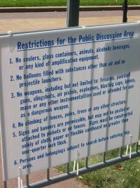
Even before noon, the Lyndon LaRouche folks had set up right next to one of the access points to the “public discussion area” (otherwise known as the “free speech zone”).  From what I could tell the table was manned by college students.  I had no idea there were college students that wacked out.  So far as we could tell, they were obeying all of the posted rules, but the day was still early yet.

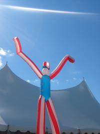
A little bit later on, we came across the Freedom Frankenstein, lumbering across the landscape like a big, scary, primary-color boogeyman.  Or something.  Okay, it was one of the decorations for the MTV concert area.  At least we think that’s what area it was in.  The people setting it up didn’t actually know, and crowd members seemed to be confused about which event was being held where.  Actually, the crowd members seemed to be confused about a great many things.

The football field just outside Emerson Gymnasium, the site of the debate, was covered with transmission trucks.  As we approached the field perimeter, we got the once-over from some grim-looking gentlemen in suits and shades.  A more normal-looking guy near the barrier line looked up at us and said, “You can’t take pictures here.  The Secret Service guys won’t allow it.”  So we retreated a bit, gained higher ground, and took the picture anyway.  Which drew the attention of a couple of Secret Service guys; as they started walking in our general direction, we decided it was time to check out the other side of campus.  It’s great to know that the media uplink trucks of the world are so well protected, you know?

The two books pictured were just sitting next to a crosswalk on Euclid Avenue.  There was nobody within thirty feet of them besides us.  We couldn’t quite work out if they were freebies (despite having cover prices) or if picking one up would activate some sort of hidden box trap.  We decided to leave them alone and go check out the Hardball rehearsal at the MSNBC stage.  Demonstrators for various causes and candidates had already staked out space, despite it being four or five hours before the show itself would air.  Chris Matthews came down and talked with the people along the fence line, and some volunteers practied handing out Krispy Kreme donuts.  Apparently that’s something they do during the show.  Or else did.  I didn’t watch it.

I’ll say this much: Chris Matthews looks a lot less healthy in person than he does on television.  I didn’t get a chance to ask him if Zell was still demanding that they duel.

In all, it was a fun time.  All it needed was some monkeys and maybe a juggling act, and the day would have been perfect.


Mazel Tov!

Published 20 years, 1 month past

Kat, Carolyn, and I send our good wishes and heartfelt congratulations to Jeffrey Zeldman and Carrie Bickner on the birth of their daughter, Ava Marie Zeldman.

Let the “valid and well-formed” jokes commence.


Finding Fame and Fortu—Okay, Just Fame

Published 20 years, 1 month past

You probably know that I’m a long-time Macintosh user, going back to the days of the single-floppy Mac SE.  At one point, I worked in a computer lab that had a “Changing the world, one person at a time” poster on the wall.  Every single one of my books, articles, and other resources has been written or developed on a Mac.  So you can imagine how thrilled I am to be featured in an Apple Pro article.  Not only can you find out a little bit about how I got into this whole CSS thing, but see a picture of me dropping some fat horns on my listeners.

I’ll put this Pro file on the shelf with being made a comic strip character as “ways to know I’ve really made it”.  But you know what really told me I’d arrived?  Discovering that someone had created a Wikipedia entry about me.  It was a pretty stubby page at the time, but its mere existence was enough to drop my jaw into my lap.  Now I find myself wondering if I should edit my own entry to include a full biography and related links, or if that would in some way be incredibly gauche.  (And asking someone else to do it for me would just be gauche by proxy, which is worse.)

It’s an odd thing to be famous, even when the fame is limited to a specific field of activity.  As a matter of fact, I was recently asked to write an article about the “fame game” and I’m still mulling over how to tackle it.  See, when you get right down to it, being well-known is both a reward and a restraint.  When people look to you, there’s a certain set of expectations that gets imposed upon you, whether you want them or not.  You’re supposed to always be right, always be fair, and always be in agreement with whoever’s looking to you.  None of these things are possible.

Nevertheless, I am where I am because I worked to get here (and was lucky), and I’ve no real complaints about the position I occupy.  All told, it’s not a bad thing.  It isn’t even a good thing.  It just kind of is.

So there’s still the question of what I might write about the “fame game”.  As it was posed to me, the editor was interested in my thoughts on “how influential designers and developers must balance ‘responsibility’ to the community with their own need to say what’s on their mind and use their clout to get good things done”.  In many ways, it’s the classic “how do you feel about being a role model?” question.  I’m not entirely sure I’m qualified to answer the question, although I do have some ideas.  I often wonder what the community thinks, though.

So I’ll throw it out to you lot: in your personal opinion, how should influencers balance community responsibility with personal expression—or does there need to be a balance at all?


Baby Proof

Published 20 years, 1 month past

September was quite an eventful month around these parts.  Guess who learned to crawl, started pulling herself to a standing position, began “cruising” (hesitantly walking while holding on to a couch, table, or other object), moved up to a bigger car seat, figured out how to drink from a sippy cup as well as she already could through a straw, and acquired full object permanence within that thirty days?

And those are just the developmental changes we’re sure happened.  We’re very tired now, thank you.

In the process of installing baby gates all over the house, I discovered that I’m becoming vaguely handy.  It’s a little weird.  Practice does get one closer to perfection, and Ged knows I’ve a very long way to go before I even begin to approach the contemplation of perfection in being handy, but I’m now to the point of seriously thinking about building my own workspace furniture, sort of like Dan did a while back.

Most of my practice was obtained by trying to baby-proof our kitchen.  This is no easy task anyway, but the, er, “interesting” choices made by the house’s previous owner made it about a zillion times more difficult.  Because of the way the drawers and cabinets are faced, it’s almost impossible to secure about half of them.  Of the half that could be secured, two-thirds of them were a royal pain.

Of course, sometimes the difficulty wasn’t with the materials.  I had a friend over to help me with the kitchen proofing, and we spent a lot of time complaining about the idiots who had put together the kitchen.  We had just pulled out a drawer to install a lock.  He selected a thin bit to drill a guide hole, and then started.  The drill bit didn’t even penetrate the facing.  He pressed harder, and still nothing.  Harder, and I realized the drill bit was actually starting to bend.  It wasn’t getting anywhere.  We were kind of impressed, as the facing didn’t look that tough.

No matter; he switch to a sturdier bit and started again.  That one made no better progress than the first one, and as he bore down, we both saw a wisp of smoke curl out of the drill site.  When the drill was lifted away, there was simply a small dimple in the facing.  Now we were seriously impressed, and more than a little confused.  What the heck was this facing made of, anyway?

Just as I started rooting around in the toolbox for a hammer and chisel, he suddenly exclaimed, “Oh, I am such a dumbass.”

It was suddenly very, very clear what had happened.  I couldn’t help it.  I started laughing, as did he.

He clicked over a lever on the drill, put the bit back in place, and hit the drill trigger.  It tore straight in.  I almost fell on the floor, I was laughing so hard.  I couldn’t speak, could barely breathe.

“Well, go figure!” he said in a self-mocking tone.  “I guess it works better when you have the drill actually going forward instead of in reverse!  Wow!  Who’d have thought?”

Indeed so.  Lesson learned.


Since there were requests for pictures of the little one in action, here you go: one crawling, one standing, and a bonus “on the swings” picture.  No, I don’t need help adjusting the brightness on these, but thanks.

Three pictures: one of her crawling away from the camera, one of her standing against a table, and one of her on a playground swing.

Slide Show Beta 2

Published 20 years, 1 month past

Thanks to the help of several contributors, the simple standards-based slide show system I put into public beta status, and which I may well end up calling S5, is almost ready to go final.  At its core, it seems to work consistently in Internet Explorer (both platforms), Firefox 0.9, and Safari 1.2.  I’ve also scripted things so that the system works in Opera 6 and up, basically allowing those browsers to fall back to using Opera Show.  This allows the slide show’s behavior to be consistent with what Opera Show users already expect, which seems like a good thing.

There are two things that don’t work as I’d hoped.  The first is the “click anywhere to advance a slide” feature, which is broken in IE/Win.  It throws a JavaScript error about the target that doesn’t make sense to me.  The second is the show/hide of the menu in IE/Mac, which I just cannot get to work.  If anyone can figure out how to make those work, let us know in the comments; otherwise I’ll just prevent IE from running that code in the final version, which will of course mean a reduced feature set in those browsers.  I’m not going to lose a lot of sleep if that happens, but I’d rather have the system be feature-consistent across browsers if possible.

(Update: if you downloaded the archive between 1421 EDT and 1504EDT, grab it again.  I initially forgot to update it with the new files.  Sorry!  It’s fixed now.)


Browse the Archive

Later Entries