Posts from 2004

Run Time Errors

Published 20 years, 7 months past

It’s been quite a weekend, and the fun started on Friday.  That morning, we drove down to Mansfield to have lunch with my father, sister, and an aunt and uncle who were up from Cincinnati to visit.  The afternoon was spent with our tax guy, so Carolyn is now known as “Daddy’s Little Deduction.”  For dinner, exhausted by the travel and looking to celebrate both getting our taxes out of the way and the arrival of my author’s copies of Cascading Style Sheets: The Definitive Guide, Second Edition (which means y’all should be getting your copies any day now!), we decided to head over to Matsu and have some sushi. A picture of Carolyn sitting in Eric's laps and gripping a pair of chopsticks in her hand as she looks down at the open menu in front of her. Carolyn sat with each of us in turn, and I’m not sure but I think she was eyeing my escolar nigiri with some interest.  She had fun fiddling with chopsticks, anyway.

Saturday morning, we attended a memorial service for the father (and grandfather) of a family we’ve become close to over the last few years.  They helped us plant fifty daffodils in our front-yard flower beds last fall in honor of Mom—they’re sprouting, and I hope to get some pictures soon—and their pre-teen daughter has already been a babysitter for Carolyn.  Since we had a baby on our hands, we sat in the far back pew and listened to the music and testimonials.  The sanctuary of the Baptist church is beautiful, with sweeping stone arches and wonderful stained glass windows, just like you remember from medieval-romance movies.  It was hard to keep from reflecting on death, as opposed to life, especially since we’d never really known the deceased; he’d had Alzheimer’s ever since we met them.

When his teenaged grandson delivered a eulogy, I looked down at Carolyn and couldn’t help whispering an apology for the day that I leave her forever.  I hope that day doesn’t come for a long, long time, but it won’t be put off forever.  I hope that when that day does come, she’ll be able to smile through the tears, warmed by memories of love and laughter.

As I looked back up, I recalled the recent Papal statement that it’s immoral to let die a person who’s in a vegetative state.  We already know he opposes voluntary euthanasia, along with capital punishment and of course abortion.  Basically, the Pope opposes any premature exit of this life, no matter if it’s an imposed exit or not.  Which forces me to wonder: what does he know about death that the rest of us don’t?  And why is he working so hard to make sure that people avoid it for as long as possible, even when they’ve become mental vegetables?

That same evening, my college friends Bruce and Laura, visiting from out of town, dropped by to see Carolyn and introduce us to their son Dennis, who was born just three days before Carolyn.  They’re currently located in Boise, Idaho, which they find to be interesting despite the political climate.  They were telling us about the “clean movie” video stores that are fairly popular in their area.  These are places that take movies and edit out the “naughty bits” so you can watch a movie without having to see or hear anything that might offend you.  (Unless of course unauthorized alterations of an artistic work offend you, in which case you’re pretty much out of luck.)  We were wondering whether these places would carry The Passion of the Christ at all, and if so, how much of it would be left.  Bruce said he’d guarantee that they’d carry it intact.  While I was over at the Catholic World News site, I saw a banner ad for CleanFilms, and as it happens they list The Passion… as an upcoming movie.  I’m almost tempted to sign up for the free trial service just to get their copy of the movie and see how long it ends up being.

Go Blue!

Published 20 years, 8 months past

One has to be careful rooting for the University of Michigan when one lives in Ohio, but I think in this case I can get away with it.  Tantek pointed out that they’re moving the College of Engineering and Computed Aided Engineering Network (love that Tohoscope groove!) sites to standards-oriented design by fall 2004, and exhort their users to get with the times.

Yes, the pages to which I just pointed are rife with tables, images with no alt attributes, and all that funkadelic old-school stuff.  We can expect that to continue until they actually do migrate more towards standards-based design.  I sincerely hope they’ll make a good show of it; I look forward to the day I can list both sites in the “Redesign Watch” sidebar here on meyerweb.

In a similarly Michigander way, I’m hoping to also be able to list MegaTokyo soon, as the man behind the comic recently posted that he’s been delving into CSS-driven design.  Not being a particular anime fan—although I liked Spirited Away, own Cowboy Bebop: The Movie, and am still captivated by the inexplicable FLCL—I’ve still been reading MegaTokyo for a good long while now.  I do get a chuckle every time a representative of the Tokyo Police Cataclysm Division makes an appearance.  Wouldn’t that make a great movie, following those guys around as they cope with and clean up after attacks by giant monsters, demon armies, prepubescent superbeings, and so on?  I’d watch it.


Tipping Points

Published 20 years, 8 months past

My original plan for today was to talk about weblogs and how they (don’t) work, but I’m having trouble forming coherent thoughts, so I’m going to put that off for a couple of days.  Besides, when I saw this picture of Simon Willison‘s desktop, my brain crashed and had to be rebooted—which makes it less stable than OS X, actually.

Instead, I have a personal reaction to a journal entry (spotted via theferrett) that described brightening a waitress’ night.  It takes a small amount of back story, so bear with me just a moment.

In early 2001, my maternal grandfather died of prostate cancer.  His wife had died years earlier, and so the money he had left was passed on to his four children, Mom obviously being one of them.  She had various ideas about what to do with it; her father had recommended that the inherited money be used for philanthropic purposes.  Although this was completely in keeping with what Mom would have done anyway, she was notoriously cautious about spending money—a trait I picked up from her—and so it sat in a bank account while she pondered her options.

Then, at the end of the same year, she was diagnosed with cancer of her own and told she had perhaps eigthteen months to live.  Caution was no longer a viable strategy.

The vast bulk of the money was set aside for donation to a single worthy cause of her choosing, but that’s a story for another time.  What she did with the rest was spread around “random acts of kindness.”  It so happened that she’d always had a dream, of sorts, that one day she’d have enough money to become a big tipper.  We never did talk about why, and maybe she wouldn’t have known, but I’ve always thought it was an effect of growing up poor in what was effectively a Depression-era family in the late 1940’s.  Whatever the reason, she’d always wanted to be flush enough to leave large tips when she dined.

Now she had some money and not much time to spend it, so she lived her dream.  When she went out for dinner, she’d give the server the usual 15% to 20%, and then add a twenty dollar bill on top of that.  If the check was for a small amount, as when she went out for coffee and the server brought a check for $4.95, she’d just put down a twenty and leave.  She usually didn’t say anything about it, she just did it, feeling good to have done it and feeling good to have made someone else’s day a little better.  And the service had to be really, really bad for her to forego an act of kindness.  This continued until the week before her death; the last place I know of her doing it was the late, lamented Dottie’s Diner, where we all went for lunch after the doctor told her that her chemotherapy options had run out.

She had some servers run after her, a few coming out to the parking lot, to tell her about her ‘mistake’ and try to give it back.  I think she was secretly pleased to meet someone that honest, even though she was uncomfortable telling them there was no mistake in person and receiving thanks.  Some of them burst into tears, or came close to it, and that made her really uncomfortable.

As I was writing this entry, I told Kat I was having trouble expressing what I wanted to say, and was thinking about deleting it completely.  She listened to what I was writing about and said, “Oh!  I performed a random act today!”  She’d gone out to lunch with a friend.  “The waitress ran after me to tell me I’d made a mistake, and when I told her it was for her, she hugged me.  I could feel your Mom smiling.”


Design Direction Dilemma

Published 20 years, 8 months past

Jason Fried, one of those savvy 37signals guys, posted recently to express some disappointment about the tone of SXSW04i.

I’d like to think I introduced new and different ways to approach common UI quandaries with  my presentation, but I left the conference looking for more. And not necessarily more presentations, but more conversation in the hallways. All I could hear was CSS CSS CSS.

…which would indicate, to me, that the job of convincing developers to use standards-oriented design is not yet complete… unless of course the “CSS CSS CSS” heard was people saying, “Jeez, I’m sick of hearing about CSS CSS CSS all the time.  We get it already.  Why can’t we hear more about X, Y, or Z?”  Which I didn’t hear, but then perhaps I wouldn’t.  If CSS-driven design still has a lot of buzz, then people are still interested in figuring it out how to better use it.

After all, table-driven design is a tool, and CSS-driven design is another tool.  All the talk about CSS is an outgrowth of the continuing effort to show why the shiny new tool is better in many ways than the old, familiar tool.  (“New” is a relative term there.)  Once you’ve figured out that it’s time to upgrade, it’s tempting to think that there’s no reason to keep promoting the new tool.  After all, you’re using it and it should be intuitively obvious to anyone that it’s the right choice.  Sadly, that’s not so.  And it should be said that the limitations in CSS layout help prolong the conversation.  There are some layouts that don’t work well, or at all, without using table markup.  There needs to be a good CSS-G (Grid) or CSS-L (Layout) defined and widely supported before we can really get on to ending all the talk about what design tool to use.

Still, I basically agree with what Jason has to say:

Web standards are great, but people’s own standards include getting things done (and that’s still too hard to do online).

UI designers are making the same old fundamental “forgetting about the human being on the other side” mistakes — except this time their code looks better. Humans — not code validators — use interfaces.

There needs to be more talk about people and goals and scenarios and tasks and clear communication and clear function. More talk about what it’s like to be a human clicking and pointing and struggling to make sense of all this “stuff” that web sites think we need to know and interfaces think we need to do.

Yes!  I was sorry that I had to miss Jason’s presentation at SXSW04i, because I’d like to learn more about making UIs work better.  I’m no usability expert, as I’m sure anyone at 37signals or UIE would be happy to confirm.  There definitely should be more talk about improving usability and design of sites.  The people who know how to do that stuff therefore need to propose and organize such panels for the next SXSW, or whatever conference they’ll be attending.  Jason did that for SXSW04i, but we need more people to do the same.

Because as long as SXSW keeps approving CSS panels, people are going to be talking about it.  If the majority of proposed design panels are about CSS, then it stands to reason that the majority of approved panels will be the same.  In some sense, I’d love to see a conference where there were so many other and more interesting panel proposals that there wasn’t room for Yet Another CSS Is Cool Panel.  Heck, I’d like to attend a conference like that, because I could really enjoy attending it instead of spending half my time and a couple of late nights worrying about what I can say on my panel without boring or confusing the audience.  (Once you count the discussions, false starts, fine-tuning, rewrites, and reworkings of the material, I spent something like ten hours preparing for my ten-minute panel segment.)

If you want the design discussion to be more about people, as I agree it should be, then it’s time to start writing articles, posting to blogs, making newsgroup posts, and presenting conference sessions about it.  It will probably take a huge heap of time, way too much energy, and a near-infinite amount of patience to get the ball rolling in the direction you want.  Of course, you won’t get paid for any of it; hell, you’ll be lucky if you’re thanked for any of it.  That’s what I and a great many other people went through to get things moving toward using standards instead of allowing sites to continue being as heavy and labrynthine as a shelf of Umberto Eco novels.  At no point did the obvious advantages of standards-oriented design sell themselves, lazy sots that they are.  It all had to be done by a group of scattered, largely uncoordinated, individually driven volunteers who took up the effort because they thought it was The Right Thing To Do.  Is it any wonder that, on occasion, we were perceived as being zealots?

I will say, standing where we are today, that for me it was all worth it.  If I’d known ahead of time what would be required, I’d never have started; and I’m sure that if I could clearly remember what was required that I’d swear never to do it again.  (I’m told that parenting is much the same.)  I don’t think the effort can be called complete, but we’re past the hardest part.  Major sites are migrating away from the bloated code of yore and reaping the benefit of simplified, semantic markup.  And it’s true that I do get paid by clients to help in that effort, although I’d like to think that the investment pays off many times over in improved page load times, reduced bandwidth consumption, faster and more efficient maintenance, and so on.  That’s true today.  For a little bit more than half a decade, it wasn’t.

To come back to my point: yes, we need to have more of a discussion about making the user’s life easier.  I’ve done and still do my part, in promoting the use of techniques—tools, if you like—that remove technical barriers to that goal (thanks to reduced page weight, et cetera).  That’s the part I know.  I hope that people in other areas of the Web design space will be willing to expend the time and energy needed to explain the parts they know.  I’d love to learn new ways to make my site better, and that can help my clients make their sites better.  I’m all about that.  I’m ready.  Let’s do it!


Functional Changes

Published 20 years, 8 months past

I’d just like to say that Mac OS X Hints is one of my favorite Web sites.  That’s where I found out how to hack the OS to fix the New Folder/New Finder Window keystroke combinations, for example.  Just a couple of days ago, I was wondering if there was a way to get the function keys to be actual function keys, instead of requiring use of the “fn” key to make them work.  As it turns out, there’s a new preference setting in 10.3.3, and I’ve already toggled mine.  Now I can play Myth again!  Not that I have any time to do so… and if I did, I’d be more likely to keep working toward the end of Metal Arms: Glitch in the System anyway.


Crosswinds

Published 20 years, 8 months past

I can’t, or more likely don’t want to, believe that there are still six and a half months to go before the U.S. presidential election is held.  My usual approach to such election years is to tune out everything until early in the actual year in which the election is held; I steadfastly refuse to pay attention in calendar years before that one (so I wasn’t paying attention to the campaigning that happened in 2003).  I take a surface reading of the situation as the party conventions approach, and between conventions and election, I dig into the positions of the two candidates, tolerating the flying mud in the process.

At least, that’s the usual plan.  This year, though, the race is basically settled and the muck is already thick in the air.  Is Kerry more or less of a flip-flopper than Bush?  Which candidate has the better or worse economic plan?  Who will be a better or worse leader in the “war on terror?”  Who can tell?  If I believed everything each side said about the other, I’d probably conclude that my clear duty as a patriot was to practice my sharpshooting and plan to attend both party conventions.  Or else flee the country.

Not that the latter idea hasn’t already occurred to some who are being made to feel a lot less welcome these days.  (Thanks for the pointer, Phil.)  I wonder: would gays be willing to give up the right to marry if conservatives gave up the right to divorce?  ‘Cause most of those leading the fight for “family values” have had more than one family, and apparently believe so deeply in the “sanctity of marriage” that they’ve gone back for more sanctity, if you catch my drift.  I’ve also sometimes wondered if women would give up the right to abortion if those opposed to abortion would give up the right to reproduce.  It seems like a place to start negotiating, anyway.

The media, as usual, isn’t helping in the slightest.  Know how much Bush’s plan to go to Mars will cost?  No, you don’t.  The trillion-dollar figure we’ve heard so often is about as accurate as Percival Lowell’s maps of Martian canals, and based on math that makes about as much sense as planning to cut deficits by raising spending while reducing revenue.  So while getting to Mars certainly won’t be cheap, we’ve all been handed a thoroughly false picture of just how not-cheap it might be.  What else is getting lost in the shouting?

I do have to wonder how many times we’re going to see former Bush administration officials claim that the priorities there are or were sorely off kilter, and then have those still in the administration dismiss the critics as partisan, wrong, irresponsible, mentally deficient, or (more usually) all of the above.  (See: Richard Clarke, Paul O’Neill, et. al.)  I mean, sure, every boss has former employees that don’t like him, but there does seem to be sort of a trend emerging.  When it’s paired with the recent statements by current and former IAEA officials, the brow does furrow with a bit of concern.  But hey, the IAEA site uses valid XHTML and CSS for layout!  So that’s cool!

Should I be worried that the valid IAEA site seems like cause for celebration?

Probably.

I do feel oddly proud that I suspected it was a validating, tableless site the instant I laid eyes on it, and my diagnosis favelets simply confirmed that impression.  It’s an odd thing to get a feel for the underlying nature of a page just by looking at it.  If only I could translate that skill to evaluating investment opportunities.


Thematic

Published 20 years, 8 months past

CSS seems to be the theme of late, so I’ll keep running with it and bring back the meyerweb themes of old (as several people had e-mailed to ask if I could do).  They won’t be available for the general site; instead, I’ve set up an example page where you can play with them for yourself.  As noted, some images used in the themes are copyrighted, while others are not.  The thematic styles themselves are now explicitly under a Creative Commons license, so do as you please with the styles, assuming you stay within the license terms.  Which shouldn’t be difficult; it’s a straight NonCommercial license.

Two of my favorite movie-and-music moments happen in the same film: The Matrix (which itself inspired one of the old meyerweb themes).  The first is the sparring program scene, where the upbeat video-game-like music goes along perfectly with the video-game flow of the sequence.  The second is the lobby shootout scene, where the video-game-like music goes along… you know.  The music used for the lobby scene is “Spybreak!” by The Propellerheads, albeit an edited version.  In fact, the version on The Matrix‘s soundtrack CD is edited down from the original Propellerheads version, which is almost twice as long, off of the album “Decksanddrumsandrockandroll”.  A while back, I assembled a personal mix called “Der Funkengrüven”, and it ended with the soundtrack version of “Spybreak!”, the only one I had available.

I’ve always wanted to use the album version instead, but I was never sure if it was worth it to buy the CD just for that song.  So I dropped into the iTunes store, called up the album, listened to the high-quality half-minute excerpts available there, and have decided to buy the album.  My only real dilemma now is whether to buy it via the iTunes store for $9.99, or to spring for a couple of extra bucks to get the physical disc in a jewel case and everything at Buy.com.  It’s my first real experience with the iTunes store, and I have to echo what everyone else has been saying: Apple got it right.  The store just works.  I wish the excerpts were a little longer, say 45 seconds or even a full minute, but that’s just picking a nit.  If I didn’t harbor lingering affection for owning albums in a physical form, I’d already have paid to download it, and I still might.  For an oldster like me, that’s saying something.

Sadly, I can’t use the iTunes store to replace my long-lost copy of “The Bobs“, but maybe I could use the store to acquire some Neil Young music…

  • Thematic was published on .
  • It was assigned to the CSS and Mac categories.
  • There have been no replies.

Return of the Fish

Published 20 years, 8 months past

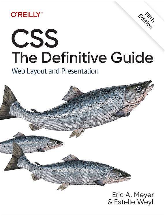
An image of the cover of Cascading Style Sheets, Second Edition I have in my hands a physical copy of the second edition of Cascading Style Sheets: The Definitive Guide, bound with a RepKover lay-flat spine and everything.  So I figure it should be shipping out to folks within the next week or two.  If you’ve pre-ordered, there ought not be long to wait!  (And if you haven’t, then what are you waiting for?)

As I mentioned yesterday, the ‘diagnosis’ favelets I used during my SXSW04i presentation generated a lot of comment, so I now have the underlying style sheets on a “Favelets” page in my “Tools” section.  For those of you who know how favelets work, just grab any or all of the style sheets you want and go for it.  For those who need some assistance, I wrote a “Favelet Creator.”  You plug in the URL of a style sheet you want to have applied to whatever page you’re viewing and the name of the favelet as you want it to appear in your toolbar.  Then you drag the resulting link into your favorites toolbar.

All this really does is create a javascript: link that, when invoked, will dynamically write a link element into the head of whatever document you’re viewing.  That link points to a style sheet, and so the styles are applied.  As an example, you could point it to a style sheet that sets borders for tables and table cells.  When you click on the favelet, all of the tables and table cells in the currently-viewed page become visible.  Figuring out exactly how a table-based page is laid out thus becomes a snap.

So if you don’t like the styles I created, you can write your own (or modify the ones I provided) and create your own diagnostic style sheets.  The favelet creator should make it even simpler.  Either way, I hope these will be helpful.


Browse the Archive

Earlier Entries

Later Entries