Posts from 2008

Characteristic Confusion

Published 15 years, 11 months past

In the course of building my line-height: normal test page, I settled on defaulting to an unusual but still pervasive font family: Webdings.  The idea was that if you picked a font family in the dropdown and you didn’t have it installed, you’d fall back to Webdings and it would be really obvious that it had happened.

(A screenshot of the symbols expected from Webdings: an ear, a circle with a line through the middle, and a spider.)

Except in Firefox 3b5, there were no dings, web or otherwise.  Instead, some serif-family font (probably my default serif, Times) was being used to display the text “Oy!”.

It’s a beta, I thought with a mental shrug, and moved on.  When I made mention of it in my post on the subject, I did so mainly so I didn’t get sixteen people commenting “No Webdings in Firefox 3 betas!” when I already knew that.

So I didn’t get any of those comments.  Instead, Smokey Ardisson posted that what Firefox 3 was doing with my text was correct.  Even though the declared fallback font was Webdings, I shouldn’t expect to see it being used, because Firefox was doing the proper Unicode thing and finding me a font that had the character glyphs I’d requested.

Wow.  Ignoring a font-family declaration is kosher?  Really?

Well, yes.  It’s been happening ever since the CSS font rules were first implemented.  In fact, it’s the basis of the whole list-of-alternatives syntax for font-family.  You might’ve thought that CSS says browsers should look to see if a requested family is available and then if not look at the next one on the list, and then goes to render text.  And it does, but it says they should do that on a per-character basis.

That is, if you ask for a character and the primary font face doesn’t have it, the browser goes to the next family in your list looking for a substitute.  It keeps doing that until it finds the character you wanted, either in your list of preferred families or else in the browser’s default fonts.  And if the browser just can’t find the needed symbol anywhere at all, you get an empty box or a question mark or some other symbol that means “FAIL” in font-rendering terms.

A commonly-cited case for this is specifying a CJKV character in a page and then trying to display it on a computer that doesn’t have non-Romance language fonts installed.  The same would hold true for any page with any characters that the installed fonts can’t support.  But think about it: if you browse to a page written in, say, Arabic, and your user style sheet says that all elements’ text should be rendered in New Century Schoolbook, what will happen?  If you have fonts that support Arabic text, you’re going to see Arabic, not New Century Schoolbook.  If you don’t, then you’re going to see a whole lot of “I can’t render that” symbols.  (Though I don’t know what font those symbols will be in.  Maybe New Century Schoolbook?  Man, I miss that font.)

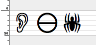
So: when I built my test, I typed “Oy!” for the example text, and then wrote styles to use Webdings to display that text.  Here’s how I represented that, mentally: the same as if I’d opened up a text editor like, oh, MS Word 5.1a; typed “Oy!”; selected that text; and then dropped down the “Font” menu and picked “Webdings”.

But here’s how Firefox 3 dealt with it: I asked for the character glpyhs “O”, “y”, and “!”; I asked for a specific font family to display that text; the requested font family doesn’t contain those glyphs or anything like them; the CSS font substitution rules kicked in and the browser picked those glyphs out of the best alternative.  (In this case, the browser’s default fonts.)

In other words, Firefox 3 will not show me the ear-Death Star-spider combo unless I put those exact symbols into my document source, or at least Unicode references that call for those symbols.  Because that’s what happens in a Unicode world: you get the glyphs you requested, even if you thought you were requesting something else.

The problem, of course, is that we don’t live in a Unicode world—not yet.  If we did, I wouldn’t keep seeing line noise on every web page where someone wrote their post in Word with smart quotes turned on and then just did a straight copy-and-paste into their CMS.  (Here we have a screenshot of text where a bullet symbol has been mangled into an a-rhone and an American cents sign, thus visually turning 'Wall-E' into 'Wallace'.)  Ged knows I would love to be in a Unicode world, or indeed any world where such character-incompatibility idiocy was a thing of the past.  The fact that we still have those problems in 2008 almost smacks of willful malignance on the part of somebody.

Furthermore, in most (but not all) of the text editors I have available and tested, I can type “Oy!” with the font set to Webdings and get the ear, Death Star, and spider symbols.  So mentally, it’s very hard to separate those glyphs from the keyboard characters I type, which makes it very hard to just accept that what Firefox 3 is doing is correct.  Instinctively, it feels flat-out wrong.  I can trace the process intellectually, sure, but that doesn’t mean it has to make sense to me.  I expect a lot of people are going to have similar reactions.

Having gone through all that, it’s worth asking: which is less correct?  Text editors for letting me turn “Oy!” into the ear-Death Star-spider combo, or Firefox for its rigid glyph substitution?  I’m guessing that the answer depends entirely on which side of the Unicode fence you happen to stand.  For those of us who didn’t know there was a fence, there’s a bit of a feeling of a slip-and-fall right smack onto it, and that’s going to hurt no matter who you are.


Tour de Frantic

Published 15 years, 11 months past

I am, as ever, woefully behind on posting.  (Then again, maybe it’s not just me: Greg Hoy recently tweeted that it’s happening all over.)  I still want to follow up on line-height: normal and also on a closely related topic that emerged in the comments.  And I will.  Eventually.

Right now, though, I want to mention a few pieces of news from the conference world.  After that, it’s back to steeling myself to upgrade WordPress while stomping out the problems I have with my current install and also, I hope, finally getting it set up to do version-controlled upgrading henceforth.

Right.  The news.

  • The early bird deadline for An Event Apart Boston 2008 is next Monday, so don’t wait much longer to register if you’re a fan of discounts.  If not, that’s cool too.  Maybe you like to pay more.  We’re not here to judge.

  • If you’re on the opposite coast, there’s also An Event Apart San Francisco 2008, whose detailed schedule was announced this morning.  It will be two days jam packed with greatness from Heather Champ, Kelly Goto, Jeremy Keith, Luke Wroblewski, Dan Cederholm, Tantek Çelik, Jeffrey Veen, Derek Featherstone, Liz Danzico, Jason Santa Maria, Jeffrey Zeldman, and your humble servant.  You’ve still got some time to register with the early bird discount, but I wouldn’t put it off forever, because there’s no way to know when the last seat will be sold.

    (And if you aren’t subscribed to our mailing list, then you’re already behind the times:  subscribers got word of the detailed San Francisco schedule yesterday, ahead of everyone else.  Because they’re on the ins, as the kids are known to say.  Don’t let them have all the fun.  Sign up today!)

  • At the beginning of June, I’ll be giving a keynote plus a bonus session to be named later at the Spring <br/> Conference in Athens, Ohio.  For years they’ve been trying to get me to come down there, and every year I had some insurmountable scheduling conflict.  It almost happened again this year, but they were really fantastic and actually worked the schedule to accommodate me, for which I can’t thank them enough.  Come on down and take a <br/> with us!

  • Come mid-July, I’ll be in sunny Philadelphia for the Higher Education Web Symposium co-teaching a full-day workshop on “CSS Tips & Techniques” with the incomparable Stephanie Sullivan.

  • And in the realm of the not-absolutely-guaranteed-and-therefore-underspecified:  come late September, it looks like I’ll be back in Destin, Florida; and I just might be making my way to Japan in early November.

Plus of course there’s An Event Apart Chicago 2008 in October, but you already knew about that.  The detailed schedule will be published in mid-July, and with that lineup of speakers, I’m already shivering with anticipation.

Okay, that’s all I have for the moment.  Hopefully that upgrade/fix/control thing will go less bumpily than I fear, and I can get another post out before all those shows have passed into memory.


line-height: abnormal

Published 15 years, 11 months past

When I first wrote Cascading Style Sheets: The Definitive Guide, the part that caused me the most difficulty and headaches was the line layout material.  Several times I was sure I had it all figured out and accurately described, only to find out I was wrong.  For two weeks I corresponded with Ian Hickson and David Baron, arguing for my understanding of things and having them show me, in merciless detail, how I was wrong.  I doubt that I will ever stop owing them for their dedication to getting me through the wilderness of my own misunderstandings.

Later on, I produced a terse description of line layout which went through a protracted vetting process with the CSS Working Group and the members of www-style.  At the time it was published, there was no more detailed and accurate description of line layout available.  Even at that, corrections trickled in over the years, which made me think of it as my own tiny little The Art of Computer Programming.  Only without the small monetary reward for finding errors.

The point here is that line layout is very difficult to truly understand—even given everything I just said, I’m still not convinced that I do—and that there are often surprises lurking for anyone who goes looking into the far corners of how it happens.  As I’ve said before, my knowledge of what goes into the layout of lines of text imparts a sense of astonishment that any page can be successfully displayed in less than the projected age of the universe.

Why bring all this up?  Because I went and poked line-height: normal with a stick, and found it to be both squamous and rugose.  As with all driven to such madness, I now seek, grinning wildly, to infect others.

Here’s the punchline: the effects of declaring line-height: normal not only vary from browser to browser, which I had expected—in fact, quantifying those differences was the whole point—but they also vary from one font face to another, and can also vary within a given face.

I did not expect that.  At least, not consciously.

My work, let me show it to you: a JavaScript-driven test file where you can pick from a list of fonts and see what happens at a variety of sizes.  (Yes, the JS is completely obtrusive; and yes, the JS is the square of amateur hour.  Let’s move on, please.  I’m perfectly happy to replace what’s there with unobtrusive and sharper JS, as long as the basic point of the page, which is testing line-height: normal, is not compromised.  Again, moving on.)

When you first go to the test, you should (I hope) see a bunch of rulered boxes containing text using the very common font face Webdings, set at a bunch of different font sizes.  The table shows you how tall the simple line boxes are at each size, and therefore the numeric equivalent for line-height: normal at those sizes.  So if a line box is using font-size: 50px and the line box is 55 pixels tall, the numeric equivalent for line-height: normal is 1.1 (55 divided by 50).

On my PowerBook, Webdings always yields a 1:1 ratio between the font-size and line box height.  The ten-pixel font size yields a ten-pixel-tall line box, and so on.

This is actually a little surprising by itself.  The CSS 2.1 specification says:

normal
Tells user agents to set the used value to a “reasonable” value based on the font of the element. The value has the same meaning as <number>. We recommend a used value for ‘normal’ between 1.0 to 1.2. The computed value is ‘normal’.

This is basically what CSS has said since its first days (see the equivalent text in CSS1 or in CSS2 for confirmation) and there’s always been a widespread assumption that, since 1.0 is probably too crowded, something around 1.2 is much more likely.

So finding a value of 1 was a surprise.  It was an even bigger surprise to me that this held true in Camino 1.5.2, Firefox 2.0.0.14, and Safari 2.0.4, all on OS X.  Firefox 3b5 didn’t render Webdings at all, so I don’t know if it would do the same.  I actually suspect not, for reasons best left for another time (and, possibly, a final release of Firefox 3).

Various browsers doing the same thing in an under-specified area of the spec?  That can’t be right.  It’s pretty much an article of faith that given the chance to do anything differently, browsers will.  The sailing was so unexpectedly smooth that I immediately assumed was that a storm lurked just over the horizon.

Well, I was right.  All I had to do was start picking other font faces.

To start, I picked the next font on the list, Times New Roman, and the equivalent values for normal immediately changed.  In other words, the numeric equivalents for Times New Roman are different than those for Webdings.  The browsers weren’t maintaining a specific value for normal, but were altering it on a per-face basis.

Now, this is legal, given the way normal is under-specified.  There’s room to allow for this behavior.  It’s actually, once you think about it, a fairly good thing from a visual point of view: the best default line height for Times New Roman is probably not the best default line height for Courier New.  So while I was initially surprised, I got over it quickly.  The seemingly obvious conclusion was that browsers were actually respecting the fonts’ built-in metrics.  This was reinforced when I found that the results were exactly the same from browser to browser.

Then I looked more closely at the numbers, and confusion set back in.  For Times New Roman, I was getting values of 1.1, 1.12, 1.16, 1.15, 1.149, and 1.1499.  If you were to round all of those numbers to two decimal points, you’d get 1.10, 1.12, 1.16, 1.15, 1.15, 1.15.  If you round them all to one decimal place, you’d get 1.1, 1.1, 1.2, 1.2, 1.1, 1.1.  They’re inconsistent.

But wait, I thought, I’m trying to compare numbers I derived by dividing pixels by pixels.  Let’s turn it around.  If I multiply the most precise measurement I’ve gotten by the various font sizes, I get… carry the two… 11.499, 28.7475, 57.495, 114.99, 1149.9, 11499.  As compared to the actual values I got, which were 11, 28, 58, 115, 1149, and 11499.

Which means the results were inappropriately rounded up in some cases and down in others.  28.7475 became 28 and 1149.9 became 1149, whereas 57.495 became 58.  Even though 11.499 became 11 and 114.99 became 115.

This was consistent across all the browsers I was testing.  So again, I was suspecting the fonts themselves.

And then I switched from Times New Roman to just plain old Times, and the storm was full upon me.  I’ll give you the results in a table.

Derived normal equivalents for Times in OS X browsers
font-size Camino 1.5.2 Firefox 2.0.0.14 Safari 2.0.4
10 1 1.2 1.3
25 1 1 1.16
50 1 1 1.18
100 1 1 1.15
1000 1 1 1.15
10000 1 1 1.15

Much the same happened when comparing Courier New with plain old Courier: full consistency on Courier New between browsers, albeit with the same strange (non-)rounding effects as seen with Times New Roman; but inconsistency between browsers on plain Courier—with Camino yielding a flat 1 down the line, Firefox going from 1.2 to 1, and Safari having a range of values above the others’ values.

Squamous!  Not to mention rugose!

Now it’s time for the stunning conclusion that derives from all this information, which is: not here.  Sorry.  So far all I have are observations.  I may turn all this into a summary page which shows the results for all the font faces across multiple browsers and platforms, but first I’ll need to get those numbers.

I do have a few speculations, though:

  1. Firefox’s inconsistency within font faces (see Times and Courier, above) may come from face substitution.  That’s when a browser doesn’t have a given character in a given face, so it looks for a substitute in another face.  If Firefox thinks it doesn’t have 10-pixel Times, it might substitute 10-pixel something else serif-ish, and that face has different line height characteristics than Times.  I don’t know what that other face might be, since it’s not Times New Roman or Georgia, but this is one possibility.  It is not the minimum font size setting in the preferences, as I’ve triple-checked to make sure I have that set to “None”.

  2. Another possibility for Firefox’s line height weirdness is a shift from subpixel font rendering to pixelly font rendering.  10-pixel text in Firefox is distinctly pixelly compared to the other browsers I tested, while sizes above there are nice and smooth.  Why this would drive up the line height by two pixels (20%), though, is not clear to me.

  3. Much of what I’ve observed will likely be laid to rest at the doorsteps of the font faces themselves.  I’d like to know how it is that the rounding behaviors are so (mathematically) messed up within faces, though.  Perhaps ideal line heights are described as an equation rather than a simple ratio?

Again, this was all done in OS X; I’ll be very interested to find out what happens on Windows, Linux, and other operating systems.  Side note for the Mac Opera fans warming up their flamethrowers: I’ve left Opera 9.27 for OS X out of this because it seems to cap font sizes at a size well below 1000, although this limit varied from one face to another.  Webdings and Courier capped at 507 pixels, whereas Courier capped at 574 pixels and Comic Sans MS stopped at 707 pixels.  I have no explanation, though doubtless someone will, but the upshot is that direct comparisons between Opera and the other browsers are impossible.  For sizes up to 100 pixels, the results were exactly consistent with Camino, if that means anything.

The one tentative conclusion I did reach is this: line-height: normal is a jumbled terrain of inconsistent behaviors, and it’s best avoided in any sort of precision layout work.  I’d already had that feeling, but at least now there’s some evidence to back up the feeling.

In any case, I doubt this is the last I’ll have to say on this particular topic.

Update 7 May 08: I’ve updated the test page with a fix from Ben Lowery so that it works in IE.  Thanks, Ben!  Now all I need is to add a way to type in any arbitrary font-family’s name, and we’ll have something everyone can use.  (Or else a way to use JavaScript to suck up the names of all the fonts installed on a machine and put them into the dropdown.  That would be cool, too.)


The Really Perfect Ringtone

Published 15 years, 11 months past

When I saw a couple of people link to “the perfect iPhone ringtone” last week, I had that sinking feeling that comes from being beaten to the punch.  I knew I should have stayed up an extra hour that one night and just gotten it done!

But wait, hold it, never mind, cancel the panic parade: it was not, in fact, the perfect ringtone.  Crisis averted!  Still, the sinking feeling lingered, reminding me of what could have been, so last night I sat down and got it done.  Now I bring to you the absolutely most perfect ringtone ever.

Feel free to preview it using that link, if you really feel that’s necessary, but frankly you should just charge ahead and download the .m4r AAC for instant ringtoniness.  If for some reason you’d rather have the audio source and do your own ringtone conversions, you can get the same file as a .m4a AAC or a comfy old .mp3.  And for all you completists, there’s a .zip archive of all three formats.

Go.  Ring.  Enjoy.


Five Years

Published 16 years, 1 week past

Five years ago, the phone rang and my life was forever altered.  It was the first of two utterly transforming phone calls we would get that year, and by far the worse.

Shortly after hanging up, I put in place the temporary home page I’d prepared ahead of time, complete with errors of fact which had grown out of my inability to think clearly about what I knew beyond any doubt was going to happen.  The next day, I noticed and corrected the errors, and then realized after a while that my corrections were incorrect and corrected them.  Correctly, at last.

When I appended the block of text a day or two later, it was a straight copy-and-paste job, and I was able to avoid introducing errors.  I was able to find a perverse solace in that.

To mark this anniversary, I’m publishing the piece I read on stage at Vox Nox 2005, which was the only time it was shared publicly in the last five years.  The stunning part, even to me, is that every bit of that piece is the raw, unedited, unaltered truth.

In some ways, I still can’t believe that it’s been five years and that she’s really forever gone, that she’s missed everything that’s happened in my life.  In some ways, I can’t accept that she will never know her granddaughter, and that her granddaughter will never know her.  And in little ways, I do my best to bridge that yawning chasm with myself and what I learned, what I was taught, over all the years of my life… minus just a bit less than five.

Five years.  Five very busy years.  Five awful, wonderful, stressful, liberating, irreplaceable years.

I miss you, Mom.


Crafting Ourselves

Published 16 years, 1 week past

My referrers lit up recently due to Jonathan Snook’s article about CSS resets and how he doesn’t use them.  To Jonathan and all the doubters and nay-sayers out there, I have only one thing to say:

Good for you.

Seriously; no sarcasm or passive-aggressiveness intended.  If I thought my reset styles, or really anything I’ve ever published or advocated, was a be-all end-all ultimate solution for every designer and design that’s ever been and could ever be, I’d be long past due for six rounds on the receiving end of a clue-by-four.

Reset styles clearly work for a lot of people, whether as-is or in a modified form.  As I say on the reset page, those styles aren’t supposed to be left alone by anyone.  They’re a starting point.  If a thousand people took them and created a thousand different personalized style sheets, that would be right on the money.  But there’s also nothing wrong with taking them and writing your own overrides.  If that works for you, then awesome.

For others, reset styles are more of an impediment.  That’s only to be expected; we all work in different ways.  The key here, and the reason I made the approving comment above, is that you evaluate various tools by thinking about how they relate to the ways you do what you do—and then choose what tools to use, and how, and when.  That’s the mark of someone who thinks seriously about their craft and strives to do it better.

I’m not saying that craftsmen/craftswomen are those people who reject the use of common tools, of course.  I’m saying that they use the tools that fit them best and modify (or create) tools to best fit them, applying their skills and knowledge of their craft to make those decisions.  It’s much the same in the world of programming.  You can’t identify a code craftsman by whether or not they use this framework or that language.  You can identify them by how they decide which framework or language to use, or not use, in a given situation.

Craftsmanship is something I’ve been thinking about quite a bit recently, as has Joshua Porter.  I delivered a keynote address on that very topic just a few days ago in Minneapolis, and my thinking infuses both of the talks I’m giving next week at An Event Apart New Orleans.  I’ve started looking harder for evidence of it, both in myself and in what I see online, and I believe striving toward being a craftsman/craftswoman is an important process for anyone who chooses to work in this field.

Because this isn’t a field of straightforward answers and universal solutions.  We are often faced with problems that have multiple solutions, none of them perfect.  To understand what makes each solution imperfect and to know which of them is the best choice in the situation—that’s knowing your craft.  That’s being a craftsman/craftswoman.  It’s a never-ending process that is all the more critical precisely because it is never-ending.

So it’s no surprise that we, as a community, keep building and sharing solutions to problems we encounter.  Discussions about the merits of those solutions in various situations are also no surprise.  Indeed, they’re exactly the opposite: the surest and, to me, most hopeful sign that web design/development continues to mature as a profession, a discipline, and a craft.  It’s evidence that we continue to challenge ourselves and each other to advance our skills, to keep learning better and better how better to do what we love so much.

I wouldn’t have it any other way.


Time and Motion

Published 16 years, 2 weeks past

I was reading an article on cosmology, as I am sometimes wont to do, and it brought back to me one of those questions that I’ve had for a while now, concerning the redshifting of light from distant galaxies as it relates to the history and expansion of the universe.

For those of you not familiar with this topic, the general idea here is that when we look at galaxies outside our own, the light they give off is shifted toward the redder end of the electromagnetic spectrum, which means the wavelengths are getting longer.  According to our present understanding of physics, the simplest explanation for this observation that the further away a galaxy is, the faster it is receding from us—thus redshifting the light it gives off, thanks to the Doppler effect.  It turns out that the amount of redshifting is directly and linearly proportional to the distance of the galaxy, a ratio named the Hubble constant in honor of Edwin Hubble, the man who first made this observation.  (He’s also the namesake of the Hubble Space Telescope, of course.)

It seems to me that this explanation  either overlooks or glosses over one kind of important point: we don’t see those galaxies as they are right now.  In fact, we’re seeing them as they were in the past, and the further out we look, the further back in time we’re looking.  If a galaxy is a five million light-years distant, then we see it as it was five million years ago.  Double the distance, and double the amount of time involved, which would seem to mean that greater redshifts are as much a product of how far back in time we’re looking as they are distance.

So why is it that distance is regarded as the primary factor here?  Why don’t we assume that the universe’s expansion is actually slowing down, given that the closer things are (and therefore the more recent they are), the less quickly they’re receding, whereas the really distant (and therefore much, much older) galaxies were receding more quickly back then?

I’ve no doubt this has been explained one way or another by people way smarter than me, but some Googling yielded no decent results—just about everything I came up with challenged the Hubble constant on various and sundry grounds, not all of them sensical (at least to me).  Nothing I found addressed this specifically.  Though I figure the explanation is straightforward enough, I don’t seem to be using the right search terms to find it.  Anyone got any help for me here?


Full Disclosure

Published 16 years, 3 weeks past
WARNING: This person omits alt text from images (Happy April Fool's Day from The Web Standards Project.)

Browse the Archive

Earlier Entries

Later Entries