Posts from 2012

Customizing Your Markup

Published 12 years, 7 months past

So HTML5 allows you (at the moment) to create your own custom elements.  Only, not really.

(Ed. note: this post has been corrected since its publication, and a followup clarification has been posted.)

Suppose you’re creating a super-sweet JavaScript library to improve text presentation — like, say, TypeButter — and you need to insert a bunch of elements that won’t accidentally pick up pre-existing CSS.  That rules span right out the door, and anything else would be either a bad semantic match, likely to pick up CSS by mistake, or both.

Assuming you don’t want to spend the hours and lines of code necessary to push ahead with span and a whole lot of dynamic CSS rewriting, the obvious solution is to invent a new element and drop that into place.  If you’re doing kerning, then a kern element makes a lot of sense, right?  Right.  And you can certainly do that in browsers today, as well as years back.  Stuff in a new element, hit it up with some CSS, and you’re done.

Now, how does this fit with the HTML5 specification?  Not at all well.  HTML5 does not allow you to invent new elements and stuff them into your document willy-nilly.  You can’t even do it with a prefix like x-kern, because hyphens aren’t valid characters for element names (unless I read the rules incorrectly, which is always possible).

No, here’s what you do instead :

  1. Wrap your document, or at least the portion of it where you plan to use your custom markup,Define the element customization you want with an element element.  That’s not a typo.
  2. To your element element, add an extends attribute whose value is the HTML5 element you plan to extend.  We’ll use span, but you can extend any element.
  3. Now add a name attribute that names your custom “element” name, like x-kern.
  4. Okay, you’re ready!  Now anywhere you want to add a customized element, drop in the elements named by extends and then supply the name via an is attribute.

Did you follow all that?  No?  Okay, maybe this will make it a bit less unclear.  (Note: the following code block was corrected 10 Apr 12.)

<element extends="span" name="x-kern"></element>
<h1>
<span is="x-kern" style="…">A</span>
<span is="x-kern" style="…">u</span>
<span is="x-kern" style="…">t</span>
<span is="x-kern" style="…">u</span>
mn
</h1>
<p>...</p>
<p>...</p>
<p>...</p>

(Based on markup taken from the TypeButter demo page.  I simplified the inline style attributes that TypeButter generates for purposes of clarity.)

So that’s how you create “custom elements” in HTML5 as of now.  Which is to say, you don’t.  All you’re doing is attaching a label to an existing element; you’re sort of customizing an existing element, not creating a customized element.  That’s not going to help prevent CSS from being mistakenly applied to those elements.

Personally, I find this a really, really, really clumsy approach — so clumsy that I don’t think I could recommend its use.  Given that browsers will accept, render, and style arbitrary elements, I’d pretty much say to just go ahead and do it.  Do try to name your elements so they won’t run into problems later, such as prefixing them with an “x” or your username or something, but since browsers support it, may as well capitalize on their capabilities.

I’m not in the habit of saying that sort of thing lightly, either.  While I’m not the wild-eyed standards-or-be-damned radical some people think I am, I have always striven to play within the rules when possible.  Yes, there are always situations where you work counter to general best practices or even the rules, but I rarely do so lightly.  As an example, my co-founders and I went to some effort to play nice when we created the principles for Microformats, segregating our semantics into attribute values — but only because Tantek, Matt, and I cared a lot about long-term stability and validation.  We went as far as necessary to play nice, and not one millimeter further, and all the while we wished mightily for the ability to create custom attributes and elements.

Most people aren’t going to exert that much effort: they’re going to see that something works and never stop to question if what they’re doing is valid or has long-term stability.  “If the browser let me do it, it must be okay” is the background assumption that runs through our profession, and why wouldn’t it?  It’s an entirely understandable assumption to make.

We need something better.  My personal preference would be to expand the “foreign elements” definition to encompass any unrecognized element, and let the parser deal with any structural problems like lack of well-formedness.  Perhaps also expand the rules about element names to permit hyphens, so that we could do things like x-kern or emeyer-disambiguate or whatever.  I could even see my way clear to defining an way to let an author list their customized elements.  Say, something like <meta name="custom-elements" content="kern lead follow embiggen shrink"/>.  I just made that up off the top of my head, so feel free to ignore the syntax if it’s too limiting. The general concept is what’s important.

The creation of customized elements isn’t a common use case, but it’s an incredibly valuable ability, and people are going to do it.  They’re already doing it, in fact.  It’s important to figure out how to make the process of doing so simpler and more elegant.


Invented Elements

Published 12 years, 8 months past

This morning I caught a pointer to TypeButter, which is a jQuery library that does “optical kerning” in an attempt to improve the appearance of type.  I’m not going to get into its design utility because I’m not qualified; I only notice kerning either when it’s set insanely wide or when it crosses over into keming.  I suppose I’ve been looking at web type for so many years, it looks normal to me now.  (Well, almost normal, but I’m not going to get into my personal typographic idiosyncrasies now.)

My reason to bring this up is that I’m very interested by how TypeButter accomplishes its kerning: it inserts kern elements with inline style attributes that bear letter-spacing values.  Not span elements, kern elements.  No, you didn’t miss an HTML5 news bite; there is no kern element, nor am I aware of a plan for one.  TypeButter basically invents a specific-purpose element.

I believe I understand the reasoning.  Had they used span, they would’ve likely tripped over existing author styles that apply to span.  Browsers these days don’t really have a problem accepting and styling arbitrary elements, and any that do would simply render type their usual way.  Because the markup is script-generated, markup validation services don’t throw conniption fits.  There might well be browser performance problems, particularly if you optically kern all the things, but used in moderation (say, on headings) I wouldn’t expect too much of a hit.

The one potential drawback I can see, as articulated by Jake Archibald, is the possibility of a future kern element that might have different effects, or at least be styled by future author CSS and thus get picked up by TypeButter’s kerns.  The currently accepted way to avoid that sort of problem is to prefix with x-, as in x-kern.  Personally, I find it deeply unlikely that there will ever be an official kern element; it’s too presentationally focused.  But, of course, one never knows.

If TypeButter shifted to generating x-kern before reaching v1.0 final, I doubt it would degrade the TypeButter experience at all, and it would indeed be more future-proof.  It’s likely worth doing, if only to set a good example for libraries to follow, unless of course there’s downside I haven’t thought of yet.  It’s definitely worth discussing, because as more browser enhancements are written, this sort of issue will come up more and more.  Settling on some community best practices could save us some trouble down the road.

Update 23 Mar 12: it turns out custom elements are not as simple as we might prefer; see the comment below for details.  That throws a fairly large wrench into the gears, and requires further contemplation.


Negative Proximity

Published 12 years, 8 months past

There’s a subtle aspect of CSS descendant selectors that most people won’t have noticed because it rarely comes up: selectors have no notion of element proximity.  Here’s the classic demonstration of this principle:

body h1 {color: red;}
html h1 {color: green;}

Given those styles, all h1 elements will be green, not red.  That’s because the selectors have equal specificity, so the last one wins.  The fact that the body element is “closer to” the h1 than the html element in the document tree is irrelevant.  CSS has no mechanism for measuring proximity within the tree, and if I had to place a bet on the topic I’d bet that it never will.

I bring this up because it can get you into trouble when you’re using the negation pseudo-class.  Consider:

div:not(.one) p {font-weight: bold;}
div.one p {font-weight: normal;}

<div class="one">
  <div class="two">
    <p>Hi there!</p>
  </div>
</div>

Given these styles, the paragraph will not be boldfaced.  That’s because both rules match, so the last one wins.  The paragraph will be normal-weight.

“AHA!” you cry.  “But the first rule has a higher specificity, so it wins regardless of the order they’re written in!”  You’d think so, wouldn’t you?  But it turns out that the negation pseudo-class isn’t counted as a pseudo-class.  It, like the univseral selector, doesn’t contribute to specificity at all:

Selectors inside the negation pseudo-class are counted like any other, but the negation itself does not count as a pseudo-class.

 — Selectors Level 3, section 9: Calculating a selector’s specificity

If you swapped the order of the rules, you’d get a boldfaced paragraph thanks to the “all-other-things-being-equal-the-last-rule-wins” step in the cascade.  However, that wouldn’t keep you from getting a red-on-red paragraph in this case:

div:not(.one) p {color: red;}
div.one p {background: red;}

<div class="one">
  <div class="two">
    <p>Hi there!</p>
  </div>
</div>

The paragraph is a child of a div that doesn’t have a class of one, but it’s also descended from a div that has a class of one.  Both rules apply.

(Thanks to Stephanie Hobson for first bringing this to my attention.)


The Web Ahead, Episode #18: Me!

Published 12 years, 8 months past

Last Thursday, I had the rare honor and privilege of chatting with Jen Simmons as a guest on The Web Ahead .  (I’ve also chatted with Jen in real life.  That’s even awesomer!)  As is my wont, I completely abused that privilege by chatting for two hours — making it the second-longest episode of The Web Ahead to date — about the history of the web and CSS, what’s coming up that jazzes me the most, and all kinds of stuff.  I even revealed, toward the end of the conversation, the big-picture projects I dearly wish I had time to work on.

The finished product was published last Friday morning.  I know it’s a bit of a lengthy beast, but if you’re at all interested about how we got to where we are with CSS, you might want to give this a listen:  The Web Ahead, Episode #18.  Available for all your finer digital audio players via embedded Flash player, iTunes, RSS, and MP3 download.

My deepest thanks to Jen for inviting me to be part of the show!


From Filaments to Semiconductors

Published 12 years, 8 months past

Thanks to last summer’s home renovation project, the new kitchen is lit by six interior flood bulbs.  We were using the diffuse incandescent bulbs our contractors put in, which were nice and warm and soft.  And also, being essentially freebies, not long for this world.  We recently had three burn out within two weeks.

We decided to take the opportunity to switch from incandescents to something far more energy-efficient.  Having used a number of CFLs around the house, I knew I wanted no part of that scene.  The subtle flicker they generate isn’t subtle enough for me, and I hate the wan quality of the light.  I’m not really thrilled with the warm-up time, either.

So we went with LEDs.  This wasn’t as straightforward as I might have liked, but we’ve now switched and are really happy to have done so.  I’d like to share the most important thing we learned in hopes of helping others through the transition.

It’s this:  if you’re going from “warm” incandescents straight to LED, find bulbs that have a color temperature of 2700K.  The first test bulb we bought was 3000K, and the difference was enormous.  By comparison to the incandescents, it was a harsh white.  In a Modernist design setting, like say at the Guggenheim, 3000K is probably a good choice.  In our wood-and-grain center-hall Colonial home, it was all wrong.

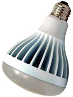
So I ran up to Home Depot and picked up a couple of EcoSmart BR30 diffuse floodlight bulbs, which are 2700K.  I put in one as a test, and when we flipped on the lights, I couldn’t see a difference in the light given off by the LED and incandescent bulbs.  The LED gave off a little bit more light than the incandescents around it (more on that in a minute) but the quality of light was essentially the same.  I put in the other test bulb with the same results.  Now we have all six cans fitted with the EcoSmarts, and the kitchen is just as warm as it was before.

One slightly noticeable difference is that there are more lumens bouncing around the kitchen than before, because we had 65W incandescents and the LEDs are equivalent to 75W (they actually consume 14W).  There weren’t any 65W equivalents in the floods, at least when I went looking, so I picked the 75W equivalents.  The new bulbs put out 800 lumens each, whereas the old ones likely shed 650-700 lumens each.  I do notice the difference, but it’s not so extra-bright that it’s bothersome.  That said, if I track down some bright white 2700Ks in the 650-700 lumen range, I may swap out half the kitchen bulbs in a staggered pattern to see how it feels.  Whichever ones I don’t use in the kitchen, I can always reuse in the cans in our basement.

The really noticeable difference is that when you flip the wall switch, it takes half a second for the bulbs to actually light up.  It’s a bit unusual when you switch straight from incandescent, but it’s no worse than the “on time” for most CFLs, and there’s no slow warm-up time for LEDs like you get with CFLs.  Once they’re on, they’re on.  And they don’t hum or flicker they way CFLs are prone to doing.

In closing, I just want to reiterate that color temperature is absolutely crucial, and if you’re coming over from incandescents, you want to be at 2700K.  Beyond that, match up the wattage as best you can, grit your teeth through the purchase price, and bask in the knowledge that your electricity bills will be lower, plus you shouldn’t have to replace the bulb any time in the next decade or even two.  That last part alone nearly makes LEDs worth the up-front cost.

If you have experiences or tips to share with regards to LED bulbs, by all means leave a comment!


Finding Unicode

Published 12 years, 8 months past

A little while back, I was reading some text when I realized the hyphens didn’t look quite right.  A little too wide, I thought.  Not em-dash wide, but still…wide.  Wide-ish?  But when I copied some of the text into a BBEdit window, they looked just like the hyphens I typed into the document.

Of course, I know Unicode is filled with all manner of symbols and that the appearance of those symbols can vary from one font face to another.  So I changed the font face, made the size really huge, and behold: they were indeed different characters.  At this point, I was really curious about what I’d found.  What exactly was it?  How would I find out?

For the record, here’s the character in question:

Googling “−” and “− Unicode” got me nothing useful.  I knew I could try the Character Viewer in OS X, and eventually I did, but I was wondering if there was a better (read: lazier) solution.  I asked the Twittersphere for advice, and while I don’t know if these solutions are any lazier, here are the best of the suggestions I received.

  • Unicode Lookup, a site that lets you input or paste in any character and get a report on what it is and how one might call it in various encodings.
  • Richard Ishida’s UniView Lite, which does much the same as Unicode Lookup with the caveat that once you’ve input your character, you have to hit the “Chars” button, not the “Search” button.  The latter is apparently how you search Unicode character names for a word or other string, like “dash” or “quot”.
  • UnicodeChecker (OS X), a nice utility that includes a character list pane as well as the ability to type or paste a character into an input and instantly get its gritty details.

Any of those will tell you that the − in question is MINUS SIGN, codepoint 8722 (decimal) / 2212 (UTF-16 hex) / U+2212 (Unicode hex) / et cetera, et cetera.  Did you know it was designated in Unicode 1.1?  Now you do, thanks to UnicodeChecker and this post.  You’re welcome.

Update 2 Mar 12:  Philippe Wittenberg points out in the comments that you can add a UnicodeChecker service.  With that enabled, all you have to do is highlight a character, summon the contextual menu (right-click, for most of us), and have it shown in UnicodeChecker.  Now that’s the kind of laziness I was trying to attain!


Adding a Comma, Expanding a Place

Published 12 years, 8 months past

The moment I hit “Publish” on this post, I will have crossed a major base-ten barrier:  this is the one thousandth post published here on meyerweb.  When I started putting up little missives back in December 1999, the idea was to communicate with my friends and family about what was going on in my life, and to maybe open a dialogue with the few people I hoped might read the forthcoming Cascading Style Sheets: The Definitive Guide.    (We expanded the acronym CSS in the title for fear potential readers might not know what “CSS” stood for — a legitimate concern back in 2000!)  Posts were written in the first-person plural, of all things, and there were no comments or search.  In fact, the whole thing was an unholy agglomeration of XML, XSLT, and shell scripts that somehow spit out HTML into quarterly archive pages — in chronological order, I’ll have you know.

Years later, I migrated to WordPress (mostly because I knew Matt personally, back before he started hobnobbing with Richard Branson and storing fruit in Louis Armstrong’s trumpet and all that), turned on comments, and never looked back.  As more and more sites have disabled commenting, I’ve left that door open and have yet to regret it.  Curating the comments has become easier to manage in the last few years as the number of comments per post has dropped, but I still believe it’s a worthwhile effort.  I was never here simply to talk; a good conversation beats a great soliloquy any day of the week.

It’s also true that, as my life has gotten more complex and my responsibilities have grown, my frequency of posting has dropped in the last few years (I believe that’s at least part of the reason for the drop in comments).  Speaking at an increasing number of conferences, founding and developing An Event Apart with Jeffrey, taking our family’s size from two to five, and trying (trying!) to keep up with the inbox and friends online — all ate into my blogging time.  I allowed it to happen, of course, in the most natural and unconscious way possible: I simply didn’t focus on blogging.  A lot of my focus I let flow into watching social networks stream crumbs of information past me, and occasionally tossing in my own crumbs, partly just to see where they flowed.

I will of course continue to put time and energy into An Event Apart and writing and above all my family, but I am reclaiming in the name of blogging the pieces of my attention I ceded to Twitter and Facebook and all that jazz.  This site, in the last 12 years, has (like an old friend) seen me through failure and success, horror and beauty, war and peace, through death and new life and all the things that greet all of us every day.  It deserves more of my focus, and that’s what I have committed to give it.  I’ll be returning to my old mix of technical and personal material, writing about CSS and standards right alongside child-raising and kitchen faucets.  You can follow along via RSS, or if you prefer a patchier approach you can watch for post announcements on Twitter.  Whatever the balance of content, whatever the post topic, I can most definitely assure you that I will continue to abuse parenthetical asides, lead off paragraphs with “Anyway”, employ British-style punctuation rules, and make jokes so obscure only I get them.

Prior to hitting “Publish” on this post, the archive of “Thoughts From Eric” (the official title of the blog portion of meyerweb) contains 400,409 words, according to WP Word Count.  This post contains 608.  Here’s to the next 598,983.


“The Vendor Prefix Predicament” at ALA

Published 12 years, 9 months past

Published this morning in A List Apart #344: an interview I conducted with Tantek Çelik, web standards lead at Mozilla, on the subject of Mozilla’s plan to honor -webkit- prefixes on some properties in their mobile browser.  Even better: Lea Verou’s Every Time You Call a Proprietary Feature ‘CSS3,’ a Kitten Dies.  Please — think of the kittens!

My hope is that the interview brings clarity to a situation that has suffered from a number of misconceptions.  I do not necessarily hope that you agree with Tantek, nor for that matter do I hope you disagree.  While I did press him on certain points, my goal for the interview was to provide him a chance to supply information, and insight into his position.  If that job was done, then the reader can fairly evaluate the claims and plans presented.  What conclusion they reach is, as ever, up to them.

We’ve learned a lot over the past 15-20 years, but I’m not convinced the lessons have settled in deeply enough.  At any rate, there are interesting times ahead.  If you care at all about the course we chart through them, be involved now.  Discuss.  Deliberate.  Make your own case, or support someone else’s case if they’ve captured your thoughts.  Debate with someone who has a different case to make.  Don’t just sit back and assume everything will work out — for while things usually do work out, they don’t always work out for the best.  Push for the best.

And fix your browser-specific sites already!


Browse the Archive

Earlier Entries

Later Entries