Posts in the Design Category

New Article: “Compassionate UX”

Published 8 years, 7 months past
Sara and I wrote an article for UX Booth, “Compassionate UX”, and it was published last week.  Two quotes (out of a ~1,750-word article):

When we get laser-focused on positive outcomes, we often fail to notice how things might go terribly wrong. But whether you’re working on something as complex as artificial intelligence or as simple as a line of microcopy, you’ll create the best products when you intentionally set aside your goals of “delight” or “engagement,” and make time to think critically about where your product might break.

It’s easy to see this as an uncomfortable restriction on the creative process, and that’s actually a pretty accurate description. Of course thinking about users’ varied identities and emotional states creates limiting factors. But that’s what design is: it is a creative solution to a set of constraints.

Read the whole thing over at UX Booth.


Design For Real Life Now Available

Published 8 years, 8 months past

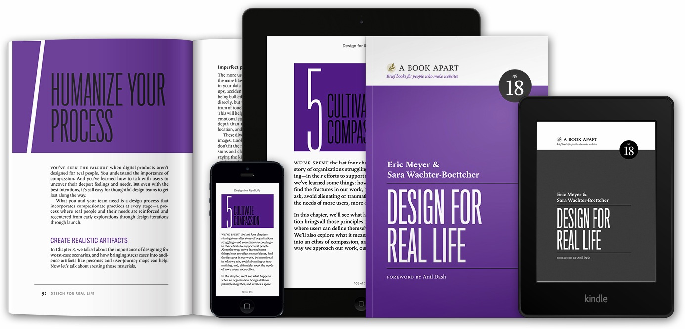
A banner showing ‘Design for Real Life’ in various media

Available as of this morning from A Book Apart in both digital and paper formats: Design for Real Life, the book Sara Wachter-Boettcher and I started writing not quite a year ago.

Anil Dash was kind enough to write a wonderful foreword for the book, in which he perfectly describes the background we were working against:

Two billion people now have some kind of access to internet technologies, and almost all of them are spending more and more time with their thumbs flicking across their phones. And the technology they’re using has a real impact on their lives. They don’t use an app to “share photos”; they use it to maintain a relationship with distant family. They don’t need to do “online banking”; they need to lend a friend money to help them out of a jam. Nobody wants to learn a complicated set of privacy controls; they just want to be able to express themselves without antagonizing bosses or in-laws.

Our thesis, against that, was to say, “As personal and digital lives become closer and effectively merge, the things we design will have to work harder and harder to deal with real people in all their messy complexity.  How can we start people thinking about this, and what tools can we give them?”  That’s what we strove to create, and now you can judge for yourself whether we succeeded.

I’ll be honest: we were pretty scared as we wrote it.  This is not a topic area that’s gotten a ton of attention, and in a lot of ways we were breaking new ground — but, at the same time, we were very aware that there was existing research and knowledge in related areas, so we wanted to be sure we were inclusive or, and respectful of, that work.  We talked to a lot of people in a variety of disciplines, trying to make sure we brought in information that would help the reader and not flying in the face of things that were already known.

So you can imagine our relief and gratitude as we’ve heard glowing reactions from people who read preview drafts — among them Kim Goodwin, Indi Young, Sara Soueidan, Caren Litherland, and Karen McGrane.  Paul Ford said, “Anyone who aspires to build global products that people love should read this book now,” and Kate Kiefer Lee said, “It will be required reading on my team.”

You might think cover blurbs like those are pure marketing fluff, and maybe in some genres they are.  For us, they serve double duty: to let you know that people who know what they’re talking about believe we know what we’re talking about, and also to let us know that.  There were days we weren’t entirely certain.

To be clear, this isn’t a book about forever treating people with kid gloves.  We say “compassion isn’t coddling”, and that’s absolutely the case.  An error message still needs to convey the error; an account lockout still needs to keep the account locked.  But how we convey errors or lockouts, and how we make people aware of the possible ramifications of their actions, is critical.  Just as there are good ways and bad ways to commiserate with a grieving friend or handle a difficult work situation, there are good ways and bad ways to approach people in our designs.

As I said before, we need to deal with real people, in all their messy complexity.  We hope Design for Real Life is the start of a whole new conversation within our field, one that will teach Sara and me just as much as anyone else about how we can be more thoughtful and humane in what we create.


Design for Real Life

Published 8 years, 8 months past

The cover of ‘Design for Real Life’

On March 8th, 2016 — just eight days from the day I’m writing this — Design for Real Life will be available from A Book Apart.  My co-author Sara Wachter-Boettcher and I are really looking forward to getting it into people’s hands.

The usual fashion is to say something like “getting it into people’s hands at long last”, but in this case, that’s not really how it went down.  Just over a year ago now, Sara published “Personal Histories”, and it was a revelation.  In her post, I could see the other half of the book that was developing in my head, a book that was growing out of “Designing for Crisis” and “Inadvertent Algorithmic Cruelty”.  So I emailed Sara and opened with:

Your post was like a bolt of lightning for me.  In the same way the Year in Review thing opened my eyes to what lay beyond “Designing for Crisis”, your post opened my eyes to how far that land beyond reaches.

After research and some intense discussions, we started writing in the spring of 2015, and finished before summer was over.  Fall of 2015 was devoted to rewrites, revisions, additions, and editing.  Winter 2015-2016 was spent in collaborative editorial and production work by the amazing team at A Book Apart.  And now…here we are.  The book is just a week away from being in people’s hands.

To celebrate, Sara and I will be hosting, with incredibly generous support from A Book Apart and PhillyCHI, a launch party at Frankford Hall in Philadelphia.  We’ll be providing some munchies, some tasty adult beverages, and there will be giveaways of both paper and digital copies of the book.  We’d love to see you there!  If you can make it, please do RSVP at that link, so we know how much food to order.

We chose Philadelphia as the site for our launch party for a few reasons.  For one, Sara lives there, so only one of us had to travel.  But to me, it brings some very personal histories full circle, because Philadelphia is where this really all got started.  It’s where Rebecca first went to be treated, where she was given the best possible shot at life, and where I started to notice the failures and successes of user experience design when it collided with the stresses of real life.

In a number of ways, this book has been a labor of love.  The most important, I think, is the love Sara and I have for our field, and how we would love to see it become more humane — really, more human.  That’s why we packed the book not just with examples of good and bad design choices, but of how we can do better.  The whole second part of the book is about how to take the principles we explore in the first part and put them to work right now — not by throwing out your current process and replacing it with a whole new, but by bringing them into your existing practice.  It’s very much about enhancing what you already do.

It’s been an intense process, both emotionally and work-wise.  We pushed as hard as we could to get this to you as soon as we could.  Now the time is almost here.  We’re really looking forward to hearing what you think of it.


Designing for Crisis, Design for Real Life

Published 8 years, 10 months past

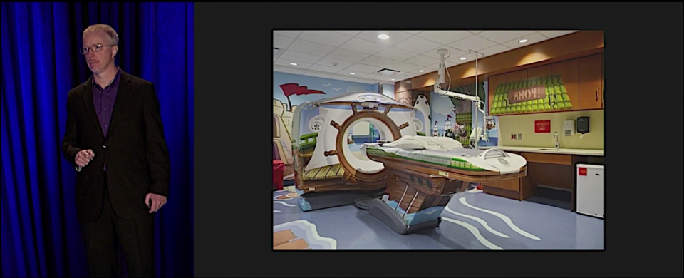
Back in October of 2014, at An Event Apart Orlando, I returned to public speaking with “Designing for Crisis”, my first steps toward illuminating how and why design needs to consider more than just the usual use cases.  I continued refining and delivering that talk throughout 2015, and it was recorded in October 2015 at An Event Apart Austin.  As of late last week, you can see the entire talk for free.

Vimeo: Designing for Crisis by Eric Meyer

There were a lot of strange confluences that went into that talk, some of them horrific, others just remarkable.  One that stands out for me, as I look at that screenshot, is how a few years ago, Jared Spool gave a talk at AEA where he discussed the GE Adventure Series, in a segment that never failed to choke me up (and often choked up Jared).  I remember being completely floored by that example, and at one point, based solely on what he’d said about the GE Adventure Series, I remarked to Jared that I occasionally thought about switching career tracks to become an experience designer.

Less than two years later, I stood in one of the first Adventure Series rooms at the University of Pittsburgh Medical Center, standing in the middle of a design I’d only ever seen on a projector screen, the same room you can see in the screenshot above, as my daughter’s head was scanned to see if the experimental medicine we’d been giving her had slowed her tumors.

Six months after that, I was talking about it on stage in Orlando, as an example of how designing for crisis can have spectacularly positive results.  The video we released last week came a year later, and is a much better version of that first talk.  I’m very happy that we can now share it with the world.

As I’ve said before, I came to realize that “Designing for Crisis” was just one piece of a larger puzzle.  To start exploring and understanding the whole puzzle, I recently finished co-authoring Design for Real Life with Sara Wachter-Boettcher, to be published by A Book Apart, possibly as soon as March (but there’s not an official date yet, so that could change).  In it, Sara and I explore a small set of principles to use in approaching design work, and talk about how to incorporate those principles into your existing design practice.  The book is the foundation for a new talk I’ll be presenting at every An Event Apart in 2016 — including this year’s Special Edition show in Orlando.

As soon as the book is available for order, we’ll let everyone know — but for now, I hope you’ll find last year’s talk useful and enlightening.  Several people have told me it changed the way they approach their work, and it serves as a pretty good introduction to the ideas and themes I’ve built on it for the book and this year’s talk, so I hope it will be an hour well spent.


A “Year in Review” Review

Published 8 years, 11 months past

A year ago today, I went onto Facebook and was shocked by what I saw.  After a few moments, I started thinking through what had happened, and why, and decided to quickly blog about it.  Before a week had gone by, that post had become a news story covered around the world, showing up in newsprint and on web sites, leading to interviews and more.  There was a moment where I was sitting in my office with my daughter when she looked over, took in my expression, and asked me if I was okay.  I couldn’t speak for a minute.  The story had just hit TIME Magazine and the New York Times.  It was a truly surreal experience.

From out of that experience, a lot of things grew.  I realized that “Designing for Crisis” was one piece of a larger topic, started to get a handle on that topic, and teamed up with Sara Wachter-Boettcher to create a book which we just finished writing, title to be announced shortly, and expect to be on shelves within a few months.

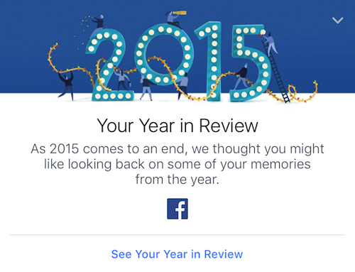
In parallel to that, I was asked to talk with the design and content teams at Facebook, which I did in the spring of 2015.  It was an incredibly productive and honest discussion, entirely because the team at Facebook was truly concerned and open to change.  You can see how this has evolved over time in On This Day, whose messaging has become more human and sensitive to the possibility of harm.  And you can especially see it in the 2015 edition of Year in Review.

Year in Review’s timeline ad for 2015.

Whereas last year, the YiR feature was clearly designed around awesome years and happy people, this year’s is a lot more respectful and careful.  It isn’t as dynamic, but when it comes to memories, this seems entirely appropriate.  As Sara and I say in our book, this is “what it looks like when an organization embeds caring into its product, and is willing to own up to mistakes”.

I know the Facebook copy “we care about you and the memories you share” has been derided in some quarters, because people reflexively assume that no company (least of all Facebook) actually cares about you as anything more than a sales unit.  Maybe that’s true of some parts of Facebook — it’s a very large company, after all, with a lot of competing fiefdoms — but the design and content teams were writing from the heart.  They honestly do care about the people who use their products, and they care very much about how their work affects people.  They know they’ll stumble sometimes, but they’re committed to trying anyway and learning from their stumbles.  For that alone, they have my deepest respect.  To forge ahead in front of an audience of well over a billion people takes an incredible amount of courage.

Year in Review will be a part of the talk I’ll be giving in 2016 at An Event Apart, just as it was of Sara’s and my forthcoming book.  In brief, the assessment that you’ll find in both places: Year in Review 2015 is a significant step forward, a great example of compassionate design at scale.  I applaud Facebook for forging a path forward.


Untitled

Published 9 years, 5 months past

If you do something you love for long enough, it gets into your bones.  But more than that, the things adjacent to it do as well.

Since I got started on the web, very nearly 22 years ago now, I’ve never really seen myself as a designer.  Granted, I did some visual design in the early days, because anyone who set up a web site back then had to be the designer: there was nobody else.  No graphic designers would deign to look at the web, and no “web designers” yet existed.  We were Web Masters because we had to be, drawing buttons and laying out content along with writing code and doing UX and UI and IA and everything else.

So I did design when I had to, but I always knew I wasn’t a capital-D Designer.  I knew this in the same way I knew I was not a boulder nor an odor: it wasn’t a failing or even a lack, but just what was true and even unremarkable.  I was a code monkey who knew his way around Photoshop and could mimic what he saw around him decently enough, but I didn’t have the creative vision or training or, really, inclination to generate my own, unique work.

As we passed out of that epoch of the web, I was more than content to stop trying to design and instead be an enabler of design.  My efforts to teach HTML and CSS had twinned, helical aims: to help anyone who wanted to create a web site share their thoughts, and to help any designer who wanted to create a visual effect share their vision.  I was a technical author, a developer, a sometime observer of design, but never a Designer.  I knew Designers by then, and I knew they possessed a skill and focus I did not.

Which was okay.  After all, I possessed a skill and focus they did not.  Our work was complementary.

What I didn’t realize was that, over all those years, as the knowledge I shared seeped into their bones and became second nature, the same thing was happening in reverse.

For the past few months, I’ve been managing a design project, getting a ton of help from Jason Santa Maria; but I’ve also been the annoying client, making unreasonable demands of everyone involved.  I insisted on changes of direction partway through, and coped with changes of understanding at other points in the process.  I refused to listen to reason at one point, and yielded to reality at another.  For most of it, I compared font faces and sizing, trying to decide which I liked best, telling Jason I wished I could have a little of option A, a little of option B, a dash of option C, struggling to put into words what I could almost see.

Among my friends, I’m vaguely infamous for not being able to tell, at a glance, the difference between Helvetica and Arial.  I’ve seen the detailed analyses of the two, and if I had the exact same run of text in each face, sitting side by side, I could probably do a credible job of figuring out which was which, but give me a standalone block of sans-serif text in Ariatica or Helvetial and my odds of knowing which it is are literally no better than a coin flip.

And yet, there I was, staring at the same layout set in various font faces, feeling the sense of each, obsessed with spacing and intervals and kerning, examining which had the best italics while trying to decide if italics should even be used, if their use conveyed the right message.  I scrutinized the spacing between blocks of text, the alignment of fragments of information, the rhythm of the entire piece, every bit of content.  It wasn’t enough that it be passable, or decent, or even good; it had to be right.  I focused on all the details as well as the overall picture with a will and intensity I had never felt before.

It wasn’t easy.  I massaged my temples as the stress of needing to make exactly the right choice overwhelmed me; I paced around my office, glaring at the alternatives on the monitor every time I passed by; I felt tears of frustration rise as I ran into yet another setback and knew that the final result would not be everything I had originally wanted it to be.  I stood in someone else’s office and rode herd on their archaic software setup, literally telling them where and how many times to click, because that’s what was necessary to get the job done properly.  I wrote and rewrote emails to the various parties in the project, masking my battered spirit as best I could while still being clear about where things stood and where I wanted them to go.

Not, as I say, by myself: Jason was invaluable to getting me off to the right start, keeping me on the right track, and helping me through the setbacks.  I doubt I could have done a tenth as well without him.  But as we progressed, I increasingly felt like I knew what his answers to my questions would be.  My inexperience and fear of error and just plain fear meant I kept checking in with him, but with every iteration, I felt more confident that I already knew the right answers.  In a lot of cases, I made the changes I was already sure he would make, and Jason’s feedback confirmed that I had done right.

Over two decades, I had slowly, unwittingly absorbed everything I needed for this project.  It had seeped into me, creeping out of a thousand Keynote slides and a million words, written and spoken, from my friends and their friends and all the people they looked up to and quoted.

Gradually, I had become a capital-D Designer.  I had a very specific intent to render, and with help and focus, I made the end product as reflective of my intent as possible.  I knew when the design felt wrong, but more importantly, I knew when the design felt right.  And I could see, at first with Jason’s help but increasingly on my own, how to get from one to the other.

This morning, the result was unveiled — literally unveiled, ritually, at the direction of our congregation’s rabbi.  A block of sparkling silver-blue granite carved with a few words of English and Hebrew.  A compact arrangement of text bearing more emotion and meaning than anything I have ever done, horrifying and beautiful, set flush into the earth of Cleveland Heights, where similar markers will one day be set for me and for my wife.

Everything I absorbed over all those years, everything I learned by choice or by chance, and most of all the help I received from everyone who’d ever shared their knowledge and insights with me, all made that possible.  Made me a Designer.

Thank you all.

This article was originally published at The Pastry Box Project on 7 June 2015.

Browse the Archive

Later Entries