Posts in the Personal Category

CSS Modules Throughout History

Published 13 years, 3 months past

For very little reason other than I was curious to see what resulted, I’ve compiled a list of various CSS modules’ version histories, and then used CSS to turn it into a set of timelines.  It’s kind of a low-cost way to visualize the life cycle of and energy going into various CSS modules.

I’ll warn you up front that as of this writing the user interaction is not ideal, and in some places the presentation suffers from too much content overlap.  This happens in timelines where lots of drafts were released in a short period of time.  (In one case, two related drafts were released on the same day!)  I intend to clean up the presentation, but for the moment I’m still fiddling with ideas.  The obvious one is to rotate every other spec name by -45 degrees, but that looked kind of awful.  I suspect I’ll end up doing some sort of timestamp comparison and if they’re too close together, toss on a class that invokes a -45deg rotation.  Or maybe I’ll get fancier!

The interaction is a little tougher to improve, given what’s being done here, but I have a few ideas for making things, if not perfect, at least less twitchy.

I should also note that not every module is listed as I write this:  I intentionally left off modules whose last update was 2006 or earlier.  I may add them at the end, or put them into a separate set of timelines.  The historian in me definitely wants to see them included, but the shadow of a UX person who dwells somewhere in the furthest corners of my head wanted to avoid as much clutter as possible.  We’ll see which one wins.

Anyway, somewhat like the browser release timeline, which is probably going to freeze in the face of the rapid-versioning schemes that are all the rage these days, I had fun combining my love of the web and my love of history.  I should do it more often, really.  The irony is that I don’t really have the time.


Adoption Day

Published 13 years, 4 months past

Yesterday morning, in a small office on the second floor of the Cuyahoga County Courthouse in downtown Cleveland, Ohio, Kat and Carolyn and Rebecca and I finalized our adoption of Joshua. There were a few witnesses to this: the social worker who has handled our case from the outset, as she did Carolyn’s; the lawyer who made sure all of our paperwork was correct; my sister and father and stepmother; our friends Gini and Ferrett and Jim; and the magistrate who conducted the proceedings.

As with Carolyn and Rebecca, I haven’t talked about Joshua being adopted — not that it was any big secret, given our having adopted our other children.  Nevertheless, I did this for the same old reasons: for the past seven months, we’ve been borrowing him from his legal guardians, the adoption agency.  The usual monthly checkups from our social worker still occurred, and there was still the theoretical possibility of Joshua’s placement being revoked for any reason whatsoever.  Or even for no reason at all.  I had no way to know if a blog post might somehow make things more difficult, so I left it alone.

All this was always a basically theoretical possibility — there was no real fear of it actually happening — but now, even the theory is undone.  Joshua is now legally our son and the girls’ brother just as completely as he has long been both in our hearts.  He is now ours — but even more than that, and far more importantly, we are now his.

Over a celebratory lunch, Kat held our sleeping son in her arms and I cradled his head with my hand as we whispered our love for him, for our girls, and for each other.


Results of The Web Design Survey, 2010

Published 13 years, 6 months past

Now available: the results from the A List Apart Survey for People Who Make Web Sites, 2010.  This is the fourth industry snapshot we’ve compiled, and the story that’s emerged over that time is proving to be pretty consistent.  You can get a high-level view from the Introduction, and then dive deeper into the results in the following chapters.  And, as is traditional, the Addendum contains links to the full (anonymized) data set in three formats for your own analytical investigations.  We’d love to see what you come up with!

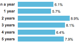
Something that surprised me quite a bit was that in 2010 we got about half the number of respondents we’ve gotten in past years — not quite seventeen thousand participated in 2010 instead of just over thirty thousand as we saw in previous years.  I’m not quite sure what to make of that.  Is the industry shrinking?  Did we not get the word out as effectively?  Was it a bad time of year to run a survey?  Are people getting tired of taking the survey?  There’s no real way to know.

At least there weren’t any wild swings in the results, which might have indicated we’d lost some subgroups in disproportionate numbers.  Whatever caused the drop in participation, it appears to have done so in an evenly-distributed fashion.

Regardless, I’d like to see higher participation next year, so if anyone has good suggestions regarding how to make that happen, please do let me know in the comments.

We plan to run the 2011 survey in the next couple of months (and I’ll post a bit more about that soon) but for now, I hope you find the 2010 results an interesting and useful look at who we are.


Spinning the Web

Published 13 years, 7 months past

Can CSS create art?  That’s a question I set out to explore recently, and I like to think that the answer is yes.  You can judge for yourself: Spinning the Web, a gallery on Flickr.

cnn

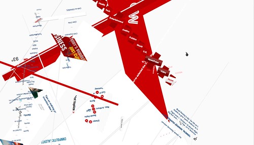
To be clear, when I say “Can CSS create art?” I don’t mean that in the sense of wondering if art, or artful designs, can be accomplished with CSS.  I think we all know the answer there, and have known at least since the Zen Garden got rolling.  What I’m doing here is using some basic CSS to generate art, using web sites as the medium.  For the series I linked, I spun all of the elements on a page using transform: rotate() to see what resulted.  Any time I saw something I liked, I took a screenshot.  After I was done, I winnowed the shots down to the best ones.

As some of you old-schoolers will probably have recognized, I’m absolutely following in the footsteps of Joshua Davis here, and in fact my working title for this effort was “Once Upon a Browser”.  I saw Josh speak years ago, and clearly remember his description of how he generated a lot of his art.  My process is almost identical, albeit with a bit less automation and computational complexity.

Because this is me, I built a little commentary joke into the first images in the series.  It’s not terribly subtle, but with luck one or two of you will get the same chuckle I did.

I’m already thinking about variants on this theme, so there may be more series to come.  In the meantime, as I surf around I’ll stop every now and again to spin what I see.  I’ll definitely mention any new additions via Twitter, and new series both there and here.  And of course if you follow me on Flickr, you’ll see new pieces as they go up.

I hope you enjoy them half as much as I enjoyed creating them.  And if anyone wants to use the originals as desktop wallpapers, as Tim proposed, feel free!


Seeing the matrix()

Published 13 years, 9 months past

Over the weekend, Aaron Gustafson and I created a tool for anyone who wants to resolve a series of CSS transforms into a matrix() value representing the same end state.  Behold: The Matrix Resolutions.  (You knew that was coming, right?)  It should work fine in various browsers, though due to the gratuitous use of keyframe animations on the html element’s multiple background images it looks best in WebKit browsers.

The way it works is you input a series of transform functions, such as translateX(22px) rotate(33deg) scale(1.13).  The end-state and its matrix() equivalent should update whenever you hit the space bar or the return key, or else explicitly elect to take the red pill.  If you want to wipe out what you’ve input and go back to a state of blissful ignorance, take the blue pill.

There is one thing to note: the matrix() value you get from the tool is equivalent to the end-state placement of all the transforms you input.  That value most likely does not create an equivalent animation, particularly if you do any rotation.  For example, animating translateX(75px) rotate(1590deg) translateY(-75px) will not appear the same as animating matrix(-0.866025, 0.5, -0.5, -0.866025, 112.5, 64.9519).  The two values will get the element to the same destination, but via very different paths.  If you’re just transforming, not animating, then that’s irrelevant.  If you are, then you may want to stick to the transforms.

This tool grew out of the first Retreats 4 Geeks (which was AWESOME) just outside of Gatlinburg, TN.  After some side conversations betwen me and Aaron during the CSS training program, we hacked this together in a few hours on Saturday night.  Hey, who knows how to party?  Aaron of course wrote the JavaScript.  Early on we came up with the punny name, and of course once we did that the visual design was pretty well chosen for us.  A free TTF webfont (for the page title), a few background images, and a whole bunch of RGBa colors later we had arrived.  Creating the visual appearance was a lot of fun, I have to say.  CSS geeks, please feel free to view source and enjoy.  No need to say “whoa” — it’s actually not that complicated.

So anyway, there you go.  If you want to see the matrix(), remember: we can only show you the door. You’re the one that has to walk through it.


CSS Pocket Reference: The Cutting Room

Published 13 years, 9 months past

I just shipped off the last of my drafts for CSS Pocket Reference, 4th Edition to my editor.  In the process of writing the entries, I set up an ad-hoc test suite and made determinations about what to document and what to cut.  That’s what you do with a book, particularly a book that’s meant to fit into a pocket.  My general guide was to cut anything that isn’t supported in any rendering engine, though in a few cases I decided to cut properties that were supported by a lone browser but had no apparent prospects of being supported by anyone else, ever.

For fun, and also to give fans of this or that property a chance to petition for re-inclusion, here are the properties and modules I cut.  Think of it as the blooper reel, which can be taken more than one way.  I’ve organized them by module because it’s easier that way.

After all that, I imagine you’re going to laugh uproariously when I tell what I did include:  paged and aural properties.  I know — I’m kind of poleaxed by my own double standard on that score.  I included them for historical reasons (they’ve long been included) and also because they’re potentially very useful to a more accessible future.  Besides, if we run out of pages, they’re in their own section and so very easy to cut.

I’m pretty sure I listed everything that I explicitly dropped, so if you spot something that I absolutely have to reinstate, here’s your chance to let me know!


Same As It Ever Was

Published 13 years, 10 months past

I recently became re-acquainted with a ghost, and it looked very, very familiar.  In the spring of 1995, just over a year into my first Web gig and still just over a year away from first encountering CSS, I wrote the following:

Writing to the Norm

No, not the fat guy on “Cheers.”  Actually, it’s a fundamental issue every Web author needs to know about and appreciate.

Web browsers are written by different people.  Each person has their own idea about how Web documents should look.  Therefore, any given Web document will be displayed differently by different browsers.  In fact, it will be displayed differently by different copies of the same browser, if the two copies have different preferences set.

Therefore, you need to keep this principle foremost in your mind at all times: you cannot guarantee that your document will appear to other people exactly as it does to you.  In other words, don’t fall into the trap of obsessively re-writing a document just to get it to “fit on one screen,” or so a line of text is exactly “one screen wide.”  This is as pointless as trying to take a picture that will always be one foot wide, no matter how big the projection screen. Changes in font, font size, window size, and so on will all invalidate your attempts.

On the other hand, you want to write documents which look acceptable to most people.  How?  Well, it’s almost an art form in itself, but my recommendation is that you assume that most people will set their browser to display text in a common font such as Times at a point size of somewhere between 10 and 15 points.  While you shouldn’t spend your time trying to precisely engineer page arrangement, you also shouldn’t waste time worrying about how pages will look for someone whose display is set to 27-point Garamond.

That’s from “Chapter 1: Terms and Concepts” of Introduction to HTML, my first publication of note and the first of three tutorials dedicated to teaching HTML in a friendly, interactive manner.  The tutorials were taken down a couple of years ago by their host organization, which made me a bit sad even though I understood why they didn’t want to maintain the pages (and deal with the support e-mail) any longer.

However, thanks to a colleague’s help and generosity I recently came into possession of copies of all three.  I’m still pondering what to do about it.  To put them back on the web would require a bit more work than just tossing them onto a server, and to make the quizzes fully functional would take yet more work, and after all this time some of the material is obsolete or even potentially misleading.  Not to mention the page is laid out using a table (woo 1995!).  On the other hand, they’d make an interesting historical document of sorts, a way to let you young whippersnappers know what it was like in the old days.

Reading through them, now sixteen years later, has been an interesting little trip down memory lane.  What strikes me most, besides the fact that my younger self was a better writer than my current self, is how remarkably stable the Web’s fluidity has been over its lifetime.  Yes, the absence of assuredly-repeatable layout is a core design principle, but it’s also the kind of thing that tends to get engineered away, particularly when designers and the public both get involved.  Its persistence hints that it’s something valuable and even necessary.  If I had to nominate one thing about the Web for the title of “Most Under-appreciated”, I think this would be it.


Welcome

Published 13 years, 11 months past

Kat and I are now triply parents.  Earlier today we welcomed Joshua David Meyer into our home and our hearts.

We’ve had this name ready ever since we started out to build a family almost a decade ago.  We chose Joshua to honor Kat’s late aunt Judy, an incredibly strong and brave woman who faced adversity with a smile.  The middle name, David, honors Kat’s grandmother Dot and is also the name of one of my best and oldest friends.

Carolyn and Rebecca are both incredibly excited to have a baby brother and are helping take care of him (and us) as much as they can.  I’ll obviously be a bit distracted during the settling-in phase of having a newborn in the house, but with any luck I’ll manage to get a few things out the door during naps.
  • Welcome was published on .
  • It was assigned to the Joshua category.
  • There have been no replies.

Browse the Archive

Earlier Entries

Later Entries