Designing the Igalia Chats Logo
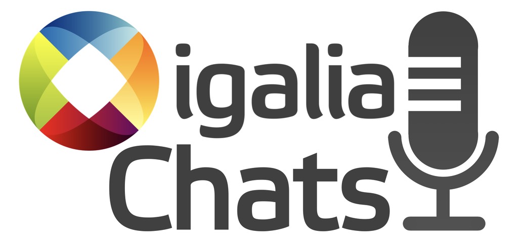
Published 2 years, 7 months pastOne of the things I’ve been doing at Igalia of late is podcasting with Brian Kardell. It’s called “Igalia Chats”, and last week, I designed it a logo. I tried out a number of different ideas, ran them past the Communication team for feedback, and settled on this one.

And there you have it, the first logo I’ve designed in… well, in quite a while. My work this time around was informed by a few things.
- Podcast apps, sites, etc. expect a square image for the podcast’s logo. This doesn’t mean you have to make the visible part of it square, exactly, but it does mean any wide-and-short logo will simultaneously feel cramped and lost in a vast void. Or maybe just very far away. The version shown in this post is not the square version, because this is not a podcast app and because I could. The square version just adds more empty whitespace at the top and bottom, anyway.
- I couldn’t really alter the official logo in any major way: the brand guidelines are pretty strong and shouldn’t be broken without collective approval. Given the time that would take, I decided to just work with the logo as-is, and think about possible variants (say, the microphone icon in the blank diamond of the logo) in a later stage. I did think about just not using the official logo at all, but that felt like it would end up looking too generic. Besides, we hav e a pretty nifty logo there, so why not use it?
- A typeface for the word “Chats” that works well with Igalia’s official logo. I used Etelka, which is a font we already use on the web site, and I think is the basis of the semi-serifed letters in the official logo anyway. Though I could be wrong about that; while I definitely have opinions about typefaces these days, I’m not very good at identifying them, or being able to distinguish between two similar fonts. Call it typeface blindness.
- Using open-source resources where possible; thus, the microphone icon came from The Noun Project. I then modified it a bit (rounded the linecaps, shortened the pickup’s brace) to balance its visual weight with the rest of the design, and not crowd the letters too much. I also added a subtle vertical gradient to the icon, which helped the word “Chats” to stand out a little more. Gotta make the logo pop, donchaknow?
There are probably some adjustments I’ll make after a bit of time, but I was determined not to let perfect be the enemy of shipping. As for how I came to create the logo, you’re probably thinking fancy CSS Grid layout and custom fonts and all that jazz, but no, I just dumped everything into Keynote and fiddled with ideas until I had some I liked. It’s not a fantastic environment for this sort of work, I expect, but it’s Good Enough For Me™.
So, if you’re subscribed to Igalia Chats via your listening channel of choice, you should be seeing a new logo. If you aren’t subscribed… try us, won’t you? Brian and I talk about a lot of web-related stuff with a lot of really interesting people — most recently, with Kilian Valkhof about the web development application Polypane, with Stephen Shankland about undersea data cables, with Zach Leatherman about open-source work and funding, and many more. Plus sometimes we just talk with each other about what’s new in Web land, things like Google Baseline or huge WebKit updates. And, yes, sometimes we talk about what Igalia is up to, like our work on the Servo engine or the Steam Deck.
This is one of the things I quite enjoy about working for Igalia — the way I can draw upon all the things I’ve learned over my many (many) years to create different things. A logo last week, a thumbnail-building tool the week before, writing news posts, recording podcasts, doing audio production, figuring out transcription technology, and on and on and on. It can sometimes be frustrating in the way all work can be, but it rarely gets boring. (And if that sounds good to you, we are hiring for a number of roles!)
