My immediate thought was to throw two spans in the header cell and
position or grid them within that cell, but the accessibility of that
seemed… questionable. It’s also what
Wikipedia already does, and we here at meyerweb are nothing if not
obsessed with finding new ways to do niche stuff. So I tried something
different. But is its accessibility any better?
If you want to see it as a live example, it’s over at
Codepen. Most of the text in the table is what macOS Preview OCRed
out of the original image, which I kept intact because I think it’s
funny. Anyway, here is the original markup I came up with for the
table head, which you should not use:
So one row for the headers across the top of the table, including the
top-left label that goes with them, and then another row with the header
that relates to the row headers for the rows below. That is to say, the
row-scoped table header in each of the rows in the table’s bodies (it
has more than one), like this:
The thing is, when I ran the idea past accessibility experts like Alice Boxhall and Adrian Roselli, they identified
a problem: Not having a full row of cells, as is the case for the second
header row, fails WCAG
1.3.3. The suggested fix was to rowspan most of the cells in the
first row, like this:
With that, table navigation wasn’t perfect, but it seemed decent, so
we could move forward.
In terms of presentation, to get the upper-left header cell to do the
split-diagonal thing, I relatively position the
<thead> and then absolutely position the second row
in the table head to sit over top of the first, pinned to the bottom
left corner.
I fiddled around for a bit with trying to use a grid instead, but it
didn’t really add anything that positioning didn’t already provide and
threw some other wrenches into the works, like having to convert the
entire table into a grid so the columns would stay aligned, so I decided
to just stick with the positioning.
Then I throw a linear gradient background into the first row’s first
cell to draw the diagonal, and everything’s thus more or less as
intended, visually speaking. (That diagonal could also be an SVG, in
fact probably should be in production, but I was seeing how an all-CSS
solution might work so a gradient is where things stand.)
There are some layout caveats with this approach, but they’re pretty
much the same as other solutions I saw: primarily, the two bits of text
that the diagonal visually separates can stick out of their respective
halves of the split cell, or even overlap each other. Also, you
might need to explicitly set a minimum height of the first header row,
in order to not exacerbate the overlap risk just described.
And then there’s a really big caveat: Safari, as of this writing,
doesn’t handle the layout at all well, because it doesn’t apply
relative positioning to <thead> (or
<tfoot> or <tbody>, but at least
it does <tr>s). I went to file a bug and found there’s already
one open, so maybe this will be fixed in the near future. I figured
out a way to get at least close to the intended result while still
allowing line-wrapping in the column header cells, but it mangled the
layout in Firefox and Chrome. In the end, to work around the problem, I
delved into browser
strangeness (at the suggestion of Marius Gundersen) and settled on
the following:
/* this is gross and I hate it but it works to fix
   Safari’s layout of the table’s top headers */
@supports (font: -apple-system-body) {
	thead tr:nth-child(1) th {
		white-space: nowrap;
	}
	thead tr:nth-child(2) th {
		position: static;
		display: block;
		margin-block: -1.5lh 0;
		padding-block: 0;
		text-align: start;
		transform: translateY(0.25lh);
	}
}
Thanks, I hate it! But it works, and I try to be pragmatic.
Anyway, the point being, what I’ve done here feels more accessible
to me, and basic testing by both me and Adrian didn’t reveal any major
problems, but I still worry about the positioning dorking things up for
the users of screen readers I don’t have access to. So I throw it to the
audience, particularly the accessibility-technology-using part of the
audience: does this solution fall down for you, or is it good enough?
Please let me know!
Over the years, I’ve created an experiment or two that drew stuff to a <canvas> element: a wave function collapse experiment here, a crystallizing palette there. After a while, I found a way to wire up a button so that clicking it would save the canvas’s contents to my computer as a PNG file. Pretty cool, I thought. Can I do the same thing with HTML+CSS structures?
First I generated it on a canvas, then I clicked a button to save it.
Turns out, no. I could use, and often have used, Firefox’s “Screenshot node” menu entry in the web inspector, or the :screenshot command in Firefox’s console, but not do it with an in-page button. Because HTML nodes don’t go in <canvas>, you see, let alone styled and scripted ones.
Or they didn’t, until just recently, when Chrome shipped a flag-gated preview of the HTML-in-canvas API. How it works is, you add a layoutsubtree attribute to a <canvas> element, and then you can put whatever HTML you want in there, with whatever CSS and JS you would normally apply to it, add a couple of magic JScantations, and what the browser would normally have painted to the page is painted to the canvas, at whatever speed the browser can manage (usually 60 frames per second or more, because web browsers are high-end first-person scrollers).
If you want to try all this out for yourself, I commend you to Amit Sheen’s “The Web Is Fun Again” over at the Frontend Masters blog, where he details how to get yourself set up for the wackiness this makes possible, and then shows some experiments. Water ripples over your pages, lens distortions that follow the mouse pointer, chromatic aberrations!
Which, I admit, all sound really off-putting to the “I just want to use the web” folks among us. What possible utility is there in having an input form that, say, makes ripples spread out from every character you type? Or having dropdown menus fall to the bottom of the page, but still actually work? Probably not a lot, unless you’re an expensive design studio working on a brag page.
But remember, this is how any new graphic advancement goes: we, by which I mean the collective web industry, start by doing really outré and eye-catching stuff that we later have cause to regret. Remember parallax scrolling effects? The early days of CSS animation? Drop shadows? There will be an initial period of excess, and then it will all settle down.
I’ve already skipped straight to the settle down part, though.
See, when I asked myself if I could render HTML+CSS on a <canvas> and then save the image to my computer, it wasn’t just me doing that “push at the limits of web features” thing I do sometimes. I had an actual, practical use case in mind: I wanted to save social media banners and thumbnails from a browser-based tool I built for my work at Igalia, just by clicking or otherwise triggering a button.
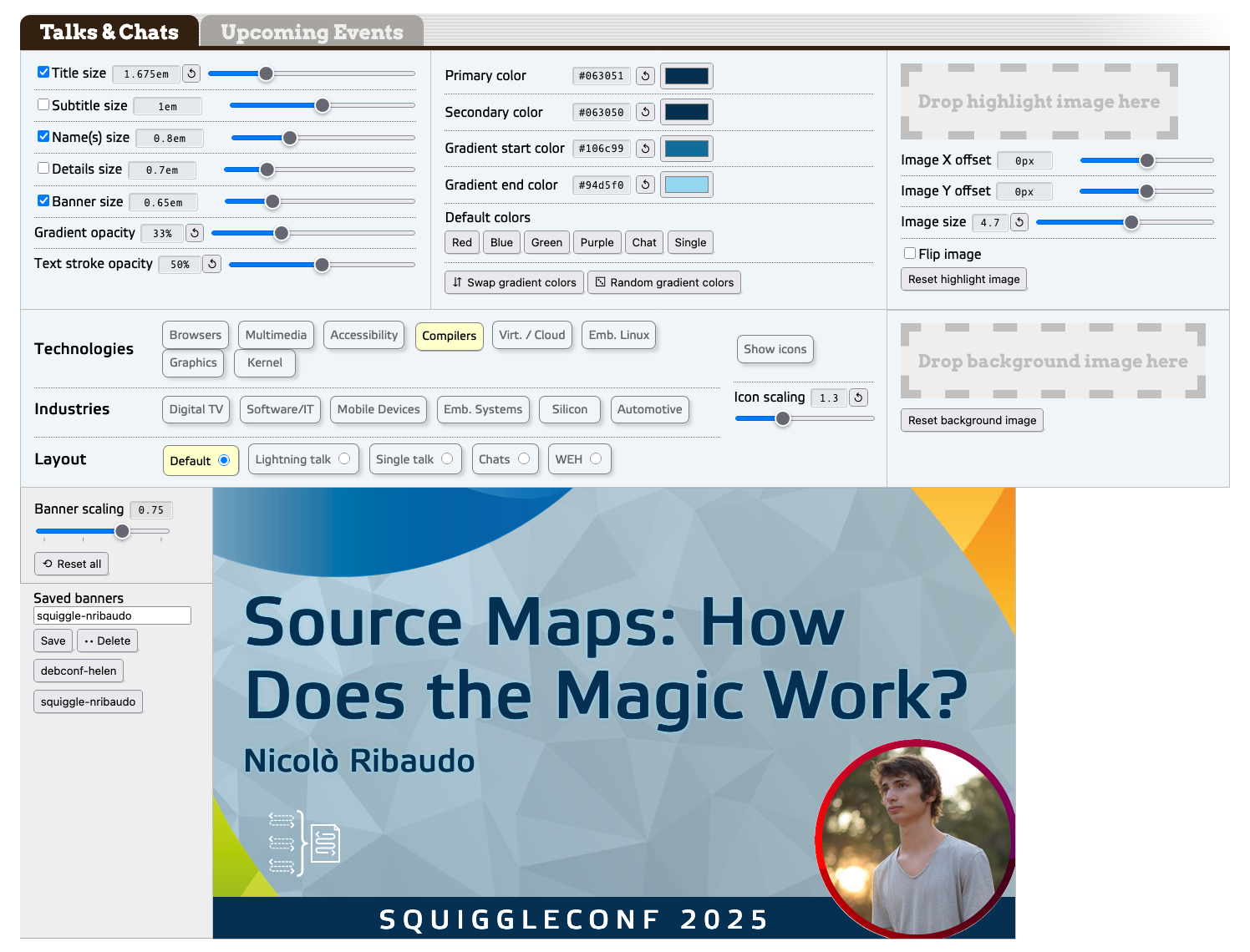
If you’re subscribed to our YouTube channel, you’ve seen these thumbnails; ditto if you’re following us on Mastodon or Bluesky. To produce those, I have an in-browser thing I built out of custom elements. It’s where the super-slider pattern developed (though they have a different name in the tool). I’m not going to link to the tool because it’s on our intranet and very few of you have a login, so here’s a screenshot of it in all its dweeb-designed semi-glory.
The banner maker, with a recent thumbnail already loaded in.
The text bits in the banner are all contenteditable HTML elements, and the various themes are managed with various blocks of CSS. (And yeah, those range inputs are all “super sliders”.) The point of all this being, I built it so that anyone at work could use it to make
banners whenever they needed, without having to wait on me to do so.
What I’ve always wanted, in order to make things easy for anyone who isn’t me, is a “click this button to save the banner as an image” feature. Anyone at Igalia could easily learn (if they didn’t already know) the web-inspector-or-console stuff I was using, of course, but it just felt so janky. A touch embarrassing, if I’m being honest.
Well, now I have what I wanted. In any browser that supports HTML-in-canvas, there is a button labeled “Download banner image”. Right now, that’s recent Chrome with the proper developer flag enabled. For all other browsers, there’s no button, and you just use the same web inspector screenshot tricks we’ve always relied on.
Making this happen wasn’t as easy as maybe that sounded, though. I hit a couple of snags along the way, one of which was quite frustrating. Those are what I actually brought you here to talk about.
The first snag was that I had to get the thumbnail preview into a <canvas> element without blowing the call stack. To explain that, let me show you a rough skeleton of the tool’s markup.
As you can read, it’s basically all custom elements, each with their own connectedCallback() function to do whatever scripting magic needs to be done when the browser first encounters them. To wrap that last element, the <thumb-preview>, inside a <canvas>, I needed to create a new canvas element, shift the preview element into the new canvas, and then insert the preview-bearing canvas, ending up with this structure.
Thus, when the <thumb-preview> was loaded in, I had its connectedCallback() run a check to see if HTML-in-canvas is supported. In situations where it is supported, I did what was needed to get to the above result.
At which point, since the <thumb-preview> is a custom element that was being placed into the DOM, it fired its connectedCallback(), thus starting the process again, creating a canvas and inserting the <thumb-preview> into the new canvas, which started the process again, recursing toward infinity. Within milliseconds, the call stack was exceeded.
So… that wasn’t going to work.
I thought for a moment that I could avoid this by setting a flag variable to true and then checking for its existence in order to skip the whole canvas-creation-preview-insertion part, but I couldn’t figure out how to make that actually work. Then I thought maybe I could sidestep the whole imbroglio using connectedMoveCallback(), but this wasn’t a move, it was a (re-)creation.
That callback was the route to fixing this problem, though. You see, there is a way to move elements from one part of the DOM to another: Element.moveBefore(). There’s no moveAfter() or moveInto(), sadly, just “move this node to the spot right before some other node”.
Here’s how I made use of that feature:
let canvas = document.createElement('canvas');
canvas.setAttribute('layoutsubtree','');
canvas.setAttribute('width','1280');
canvas.setAttribute('height','720');

this.closest('section').appendChild(canvas);

let beacon = document.createElement('span');
canvas.appendChild(beacon);
canvas.moveBefore(this,beacon);
beacon.remove();
Yep. I created a canvas, stuck the canvas into the closest ancestor section, created a span, stuck the span into the canvas, moved the preview element to right before the span, and then deleted the span. (There may well be a better way to do this, one that my DuckDucking failed to turn up. If so, please comment below!)
Oh, and here’s what gets executed when the preview is moved, instead of append-created:
connectedMoveCallback() {
	return;
}
Heckuva way to run a railroad.
At that point, I had the canvas where I wanted it and the preview where I wanted it, and the call stack remained un-blown. Huzzah! I then recited the magic JScantations to make the canvas actually render its subtree (see the “Web is Fun Again” article I linked earlier for details on this), and hey presto, DOM was being rendered into a canvas! Then, when I clicked the button, the canvas was rendered as a PNG and my browser downloaded that PNG! I had what I wanted!
Almost.
Because the second snag, you see, is that canvases have an explicit size. Are in effect required to do so, because otherwise they default to zero pixels tall and wide. So if you want to see anything, you need to give them some dimensions. I did that, as the code before showed, making the canvas 1280×720 (YouTube’s recommended thumbnail size) through setAttribute() methods.
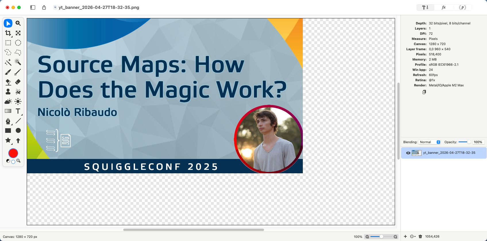
The problem is, the default scale factor on the thumbnail preview is 0.75, which translates to 960×540. Thus, when I clicked the image capture button, my browser downloaded a 1280×720 image with the thumbnail in the top left, and transparency below and to its right.
The previously-seen banner, which was rendered at 0.75 scale in an un-resized canvas, as shown in the macOS image editor Acorn.
“Just resize the canvas, ya dork!” you might say. I certainly did (say that, I mean). But if I set it to 960 wide and 540 tall, then when the scale was increased to 1, I got a 1280×720 DOM node cropped to its top left 960×540. I needed to dynamically resize the canvas element to have its size match the size of the thumb-preview.
And this is where I ran headfirst into several brick walls, because orcing a canvas element to resize in all the situations you want it to, including when it’s spawned, is not nearly as easy as you’d think. It wasn’t for me, anyway. I bulled my way through to a solution, eventually, painfully, but I got there.
(As I write this, I’m wondering if I should have also created a <div>, appended the canvas to that, and then used CSS to change the div’s size while the canvas was set to have 100% height and width. Or maybe have the DOM subtree pinned to 1280×720 and use CSS scale to change the canvas size visually. Or perhaps some kind of resizeObserver shenanigans. Or probably just pass some parameters to the HTML-in-canvas drawElementImage method. Hmmm.)
Regardless of whether I overlooked a less frustrating way do what I wanted, this does still point to a fundamental tension in the HTML-in-canvas approach: sizing.
Canvases do not, as a rule, grow or shrink to fit their contents. DOM elements, as a rule, very much do, unless you force them not to. HTML-in-canvas is taking a very fluid, flexible, mostly unbounded layout paradigm and rasterizing it, or at least some of it, into a very bounded window of a given size. Sixty times (or more) every second, the browser is taking a screenshot the size of the canvas’s content box and pasting said screenshot into that content box. You can do fun stuff to it along the way, with filters or shaders or canvas draw calls or whatever you can code up, so that each one of those screenshots gets jazzed up in some fashion, but at base, it’s still fundamentally screenshot, paste, screenshot, paste, over and over.
For use cases like mine, this isn’t really a big problem. I am, in the end, trying to get a screenshot of a static part of the page. HTML-in-canvas is very good for that. It could completely revolutionize the browser-based slideshow genre. The Reveal.js plugin landscape alone could be a sight to behold.
But in the general cases — the kinds of things we mostly do most every day — I don’t think this is likely to catch on. We might develop some patterns to make it easier, some interesting hacks to overcome the mismatch, but I don’t think that will significantly move the needle. On the other hand, if canvases can be made as flexible and content-wrapping as a bog-standard <div>, then I would expect to see a lot more usage.
Although if that can be done, then we wouldn’t really need to stay chained to HTML-in-canvas. Instead, we could define a syntax to mark standard HTML elements as more visually manipulable, via an HTML attribute or CSS property or DOM method or all three.
We’ve gotten close to that before: CSS Houdini and Microsoft’s original filter property, to pick two examples. We could try again. Maybe the HTML-in-canvas period is how we figure out what that simpler syntax should look like, by figuring out what it should make possible, and what it should make easy.
I’d be okay with that. How about you?
Many thanks to my colleagues Brian Kardell and Stephen Chenney for their early review and feedback on this post.
Previously on meyerweb, I crawled through a way to turn parenthetical comments into sidenotes, which I called “asidenotes”. As a recap, these are inline asides in parentheses, which is something I like to do. The constraints are that the text has to start inline, with its enclosing parentheses as part of the static content, so that the parentheses are present if CSS isn’t applied, but should lose those parentheses when turned into asidenotes, while also adding a sentence-terminating period when needed.
At the end of that post, I said I wouldn’t use the technique I developed, because the markup was too cluttered and unwieldy, and there were failure states that CSS alone couldn’t handle. So what can we do instead? Extend HTML to do things automatically!
If you’ve read my old post “Blinded By the DOM Light”, you can probably guess how this will go. Basically, we can write a little bit of JavaScript to take an invented element and Do Things To It™. What things? Anything JavaScript makes possible.
So first, we need an element, one with a hyphen in the middle of its name (because all custom elements require an interior hyphen, similar to how all custom properties and most custom identifiers in CSS require two leading dashes). Something like:
<aside-note>(actual text content)</aside-note>
Okay, great! Thanks to HTML’s permissive handling of unrecognized elements, this completely new element will be essentially treated like a <span> in older browsers. In newer browsers, we can massage it.
class asideNote extends HTMLElement {
	connectedCallback() {
		let marker = document.createElement('sup');
		marker.classList.add('asidenote-marker');
		this.after(marker);
	}
}
customElements.define("aside-note",asideNote);
With this in place, whenever a supporting browser encounters an <aside-note> element, it will run the JS above. Right now, what that does is insert a <sup> element just after the <aside-note>.
“Whoa, wait a minute”, I thought to myself at this point. “There will be browsers (mostly older browser versions) that understand custom elements, but don’t support anchor positioning. I should only run this JS if the browser can position with anchors, because I don’t want to needlessly clutter the DOM. I need an @supports query, except in JS!” And wouldn’t you know it, such things do exist.
class asideNote extends HTMLElement {
	connectedCallback() {
		if (CSS.supports('bottom','anchor(top)')) {
			let marker = document.createElement('sup');
			marker.classList.add('asidenote-marker');
			this.after(marker);
		}
	}
}
I went through a lot of that CSS in the previous post, so jump over there to get details on what all that means if the above has you agog. I did add a few bits of text styling like an explicit line height and slight size reduction, and changed all the asidenote classes there to aside-note elements here, but nothing is different with the positioning and such.
Let’s go back to the JavaScript, where we can strip off the leading and trailing parentheses with relative ease.
class asideNote extends HTMLElement {
	connectedCallback() {
		if (CSS.supports('bottom','anchor(top)')) {
			let marker = document.createElement('sup');
			marker.classList.add('asidenote-marker');
			this.after(marker);
			let inner = this.innerText;
			if (inner.slice(0,1) == '(' && inner.slice(-1) == ')') {
				inner = inner.slice(1,inner.length-1);}
			this.innerText = inner;
		}
	}
}
This code looks at the innerText of the asidenote, checks to see if it both begins and ends with parentheses (which all asidenotes should!), and then if so, it strips them out of the text and sets the <aside-note>’s innerText to be that stripped string. I decided to set it up so that the stripping only happens if there are balanced parentheses because if there aren’t, I’ll see that in the post preview and fix it before publishing.
I still haven’t added the full stop at the end of the asidenotes, nor have I accounted for asidenotes that end in punctuation, so let’s add in a little bit more code to check for and do that:
class asideNote extends HTMLElement {
	connectedCallback() {
		if (CSS.supports('bottom','anchor(top)')) {
			let marker = document.createElement('sup');
			marker.classList.add('asidenote-marker');
			this.after(marker);
			let inner = this.innerText;
			if (inner.slice(0,1) == '(' && inner.slice(-1) == ')') {
				inner = inner.slice(1,inner.length-1);}
			if (!isLastCharSpecial(inner)) {
				inner += '.';}
			this.innerText = inner;
		}
	}
}
function isLastCharSpecial(str) {
	const punctuationRegex = /[!/?/‽/.\\]/;
	return punctuationRegex.test(str.slice(-1));
}
And with that, there is really only one more point of concern: what will happen to my asidenotes in mobile contexts? Probably be positioned just offscreen, creating a horizontal scrollbar or just cutting off the content completely. Thus, I don’t just need a supports query in my JS. I also need a media query. It’s a good thing those also exist!
class asideNote extends HTMLElement {
	connectedCallback() {
		if (CSS.supports('bottom','anchor(top)') &&
			window.matchMedia('(width >= 65em)').matches) {
			let marker = document.createElement('sup');
			marker.classList.add('asidenote-marker');
			this.after(marker);
Adding that window.matchMedia to the if statement’s test means all the DOM and content massaging will be done only if the browser understands anchor positioning and the window width is above 65 ems, which is my site’s first mobile media breakpoint that would cause real layout problems. Otherwise, it will leave the asidenote content embedded and fully parenthetical. Your breakpoint will very likely differ, but the principle still holds.
The one thing about this JS is that the media query only happens when the custom element is set up, same as the support query. There are ways to watch for changes to the media environment due to things like window resizes, but I’m not going to use them here. I probably should, but I’m still not going to.
So: will I use this version of asidenotes on meyerweb? I might, Rabbit, I might. I mean, I’m already using them in this post, so it seems like I should just add the JS to my blog templates and the CSS to my stylesheets so I can keep doing this sort of thing going forward. Any objections? Let’s hear ’em!
It’s not really a secret I have a thing for sidenotes, and thus for CSS anchored positioning. But a thing I realized about myself is that most of my sidenotes are likely to be tiny asides commenting on the main throughline of the text, as opposed to bibliographic references or other things that usually become actual footnotes or endnotes. The things I would sidenote currently get written as parenthetical inline comments (you know, like this). Asidenotes, if you will.
Once I had realized that, I wondered: could I set up a way to turn those parenthetical asides into asidenotes in supporting browsers, using only HTML and CSS? As it turns out, yes, though not in a way I would actually use. In fact, the thing I eventually arrived at is pretty terrible.
Okay, allow me to explain.
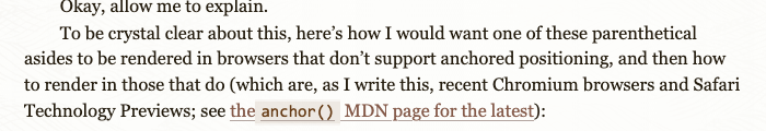
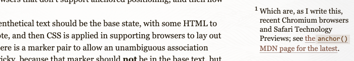
To be crystal clear about this, here’s how I would want one of these parenthetical asides to be rendered in browsers that don’t support anchored positioning, and then how to render in those that do (which are, as I write this, recent Chromium browsers and Safari Technology Previews; see theanchor() MDN page for the latest):
A parenthetical sitting inline (top) and turned into an asidenote (bottom).
My thinking is, the parenthetical text should be the base state, with some HTML to flag the bit that’s an asidenote, and then CSS is applied in supporting browsers to lay out the text as an asidenote. There is a marker pair to allow an unambiguous association between the two, which is tricky, because that marker should not be in the base text, but should appear when styled.
I thought for a minute that I would wrap these little notes in <aside>s, but quickly realized that would probably be a bad idea for accessibility and other reasons. I mean, I could use CSS to cast the <aside> to an inline box instead of its browser-default block box, but I’d need to label each one separately, be very careful with roles, and so on and so on. It was just the wrong tool, it seemed to me. (Feel free to disagree with me in the comments!)
So, I started with this:
<span class="asidenote">(Feel free to disagree with me in the comments!)</span>
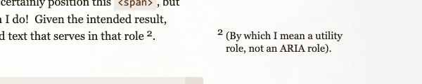
That wasn’t going to be enough, though, because I can certainly position this <span>, but there’s nothing available to leave a maker behind when I do! Given the intended result, then, there needs to be something in the not-positioned text that serves in that role (by which I mean a utility role, not an ARIA role). Here’s where my mind went:
<span class="asidenote">(by which I mean a utility role, not an ARIA role)</span><sup></sup>
The added <sup> is what will contain the marker text, like 1 or a or whatever.
This seemed like it was the minimum viable structure, so I started writing some styles. These asidenotes would be used in my posts, and I’d want the marker counters to reset with each blog post, so I built the selectors accordingly:
So far, I’ve set a named anchor on the <main> element (which has an id of thoughts) that encloses a page’s content, reset a counter on each <article>, and inserted that counter as the ::before content for both the asidenotes’ <span>s and the <sup>s that follow them. That done, it’s time to actually position the asidenotes:
Here, each class="asidenote" element increments the asidenotes counter by one, and then the asidenote is absolutely positioned so its top is placed at the larger value of two-thirds of an em below the bottom of the previous asidenote, if any; or else the top of its implicit anchor, which, because I didn’t set an explicit named anchor for it in this case, seems to be the place it would have occupied in the normal flow of the text. This latter bit is long-standing behavior in absolute positioning of inline elements, so it makes sense. I’m just not sure it fully conforms to the specification, though it’s particularly hard for me to tell in this case.
Moving on! The left edge of the asidenote is set 4em to the right of the right edge of --main and then some formatting stuff is done to keep it balanced and nicely sized for its context. Some of you will already have seen what’s going to happen here.
An asidenote with some typographic decoration it definitely should not have in this context.
Yep, the parentheses came right along with the text, and in general the whole thing looks a little odd. I could certainly argue that these are acceptable design choices, but it’s not what I want to see. I want the parentheses to go away when laid out as a asidenote, and also capitalize the first letter if it isn’t already, plus close out the text with a full stop.
And this is where the whole thing tipped over into “I don’t love this” territory. I can certainly add bits of text before and after an element’s content with pseudo-elements, but I can’t subtract bits of text (not without JavaScript, anyway). The best I can do is suppress their display, but for that, I need structure. So I went this route with the markup and CSS:
<span class="asidenote"><span>(</span>by which I mean a utility role, not an ARIA role<span>)</span></span><sup></sup>
I could have used shorter elements like <b> or <i>, and then styled them to look normal, but nah. I don’t love the clutter, but <span> makes more sense here.
With those parentheses gone, I can uppercase the the first visible letter and full-stop the end of each asidenote like so:
…and that’s more or less it (okay, yes, there are a few other tweaks to the markers and their sizes and line heights and asidenote text size and blah blah blah, but let’s not clutter up the main points by slogging through all that). With that, I get little asides that are parenthetical in the base text, albeit with a bunch of invisible-to-the-user markup clutter, that will be progressively enhanced into full asidenotes where able.
There’s an extra usage trap here, as well: if I always generate a full stop at the end, it means I should never end my asidenotes with a question mark, exclamation point, interrobang, or other sentence-ending character. But those are things I like to do!
So, will I use this on meyerweb? Heck to the no. The markup clutter is much more annoying than the benefit, it fumbles on some pretty basic use cases, and I don’t really want to go to the lengths of creating weird bespoke text macros — or worse, try to fork and extend a local Markdown parser to add some weird bespoke text pattern — just to make this work. If CSS had a character selector that let me turn off the parentheses without needing the extras <span>s, and some kind of outside-the-element generated content, then maybe yes. Otherwise, no, this is not how I’d do it, at least outside this post. At the very least, some JavaScript is needed to remove bits of text and decide whether to append the full stop.
Given that JS is needed, how would I do it? With custom elements and the Light DOM, which I’ll document in the next post. Stay tuned!
Previously on meyerweb, I explored ways to do strange things with the infinity keyword in CSS calculation functions. There were some great comments on that post, by the way; you should definitely go give them a read. Anyway, in this post, I’ll be doing the same thing, but with different properties!
When last we met, I’d just finished up messing with font sizes and line heights, and that made me think about other text properties that accept lengths, like those that indent text or increase the space between words and letters. You know, like these:
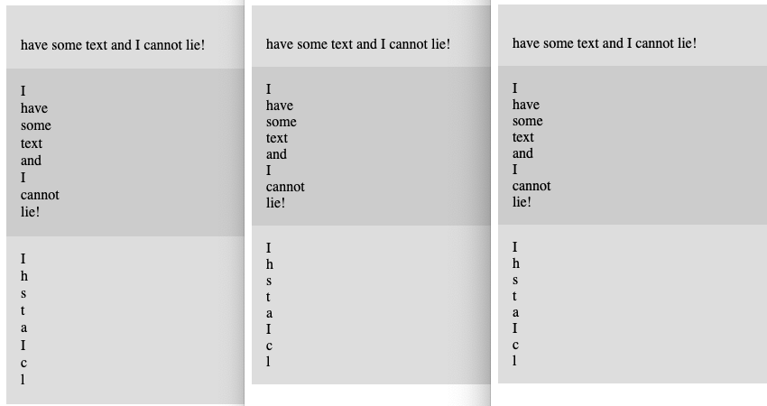
<div>I have some text and I cannot lie!</div>
<div>I have some text and I cannot lie!</div>
<div>I have some text and I cannot lie!</div>
According to Frederic Goudy, I am now the sort of man who would steal a infinite number of sheep. Which is untrue, because, I mean, where would I put them?
Consistency across Firefox, Chrome, and Safari
Visually, these all came to exactly the same result, textually speaking, with just very small (probably line-height-related) variances in element height. All get very large horizontal overflow scrolling, yet scrolling out to the end of that overflow reveals no letterforms at all; I assume they’re sat just offscreen when you reach the end of the scroll region. I particularly like how the “I” in the first <div> disappears because the first line has been indented a few million (or a few hundred undecillion) pixels, and then the rest of the text is wrapped onto the second line. And in the third <div>, we can check for line-leading steganography!
When you ask for the computed values, though, that’s when things get weird.
Text property results
Computed value for…
Browser
text-indent
word-spacing
letter-spacing
Safari
33554428px
33554428px
33554428px
Chrome
33554400px
3.40282e+38px
33554400px
Firefox (Nightly)
3.40282e+38px
3.40282e+38px
3.40282e+38px
Safari and Firefox are at least internally consistent, if many orders of magnitude apart from each other. Chrome… I don’t even know what to say. Maybe pick a lane?
I have to admit that by this point in my experimentation, I was getting a little bored of infinite pixel lengths. What about infinite unitless numbers, like line-height or — even better — z-index?
The result you get in any of Firefox, Chrome, or Safari
It turns out that in CSS you can go to infinity, but not beyond, because the computed values were the same regardless of whether the calc() value was infinity or infinity + 1.
z-index values
Browser
Computed value
Safari
2147483647
Chrome
2147483647
Firefox (Nightly)
2147483647
Thus, the first two <div> s were a long way above the third, but were themselves drawn with the later-painted <div> on top of the first. This is because in positioning, if overlapping elements have the same z-index value, the one that comes later in the DOM gets painted over top any that come before it.
This does also mean you can have a finite value beat infinity. If you change the previous CSS like so:
…then the third <div> is painted atop the other two, because they all have the same computed value. And no, increasing the finite value to a value equal to 2,147,483,648 or higher doesn’t change things, because the computed value of anything in that range is still 2147483647.
The results here led me to an assumption that browsers (or at least the coding languages used to write them) use a system where any “infinity” that has multiplication, addition, or subtraction done to it just returns “infinite”. So if you try to double Infinity, you get back Infinity (or Infinite or Inf or whatever symbol is being used to represent the concept of the infinite). Maybe that’s entry-level knowledge for your average computer science major, but I was only one of those briefly and I don’t think it was covered in the assembler course that convinced me to find another major.
Looking across all those years back to my time in university got me thinking about infinite spans of time, so I decided to see just how long I could get an animation to run.
div {
	animation-name: shift;
	animation-duration: calc(infinity * 1s);
}
@keyframes shift {
	from {
		transform: translateX(0px);
	}
	to {
		transform: translateX(100px);
	}
}
<div>I’m timely!</div>
The results were truly something to behold, at least in the cases where beholding was possible. Here’s what I got for the computed animation-duration value in each browser’s web inspector Computed Values tab or subtab:
animation-duration values
Browser
Computed value
As years
Safari
🤷🏽
Chrome
1.79769e+308s
5.7004376e+300
Firefox (Nightly)
3.40282e+38s
1.07902714e+31
Those are… very long durations. In Firefox, the <div> will finish the animation in just a tiny bit over ten nonillion (ten quadrillion quadrillion) years. That’s roughly ten times as long as it will take for nearly all the matter in the known Universe to have been swallowed by supermassive galactic black holes.
In Chrome, on the other hand, completing the animation will take approximately half again as long asan incomprehensibly longer amount of time than our current highest estimate for the amount of time it will take for all the protons and neutrons in the observable Universe to decay into radiation, assuming protons actually decay. (Source: Wikipedia’s Timeline of the far future.)
“Okay, but what about Safari?” you may be asking. Well, there’s no way as yet to find out, because while Safari loads and renders the page like usual, the page then becomes essentially unresponsive. Not the browser, just the page itself. This includes not redrawing or moving the scrollbar gutters when the window is resized, or showing useful information in the Web Inspector. I’ve already filed a bug, so hopefully one day we’ll find out whether its temporal limitations are the same as Chrome’s or not.
It should also be noted that it doesn’t matter whether you supply 1s or 1ms as the thing to multiply with infinity: you get the same result either way. This makes some sense, because any finite number times infinity is still infinity. Well, sort of. But also yes.
So what happens if you divide a finite amount by infinity? In browsers, you very consistently get nothing!
div {
	animation-name: shift;
	animation-duration: calc(100000000000000000000000s / infinity);
}
(Any finite number could be used there, so I decided to type 1 and then hold the 0 key for a second or two, and use the resulting large number.)
Division-by-infinity results
Browser
Computed value
Safari
0
Chrome
0
Firefox (Nightly)
0
Honestly, seeing that kind of cross-browser harmony… that was soothing.
And so we come full circle, from something that yielded consistent results to something else that yields consistent results. Sometimes, it’s the little wins that count the most.
…and I immediately thought, This is a perfect outer-limits probe! By which I mean, if I hand a browser values that are effectively infinite by way of theinfinity keyword, it will necessarily end up clamping to something finite, thus revealing how far it’s able or willing to go for that property.
The first thing I did was exactly what Andy proposed, with a few extras to zero out box model extras:
Then I loaded the (fully valid HTML 5) test page in Firefox Nightly, Chrome stable, and Safari stable, all on macOS, and things pretty immediately got weird:
Element Size Results
Browser
Computed value
Layout value
Safari
33,554,428
33,554,428
Chrome
33,554,400
33,554,400
Firefox (Nightly)
19.2 / 17,895,700
19.2 / 8,947,840 †
† height / width
Chrome and Safari both get very close to 225-1 (33,554,431), with Safari backing off from that by just 3 pixels, and Chrome by 31. I can’t even hazard a guess as to why this sort of value would be limited in that way; if there was a period of time where 24-bit values were in vogue, I must have missed it. I assume this is somehow rooted in the pre-Blink-fork codebase, but who knows. (Seriously, who knows? I want to talk to you.)
But the faint whiff of oddness there has nothing on what’s happening in Firefox. First off, the computed height is19.2px, which is the height of a line of text at default font size and line height. If I explicitly gave it line-height: 1, the height of the <div> changes to 16px. All this is despite my assigning a height of infinite pixels! Which, to be fair, is not really possible to do, but does it make sense to just drop it on the floor rather than clamp to an upper bound?
Even if that can somehow be said to make sense, it only happens with height. The computed width value is, as indicated, nearly 17.9 million, which is not the content width and is also nowhere close to any power of two. But the actual layout width, according to the diagram in the Layout tab, is just over 8.9 million pixels; or, put another way, one-half of 17,895,700 minus 10.
This frankly makes my brain hurt. I would truly love to understand the reasons for any of these oddities. If you know from whence they arise, please, please leave a comment! The more detail, the better. I also accept trackbacks from blog posts if you want to get extra-detailed.
For the sake of my aching skullmeats, I almost called a halt there, but I decided to see what happened with font sizes.
My skullmeats did not thank me for this, because once again, things got… interesting.
Font Size Results
Browser
Computed value
Layout value
Safari
100,000
100,000
Chrome
10,000
10,000
Firefox (Nightly)
3.40282e38
2,400 / 17,895,700 †
† line height values of normal /1
Safari and Chrome have pretty clearly set hard limits, with Safari’s an order of magnitude larger than Chrome’s. I get it: what are the odds of someone wanting their text to be any larger than, say, a viewport height, let alone ten or 100 times that height? What intrigues me is the nature of the limits, which are so clearly base-ten numbers that someone typed in at some point, rather than being limited by setting a register size or variable length or something that would have coughed up a power of two.
And speaking of powers of two… ah, Firefox. Your idiosyncrasy continues. The computed value is a 32-bit single-precision floating-point number. It doesn’t get used in any of the actual rendering, but that’s what it is. Instead, the actual font size of the text, as judged by the Box Model diagram on the Layout tab, is… 2,400 pixels.
Except, I can’t say that’s the actual actual font size being used: I suspect the actual value is 2,000 with a line height of 1.2, which is generally what normal line heights are in browsers. “So why didn’t you just set line-height: 1 to verify that, genius?” I hear you asking. I did! And that’s when the layout height of the <div> bloomed to just over 8.9 million pixels, like it probably should have in the previous test! And all the same stuff happened when I moved the styles from the<div> to the <body>!
I’ve started writing at least three different hypotheses for why this happens, and stopped halfway through each because each hypothesis self-evidently fell apart as I was writing it. Maybe if I give my whimpering neurons a rest, I could come up with something. Maybe not. All I know is, I’d be much happier if someone just explained it to me; bonus points if their name is Clarissa.
Since setting line heights opened the door to madness in font sizing, I thought I’d try setting line-height to infinite pixels and see what came out. This time, things were (relatively speaking) more sane.
Line Height Results
Browser
Computed value
Layout value
Safari
33,554,428
33,554,428
Chrome
33,554,400
33,554,400
Firefox (Nightly)
17,895,700
8,947,840
Essentially, the results were the same as what happened with element widths in the first example: Safari and Chrome were very close to 225-1, and Firefox had its thing of a strange computed value and a rendering size not quite half the computed value.
I’m sure there’s a fair bit more to investigate about infinite-pixel values, or about infinite values in general, but I’m going to leave this here because my gray matter needs a rest and possibly a pressure washing. Still, if you have ideas for infinitely fun things to jam into browser engines and see what comes out, let me know. I’m already wondering what kind of shenanigans, other than in z-index, I can get up to with calc(-infinity)…
There’s a layout type that web designers have been using for a long time now, and yet can’t be easily done with CSS: “masonry” layout, sometimes called “you know, like Pinterest does it” layout. Masonry sits sort of halfway between flexbox and grid layout, which is a big part of why it’s been so hard to formalize. There are those who think of it as an extension of flexbox, and others who think it’s an extension of grid, and both schools of thought have pretty solid cases.
But then, maybe you don’t actually need to explore the two sides of the debate, because there’s a new proposal in town. It’s currently being called Item Flow (which I can’t stop hearing sung by Eddie Vedder, please send help) and is explained in some detail in a blog post from the WebKit team. The short summary is that it takes the flow and packing capabilities from flex and grid and puts them into their own set of properties, along with some new capabilities.
As an example, here’s a thing you can currently do with flexbox:
Now you might be thinking, okay, this just renames some flex properties to talk about items instead and you also get a shorthand property; big deal. It actually is a big deal, though, because these item-* properties would apply in grid settingsas well. In other words, you would be able to say:
display: grid;
item-flow: wrap column;
Hold up. Item wrapping… in grid?!? Isn’t that just the same as what grid already does? Which is an excellent question, and not one that’s actually settled.
However, let’s invert the wrapping in grid contexts to consider an example given in the WebKit article linked earlier, which is that you could specify a single row of grid items that equally divide up the row’s width to size themselves, like so:
In that case, a row of five items would size each item to be one-fifth the width of the row, whereas a row of three items would have each item be one-third the row’s width. That’s a new thing, and quite interesting to ponder.
The proposal includes the properties item-pack and item-slack, the latter of which makes me grin a little like J.R. “Bob” Dobbs but the former of which I find a lot more interesting. Consider:
This would act with flex items much the way text-wrap: balance acts with words. If you have six flex items of roughly equal size, they’ll balance between two rows to three-and-three rather than five-and-one. Even if your flex items are of very different sizes, item-pack: balance would do always automatically its best to get the row lengths as close to equal as possible, whether that’s two rows, three rows, four rows, or however many rows. Or columns! This works just as well either way.
There are still debates to be had and details to be worked out, but this new direction does feel fairly promising to me. It covers all of the current behaviors that flex and grid flowing already permit, plus it solves some longstanding gripes about each layout approach and while also opening some new doors.
The prime example of a new door is the aforementioned masonry layout. In fact, the previous code example is essentially a true masonry layout (because it resembles the way irregular bricks are laid in a wall). If we wanted that same behavior, only vertically like Pinterest does it, we could try:
display: flex;
item-direction: column;  /* could also be `flex-direction` */
item-wrap: wrap;         /* could also be `flex-wrap` */
item-pack: balance;
That would be harder to manage, though, since for most writing modes on the web, the width is constrained and the height is not. In other words, to make that work with flexbox, we’d have to set an explicit height. We also wouldn’t be able to nail down the number of columns. Furthermore, that would cause the source order to flow down columns and then jump back to the top of the next column. So, instead, maybe we’d be able to say:
If I’ve read the WebKit article correctly, that would allow Pinterest-style layout with the items actually going across the columns in terms of source order, but being laid out in packed columns (sometimes called “waterfall” layout, which is to say, “masonry” but rotated 90 degrees).
That said, it’s possible I’m wrong in some of the particulars here, and even if I’m not, the proposal is still very much in flux. Even the property names could change, so values and behaviors are definitely up for debate.
As I pondered that last example, the waterfall/Pinterest layout, I thought: isn’t this visual result essentially what multicolumn layout does? Not in terms of source order, since multicolumn elements run down one column before starting again at the top of the next. But that seems an easy enough thing to recreate like so:
That’s a balanced set of three equally wide columns, just like in multicol. I can use gap for the column gaps, so that’s handled. I wouldn’t be able to set up column rules — at least, not right now, though that may be coming thanks to the Edge team’s gap decorations proposal. But what I would be able to do, that I can’t now, is vary the width of my multiple columns. Thus:
Is that useful? I dunno! It’s certainly not a thing we can do in CSS now, though, and if there’s one thing I’ve learned in the past almost three decades, it’s that a lot of great new ideas come out of adding new layout capabilities.
So, if you’ve made it this far, thanks for reading and I strongly encourage you to go read the WebKit team’s post if you haven’t already (it has more detail and a lovely summary matrix near the end) and think about what this could do for you, or what it looks like it might fall short of making possible for you.
As I’ve said, this feels promising to me, as it enables what we thought was a third layout mode (masonry/waterfall) by enriching and extending the layout modes we already have (flex/grid). It also feels like this could eventually lead to a Grand Unified Layout Platform — a GULP, if you will — where we don’t even have to say whether a given layout’s display is flex or grid, but instead specify the exact behaviors we want using various item-* properties to get just the right ratio of flexible and grid-like qualities for a given situation.
…or, maybe, it’s already there. It almost feels like it is, but I haven’t thought about it in enough detail yet to know if there are things it’s missing, and if so, what those might be. All I can say is, my Web-Sense is tingling, so I’m definitely going to be digging more at this to see what might turn up. I’d love to hear from all y’all in the comments about what you think!
I’m a little (okay, a lot) late to it, but meyerweb is now participating in CSS Naked Day — I’ve removed the site’s styles, except in cases where pages have embedded CSS, which I’m not going to do a find-and-replace to try to suppress. So if I embedded a one-off CSS Grid layout, like on the Toolbox page, that will still be in force. Also, cached files with CSS links could take a little time to clear out. Otherwise, you should get 1990-style HTML. Enjoy!
(The site’s design will return tomorrow, or whenever I remember [or am prodded] to restore it.)
