I’m a little (okay, a lot) late to it, but meyerweb is now participating in CSS Naked Day — I’ve removed the site’s styles, except in cases where pages have embedded CSS, which I’m not going to do a find-and-replace to try to suppress. So if I embedded a one-off CSS Grid layout, like on the Toolbox page, that will still be in force. Also, cached files with CSS links could take a little time to clear out. Otherwise, you should get 1990-style HTML. Enjoy!
(The site’s design will return tomorrow, or whenever I remember [or am prodded] to restore it.)
Back in 2023, I belatedly jumped on the bandwagon of people posting their CSS wish lists for the coming year. This year I’m doing all that again, less belatedly! (I didn’t do it last year because I couldn’t even. Get it?)
I started this post by looking at what I wished for a couple of years ago, and a small handful of my wishes came true:
Color shading and blending (thanks to color-mix())
More and better :has() use
Note that by “came true”, I mean “reached at least Baseline Newly Available”, not “reached Baseline Universal”; that latter status comes over time. And more :has() isn’t really a feature you can track, but I do see more people sharing cool :has() tricks and techniques these days, so I’ll take that as a positive signal.
A couple more of my 2023 wishes are on the cusp of coming true:
Those are both in the process of rolling out, and look set to reach Baseline Newly Available before the year is done. I hope.
That leaves the other half of the 2023 list, none of which has seen much movement. So those will be the basis of this year’s list, with some new additions.
Hanging punctuation
WebKit has been the sole implementor of this very nice typographic touch for almost a decade now. The lack of any support by Blink and Gecko is now starting to verge on feeling faintly ridiculous.
Margin and line box trimming
Trim off the leading block margin on the first child in an element, or the trailing block margin of the last child, so they don’t stick out of the element and mess with margin collapsing. Same thing with block margins on the first and last line boxes in an element. And then, be able to do similar things with the inline margins of elements and line boxes! All these things could be ours.
Stroked text
We can already fake text stroking with text-shadow and paint-order, at least in SVG. I’d love to have a text-stroke property that can be applied to HTML, SVG, and MathML text. And XML text and any text that CSS is able to style. It should be at least as powerful as SVG stroking, if not more so.
Expanded attr() support
This has seen some movement specification-wise, but last I checked, no implementation promises or immediate plans. Here’s what I want to be able to do:
Yes, I still want CSS Exclusions, a lot. They would make some layout hacks a lot less hacky, and open the door for really cool new hacks, by letting you just mark an element as creating a flow exclusions for the content of other elements. Position an image across two columns of text and set it to exclude, and the text of those columns will flow around or past it like it was a float. This remains one of the big missing pieces of CSS layout, in my view. Linked flow regions is another.
Masonry layout
This one is a bit stalled because the basic approach still hasn’t been decided. Is it part of CSS Grid or its own display type? It’s a tough call. There are persuasive arguments for both. I myself keep flip-flopping on which one I prefer.
Designers want this. Implementors want this. In some ways, that’s what makes it so difficult to pick the final syntax and approach: because everyone wants this, everyone wants to make the exactly perfect right choices for now, for the future, and for ease of teaching new developers. That’s very, very hard.
Grid track and gap styles
Yeah, I still want a Grid equivalent of column-rule, except more full-featured and powerful. Ideally this would be combined with a way to select individual grid tracks, something like:
…in order to just put a gap rule on that particular column. I say that would be ideal because then I could push for a way to set the gap value for individual tracks, something like:
In other words, you can use custom media queries as much as you want throughout your CSS, but change their definitions in just one place. It’s CSS variables, but for media queries! Let’s do it.
Unprefix all the things
Since we decided to abandon vendor prefixing in favor of feature flags, I want to see anything that’s still prefixed get unprefixed, in all browsers. Keep the support for the prefixed versions, sure, I don’t care, just let us write the property and value names without the prefixes, please and thank you.
Grab bag
I still would like a way to indicate when a shorthand property is meant for logical rather than physical directions, a way to apply a style sheet to a single element, the ability to add or subtract values from a shorthand without having to rewrite the whole thing, and styles that cross resource boudnaries. They’re all in the 2023 post.
Once upon a time, there was a movie called Once Upon a Forest. I’ve never seen it. In fact, the only reason I know it exists is because a few years after it was released, Joshua Davis created a site called Once Upon a Forest, which I was doing searches to find again. The movie came up in my search results; the site, long dead, did not. Instead, I found its original URL on Joshua’s Wikipedia page, and the Wayback Machine coughed up snapshots of it, such as this one. You can also find static shots of it on Joshua’s personal web site, if you scroll far enough.
That site has long stayed with me, not so much for its artistic expression (which is pleasant enough) as for how the pieces were produced. Joshua explained in a talk that he wrote code to create generative art, where it took visual elements and arranged them randomly, then waited for him to either save the result or hit a key to try again. He created the elements that were used, and put constraints on how they might be arranged, but allowed randomness to determine the outcome.
That appealed to me deeply. I eventually came to realize that the appeal was rooted in my love of the web, where we create content elements and visual styles and scripted behavior, and then we send our work into a medium that definitely has constraints, but something very much like the random component of generative art: viewport size, device capabilities, browser, and personal preference settings can combine in essentially infinite ways. The user is the seed in the RNG of our work’s output.
Normally, we try very hard to minimize the variation our work can express. Even when crossing from one experiential stratum to another — that is to say, when changing media breakpoints — we try to keep things visually consistent, orderly, and understandable. That drive to be boring for the sake of user comprehension and convenience is often at war with our desire to be visually striking for the sake of expression and enticement.
There is a lot, and I mean a lot, of room for variability in web technologies. We work very hard to tame it, to deny it, to shun it. Too much, if you ask me.
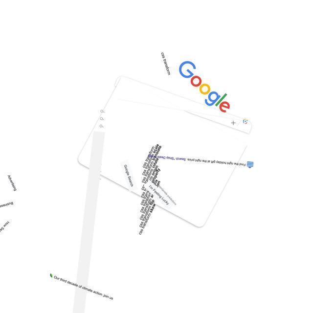
About twelve and half years ago, I took a first stab at pushing back on that denial with a series posted to Flickr called “Spinning the Web”, where I used CSS rotation transforms to take consistent, orderly, understandable web sites and shake them up hard. I enjoyed the process, and a number of people enjoyed the results.
google.com, late November 2023
In the past few months, I’ve come back to the concept for no truly clear reason and have been exploring new approaches and visual styles. The first collection launched a few days ago: Spinning the Web 2023, a collection of 26 web sites remixed with a combination of CSS and JS.
I’m announcing them now in part because this month has been dubbed “Genuary”, a month for experimenting with generative art, with daily prompts to get people generating. I don’t know if I’ll be following any of the prompts, but we’ll see. And now I have a place to do it.
You see, back in 2011, I mentioned that my working title for the “Spinning the Web” series was “Once Upon a Browser”. That title has never left me, so I’ve decided to claim it and created an umbrella site with that name. At launch, it’s sporting a design that owes quite a bit to Once Upon a Forest — albeit with its own SVG-based generative background, one I plan to mess around with whenever the mood strikes. New works will go up there from time to time, and I plan to migrate the 2011 efforts there as well. For now, there are pointers to the Flickr albums for the old works.
I said this back in 2011, and I mean it just as much in 2023: I hope you enjoy these works even half as much as I enjoyed creating them.
I’ve posted a followup to this post which you should read before you read this post, because you might decide there’s no need to read this one. If not, please note that what’s documented below was a hack to overcome a bug that was quickly fixed, in a part of CSS that wasn’t enabled in stable Firefox at the time I wrote the post. Thus, what follows isn’t really useful, and leaves more than one wrong impression. I apologize for this. For a more detailed breakdown of my errors, please see the followup post.
I’ve been doing some development recently on a tool that lets me quickly produce social-media banners for my work at Igalia. It started out using a vanilla JS script to snarfle up collections of HTML elements like all the range inputs, stick listeners and stuff on them, and then alter CSS variables when the inputs change. Then I had a conceptual breakthrough and refactored the entire thing to use fully light-DOM web components (FLDWCs), which let me rapidly and radically increase the tool’s capabilities, and I kind of love the FLDWCs even as I struggle to figure out the best practices.
With luck, I’ll write about all that soon, but for today, I wanted to share a little hack I developed to make Firefox a tiny bit more capable.
One of the things I do in the tool’s CSS is check to see if an element (represented here by a <div> for simplicity’s sake) has an image whose src attribute is a base64 string instead of a URI, and when it is, add some generated content. (It makes sense in context. Or at least it makes sense to me.) The CSS rule looks very much like this:
div:has(img[src*=";data64,"])::before {
	[…generated content styles go here…]
}
This works fine in WebKit and Chromium. Firefox, at least as of the day I’m writing this, often fails to notice the change, which means the selector doesn’t match, even in the Nightly builds, and so the generated content isn’t generated. It has problems correlating DOM updates and :has(), is what it comes down to.
There is a way to prod it into awareness, though! What I found during my development was that if I clicked or tabbed into a contenteditable element, the :has() would suddenly match and the generated content would appear. The editable element didn’t even have to be a child of the div bearing the :has(), which seemed weird to me for no distinct reason, but it made me think that maybe any content editing would work.
I tried adding contenteditable to a nearby element and then immediately removing it via JS, and that didn’t work. But then I added a tiny delay to removing the contenteditable, and that worked! I feel like I might have seen a similar tactic proposed by someone on social media or a blog or something, but if so, I can’t find it now, so my apologies if I ganked your idea without attribution.
My one concern was that if I wasn’t careful, I might accidentally pick an element that was supposed to be editable, and then remove the editing state it’s supposed to have. Instead of doing detection of the attribute during selection, I asked myself, “Self, what’s an element that is assured to be present but almost certainly not ever set to be editable?”
Well, there will always be a root element. Usually that will be <html> but you never know, maybe it will be something else, what with web components and all that. Or you could be styling your RSS feed, which is in fact a thing one can do. At any rate, where I landed was to add the following right after the part of my script where I set an image’s src to use a base64 URI:
let ffHack = document.querySelector(':root');
ffHack.setAttribute('contenteditable','true');
setTimeout(function(){
	ffHack.removeAttribute('contenteditable');
},7);
Literally all this does is grab the page’s root element, set it to be contenteditable, and then seven milliseconds later, remove the contenteditable. That’s about a millisecond less than the lifetime of a rendering frame at 120fps, so ideally, the browser won’t draw a frame where the root element is actually editable… or, if there is such a frame, it will be replaced by the next frame so quickly that the odds of accidentally editing the root are very, very, very small.
At the moment, I’m not doing any browser sniffing to figure out if the hack needs to be applied, so every browser gets to do this shuffle on Firefox’s behalf. Lazy, I suppose, but I’m going to wave my hands and intone “browsers are very fast now” while studiously ignoring all the inner voices complaining about inefficiency and inelegance. I feel like using this hack means it’s too late for all those concerns anyway.
I don’t know how many people out there will need to prod Firefox like this, but for however many there are, I hope this helps. And if you have an even better approach, please let us know in the comments!
Not quite a year ago, I published an exploration of how I used layered backgrounds to create the appearance of a single bent line that connected one edge of the design to whichever navbar link corresponded to the current page. It was fairly creative, if I do say so myself, but even then I knew — and said explicitly! — that it was a hack, and that I really wanted to use anchor positioning to do it cleanly.
Now that anchor positioning is supported behind a developer flag in Chrome, we can experiment with it, as I did in the recent post “Nuclear Anchored Sidenotes”. Well, today, I’m back on my anchor BS with a return to that dashed navbar connector as seen on wpewebkit.org, and how it can be done more cleanly and simply, just as I’d hoped last year.
First, let’s look at the thing we’re trying to recreate.
The connecting line, as done with a bunch of forcibly-sized and creatively overlapped background gradient images.
To understand the ground on which we stand, let’s make a quick perusal of the simple HTML structure at play here. At least, the relevant parts of it, with some bits elided by ellipses for clarity.
Inside that (unclassed! on purpose!) <ul>, there are a number of list items, each of which holds a hyperlink. Whichever list item contains the hyperlink that corresponds to the current page gets a class of currentPage, because class naming is a deep and mysterious art.
To that HTML structure, the following bits of CSS trickery were applied in the work I did last year, brought together in this code block for the sake of brevity (note this is the old thing, not the new anchoring hotness):
If you’re wondering what the heck is going on there, please feel free to read the post from last year. You can even go read it now, if you want, even though I’m about to flip most of that apple cart and stomp on the apples to make ground cider. Your life is your own; steer it as best suits you.
Anyway, here are the bits I’m tearing out to make way for an anchor-positioning solution. The positioning-edge properties (top, etc.) removed from the second rule will return shortly in a more logical form.
That pulls out not only the positioning edge properties, but also the background dash variables and related properties. And a whole rule to relatively position the currentPage list item, gone. The resulting lack of any connecting line being drawn is perhaps predictable, but here it is anyway.
The connecting line disappears as all its support structures and party tricks are swept away.
With the field cleared of last year’s detritus, let’s get ready to anchor!
Step one is to add in positioning edges, for which I’ll use logical positioning properties instead of the old physical properties. Along with those, a negative Z index to drop the generated decorator (that is, a decorative component based on generated content, which is what this ::before rule is creating) behind the entire set of links, dashed borders along the block and inline ends of the generated decorator, and a light-red background color so we can see the decorator’s placement more clearly.
I’ll also give the <a> element inside the currentPage list item a dashed border along its block-end edge, since the design calls for one.
 nav.global ul li.currentPage a {
		padding: 0;
		padding-block: 0.25em;
		margin: 1em;
		color: inherit;
	   border-block-end: 1px dashed;
	}
And those changes give us the result shown here.
The generated decorator, decorating the entirety of its containing block.
Well, I did set all the positioning edge values to be 0, so it makes sense that the generated decorator fills out the relatively-positioned <div> acting as its containing block. Time to fix that.
What we need to do give the top and right — excuse me, the block-start and inline-end — edges of the decorator a positioning anchor. Since the thing we want to connect the decorator’s visible edges to is the <a> inside the currentPage list item, I’ll make it the positioning anchor:
 nav.global ul li.currentPage a {
		padding: 0;
		padding-block: 0.25em;
		margin: 1em;
		color: inherit;
		border-block-end: 1px dashed;
	   anchor-name: --currentPageLink;
	}
Yes, you’re reading that correctly: I made an anchor be an anchor.
(That’s an HTML anchor element being designated as a CSS positioning anchor, to be clear. Sorry to pedantically explain the joke and thus ruin it, but I fear confusion more than banality.)
Now that we have a positioning anchor, the first thing to do, because it’s more clear to do it in this order, is to pin the inline-end edge of the generated decorator to its anchor. Specifically, to pin it to the center of the anchor, since that’s what the design calls for.
Because this anchor() function is being used with an inline inset property, the center here refers to the inline center of the referenced anchor (in both the HTML and CSS senses of that word) --currentPageLink, which in this particular case is its horizontal center. That gives us the following.
The generated decorator with its inline-end edge aligned with the inline center of the anchoring anchor.
The next step is to pin the top block edge of the generated decorator with respect to its positioning anchor. Since we want the line to come up and touch the block-end edge of the anchor, the end keyword is used to pin to the block end of the anchor (in this situation, its bottom edge).
Since the inset property in this case is block-related, the end keyword here means the block end of the anchor (again, in both senses). And thus, the job is done, except for removing the light-red diagnostic background.
The generated decorator with its block-start edge aligned with the block-end edge of the anchoring anchor.
Once that red background is taken out, we end up with the following rules inside the media query:
The inline-start and block-end edges of the generated decorator still have position values of 0, so they stick to the edges of the containing block (the <div>). The block-start and inline-end edges have values that are set with respect to their anchor. That’s it, done and dusted.
The connecting line is restored, but is now a lot easier to manage from the CSS side.
…okay, okay, there are a couple more things to talk about before we go.
First, the dashed borders I used here don’t look fully consistent with the other dashed “borders” in the design. I used actual borders for the CSS in this article because they’re fairly simple, as CSS goes, allowing me to focus on the topic at hand. To make these borders fully consistent with the rest of the design, I have two choices:
Remove the borders from the generated decorator and put the background-trick “borders” back into it. This would be relatively straightforward to do, at the cost of inflating the rules a little bit with background sizing and positioning and all that.
Convert all the other background-trick “borders” to be actual dashed borders. This would also be pretty straightforward, and would reduce the overall complexity of the CSS.
On balance, I’d probably go with the first option, because dashed borders still aren’t fully visually consistent from browser to browser, and people get cranky about those kinds of inconsistencies. Background gradient tricks give you more control in exchange for you writing more declarations. Still, either choice is completely defensible.
Second, you might be wondering if that <div> was even necessary. Not technically, no. At first, I kept using it because it was already there, and removing it seemed like it would require refactoring a bunch of other code not directly related to this post. So I didn’t.
But it tasked me. It tasked me. So I decided to take it out after all, and see what I’d have to do to make it work. Once I realized doing this illuminated an important restriction on what you can do with anchor positioning, I decided to explore it here.
As a reminder, here’s the HTML as it stood before I started removing bits:
Originally, the <div> was put there to provide a layout container for the logo and navbar links, so they’d be laid out to line up with the right and left sides of the page content. The <nav> was allowed to span the entire page, and the <div> was set to the same width as the content, with auto side margins to center it.
So, after pulling out the <div>, I needed an anchor for the navbar to size itself against. I couldn’t use the <main> element that follows the <nav> and contains the page content, because it’s a page-spanning Grid container. Just inside it, though, are <section> elements, and some (not all!) of them are the requisite width. So I added:
main > section:not(.full-width) {
	anchor-name: --mainCol;
}
The full-width class makes some sections page-spanning, so I needed to avoid those; thus the negative selection there. Now I could reference the <nav>’s edges against the named anchor I just defined. (Which is probably actually multiple anchors, but they all have the same width, so it comes to the same thing.) So I dropped those anchor references into the CSS:
And that worked! The inline start and end edges, which in this case are the left and right edges, lined up with the edges of the content column.
Positioning the <nav> with respect to the anchoring section(s).
…except it didn’t work on any page that had any content that overflowed the main column, which is most of them.
See, this is why I embedded a <div> inside the <nav> in the first place.
But wait. Why couldn’t I just position the logo and list of navigation links against the --mainCol anchor? Because in anchored positioning, just like nearly every other form of positioning, containing blocks are barriers. Recall that the <nav> is a fixed-position box, so it can stick to the top of the viewport. That means any elements inside it can only be positioned with respect to anchors that also have the <nav> as their containing block.
That’s fine for the generated decorator, since it and the currentPageLink anchor both have the <nav> as their containing block. To try to align the logo and navlinks, though, I can’t look outside the <nav> at anything else, and that includes the sections inside the <main> element, because the <nav> is not their containing block. The <nav> element itself, on the other hand, shares a containing block with those sections: the initial containing block. So I can anchor the <nav> itself to --mainCol.
I fiddled with various hacks to extend the background of the <nav> without shifting its content edges, padding and negative margins and stuff like that, but in end, I fell back on a border-image hack, which required I remove the background.
The appearance of a full-width navbar, although it’s mostly border image fakery.
Was it worth it? I have mixed feelings about that. On the one hand, putting all of the layout hackery into the CSS and removing it all from the HTML feels like the proper approach. On the other hand, it’s one measly <div>, and taking that approach means better support for older browsers. On the gripping hand, if I’m going to use anchor positioning, older browsers are already being left out of the fun. So I probably wouldn’t have even gone down this road, except it was a useful example of how anchor positioning can be stifled.
At any rate, there you have it, another way to use anchor positioning to create previously difficult design effects with relative ease. Just remember that all this is still in the realm of experiments, and production use will be limited to progressive enhancements until this comes out from behind the developer flags and more browsers add support. That makes now a good time to play around, get familiar with the technology, that sort of thing. Have fun with it!
Exactly one year ago today, which I swear is a coincidence I only noticed as I prepared to publish this, I posted an article on how I coded the footnotes for The Effects of Nuclear Weapons. In that piece, I mentioned that the footnotes I ended up using weren’t what I had hoped to create when the project first started. As I said in the original post:
Originally I had thought about putting footnotes off to one side in desktop views, such as in the right-hand grid gutter. After playing with some rough prototypes, I realized this wasn’t going to go the way I wanted it to…
I came back to this in my post “CSS Wish List 2023”, when I talked about anchor(ed) positioning. The ideal, which wasn’t really possible a year ago without a bunch of scripting, was to have the footnotes arranged structurally as endnotes, which we did, but in a way that I could place the notes as sidenotes, next to the footnote reference, when there was enough space to show them.
As it happens, that’s still not really possible without a lot of scripting today, unless you have:
A recent (as of late 2023) version of Chrome
With the “Experimental web features” flag enabled
With those things in place, you get experimental support for CSS anchor positioning, which lets you absolutely position an element in relation to any other element, anywhere in the DOM, essentially regardless of their markup relationship to each other, as long as they conform to a short set of constraints related to their containing blocks. You could reveal an embedded stylesheet and then position it next to the bit of markup it styles!
Anchoring Sidenotes
More relevantly to The Effects of Nuclear Weapons, I can enhance the desktop browsing experience by turning the popup footnotes into Tufte-style static sidenotes. So, for example, I can style the list items that contain the footnotes like this:
A sidenote next to the main text column, with its number aligned with the referencing number found in the main text column.
Let me break that down. The position is absolute, and bottom is set to auto to override a previous bit of styling that’s needed in cases where a footnote isn’t being anchored. I also decided to restrain the maximum width of a sidenote to 23em, for no other reason than it looked right to me.
(A brief side note, pun absolutely intended: I’m using the physical-direction property top because the logical-direction equivalent in this context, inset-block-start, only gained full desktop cross-browser support a couple of years ago, and that’s only true if you ignore IE11’s existence, plus it arrived in several mobile browsers only this year, and I still fret about those kinds of things. Since this is desktop-centric styling, I should probably set a calendar reminder to fix these at some point in the future. Anyway, see MDN’s entry for more.)
Now for the new and unfamiliar parts.
top: anchor(top);
This sets the position of the top edge of the list item to be aligned with the top edge of its anchor’s box. What is a footnote’s anchor? It’s the corresponding superscripted footnote mark embedded in the text. How does the CSS know that? Well, the way I set things up — and this is not the only option for defining an anchor, but it’s the option that worked in this use case — the anchor is defined in the markup itself. Here’s what a footnote mark and its associated footnote look like, markup-wise.
explosion,<sup><a href="#fnote01" id="fn01">1</a></sup> although
The important bits for anchor positioning are the id="fn01" on the superscripted link, and the anchor="fn01" on the list item: the latter establishes the element with an id of fn01 as the anchor for the list item. Any element can have an anchor attribute, thus creating what the CSS Anchor Positioning specification calls an implicit anchor. It’s explicit in the HTML, yes, but that makes it implicit to CSS, I guess. There’s even an implicit keyword, so I could have written this in my CSS instead:
top: anchor(implicit top);
(There are ways to mark an element as an anchor and associate other elements with that anchor, without the need for any HTML. You don’t even need to have IDs in the HTML. I’ll get to that in a bit.)
Note that the superscripted link and the list item are just barely related, structurally speaking. Their closest ancestor element is the page’s single <main> element, which is the link’s fourth-great-grandparent, and the list item’s third-great-grandparent. That’s okay! Much as a <label> can be associated with an input element across DOM structures via its for attribute, any element can be associated with an anchoring element via its anchor attribute. In both cases, the value is an ID.
So anyway, that means the top edge of the endnote will be absolutely positioned to line up with the top edge of its anchor. Had I wanted the top of the endnote to line up with the bottom edge of the anchor, I would have said:
top: anchor(bottom);
But I didn’t. With the top edges aligned, I now needed to drop the endnote into the space outside the main content column, off to its right. At first, I did it like this:
left: anchor(--main right);
Wait. Before you think you can just automatically use HTML element names as anchor references, well, you can’t. That --main is what CSS calls a dashed-ident, as in a dashed identifier, and I declared it elsewhere in my CSS. To wit:
main {
	anchor-name: --main;
}
That assigns the anchor name --main to the <main> element in the CSS, no HTML attributes required. Using the name --main to identify the <main> element was me following the common practice of naming things for what they are. I could have called it --mainElement or --elMain or --main-column or --content or --josephine or --📕😉 or whatever I wanted. It made the most sense to me to call it --main, so that’s what I picked.
Having done that, I can use the edges of the <main> element as positioning referents for any absolutely (or fixed) positioned element. Since I wanted the left side of sidenotes to be placed with respect to the right edge of the <main>, I set their left to be anchor(--main right).
Thus, taking these two declarations together, the top edge of a sidenote is positioned with respect to the top edge of its implicit anchor, and its left edge is positioned with respect to the right edge of the anchor named --main.
	top: anchor(top);
	left: anchor(--main right);
Yes, I’m anchoring the sidenotes with respect to two completely different anchors, one of which is a descendant of the other. That’s okay! You can do that! Literally, you could position each edge of an anchored element to a separate anchor, regardless of how they relate to each other structurally.
Once I previewed the result of those declarations, I saw I the sidenotes were too close to the main content, which makes sense: I had made the edges adjacent to each other.
Red borders showing the edges of the sidenote and the main column touching.
I thought about using a left margin on the sidenotes to push them over, and that would work fine, but I figured what the heck, CSS has calculation functions and anchor functions can go inside them, and any engine supporting anchor positioning will also support calc(), so why not? Thus:
left: calc(anchor(--main right) + 0.5em);
I wrapped those in a media query that only turned the footnotes into sidenotes at or above a certain viewport width, and wrapped that in a feature query so as to keep the styles away from non-anchor-position-understanding browsers, and I had the solution I’d envisioned at the beginning of the project!
Except I didn’t.
Fixing Proximate Overlap
What I’d done was fine as long as the footnotes were well separated. Remember, these are absolutely positioned elements, so they’re out of the document flow. Since we still don’t have CSS Exclusions, there needs to be a way to deal with situations where there are two footnotes close to each other. Without it, you get this sort of thing.
Two sidenotes completely overlapping with each other. This will not do.
I couldn’t figure out how to fix this problem, so I did what you do these days, which is I posted my problem to social media. Pretty quickly, I got a reply from the brilliant Roman Komarov, pointing me at a Codepen that showed how to do what I needed, plus some very cool highlighting techniques. I forked it so I could strip it down to the essentials, which is all I really needed for my use case, and also have some hope of understanding it.
Once I’d worked through it all and applied the results to TEoNW, I got exactly what I was after.
The same two sidenotes, except now there is no overlap.
Whoa. That’s a lot of functions working together there in the top value. (CSS is becoming more and more functional, which I feel some kind of way about.) It can all be verbalized as, “the position of the top edge of the list item is either the same as the top edge of its anchor, or two-thirds of an em below the bottom edge of the previous sidenote, whichever is further down”.
The browser knows how to do this because the list items have all been given an anchor-name of --sidenote (again, that could be anything, I just picked what made sense to me). That means every one of the endnote list items will have that anchor name, and other things can be positioned against them.
Those styles mean that I have multiple elements bearing the same anchor name, though. When any sidenote is positioned with respect to that anchor name, it has to pick just one of the anchors. The specification says the named anchor that occurs most recently before the thing you’re positioning is what wins. Given my setup, this means an anchored sidenote will use the previous sidenote as the anchor for its top edge.
At least, it will use the previous sidenote as its anchor if the bottom of the previous sidenote (plus two-thirds of an em) is lower than the top edge of its implicit anchor. In a sense, every sidenote’s top edge has two anchors, and the max() function picks which one is actually used in every case.
CSS, man.
Remember that all this is experimental, and the specification (and thus how anchor positioning works) could change. The best practices for accessibility are also not clear yet, from what I’ve been able to find. As such, this may not be something you want to deploy in production, even as a progressive enhancement. I’m holding off myself for the time being, which means none of the above is currently used in the published version of The Effects of Nuclear Weapons. If people are interested, I can create a Codepen to illustrate.
I do know this is something the CSS Working Group is working on pretty hard right now, so I have hopes that things will finalize soon and support will spread.
My thanks to Roman Komarov for his review of and feedback on this article. For more use cases of anchor positioning, see his lengthy (and quite lovely) article “Future CSS: Anchor Positioning”.
Dave
asked people to share their CSS wish lists for 2023, and even though
it’s well into the second month of the year, I’m going to sprint
wild-eyed out of the brush along the road, grab the hitch on the back of
the departing bandwagon, and try to claw my way aboard.
At first I thought I had maybe four or five things to put on my list,
but as I worked on it, I kept thinking of one more thing and one more
thing until eventually I had a list of (checks notes) sixt — no, SEVENTEEN?!?!? What the hell.
There’s going to be some overlap with the things being worked on for
Interop 2023, and I’m sure
there will be overlap with other peoples’ lists. Regardless, here we
go.
Subgrid
Back in the day, I asserted Grid should wait for subgrid. I was
probably wrong about that, but I wasn’t wrong about the usefulness of
and need for subgrid. Nearly every time I implement a design, I trip
over the lack of widespread support.
I have a blog post in my head about how I hacked around this problem
for wpewebkit.org by applying the
same grid column template to nested containers, and how I could make it
marginally more efficient with variables. I keep not writing it, because
it would show the approach and improvement and then mostly be about the
limitations, flaws, and annoyances this approach embodies. The whole
idea just depresses me, and I would probably become impolitic.
So instead I’ll just say that I hope those browser engines that have
yet to catch up with subgrid support will do so in 2023.
Masonry layout
Grid layout is great, and you can use it to create a masonry-style
layout, but having a real masonry layout mechanism would be better,
particularly if you can set it on a per-axis basis. What I mean is, you
could define a bunch of fixed (or flexible) columns and then say the
rows use masonry layout. It’s not something I’m likely to
use myself, but I always think the more layout possibilities there are,
the better.
Grid track styles
For someone who doesn’t do a ton of layout, I find myself wanting to
style grid lines a surprising amount. I just want to do something
like:
…although it would be much better to be able to style separators for
a specific grid track, or even an individual grid cell, as well as be
able to apply it to an entire grid all at once.
No, I don’t know exactly how this should work. I’m an idea guy! But
that’s what I want. I want to be able to define what separator lines
look like between grid tracks, centered on the grid lines.
Anchored positioning
I’ve wanted this in one form or another almost since CSS2 was
published. The general idea is, you can position an element in relation
to the edges of another element that isn’t a containing block. I wrote
about this a bit in my post on connector lines for wpewebkit.org, but
another place it would have come in handy was with the
footnotes on The Effects of Nuclear Weapons.
See, I wanted those to actually be sidenotes, Tufteee-styleee. Right now, in order to make sidenotes, you have to stick the footnote into the text, right where its footnote reference appears — or, at a minimum, right after the element containing the footnote reference. Neither was acceptable to me, because it would dork up the source text.
What I wanted to be able to do was collect all the footnotes as
endnotes at the end of the markup (which we did) and then absolutely
position each to sit next to the element that referenced them, or
have it pop up there on click, tap, hover, whatever. Anchored positioning
would make that not just possible, but fairly easy to do.
Exclusions
Following on anchored positioning, I’d love to have
CSS Exclusions
finally come to browsers. Exclusions are a way to mark an element to
have other content avoid it. You know how floats move out of the normal
flow, but normal-flow text avoids overlapping them? That’s an exclusion.
Now imagine being able to position an element by other means, whether
grid layout or absolute positioning or whatever, and then say “have the
content of other elements flow around it”. Exclusions! See this
article by Rob Weychert for a more in-depth explanation of a common
use case.
Element transitions
The web is cool and all, but you know how futuristic interfaces in
movies have pieces of the interface sliding and zooming and popping out and all that
stuff? Element transitions. You can already try them
out in Chrome Canary, Batman, and I’d love to see them across the
board. Even more, I’d love some gentle, easy-to-follow tutorials on how
to make them work, because even in their single-page form, I found the
coding requirements basically impossible to work out. Make them all-CSS,
and explain them like I’m a newb, and I’m in.
Nested Selectors
A lot of people I know are still hanging on to preprocessors solely
because they permit nested selectors, like:
main {
	padding: 1em;
	background: #F1F1F0;

	h2 {
		border-block-end: 1px solid gray;
	}
	p {
		text-indent: 2em;
	}
}
The CSS Working Group has been wrestling with this for quite some
time now, because it turns out the CSS parsing rules make it hard to
just add this, there are a lot of questions about how this should
interact with pseudo-classes like :is(), there are serious
concerns about doing this in a way that will be maximally
future-compatible, and also there has been a whole lot of argument over
whether it’s okay to clash with Sass syntax or not.
So it’s a difficult thing to make happen in native CSS, and the
debates are both wide-ranging and slow, but it’s on my (and probably
nearly everyone else’s) wish list. You can try it out in Safari Technology Preview
as I write this, so here’s hoping for accelerating adoption!
More and better :has()
Okay, since I’m talking about selectors already, I’ll throw in
universal, full-featured, more optimized support for
:has(). One browser doesn’t support compound selectors, for
example. I’ve also thought that maybe some combinators would be nice,
like making a:has(> b) can be made equal to
a < b.
But I also wish for people to basically go crazy with
:has(). There’s SO MUCH THERE. There are so many
things we can do with it, and I don’t think we’ve touched even a tiny
fraction of the possibility space.
More attr()
I’ve wanted attr() to be more widely accepted in CSS
values since, well, I can’t remember. A long time. I want to be
able to do something like:
Okay, not a great example, but it conveys the idea. I also talked
about this in my
post about aligning table columns.
I realize adding this would probably lead to
someone creating a framework called Headgust where all the styling is
jammed into a million data-*attributes and the whole of the
framework’s CSS is nothing but property: attr() declarations
for every single CSS property known to man, but we shouldn’t let that stop us.
Variables in media queries
Basically I want to be able to do this:
:root {--mobile: 35em;}

@media (min-width: var(--mobile)) {
	/* non-mobile styles go here */
}
That’s it. This was made possible in container queries, I believe, so
maybe it can spread to media (and feature?) queries. I sure hope so!
Logical modifiers
You can do this:
p {margin-block: 1em; margin-inline: 1rem;}
But you can’t do this:
p {margin: logical 1em 1rem;}
I want to be able to do that. We should all want to be able
to do that, however it’s made possible.
Additive values
You know how you can set a bunch of values with a comma-separated
list, but if you want to override just one of them, you have to do the
whole thing over? I want to be able to add another thing to the list
without having to do the whole thing over. So rather than adding a value
like this:
No, I don’t know how to figure out where in the list it should be
added. I don’t know a lot of things. I just know I want to be able to do
this. And also to remove values from a list in a similar way, since I’m
pony-wishing.
Color shading and blending
Preprocessors already allow you to say you want the color of an
element to be 30% lighter than it would otherwise be. Or darker. Or
blend two colors together. Native CSS should have the same power. It’s being
worked on. Let’s get it done, browsers.
Hanging punctuation
Safari has supported hanging-punctuation forever (where “forever”,
in this case, means since 2016) and it’s long past time for other browsers
to get with the program. This should be universally supported.
Cross-boundary styles
I want to be able to apply styles from my external (or even embedded) CSS to a resource like an external SVG. I realize this sets up all kinds
of security and privacy concerns. I still want to be able to do it. Every time I have to embed an entire inline SVG into a template just so
I can change the fill color of a logo based on its page context, I grit
my teeth just that little bit harder. It tasks me.
Scoped styling (including
imports)
The Mirror Universe version of the previous wish is that I want to be
able to say a bit of CSS, or an entire style sheet (embedded or
external), only applies to a certain DOM node and all its descendants.
“But you can do that with descendant selectors!” Not always. For that
matter, I’d love to be able to just say:
<div style="@import(styles.css);">
…and have that apply to that <div> and its
descendants, as if it were an <iframe>, while
not being an <iframe> so styles from the
document could also apply to it. Crazy? Don’t care. Still want it.
Linked flow regions(?)
SPECIAL BONUS TENTATIVE WISH: I didn’t particularly like how CSS Regions were
structured, but I really liked the general idea. It would be really
great to be able to link elements together, and allow the content to
flow between them in a “smooth” manner. Even to allow the content from
the second region to flow back into the first, if there’s room for it
and nothing prevents it. I admit, this is really a “try to recreate
Aldus PageMaker
in CSS” thing for me, but the idea still appeals to me,
and I’d love to see it come to CSS some day.
So there you go. I’d love to hear what you’d like to see added to CSS, either in the comments below or in posts of your own.
@media (prefers-color-scheme: dark) {
	html body {filter: invert(1);}
	/* the following really should be managed by a cascade layer */
	html img,
	html img.book.cover,
	html img.book.cover.big,
	html #archipelago a:hover img {filter: invert(1);}
	html #thoughts figure.standalone img {
	  box-shadow: 0.25em 0.25em 0.67em #FFF8;
	}
}
It’s the work of about five minutes’ thought and typing, so I suspect it’s teetering on the edge of Minimum Viable Product, but I’m not sure which side of that line it lands on.
Other than restructuring things so that I can use Cascade Layers to handle the Light and Dark Mode styling, what am I missing or overlooking? <video> elements, I suppose, but anything else jump out at you as in need of correction? Let me know!
(P.S. “Use only classes, never IDs” is not something that needs to be corrected. Yes, I know why people think that, and this situation seems to be an argument in favor of that view, but I have a different view and will not be converting IDs to classes. Thanks in advance for your forbearance.)


