Posts in the CSS Category

Pseudo-Phantoms

Published 15 years, 9 months past

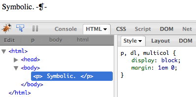
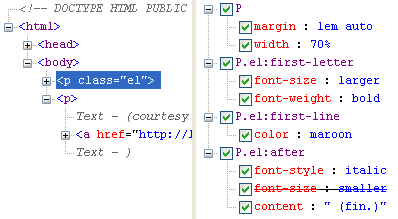
In the course of a recent debugging session, I discovered a limitation of web inspectors (Firebug, Dragonfly, Safari’s Web Inspector, et al.) that I hadn’t quite grasped before: they don’t show pseudo-elements and they’re not so great with pseudo-classes.  There’s one semi-exception to this rule, which is Internet Explorer 8’s built-in Developer Tool.  It shows pseudo-elements just fine.

Here’s an example of what I’m talking about:

p::after {content: " -\2761-"; font-size: smaller;}

Drop that style into any document that has paragraphs.  Load it up in your favorite development browser.  Now inspect a paragraph.  You will not see the generated content in the DOM view, and you won’t see the pseudo-element rule in the Styles tab (except in IE, where you get the latter, though not the former).

The problem isn’t that I used an escaped Unicode reference; take that out and you’ll still see the same results, as on the test page I threw together.  It isn’t the double-colon syntax, either, which all modern browsers handle just fine; and anyway, I can take it back to a single colon and still see the same results.  ::first-letter, ::first-line, ::before, and ::after are all basically invisible in most inspectors.

This can be a problem when developing, especially in cases such as having a forgotten, runaway generated-content clearfix making hash of the layout.  No matter how many times you inspect the elements that are behaving strangely, you aren’t going to see anything in the inspector that tells you why the weirdness is happening.

The same is largely true for dynamic pseudo-classes.  If you style all five link states, only two will show up in most inspectors—either :link or :visited, depending on whether you’ve visited the link’s target; and :focus.  (You can sometimes also get :hover in Dragonfly, though I’ve not been able to do so reliably.  IE8’s Developer Tool always shows a:link even when the link is visited, and doesn’t appear to show any other link states.  …yes, this is getting complicated.)

The more static pseudo-classes, like :first-child, do show up pretty well across the board (except in IE, which doesn’t support all the advanced static pseudo-classes; e.g., :last-child).

I can appreciate that inspectors face an interesting challenge here.  Pseudo-elements are just that, and aren’t part of the actual structure.  And yet Internet Explorer’s Developer Tool manages to find those rules and display them without any fuss, even if it doesn’t show generated content in its DOM view.  Some inspectors do better than others with dynamic pseudo-classes, but the fact remains that you basically can’t see some of them even though they will potentially apply to the inspected link at some point.

I’d be very interested to know what inspector teams encountered in trying to solve this problem, or if they’ve never tried.  I’d be especially interested to know why IE shows pseudo-elements when the others don’t—is it made simple by their rendering engine’s internals, or did someone on the Developer Tool team go to the extra effort of special-casing those rules?

For me, however, the overriding question is this: what will it take for the various inspectors to behave more like IE’s does, and show pseudo-element and pseudo-class rules that are associated with the element currently being inspected?  And as a bonus, to get them to show in the DOM view where the pseudo-elements actually live, so to speak?

(Addendum: when I talk about IE and the Developer Tool in this post, I mean the tool built into IE8.  I did not test the Developer Toolbar that was available for IE6 and IE7.  Thanks to Jeff L for pointing out the need to be clear about that.)


Handling an Explicit-Width Bug in Internet Explorer

Published 16 years, 4 months past

In creating the combo-bar charts for the survey report, I stumbled into an Explorer bug that I didn’t remember ever seeing before, and Google didn’t turn up anything that seemed to be related.  This could easily mean that I’m the only person who ever did something this insane and thus found the bug.  It could just as easily mean that my Google-fu has failed.  Either way, I’ll write it up here so it can enter the collective memory.  (And surely someone has already noted that Google is positively Jungian?)

You can see both the problem and two workarounds if you visit this test page using IE6 or IE7.  In brief, the problem occurred when I had a table cell containing a paragraph with an explicit width set.  I did this through the style attribute, though tests show that for this bug, it doesn’t matter whether you use the attribute or assign it via a style sheet.  Around these explicit-width paragraphs were div elements with width: 200%;, for bar-drawing purposes (it’s a little complicated).  Everything was fine in 99% of cases.  But as soon as the header text at the beginning of the row went to two lines of text, the explicit-width paragraphs doubled in width.  What was 80.1% wide would be drawn as though it were 160.2% wide.

My hopefully understandable reaction was to say, “Whuh?”.  I threw a few hasLayout triggers at the offending paragraph (relative position, zoom, etc.) and got nowhere.  In the end I worked around the problem by telling IE6 and IE7 to not wrap text in the row headers of combo charts.  (The bug is not present in IE8.)

I mentioned all this in my announcement post, and the ever-awesome Dan Wilkinson discovered that the problem could be fixed by setting all of the table rows to, say, height: 3em.  Armed with that breakthrough, I experimented a little more and found that I could actually set the offending table row’s height to 2.75em and still have things work as intended.  Below that and the paragraph widths doubled.

Then I lowered the line-height of the headers to 1 and found that I could take the overall row’s height as low as 2.33em before triggering the bug.  And that’s when it dawned: the bug was triggered by the layout height of the header cell’s content being taller than the content of the cell containing the paragraph, and not explicitly declaring styles that would make the data cell as tall as or taller than the height needed to have the header cell contain its content.

Okay, that’s a little dense.  Let me step through the symptoms and two found workarounds to see if that clears it up:

  1. The data cell always has a single line of text.  The bug is triggered by having the header cell go to two lines of text, whereas it is not if the header cell has a single line of text.
  2. If the row’s height is explicitly set to a value equal to or greater than the header cell’s content, the bug is not triggered.
  3. Alternatively, if the height of the data cell is set or forced to be equal to or greater than the height of the header cell, the bug is not triggered.  This can be done with an explicit height or with added top and bottom padding or by adding top and bottom margins to the paragraphs in the cell.

Some side tests I did indicate that the header cell is not needed to trigger the bug.  In other words, the problem could happen even if there are only data cells in the row.  Furthermore, I found that the width-scaling was directly affected by the width of the wrapping div, and thus the widths were doubling only because I had the div‘s width set to 200%.  If I set it to 150% instead of 200%, then the paragraphs only got half again as wide instead of doubling.  That seems to make sense until you see it in action.  When I say the paragraphs got half again as wide, I mean that instead of being 75% as wide as the div, they were 112.5% as wide as the div.  If I set the div‘s width to 200%, then they were 150% the width of the div.

So.  As I say, this bug does not affect IE8, so that’s good, and it can be worked around in IE6 and IE7, which is even better.  The problem would be if you didn’t know how tall your cells might get—in my case, I can be (reasonably) sure that the tallest a cell’s content will ever get is two lines of text, and by setting an explicit line-height on the headers I can know how tall I have to make the rows in order to avoid the bug.

Another day, another workaround!


CSS3 Feedback: Graphical Thoughts

Published 16 years, 5 months past

(This is part of the Feedback on ‘WaSP Community CSS3 Feedback 2008′ series.)

My few thoughts on the “Graphical Effects” part of the feedback document.  A lot of what was mentioned by the community is already in the pipeline, so there’s not a lot to say about those except “hurry ’em up, willya?”.

Gradients — like rounded corners, no surprise these came up.  (All we need is to define wet-floor-reflect and we’ll complete the Web 2.0 design tricks hat trick.)  I’d like to see them myself, and I don’t think defining them is quite as hard as the commentary implies:

Imagine, for example, applying a gradient to the text of a <span> broken across two lines. Do you apply the gradient to each part individually? Glue them together as if they were all on one line first? Draw a rectangle around both parts and apply the gradient to that? (CSS3 Backgrounds and Borders has a control for this.)

I’d say the answer is right there, in the form of background-break, but let’s assume for a moment that said property never existed and we still had to deal with this problem.  I can think of two solutions:

  1. Only allow gradients to be applied to non-inline boxes.  This would not be my preference, but it could be so defined.  There’s already precedence with CSS for that sort of limitation:  width, height, text-align, and other properties are restricted to non-inline boxes.
  2. Treat gradients the way backgrounds and borders are already treated on inline boxes.  I’d be much more in favor of this.  In other words, lay out the inline box as though it is all on one line and then break it in pieces as needed to fit into the actual text flow.  (This is the behavior of continuous, the default value of background-break.)

But since background-break exists, you just treat gradients as you would any other background in accordance with background-break‘s definitions.

The somewhat trickier problem is how to define the value syntax for background-gradient so that’s both powerful and extensible without being unusable.  I think that’s solvable, but not easily, and probably not in a way that will satisfy everyone.

(Though this would be a fabulous place for the cardinal-point values from pre-CSS1 days, which you can still find in the specification if you look hard enough, to make a roaring comeback, wouldn’t it?)

Unidirectional background repeats — I say yes.  Here, have some values: repeat-up, repeat-right, repeat-down, and repeat-left.  In each case, the image would be repeated in the indicated direction from the origin image (the one placed by background-position).  Ironically, really old versions of IE did half of this by not correctly supporting repeat-x and repeat-y, treating them instead as if they were repeat-right and repeat-down.

There are occasions where this would be very useful, especially if you can combine the values into something like repeat-down repeat-right, and most especially in conjunction with multiple backgrounds.  So you could put an image stripe across the top of the element background, another one down the left side, and then fill in the rest of the background with a repeat-down repeat-right image.  Not a particularly common case, but the only way to handle it at present is with multiple nested elements, each with its own background and possibly a lot of negative margin trickery, and nobody wants that.  (Which may also be why it isn’t a particularly common case.)

You could also put an image in the center of your page and then a single stripe that goes only downward from behind it.  Like a golf ball on a tee, say; or a tree trunk below the leafy crowm; or a stem from a flower.

Slanted corners — sure, why not?  The issues are all the same as with rounded corners; the only difference is that you have a flat corner instead of a rounded one.  It makes joins between different borders styles/colors more obvious, but that’s a good thing: any solution that works well for the slant corner should work as well for the rounded corner.  Besides, if we’re already going to the effort of rounding corners, this seems like a pretty easy add-on.

Multiple borders — I think this would be quite useful.  I occasionally fake this with a border and an outline (as in my diagnostic styles) but that only works for two; if you want three or more nested borders (or two or more in IE/Win) you have to start nesting elements.  Also, having multiple borders lets you define your own gradient borders like you were a pixel artist, and who doesn’t like pixel artists?

At the same time, though, I do feel that this should be fairly low on the implementation totem pole.  And, as pointed out in the document, if image borders get implemented then a lot of the need for multiple borders goes away.

Alpha channel image masks — the problem I have here is what happens if you, say, try to use an image to alpha-mask a non-replaced element?  How does it scale?  Or does it?  Will there be a mask-stretch property?  Who really wants to stretch an image over a great big div anyway?  (From a visual-results point of view, I mean.)

Allowing masks might help in figuring out how to do non-rectangular float areas, in that you could use the alpha image to define the area used for float exclusion.  Combine that with a stretch ability and SVG support, so you can draw scalable vector masks, and I think you’re really getting somewhere.  (As does Matt Wilcox; he and I have been chewing this over in the comments on the previous post in the series.)


CSS3 Feedback: Animated Shapes

Published 16 years, 6 months past

(This is part of the Feedback on ‘WaSP Community CSS3 Feedback 2008’ series.)

The portion of the feedback devoted to shapes had two overarching themes, as I saw it.  That makes this entry a bit short, but when I tried to combine it with my feedback on “Graphical Effects“, it quickly got too long.  So, a little amuse cerveau, as it were.

Animations, transformations, and so on — the WebKit team have of course been having a field day in this area, and what they’ve done will likely make is way to other browsers.  Or not.  I don’t know.  I’m not entirely thrilled about the effort that’s gone into those properties when there are so many other, more basic things that need love and care, but there’s no denying the essential coolness of slowly rotating an entire page.  Which I totally need to do the next time I give a presentation.

I’m not going to get into the “these things are behavior and therefore JavaScript!” argument.  CSS already does behavior (think :hover) and it’s going to do more over time.  I don’t see how that historical pressure can be resisted for much longer, short of outright refusing to take on any more behaviors and thus making itself a prime candidate for replacement with something else.  We may as well do our best to make sure CSS does good behaviors well, in ways that makes the most sense to the most authors.

So that’s basically my feedback: since we’re going to do it, let’s do it right.  Apple’s made a start, and unless the syntax they’ve defined in their CSS Animations draft is completely unworkable in other browsers for technical reasons, then let’s just roll with it.  And please note I said the syntax, not the overall concept.  (Ditto for their CSS Transforms draft.)

Stuff that isn’t rectangular — including both polygonal element boxes and polygonal floats.  I’ve wanted these for at least a decade, so it’s little surprise that I’m in favor.  Ragged floats were invented as a hack to make the latter happen, of course, and the basic idea’s been improved upon more than once.

The tricky part, of course, is actually defining polygons.  Regular polygons, as in hexagons and octagons and dodecagons, are not terribly difficult; but creating an irregular polygon requires defining a set of point coordinates in relation to some origin and resolving what happens when the lines cross over each other and… well, yeah.

The build-on-what-exists approach would just adopt the syntax HTML area elements use in the coords elements.  There would be two interesting questions there, which are what happens with negative coordinate values, and what happens if you draw a polygon that cuts through some of the element’s content.  For example, you have a div containing an image, and you define the polygon to be smaller (in places) than the image.  Is the browser obligated to prevent content overlap in such cases?  I would tend to say no but I can see arguments for the opposite view, particularly when it comes to floats.

Then there’s the problem that you’d have to define a separate polygon for every element that needed a non-rectangular float, as Bert Bos notes in his thoughts on the topic from a couple of years ago.  His contour idea is certainly interesting, though I’d then start to wonder how you define a contour point on, say, an irregular faded gradient.

Anyway, I thought about adapting clip to the purpose of defining float polygons, but then I remembered the long, tortuous hell that is the history of clip (and offset-clip) and decided that a new property is the way to go.  Clean break, start fresh, et cetera.  I don’t know what it would be called.  content-shape, maybe, to go with element-shape.  Or not.


Wanted: Layout System

Published 16 years, 6 months past

(This is part of the Feedback on ‘WaSP Community CSS3 Feedback 2008’ series.)

Not surprisingly, there was a lot of community feedback asking for better layout mechanisms.  Actually, people were asking for any decent layout mechanism at all, which CSS has historically lacked.  Floats mostly work, but they’re a hack and can be annoyingly fragile even when you ignore old-browser bugs.  Positioning works in limited cases, but does not handle web-oriented layout at all well.

Why do we use floats for layout, anyway?  clear.  That’s pretty much the whole answer.  The unique in-flow/out-of-flow nature of floats means they interact with each other and with the normal flow, which means they can be cleared, which makes them useful.  Because with clear, we can float layout blocks around and then push other non-floated blocks, like footers, below the floats.

Positioning, of course, permits total layout freedom in the sense that you can put a layout block anywhere with respect to its containing block.  The downfall is that absolutely positioned elements are entirely out of the normal flow, so they can’t stay out of each others’ way like floats do, and you can’t clear anything with respect to a positioned element.  If there had been a position-clear or its equivalent from the outset, we’d never have bothered with floats.

(And if we can just add position-clear to CSS, that would be completely awesome.  It’s been done with JavaScript and it will most likely be done again and better.  It wouldn’t even be that hard to implement, at least for 99.5% of cases.)

All this is why the old “only use tables for layout” argument keeps coming up over and over: strip away the overheated rhetoric and obvious link-baiting, and you find the core of a real need.  Because as powerful as CSS can be, table cells do certain things very easily that CSS makes very, very hard.  Cells stretch vertically, keeping equal heights as a matter of their intrinsic nature.  They stay out of each others’ way, while still being allowed to sit next to each other and use any sizing dimensions.  They tie their layout to their parent elements, and vice versa.

There are no equivalents in CSS.  There have been various very clever attempts to replicate bits and pieces of those capabilities using CSS.  What CSS does, it does very well: if you don’t need equal-height layout blocks, then no problem.  If you do, it’s a massive pain.  Clever techniques provide substitutes, but can’t replace what tables already do.

And please, let’s put the whole “display: table-cell will grant those abilities through CSS” to rest.  Saying that is just saying “use tables for layout” with different words.  Turning a bunch of divs or list items or whatever into table-role boxes is no better than just using table markup in the first place, and it’s arguably worse.  Using element names other than table and td to create layout tables, and then claiming it’s not using tables for layout, borders on self-deception.

Not to mention doing things that way means you’re doing your layout in a highly source-order-dependent fashion, which was one of the things about table layout we were trying to get away from in the first place.

So how do we get really powerful source-order-independent layout?  I wish I knew.  The Advanced Layout module has been sitting around for a while now, and even if you’re a fan of defining layout as ASCII art—which I find repels and appeals in equal measure, but that’s probably just me—there appears to be close to zero implementor interest.  So how do we get those abilities in a form that implementors will, y’know, implement?  I don’t know.  I don’t care.  We just need it, and have needed it for a good decade or so.  Without it, CSS is a styling language but not a layout language.  We’ve bent it into being something close to a layout language, which is nice but not really ideal.

Maybe CSS isn’t the place for this.  Maybe there needs to be a new layout language that can be defined and implemented without regard to the constraints of the existing CSS syntax rules, without worrying about backwards compatibility.  Maybe that way we can not only get strong layout but also arbitrary shapes, thus leaving behind the rectangular prison that’s defined the web for almost two decades.

I don’t have a concrete idea to propose here, because it’s not up to us any more.  A solution was worked out over the course of several years and then found wanting by the implementors.  Really, it’s up to the implementors to figure it out now.  I personally would like to just lock the browser teams from Microsoft, Mozilla, Opera, and Apple in a room and not let them out until they’ve defined something that works and they’ve all agreed to implement soonest.  I might even supply food and water.

And yes, I just advocated doing this outside the W3C process.  Why wouldn’t I?  The process has, in the last decade, not produced anything even remotely resembling an answer to this problem.  Time to try another path and see if it gets any closer to the goal.

No doubt someone’s going to spin this as “See, even noted standards zealot Eric Meyer now says CSS is flawed!”—only they’ll be wrong because this isn’t a now thing.  I’ve been saying this for years in interviews, in person, and in general.  Any time someone asks me what CSS is missing or should do better, the answer has always been a variant on “a strong layout system”.  I’ve been saying it for at least a decade.  So I’m not saying it now.  I’m saying it again.  And again and again and again and…

If I sound frustrated, it’s because I am, and have been for a good long while.  I’m not the only one.  It rankles to have CSS be, as Winston Churchill would have put it, the worst form of layout except for all the others that have been tried.


CSS3 Feedback: Layout

Published 16 years, 6 months past

(This is part of the Feedback on ‘WaSP Community CSS3 Feedback 2008’ series.)

In this round, layout.  Not all of it, but the bits that struck me as either really useful or really, really way too long overdue.

Float containment yes, we need a property that does just that.  As long as we’re tied to floats for layout—and I plan to rant about that soon—there should be a clear, unambiguous, intentionally defined property that tells elements to wrap themselves around floated descendant elements.  overflow works in most cases but can fall down in unusual circumstances (I’ve seen scrollbars appear where none were actually needed) and anyway, it wasn’t intended to provide the wrapping effect in the first place.  That it does so is a happy side effect, but it’s still a side effect.  The rest of the float-wrapping techniques are even more convoluted.  “There are already ways to do that so we don’t need a property” is rather like saying “we can already do layout with tables so why do we need CSS layout?”.

Positioning by center yes, please.  The way to center an absolutely positioned element within its containing block is to set the top and left to 50% each and then define negative top and left margins that are half the positioned element’s height and width.  That’s just awful, and requires at least an explicit width, if not an explicit height.  When I did the structured timeline, here’s how I got the version numbers to center below the dots:

#timeline tbody td p {
	position: absolute;
	top: 50%;
	width: 2.1em;
	margin: -5px 0 0 -1em;
}

See that -1em left margin, and the 2.1em width?  Just to get the center of positioned elements’ boxes sit on top of a certain left offset (defined elsewhere in the CSS).  Ditto the negative top margin, to pull it upward just enough so that the elements’ boxes would have the point five pixels down from their tops line up with the vertical midpoint of their containing blocks.

I wanted to do something like this:

#timeline tbody td p {
	position: absolute;
	top: 50%;
	position-anchor: 50% 5px;
}

That would have said that the point in the center of the absolutely positioned element should be placed at the point in the containing block 21.7% down from the top and 44% of the way across from the left.  That would hang the positioned element’s center on that point, regardless of the size of the positioned element—note that I took out the width.  I could stop defining explicit sizes and just let the elements be the size they want to be to show their content.

The problem is that approach doesn’t fit at all well with the way positioning layout is defined.  Suppose I said this:

#timeline tbody td p {
	position: absolute;
	top: 50%; bottom: 0;
	left: 50%; right: 25%;
	position-anchor: 50% 5px;
}

Now what?  I’m not even sure myself.  Maybe define rename it to position-offset and define percentages to be relative to the height and width of the positioned element (not its containing block), so that it doesn’t interact directly with the offset properties like top and right?

All I want is a way to hang elements off of offset points, and not be restricted to the corners of the elements, and have the solution work even when the elements have automatic height and width, and not require extra markup to make it happen.  Oh, and a ponycar.

Box sizing what in the nine hells of Valeria is taking so long?  We needed that one ten years ago.  I no longer care if it’s done as its own property or as new keywords on height and width.  I just want it.  Someone will make it happen, with or without the WG or implementors—mark my words.

Same-height elements yes, a way to tie element heights (whether they’re siblings or not) together would be welcome, although I can see how specifying it in an implementable would be tricky; no, display: table-cell  is not the answer.  Soon I will rant about this.  Soon.


CSS3 Feedback: Selector Blocks

Published 16 years, 6 months past

(This is part of the Feedback on ‘WaSP Community CSS3 Feedback 2008’ series.)

Out of all the selector feedback, selector blocks was the part that really caught my attention.  I also see the usefulness of a parent selector, but that one has come up many times before, and it’s always died at the doorstep of implementors, who point out that it’s far too difficult to implement without serious performance penalties and even risk of browser lockup.  See, for example, the comment left by David Hyatt on Shaun Inman’s post on the idea.  Similarly, I think constants (or macros or whatever they’re called) are a great idea and would be very helpful, especially if you’re coding up a Jason Special.  Both are loaded with use cases, so I don’t feel like I can add a lot; besides, constants are already in the WG charter, so there’s once more hope in the land.

So anyway, selector blocks.  To pick one recent example, while working on a project that should very soon see the light of day, I had a situation involving the following chunk of rules.

h1, h2, h3, h4, h5, h6, table {
   font: 1em Arial, "Helvetica Neue", Helvetica, sans-serif;}
h1 {font-size: 275%;}
h3:first-child {margin-top: 1em;}
p.tagline {margin: -0.25em 0 1.25em;
   font-size: 125%;
   color: #7B7960;}
h3 {margin: 1.5em 0 0.25em; font-size: 125%;}
h3:before {font-size: 75%; counter-increment: subhead;}
h4 {margin: 2.5em 0 0.75em;
   text-transform: uppercase; font-size: 125%;
   color: #928F59;}
p {margin: 0 0 1em;}
ul {padding-left: 1.5em;}
ul li {list-style: disc; margin: 0.5em 0;}

Nothing unusual about them, of course, unless you count my use of counters.  These rules had been written early on in development, and the design had evolved around that part of the document.  As more page components were added, I realized that I needed to scope all these rules to one section of the document: specifically, a div with a class of main.  So here’s what I had to do.

.main h1, .main h2, .main h3, .main h4, 
.main h5, .main h6, .main table {
   font: 1em Arial, "Helvetica Neue", Helvetica, sans-serif;}
.main h1 {font-size: 275%;}
.main h3:first-child {margin-top: 1em;}
.main p.tagline {margin: -0.25em 0 1.25em;
   font-size: 125%;
   color: #7B7960;}
.main h3 {margin: 1.5em 0 0.25em; font-size: 125%;}
.main h3:before {font-size: 75%; counter-increment: subhead;}
.main h4 {margin: 2.5em 0 0.75em;
   text-transform: uppercase; font-size: 125%;
   color: #928F59;}
.main p {margin: 0 0 1em;}
.main ul {padding-left: 1.5em;}
.main ul li {list-style: disc; margin: 0.5em 0;}

This, on the other hand, is what I really wanted to do:

.main {
   h1, h2, h3, h4, h5, h6, table {
      font: 1em Arial, "Helvetica Neue", Helvetica, sans-serif;}
   h1 {font-size: 275%;}
   h3:first-child {margin-top: 1em;}
   p.tagline {margin: -0.25em 0 1.25em;
      font-size: 125%;
      color: #7B7960;}
   h3 {margin: 1.5em 0 0.25em; font-size: 125%;}
   h3:before {font-size: 75%; counter-increment: subhead;}
   h4 {margin: 2.5em 0 0.75em;
      text-transform: uppercase; font-size: 125%;
      color: #928F59;}
   p {margin: 1em 0;}
   ul {padding-left: 1.5em;}
   ul li {list-style: disc; margin: 0.5em 0;}
}

Or, if necessary, to put the whole original chunk into its own style sheet and then do one of the following:

div.main {@import url(main-style.css);}

<div class="main" style="@import url(main-style.css);">

Interestingly, the latter is theoretically possible, thanks to the more advanced profiles in the CSS module “Syntax of CSS rules in HTML’s ‘style’ attribute“.  I’m not aware of the former having been seriously considered (despite my best efforts, once upon a time), though it’s always possible I missed something.

But either one of those approaches would be a last resort, in my opinion.  I’d much rather just wrap the whole chunk in .main { }, like I showed previously, and be done with it.  That capability would also simplify certain annoyingly repetitive patterns, like the very first of those rules.  I think it’s pretty obvious which of the following is easier to write and maintain:

body.home #content .entry h2, 
body.home #content .entry h3, 
body.home #content .entry h4, 
body.home #content .entry h5, 
body.home #content .entry h6 {...}

body.home #content .entry {
   h2, h3, h4, h5, h6 {...}
}

I mean, just look at the former, and imagine what one goes through to write it in the first place.  Copy, paste, paste, paste, paste, paste… maddening.  And that’s just for a small block of CSS like this one.  Imagine the tedium of doing this for a block of 50 rules, or 150.  (Also, this is the the same thing that was requested in the feedback as “Grouped Alternates“, albeit with a different syntax.)

One objection to this sort of pattern is that it increases dependence on descendant selectors, which are computationally inefficient.  But it doesn’t: I had to create a whole bunch of descendant selectors as it was, and did so far more clumsily.  And had I missed a command-V somewhere, I’d have had styles that applied outside their intended subtree.  Introducing a way to nest blocks like this doesn’t change anything except make it easier and more maintainable to do what we already do.  Honestly, it’s pretty much impossible to increase dependence on descendant selectors.  The best we can do now is make them less difficult to write.

I realize that the syntax I depict would cause backwards-compatibility problems, as in older browsers would not behave as intended when exposed to this sort of thing, but I’ve also stopped being concerned about that.  We can’t keep holding ourselves hostage to decisions made a decade or more back.  Provide the capability and authors will use it when they can.  Over time, its use will become more prevalent—kind of the same way authors adopted CSS in the first place.

I also realize that this case has been made time and again by many, many other people.  This isn’t even the first time I’ve made this case, though I think the other times were within the WG and therefore off the public record.  The fact that it keeps being made is a strong indicator that the need exists, and dismissing the idea because the same end effect can be achieved with existing selector syntax (as shown above) isn’t acceptable.  That’s like saying that complex selection effects can be achieved with JavaScript or XPath, so there’s no need for advanced CSS selectors.

So that’s my use case.  I actually have a bunch more, but they all follow the same basic pattern: the desire to group rules together into subsections of a document, or to otherwise simplify the writing of CSS.


Feedback on ‘WaSP Community CSS3 Feedback 2008’

Published 16 years, 6 months past

Back before holiday season hit, Elika Etemad—better known as Fantasai—published WaSP Community CSS3 Feedback 2008.  I gave it a read and came away with a number of things I wanted to say.  So many things, in fact, that I’ll need to split them up into a series of posts.  This here post will serve as introduction and hub, with links to the follow-on entries added as they’re published.  All very Bray-ny, no?  (Go ahead, groan.  It only encourages me.)

Here you go:

  1. Selector blocks
  2. Layout
  3. Wanted: Layout System
  4. Animated Shapes
  5. Graphical Thoughts

I want to make clear up front that I’m not going to address every single point in the feedback document: it’s just too incredibly huge.  I did think about making my own copy and then just filling in my reactions to each point, but that didn’t scale very well.  Not only did it seem really overbearing and maybe just a touch egotistical, but some of my reactions were based on related topics in separate areas of the original.  Besides, I know what it’s like trying to read a really, really long article, so breaking it up and just focusing on the parts that got me fired up made way more sense.

There is one thing I want to address before I start serving up the follow-on installments.  At the end of Fantasai’s post, there’s a link to my 2006 post about the benefit of having a community liaison, someone who bridges the gap between the WG and the public.  She then asks if anyone is interested in volunteering, but personally, I don’t see the need.  The WG already has a community liaison:  it’s you, Fantasai.  It has been for some time now, thanks to your regular and informative CSS WG blog posts and other outreach work such as “WaSP Community CSS3 Feedback 2008”.  The job is being done, and being done very well, I don’t think there’s any doubt that the Working Group is much, much better for it.


Browse the Archive

Earlier Entries

Later Entries