Posts in the Tech Category

A Leap of Decades

Published 1 year, 8 months past

I’ve heard it said there are two kinds of tech power users: the ones who constantly update to stay on the bleeding edge, and the ones who update only when absolutely forced to do so.  I’m in the latter camp.  If a program, setup, or piece of hardware works for me, I stick by it like it’s the last raft off a sinking island.

And so it has been for my early 2013 MacBook Pro, which has served me incredibly well across all those years and many continents, but was sliding into the software update chasm: some applications, and for that matter its operating system, could no longer be run on its hardware.  Oh and also, the top row of letter keys was becoming unresponsive, in particular the E-R-T sequence.  Which I kind of need if I’m going to be writing English text, never mind reloading pages and opening new browser tabs.

Stepping Up

An early 2013 MacBook Pro sitting on a desk next to the box of an early 2023 MacBook Pro, the latter illuminated by shafts of sunlight.
The grizzled old veteran on the verge of retirement and the fresh new recruit that just transferred in to replace them.

So on Monday, I dropped by the Apple Store and picked up a custom-built early 2023 MacBook Pro: M2 Max with 38 GPU cores, 64GB RAM, and 2TB SSD.  (Thus quadrupling the active memory and nearly trebling the storage capacity of its predecessor.)  I went with that balance, or perhaps imbalance, because I intend to have this machine last me another ten years, and in that time, RAM is more likely to be in demand than SSD.  If I’m wrong about that, I can always plug in an external SSD.  Many thanks to the many people in my Mastodon herd who nudged me in that direction.

I chose the 14” model over the 16”, so it is a wee bit smaller than my old 15” workhorse.  The thing that surprises me is the new machine looks boxier, somehow.  Probably it’s that the corners of the case are not nearly as rounded as the 2013 model, and I think the thickness ratio of display to body is closer to 1:1 than before.  It isn’t a problem or anything, it’s just a thing that I notice.  I’ll probably forget about it soon enough.

Some things I find mildly-to-moderately annoying:

  • DragThing doesn’t work any more.  It had stopped being updated before the 64-bit revolution, never mind the shift to Apple silicon, so this was expected, but wow do I miss it.  Like a stick-shift driver uselessly stomping the floorboards and blindly grasping air while driving an automatic car, I still flip the mouse pointer toward the right edge of the screen, where I kept my DragThing dock, before remembering it’s gone.  I’ve looked at alternatives, but none of them seem like they’re meant as straight up replacements, so I’ve yet to commit to one.  Maybe some day I’ll ask Daniel to teach me Swift to I can build my own. (Because I definitely need more demands on my time.)
  • The twisty arrows in the Finder to open and close folders don’t have enough visual weight.  Really, the overall UI feels like a movie’s toy representation of an operating system, not an actual operating system.  I mean, the visual presentation of the OS looks like something I would create, and brother, that is not a compliment.
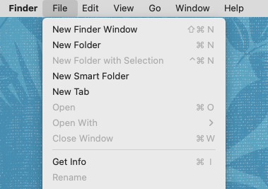
  • The Finder’s menu bar has no visually distinct background.  What the hell.  No, seriously, what the hell?  The Notch I’m actually okay with, but removing the distinction between the active area of the menu bar and the inert rest of the desktop seems… ill-advised.  Do not like.  HARK, A FIX: Cory Birdsong pointed me to “System Settings… > Accessibility > Display > Reduce Transparency”, which fixes this, over on Mastodon.  Thanks, Cory!
  • I’m not used to the system default font(s) yet, which I imagine will come with time, but still catches me here and there.
  • The alert and other systems sounds are different, and I don’t like them.  Sosumi.

Oh, and it’s weird to me that the Apple logo on the back of the display doesn’t glow.  Not annoying, just weird.

Otherwise, I’m happy with it so far.  Great display, great battery life, and the keyboard works!

Getting Migratory

The 2013 MBP was backed up nightly to a 1TB Samsung SSD, so that was how I managed the migration: plugged the SSD into the new MBP and let Migration Assistant do its thing.  This got me 90% of the way there, really.  The remaining 10% is what I’ll talk about in a bit, in case anyone else finds themselves in a similar situation.

The only major hardware hurdle I hit was that my Dell U2713HM monitor, also of mid-2010s vintage, seems to limit HDMI signals to 1920×1080 despite supposedly supporting HDMI 1.4, which caught me by surprise.  When connected to a machine via DisplayPort, even my 2013 MBP, the Dell will go up to 2560×1440.  The new MBP only has one HDMI port and three USB-C ports.  Fortunately, the USB-C ports can be used as DisplayPorts, so I acquired a DisplayPort–to–USB-C cable and that fixed the situation right up.

Yes, I could upgrade to a monitor that supports USB-C directly, but the Dell is a good size for my work environment, it still looks pretty good, and did I mention I’m the cling-tightly-to-what-works kind of user?

Otherwise, in the hardware space, I’ll have to figure out how I want to manage connecting all the USB-A devices I have (podcasting microphone, wireless headset, desktop speaker, secondary HD camera, etc., etc.) to the USB-C ports.  I expected that to be the case, just as I expected some applications would no longer work.  I expect an adapter cable or two will be necessary, at least for a while.

Trouble Brewing

I said earlier that Migration Assistant got me 90% of the way to being switched over.  Were I someone who doesn’t install stuff via the Terminal, I suspect it would have been 100% successful, but I’m not, so it wasn’t.  As with the cables, I anticipated this would happen.  What I didn’t expect was that covering that last 10% would take me only an hour or so of actual work, most of it spent waiting on downloads and installs.

First, the serious and quite unexpected problem: my version of Homebrew used an old installation prefix, one that could break newer packages.  So, I needed to migrate Homebrew itself from /usr/local to /opt/homebrew.  Some searching around indicated that the best way to do this was uninstall Homebrew entirely, then install it fresh.

Okay, except that would also remove everything I’d installed with Homebrew.  Which was maybe not as much as some of y’all, but it was still a fair number of fairly essential packages.  When I ran brew list, I got over a hundred packages, of which most were dependencies.  What I found through further searching was that brew leaves returns a list of the packages I’d installed, without their dependencies.  Here’s what I got:

automake
bash
bison
chruby
ckan
cmake
composer
ffmpeg
gh
git
git-lfs
httpd
imagemagick
libksba
lynx
minetest
minimal-racket
pandoc
php
php@7.2
python@3.10
ruby
ruby-install
wget
yarn

That felt a lot more manageable.  After a bit more research, boiled down to its essentials, the New Brew Shuffle I came up with was:


$ brew leaves > brewlist.txt

$ /bin/bash -c "$(curl -fsSL https://raw.githubusercontent.com/Homebrew/install/HEAD/uninstall.sh)"

$ xcode-select --install

$ /bin/bash -c "$(curl -fsSL https://raw.githubusercontent.com/Homebrew/install/HEAD/install.sh)"

$ xargs brew install < brewlist.txt

The above does elide a few things.  In step two, the Homebrew uninstall script identified a bunch of directories that it couldn’t remove, and would have to be deleted manually.  I saved all that to a text file (thanks to Warp’s “Copy output” feature) for later study, and pressed onward.  I probably also had to sudo some of those steps; I no longer remember.

In addition to all the above, I elected to delete a few of the packages in brewlist.txt before I fed it back to brew install in the last step — things like ckan, left over from my Kerbal Space Program days  —  and to remove the version dependencies for PHP and Python.  Overall, the process was pretty smooth.  I just had to sit there and watch Homrebrew chew through all the installs, including all the dependencies.

Cleanup

Once all the reinstalls from the last step had finished, I was left with a few things to clean up.  For example, Python didn’t seem to have installed.  Eventually I realized it had actually installed as python3 instead of just plain python, so that was mostly fine and I’m sure there’s a way to alias one to the other that I might get around to looking up one day.

Ruby also didn’t seem to reinstall cleanly: there was a library it was looking for that complained about the chip architecture, and attempts to overcome that spawned even more errors, and none of them were decipherable to me or my searches.  Multiple attempts at uninstalling and then reinstalling Ruby through a variety of means, some with Homebrew, some other ways, either got me the same indecipherable erros or a whole new set of indecipherable errors.  In the end, I just uninstalled Ruby, as I don’t actually use it for anything I’m aware of, and the default Ruby that comes with macOS is still there.  If I run into some script I need for work that requires something more, I’ll revisit this, probably with many muttered imprecations.

Finally, httpd wasn’t working as intended.  I could launch it with brew services httpd start, but the resulting server was pointing to a page that just said “It works!”, and not bringing up any of my local hosts.  Eventually, I found where Homebrew had stuffed httpd and its various files, and then replaced its configuration files with my old configuration files.  Then I went through the cycle of typing sudo apachectl start, addressing the errors it threw over directories or PHP installs or whatever by editing httpd.conf, and then trying again.

After only three or four rounds of that, everything was up and running as intended  —  and as a bonus, I was able to mark httpd as a Login item in the Finder’s System Settings, so it will automatically come back up whenever I reboot!  Which my old machine wouldn’t do, for some reason I never got around to figuring out.

Now I just need to decide what to call this thing.  The old MBP was “CoCo”, as in the TRS-80 Color Computer, meant as a wry commentary on the feel of the keyboard and a callback to the first home computer I ever used.  That joke still works, but I’m thinking the new machine will be “C64” in honor of the first actually powerful home computer I ever used and its 64 kilobytes of RAM.  There’s a pleasing echo between that and the 64 gigabytes of RAM I now have at my literal fingertips, four decades later.

Now that I’m up to date on hardware and operating system, I’d be interested to hear what y’all recommend for good quality-of-life improvement applications or configuration changes.  Link me up!


CSS Wish List 2023

Published 1 year, 9 months past

Dave asked people to share their CSS wish lists for 2023, and even though it’s well into the second month of the year, I’m going to sprint wild-eyed out of the brush along the road, grab the hitch on the back of the departing bandwagon, and try to claw my way aboard. At first I thought I had maybe four or five things to put on my list, but as I worked on it, I kept thinking of one more thing and one more thing until eventually I had a list of (checks notes) sixt — no, SEVENTEEN?!?!?  What the hell.

There’s going to be some overlap with the things being worked on for Interop 2023, and I’m sure there will be overlap with other peoples’ lists.  Regardless, here we go.


Subgrid

Back in the day, I asserted Grid should wait for subgrid.  I was probably wrong about that, but I wasn’t wrong about the usefulness of and need for subgrid.  Nearly every time I implement a design, I trip over the lack of widespread support.

I have a blog post in my head about how I hacked around this problem for wpewebkit.org by applying the same grid column template to nested containers, and how I could make it marginally more efficient with variables.  I keep not writing it, because it would show the approach and improvement and then mostly be about the limitations, flaws, and annoyances this approach embodies.  The whole idea just depresses me, and I would probably become impolitic.

So instead I’ll just say that I hope those browser engines that have yet to catch up with subgrid support will do so in 2023.

Masonry layout

Grid layout is great, and you can use it to create a masonry-style layout, but having a real masonry layout mechanism would be better, particularly if you can set it on a per-axis basis.  What I mean is, you could define a bunch of fixed (or flexible) columns and then say the rows use masonry layout.  It’s not something I’m likely to use myself, but I always think the more layout possibilities there are, the better.

Grid track styles

For someone who doesn’t do a ton of layout, I find myself wanting to style grid lines a surprising amount.  I just want to do something like:

display: grid;
gap: 1em;
grid-rules-columns: 1px dotted red;

…although it would be much better to be able to style separators for a specific grid track, or even an individual grid cell, as well as be able to apply it to an entire grid all at once.

No, I don’t know exactly how this should work.  I’m an idea guy!  But that’s what I want.  I want to be able to define what separator lines look like between grid tracks, centered on the grid lines.

Anchored positioning

I’ve wanted this in one form or another almost since CSS2 was published.  The general idea is, you can position an element in relation to the edges of another element that isn’t a containing block.  I wrote about this a bit in my post on connector lines for wpewebkit.org, but another place it would have come in handy was with the footnotes on The Effects of Nuclear Weapons.

See, I wanted those to actually be sidenotes, Tufteee-styleee.  Right now, in order to make sidenotes, you have to stick the footnote into the text, right where its footnote reference appears  —  or, at a minimum, right after the element containing the footnote reference.  Neither was acceptable to me, because it would dork up the source text.

What I wanted to be able to do was collect all the footnotes as endnotes at the end of the markup (which we did) and then absolutely position each to sit next to the element that referenced them, or have it pop up there on click, tap, hover, whatever.  Anchored positioning would make that not just possible, but fairly easy to do.

Exclusions

Following on anchored positioning, I’d love to have CSS Exclusions finally come to browsers.  Exclusions are a way to mark an element to have other content avoid it.  You know how floats move out of the normal flow, but normal-flow text avoids overlapping them?  That’s an exclusion.  Now imagine being able to position an element by other means, whether grid layout or absolute positioning or whatever, and then say “have the content of other elements flow around it”.  Exclusions!  See this article by Rob Weychert for a more in-depth explanation of a common use case.

Element transitions

The web is cool and all, but you know how futuristic interfaces in movies have pieces of the interface sliding and zooming and popping out and all that stuff?  Element transitions.  You can already try them out in Chrome Canary, Batman, and I’d love to see them across the board.  Even more, I’d love some gentle, easy-to-follow tutorials on how to make them work, because even in their single-page form, I found the coding requirements basically impossible to work out.  Make them all-CSS, and explain them like I’m a newb, and I’m in.

Nested Selectors

A lot of people I know are still hanging on to preprocessors solely because they permit nested selectors, like:

main {
	padding: 1em;
	background: #F1F1F0;
	
	h2 {
		border-block-end: 1px solid gray;
	}
	p {
		text-indent: 2em;
	}
}

The CSS Working Group has been wrestling with this for quite some time now, because it turns out the CSS parsing rules make it hard to just add this, there are a lot of questions about how this should interact with pseudo-classes like :is(), there are serious concerns about doing this in a way that will be maximally future-compatible, and also there has been a whole lot of argument over whether it’s okay to clash with Sass syntax or not.

So it’s a difficult thing to make happen in native CSS, and the debates are both wide-ranging and slow, but it’s on my (and probably nearly everyone else’s) wish list.  You can try it out in Safari Technology Preview as I write this, so here’s hoping for accelerating adoption!

More and better :has()

Okay, since I’m talking about selectors already, I’ll throw in universal, full-featured, more optimized support for :has().  One browser doesn’t support compound selectors, for example.  I’ve also thought that maybe some combinators would be nice, like making a:has(> b) can be made equal to a < b.

But I also wish for people to basically go crazy with :has().  There’s SO MUCH THERE.  There are so many things we can do with it, and I don’t think we’ve touched even a tiny fraction of the possibility space.

More attr()

I’ve wanted attr() to be more widely accepted in CSS values since, well, I can’t remember.  A long time.  I want to be able to do something like:

p[data-size] {width: attr(data-width, rem);}

<p data-size="27">…</p>

Okay, not a great example, but it conveys the idea.  I also talked about this in my post about aligning table columns. I realize adding this would probably lead to someone creating a framework called Headgust where all the styling is jammed into a million data-*attributes and the whole of the framework’s CSS is nothing but property: attr() declarations for every single CSS property known to man, but we shouldn’t let that stop us.

Variables in media queries

Basically I want to be able to do this:

:root {--mobile: 35em;}

@media (min-width: var(--mobile)) {
	/* non-mobile styles go here */
}

That’s it.  This was made possible in container queries, I believe, so maybe it can spread to media (and feature?) queries.  I sure hope so!

Logical modifiers

You can do this:

p {margin-block: 1em; margin-inline: 1rem;}

But you can’t do this:

p {margin: logical 1em 1rem;}

I want to be able to do that.  We should all want to be able to do that, however it’s made possible.

Additive values

You know how you can set a bunch of values with a comma-separated list, but if you want to override just one of them, you have to do the whole thing over?  I want to be able to add another thing to the list without having to do the whole thing over.  So rather than adding a value like this:

background-clip: content, content, border, padding; /* needed to add padding */

…I want to be able to do something like:

background-clip: add(padding);

No, I don’t know how to figure out where in the list it should be added.  I don’t know a lot of things.  I just know I want to be able to do this.  And also to remove values from a list in a similar way, since I’m pony-wishing.

Color shading and blending

Preprocessors already allow you to say you want the color of an element to be 30% lighter than it would otherwise be.  Or darker.  Or blend two colors together.  Native CSS should have the same power.  It’s being worked on.  Let’s get it done, browsers.

Hanging punctuation

Safari has supported hanging-punctuation forever (where “forever”, in this case, means since 2016) and it’s long past time for other browsers to get with the program.  This should be universally supported.

Cross-boundary styles

I want to be able to apply styles from my external (or even embedded) CSS to a resource like an external SVG.  I realize this sets up all kinds of security and privacy concerns.  I still want to be able to do it.  Every time I have to embed an entire inline SVG into a template just so I can change the fill color of a logo based on its page context, I grit my teeth just that little bit harder.  It tasks me.

Scoped styling (including imports)

The Mirror Universe version of the previous wish is that I want to be able to say a bit of CSS, or an entire style sheet (embedded or external), only applies to a certain DOM node and all its descendants. “But you can do that with descendant selectors!” Not always.  For that matter, I’d love to be able to just say:

<div style="@import(styles.css);">

…and have that apply to that <div> and its descendants, as if it were an <iframe>, while not being an <iframe> so styles from the document could also apply to it.  Crazy?  Don’t care.  Still want it.

Linked flow regions(?)

SPECIAL BONUS TENTATIVE WISH: I didn’t particularly like how CSS Regions were structured, but I really liked the general idea.  It would be really great to be able to link elements together, and allow the content to flow between them in a “smooth” manner.  Even to allow the content from the second region to flow back into the first, if there’s room for it and nothing prevents it.  I admit, this is really a “try to recreate Aldus PageMaker in CSS” thing for me, but the idea still appeals to me, and I’d love to see it come to CSS some day.


So there you go.  I’d love to hear what you’d like to see added to CSS, either in the comments below or in posts of your own.


Minimal Dark Mode Styling

Published 1 year, 10 months past

Spurred by a toot in reply to a goofy dev joke I made, I’ve set up a dirty-rough Dark Mode handler for meyerweb:

@media (prefers-color-scheme: dark) {
	html body {filter: invert(1);}
	/* the following really should be managed by a cascade layer */
	html img, 
	html img.book.cover, 
	html img.book.cover.big, 
	html #archipelago a:hover img {filter: invert(1);}
	html #thoughts figure.standalone img {
	  box-shadow: 0.25em 0.25em 0.67em #FFF8;
	}
}

It’s the work of about five minutes’ thought and typing, so I suspect it’s teetering on the edge of Minimum Viable Product, but I’m not sure which side of that line it lands on.

Other than restructuring things so that I can use Cascade Layers to handle the Light and Dark Mode styling, what am I missing or overlooking?  <video> elements, I suppose, but anything else jump out at you as in need of correction?  Let me know!

(P.S. “Use only classes, never IDs” is not something that needs to be corrected.  Yes, I know why people think that, and this situation seems to be an argument in favor of that view, but I have a different view and will not be converting IDs to classes.  Thanks in advance for your forbearance.)


Styling a ‘pre’ That Contains a ‘code’

Published 1 year, 10 months past

I’ve just committed my first :has() selector to production CSS and want to share it, so I will!  But first, a little context that will feel familiar to nerds like me who post snippets of computer code to the Web, and have markup with this kind of tree structure (not raw source; we’d never allow this much formatting whitespace inside a <pre>):

<pre>
	<code>
		{{content goes here}}
	</code>
</pre>

It’s nicely semantic, indicating that the contents of the <pre> are in fact code of some kind, as opposed to just plain preformatted text like, say, output from a shell script or npm job, which isn’t code and thus should, perhaps, be styled in a distinct way.

Given cases like that, you’ve probably written rules that go a little something like this:

pre > code {
	display: block;
	background: #f1f1f1;
	padding: 1.33em;
	border-radius: 0.33em;
}

Which says: if a <code> element is the child of a <pre> element, then turn the <code> into a block box and give it some background color, padding, etc.

It works out fine, but it always feels a little fragile.  What if there are already <pre> styles that throw off the intended effect on code blocks?  Do we get into specificity wars between those rules and the code-block rules?  Find other ways to figure out what should be adjusted in which cases?  Those are probably manageable problems, but it would be better not to have them.

It’s also, when you step back for a moment, a little weird.  The <pre> is already a block box and the container for the code; why aren’t we styling that?  Because unless you wrote some scripting, whether server-side or client-side, to add a class to the <pre> in scenarios like this, there wasn’t a way to address it directly based on its structural contents.

There is now:

pre:has(> code) {
	background: #f1f1f1;
	padding: 1.33em;
	border-radius: 0.33em;
}

Now I’m styling any <pre> that has a <code> as a child, which is why I took out the display: block.  I don’t need it any more!

But suppose you have a framework or ancient script or something that inserts classed <span> elements between the <pre> and the <code>, like this:

<pre>
	<span class="pref">
		<code>
			{{content goes here}}
		</code>
	</span>
</pre>

First of all, ew, address the root problem here if at all possible.  But if that isn’t possible for whatever reason, you can still style the <pre> based on the presence of a <code> by removing the child combinator from the selector.  In other words:

pre:has(code) {
	background: #f1f1f1;
	padding: 1.33em;
	border-radius: 0.33em;
}

Now I’m styling any <pre> that has a <code> as a descendant  —  child, grandchild, great-great-great-great grandchild, whatever.

Which is not only more robust, it’s a lot more future-proof: even if some hot new front-end framework that sticks in <span> elements or something gets added to the site next year, this style will just keep chugging along, styling <pre> elements that contain <code> elements until long after that hot new framework has cooled to ash and been chucked into the bit-bucket.

There is one thing to keep in mind here, as pointed out by Emmanuel over on Mastodon: if you have a scenario where <pre> elements can contain child text nodes in addition to <code> blocks, the <pre> will still be styled in its entirely.  Consider:

<pre>
	{{some text is here}}
	<code>
		{{content goes here}}
	</code>
	{{or text is here}}
</pre>

pre:has(> code) and pre:has(code) will still match the <pre> element here, which means all of the text (both inside and outside the <code> elements)  will sit inside the light-gray box with the rounded corners.  If that’s fine for your use case, great!  If not, then don’t use :has() in this scenario, and stick with the pre > code {…} or pre code {…} approach of yore.  That will style just the <code> elements instead of the whole <pre>, as in the example at the beginning of this article.

As I write this, the code hasn’t gone into production on wpewebkit.org yet, but I think it will within the next week or two, and will be my first wide-production use of :has().  I feel like it’s a great way to close out 2022 and kick off 2023, because I am that kind of nerd.  If you are too, I hope you enjoyed this quick dive into the world of :has().


Highlighting Image Accessibility on Mastodon

Published 1 year, 11 months past

Some time ago, I published user styles to visually highlight images on Twitter that didn’t have alt text  —  this was in the time before the “ALT” badge and the much improved accessibility features Twitter deployed in the pre-Musk era.

With the mass Mastodon migration currently underway in the circles I frequent, I spend more time there, and I missed the quick visual indication of images having alt text, as well as my de-emphasis styles for those images that don’t have useful alt text.  So I put the two together and wrote a new user stylesheet, which I apply via the Stylus browser extension.  If you’d like to also use it, please do so!

/* ==UserStyle==
@name           mastodon.social - 12/14/2022, 9:37:56 AM
@namespace      github.com/openstyles/stylus
@version        1.0.0
@description    Styles images posted on mastodon.social based on whether or not they have alt text.
@author         @Meyerweb@mastodon.social, https://meyerweb.com/
==/UserStyle== */

@-moz-document regexp(".*\.social.*") {
	.media-gallery__item-thumbnail img:not([alt]) {
		filter: grayscale(1) contrast(0.5);
	}
	.media-gallery__item-thumbnail img:not([alt]):hover {
		filter: none;
	}
	.media-gallery__item-thumbnail:has(img[alt]) {
		position: relative;
	}
	.media-gallery__item-thumbnail:has(img[alt])::after {
		content: "ALT";
		position: absolute;
		bottom: 0;
		right: 0;
		border-radius: 5px 0 0 0;
		border: 1px solid #FFF3;
		color: #FFFD;
		background: #000A;
		border-width: 1px 0 0 1px;
		padding-block: 0.5em 0.4em;
		padding-inline: 0.7em 0.8em;
		font: bold 90% sans-serif;
	}
}

Because most of my (admittedly limited and sporadic) Mastodon time is spent on mastodon.social, the styles I wrote are attuned to mastodon.social’s markup.  I set things up so these styles should be applied to any *.social site, but only those who use the same markup mastodon.social uses will get the benefits.  pinafore.social, for example, has different markup (I think they’re using Svelte).

You can always adapt the selectors to fit the markup of whatever Mastodon instance you use, if you’re so inclined.  Please feel free to share your changes in the comments, or in posts of your own.  And with any luck, this will be a temporary solution before Mastodon adds these sorts of things natively, just as Twitter eventually did.


Addendum: It was rightly pointed out to me that Firefox does not, as of this writing, support :has() by default.  If you want to use this in Firefox, as I do, set the layout.css.has-selector.enabled flag in about:config to true.


How to Verify Site Ownership on Mastodon Profiles

Published 1 year, 11 months past

Like many of you, I’ve been checking out Mastodon and finding more and more things I like.  Including the use of XFN (XHTML Friends Network) semantics to verify ownership of sites you link from your profile’s metadata!  What that means is, you can add up to four links in your profile, and if you have an XFN-compliant link on that URL pointing to your Mastodon profile, it will show up as verified as actually being your site.

Okay, that probably also comes off a little confusing.  Let me walk through the process.

First, go to your home Mastodon server and edit your profile.  On servers like mastodon.social, there should be an “Edit profile” link under your user avatar.

Here’s what it looks like for me.  Yes, I prefer Light Mode.  No, I don’t want to have a debate about it.

I saw the same thing on another Mastodon server where I have an account, so it seems to be common to Mastodon in general.  I can’t know what every Mastodon server does, though, so you might have to root around to find how you edit your profile.  (Similarly, I can’t be sure that everything will be exactly as I depict it below, but hopefully it will be at least reasonably close.)

Under “Appearance” in the profile editing screen, which I believe is the default profile editing page, there should be a section called “Profile metadata”.  You’ll probably have to scroll a bit to reach it.  You can add up to four labels with content, and a very common label is “Web” or “Homepage” with the URL of your personal server.  They don’t all have to be links to sites; you could add your favorite color or relationship preference(s) or whatever

I filled a couple of these in for demonstration purposes, but now they’re officially part of my profile.  No, I don’t want to debate indentation preferences, either.

But look, over there next to the table, there’s a “Verification” section, with a little bit of explanation and a field containing some markup you can copy, but it’s cut off before the end of the markup.  Here’s what mine looks like in full:

<a rel="me" href="https://mastodon.social/@Meyerweb">Mastodon</a>

If I take this markup and add it to any URL I list in my metadata, then that entry in my metadata table will get special treatment, because it will mean I’ve verified it.

The important part is the rel="me", which establishes a shared identity.  Here’s how it’s (partially) described by XFN 1.1:

A link to yourself at a different URL. Exclusive of all other XFN values. Required symmetric.

I admit, that’s written in terse spec-speak, so let’s see how this works out in practice.

First, let’s look at the markup in my Mastodon profile’s page.  Any link to another site in the table of profile metadata has a me value in the rel attribute, like so:

<a href="https://meyerweb.com/" rel="nofollow noopener noreferrer me">

That means I’ve claimed via Mastodon that meyerweb.com is me at another URL.

But that’s not enough, because I could point at the home page of, say, Wikipedia as if it were mine.  That’s why XFN requires the relationship to be symmetric, which is to say, there needs to be a rel="me" annotated link on each end.  (On both ends.  However you want to say that.)

So on the page being pointed to, which in my case is https://meyerweb.com/, I need to include a link back to my Mastodon profile page, and that link also has to have rel="me".  That’s the markup Mastodon provided for me to copy, which we saw before and I’ll repeat here:

<a rel="me" href="https://mastodon.social/@Meyerweb">Mastodon</a>

Again, the important part is that the href points to my Mastodon profile page, and there’s a rel attribute containing me.  It can contain other things, like noreferrer, but needs to have me for the verfiication to work.  Note that the content of the link element doesn’t have to be the text “Mastodon”.  In my case, I’m using a Mastodon logo, with the markup looking like this:

<a rel="me" href="https://mastodon.social/@Meyerweb">
 	<img src="/pix/icons/mastodon.svg" alt="Mastodon">
</a>

With that in place, there’s a “me” link pointing to a page that contains a “me” link.  That’s a symmetric relationship, as XFN requires, and it verifies that the two pages have a shared owner.  Who is me!

Thus, if you go to my Mastodon profile page, in the table of my profile metadata, the entry for my homepage is specially styled to indicate it’s been verified as actually belonging to me.

The table as it appears on my profile page for me.  Your colors may vary.

And that’s how it works.

Next question: how can I verify my GitHub page?  At the moment, I’d have to put my Mastodon profile page’s URL into the one open field for URLs in GitHub profiles, because GitHub also does the rel="me" thing for its profile links.  But if I do that, I’d have to remove the link to my homepage, which I don’t want to do.

Until GitHub either provides a dedicated Mastodon profile field the way it provides a dedicated Twitter profile field, or else allows people to add multiple URLs to their profiles the way Mastodon does, I won’t be able to verify my GitHub page on Mastodon.  Not a huge deal for me, personally, but in general it would be nice to see GitHub become more flexible in this area.  Very smart people are also asking for this, so hopefully that will happen soon(ish).


Masked Gradient Dashed Lines

Published 2 years, 3 weeks past

I talked in my last post about how I used linear gradients to recreate dashed lines for the navlinks and navbar of wpewebkit.org, but that wasn’t the last instance of dashing gradients in the design.  I had occasion to use that technique again, except this time as a way to create a gradient dash.  I mean, a dashed line that has a visible gradient from one color to another, as well as a dashed line that’s constructed using a linear gradient.  Only this time, the dashed gradient is used to create the gaps, not the dashes.

To set the stage, here’s the bit of the design I had to create:

Design!

The vertical dashed line down the left side of the design is a dashed linear gradient, but that’s not actually relevant.  It could have been a dashed border style, or an SVG, or really anything.  And that image on the right is a PNG, but that’s also not really relevant.  What’s relevant is I had to make sure the image was centered in the content column, and yet its dashed line connected to the left-side dashed line, regardless of where the image landed in the actual content.

Furthermore, the colors of the two dashed lines were different at the point I was doing the implementation: the left-side line was flat black, and the line in the image was more of a dark gray.  I could have just connected a dark gray line to the black, but it didn’t look right.  A color transition was needed, while still being a dashed line.

Ideally, I was looking for a solution that would allow a smooth color fade over the connecting line’s length while also allowing the page background color to show through.  Because the page background might sometimes be white and sometimes be a light blue and might in the future be lime green wavy pattern or something, who knows.

So I used a dashed linear gradient as a mask.  The CSS goes like this:

.banner::before {
	content: '';
	position: absolute;
	top: 50%;
	left: -5rem;
	width: 5rem;
	height: 1px;
	background: linear-gradient(90deg, #222, #888);
	mask-image: repeating-linear-gradient(
		270deg, transparent, #999 1px 3px, transparent 4px 7px);
}

Please allow me to break it down a step at a time.

First, there’s the positioning of the pseudo-element, reaching leftward 5rem from the left edge of the content column, which here I’ve annotated with a red outline. (I prefer outlines to borders because outlines don’t participate in layout, so they can’t shift things around.)

.banner::before {
	content: '';
	position: absolute;
	top: 50%;
	left: -5rem;
	width: 5rem;
	height: 1px;
}
The very skinny-short red box is where the connecting line needs to be drawn.

To that pseudo-element, I added a 90-degree-pointing linear gradient from black to gray to its background.

	…
	background: linear-gradient(90deg, #222, #888);
}
The gradient filling the entire background of the pseudo-element.

The pseudo-element does happen to touch the end of one of the vertical dashes, but that’s purely by coincidence.  It could have landed anywhere, including between two dashes.

So now it was time for a mask.  CSS Masks are images used to hide parts of an element based on the contents of the masking image, usually its alpha channel. (Using luminosity to define transparency levels via the mask-mode property is also an option, but Chrome doesn’t support that as yet.)  For example, you can use small images to clip off the corners of an element.

In this case, I defined a repeating linear gradient because I knew what size the dashes should be, and I didn’t want to mess with mask-size and mask-repeat (ironically enough, as you’ll see in a bit).  This way, the mask is 100% the size of the element’s box, and I just need to repeat the gradient pattern however many times are necessary to cross the entire width of the element’s background.

Given the design constraints, I wanted the dash pattern to start from the right side, the one next to the image, and repeat leftward, to ensure that the dash pattern would look unbroken.  Thus I set its direction to be 270 degrees.  Here I’ll have it alternate between red and transparent, because the actual color used for the opaque parts of the mask doesn’t matter, only its opacity:

	…
	mask-image: repeating-linear-gradient(
		270deg, transparent, red 1px 3px, transparent 4px 7px);
}
The pseudo-element being masked over and over again to create a dashed line that allows the backdrop to show through.

The way the mask works, the transparent parts of the masking image cause the corresponding parts of the element to be transparent  —  to be clipped away, in effect.  The opaque parts, whatever color they actually have, cause the corresponding parts of the element to be drawn.  Thus, the parts of the background’s black-to-gray gradient that line up with the opaque parts of the mask are rendered, and the rest of the gradient is not.  Thus, a color-fading dashed line.

This is actually why I separated the ends of the color stops by a pixel: by defining a one-pixel distance for the transition from transparent to opaque (and vice versa), the browser fills those pixels in with something partway between those two states.  It’s probably 50% opaque, but that’s really up to the browser.

The pixels of the repeating gradient pattern, shown here in the reading order of the CSS value.  In practice, this pattern is flipped horizontally, since its gradient arrow points to 270 degrees (leftward).

The result is a softening effect, which matches well with the dashed line in the image itself and doesn’t look out of place when it meets up with the left-hand vertical dashed line.

At least, everything I just showed you is what happens in Firefox, which proudly supports all the masking properties.  In Chromium and WebKit browsers, you need vendor prefixes for masking to work.  So here’s how the CSS turned out:

.banner::before {
	content: '';
	position: absolute;
	top: 50%;
	left: -5rem;
	width: 5rem;
	height: 1px;
	background: linear-gradient(90deg, #222, #888);
	-webkit-mask-image: repeating-linear-gradient(
		270deg, transparent, red 1px 3px, transparent 4px 7px);
	mask-image: repeating-linear-gradient(
		270deg, transparent, red 1px 3px, transparent 4px 7px);
}

And that’s where we were at launch.

It still bugged me a little, though, because the dashes I created were one pixel tall, but the dashes in the image weren’t.  They were more like a pixel and a half tall once you take the aliasing into account, so they probably started out 2 (or more)  pixels tall and then got scaled down.  The transition from those visually-slightly-larger dashes to the crisply-one-pixel-tall pseudo-element didn’t look quite right.

I’d hoped that just increasing the height of the pseudo-element to 2px would work, but that made the line look too thick.  That meant I’d have to basically recreate the aliasing myself.

At first I considered leaving the mask as it was and setting up two linear gradients, the existing one on the bottom and a lighter one on top.  Instead, I chose to keep the single background gradient and set up two masks, the original on the bottom and a more transparent one on top.  Which meant I’d have to size and place them, and keep them from tiling.  So, despite my earlier avoidance, I had to mess with mask sizing and repeating anyway.

mask-image:
	repeating-linear-gradient(
		270deg, transparent, #89A4 1px 3px, transparent 4px 7px),
	repeating-linear-gradient(
		270deg, transparent, #89A 1px 3px, transparent 4px 7px);
	mask-size: 100% 1px;
	mask-repeat: no-repeat;
	mask-position: 100% 0%, 100% 100%;
Two masks, one effect.

And that’s how it stands as of today.

In the end, this general technique is pretty much infinitely adaptable, in that you could define any dash pattern you like and have it repeat over a gradient, background image, or even just a plain background color.  It could be used to break up an element containing text, so it looks like the text has been projected onto a thick dashed line, or put some diagonal slashes through text, or an image, or a combination.

SLASHED TEXT
No PNG, no SVG, just text and CSS.

Or use a tiled radial gradient to make your own dotted line, one that’s fully responsive without ever clipping a dot partway through.  Wacky line patterns with tiled, repeated conic gradients?  Sure, why not?

The point being, masks let you break up the rectangularity of elements, which can go a long way toward making designs feel more alive.  Give ’em a try and see what you come up with!


A Dashing Navbar Solution

Published 2 years, 1 month past

One of the many things Igalia does is maintain an official port of WebKit for embedded devices called WPE WebKit, and as you might expect, it has a web site.  The design had gotten a little stale since its launch a few years ago, so we asked Denis Radenković at 38one to come up with a new design, which we launched yesterday.  And I got to turn it into HTML and CSS!  Which was mostly normal stuff, margins and font sizing and all that, but also had some bits that called for some creativity.

There was one aspect of the design that I honestly thought wasn’t going to be possible, which was the way the “current page” link in the site navbar connected up to the rest of the page’s design via a dashed line. You can see it on the site, or in this animation about how each navlink was designed to appear.

Navigation link styles, not including the Home button, which is essentially the same but not nearly as obvious because of its specific layout.

I thought about using bog-standard dashed element borders: one on a filler element or pseudo-element that spanned the mostly-empty left side of the navbar, and one on each navlink before the current one, and then… I don’t know. I didn’t get that far, because I realized the dashed borders would almost certainly stutter, visually. What I mean is, the dashes wouldn’t follow a regular on-off pattern, which would look fairly broken.

My next thought was to figure out how to size a filler element or pseudo-element so that it was the exact width needed to reach the middle of the active navlink. Maybe there’s a clever way to do that with just HTML and CSS, but I couldn’t think of a way to do it that wasn’t either structurally nauseating or dependent on me writing clever JavaScript. So I tossed that idea, though I’ll return to it at the end of the post.

In the end, it was the interim development styles that eventually got me there. See, while building out other parts of the design, I just threw a dashed border on the bottom of the navbar, which (as is the way of borders) spanned its entire bottom edge. At some point I glanced up at it and thought, If only I could figure out a mask that would clip off the part of the border I don’t need. And slowly, I realized that with a little coding sleight-of-hand, I could almost exactly do that.

First, I removed the bottom border from the navbar and replaced it with a dashed linear gradient background, like this:

nav.global {
	background-image: linear-gradient(
		90deg,
		currentColor 25%,
		transparent 25% 75%,
		currentColor 75%
	);
	background-position: 0 100%;
	background-size: 8px 1px;
	background-repeat: repeat-x;
}

(Okay, I actually used the background shorthand form of the above — linear-gradient(…) 0 100% / 8px 1px repeat-x — but the result is the same.)

I thought about using repeating-linear-gradient, which would have let me skip having to declare a background-repeat, but would have required me to size the gradient’s color stops using length units instead of percentages. I liked how, with the above, I could set the color stops with percentages, and then experiment with the size of the image using background-size. (7px 1px? 9px 1px? 8px 1.33px? Tried ’em all, and then some.) But that’s mostly a personal preference, not based in any obvious performance or clarity win, so if you want to try this with a repeating gradient, go for it.

But wait. What was the point of recreating the border’s built-in dash effect with a gradient background? Well, as I said, it made it easier to experiment with different sizes. It also allowed me to create a dash pattern that would be very consistent across browsers, which border-style dashes very much are not.

But primarily, I wanted the dashes to be in the background of the navbar because I could then add small solid-color gradients to the backgrounds of the navlinks that come after the active one.

nav.global li.currentPage ~ li {
	background: linear-gradient(0deg, #FFF 2px, transparent 2px);
}

That selects all the following-sibling list items of the currentPage-classed list item, which here is the “Learn & Discover” link.

<ul class="about off">
	<li><a class="nav-link" href="…">Home</a></li>
	<li class="currentPage"><a class="nav-link" href="…">Learn &amp; Discover</a></li>
	<li><a class="nav-link" href="…">Blog</a></li>
	<li><a class="nav-link" href="…">Developers</a></li>
	<li><a class="btn cta" href="…">Get Started</a></li>
</ul>

Here’s the result, with the gradient set to be visible with a pinkish fill instead of #FFF so we can see it:

The “masking” gradients, here set to be a nicely rosy pink instead of the usual solid white.

You can see how the pink hides the dashes. In the actual styles, because the #FFF is the same as the design’s page background, those list items’ background gradients are placed over top of (and thus hide) the navbar’s background dash.

I should point out that the color stop on the white solid gradient could have been at 1px rather than 2px and still worked, but I decided to give myself a little bit of extra coverage, just for peace of mind. I should also point out that I didn’t just fill the backgrounds of the list items with background-color: #FFF because the navbar has a semitransparent white background fill and a blurring background-filter, so the page content can be hazily visible through the navbar, as shown here.

The backdrop-blurring of content behind the navbar, not blurring nearly as much as I thought they should, but oh well.

The white line is slightly suboptimal in this situation, but it doesn’t really stand out and does add a tiny bit of visual accent to the navbar’s edge, so I was willing to go with it.

The next step was a little trickier: there needs to be a vertical dashed line “connecting” to the navbar’s dashed line at the horizontal center of the link, and also the navbar’s dashed line needs to be hidden, but only to the right of the vertical dashed line. I thought about doing two background gradients on the list item, one for the vertical dashed line and one for the white “mask”, but I realized that constraining the vertical dashed line to be half the height of the list item while also getting the repeating pattern correct was too much for my brain to figure out.

Instead, I positioned and sized a generated pseudo-element like this:

nav.global ul li.currentPage {
	position: relative;
}
nav.global ul li.currentPage::before {
	content: '';
	position: absolute;
	z-index: 1;
	top: 50%;
	bottom: 0;
	left: 50%;
	right: 0;
	background:
		linear-gradient(180deg,
			currentColor 25%,
			transparent 25% 75%, 
			currentColor 75%) 0 0 / 1px 8px repeat-y, 
		linear-gradient(0deg, #FFFF 2px, transparent 2px);
	background-size: 1px 0.5em, auto;
}

That has the generated pseudo-element fill the bottom right quadrant of the active link’s list item, with a vertical dashed linear gradient running along its left edge and a solid white two-pixel gradient along its bottom edge, with the solid white below the vertical dash. Here it is, with the background pinkishly filled in to be visible behind the two gradients.

That’s the ::before with its background filled in a rosy pink instead of the usual transparency.

With that handled, the last step was to add the dash across the bottom of the current-page link and then mask the vertical line with a background color, like so:

nav.global ul li.currentPage a {
	position: relative;
	z-index: 2;
	background: var(--dashH); /* converted the dashes to variables */
	background-size: 0.5em 1px;
	background-position: 50% 100%;
	background-color: #FFF;
}

And that was it. Now, any of the navbar links can be flagged as the current page (with a class of currentPage on the enclosing list item) and will automatically link up with the dashes across the bottom of the navbar, with the remainder of that navbar dash hidden by the various solid white gradient background images.

An animation of the link styles, only now you know how they work.

So, it’s kind of a hack, and I wish there were a cleaner way to do this. And maybe there is! I pondered setting up a fine-grained grid and adding an SVG with a dashed path, or maybe a filler <span>, to join the current link to the line. That also feels like a hack, but maybe less of one. Or maybe not!

What I believe I want are the capabilities promised by the Anchored Positioning proposal. I think I could have done something like:

nav.global {position: relative;}
nav.global .currentPage {anchor-name: --navLink;}
nav.global::before {
	position: absolute;
	left: 0;
	bottom: 0;
	right: var(--center);
	--center: anchor(--navLink 50%);
	top: anchor(--navLink bottom);
}

…and then used that to run the dashed line over from the left side of the page to underneath the midpoint of the current link, and then up to the bottom edge of that link. Which would have done away with the need for the li ~ li overlaid-background hack, and nearly all the other hackery. I mean, I enjoy hackery as much as the next codemonaut, but I’m happier when the hacks are more elegant and minimal.


Browse the Archive

Earlier Entries

Later Entries