Posts in the Tech Category

Feeling Friendly

Published 21 years, 11 months past

The Web is getting more and more friendly.  In the past two weeks, there have been three XFN tools that were announced: 

Can you feel the love?

While I was trawling personal sites. I kept seeing something I that I just don’t get.  There seems to be a small trend toward posting a link to one’s Amazon wish list.  What’s the goal?  Is it just a convenient way to say, “Here’s what I like”?  Do you assume, or hope, that a random passerby will decide to buy you something off of the list?  And wouldn’t it be kind of creepy if they did?  Somebody clue me in.  I mean, yeah, social networking is interesting and I’m all for the spread of information, but this seems like it might have crossed a line.  I only wish I could decide which one.


It’s Always Something Else

Published 21 years, 11 months past

According to a correspondent, the Redesign Watch and Platelets columns don’t actually sit side by side in Linux, but instead the Platelets drop down to start after the end of Redesign Watch.  This is, apparently, consistent across his various Linux browsers, including IE/Win (using crossover).  I’m not sure I can explain this.  The widths of the two divs that contain those modules are set to 9.5em and 5.5em, respectively, and they have neither margins nor padding (nor side borders).  Add them together, and you get 15em, the exact width value of div#extra.  I was going to claim a rounding error, except it’s happening in all his browsers, so now I’m thinking maybe a font thing.  I might suspect that the Platelets float is expanding its width to enclose the content, except explicit-width floats shouldn’t change width even if its content won’t fit.  IE/Win might do that, but I wouldn’t expect it from Firebird/Mozilla, which apparently also has the problem.

As with any experiment, the design here will probably slowly evolve as I run into such things.  As an example, I may adjust the widths of the two modules slightly, perhaps to 9.25em and 5.75em, just to see if it causes more problems or not.  I knew that, in setting widths so closely to each other and to their inherent content widths, I was taking a risk.  I don’t see the risk as any greater than using a table, though: if I did drop those modules into a two-cell table, then the content might push the table to be wider, thus having it stick out of the sidebar entirely.  That would be fairly awful.  So, as usual, it’s all about tradeoffs.  Here, I traded away “always stay next to each other” to get “always stay within the sidebar.”

As silly as this progression of creeping fixes might seem, it’s nothing compared to what Morbus Iff went through in an attempt to make Panther act the way he wanted it to act, and indeed the way Jaguar acted.  I suspect there are similar tales of woe from any major power user of any operating system, or any technology for that matter.  The more you know, the easier it is to get yourself trapped by unexpected changes.

For example, there have been some problems with the CSS validator of late; Mr. Zeldman has all the details.  As a result, there’s been some confusion here and there about the validity of the Box Model Hack.  Let me be clear up front: the hack is valid.  It always was, and always will be unless the CSS grammar undergoes some fairly radical changes.  This is an entirely different question than whether or not you should use it, or any other hack—that’s much less clear.  I’m not saying that the hack is Good or Bad.  I’m saying that it is completely valid according to the CSS grammar.

Historical note: the Box Model Hack was derived from test p.twentyb in section 7.1 of the CSS1 Test Suite.

Here’s the heart of the matter, the part that causes most people to assume that the hack isn’t valid:

voice-family: ""}"";

I know, it looks like a burst of line noise, or maybe a regexp (but I repeat myself).  It’s still quite valid.  It’s an attempt to supply a voice-family value of "}", while quoting that value.  This is analagous to:

font-family: "New Century Schoolbook";

Now suppose we had a font family named Joe "Average" Public, with the quotes being a part of the name.  We’d likely want to quote the name when making it part of a value.  Thus, we’d need to escape the quotation marks that are in the family name itself, like so:

font-family: "Joe "Average" Public";

In order to keep the quotes in the name from breaking the value up, they’ve been escaped using a back-slash.  That’s part of the CSS grammar.  In that light, then, reconsider the name "}".  If it’s to be quoted, then the quotes in the family name have to be escaped.  Thus, highlighted part of the following example is the escaped voice family name:

voice-family: ""}"";

Therefore: a valid hack.  Again, I’m making no claims that using the hack, or indeed any hack, is a good idea or a bad idea.  I just wanted to make clear how this particular hack works, and that it conforms fully to the CSS grammar.

This is at any rate better than the recent FrontPage ad that’s making the rounds of standards-aware folks.  I’ll just point to Dave Shea‘s post, which contains both a link to the ad in question and a useful hint to understanding why it’s so funny.

It’s Always Something

Published 21 years, 11 months past

Anyone visiting the main page of meyerweb with IE6 in the last fifteen hours (it’s now about 1300 EST) may have noticed the sidebar was intruding into the main content column, and generally looking icky.  The problem has now been fixed.  It happened thanks to, of all things, a bug in IE/Win’s rendering engine.  (Gasp! No!  How can this be?)

Here’s what happened.  I added the “Redesign Watch” and “Platelets” lists to the sidebar, which is actually marked with an id of extra in the source because it’s what I regard as extra material; it comes after the page’s content in the source.  I wanted the two lists to be side by side, and here’s how I originally did it:

#extra #redesigns {float: left; width: 9.5em;}
#extra #platewatch {margin-left: 9.5em;}

Simple enough, or so you’d think.  Instead, this caused IE6 to push the sidebar about half an em to the left, which is what led to the overlap.  The (previous) link at the bottom of the Platelets column was also way out of joint.  If I removed the two lists, then everything went back to normal.  So clearly IE/Win was having trouble with the floats, or perhaps with floats inside a positioned element.  At any rate, it was the new material that was triggering a bug.

I seriously considered doing this:

#extra>#redesigns {float: left; width: 9.5em;}
#extra>#platewatch {margin-left: 9.5em;}

By using the child-selection combinator (>), which IE/Win doesn’t understand, I could have entirely hidden both rules from IE/Win.  That would have meant the Redesign Watch and Platelets lists would simply follow one another, as Destinations does Navigation, because none of the floating or margin-modification would have been allowed to confuse Trident (IE/Win’s layout engine).  This solution, while practical, didn’t really satify me, so I decided to try another approach.  Perhaps floating both elements will be sufficient, I thought.  So:

#extra #redesigns {float: left; width: 9.5em;}
#extra #platewatch {float: right; width: 5.5em;}

It worked: the two lists ended up side by side as I wished, and the sidebar was no longer pushing its way into the main content column.

This should not have been a real surprise to me, as I’d been aware that IE/Win has trouble with floats overlapping the margins of normal-flow elements that follow them in the document source.  I just forgot, which I seem to do pretty regularly—it’s the one IE/Win bug I can’t seem to permanently store in long-term memory.  I have some hopes that writing it up will help affix it in my brain, in addition to helping out anyone who’s had similar problems with their layouts.

Thanks to The Ferrett for pointing out the layout problem, so I could track down and fix it.  I hadn’t sworn at IE enough this week anyway.

I also rediscovered Explorer’s lack of support for the keyword inherit.  So the “previous” link in the Platelets column will use a monospace font in IE.  Other browsers will properly see it in the site’s default font (Arial, as of this writing).  I could write a rule or two to make the display more visually consistent, but I decided against it.  In this case, I’ll accept the visual evidence of limitations in IE over needlessly complicating my CSS.

Oh, by the way… did you notice that I added HTML+CSS redesign and license-plate information to the sidebar?  My personal page also has a new sidebar feature, one which will be of particular interest to anyone who wants to know what I’m reading in my few spare moments.  These are all the result of my working on creating “blogmark”-type data structures and pushing them live via XSLT (<shudder />).  I haven’t bothered to set up individual RSS feeds for them, but it wouldn’t be difficult.  I may extend this to a real “blogmark” area where I point at stuff that I find interesting, but don’t want to spend time writing about.  Most of the things I’d be likely to link I’d be getting from other people’s blogmarks anyway, and somehow the process of taking someone else’s blogmark and turning it into a local blogmark just seems silly.


Love, Feline Style

Published 21 years, 11 months past

Ever since the day after Carolyn came home, our cat Gravity has mostly ignored Carolyn’s presence.  We’d been somewhat concerned that there would be hostility between them in the months to come, which wouldn’t really end well because Gravity still has claws.  Those concerns are now, for the most part, erased.  This afternoon, we discovered that not only has Gravity gotten used to Carolyn’s presence, but now regards her as a part of the family.

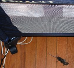
We know this because Gravity left Carolyn a gift—a freshly killed mouse, lying on the floor right next to the bassinet where Carolyn sleeps during the day.  A small mouse carcass lies on the floor next to the bassinet.  From what I understand, this is typically how mother-cats feed their children, and start training them to hunt for their own food.  I wished there were some way to communicate to Gravity that she could have her hunting spoils back, since Carolyn’s fairly well fed even without rodent supplements.  When you think about all this, it’s really rather touching, in a morbid way.  Kat and I both got a pretty good laugh out of it.

Of course, then I had to dispose of the carcass.

So Safari 1.2 is out, and of course was released just two days after I changed designs.  So the fix for the first-letter bug that occurred with “Thoughts From Eric” in the previous design is in place, but you can’t see it working here.  On the other hand, my recently constructed test page demonstrating Safari 1.1’s bugs with :hover and generated content show that 1.2 fixed the problem.  So, that’s cool.

What is even cooler is John Gruber’s in-depth exploration of the OmniWeb beta.  The “tabbed” interface, although not what I personally think of as tabbed, is still a welcome addition; I’ve found that I basically can’t live without tabs.  (I do a sweep of all my regularly read blogs by opening them all in tabs, via a bookmark group.)  What sounds really outstanding, though, is OmniWeb’s workspaces and site-specific preferences.  It’s probably enough for me to tolerate the obsolescence of the rendering engine, which is equivalent to Safari 1.0, but we’ll see.  You should see, too—go read John’s review of the browser, which is comprehensive and detailed.  Truly excellent.

Complete topic shift: back in September, Molly was aghast at the Quizno’s television commercial featuring an adult male human suckling at the teat of a wolf.  Well, their new ad campaign has launched, and if anything it’s more wrong.  Sure, it’s a complete ripoff of the Spongmonkeys, mostly because it turns out the same guy did bothWarning: if you follow the Spongmonkeys link, I am not responsible for any psychological damage you may suffer, but it is very much like the commercial.

Is it just me, or are commercials in general getting a lot weirder of late?


Rebirth

Published 21 years, 11 months past

As any visitor can easily see, the new design is in place and seems to be working smoothly.  In conjunction with the redesign, I’ve reworked the post structures and permanent URIs a bit.  The old URIs won’t change (’cause, you know, they’re cool) but moving forward, I’ve tightened the URIs up a bit.  In this, I followed Tantek’s lead to a large degree.  Generally my posts won’t include a timecode since it’s highly unlikely that I’ll post more than once per day.  (Shoot, any more I’m lucky to post more than once per week.)  If I ever do need a timecode for a post, it will be simple enough to add; my XSLT is already set up to handle it.

You may also have noticed that the posts previous to today have disappeared from meyerweb’s home page, and from the RSS feeds.  This happened because I rewrote some of the XSLT and changed the base XML structure of the archives, and trying to merge the old structure and transformations with the new ones was just too annoying for words.  So I’ve basically hit the reset button on the posts, although the old posts are still available from the archives, just as they always were.  It’s a temporary situation at best, since both the home page and RSS feeds will fill up as I write more entries.

As for the masthead image you can see today, it’s the same one I used for the Eos theme in the previous design, thus giving some minor sense of continuity to the process.  (Said image is the intellectual property of Tantek Çelik and used with his permission, by the way.)  The masthead image won’t remain constant—I’m planning to change it every week or two, with future images coming from photographs I’ve taken.  I already have thirteen ready to go, culled from the two thousand or so images in my iPhoto library.  I imagine that eventually I’ll add the ability to pick a favorite theme, or to pick one at random, or something.  I might even add the ability for you to supply the URI of an image you particularly like, although that seems a little obscure.  You can already do it with a user stylesheet anyway, since the site’s CSS signature (www-meyerweb-com) remains fully in place.  For those who feel the urge, the masthead images are 1280 by 128 pixels in size, and I’ve tried to keep them to 25KB or less.

Gradual changes will probably continue to happen for a while, in fact.  The sidebar content will be developed over time, for example.  I may also slowly enhance the design from its current sparse styling.  I doubt it’ll change a whole lot, to be honest, but I may from time to time test out new techniques or visual effects.

Let’s see, what else… oh yes.  If you’re using Mozilla or Safari (and maybe Opera), notice what happens when you mouse over the title of the post.  That’s generated content, not a background image, which is why Explorer doesn’t get the same effect.  This fails to bother me, since it’s more fun visual frosting than anything critical.  What’s interesting to note is that it doesn’t work in Safari 1.1 unless the border is changed in some way.  If the hover effect is removed, no generated content.  I wonder if that’s been fixed in the current internal builds.

The sidebar is absolutely positioned, and the gray area around the page content is the background of the html element (which means the black borders around the content are set for the body element).  The sidebar assembly was reworked so that it’s easy to add different content for different areas of the site.  For example, the Destinations on Kat’s page are different from those in my area of the site.  I haven’t done a lot with this capability yet, but probably will as time goes on.

That’s about it for now.  I’ll get back to the usual ramblings tomorrow.


Ephemera

Published 22 years past

More and more over the past few days, Carolyn has started smiling—they’re usually quick and fleeting, but more often she’s broken into wide grins that crinkle her eyes and pull her cheeks back.  When I’m holding her and she does it, I can feel a flood of endorphins surging into my body, attempting to get me addicted to her smiles.  There are certainly worse addictions to have.  We don’t have a picture yet, and when we do it will probably show up on her soon-to-be-created page.  Meanwhile, we do have a picture of her getting ready to head outdoors; A picture of Carolyn's eyes peeking out from under a snowsuit hood and over a fluffy blanket, the two of which are surrounding her in an attempt to keep the cold at bay. hopefully that will satisfy people’s picture cravings for a few days.

With the amount of time I’ve been spending in iPhoto these days, downloading new Carolyn pictures from our camera, there’s been a slowly strengthening impulse to publish my favorite pictures as a gallery of sorts.  I was getting pretty close to doing it when, fortunately for us all, Derek Powazek launched ephemera.org.  Five minutes looking through the site woke me up and completely disabused me of any notion that a gallery of the photographs I take would be in any way necessary.  I want to order large prints of several of Derek’s photos and hang them in my office.  The same’s true of many pictures that Heather has taken, and now that the two of them are engaged (for which I humbly offer my very belated congratulations!), I foresee the formation of a photographic powerhouse of previously unimagined proportions.  How do they get their pictures to be so vivid, anyway?  The colors are just so deep and perfect; they make me want to cry when I look at my own pictures.

You’ll still get to experience some small portions of my photography, though.  I’m slowly working through the final steps of a meyerweb redesign, and you can see the wireframe if you’re at all interested.  If you hit major layout errors, you can let me know, but four things to keep in mind:

  • The font size is what it is, or at least will be what it will be.  In other words, I’m going to size fonts as I think appropriate for my site, taking into account everything I know about browsers, users, CSS, and the pros and cons of various font-sizing approaches.  Telling me that I’ve made the wrong choice will not change anything, because there are almost no objectively wrong choices in this area.  There are only tradeoffs.
  • If your browser window is too narrow in the IE/Win series, then the sidebar will likely start overlapping the content.  This is due to the bugs in IE/Win’s handling of width, so try widening or maximizing your browser window to see if any observed overlaps are fixed.  If not (and your resolution is higher than 640×480) then let me know.
  • I know that some of the sidebar content repeats, is badly out of date, or points to non-existent resources.  It’s mostly there as a placeholder so I can resolve layout issues without having to get all the data assembled first.
  • The journal entries aren’t very well laid out yet.  I’ll get there soon.

The new design will let you experience (some would say suffer through) bits of my photography because the masthead will contain slices of pictures I’ve taken.  I apologize in advance.


Fractional Styles

Published 22 years, 1 week past

At the Web Design Meetup last week, Warren expressed annoyance that there are a limited number of fraction character entities.  I pointed out that you can use MathML to represent any fraction you like, but of course it requires a browser that supports MathML.  Those are kind of rare.

So absent MathML, it’s easy to get a nice presentation of, say, one quarter (¼, a.k.a. character entity &#188;), but how do you get a similarly nice rendering of thirteen thirty-seconds?  As it turns out, you can at least get close with a bit of structural massaging.  (That sounds so much better than “structural hacking,” doesn’t it?)  Here’s what I came up with:

span.frac sup, span.frac sub {font-size: 75%;
  vertical-align: baseline;
  position: relative;}
span.frac sup {top: -0.5em; left: 0.15em;}
span.frac sub {left: -0.15em;}

17 <span class="frac"><sup>13</sup><b>/</b><sub>32</sub></span>

That results in the following, which I recreated using inline styles just to make life easier when I archive this post:

17 13/32

Not too bad, at least in Safari, Mozilla, and IE5/Mac, but not great.  In his own efforts along these lines, Warren uncovered the fraction-slash character entity (&#8260;), which could help improve the result.  I also notice that my numbers are bigger than the numbers in the original entity.  So I adjusted my styles, with the following result.

span.frac sup, span.frac sub {font-size: 60%;
  font-weight: bold;
  vertical-align: baseline;
  position: relative;}
span.frac sup {top: -0.5em; left: 0.1em;}

17 1332

So let’s compare the one-quarter entity to the styled version.

¼   14

There are font-family differences, I admit, but they’re pretty close to each other in the browsers I mentioned before.

The problem, really, is the markup involved, but I don’t see how one can really reduce it any further.  MathML’s representation of fractions isn’t noticeably less weighty, really, not even counting possibly required namespacing, which I’m not going to include here:

<mfrac><mi>1</mi><mrow>4</mrow></mfrac>

I suppose that if I wanted to show arbitrary fractions a lot, I could represent them in MathML and then transform the math markup into HTML before delivering it to browsers.  I don’t have a lot of need for such fractions, at least not so far, but it was an interesting exercise.

Now for a little cleanup with regard to previous posts.

  • Chuq pointed out that iLife was never totally free, but that Apple was allowing updates to old versions at no cost.  In my case, iLife appeared to be free because it came installed on my OS X laptop, so I never overtly surrendered money for the product.  I suppose the cost is somehow built into the cost of the operating system.  Regardless, I still think that there was a bit of baiting and switching in letting people download major upgrades at no cost and then closing the gate.  I guess what I want is consistency; I didn’t realize I was benefitting from lax license enforcement, if that’s what it was.  I thought Apple was just making decent tools available for free to Mac users in order to draw more people to the Mac.  That would make some business sense, even if it isn’t what they were doing.  After all, I haven’t heard any plans to charge for upgrades to iTunes, and I don’t expect that I will.  Apple may be many things, but grossly stupid isn’t generally one of them.

    At any rate, I’d still be interested in paying for just an iPhoto upgrade, especially since I looked at some programs readers e-mailed me to suggest, and they were all either not what I wanted, or too darned expensive.  I imagine there are people who would pay to download GarageBand as a standalone, for example.

  • It turns out that there are a number of demonstrations of using behaviors to get PNG transparency in IE/Win.  Here are a few that people sent me:

    I’m sure there must be others.  Google could tell me, but I feel overloaded already.

Carolyn turns six weeks old tomorrow.  I’ll have to find a good picture to post, especially since so many people have asked for them.  She’ll get her own page sooner or later, but I’ve had other and much more pressing things on my plate.  As long as I have it ready by the time she wants to start blogging…


iRant, But Not Too Much

Published 22 years, 2 weeks past

From my point of view, the biggest news from Steve Jobs’ keynote this morning was the announcement of iLife.  More specifically, it was the new version of iPhoto, which I’d really been hoping would be announced.  And so it was.  It’s much faster, more capable, enables photo sharing with Rendezvous—just about everything I’d hoped would happen.  Unfortunately, it also came with something I hadn’t expected: a price tag.

I have no problems with Apple charging money for a piece of software.  What bothers me is the practice of releasing it for free and then, without warning, bundling it into a commercial suite.  If they’d charged for it all along, that would be fine.  If we’d known ahead of time that it would be free until Apple felt it was a product worth selling, at which time it would stop being free, fine.  But that was never made clear, if it was even mentioned at all, and I find that annoying.

Further exacerbating the problem is that of the five iLife components, I have use for only two of them, iPhoto and iTunes, and the former of them is (for the moment) free.  iDvd, iMovie, and Garage Band are completely useless to me as I have neither a video camera nor a garage band.  So if I really want iPhoto 4, I have to pay $49 for it and a bunch of unnecessary code.  That doesn’t make sense to me.  Hopefully, Apple will offer the iLife components separately, so that I could pay $9.99 for iPhoto and ignore the rest.  Or, better still, they’ll release an update to the free iPhoto that fixes the sluggishness but doesn’t include the other cool stuff in the commercial version.

Alternatively, I could hunt for a freeware replacement to iPhoto.  At least one colleague has asked me why I use iPhoto at all, given its slowness and the bloated data files and directory structures it creates.  The thing is, I really like the way iPhoto allows you to modify photos while preserving the originals, and the way album organization is handled.  The transition effect in the slideshows is pretty nifty, too.  In general, the whole iPhoto interface and feature set works pretty well for me—it’s just the lack of speed that’s a problem.  Well, that and the lack of smoothly resized exports, but I’ve complained about that in the past.  If I could find something equivalent to iPhoto, or at least darned close to it, I’d probably switch.  If no such application exists, then I’d love to see some open-source coders get together and create one.  Any takers?


Browse the Archive

Earlier Entries

Later Entries