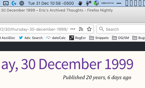
I’m posting this on the last day of 2019. As I write it, the second post I ever made on meyerweb says it was published “20 years, 6 days ago”. It was published on the second-to-last day of 1999, which was 20 years and one day ago.
Up top, the date when I wrote this post. Down below, a five-day error.
What I realized, once the discrepancy was pointed out to me (hat tip: Eric Portis), is the five-day error is there because in the two decades since I posted it, there have been five leap days. When I wrote the code to construct those relative-time strings, I either didn’t think about leap days, or if I did, I decided a day or two here and there wouldn’t matter all that much.
Which is to say, I failed to think about the consequences of my code running over long periods of time. Maybe a day or two of error isn’t all that big a deal, in human-friendly relative-time output. If a post was six years and two days ago but the code says 6 and 1, well, nobody will really care that much even if they notice. But five days is noticeable, and what’s more, it’s a little human-unfriendly. It’s noticeable. It jars.
I think a lot of us tend not to think about running code over long time periods. I don’t even mean long time periods in “Web years”, though I could — the Web is now just about three decades old, depending on when you reckon the start date. (Births of the web are like standards — there are so many to choose from!) I mean human-scale long periods of time, code that is old enough to have been running before your children were born, or maybe even you yourself. Code that might still be running long after you die, or your children do.
The Web often seems ephemeral. Trends shift, technologies advance, frameworks flare and fade. There’s always so much new shiny stuff to try, new things to learn, that it seems like nothing will last. We say “the Internet never forgets” (even though it does so all the time) but it’s lip service at this point. And yet, the first Web pages are still online and accessible.
Which means the code that underpins them, from the HTML to the HTTP, is all still running and viable after 30 years. The foresight that went into those technologies, and the bedrock commitment to consistency over long time frames, is frankly incredible. It’s inspiring. Compatibility both forwards and backwards in time, over decades and perhaps eventually centuries, is a remarkable achievement.
As I write this, I have yet to fix my relative-time code. It’s on my list now, and I plan to get to it soon. I presume the folks creating Intl.RelativeTimeFormat (hat tip: Amelia Bellamy-Royds) put a lot more thought into their code than I did mine, because they know they’re writing for long time frames.
What I need to do is adopt that same mindset. I think we all do. We should think of our code, even our designs, as running for decades, and alter our work to match. I don’t necessarily know what that means, but we’ll never find out unless we try.
We have a lot of new layout tools at our disposal these days — flexbox is finally stable and interoperable, and Grid very much the same, with both technologies having well over 90% support coverage. In that light, we might think there’s no place for old tricks like negative margins, but I recently discovered otherwise.
That’s the opening paragraph to my 24ways piece “Flexible Captioned Slanted Images”, which I now realize I should have called “Accessible Flexible Captioned Slanted Images”. Curse my insufficient title writing! In just about 2,000 words, I explore a blend of new CSS and old layout tricks to take an accessible markup structure and turn it into the titular slanted images, which are fully flexible across all screen sizes while being non-rectangular.
It’s just my second piece for 24ways, coming a dozen years and a day after the first — and is very possibly my last, as Drew closed out this year by putting 24ways on hiatus. Fifteen years is a heck of a run for any project, let alone an annual side project, and I salute everyone involved along the way. Content is hard. Managing content is harder. Here’s to everyone who put in the time and energy to make such a valuable resource. If you’ve never been through the 24 ways archives, now’s your chance. I promise it will be very much worth your time.
A fairly new addition to CSS is the ability to define midpoints between two color stops in a gradient. You can do this for both linear and radial gradients, but I’m going to stick with linear gradients in this piece, since they’re easier to show and visualize, at least for me.
The way they work is that you can define a spot on the gradient where the color that’s a halfway blend between the two color stops is located. Take the mix of #00F (blue) with #FFF (white), for example. The color midway through that blend is #8080FF, a pale-ish blue. By default, that will land halfway between the two color stops. So given linear-gradient(90deg, blue 0px, white 200px), you get #8080FF at 100 pixels. If you use a more generic 90deg, blue, white 100%, then you get #8080FF at the 50% mark.
linear-gradient(90deg, blue, white 100%)
If you set a midpoint, though, the placement of #8080FF is set, and the rest of the gradient is altered to create a smooth progression. linear-gradient(blue 0px, 150px, white 200px) places the midway color #8080FF at 150 pixels. From 0 to 150 pixels is a gradient from #F00 to #8080FF, and from 150 pixels to 200 pixels is a gradient from #8080FF to #FFF. In the following case, #8080FF is placed at the 80% mark; if the gradient is 200 pixels wide, that’s at 160 pixels. For a 40-em gradient, that midpoint color is placed at 32em.
linear-gradient(90deg, blue, 80%, white 100%)
You might think that’s essentially two linear gradients next to each other, and that’s an understandable assumption. For one, that’s what used to be the case. For another, without setting midpoints, you do get linear transitions. Take a look at the following example. If you hover over the second gradient, it’ll switch direction from 270deg to 90deg. Visually, there’s no difference, other than the label change.
linear-gradient(<angle>, blue, white, blue)
That works out because the easing from color stop to color stop is, in this case, linear. That’s the case here because the easing midpoints are halfway between the color stops — if you leave them out, then they default to 50%. In other words, linear-gradient(0deg, blue, white, blue) and linear-gradient(0deg, blue, 50%, white, 50%, blue) have the same effect. This is because the midpoint easing algorithm is based on logarithms, and is designed to yield linear easing for a 50% midpoint.
Still, in the general case, it’s a logarithm algorithm (which I love to say out loud). If the midpoint is anywhere other than exactly halfway between color stops, there will be non-linear easing. More to the point, there will be non-linear, asymmetrical easing. Hover over the second gradient in the following example, where there are midpoints set at 10% and 90%, to switch it from 270deg to 90deg, and you’ll see that it’s only a match when the direction is the same.
This logarithmic easing is used because that’s what Photoshop does. (Not Mosaic, for once!) Adobe proposed adding non-linear midpoint easing to gradients, and they had an equation on hand that gave linear results in the default case. It was also what developers would likely need to match if they got handed a Photoshop file with eased gradients in it. So the Working Group, rather sensibly, went with it.
The downside is that under this easing regime, it’s really hard to create symmetric non-linear line gradients. It might even be mathematically impossible, though I’m no mathematician. Regardless, its very nature means you can’t get perfect symmetry. This stands in contrast to cubic Bézier easing, where it’s easy to make symmetric easings as long as you know which values to swap. And there are already defined keywords that are symmetric to each other, like ease-in and ease-out.
If you’re up for the work it takes, it’s possible to get some close visual matches to cubic Bézier easing using the logarithmic easing we have now. With a massive assist from Tab Atkins, who wrote the JavaScript I put to use, I created a couple of CodePens to demonstrate this. In the first, you can see that linear-gradient(90deg, blue, 66.6%, white) is pretty close to linear-gradient(90deg, blue, ease-in, white). There’s a divergence around the 20-30% area, but it’s fairly minor. Setting an interim color stop would probably bring it more in line. That’s partly how I got a close match to linear-gradient(90deg, blue, ease-out, white), which came out to be linear-gradient(90deg, blue, 23%, #AFAFFF 50%, 68%, white 93%).
Those examples are all one-way, however — not symmetrical. So I set up a second CodePen where I explored recreations of a few symmetrical non-linear gradients. The simplest example matches linear-gradient(90deg, blue, ease-in, white, ease-out, blue) with linear-gradient(90deg, blue, 33.3%, white 50%, 61.5%, #5050FF 75%, 84%, blue 93%), and they only get more complex from there.
I should note that I make no claim I’ve found the best possible matches in my experiments. There are probably more accurate reproductions possible, and there are probably algorithms to work out what they would be. Instead, I did what most authors would do, were they motivated to do this at all: I set some stops and manually tweaked midpoints until I got a close match. My basic goal was to minimize the number of stops and midpoints, because doing so meant less work for me.
So, okay, we can recreate cubic Bézier easing with logarithmic midpoints. Still, wouldn’t it be cool to just allow color easing using cubic Béziers? That’s what Issue #1332 in the CSS Working Group’s Editor Drafts repository requests. From the initial request, the idea has been debated and refined so that most of the participants seem happy with a syntax like linear-gradient(red, ease-in-out, blue).
The thing is, it’s generally not enough to have an accepted syntax — the Working Group, and more specifically browser implementors, want to see use cases. When resources are finite, requests get prioritized. Solving actual problems that authors face always wins over doing an arguably cool thing nobody really needs. Which is this? I don’t know, and neither does the Working Group.
So: if you have use cases where cubic Bézier easing for gradient color stops would make your life easier, whether it’s for drop shadows or image overlays or something I could never think of because I haven’t faced it, please add them to the GitHub issue!
There’s a long history in computer programming of using hexadecimal strings that look like English words to flag errors. These are referred to, amusingly, as “magic debug values”, and yes, Wikipedia has the lowdown. One of the most (in)famous is DEADBEEF, which was used “on IBM systems such as the RS/6000, also used in the classic Mac OS operating systems, OPENSTEP Enterprise, and the Commodore Amiga”, among others. It’s also become the name of a Gnu/Linux music player, and apparently does not have anything to do with Cult of the Dead Cow, at least not so far as I could determine. Maybe someone with more knowledge can drop a comment.
Anyway, one of the things about these magic debug values is they’re usually eight characters long. Not always, as in the case of BADC0FFEE0DDF00D (from RS/6000, again), but usually. Nintendo used 0D15EA5E in the GameCube and Wii to indicate a normal boot (!), iOS logs DEAD10CC when an application terminates in a specific yet incorrect manner, and FEEDFACE shows up in PowerPC Mach-O binaries , as well as the VLC Player application. Just to pick a few examples.
The eight-character nature of these magic codes has meant that, for a long time, you couldn’t also use them on the sly to define colors in CSS, because it was limited to the #RRGGBB format. Well, those days are over. Long over. Eight-digit hex color values are here, have been here a while, and are widely supported. Here are a few swatches laid over a (fully opaque) white-to-black gradient.
#abadcafe
#baaaaaaa
#deadbeef
#deadfeed
#defec8ed
#feedbacc
If you’re using Internet Explorer or Edge, those aren’t going to work for you. At least, not until Edge switches over to Blink; then, they should work just fine.
Thanks to the way they were constructed, by only using the letters A-F, most of the colors above are mostly opaque. The last two digits in #RRGGBBAA set the alpha channel level of the color, just like the last part of the rgba() syntax. Thus, the EF at the end of DEADBEEF sets the alpha value to 0.937; EF is equivalent to decimal 239, and 239 ÷ 255 = 0.937 (approximately). In other words, #DEADBEEF is essentially equivalent to rgba(222,173,190,0.937).
That’s why, of the six swatches, only the sheepish #baaaaaaa and the homophonic #feedbacc let the background gradient show through more than very slightly; their alpha channels are 0.666 and 0.8, respectively. The rest are 0.929 and up.
Being stuck in the A-F range is fairly constraining, but that’s where hexadecimal and English overlap, so that’s how it goes. However, if you’re willing to turn to leetspeak syntax — that is, allowing yourself to use 0 as a substitute for O, 1 for L and occasionally I, 5 for S, 7 for T, and so on — then a lot more possibilities open up. In addition to some of the classic error codes like fee1dead (Linux), I had fun devising other eight-character color words like acc0lade and face1e55, not to mention the very nautical ccccccc5. (Think about it.) Behold!
#0ff1c1a1
#1337c0de
#5e1f1e55
#a114c0de
#acc01ade
#ba5e1e55
#bada55e5
#bebada55
#beefc0de
#b0bafe77
#b0a710ad
#c010ca7e
#c0de1e55
#ccccccc5
#d0d0c0de
#dabbad00
#dead10ad
#deadd0d0
#decea5ed
#face1e55
#fee1dead
There are still more l33t-compliant number substitutions available, like 6 for G, but I felt like I was already pushing it with the examples I have. One could also use calculator spelling, where 9 is a stand-in for g, and even mix together l33t and calculator syntaxes in the same value. So many possibilities!
You may have noticed one value which creates no color: #DABBAD00, which has 00 for its alpha, so it’s fully, completely transparent. It’s fully transparent #DABBAD, I suppose, but there’s really no difference between one transparent color and another, as far as I’m concerned. I mean, if a color falls transparent, then there’s nobody to see it, so is it really a color at all? I say thee nay.
If you’re familiar with the way #RRGGBB hex values can be represented with the shortened #RGB syntax, then it will probably come as little surprise that #RRGGBBAA has a shortened #RGBA syntax, where each digit is duplicated. This opens the world of four-letter words to us! Here are a few:
#10ad
#1337
#b007
#ba5e
#bead
#beef
#c0de
#cafe
#cede
#dada
#dead
#deed
#f00d
#fade
#f8ed
#feed
#0b0e
Here, we finally have a fully opaque word-color: #BEEF expands out to #BBEEEEFF, making the alpha value FF, which decimal-translates to 255, which is fully opaque. So we get a nice opaque powdery blue out of BEEF, which is counterintuitive in the best possible way. Also, every time I see BBEEEEFF, either in print or in my head, I hear Mrs. Which ordering dinner.
And okay, yes, #F8ED isn’t a four-letter word, it’s a four-symbol license-plate word. So it’s even cooler.
If you’re thinking about using these in your CSS, you might be concerned about backwards compatibility, since any browser that doesn’t understand four- or eight-digit hexadecimal color values will just drop them on the floor. That might be okay for text coloring, since the text will likely have some color, even if it’s browser-default, which is usually black. For backgrounds, having colors ignored probably less okay, particularly if you set foreground colors that depend on the background colors.
There are a couple of possibilities here. One is to use the cascade and CSS error handling to your advantage, in the time-honored pattern of doing the simpler version first and the more sophisticated version second.
#example {
   color: #DEA;
   color: #DEAD;
}
That works in simple scenarios, but for more complicated situations — say, ones where you have foreground and background depending on each other — feature queries are an option to consider, if for no other reason than cleaner organization and legibility.
Naturally and as usual, you’ll have to figure out what makes the most sense for your situation. Maybe the right answer will be to avoid using these sorts of values at all, although I don’t know where the fun is in that.
At any rate, I hope you’ve enjoyed this little tour of magic debug values, l33tspeak, and color words. As always, #feedbacc is more than welcome in the comments!
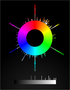
I’ve always meant to get back to it and make it more interactive. So over the past several evenings, I’ve rebuilt it as an SVG-based visualization. The main point of doing this was so that when you hover the mouse pointer over one of the little color boxes, it will fill the center of the color wheel with the hovered color and tell you its name and HSL values. Which it does, now. It even tries to guess whether the text should be white or black, in order to contrast with the underlying color. Current success rate on that is about 90%, I think. Calculating perceived visual brightness turns out to be pretty hard!
Other things I either discovered, or want to do better in the future:
Very nearly half the CSS4 (and also CSS3/SVG) color keywords are in the first 90 degrees of hue. More than half are in the first 120 degrees.
There are a lot of light/medium/dark variant names in the green and blue areas of the color space.
I wish I could make the color swatches bigger, but when I do that the adjacent swatches overlap each other and one of them gets obscured.
Therefore, being able to zoom in on parts of the visualization is high on my priority list. All I need is a bit of event monitoring and some viewbox manipulation. Well, that and a bit more time. Done, at least for mouse scroll wheels.
I’d like to add a feature at some point where you type text, and a list is dynamically filtered to show keywords containing what you typed. And each such keyword has a line connecting it to the actual color swatch in the visualization. I have some ideas for how to make that work.
I’d love to create a visualization that placed the color swatches in a 3D cylindrical space summarizing hue, lightness. and saturation. Not this week, though.
I’m almost certain it needs accessibility work, which is also high on my priority list.
SVG needs conic gradients. Or the ability to wrap a linear gradient along/inside/around a shape like a circle, that would work too. Having to build a conic gradient out of 360 individual <path>s is faintly ridiculous, even if you can automate it with JS.
And also z-index awareness. C’mon, SVG, get it together.
I toyed with the idea of nesting elements with borders and some negative margins to pull one border on top of another, or nesting a border inside an outline and then using negative margins to keep from throwing off the layout. But none of that felt satisfying.
It turns out there are a number of tricks to create the effect of stacking one border atop another by combining a border with some other CSS effects, or even without actually requiring the use of any borders at all. Let’s explore, shall we?
That’s from the introduction to my article “Stacked ‘Borders’”, which marks the first time I’ve ever been published at the venerable upstart CSS-Tricks. (I’m old, so I can call things both venerable and an upstart. You kids today!) In it, I explore ways to simulate the effect of stacking multiple element borders atop on another, including combining box shadows and outlines, borders and backgrounds, and even using border images, which have a much wider support base than you might have realized.
Many thanks to Chris Coyier for accepting the piece, and Geoff Graham for his editorial assistance. I hope you’ll find at least some part of it useful, or better still, interesting. Share and enjoy!
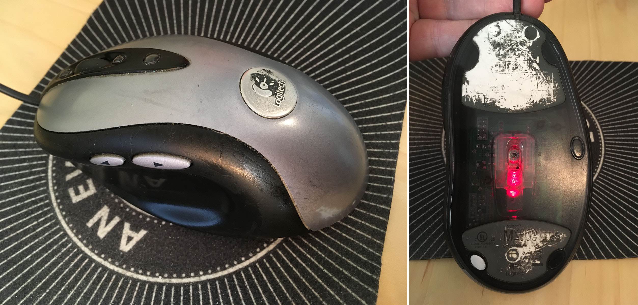
I’ve relied on a mouse for about a decade and a half. I don’t mean “relied on a mouse” in the generic sense, but rather in the sense that I’ve relied on one very specific and venerable mouse: a Logitech MX500.
I’ve had it for so long, I’d forgotten how long I’ve had it. I searched for information about its production dates and wouldn’t you know it, Wikipedia has an article devoted solely to Logitech products throughout history, because of course it does, and it lists (among other things) their dates of release. The MX500 was released in 2002, and superseded by the MX510 in 2004. I then remembered a photo I took of my eldest child when she was an infant, trying to chew on a computer mouse. I dug it out of my iPhoto library and yep, it’s my MX500. The picture is dated June 2004.
So I have photographic evidence that I’ve used this specific mouse for 15 years or more. The logo plate on top of the mouse has been worn half-smooth and half-paintless by the palm of my hand, much like the shiny-smooth areas worn into the subtle matte surface texture where the thumb and pinky finger grip the sides. The model and technical information printed on the underside has similarly worn away. It started out with four little oval glide nubs on the underside that held the bottom away from the desk surface; only one remains. Even though, as an optical mouse, it can be used on any surface, I eventually went back to soft mousepads, so as to limit further undercarriage damage.
The old gray mare — er, mouse — proving that it’s not the years, it’s the mileage
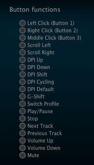
Why have I been so devoted to this mouse? Well, it’s incredibly well engineered, for one — it’s put up with 15 years of daily use. It’s exactly the right shape for my hand, and it has multiple configurable inputs right where I expect them. There are arrow buttons just above my thumb which I use as forward/backward in browsers, buttons above and below the scroll wheel that I map to Page Up/Page Down, an extra button at almost the apex of the mouse’s back mapped to ⌥⇥ (Option-Tab), and the usual right/left mouse click buttons. Plus the scroll wheel is itself a push-down-to-click button.
Most of these features can be found on one mouse or another, but it’s rare to find them all in one mouse — and next to impossible to find them in a shape and size that feels comfortable to me. I’d occasionally looked at the secondary market, but even used, the MX500 can command three figures. I checked Amazon as I wrote this, and an unused MX500 was listing for two hundred fifty dollars. Unused copies of its successor, the MX510, were selling for even more.
Now, if you were into gaming in the first decade of the 2000s, you may have heard of or used the MX510’s successor, the MX518. Released in 2005, it was basically an MX500/MX510, but branded for gaming, with some optical-sensor upgrades for more tracking precision. The MX518 lasted until 2011, when it was superseded by a different model, which itself was superseded, which et cetera, et cereta, et cetera.
Which brings me to the point of all this. A few weeks ago, after several weeks of sporadic glitches, the scroll wheel on my MX500 almost completely stopped responding to being scrolled. Which maybe doesn’t sound like a big deal, but try going without your scroll wheel for a while. I was surprised to discover how much I relied on it. So, glumly, knowing the model was long out of production and incredibly expensive to buy, I went searching for equivalents.
And that’s when I discovered that Logitech had literally announced less than a week earlier that they were releasing an updated MX518, available for pre-order.
Friends, I have never pre-ordered anything so fast.
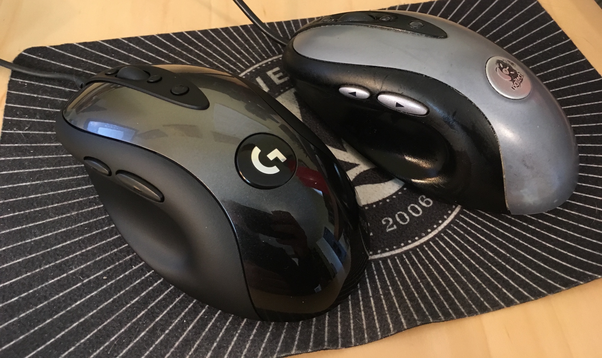
This past Thursday afternoon, it arrived. I got it set up and have been working with it since. And I have some impressions.
Physically, the MX518 Legendary (as Logitech has branded it) is 95% a match for my old MX500. It’s ever so slightly smaller, just enough that I can tell but not quite enough to be annoying, odd as that may seem. Otherwise, everything feels like it should. The buttons are crisp and clicky, and right where I expect them. And the scroll wheel… well, it works.
The coloration is different — the surface and buttons are all black, as opposed to the MX500’s black-and-silver two-tone styling. While I miss the two-tone a bit, there’s an upgrade: the smooth black top surface has subtle little sparkles embedded in the paint. Shiny!
The changing of the guard
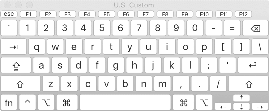
On the other hand, configuring the mouse was a bit of an odyssey. First off, let me make clear that I have a weird setup, even for a grumpy old Mac user. I plug a circa-2000 Macally original iKey 104-key keyboard into my 2013 MacBook Pro. (Yes, you have sensed a trend here: when I find hardware I really like, I hang onto it like a rabid weasel. Ditto software.) The “extra” keys on the Macally like Page Up, Home, and so on don’t get recognized by a lot of current software. Even the Finder can’t read the keyboard’s function keys properly. I’ve restored their functionality with the entirely excellent BetterTouchTool, but it remains that the keyboard is just odd in its ancientness.
Anyway, I first opened System Preferences and then the Logitech Control Center pane. It couldn’t find the MX518 Legendary at all. So next I opened the (separate) Logitech Options pane, which drives the wireless mouse I use when I travel. It too was unable to find the MX518.
Where my paging functions at?
Some Bing-ing led me to a download for Logitech Gaming Software (hereafter LGS), which I installed. That could see the MX518 just fine. Once I stumbled my way into an understanding of LGS’s UI, I set about trying to configure the MX518’s buttons to do what I wanted.
And could not. In the list of predefined mouse actions that could be assigned to the buttons, precisely none of my desires were listed. No ⌘-arrow combos, no page up or down, not even ⌥⇥ to switch apps. I mean, I guess that’s to be expected: it’s sold as a gaming mouse. LGS has plenty of support for on-the-fly-dee-pee-eye switching and copy-paste and all that. Not so much for document editing and code browsing.
There is a way to assign keyboard combos to buttons, but again, the software could understand precisely none of the combos I wanted to record when I typed them on my Macally. So I went to the MacBook Pro’s built-in keyboard, where I was able to register ⌥⇥, ⌘→, and ⌘←. I could not, however much I tried, register Page Up or Page Down. I pressed Fn, which showed “Fn” in the LGS software, and then pressed the down arrow for Page Down, and as long as I held down both keys, it showed “Page Down”. But as soon as I let go of the down arrow, “Fn” was registered again. No Page Down for me.
Now, recall, this was happening on the laptop’s built-in keyboard. I can’t really blame this one on age of the external Macally. I really think this one might fall on LGS itself; while a 2013 MacBook is old, it’s not that old.
I thought I might be stuck, but I intuited a workaround: I opened the Keyboard Viewer app built into the Finder. With that, I could just click the virtual Page Up and Page Down keys, and LGS registered them without a hiccup. While I was in there, I used it to set the scroll wheel’s middle-button click to trigger Mission Control (F3).
The following key-repeat problem has been fixed and was not the fault of the MX518; see my comment for details on how I resolved it. The one letdown I have is that the buttons don’t appear to repeat keystrokes. So if I hold the button I’ve assigned to Page Down for example, I get exactly one page-down, and that’s it until I release and click the button again. On the MX500, holding down the button assigned to Page Down would just constantly page down until I let go. This was sometimes preferable to scrolling with the scroll wheel, especially for long documents I wanted to very quickly scan for a certain figure or other piece of the page. The same was true for all the buttons: hold it down, and the thing it was configured to do happened repeatedly until you let go.
The MX518 Legendary isn’t doing that. I don’t know if this is an inherent limitation of the mouse, its software, my configuration of it, the interaction of software and operating system, or something else entirely. It’s not an issue forty-nine times out of fifty, but that fiftieth time is annoying.
The other annoyance is one of possibly missed potential. The mouse software has, in keeping with its gaming focus, the ability to set up multiple profiles; that way, you can assign unique actions to the buttons on a per-application basis. I set up a couple of profiles to test it out, but LGS is completely opaque about how to make profiles switch automatically when you switch to an app. I’ll look for an answer online, but it’s annoying that the software promises per-app profiles, and then apparently fails to deliver on that promise.
So after all that, am I happy? Yes. It’s essentially my old mouse, except brand new. My heartfelt thanks to Logitech for bringing this workhorse out of retirement. I look forward to a decade or more with it.
Firefox 62 ships today, bringing with it some real CSS goodness. For one: float shapes! Which means now, mainline Firefox users will see the text flow past the blender in “Handiwork” the same way Chrome users have for a long time now.
But an even bigger addition is support for variable fonts. The ability to have one font file that mathematically describes variants on the base face means that all kinds of fine-grained typography is possible with far less bandwidth overhead and a major reduction in page weight.
However: bear in mind that like Safari, but unlike Chrome, Firefox’s variable-font support is dependent on the operating system on which is runs. If you have Windows 10, or Max OS X 10.13, then you have variable font support in Firefox and Safari. Earlier versions of those operating systems don’t support variable fonts, and so Safari and Firefox don’t either. Chrome rolls its own variable-font support, so it can extend support backwards in the OS timeline.
(I don’t know how things stand in the Linux world. Hopefully someone can clear things up in the comments!)
I say this not to chastise Firefox (nor Safari), because I tend to think leaning on the OS for this sort of thing is reasonable. I feel the same way about form elements like <select> dropdowns, to be clear, which I know likely places me in the minority. The point here is to give you a heads-up: if you get reports that a font isn’t doing the variable thing you styled, but it’s working fine for you, keep “check their operating system version” on your list of diagnostic tests.