Posts in the Standards Category

Bar Graphs With Style

Published 18 years, 11 months past

A lot of the time, when I’m sharing a technique or effect I’ve devised, I’ll say something like “I doubt I’m the first to think of this…” or “it may not be original, but it’s original to me…”.  This might strike some as an annoying quirk, some sort of pseudo-modesty that I should either embrace fully or just drop already.

However, I do it because I know it’s true.  Even some of the most radical experiments I’ve published, like those on css/edge, were prefigured or anticipated by others.  I didn’t steal anyone’s ideas, of course.  Every one of those demos was an original creation born of my knowledge and thinking.  They just weren’t necessarily the very first instance of those techniques ever published anywhere.  Other ideas, like Universal Child Replacement, were devised before I hit upon them but were never documented.

I bring this up because the door swings both ways: from time to time, I see someone else publish a technique or idea that I’d had but never documented.  A recent case in point was the appearance of “CSS for Bar Graphs” at Apples to Oranges, which showed a vertical bar graph created out of CSS and a list.  I’d done something very, very similar almost three months before the AtO article’s publication date while creating an invoice-tracking system for myself, and never gotten around to publishing an example.

This almost certainly means that they and I were creating basically the same thing at the same time.  Who got the idea first?  Who cares?  It’s a nifty idea no matter who thought it up.  Plus it’s a near-certainty that somebody else did it long before three months ago, and never got around to documenting it.

I often wonder how many really cool techniques and ideas are lost simply because the inventors don’t have the time or energy to publish them.

Since my approach varies a bit from AtO’s, I’ve put up a css/edge demonstration for people to poke.  The major difference is, I think, my use of empty divs to create the horizontal strata instead of a background image.  This let me have strata that were scaled to the figures being output.  For example, if the strata are increments of $10,000 and the highest bar is $55,055, then I can write out enough “bar divs” to make the top of the chart $60,000.  If the tallest bar only goes to $38,522, then I can stop at $40,000.

This also meant calculating and writing out the bars’ heights as inline styles.  What you see in the markup of my demo is the end result of all that back-end calculation.  There are doubtless better ways to go about creating the strata and setting the bar heights, most obviously using DOM scripting to write in said bar divs instead of dirtying up the XHTML with them.  The same would be true for the inline heights of the bars themselves, which could be dropped in favor of dynamic setting.  Heck, you could even make it so the chart could be zoomed in or out.

Someone else can do the necessary scripting if they like; I’m content to get the example out there, however late to the party I may be.  The more such examples there are, the better.

Followup: Tables to Bar Graphs, in which the same chart is created out of a table instead of nested lists.


Adium: Chatting With Style

Published 18 years, 11 months past

Tim Bray, that dashing man-about-town, recently sang the praises of Adium, a multi-service chat client for OS X.  I’d tried it a while back, and been only marginally impressed.  At the time, its presentational inflexibility was too annoying for me to take it seriously.  Okay, yes: it was a damn sight better than Messenger for OS X, which is the only reason I even kept it on my hard drive.  But I hardly ever log onto MSN any more, as everyone I know is on AIM.  So I’d stuck with iChat AV.

Still, Tim’s word is always gold (or at least high-grade palladium) with me, and he said the magic words (“highly skinnable”), so I downloaded the latest copy and poked around for a bit.

Boy howdy!  Adium has definitely come a long, long way since last I visited.  You can change the appearance of your chat sessions (with “message themes”), the dock icons, the contact list, and much more.  Since none of the default message themes really did it for me, I went looking for others.  There are quite a few available at the Adium Xtras site, but none of them were really what I wanted either.  In iChat, I cranked the graphic frippery down to zero so that the chat sessions were as compact as possible, but I still had the text look nice.  If I could recreate that in Adium, it would make the migration much, much simpler.

So I dug into the package contents of a promising message theme… and found out that themes are based on nothing more than XHTML and CSS.

Seriously.  The entirety of an Adium chat window is an XHTML document that’s being dynamically updated via DOM scripting—all of it pumped through WebKit, of course.  In creating a message theme, you define what markup will be used, and write CSS to style it.  You can even define variants on your theme by writing additional style sheets.
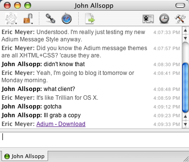
So with some quick hacking, I not only radically improved the markup generated during a chat (the markup I saw in the packages I downloaded was, um, sub-optimal), but I basically replicated my old iChat theme with some simple CSS.  And then I created some variants that slightly modify it in various ways, mostly to prove that I could.

I’m now wondering if I could write and attach JavaScript that would make chat sessions even more interactive, more robust.  (Update: Phil says yes.)  Click on a line to copy the whole line to the clipboard, say, or dynamically change the in-session presentation by hitting a button.  Adium may block that kind of thing, but if not, then it’s a chat client extensible beyond anything I’ve so far imagined.

And given how much I love to tinker with my software, that’s like waving a bulging suitcase of money in front of a senator.

Granted, there are some things I’d like to change.  For example, the markup you define in a theme is not used in saving the chat log.  In a log, you just get some basic markup with a case of classitis and very, very poor semantics.  It would be a lot cooler if you could define the log markup (or the log just used the markup you generate during a chat session) and the CSS to present it.

A chat log is also something that, it seems to me, cries out for a microformat.  The markup I’m using for my theme is also a first effort in that direction, recycling some other microformats’ concepts (I stole a bit from hCalendar and am planning to graft in some hCard as well) and setting up some basics.  If I can take this far enough, I might consider pushing to upgrade the markup Adium generates in its logs.  They’re dropping a lot of information on the floor when they write out the logs, and I think that’s a shame.

But then, I can make the effort to fix that and actually have a chance of it paying dividends.  The joys of open source, you know?

I’ll still use iChat AV for videoconferences, which are an essential tool for family cohesiveness when I’m on the road, as well as to keep close to my father down in Florida.  For text, though—which accounts for at least 90% of my instant messaging activity—Adium is my new chat buddy.


Post-Event

Published 18 years, 11 months past

Well, An Event Apart Philadelphia is in the history books.  (Or, as they might say on the original Iron Chef, “Battle Standards is OVAH!!!”.)  If you want to relive the event, vicariously or otherwise, there’s a Flickr group for the event, as well as all the public photos tagged “aneventapart”.  As I write this, those two sets of pictures don’t form a perfect union, so if you’re really curious, it’s worth checking out both.

I haven’t seen any feedback yet, so I only know what I thought of the event.  At the risk of sounding egotistical, not to mention ungrammatical, I thought it went great.  There were things that could have gone better—my presentation on em-based layouts particularly needs some buffing and polishing—but given that it was the first in the series, and as such largely uncharted waters, I’m not sure I could be happier about how things went.  Even the problems that arose, like the morning crushing of the wifi, were corrected quickly.  The audience seemed really involved and their questions were sharp.  We got a few laughs.  Life was good.

Jeffrey and I would like to sincerely thank each and every attendee for making the event so great, and to thank our sponsors (AIGA, Media Temple, New Riders, and Pixelworthy) for helping make the event possible at all.


AIGA Interview Redux

Published 18 years, 11 months past

Speaking of AEA, the good people at AIGA released another podcast interview with Jeffrey Zeldman.  Rumor has it they’ll have one coming soon starring Our Man Stan, and there might even be another from yours truly.  Grab hold of their podcast feed if you’re interested in any of that, or in hearing from other designers in the future.

(One week to go.  Woo hoo!)

Update: Jason’s interview is now available.


Slashdot’s Validity

Published 19 years, 1 month past

With the Redesign Watch back up and running, the most recent entry is Slashdot, the venerable geek portal so infamous for its ability to kill web servers with a single link that the site’s name is a verb meaning “to bring a server grinding to a halt”.

I was asked in a comment:

What’s your feeling on slashdot being HTML 4.01 (and slightly failing validation) VS XHTML 1.0?

My feeling is good.  Why?  Let’s take the second part first.

When it comes to HTML versus XHTML, I just do not care.  Sure, sure, people will tell you that XHTML is XML so it’s more transformable or something.  That’s a very good argument when the XHTML is well-formed and valid.  It’s also a very good argument for using HTML when it’s well-formed and valid.  Conversely, neither HTML nor XHTML is easily transformed when ill-formed and invalid.  This is an experiential point of view, too: I’ve written XSLT (which is itself so tortuous and ugly that it almost by definition cannot be called well-formed) to transform both HTML and XHTML, and the effort is pretty much the same each way—assuming well-formed, valid markup.

So as far as I’m concerned, there’s really no major practical difference between HTML and XHTML.  There are plenty of minor practical differences, like having to throw trailing slashes on all your empty elements in XHTML and needing some namespace information.  Some people will tell you the whole MIME-type thing is a major practical concern, but I’m just not that much of a purist.  Take that for whatever it’s worth.

I mean, imagine a world where Slashdot had used XHTML instead of HTML, and was failing validation.  How would that be any better or worse than things are now?

Okay, so that’s the second part.  The first part, the failure to validate, is not something I can get too terribly upset about.  Slashdot, as a site that accepts ads, is going to get horrible markup shoved into its pages.  That’s just the way it is.  If you want major sites to be perfectly valid, then in all honesty advertisers are the place to start.  So they’re already operating with a major handicap there.

Even if we were to ride our high horses along a very hard line and say that ads are just no excuse, I’d be hard-pressed to fault the job they’ve done.  For example, I ran a check on the Slashdot home page.  Out of 1,262 lines of code, there were exactly four validation errors, and that’s using HTML 4.01 Strict—you’ll note they bypassed Transitional, which only increases my respect.  Three of the errors revolved around an image in a noscript element, and the last was due to the presence of a language attribute on a script element—something they can fix in fifteen seconds, once it gets to the top of the to-do list.

You know what?  I’d be ecstatic to have that low a failure rate when launching the markover of an incredibly complex site like Slashdot.  Think about all the content they have to manage, stitch together, and offer up.  Four errors out of all that dynamically assembled markup?  I say somebody should organize them a parade for doing such a good job, and showing that any site can make use of and benefit from standards.

I’m also really looking forward to the restyling of Slashdot through user-created style sheets, and the Greasemonkey enhancements built on top of this new structure.  If there’s a site whose readers are inherently primed to script the holy bejeezus out of it, that would be the one.

Would I be happier if they’d managed to achieve total validation?  Of course.  In the meantime, though, I’m going to be very nearly as happy for what they’ve accomplished, and also for the simple fact of it being another major site that’s taken a big step forward.  Progress is always a cause for celebration in my world.


Speaking Out

Published 19 years, 2 months past

Just a reminder to all of you in the Chicago, IL area that I’ll be talking about XHTML, CSS, and that sort of thing on Thursday, 4 3 November 2005.  I’ll be talking all day long, or close to it, as I delve into details, rebuild a design or two, and answer questions from the attendees.  If you’re interested, check out the Carson Workshops site for more information on this and other workshops.

If you’re in Philadelphia, of course, you’ll want to check out An Event Apart, where Mr. Zeldman and I will trade off talking all day.  Seats have been selling pretty briskly, so if you’re interested, you might want to register soon.

I’d encourage all you Strayans to register for WE05, except it’s completely sold out.  The same is very nearly true of UI10, from what I’m told.  Things are definitely picking up on the events circuit!

Which is a good thing for me… after all, how else am I going to reach Gold Elite status?  (I wonder if I get an energy sword for that.)


Skewered By a Transcript

Published 19 years, 2 months past

A little while back, David Poteet of New City Media conducted an interview with me, and the much-edited version is not only a part of today’s UIEtips newsletter, but also published as a full article on the UIE web site.  In it, I lay out my case for why standards-oriented design is a good thing from a non-technical purity-neutral point of view, and use eBay as my Exhibit A for a site that could reap big returns from moving toward using standards.  Ethan has already called the article a “great read”, further cementing his reputation as the whacked-out loon of the standards world.

I have to be honest: reading the full transcription of the interview was a deeply shocking and humbling experience.  In the past, when reading transcripts of news interviews and commentary shows, I’ve winced and clucked over the mangled syntax of the people being transcribed.  False starts, weird shifts, strange commas, unfinished sentences, mind-number repetition, long rambling assaults on syntax and coherence—what was wrong with these people?  Are these the best minds our society can produce?  Can none of them do so much as utter a sentence with a clear point and progression?  How many “you know”s does one person really need?

Then I read the transcription of me, and was utterly horrified.  I sounded exactly like everyone else!  Worse, at times.  Here’s but one example, from a portion of the interview that didn’t get used in the edited version.  (Note that this was conducted before I moved to my current host; so far as I know I’m no longer in danger of hitting any caps.)

Yeah, you’re talking about actually, you know, reducing the bandwidth bill and saving money, in that sense.  I mean, for most people, for my site, MeyerWeb, I’m actually getting close to, I’m having some bandwidth, I’m getting close to hitting a bandwidth ceiling with my current provider —

And then, not five seconds later:

It’s less of an issue because I’m paying more, 30, 40, 50, whatever number of dollars per month and as long as I don’t put up The Matrix Reloaded for people to download and, you know, they use several terabytes worth of data in a month, you know, that’s what I pay.  I don’t have to pay extra bandwidth.  That gets rolled into the cost.

The horror.  The horror!

Thankfully, the published version of the interview makes me sound a good deal less like an epileptic chimp—so you might want to check it out, if you have a few spare minutes.

You know, a lot of people have told me I write like I speak.  Apparently, they were all being very, very kind to me.


An Event Apart Debuts

Published 19 years, 2 months past

I couldn’t be more proud to announce the launch of An Event Apart.  What is An Event Apart (AEA)?  It’s an all-day seminar, one that moves from city to city, featuring me and Jeffrey Zeldman.  The inaugural event will be held at the Franklin Institute in central Philadelphia, Pennsylvania on Monday, 5 December 2005.  We’ll be taking it to other cities in 2006; keep an eye on the AEA RSS feed for announcements.

Honestly, AEA can be summarized in one sentence: it’s the kind of seminar Jeffrey and I would want to attend.  Hopefully that right there is enough to get you interested, but wait until you hear the details.

  • No “intro to X” sessions.  We’re packing the day with as much detail, technical insight, and expert information as possible.  We won’t be taking any time to explain the basics of CSS or XHTML or anything else.  From the first minute to the last, we’re putting the pedal to the metal.
  • An intimate look at how Jeffrey and I do what we do.  Most of our material will be drawn from recent projects we’ve done together, such as the web sites for A List Apart, An Event Apart, UNIFEM, and others.  All the nifty tricks, browser hacks, practical compromises and development surprises—they’ll be laid bare for attendees to examine, question, chuckle over, and take back to their own work.
  • Going from  comp to complete.  How does one get from a visual comp file to a working XHTML+CSS page?  You’ll find out how we do it as we step through that very process.
  • Constant interaction.  This isn’t a rigidly formalized “we talk for 80 minutes and you ask questions for 10 minutes” kind of setup.  Jeffrey and I see it as more of a conversation between us and the attendees.  We’ll probably do most of the talking, and we’ll certainly have all kinds of stuff to talk about, but we’re really looking forward to questions that will take things in a new direction.  We want the attendees to ask tough questions about what we’re showing, and ask us about the tough problems they’ve faced.
  • Attendee markover.  For one of the day’s sessions, we’ll take a site submitted by an attendee and give it a markover, turning it into semantic XHTML and CSS without disrupting the visual appearance.  This will make for a great look at practical standards-oriented design for a real-world site.
  • Interesting venues.  Jeffrey and I been to a zillion conferences in hotel ballrooms and conference centers, and frankly we’re bored to death with that whole repetitive scene.  So we’re going to aim for places that are a little off the beaten path; venues that have some interest.  As an example, just look at the venue for AEA Philadelphia, the Franklin Institute; it’s one of the most prestigious science museums in the country.

The content of AEA won’t be just markup and CSS, either.  We’re going to talk about how standards-based design speeds up the development process, how we work in a distributed team, and how we approach web design in general.  We’ll share what’s worked for us and what hasn’t, and find out what experiences the attendees have had.

So if you’re in the Philadelphia area, or can reach it fairly easily, I strongly encourage you to take a look at the AEA site—and then ask yourself whether this is an event you can afford to miss.


Browse the Archive

Earlier Entries

Later Entries