Posts in the Standards Category

First Week at Igalia

Published 3 years, 10 months past

The first week on the job at Igalia was… it was good, y’all.  Upon formally joining the Support Team, got myself oriented, built a series of tests-slash-demos that will be making their way into some forthcoming posts and videos, and forked a copy of the Mozilla Developer Network (MDN) so I can start making edits and pushing them to the public site.  In fact, the first of those edits landed Sunday night!  And there was the usual setting up accounts and figuring out internal processes and all that stuff.

A series of tests of the CSS logical property ';block-border'.
Illustrating the uses of border-block.

To be perfectly honest, a lot of my first-week momentum was provided by the rest of the Support Team, and setting expectations during the interview process.  You see, at one point in the past I had a position like this, and I had problems meeting expectations.  This was partly due to my inexperience working in that sort of setting, but also partly due to a lack of clear communication about expectations.  Which I know because I thought I was doing well in meeting them, and then was told otherwise in evaluations.

So when I was first talking with the folks at Igalia, I shared that experience.  Even though I knew Igalia has a different approach to management and evaluation, I told them repeatedly, “If I take this job, I want you to point me in a direction.”  They’ve done exactly that, and it’s been great.  Special thanks to Brian Kardell in this regard.

I’m already looking forward to what we’re going to do with the demos I built and am still refining, and to making more MDN edits, including some upgrades to code examples.  And I’ll have more to say about MDN editing soon.  Stay tuned!


First Day at Igalia

Published 3 years, 10 months past

Today is my first day as a full-time employee at Igalia, where I’ll be doing a whole lot of things I love to do: document and explain web standards at MDN and other places, participate in standards work at the W3C, take on some webmaster duties, and play a part in planning Igalia’s strategy with respect to advancing the web.  And likely other things!

I’ll be honest, this is a pretty big change for me.  I haven’t worked for anyone other than myself since 2003.  But the last time I did work for someone else, it was for Netscape (slash AOL slash Time Warner) as a Standards Evangelist, a role I very much enjoyed.  In many ways, I’m taking that role back up at Igalia, in a company whose values and structure are much more in line with my own.  I’m really looking forward to finding out what we can do together.

If the name Igalia doesn’t ring any bells, don’t worry: nobody outside the field has heard of them, and most people inside the field haven’t either.  So, remember when CSS Grid came to browsers back in 2017?  Igalia did the implementation that landed in Safari and Chromium.  They’ve done a lot of other things besides that — some of which I’ll be helping to spread the word about — but it’s the thing that web folks will be most likely to recognize.

This being my first day and all, I’m still deep in the setting up of logins and filling out of forms and general orienting of oneself to a new team and set of opportunities to make a positive difference, so there isn’t much more to say besides I’m stoked and planning to say more a little further down the road.  For now, onward!


CSS Naked Day 2020

Published 4 years, 8 months past

If you’re here on meyerweb on April 9th, 2020, then you’re seeing the site without the CSS I wrote for its design and layout.  Why?  It’s CSS Naked Day!  To quote that site:

The idea behind this event is to promote Web Standards. Plain and simple. This includes proper use of HTML, semantic markup, a good hierarchy structure, and of course, a good old play on words. It’s time to show off your <body> for what it really is.

So last night, I removed the links to the main stylesheets for the site.  There are, I should note, scattered pages where local CSS is still in play. I could have tracked them all down and removed their CSS as well, and I considered doing so, but in the end I decided against it.

There’s a history to this day.  In the late Aughts, it was an annual thing, not unlike Blue Beanie Day, to draw attention to web standards and reinforce among the community that good, solid, robust development practices are a good thing.  Because after all, if your site isn’t usable without the CSS, then it almost certainly has structure and accessibility problems you probably haven’t been thinking about.

In all honesty, I had forgotten about it until just a couple of days prior, I suddenly thought, “Wait, early April, isn’t that when CSS Naked Day was observed?”  I went looking, and discovered that yes, it was.  I had remembered April 7th, but apparently April 9th was the actual date.  Or became it over time.  Either way, here we are, feeling fancy-free!

What’s been interesting has been what CSS Naked Day has revealed about browsers as well as about our HTML.  To pick one example, suppose you have a very large SVG logo, which you size to where you want it with CSS.  This is ordinarily a best practice: the SVG is the same file size whether it renders huge or tiny, so there’s no downside to having an SVG that renders 1200 x 1000 when you view it directly — thus allowing you to see all the little details — but is sized to 120 x 100 via CSS for layout purposes.

But take away the CSS, and the SVG will become 1200 x 1000 again.  That might tell you to resize it for production, sure, and you probably should.  But it also points out that browsers will not constrain that image, not even to the viewport.  If your window is only 900 pixels wide, the SVG could well spill outside, forcing a horizontal scrollbar.  Is that good?  Maybe!  Maybe not!  We might wish browsers would bake something like img {max-width: 100%; height: auto;} into their user-agent stylesheet(s), but maybe that would have unforeseen downsides.  The point is, this is a thing about browsers that CSS Naked Day reveals, and it’s worth knowing.

Similarly, this reveals that browsers don’t have a way to restrict the width of lines of text.  Thus, if the browser window is wide, the lines get very long — long enough to make reading more difficult.  This isn’t a problem on handheld devices like smartphones, but on desktop (use of which has risen significantly in areas locked down to limit the spread of SARS-CoV-2) it can be a problem.  Again, if browsers had something like body {max-width: 70em;} or max-width: 100ch or suchlike, this wouldn’t be a problem.  Should they?  Maybe!  It’s worth thinking about for your own work, if nothing else.

(For much more thinking about these kinds of browser behaviors and how to address them, you should absolutely check out the CSS Remedy project.  “CSS Remedy sets CSS properties or values to what they would be if the CSSWG were creating the CSS today, from scratch, and didn’t have to worry about backwards compatibility.”)

If I’d remembered sooner, I might have contacted the maintainers of the CSS Naked Day site and posted about it ahead of time and thought about stuff like a hashtag to spread the word.  Maybe that will happen next year.  Until then, enjoy all the nudity!


CSS Specification Timelines, Updated and Modernized

Published 4 years, 9 months past

Back in 2011, I decided to make a timeline out of CSS modules’ version histories, where “version history” means “a list of all the various drafts that were published”.  I updated the data every now and again, and then kind of let it go dormant for a few years.

Until this past weekend, when for no clear reason I decided what the hell, it’s time for a refresh.  So I trawled through all the specs’ version histories to get the stuff I didn’t have, and gave the presentation a bit of an upgrade.  The overall look and feel is pretty consistent, except now, thanks to repeating linear gradients, I have vertical stripes to show each year in the now 21-year-long timeline.  I put labels up at the top of the stripes, and figured they should remain visible no matter where you scroll, so I set them to position: sticky.  Then I realized most people would have to scroll horizontally, so I made the specification names sticky as well.

So now, no matter where you scroll on the page, you’ll see the specifications along the left and the years along the top.  The layout isn’t mobile-hostile, exactly, but it isn’t RWD-ized either.  I’m not really sure how I could make this fully responsive, except maybe to just drop the timeline layout altogether and revert to the lists that underlie the layout.

While I was at it, I converted a fair bit of the CSS to use var() and calc() so that I could set a column width in one place, and sprinkled in just a tiny bit more PHP to output offset values in a couple of places.  Nothing major, just quality-of-life upgrades for the maintainer, which is to say, me.

I bring all this up for two reasons.  One, I like the presentation upgrades, and wanted to share.  Two, by sheer coincidence, today the CSS Working Group published first versions of four CSS modules:

So I’ve added them to the timeline, along with CSS Color Module Level 4, which I’d overlooked in my weekend update.  These are the first module versions of 2020, so enjoy!

I do find it a little weird that Color Level 5 is out when Color Level 4 has never left Working Draft status, but maybe Level 4 is about to graduate, and this just happened to come out first.  We’ll see!


Color Easing Isn’t Always Easy

Published 5 years, 8 months past

A fairly new addition to CSS is the ability to define midpoints between two color stops in a gradient.  You can do this for both linear and radial gradients, but I’m going to stick with linear gradients in this piece, since they’re easier to show and visualize, at least for me.

The way they work is that you can define a spot on the gradient where the color that’s a halfway blend between the two color stops is located.  Take the mix of #00F (blue) with #FFF (white), for example.  The color midway through that blend is #8080FF, a pale-ish blue.  By default, that will land halfway between the two color stops.  So given linear-gradient(90deg, blue 0px, white 200px), you get #8080FF at 100 pixels.  If you use a more generic 90deg, blue, white 100%, then you get #8080FF at the 50% mark.

linear-gradient(90deg, blue, white 100%)

If you set a midpoint, though, the placement of #8080FF is set, and the rest of the gradient is altered to create a smooth progression.  linear-gradient(blue 0px, 150px, white 200px) places the midway color #8080FF at 150 pixels.  From 0 to 150 pixels is a gradient from #F00 to #8080FF, and from 150 pixels to 200 pixels is a gradient from #8080FF to #FFF.  In the following case, #8080FF is placed at the 80% mark; if the gradient is 200 pixels wide, that’s at 160 pixels.  For a 40-em gradient, that midpoint color is placed at 32em.

linear-gradient(90deg, blue, 80%, white 100%)

You might think that’s essentially two linear gradients next to each other, and that’s an understandable assumption.  For one, that’s what used to be the case.  For another, without setting midpoints, you do get linear transitions.  Take a look at the following example.  If you hover over the second gradient, it’ll switch direction from 270deg to 90deg.  Visually, there’s no difference, other than the label change.

linear-gradient(<angle>, blue, white, blue)

That works out because the easing from color stop to color stop is, in this case, linear.  That’s the case here because the easing midpoints are halfway between the color stops — if you leave them out, then they default to 50%.  In other words, linear-gradient(0deg, blue, white, blue) and linear-gradient(0deg, blue, 50%, white, 50%, blue) have the same effect.  This is because the midpoint easing algorithm is based on logarithms, and is designed to yield linear easing for a 50% midpoint.

Still, in the general case, it’s a logarithm algorithm (which I love to say out loud).  If the midpoint is anywhere other than exactly halfway between color stops, there will be non-linear easing.  More to the point, there will be non-linear, asymmetrical easing.  Hover over the second gradient in the following example, where there are midpoints set at 10% and 90%, to switch it from  270deg to 90deg, and you’ll see that it’s only a match when the direction is the same.

linear-gradient(<angle>, blue, 10%, white, 90%, blue)

This logarithmic easing is used because that’s what Photoshop does.  (Not Mosaic, for once!)  Adobe proposed adding non-linear midpoint easing to gradients, and they had an equation on hand that gave linear results in the default case.  It was also what developers would likely need to match if they got handed a Photoshop file with eased gradients in it.  So the Working Group, rather sensibly, went with it.

The downside is that under this easing regime, it’s really hard to create symmetric non-linear line gradients.  It might even be mathematically impossible, though I’m no mathematician.  Regardless, its very nature means you can’t get perfect symmetry.  This stands in contrast to cubic Bézier easing, where it’s easy to make symmetric easings as long as you know which values to swap.  And there are already defined keywords that are symmetric to each other, like ease-in and ease-out.

If you’re up for the work it takes, it’s possible to get some close visual matches to cubic Bézier easing using the logarithmic easing we have now.  With a massive assist from Tab Atkins, who wrote the JavaScript I put to use, I created a couple of CodePens to demonstrate this.  In the first, you can see that linear-gradient(90deg, blue, 66.6%, white) is pretty close to linear-gradient(90deg, blue, ease-in, white).  There’s a divergence around the 20-30% area, but it’s fairly minor.  Setting an interim color stop would probably bring it more in line.  That’s partly how I got a close match to linear-gradient(90deg, blue, ease-out, white), which came out to be linear-gradient(90deg, blue, 23%, #AFAFFF 50%, 68%, white 93%).

Those examples are all one-way, however — not symmetrical.  So I set up a second CodePen where I explored recreations of a few symmetrical non-linear gradients.  The simplest example matches linear-gradient(90deg, blue, ease-in, white, ease-out, blue) with linear-gradient(90deg, blue, 33.3%, white 50%, 61.5%, #5050FF 75%, 84%, blue 93%), and they only get more complex from there.

I should note that I make no claim I’ve found the best possible matches in my experiments.  There are probably more accurate reproductions possible, and there are probably algorithms to work out what they would be.  Instead,  I did what most authors would do, were they motivated to do this at all: I set some stops and manually tweaked midpoints until I got a close match.  My basic goal was to minimize the number of stops and midpoints, because doing so meant less work for me.

So, okay, we can recreate cubic Bézier easing with logarithmic midpoints.  Still, wouldn’t it be cool to just allow color easing using cubic Béziers?  That’s what Issue #1332 in the CSS Working Group’s Editor Drafts repository requests.  From the initial request, the idea has been debated and refined so that most of the participants seem happy with a syntax like linear-gradient(red, ease-in-out, blue).

The thing is, it’s generally not enough to have an accepted syntax — the Working Group, and more specifically browser implementors, want to see use cases.  When resources are finite, requests get prioritized.  Solving actual problems that authors face always wins over doing an arguably cool thing nobody really needs.  Which is this?  I don’t know, and neither does the Working Group.

So: if you have use cases where cubic Bézier easing for gradient color stops would make your life easier, whether it’s for drop shadows or image overlays or something I could never think of because I haven’t faced it, please add them to the GitHub issue!


CSS4 Color Keyword Distribution Visualization

Published 5 years, 8 months past

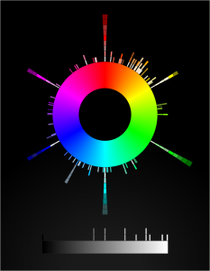
Long, long ago — not quite seven years ago, in fact — I built a canvas-based visualization of the distribution of CSS3/SVG color keywords and released it.  And there it’s sat, static and inert (despite being drawn with a whooooole lotta JS) ever since.

I’ve always meant to get back to it and make it more interactive.  So over the past several evenings, I’ve rebuilt it as an SVG-based visualization.  The main point of doing this was so that when you hover the mouse pointer over one of the little color boxes, it will fill the center of the color wheel with the hovered color and tell you its name and HSL values.  Which it does, now.  It even tries to guess whether the text should be white or black, in order to contrast with the underlying color.  Current success rate on that is about 90%, I think.  Calculating perceived visual brightness turns out to be pretty hard!

Other things I either discovered, or want to do better in the future:

  • Very nearly half the CSS4 (and also CSS3/SVG) color keywords are in the first 90 degrees of hue.  More than half are in the first 120 degrees.
  • There are a lot of light/medium/dark variant names in the green and blue areas of the color space.
  • I wish I could make the color swatches bigger, but when I do that the adjacent swatches overlap each other and one of them gets obscured.
  • Therefore, being able to zoom in on parts of the visualization is high on my priority list.  All I need is a bit of event monitoring and some viewbox manipulation.  Well, that and a bit more time. Done, at least for mouse scroll wheels.
  • I’d like to add a feature at some point where you type text, and a list is dynamically filtered to show keywords containing what you typed.  And each such keyword has a line connecting it to the actual color swatch in the visualization.  I have some ideas for how to make that work.
  • I’d love to create a visualization that placed the color swatches in a 3D cylindrical space summarizing hue, lightness. and saturation.  Not this week, though.
  • I’m almost certain it needs accessibility work, which is also high on my priority list.
  • SVG needs conic gradients.  Or the ability to wrap a linear gradient along/inside/around a shape like a circle, that would work too.  Having to build a conic gradient out of 360 individual <path>s is faintly ridiculous, even if you can automate it with JS.
  • And also z-index awareness.  C’mon, SVG, get it together.

Anyway, here it is: CSS4 Color Keyword Distribution.  I hope you  like it!


How Do I Increase Accessibility?

Published 6 years, 11 months past

I have an accessibility question.  Okay, it’s a set of questions, but they’re really all facets of the same question:

How do I make my site’s structure the most accessible to the most people?

Which sounds a bit broad.  Let me narrow it down.  Here’s the basic layout order of most pages on meyerweb:

  1. Masthead
  2. Navigation (in a <nav> element)
  3. Main page content (in a <main> element), occasionally with a sidebar
  4. Footer (in a <footer> element)

But this is, at the moment, the source order of those pieces:

  1. Masthead
  2. Main page content (in a <main> element), occasionally with a sidebar
  3. Navigation (in a <nav> element)
  4. Footer (in a <footer> element)

The difference is the navigation.  I put it later in the source order because I want those using speaking browsers to be able to get the content quickly, without having to tab through the navigation on every page.

But is that actually a concern, given my use of a <main> element for the main content of the page?  And the <nav> and <footer> elements, do those also help with jumping around the page?  If not, what’s the best-practice structural order for those pieces?

If so, does that mean it’s okay to put the navigation back up there in the source order, and stop doing wacky things with the order element to place it visually where it isn’t, structurally?

I have the same questions for those who use keyboard tabbing of the visual layout, not speaking browsers.  What’s the best way to help them?  If it’s tabindex, how should I order the tabbing index?

And in either case, do I need skip links to get people around quickly?  Do I want skip links?  Do my assistive-technology users want skip links?

Maybe the real question is “Given this layout, and my desire to make getting to main content and other pieces of the page as easy as possible for those who rely on assistive technology, how should I structure and annotate the content to raise the fewest barriers for the fewest people?”

Unless, of course, the real question is one I don’t know enough to ask.

Can you help me out, accessibility hivemind?  I’d really appreciate some expert insight.  All my instincts are more than a decade out of date.


CSS Grid!

Published 8 years, 2 weeks past

The Grid code is coming!  The Grid code is coming!  It’s really, finally coming to a browser near you!  Woohooooo!

Whoa, there.  What’s all the hubbub, bub?

CSS Grid is going to become supported-by-default in Chrome and Firefox in March of 2017.  Specifically, Mozilla will ship it in Firefox 52, scheduled for March 7th.  Due to the timing of their making Grid enabled-by-default in Chrome Canary, it appears Google will ship it in Chrome 57, scheduled for March 14th.  In each case, once the support is enabled by default in the public-release channels — that is to say, the “evergreen” browser releases that the general public uses — every bit of Grid support now in place in the developer editions of the browsers will become exposed in the public releases.  Anything Grid will Just Start Working™®©.

Are those dates an ironclad guarantee?

Heck no.  Surprise problems could cause a pushback to a later release.  The release schedule could shift.  The sun could explode.  But we know the browsers already have running code for Grid, and when they mark something as ready for public release, it usually gets released to the public on schedule.

So Grid support in March, huh?

Yep!

How long until I can actually use Grid, then?  Two or three years?

March 2017.  So about four months from now.

But it won’t be universally supported then!

Rounded corners aren’t universally supported even now, but I bet you’ve used them.

Now you’re just being disingenuous.

Look, I get it.  Base layout’s a little different than shaving pixels off corners, it’s true.  If you have a huge IE9 user base, converting everything to Grid, and only Grid, might be a bit much.  But I’m guessing that you do have a layout that functions in older browsers, yes?

Of course.

Then my original answer stands: March 2017.  Because any browsers that understand Grid will also understand @supports(), and you can use that to have a Grid layout for Grid-enabled browsers while still feeding a float-and-inline-block layout to browsers that don’t understand Grid.  Jen Simmons wrote a comprehensive article about @supports(), and I wrote a short article demonstrating its use to add layout enhancements.  The same principles will apply with Grid: you can set up downlevel rules, and then encapsulate the hot new rules in @supports().  You can retroactively enhance the layouts you already have, or take that approach with any new designs.

Writing two different layouts for the same page doesn’t sound like a good use of my time.

I get that too.  Look at it this way: at some point, you’re going to have to learn Grid.  Why not learn it on the job, experimenting with layouts you already understand and know how you want to have behave, instead of having to set aside extra time to learn it in a vacuum using example files that have nothing to do with your work?  You’ll be able to take it at your own pace, build up a new set of instincts, and future-proof your work.

Can’t I just wait until someone creates a framework for me?

You could, except here’s the thing: as Jen Simmons has observed, Grid is a framework.  Using a framework to abstract a framework seems inefficient at best.  I mean, sure, people are going to do it.  There will be Gridstraps and GAMLs and 1280.gses and what have you.  And when those are out, if you decide to use one, you’ll have spend time and energy learning how it works.  I recommend investing that time in learning Grid Actual, so that you can build your own layouts and not be constrained by the assumptions that are inevitably baked into frameworks.

Grid sounds like tables 2.0.  I thought we all agreed tables for layout were a bad idea.

We agreed table markup for layout was a bad idea, particularly because at the time it was popular, it required massive structural hacks just to get borders around boxes, never mind rounded corners.  The objection was that it took 50KB of HTML tags and three server calls just to do anything, and 100 times that to set up a whole page’s layout, plus table markup locked everything into a very precise source order that played merry hell with any concept of accessible, searchable content.  The objection wasn’t to the visual result.  It was to what it took to get those results.

With Grid, you get the ability to take simple, accessible markup, and lay it out pretty much however you want.  You can put the last element in the source first in layout, for example.  You can switch a couple of adjacent bits of the page.  Questions like “how do I order these elements to get them to lay out right?” become a thing of the past.  You order them properly, and then lay them out.  It’s the closest we’ve ever gotten to a clean separation between structure and presentation.

Not only that, but thanks to CSS transforms, clipping paths, float shapes, and more, you don’t have to make everything into a perfectly-edged grid layout.  There is so much room for visual creativity, you can’t even imagine.  I can’t even imagine.  Nobody can.

So Grid solves every single layout question we’ve ever had, huh?  Layout Nerdvana for all?

Oh, no, there are still things missing.  Subgrid didn’t make it into these releases, so there will still be some gridlike layouts that seem like they should be simple, but will actually be difficult or impossible.  You can’t style a grid cell or area directly; you have to have a markup element of some sort to hang there and style.  All grid areas and cells have to be rectangular — you can’t have an L-shaped area, for example.  Grid gaps (“gutters”) can only be of uniform size on a given axis, very much like border-spacing in table CSS.

You can usually fake your way around these limitations, but they’re still limitations, at least for now.  And yeah, there will probably be bugs found.  If not bugs, probably unexpected use cases that the spec doesn’t adequately cover.  But a lot of people have worked really hard over an extended period of time on stamping out bugs and supporting a variety of use cases.  This is solid work, and it’s going to ship in that state.

What happens if Firefox or Chrome pushes Grid back a release or two, but the other ships on schedule?

In that case, it will take a little longer for your @supports()-encapsulated Grid rules to be recognized by the tardy browser.  No big deal.  The same applies to MS Edge, which hasn’t caught up to the new Grid syntax even though it was the first to ship a Grid implementation — with different rules, all behind prefixes.  Once Edge gets wise to the new syntax and behaviors, your CSS will just start working there, same as it did in Firefox and Chrome and any other browser that adds Grid.

All right, so where can I go to learn how to use it?

There are several good resources, with more coming online even now.  Here are just a few:

  • The Experimental Layout Lab of Jen Simmons  —  great for seeing layout examples in action using a variety of new technologies.  If you’re laser-focused on just Grid, then start with example #7, “Image Gallery Study”, but the whole site is worth exploring.  Bonus: make sure to responsively test the top of the page, which has some great Grid-driven rearrangements as the page gets more narrow.
  • Rachel Andrews’ Grid By Example  —  a large and growing collection of examples, resources, tutorials, and more.  There’s a whole section titled “Learn Grid Layout” that’s further broken up into sections like “UI Patterns” and “Video tutorial”.
  • CSS-Tricks’ A Complete Guide to Grid — a boiled-down, pared-down, no-nonsense distillation of Grid properties and values.  It might be a bit bewildering if you’re new to Grid, but it’s the kind of resource you’ll probably come back to again and again as you’re getting familiar with Grid.
  • CSS Grid Layout specification — if all else fails, you can always go to the source, Luke.

But remember!  If you hit these sites before March 2017, you’ll need to make sure you have Grid support enabled in your browser so that you can make sense of the examples (not to mention anything you might create yourself).  Igalia has a brief and handy how-to page at Enable CSS Grid Layout, and Rachel also has a Browsers page with more information.

I’ve been hurt by layout promises before, and I’m afraid to trust.

I feel you.  Oh, do I feel you.  But this really looks like the real thing.  It’s coming.  Get ready.


Browse the Archive

Earlier Entries

Later Entries