Late last week, I posted a tiny hack related to :has() and Firefox. This was, in some ways, a mistake. Let me explain how.
Primarily, I should have filed a bug about it. Someone else did so, and it’s already been fixed. This is all great in the wider view, but I shouldn’t be offloading the work of reporting browser bugs when I know perfectly well how to do that. I got too caught up in the fun of documenting a tiny hack (my favorite kind!) to remember that, which is no excuse.
Not far behind that, I should have remembered that Firefox only supports :has() at the moment if you’ve enabled the layout.css.has-selector.enabled flag in about:config. Although this may be the default now in Nightly builds, given that my copy of Firefox Nightly (121.0a1) shows the flag as true without the Boldfacing of Change. At any rate, I should have been clear about the support status.
Thus, I offer my apologies to the person who did the reporting work I should have done, who also has my gratitude, and to anyone who I misled about the state of support in Firefox by not being clear about it. Neither was my intent, but impact outweighs intent. I’ll add a note to the top of the previous article that points here, and resolve to do better.
I’ve posted a followup to this post which you should read before you read this post, because you might decide there’s no need to read this one. If not, please note that what’s documented below was a hack to overcome a bug that was quickly fixed, in a part of CSS that wasn’t enabled in stable Firefox at the time I wrote the post. Thus, what follows isn’t really useful, and leaves more than one wrong impression. I apologize for this. For a more detailed breakdown of my errors, please see the followup post.
I’ve been doing some development recently on a tool that lets me quickly produce social-media banners for my work at Igalia. It started out using a vanilla JS script to snarfle up collections of HTML elements like all the range inputs, stick listeners and stuff on them, and then alter CSS variables when the inputs change. Then I had a conceptual breakthrough and refactored the entire thing to use fully light-DOM web components (FLDWCs), which let me rapidly and radically increase the tool’s capabilities, and I kind of love the FLDWCs even as I struggle to figure out the best practices.
With luck, I’ll write about all that soon, but for today, I wanted to share a little hack I developed to make Firefox a tiny bit more capable.
One of the things I do in the tool’s CSS is check to see if an element (represented here by a <div> for simplicity’s sake) has an image whose src attribute is a base64 string instead of a URI, and when it is, add some generated content. (It makes sense in context. Or at least it makes sense to me.) The CSS rule looks very much like this:
div:has(img[src*=";data64,"])::before {
	[…generated content styles go here…]
}
This works fine in WebKit and Chromium. Firefox, at least as of the day I’m writing this, often fails to notice the change, which means the selector doesn’t match, even in the Nightly builds, and so the generated content isn’t generated. It has problems correlating DOM updates and :has(), is what it comes down to.
There is a way to prod it into awareness, though! What I found during my development was that if I clicked or tabbed into a contenteditable element, the :has() would suddenly match and the generated content would appear. The editable element didn’t even have to be a child of the div bearing the :has(), which seemed weird to me for no distinct reason, but it made me think that maybe any content editing would work.
I tried adding contenteditable to a nearby element and then immediately removing it via JS, and that didn’t work. But then I added a tiny delay to removing the contenteditable, and that worked! I feel like I might have seen a similar tactic proposed by someone on social media or a blog or something, but if so, I can’t find it now, so my apologies if I ganked your idea without attribution.
My one concern was that if I wasn’t careful, I might accidentally pick an element that was supposed to be editable, and then remove the editing state it’s supposed to have. Instead of doing detection of the attribute during selection, I asked myself, “Self, what’s an element that is assured to be present but almost certainly not ever set to be editable?”
Well, there will always be a root element. Usually that will be <html> but you never know, maybe it will be something else, what with web components and all that. Or you could be styling your RSS feed, which is in fact a thing one can do. At any rate, where I landed was to add the following right after the part of my script where I set an image’s src to use a base64 URI:
let ffHack = document.querySelector(':root');
ffHack.setAttribute('contenteditable','true');
setTimeout(function(){
	ffHack.removeAttribute('contenteditable');
},7);
Literally all this does is grab the page’s root element, set it to be contenteditable, and then seven milliseconds later, remove the contenteditable. That’s about a millisecond less than the lifetime of a rendering frame at 120fps, so ideally, the browser won’t draw a frame where the root element is actually editable… or, if there is such a frame, it will be replaced by the next frame so quickly that the odds of accidentally editing the root are very, very, very small.
At the moment, I’m not doing any browser sniffing to figure out if the hack needs to be applied, so every browser gets to do this shuffle on Firefox’s behalf. Lazy, I suppose, but I’m going to wave my hands and intone “browsers are very fast now” while studiously ignoring all the inner voices complaining about inefficiency and inelegance. I feel like using this hack means it’s too late for all those concerns anyway.
I don’t know how many people out there will need to prod Firefox like this, but for however many there are, I hope this helps. And if you have an even better approach, please let us know in the comments!
Not quite a year ago, I published an exploration of how I used layered backgrounds to create the appearance of a single bent line that connected one edge of the design to whichever navbar link corresponded to the current page. It was fairly creative, if I do say so myself, but even then I knew — and said explicitly! — that it was a hack, and that I really wanted to use anchor positioning to do it cleanly.
Now that anchor positioning is supported behind a developer flag in Chrome, we can experiment with it, as I did in the recent post “Nuclear Anchored Sidenotes”. Well, today, I’m back on my anchor BS with a return to that dashed navbar connector as seen on wpewebkit.org, and how it can be done more cleanly and simply, just as I’d hoped last year.
First, let’s look at the thing we’re trying to recreate.
The connecting line, as done with a bunch of forcibly-sized and creatively overlapped background gradient images.
To understand the ground on which we stand, let’s make a quick perusal of the simple HTML structure at play here. At least, the relevant parts of it, with some bits elided by ellipses for clarity.
Inside that (unclassed! on purpose!) <ul>, there are a number of list items, each of which holds a hyperlink. Whichever list item contains the hyperlink that corresponds to the current page gets a class of currentPage, because class naming is a deep and mysterious art.
To that HTML structure, the following bits of CSS trickery were applied in the work I did last year, brought together in this code block for the sake of brevity (note this is the old thing, not the new anchoring hotness):
If you’re wondering what the heck is going on there, please feel free to read the post from last year. You can even go read it now, if you want, even though I’m about to flip most of that apple cart and stomp on the apples to make ground cider. Your life is your own; steer it as best suits you.
Anyway, here are the bits I’m tearing out to make way for an anchor-positioning solution. The positioning-edge properties (top, etc.) removed from the second rule will return shortly in a more logical form.
That pulls out not only the positioning edge properties, but also the background dash variables and related properties. And a whole rule to relatively position the currentPage list item, gone. The resulting lack of any connecting line being drawn is perhaps predictable, but here it is anyway.
The connecting line disappears as all its support structures and party tricks are swept away.
With the field cleared of last year’s detritus, let’s get ready to anchor!
Step one is to add in positioning edges, for which I’ll use logical positioning properties instead of the old physical properties. Along with those, a negative Z index to drop the generated decorator (that is, a decorative component based on generated content, which is what this ::before rule is creating) behind the entire set of links, dashed borders along the block and inline ends of the generated decorator, and a light-red background color so we can see the decorator’s placement more clearly.
I’ll also give the <a> element inside the currentPage list item a dashed border along its block-end edge, since the design calls for one.
 nav.global ul li.currentPage a {
		padding: 0;
		padding-block: 0.25em;
		margin: 1em;
		color: inherit;
	   border-block-end: 1px dashed;
	}
And those changes give us the result shown here.
The generated decorator, decorating the entirety of its containing block.
Well, I did set all the positioning edge values to be 0, so it makes sense that the generated decorator fills out the relatively-positioned <div> acting as its containing block. Time to fix that.
What we need to do give the top and right — excuse me, the block-start and inline-end — edges of the decorator a positioning anchor. Since the thing we want to connect the decorator’s visible edges to is the <a> inside the currentPage list item, I’ll make it the positioning anchor:
 nav.global ul li.currentPage a {
		padding: 0;
		padding-block: 0.25em;
		margin: 1em;
		color: inherit;
		border-block-end: 1px dashed;
	   anchor-name: --currentPageLink;
	}
Yes, you’re reading that correctly: I made an anchor be an anchor.
(That’s an HTML anchor element being designated as a CSS positioning anchor, to be clear. Sorry to pedantically explain the joke and thus ruin it, but I fear confusion more than banality.)
Now that we have a positioning anchor, the first thing to do, because it’s more clear to do it in this order, is to pin the inline-end edge of the generated decorator to its anchor. Specifically, to pin it to the center of the anchor, since that’s what the design calls for.
Because this anchor() function is being used with an inline inset property, the center here refers to the inline center of the referenced anchor (in both the HTML and CSS senses of that word) --currentPageLink, which in this particular case is its horizontal center. That gives us the following.
The generated decorator with its inline-end edge aligned with the inline center of the anchoring anchor.
The next step is to pin the top block edge of the generated decorator with respect to its positioning anchor. Since we want the line to come up and touch the block-end edge of the anchor, the end keyword is used to pin to the block end of the anchor (in this situation, its bottom edge).
Since the inset property in this case is block-related, the end keyword here means the block end of the anchor (again, in both senses). And thus, the job is done, except for removing the light-red diagnostic background.
The generated decorator with its block-start edge aligned with the block-end edge of the anchoring anchor.
Once that red background is taken out, we end up with the following rules inside the media query:
The inline-start and block-end edges of the generated decorator still have position values of 0, so they stick to the edges of the containing block (the <div>). The block-start and inline-end edges have values that are set with respect to their anchor. That’s it, done and dusted.
The connecting line is restored, but is now a lot easier to manage from the CSS side.
…okay, okay, there are a couple more things to talk about before we go.
First, the dashed borders I used here don’t look fully consistent with the other dashed “borders” in the design. I used actual borders for the CSS in this article because they’re fairly simple, as CSS goes, allowing me to focus on the topic at hand. To make these borders fully consistent with the rest of the design, I have two choices:
Remove the borders from the generated decorator and put the background-trick “borders” back into it. This would be relatively straightforward to do, at the cost of inflating the rules a little bit with background sizing and positioning and all that.
Convert all the other background-trick “borders” to be actual dashed borders. This would also be pretty straightforward, and would reduce the overall complexity of the CSS.
On balance, I’d probably go with the first option, because dashed borders still aren’t fully visually consistent from browser to browser, and people get cranky about those kinds of inconsistencies. Background gradient tricks give you more control in exchange for you writing more declarations. Still, either choice is completely defensible.
Second, you might be wondering if that <div> was even necessary. Not technically, no. At first, I kept using it because it was already there, and removing it seemed like it would require refactoring a bunch of other code not directly related to this post. So I didn’t.
But it tasked me. It tasked me. So I decided to take it out after all, and see what I’d have to do to make it work. Once I realized doing this illuminated an important restriction on what you can do with anchor positioning, I decided to explore it here.
As a reminder, here’s the HTML as it stood before I started removing bits:
Originally, the <div> was put there to provide a layout container for the logo and navbar links, so they’d be laid out to line up with the right and left sides of the page content. The <nav> was allowed to span the entire page, and the <div> was set to the same width as the content, with auto side margins to center it.
So, after pulling out the <div>, I needed an anchor for the navbar to size itself against. I couldn’t use the <main> element that follows the <nav> and contains the page content, because it’s a page-spanning Grid container. Just inside it, though, are <section> elements, and some (not all!) of them are the requisite width. So I added:
main > section:not(.full-width) {
	anchor-name: --mainCol;
}
The full-width class makes some sections page-spanning, so I needed to avoid those; thus the negative selection there. Now I could reference the <nav>’s edges against the named anchor I just defined. (Which is probably actually multiple anchors, but they all have the same width, so it comes to the same thing.) So I dropped those anchor references into the CSS:
And that worked! The inline start and end edges, which in this case are the left and right edges, lined up with the edges of the content column.
Positioning the <nav> with respect to the anchoring section(s).
…except it didn’t work on any page that had any content that overflowed the main column, which is most of them.
See, this is why I embedded a <div> inside the <nav> in the first place.
But wait. Why couldn’t I just position the logo and list of navigation links against the --mainCol anchor? Because in anchored positioning, just like nearly every other form of positioning, containing blocks are barriers. Recall that the <nav> is a fixed-position box, so it can stick to the top of the viewport. That means any elements inside it can only be positioned with respect to anchors that also have the <nav> as their containing block.
That’s fine for the generated decorator, since it and the currentPageLink anchor both have the <nav> as their containing block. To try to align the logo and navlinks, though, I can’t look outside the <nav> at anything else, and that includes the sections inside the <main> element, because the <nav> is not their containing block. The <nav> element itself, on the other hand, shares a containing block with those sections: the initial containing block. So I can anchor the <nav> itself to --mainCol.
I fiddled with various hacks to extend the background of the <nav> without shifting its content edges, padding and negative margins and stuff like that, but in end, I fell back on a border-image hack, which required I remove the background.
The appearance of a full-width navbar, although it’s mostly border image fakery.
Was it worth it? I have mixed feelings about that. On the one hand, putting all of the layout hackery into the CSS and removing it all from the HTML feels like the proper approach. On the other hand, it’s one measly <div>, and taking that approach means better support for older browsers. On the gripping hand, if I’m going to use anchor positioning, older browsers are already being left out of the fun. So I probably wouldn’t have even gone down this road, except it was a useful example of how anchor positioning can be stifled.
At any rate, there you have it, another way to use anchor positioning to create previously difficult design effects with relative ease. Just remember that all this is still in the realm of experiments, and production use will be limited to progressive enhancements until this comes out from behind the developer flags and more browsers add support. That makes now a good time to play around, get familiar with the technology, that sort of thing. Have fun with it!
Exactly one year ago today, which I swear is a coincidence I only noticed as I prepared to publish this, I posted an article on how I coded the footnotes for The Effects of Nuclear Weapons. In that piece, I mentioned that the footnotes I ended up using weren’t what I had hoped to create when the project first started. As I said in the original post:
Originally I had thought about putting footnotes off to one side in desktop views, such as in the right-hand grid gutter. After playing with some rough prototypes, I realized this wasn’t going to go the way I wanted it to…
I came back to this in my post “CSS Wish List 2023”, when I talked about anchor(ed) positioning. The ideal, which wasn’t really possible a year ago without a bunch of scripting, was to have the footnotes arranged structurally as endnotes, which we did, but in a way that I could place the notes as sidenotes, next to the footnote reference, when there was enough space to show them.
As it happens, that’s still not really possible without a lot of scripting today, unless you have:
A recent (as of late 2023) version of Chrome
With the “Experimental web features” flag enabled
With those things in place, you get experimental support for CSS anchor positioning, which lets you absolutely position an element in relation to any other element, anywhere in the DOM, essentially regardless of their markup relationship to each other, as long as they conform to a short set of constraints related to their containing blocks. You could reveal an embedded stylesheet and then position it next to the bit of markup it styles!
Anchoring Sidenotes
More relevantly to The Effects of Nuclear Weapons, I can enhance the desktop browsing experience by turning the popup footnotes into Tufte-style static sidenotes. So, for example, I can style the list items that contain the footnotes like this:
A sidenote next to the main text column, with its number aligned with the referencing number found in the main text column.
Let me break that down. The position is absolute, and bottom is set to auto to override a previous bit of styling that’s needed in cases where a footnote isn’t being anchored. I also decided to restrain the maximum width of a sidenote to 23em, for no other reason than it looked right to me.
(A brief side note, pun absolutely intended: I’m using the physical-direction property top because the logical-direction equivalent in this context, inset-block-start, only gained full desktop cross-browser support a couple of years ago, and that’s only true if you ignore IE11’s existence, plus it arrived in several mobile browsers only this year, and I still fret about those kinds of things. Since this is desktop-centric styling, I should probably set a calendar reminder to fix these at some point in the future. Anyway, see MDN’s entry for more.)
Now for the new and unfamiliar parts.
top: anchor(top);
This sets the position of the top edge of the list item to be aligned with the top edge of its anchor’s box. What is a footnote’s anchor? It’s the corresponding superscripted footnote mark embedded in the text. How does the CSS know that? Well, the way I set things up — and this is not the only option for defining an anchor, but it’s the option that worked in this use case — the anchor is defined in the markup itself. Here’s what a footnote mark and its associated footnote look like, markup-wise.
explosion,<sup><a href="#fnote01" id="fn01">1</a></sup> although
The important bits for anchor positioning are the id="fn01" on the superscripted link, and the anchor="fn01" on the list item: the latter establishes the element with an id of fn01 as the anchor for the list item. Any element can have an anchor attribute, thus creating what the CSS Anchor Positioning specification calls an implicit anchor. It’s explicit in the HTML, yes, but that makes it implicit to CSS, I guess. There’s even an implicit keyword, so I could have written this in my CSS instead:
top: anchor(implicit top);
(There are ways to mark an element as an anchor and associate other elements with that anchor, without the need for any HTML. You don’t even need to have IDs in the HTML. I’ll get to that in a bit.)
Note that the superscripted link and the list item are just barely related, structurally speaking. Their closest ancestor element is the page’s single <main> element, which is the link’s fourth-great-grandparent, and the list item’s third-great-grandparent. That’s okay! Much as a <label> can be associated with an input element across DOM structures via its for attribute, any element can be associated with an anchoring element via its anchor attribute. In both cases, the value is an ID.
So anyway, that means the top edge of the endnote will be absolutely positioned to line up with the top edge of its anchor. Had I wanted the top of the endnote to line up with the bottom edge of the anchor, I would have said:
top: anchor(bottom);
But I didn’t. With the top edges aligned, I now needed to drop the endnote into the space outside the main content column, off to its right. At first, I did it like this:
left: anchor(--main right);
Wait. Before you think you can just automatically use HTML element names as anchor references, well, you can’t. That --main is what CSS calls a dashed-ident, as in a dashed identifier, and I declared it elsewhere in my CSS. To wit:
main {
	anchor-name: --main;
}
That assigns the anchor name --main to the <main> element in the CSS, no HTML attributes required. Using the name --main to identify the <main> element was me following the common practice of naming things for what they are. I could have called it --mainElement or --elMain or --main-column or --content or --josephine or --📕😉 or whatever I wanted. It made the most sense to me to call it --main, so that’s what I picked.
Having done that, I can use the edges of the <main> element as positioning referents for any absolutely (or fixed) positioned element. Since I wanted the left side of sidenotes to be placed with respect to the right edge of the <main>, I set their left to be anchor(--main right).
Thus, taking these two declarations together, the top edge of a sidenote is positioned with respect to the top edge of its implicit anchor, and its left edge is positioned with respect to the right edge of the anchor named --main.
	top: anchor(top);
	left: anchor(--main right);
Yes, I’m anchoring the sidenotes with respect to two completely different anchors, one of which is a descendant of the other. That’s okay! You can do that! Literally, you could position each edge of an anchored element to a separate anchor, regardless of how they relate to each other structurally.
Once I previewed the result of those declarations, I saw I the sidenotes were too close to the main content, which makes sense: I had made the edges adjacent to each other.
Red borders showing the edges of the sidenote and the main column touching.
I thought about using a left margin on the sidenotes to push them over, and that would work fine, but I figured what the heck, CSS has calculation functions and anchor functions can go inside them, and any engine supporting anchor positioning will also support calc(), so why not? Thus:
left: calc(anchor(--main right) + 0.5em);
I wrapped those in a media query that only turned the footnotes into sidenotes at or above a certain viewport width, and wrapped that in a feature query so as to keep the styles away from non-anchor-position-understanding browsers, and I had the solution I’d envisioned at the beginning of the project!
Except I didn’t.
Fixing Proximate Overlap
What I’d done was fine as long as the footnotes were well separated. Remember, these are absolutely positioned elements, so they’re out of the document flow. Since we still don’t have CSS Exclusions, there needs to be a way to deal with situations where there are two footnotes close to each other. Without it, you get this sort of thing.
Two sidenotes completely overlapping with each other. This will not do.
I couldn’t figure out how to fix this problem, so I did what you do these days, which is I posted my problem to social media. Pretty quickly, I got a reply from the brilliant Roman Komarov, pointing me at a Codepen that showed how to do what I needed, plus some very cool highlighting techniques. I forked it so I could strip it down to the essentials, which is all I really needed for my use case, and also have some hope of understanding it.
Once I’d worked through it all and applied the results to TEoNW, I got exactly what I was after.
The same two sidenotes, except now there is no overlap.
Whoa. That’s a lot of functions working together there in the top value. (CSS is becoming more and more functional, which I feel some kind of way about.) It can all be verbalized as, “the position of the top edge of the list item is either the same as the top edge of its anchor, or two-thirds of an em below the bottom edge of the previous sidenote, whichever is further down”.
The browser knows how to do this because the list items have all been given an anchor-name of --sidenote (again, that could be anything, I just picked what made sense to me). That means every one of the endnote list items will have that anchor name, and other things can be positioned against them.
Those styles mean that I have multiple elements bearing the same anchor name, though. When any sidenote is positioned with respect to that anchor name, it has to pick just one of the anchors. The specification says the named anchor that occurs most recently before the thing you’re positioning is what wins. Given my setup, this means an anchored sidenote will use the previous sidenote as the anchor for its top edge.
At least, it will use the previous sidenote as its anchor if the bottom of the previous sidenote (plus two-thirds of an em) is lower than the top edge of its implicit anchor. In a sense, every sidenote’s top edge has two anchors, and the max() function picks which one is actually used in every case.
CSS, man.
Remember that all this is experimental, and the specification (and thus how anchor positioning works) could change. The best practices for accessibility are also not clear yet, from what I’ve been able to find. As such, this may not be something you want to deploy in production, even as a progressive enhancement. I’m holding off myself for the time being, which means none of the above is currently used in the published version of The Effects of Nuclear Weapons. If people are interested, I can create a Codepen to illustrate.
I do know this is something the CSS Working Group is working on pretty hard right now, so I have hopes that things will finalize soon and support will spread.
My thanks to Roman Komarov for his review of and feedback on this article. For more use cases of anchor positioning, see his lengthy (and quite lovely) article “Future CSS: Anchor Positioning”.
The Web is a little bit darker today, a fair bit poorer: Molly Holzschlag is dead. She lived hard, but I hope she died easy. I am more sparing than most with my use of the word “friend”, and she was absolutely one. To everyone.
If you don’t know her name, I’m sorry. Too many didn’t. She was one of the first web gurus, a title she adamantly rejected — “We’re all just people, people!” — but it fit nevertheless. She was a groundbreaker, expanding and explaining the Web at its infancy. So many people, on hearing the mournful news, have described her as a force of nature, and that’s a title she would have accepted with pride. She was raucous, rambunctious, open-hearted, never ever close-mouthed, blazing with fire, and laughed (as she did everything) with her entire chest, constantly. She was giving and took and she hurt and she wanted to heal everyone, all the time. She was messily imperfect, would tell you so loudly and repeatedly, and gonzo in all the senses of that word. Hunter S. Thompson should have written her obituary.
I could tell so many stories. The time we were waiting to check into a hotel, talking about who knows what, and realized Little Richard was a few spots ahead of us in line. Once he’d finished checking in, Molly walked right over to introduce herself and spend a few minutes talking with him. An evening a group of us had dinner one the top floor of a building in Chiba City and I got the unexpectedly fresh shrimp hibachi. The time she and I were chatting online about a talk or training gig, somehow got onto the subject of Nick Drake, and coordinated a playing of “ Three Hours” just to savor it together. A night in San Francisco where the two of us went out for dinner before some conference or other, stopped at a bar just off Union Square so she could have a couple of drinks, and she got propositioned by the impressively drunk couple seated next to her after they’d failed to talk the two of us into hooking up. The bartender couldn’t stop laughing.
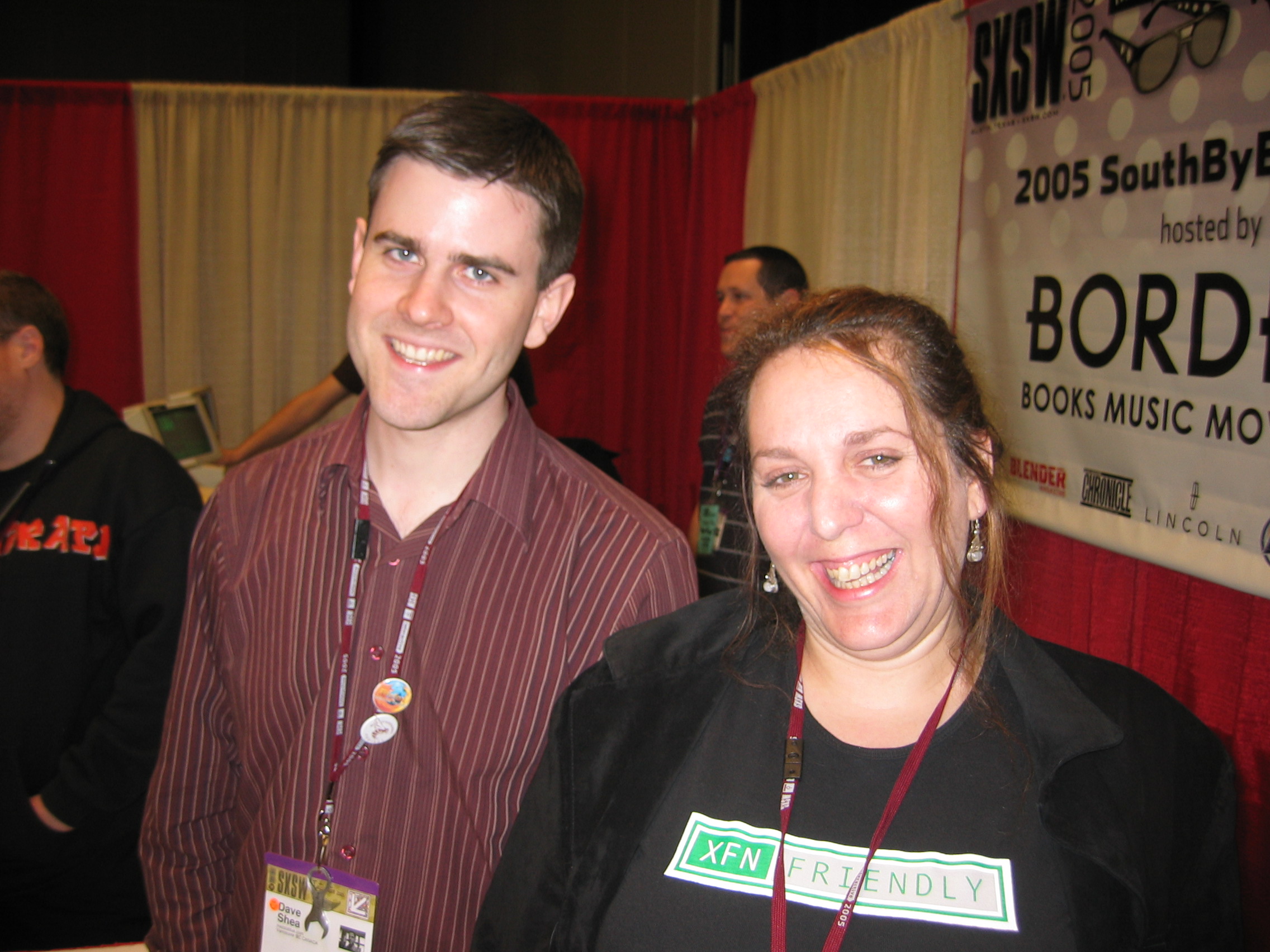
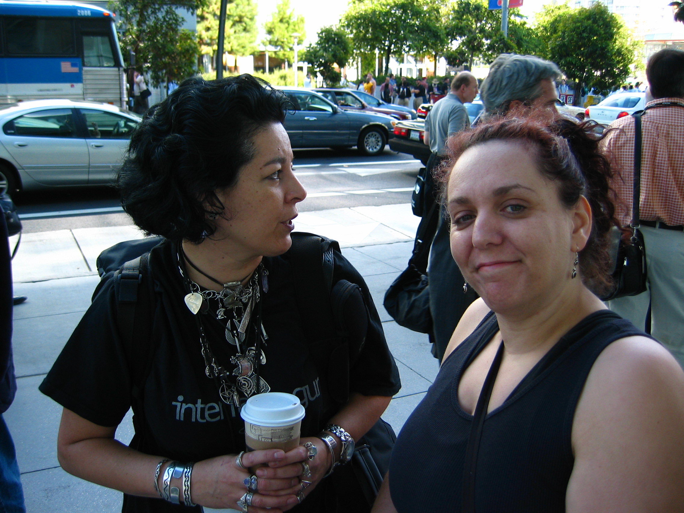
At SXSW 2005 with Dave Shea, her co-author on The Zen of CSS, and wearing an XFN shirt.Standing outside Moscone Center in San Francisco with Cia Romano. I think this is that time we all got evacuated due to a fire alarm.
Or the time a bunch of us were gathered in New Orleans (again, some conference or other) and went to dinner at a jazz club, where we ended up seated next to the live jazz trio and she sang along with some of the songs. She had a voice like a blues singer in a cabaret, brassy and smoky and full of hard-won joys, and she used it to great effect standing in front of Bill Gates to harangue him about Internet Explorer. She raised it to fight like hell for the Web and its users, for the foundational principles of universal access and accessible development. She put her voice on paper in some three dozen books, and was working on yet another when she died. In one book, she managed to sneak past the editors an example that used a stick-figure Kama Sutra custom font face. She could never resist a prank, particularly a bawdy one, as long as it didn’t hurt anyone.
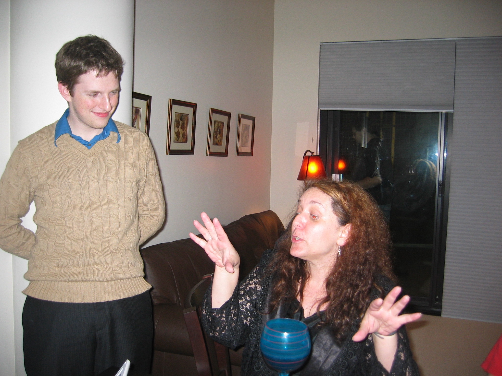
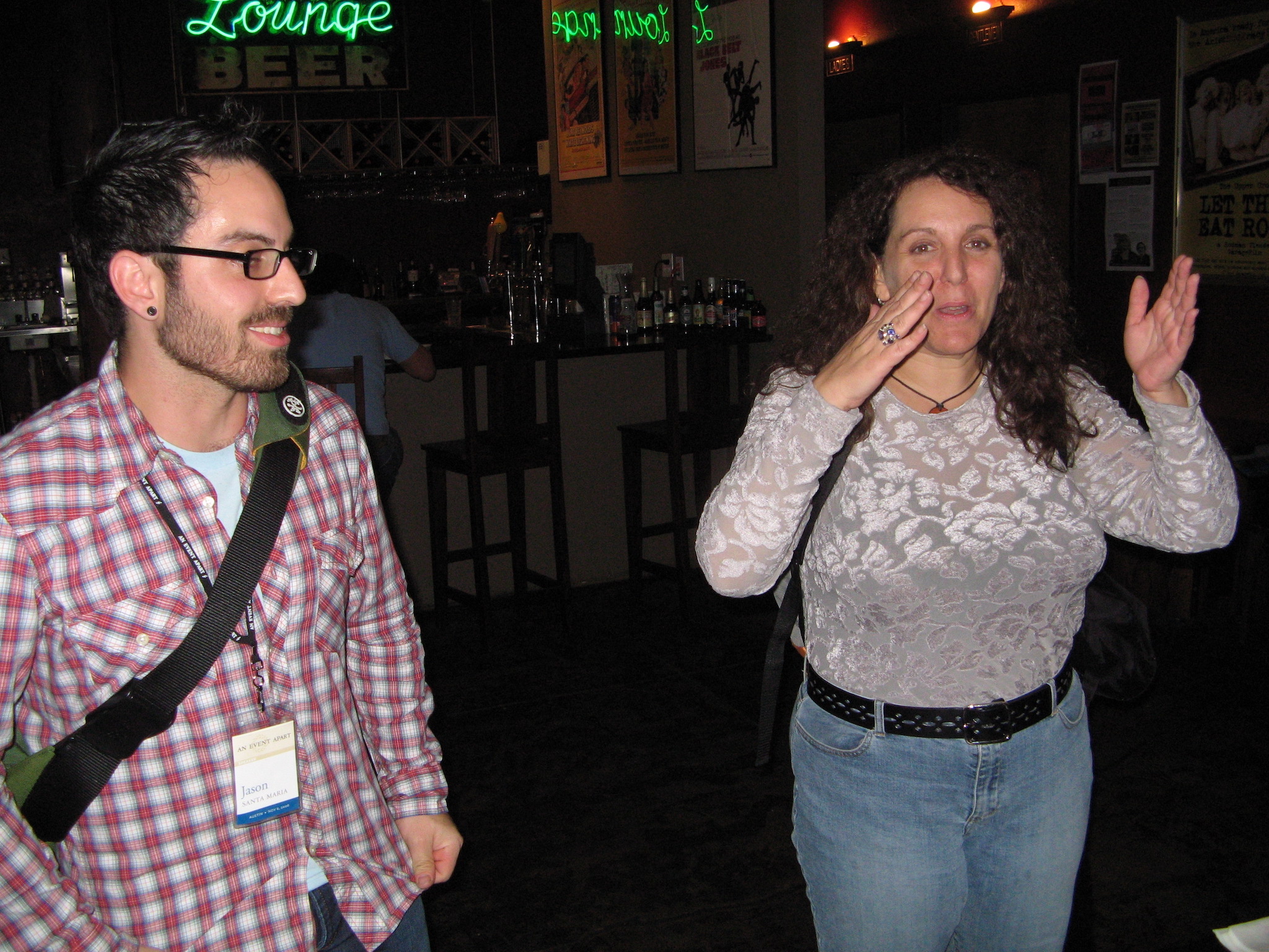
Holding court in somebody’s hotel suite, with a baby Matt Mullenweg in attendance.Once again holding court, this time at a bar with Jason Santa Maria.
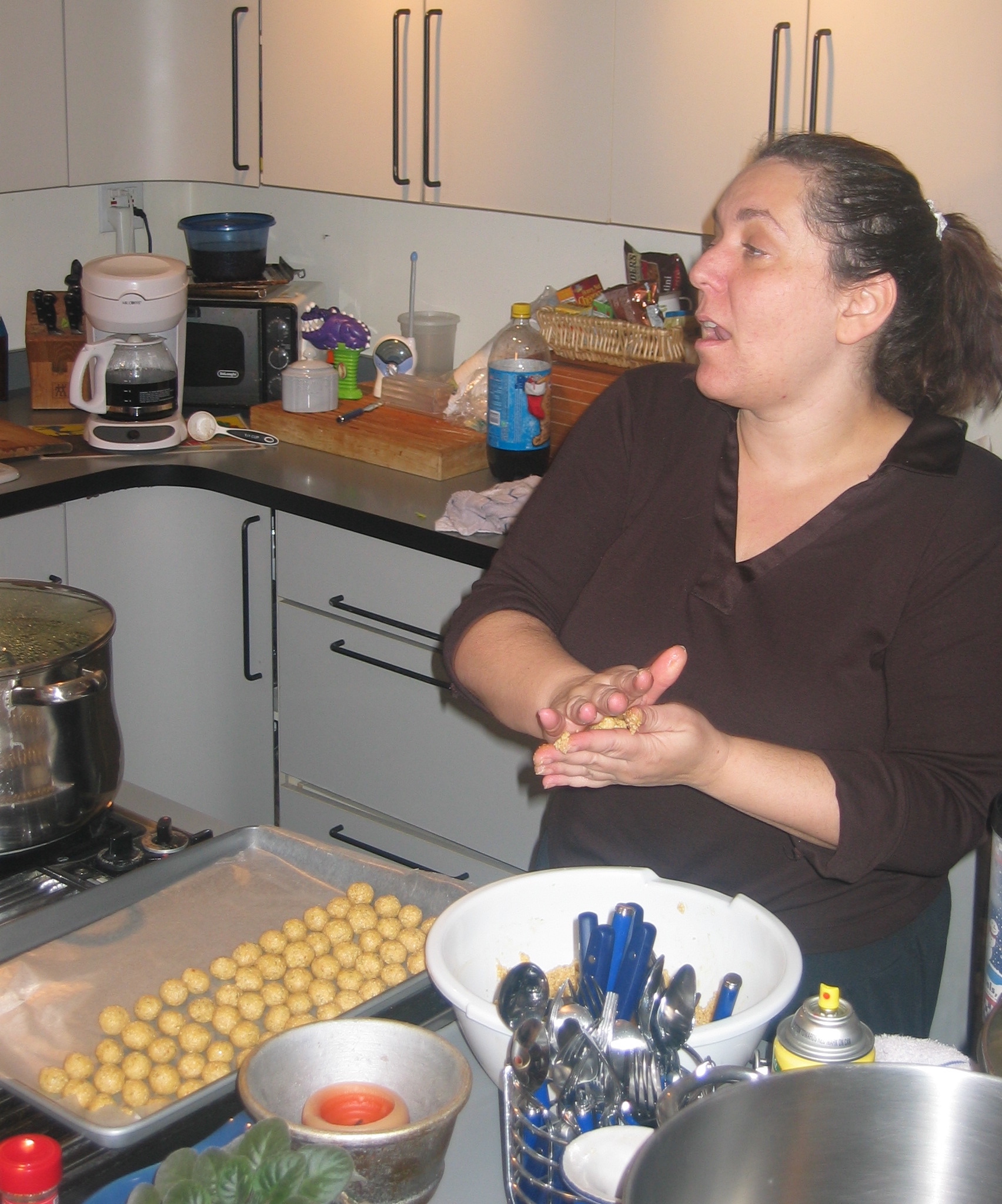
She made the trek to Cleveland at least once to attend and be part of the crew for one of our Bread and Soup parties. We put her to work rolling tiny matzoh balls and she immediately made ribald jokes about it, laughing harder at our one-up jokes than she had at her own. She stopped by the house a couple of other times over the years, when she was in town for consulting work, “Auntie Molly” to our eldest and one of my few colleagues to have spent any time with Rebecca. Those pictures were lost, and I still keenly regret that.
Rolling matzoh balls in our kitchen, still holding court.On top of a bus somewhere in the world, probably London, with my partner Kat.
There were so many things about what the Web became that she hated, that she’d spent so much time and energy fighting to avert, but she still loved it for what it could be and what it had been originally designed to be. She took more than one fledgling web designer under her wing, boosted their skills and careers, and beamed with pride at their accomplishments. She told a great story about one, I think it was Dunstan Orchard but I could be wrong, and his afternoon walk through a dry Arizona arroyo.
I could go on for pages, but I won’t; if this were a toast and she were here, she would have long ago heckled me (affectionately) into shutting up. But if you have treasured memories of Molly, I’d love to hear them in the comments below, or on your own blog or social media or podcasts or anywhere. She loved stories. Tell hers.
One of the things I’ve been doing at Igalia of late is podcasting with Brian Kardell. It’s called “Igalia Chats”, and last week, I designed it a logo. I tried out a number of different ideas, ran them past the Communication team for feedback, and settled on this one.
D&AD Awards committee, you know where to find me.
And there you have it, the first logo I’ve designed in… well, in quite a while. My work this time around was informed by a few things.
Podcast apps, sites, etc. expect a square image for the podcast’s logo. This doesn’t mean you have to make the visible part of it square, exactly, but it does mean any wide-and-short logo will simultaneously feel cramped and lost in a vast void. Or maybe just very far away. The version shown in this post is not the square version, because this is not a podcast app and because I could. The square version just adds more empty whitespace at the top and bottom, anyway.
I couldn’t really alter the official logo in any major way: the brand guidelines are pretty strong and shouldn’t be broken without collective approval. Given the time that would take, I decided to just work with the logo as-is, and think about possible variants (say, the microphone icon in the blank diamond of the logo) in a later stage. I did think about just not using the official logo at all, but that felt like it would end up looking too generic. Besides, we hav e a pretty nifty logo there, so why not use it?
A typeface for the word “Chats” that works well with Igalia’s official logo. I used Etelka, which is a font we already use on the web site, and I think is the basis of the semi-serifed letters in the official logo anyway. Though I could be wrong about that; while I definitely have opinions about typefaces these days, I’m not very good at identifying them, or being able to distinguish between two similar fonts. Call it typeface blindness.
Using open-source resources where possible; thus, the microphone icon came from The Noun Project. I then modified it a bit (rounded the linecaps, shortened the pickup’s brace) to balance its visual weight with the rest of the design, and not crowd the letters too much. I also added a subtle vertical gradient to the icon, which helped the word “Chats” to stand out a little more. Gotta make the logo pop, donchaknow?
There are probably some adjustments I’ll make after a bit of time, but I was determined not to let perfect be the enemy of shipping. As for how I came to create the logo, you’re probably thinking fancy CSS Grid layout and custom fonts and all that jazz, but no, I just dumped everything into Keynote and fiddled with ideas until I had some I liked. It’s not a fantastic environment for this sort of work, I expect, but it’s Good Enough For Me™.
This is one of the things I quite enjoy about working for Igalia — the way I can draw upon all the things I’ve learned over my many (many) years to create different things. A logo last week, a thumbnail-building tool the week before, writing news posts, recording podcasts, doing audio production, figuring out transcription technology, and on and on and on. It can sometimes be frustrating in the way all work can be, but it rarely gets boring. (And if that sounds good to you, we are hiring for a number of roles!)
I’ve played a lot of video games over the years, and the thing that just utterly blows my mind about them is how every frame is painted from scratch. So in a game running at 30 frames per second, everything in the scene has to be calculated and drawn every 33 milliseconds, no matter how little or much has changed from one frame to the next. In modern games, users generally demand 60 frames per second. So everything you see on-screen gets calculated, placed, colored, textured, shaded, and what-have-you in 16 milliseconds (or less). And then, in the next 16 milliseconds (or less), it has to be done all over again. And there are games that render the entire scene in single-digits numbers of milliseconds!
I mean, I’ve done some simple 3D render coding in my day. I’ve done hobbyist video game development; see Gravity Wars, for example (which I really do need to get back to and make less user-hostile). So you’d think I’d be used to this concept, but somehow, I just never get there. My pre-DOS-era brain rebels at the idea that everything has to be recalculated from scratch every frame, and doubly so that such a thing can be done in such infinitesimal slivers of time.
So you can imagine how I feel about the fact that web browsers operate in exactly the same way, and with the same performance requirements.
Maybe this shouldn’t come as a surprise. After all, we have user interactions and embedded videos and resizable windows and page scrolling and stuff like that, never mind CSS animations and DOM manipulation, so the viewport often needs to be re-rendered to reflect the current state of things. And to make all that feel smooth like butter, browser engines have to be able to display web pages at a minimum of 60 frames per second.
Admittedly, this would be a popular UI for browsing social media.
This demand touches absolutely everything, and shapes the evolution of web technologies in ways I don’t think we fully appreciate. You want to add a new selector type? It has to be performant. This is what blocked :has() (and similar proposals) for such a long time. It wasn’t difficult to figure out how to select ancestor elements — it was very difficult to figure out how to do it really, really fast, so as not to lower typical rendering speed below that magic 60fps. The same logic applies to new features like view transitions, or new filter functions, or element exclusions, or whatever you might dream up. No matter how cool the idea, if it bogs rendering down too much, it’s a non-starter.
I should note that none of this is to say it’s impossible to get a browser below 60fps: pile on enough computationally expensive operations and you’ll still jank like crazy. It’s more that the goal is to keep any new feature from dragging rendering performance down too far in reasonable situations, both alone and in combination with already-existing features. What constitutes “down too far” and “reasonable situations” is honestly a little opaque, but that’s a conversation slash vigorous debate for another time.
I’m sure the people who’ve worked on browser engines have fascinating stories about what they do internally to safeguard rendering speed, and ideas they’ve had to spike because they were performance killers. I would love to hear those stories, if any BigCo devrel teams are looking for podcast ideas, or would like to guest on Igalia Chats. (We’d love to have you on!)
Anyway, the point I’m making is that performance isn’t just a matter of low asset sizes and script tuning and server efficiency. It’s also a question of the engine’s ability to redraw the contents of the viewport, no matter what changes for whatever reason, with reasonable anticipation of things that might affect the rendering, every 15 milliseconds, over and over and over and over and over again, just so we can scroll our web pages smoothly. It’s kind of bananas, and yet, it also makes sense. Welcome to the web.
The other week I crossed a midpoint, of sorts: as I was driving home from a weekly commitment, my iPhone segued from Rush’s “Mystic Rhythms” to The Seatbelts’ “N.Y. Rush”, which is, lexicographically speaking, the middle of my iTu — oh excuse me, the middle of my Music Dot App Library, where I passed from the “M” songs into the “N” songs.
Every time I have to drive my car for more than a few minutes, I’ll plug in my iPhone and continue the listen from where I left off. This mainly happens during the aforementioned weekly commitment, which usually sees me driving for an hour or so. I also listen to it while I’m doing chores around the house like installing ceiling fans or diagnosing half-dead Christmas light strings.
This sort of listen is, in many ways, like listening to the entire library on shuffle, because, as Jared Spool used to point out (and probably still does), alphabetically sorting a long list of things is indistinguishable from having it randomized. For me, the main difference between alphabetical and random is that it’s a lot easier to pick back up where you left off when working through alphabetically. (Yes, Music Dot App should do that automatically, but sometimes it forgets where it was.) You can also be a lot more certain that every song gets a listen, something that’s harder to ensure if you’re listening to a random shuffle of a couple thousand tracks and your software loses its place.
Some of these combinations groove, some delight, some earn the stank face, and some make me literally laugh out loud. And some aren’t related by title but still go together really, really well. A recent example was the segue from The Prodigy’s “Narayan” to Radiohead’s “The National Anthem”, which sonically flowed just right at the switchover, almost like they’d been composed to have that effect. It made this old long-ago radio DJ smile.
I say I took inspiration from Kevin because my listen has a couple of differences to his:
Kevin has a “no skips, ever” rule, but I will skip songs that are repeats. This happens a lot when you have both live and studio albums, as I do for a few artists (particularly
Rush), or have copied tracks for lightly-engineered playlists, as I have a few times. That said, if I have a song by one artist and a cover of that song by another, I don’t skip either of them. For remixes or alternate recordings of a song by the same artist, I generally don’t skip, unless the remix is just the original song with a vaguely different beat track.
I filtered out most of my classical content before starting. This is not because I dislike classical, but because they tend to sort together in unrelenting clumps — all of Beethoven’s and Mozart’s symphonies one after another after another, for example — and I wanted a varietal mix. I did keep “classical” albums like Carreras Domingo Pavarotti in Concert and Carmina Burana because they have normal-length tracks with titles that scatter them throughout the sort. The same reasoning was used to retain classic film and TV scores, even if I was stretching it a bit to leave in The Music of Cosmos (the 1980 one), which prefixes all its tracks with Roman numerals… but each track is a medley, so it got a pass. The whole-album-in-a-single-MP3 The Music of Osmos, on the other hand, did not.
All that said, I have a much shorter road than Kevin: he has a library of over twelve thousand tracks, whereas my slightly-filtered library is just shy of 2,500 tracks, or right around 160 hours. The repeated-song skips knock the total time down a bit, probably by a few hours but not much more than that. So, figure at an average of 80 minutes per week, that’s about 120 weeks, or two years and four months to get from beginning to end.
And what will I do when I reach the end? Probably go back to better curate the sorting (e.g., configuring Soundgarden’s “4th of July” to be sorted as “Fourth of July”), create a playlist that cuts out the repeats ahead of time, and start over. But we’ll see when I get there. Maybe next time I’ll listen to it in reverse alphabetical order instead.


