If you’re reading this, odds are you’ve at least heard of A Book Apart (ABA), who published Design for Real Life, which I co-wrote with Sara Wachter-Boettcher back in 2016. What you may not have heard is that ABA has closed up shop. There won’t be any more new ABA titles, nor will ABA continue to sell the books in their catalog.
That’s the bad news. The great news is that ABA has transferred the rights for all of its books to their respective authors! (Not every ex-publisher does this, and not every book contract demands it, so thanks to ABA.) We’re all figuring out what to do with our books, and everyone will make their own choices. One of the things Sara and I have decided to do is to eventually put the entire text online for free, as a booksite. That isn’t ready yet, but it should be coming somewhere down the road.
In the meantime, we’ve decided to cut the price of print and e-book copies available through Ingram. DfRL was the eighteenth book ABA put out, so we’ve decided to make the price of both the print and e-book $18, regardless of whether those dollars are American, Canadian, or Australian. Also €18 and £18. Basically, in all five currencies we can define, the price is 18 of those.
…unless you buy it through Apple Books; then it’s 17.99 of every currency, because the system forces us to make it cheaper than the list price and also have the amount end in .99. Obversely, if you’re buying a copy (or copies) for a library, the price has to be more than the list price and also end in .99, so the library cost is 18.99 currency units. Yeah, I dunno either.
At any rate, compared to its old price, this is a significant price cut, and in some cases (yes, Australia, we’re looking at you) it’s a huge discount. Or, at least, it will be at a discount once online shops catch up. The US-based shops seem to be up to date, and Apple Books as well, but some of the “foreign” (non-U.S.) sources are still at their old prices. In those cases, maybe wishlist or bookmark or something and keep an eye out for the drop. We hope it will become global by the end of the week. And hey, as I write this, a couple of places have the ebook version for like 22% less than our listed price.
So! If you’ve always thought about buying a copy but never got around to it, now’s a good time to get a great deal. Ditto if you’ve never heard of the book but it sounds interesting, or you want it in ABA branding, or really for any other reason you have to buy a copy now.
I suppose the real question is, should you buy a copy? We’ll grant that some parts of it are a little dated, for sure. But the concepts and approaches we introduced can be seen in a lot of work done even today. It made significant inroads into government design practices in the UK and elsewhere, for example, and we still hear from people who say it really changed how they think about design and UX. We’re still very proud of it, and we think anyone who takes the job of serving their users seriously should give it a read. But then, I guess we would, or else we’d never have written it in the first place.
And that’s the story so far. I’ll blog again when the freebook is online, and if anything else changes as we go through the process. Got questions? Leave a comment or drop me a line.
I woke up this morning about an hour ahead of my alarm, the sky already light, birds calling. After a few minutes, a brief patter of rain swept across the roof and moved on.
I just lay there, not really thinking. Feeling. Remembering.
Almost sixteen years to the minute before I awoke, my second daughter was born. Almost ten years to the same minute before, she’d turned six years old, already semi-unconscious, and died not quite twelve hours later.
So she won’t be taking her first solo car drive today. She won’t be celebrating with dinner at her favorite restaurant in the whole world. She won’t kiss her niece good night or affectionately rag on her siblings.
Or maybe she wouldn’t have done any of those things anyway, after a decade of growth and changes and paths taken. What would she really be like, at sixteen?
We will never know. We can’t even guess. All of that, everything she might have been, is lost.
This afternoon, we’ll visit Rebecca’s grave, and then go to hear her name read in remembrance at one of her very happiest places, Anshe Chesed Fairmount Temple, for the last time. At the end of the month, the temple will close as part of a merger. Another loss.
A decade ago, I said that I felt the weight of all the years she would never have, and that they might crush me. Over time, I have come to realize all the things she never saw or did adds to that weight. Even though it seems like it should be the same weight. Somehow, it isn’t.
I was talking about all of this with a therapist a few days ago, about the time and the losses and their accumulated weight. I said, “I don’t know how to be okay when I failed my child in the most fundamental way possible.”
“You didn’t fail her,” they said gently.
“I know that,” I replied. “But I don’t feel it.”
A decade, it turns out, does not change that. I’m not sure now that any stretch of time ever could.
TAKE HEED! Due to changes in GitHub’s markup, the following post was superseded in September 2025 by the post Bookmarklet: Load All GitHub Comments (take 2), which has an updated bookmarklet.
What happened was, Brian and I were chatting about W3C GitHub issues and Brian mentioned how really long issues are annoying to search and read, because GitHub has this thing where if there are too many comments on an issue, it snips out the middle with a “Load more…” button that’s very tastefully designed and pretty easy to miss if you’re quick-scrolling to try to catch up. The squiggle-line would be a good marker, if it weren’t so tasteful as to blend into the background in a way that makes the Baby WCAG cry.
And what’s worse, from this perspective, is that if the issue has been discussed to a very particular kind of death, the “Load more…” button can have more “Load more…” buttons hiding within. So even if you know there was an interesting comment, and you remember a word or two of it, page-searching in your browser will do no good if the comment in question is buried one or more XMLHTTPRequest calls deep.
“I really wish GitHub had an ‘expand all comments’ button at the top or something,” Brian said (or words to that effect).
Well, it was a Friday afternoon and I was feeling code-hacky, so I wrote a bookmarklet. Here it is in easy-to-save hyperlink form:
It waits half a second after you activate it to find all the buttons on the page (in my test runs, usually six hundred of them). Then it looks through all the buttons to find the ones that have a textContent of “Load more…” and dispatches a click event to each one. With that done, it waits five seconds and does it all again, waits five seconds to do it again, and so on. Once it finds there are zero buttons with the “Load more…” textContent, it exits. And, if five seconds is too quick due to slow loading times, you can always invoke the bookmarklet again should you come across a “Load more…” button.
If you want this ability for yourself, just drag the link above into your bookmark toolbar or bookmarks menu, and whenever you load up a mega-thread GitHub issue, fire the bookmarklet to load all the comments. I imagine there may be cleaner ways to do this, but I was able to codeslam this in about 15 minutes using ViolentMonkey on live GitHub pages, and it does the thing.
I did consider complexifying the ViolentMonkey script so that any GitHub page is scanned for the “Load more…” button, and if one is present, then a “Load all comments” button is plopped into the top of the page, but I knew that would take at least another 15 minutes and my codeslam window was closing. Also, it would require anyone using it to run ViolentMonkey (or equivalent) all the time, whereas the bookmarlet has zero impact unless the user invokes it. If you want to extend this into something more than it is and share your solution with the world, by all means feel free.
The point of all this being, if you too wish GitHub had an easy way to load all the comments without you having to search for the “Load more…” button yourself, now there’s a bookmarklet made just for you. Enjoy!
Once upon a time, there was a movie called Once Upon a Forest. I’ve never seen it. In fact, the only reason I know it exists is because a few years after it was released, Joshua Davis created a site called Once Upon a Forest, which I was doing searches to find again. The movie came up in my search results; the site, long dead, did not. Instead, I found its original URL on Joshua’s Wikipedia page, and the Wayback Machine coughed up snapshots of it, such as this one. You can also find static shots of it on Joshua’s personal web site, if you scroll far enough.
That site has long stayed with me, not so much for its artistic expression (which is pleasant enough) as for how the pieces were produced. Joshua explained in a talk that he wrote code to create generative art, where it took visual elements and arranged them randomly, then waited for him to either save the result or hit a key to try again. He created the elements that were used, and put constraints on how they might be arranged, but allowed randomness to determine the outcome.
That appealed to me deeply. I eventually came to realize that the appeal was rooted in my love of the web, where we create content elements and visual styles and scripted behavior, and then we send our work into a medium that definitely has constraints, but something very much like the random component of generative art: viewport size, device capabilities, browser, and personal preference settings can combine in essentially infinite ways. The user is the seed in the RNG of our work’s output.
Normally, we try very hard to minimize the variation our work can express. Even when crossing from one experiential stratum to another — that is to say, when changing media breakpoints — we try to keep things visually consistent, orderly, and understandable. That drive to be boring for the sake of user comprehension and convenience is often at war with our desire to be visually striking for the sake of expression and enticement.
There is a lot, and I mean a lot, of room for variability in web technologies. We work very hard to tame it, to deny it, to shun it. Too much, if you ask me.
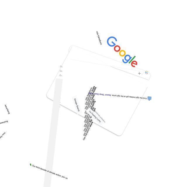
About twelve and half years ago, I took a first stab at pushing back on that denial with a series posted to Flickr called “Spinning the Web”, where I used CSS rotation transforms to take consistent, orderly, understandable web sites and shake them up hard. I enjoyed the process, and a number of people enjoyed the results.
google.com, late November 2023
In the past few months, I’ve come back to the concept for no truly clear reason and have been exploring new approaches and visual styles. The first collection launched a few days ago: Spinning the Web 2023, a collection of 26 web sites remixed with a combination of CSS and JS.
I’m announcing them now in part because this month has been dubbed “Genuary”, a month for experimenting with generative art, with daily prompts to get people generating. I don’t know if I’ll be following any of the prompts, but we’ll see. And now I have a place to do it.
You see, back in 2011, I mentioned that my working title for the “Spinning the Web” series was “Once Upon a Browser”. That title has never left me, so I’ve decided to claim it and created an umbrella site with that name. At launch, it’s sporting a design that owes quite a bit to Once Upon a Forest — albeit with its own SVG-based generative background, one I plan to mess around with whenever the mood strikes. New works will go up there from time to time, and I plan to migrate the 2011 efforts there as well. For now, there are pointers to the Flickr albums for the old works.
I said this back in 2011, and I mean it just as much in 2023: I hope you enjoy these works even half as much as I enjoyed creating them.
I haven’t generally been one to survey years as they end, but I’m going to make an exception for 2023, because there were three pretty big milestones I’d like to mark.
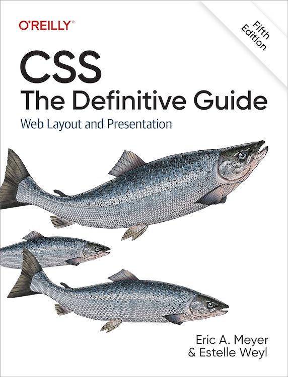
The first is that toward the end of May, the fifth edition of CSS: The Definitive Guide was published. This edition weighs in at a mere 1,126 pages, and covers just about everything in CSS that was widely supported by the end of the 2022, and a bit from the first couple of months in 2023. It’s about 5% longer by page count than the previous edition, but it has maybe 20% more material. Estelle and I pulled that off by optimizing some of the older material, dropping some “intro to web” stuff that was still hanging about in the first chapter, and replacing all the appendices from the fourth edition with a single appendix that lists the URLs of useful CSS resources. As with the previous edition, the files used to produce the figures for the book are all available online as a website and a repository.
The second is that Kat and I went away for a week in the summer to celebrate our 25th wedding anniversary. As befits our inclinations, we went somewhere we’d never been but always wanted to visit, the Wisconsin Dells and surrounding environs. We got to tour The Cave of the Mounds (wow), The House on the Rock (double wow), The World of Doctor Evermore (wowee), and the Dells themselves. We took a river tour, indulged in cheesy tourist traps, had some fantastic meals, and generally enjoyed our time together. I did a freefall loop-de-loop waterslide twice, so take that, Action Park.
The third is that toward the end of the year, Kat and I became grandparents to the beautiful, healthy baby of our daughter Carolyn. A thing that people who know us personally know is that we love babies and kids, so it’s been a real treat to have a baby in our lives again. It’s also been, and will continue to be, a new and deeper phase of parenthood, as we help our child learn how to be a parent to her child. We eagerly look forward to seeing them both grow through the coming years.
So here’s to a year that contained some big turning points, and to the turning points of the coming year. May we all find fulfillment and joy wherever we can.
For reasons I’m not going to get into here, I want be able to pixelate web pages, or even parts of web pages, entirely from the client side. I’m using ViolentMonkey to inject scripts into pages, since it lets me easily open the ViolentMonkey browser-toolbar menu and toggle scripts on or off at will.
I’m aware I could take raster screenshots of pages and then manipulate them in an image editor. I don’t want to do that, though — I want to pixelate live. For reasons.
So far as I’m aware, my only option here is to apply SVG filters by way of CSS. The problem I’m running into is that I can’t figure out how to construct an SVG filter that will exactly:
Divide the element into cells; for example, a grid of 4×4 cells
Find the average color of the pixels in each cell
Flood-fill each cell with the average color of its pixels
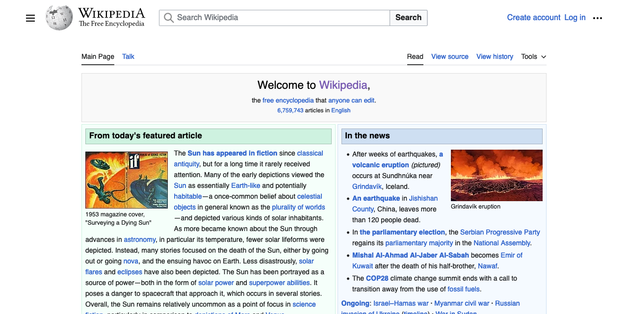
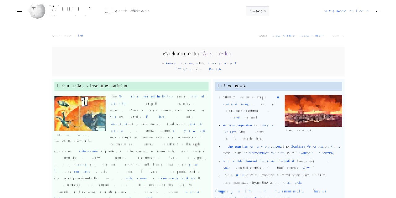
As a way of understanding the intended result, see the following screenshot of Wikipedia’s home page, and then the corresponding pixelated version, which I generated using the Pixelate filter in Acorn.
Wikipedia in the raw, and blockified.
See how the text is rendered out? That’s key here.
I found a couple of SVG pixelators in a StackOverflow post, but what they both appear to do is sample pixels at regularly-spaced intervals, then dilate them. This works pretty okay for things like photographs, but it falls down hard when it comes to text, or even images of diagrams. Text is almost entirely vanished, as shown here.
The text was there a minute ago, I swear it.
I tried Gaussian blurring at the beginning of my filters in an attempt to overcome this, but that mostly washed the colors out, and didn’t make the text more obviously text, so it was a net loss. I messed around with dilation radii, and there was no joy there. I did find some interesting effects along the way, but none of them were what I was after.
I’ve been reading through various tutorials and MDN pages about SVG filters, and I’m unable to figure this out. Though I may be wrong, I feel like the color-averaging step is the sticking point here, since it seems like <feTile> and <feFlood> should be able to handle the first and last steps. I’ve wondered if there’s a way to get a convolve matrix to do the color-averaging part, but I have no idea — I never learned matrix math, and later-life attempts to figure it out have only gotten me as far as grasping the most general of principles. I’ve also tried to work out if a displacement map could be of help here, but so far as I can tell, no. But maybe I just don’t understand them well enough to tell?
It also occurred to me, as I was prepared to publish this, that maybe a solution would be to use some kind of operation (a matrix, maybe?) to downsize the image and then use another operation to upsize it to the original size. So to pixelfy a 1200×1200 image into 10×10 blocks, smoothly downsize it to 120×120 and then nearest-neighbor it back up to 1200×1200. That feels like it would make sense as a technique, but once again, even if it does make sense I can’t figure out how to do it. I searched for terms like image scale transform matrix but I either didn’t get good results, or didn’t understand them when I did. Probably the latter, if we’re being honest.
So, if you have any ideas for how to make this work, I’m all ears — either here in the comments, on your own site, or as forks of the Codepen I set up for exactly that purpose. My thanks for any help!
A few days ago was the 30th anniversary of the first time I wrote an HTML document. Back in 1993, I took a Usenet posting of the “Incomplete Mystery Science Theater 3000 Episode Guide” and marked it up. You can see the archived copy here on meyerweb. At some point, the markup got updated for reasons I don’t remember, but I can guarantee you the original had uppercase tag names and I didn’t close any paragraphs. That’s because I was using <P> as a shorthand for <BR><BR>, which was the style at the time.
Its last-updated date of December 3, 1993, is also the date I created it. I was on lobby duty with the CWRU Film Society, and had lugged a laptop (I think it was an Apple PowerBook of some variety, something like a 180, borrowed from my workplace) and a printout of the HTML specification (or maybe it was “Tags in HTML”?) along with me.
I spent most of that evening in the lobby of Strosacker Auditorium, typing tags and doing find-and-replace operations in Microsoft Word, and then saving as text to a file that ended in .html, which was the style at the time. By the end of the night, I had more or less what you see in the archived copy.
The only visual change between then and now is that a year or two later, when I put the file up in my home directory, I added the toolbars at the top and bottom of the page — toolbars I’d designed and made a layout standard as CWRU’s webmaster. Which itself only happened because I learned HTML.
A couple of years ago, I was fortunate enough to be able to relate some of this story to Joel Hodgson himself. The story delighted him, which delighted me, because delighting someone who has been a longtime hero really is one of life’s great joys. And the fact that I got to have that conversation, to feel that joy, is inextricably rooted in my sitting in that lobby with that laptop and that printout and that Usenet post, adding tags and saving as text and hitting reload in Mosaic to instantly see the web page take shape, thirty years ago this week.
For a while now, Web Components (which I’m not going to capitalize again, you’re welcome) have been one of those things that pop up in the general web conversation, seem intriguing, and then fade into the background again.
I freely admit a lot of this experience is due to me, who is not all that thrilled with the Shadow DOM in general and all the shenanigans required to cross from the Light Side to the Dark Side in particular. I like the Light DOM. It’s designed to work together pretty well. This whole high-fantasy-flavored Shadowlands of the DOM thing just doesn’t sit right with me.
If they do for you, that’s great! Rock on with your bad self. I say all this mostly to set the stage for why I only recently had a breakthrough using web components, and now I quite like them. But not the shadow kind. I’m talking about Fully Light-DOM Components here.
It started with a one-two punch: first, I read Jim Nielsen’s “Using Web Components on My Icon Galleries Websites”, which I didn’t really get the first few times I read it, but I could tell there was something new (to me) there. Very shortly thereafter, I saw Dave Rupert’s <fit-vids> CodePen, and that’s when the Light DOM Bulb went off in my head. You just take some normal HTML markup, wrap it with a custom element, and then write some JS to add capabilities which you can then style with regular CSS! Everything’s of the Light Side of the Web. No need to pierce the Vale of Shadows or whatever.
Kindly permit me to illustrate at great length and in some depth, using a thing I created while developing a tool for internal use at Igalia as the basis. Suppose you have some range inputs, just some happy little slider controls on your page, ready to change some values, like this:
The idea here is that you use the slider to change the font size of an element of some kind. Using HTML’s built-in attributes for range inputs, I set a minimum, maximum, and initial value, the step size permitted for value changes, and an ID so a <label> can be associated with it. Dirt-standard HTML stuff, in other words. Given that this markup exists in the page, then, it needs to be hooked up to the thing it’s supposed to change.
In Ye Olden Days, you’d need to write a function to go through the entire DOM looking for these controls (maybe you’d add a specific class to the ones you need to find), figure out how to associate them with the element they’re supposed to affect (a title, in this case), add listeners, and so on. It might go something like:
let sliders = document.querySelectorAll('input[id]');
for (i = 0; i < sliders.length; i++) {
	let slider = sliders[i];
	// …add event listeners
	// …target element to control
	// …set behaviors, maybe call external functions
	// …etc., etc., etc.
}
Then you’d have to stuff all that into a window.onload observer or otherwise defer the script until the document is finished loading.
To be clear, you can absolutely still do it that way. Sometimes, it’s even the most sensible choice! But fully-light-DOM components can make a lot of this easier, more reusable, and robust. We can add some custom elements to the page and use those as a foundation for scripting advanced behavior.
Now, if you’re like me (and I know I am), you might think of converting everything into a completely bespoke element and then forcing all the things you want to do with it into its attributes, like this:
<super-slider type="range" min="0.5" max="4" step="0.1" value="2"
	          unit="em" target=".preview h1">
Title font size
</super-slider>
Don’t do this. If you do, then you end up having to reconstruct the HTML you want to exist out of the data you stuck on the custom element. As in, you have to read off the type, min, max, step, and value attributes of the <super-slider> element, then create an <input> element and add the attributes and their values you just read off <super-slider>, create a <label> and insert the <super-slider>’s text content into the label’s text content, and why? Why did I do this to myse — uh, I mean, why do this to yourself?
This is the pattern I got from <fit-vids>, and the moment that really broke down the barrier I’d had to understanding what makes web components so valuable. By taking this approach, you get everything HTML gives you with the <label> and <input> elements for free, and you can add things on top of it. It’s pure progressive enhancement.
To figure out how all this goes together, I found MDN’s page “Using custom elements” really quite valuable. That’s where I internalized the reality that instead of having to scrape the DOM for custom elements and then run through a loop, I could extend HTML itself:
class superSlider extends HTMLElement {
	connectedCallback() {
		//
		// the magic happens here!
		//
	}
}

customElements.define("super-slider",superSlider);
What that last line does is tell the browser, “any <super-slider> element is of the superSlider JavaScript class”. Which means, any time the browser sees <super-slider>, it does the stuff that’s defined by class superSlider in the script. Which is the thing in the previous code block! So let’s talk about how it works, with concrete examples.
It’s the class structure that holds the real power. Inside there, connectedCallback() is invoked whenever a <super-slider> is connected; that is, whenever one is encountered in the page by the browser as it parses the markup, or when one is added to the page later on. It’s an auto-startup callback. (What’s a callback? I’ve never truly understood that, but it turns out I don’t have to!) So in there, I write something like:
connectedCallback() {
	let targetEl = document.querySelector(this.getAttribute('target'));
	let unit = this.getAttribute('unit');
	let slider = this.querySelector('input[type="range"]');
}
So far, all I’ve done here is:
Used the value of the target attribute on <super-slider> to find the element that the range slider should affect using a CSS-esque query.
The unit attribute’s value to know what CSS unit I’ll be using later in the code.
Grabbed the range input itself by running a querySelector() within the <super-slider> element.
With all those things defined, I can add an event listener to the range input:
slider.addEventListener("input",(e) => {
	let value = slider.value + unit;
	targetEl.style.setProperty('font-size',value);
});
…and really, that’s it. Put all together:
class superSlider extends HTMLElement {
	connectedCallback() {
		let targetEl = document.querySelector(this.getAttribute('target'));
		let unit = this.getAttribute('unit');
		let slider = this.querySelector('input[type="range"]');
		slider.addEventListener("input",(e) => {
			targetEl.style.setProperty('font-size',slider.value + unit);
		});
	}
}

customElements.define("super-slider",superSlider);
 <span>See the Pen <a href="https://codepen.io/meyerweb/pen/oNmXJRX">
 WebCOLD 01</a> by Eric A.  Meyer (<a href="https://codepen.io/meyerweb">@meyerweb</a>)
 on <a href="https://codepen.io">CodePen</a>.</span>
As I said earlier, you can get to essentially the same result by running document.querySelectorAll('super-slider') and then looping through the collection to find all the bits and bobs and add the event listeners and so on. In a sense, that’s what I’ve done above, except I didn’t have to do the scraping and looping and waiting until the document has loaded — using web components abstracts all of that away. I’m also registering all the components with the browser via customElements.define(), so there’s that too. Overall, somehow, it just feels cleaner.
One thing that sets customElements.define() apart from the collect-and-loop-after-page-load approach is that custom elements fire all that connection callback code on themselves whenever they’re added to the document, all nice and encapsulated. Imagine for a moment an application where custom elements are added well after page load, perhaps as the result of user input. No problem! There isn’t the need to repeat the collect-and-loop code, which would likely have to have special handling to figure out which are the new elements and which already existed. It’s incredibly handy and much easier to work with.
But that’s not all! Suppose we want to add a “reset” button — a control that lets you set the slider back to its starting value. Adding some code to the connectedCallback() can make that happen. There’s probably a bunch of different ways to do this, so what follows likely isn’t the most clever or re-usable way. It is, instead, the way that made sense to me at the time.
With that code added into the connection callback, a button gets added right after the slider, and it shows a little circle-arrow to convey the concept of resetting. You could just as easily make its text “Reset”. When said button is clicked or keyboard-activated ("click" handles both, it seems), the slider is reset to the stored initial value, and then an input event is fired at the slider so the target element’s style will also be updated. This is probably an ugly, ugly way to do this! I did it anyway.
 <span>See the Pen <a href="https://codepen.io/meyerweb/pen/jOdPdyQ">
 WebCOLD 02</a> by Eric A.  Meyer (<a href="https://codepen.io/meyerweb">@meyerweb</a>)
 on <a href="https://codepen.io">CodePen</a>.</span>
Okay, so now that I can reset the value, maybe I’d also like to see what the value is, at any given moment in time? Say, by inserting a classed <span> right after the label and making its text content show the current combination of value and unit?
let label = this.querySelector('label');
let readout = document.createElement('span');
readout.classList.add('readout');
readout.textContent = slider.value + unit;
label.after(readout);
Plus, I’ll need to add the same text content update thing to the slider’s handling of input events:
I imagine I could have made this readout-updating thing a little more generic (less DRY, if you like) by creating some kind of getter/setter things on the JS class, which is totally possible to do, but that felt like a little much for this particular situation. Or I could have broken the readout update into its own function, either within the class or external to it, and passed in the readout and slider and reset value and unit to cause the update. That seems awfully clumsy, though. Maybe figuring out how to make the span a thing that observes slider changes and updates automatically? I dunno, just writing the same thing in two places seemed a lot easier, so that’s how I did it.
So, at this point, here’s the entirety of the script, with a CodePen example of the same thing immediately after.
class superSlider extends HTMLElement {
connectedCallback() {
let targetEl = document.querySelector(this.getAttribute("target"));
let unit = this.getAttribute("unit");
let slider = this.querySelector('input[type="range"]');
slider.addEventListener("input", (e) => {
	targetEl.style.setProperty("font-size", slider.value + unit);
	readout.textContent = slider.value + unit;
});
let reset = slider.getAttribute("value");
let resetter = document.createElement("button");
resetter.textContent = "↺";
resetter.setAttribute("title", reset + unit);
resetter.addEventListener("click", (e) => {
slider.value = reset;
slider.dispatchEvent(
new MouseEvent("input", { view: window, bubbles: false })
);
});
slider.after(resetter);
let label = this.querySelector("label");
let readout = document.createElement("span");
readout.classList.add("readout");
readout.textContent = slider.value + unit;
label.after(readout);
}
}
customElements.define("super-slider", superSlider);
 <span>See the Pen <a href="https://codepen.io/meyerweb/pen/NWoGbWX">
 WebCOLD 03</a> by Eric A.  Meyer (<a href="https://codepen.io/meyerweb">@meyerweb</a>)
 on <a href="https://codepen.io">CodePen</a>.</span>
Anything you can imagine JS would let you do to the HTML and CSS, you can do in here. Add a class to the slider when it has a value other than its default value so you can style the reset button to fade in or be given a red outline, for example.
Or maybe do what I did, and add some structural-fix-up code. For example, suppose I were to write:
In that bit of markup, I left off the id on the <input> and the for on the <label>, which means they have no structural association with each other. (You should never do this, but sometimes it happens.) To handle this sort of failing, I threw some code into the connection callback to detect and fix those kinds of authoring errors, because why not? It goes a little something like this:
if (!label.getAttribute('for') && slider.getAttribute('id')) {
	label.setAttribute('for',slider.getAttribute('id'));
}
if (label.getAttribute('for') && !slider.getAttribute('id')) {
	slider.setAttribute('id',label.getAttribute('for'));
}
if (!label.getAttribute('for') && !slider.getAttribute('id')) {
	let connector = label.textContent.replace(' ','_');
	label.setAttribute('for',connector);
	slider.setAttribute('id',connector);
}
Once more, this is probably the ugliest way to do this in JS, but also again, it works. Now I’m making sure labels and inputs have association even when the author forgot to explicitly define it, which I count as a win. If I were feeling particularly spicy, I’d have the code pop an alert chastising me for screwing up, so that I’d fix it instead of being a lazy author.
It also occurs to me, as I review this for publication, that I didn’t try to do anything in situations where both the for and id attributes are present, but their values don’t match. That feels like something I should auto-fix, since I can’t imagine a scenario where they would need to intentionally be different. It’s possible my imagination is lacking, of course.
So now, here’s all just-over-40 lines of the script that makes all this work, followed by a CodePen demonstrating it.
class superSlider extends HTMLElement {
	connectedCallback() {
		let targetEl = document.querySelector(this.getAttribute("target"));
		let unit = this.getAttribute("unit");

		let slider = this.querySelector('input[type="range"]');
		slider.addEventListener("input", (e) => {
			targetEl.style.setProperty("font-size", slider.value + unit);
			readout.textContent = slider.value + unit;
		});

		let reset = slider.getAttribute("value");
		let resetter = document.createElement("button");
		resetter.textContent = "↺";
		resetter.setAttribute("title", reset + unit);
		resetter.addEventListener("click", (e) => {
			slider.value = reset;
			slider.dispatchEvent(
				new MouseEvent("input", { view: window, bubbles: false })
			);
		});
		slider.after(resetter);

		let label = this.querySelector("label");
		let readout = document.createElement("span");
		readout.classList.add("readout");
		readout.textContent = slider.value + unit;
		label.after(readout);

		if (!label.getAttribute("for") && slider.getAttribute("id")) {
			label.setAttribute("for", slider.getAttribute("id"));
		}
		if (label.getAttribute("for") && !slider.getAttribute("id")) {
			slider.setAttribute("id", label.getAttribute("for"));
		}
		if (!label.getAttribute("for") && !slider.getAttribute("id")) {
			let connector = label.textContent.replace(" ", "_");
			label.setAttribute("for", connector);
			slider.setAttribute("id", connector);
		}
	}
}

customElements.define("super-slider", superSlider);
 <span>See the Pen <a href="https://codepen.io/meyerweb/pen/PoVPbzK">
 WebCOLD 04</a> by Eric A.  Meyer (<a href="https://codepen.io/meyerweb">@meyerweb</a>)
 on <a href="https://codepen.io">CodePen</a>.</span>
There are doubtless cleaner/more elegant/more clever ways to do pretty much everything I did above, considering I’m not much better than an experienced amateur when it comes to JavaScript. Don’t focus so much on the specifics of what I wrote, and more on the overall concepts at play.
I will say that I ended up using this custom element to affect more than just font sizes. In some places I wanted to alter margins; in others, the hue angle of colors. There are a couple of ways to do this. The first is what I did, which is to use a bunch of CSS variables and change their values. So the markup and relevant bits of the JS looked more like this:
I’ll leave the associated JS as an exercise for the reader. I can think of reasons to do either of those approaches.
But wait! There’s more! Not more in-depth JS coding (even though we could absolutely keep going, and in the tool I built, I absolutely did), but there are some things to talk about before wrapping up.
First, if you need to invoke the class’s constructor for whatever reason — I’m sure there are reasons, whatever they may be — you have to do it with a super() up top. Why? I don’t know. Why would you need to? I don’t know. If I read the intro to the super page correctly, I think it has something to do with class prototypes, but the rest went so far over my head the FAA issued a NOTAM. Apparently I didn’t do anything that depends on the constructor in this article, so I didn’t bother including it.
Second, basically all the JS I wrote in this article went into the connectedCallback() structure. This is only one of four built-in callbacks! The others are:
disconnectedCallback(), which is fired whenever a custom element of this type is removed from the page. This seems useful if you have things that can be added or subtracted dynamically, and you want to update other parts of the DOM when they’re subtracted.
adoptedCallback(), which is (to quote MDN) “called each time the element is moved to a new document.” I have
no idea what that means. I understand all the words; it’s just that particular combination of them that confuses me.
attributeChangedCallback(), which is fired when attributes of the custom element change. I thought about trying to use this for my super-sliders, but in the end, nothing I was doing made sense (to me) to bubble up to the custom element just to monitor and act upon. A use case that does suggest itself: if I allowed users to change the sizing unit, say from
em to
vh, I’d want to change other things, like the
min,
max,
step, and default
value attributes of the sliders. So, since I’d have to change the value of the
unit attribute anyway, it might make sense to use
attributeChangedCallback() to watch for that sort of thing and then take action. Maybe!
Third, I didn’t really talk about styling any of this. Well, because all of this stuff is in the Light DOM, I don’t have to worry about Shadow Walls or whatever, I can style everything the normal way. Here’s a part of the CSS I use in the CodePens, just to make things look a little nicer:
Hopefully that all makes sense, but if not, let me know in the comments and I’ll clarify.
A thing I didn’t do was use the :defined pseudo-class to style custom elements that are defined, or rather, to style those that are not defined. Remember the last line of the script, where customElements.define() is called to define the custom elements? Because they are defined that way, I could add some CSS like this:
super-slider:not(:defined) {
	display: none;
}
In other words, if a <super-slider> for some reason isn’t defined, make it and everything inside it just… go away. Once it becomes defined, the selector will no longer match, and the display: none will be peeled away. You could use visibility or opacity instead of display; really, it’s up to you. Heck, you could tile red warning icons in the whole background of the custom element if it hasn’t been defined yet, just to drive the point home.
The beauty of all this is, you don’t have to mess with Shadow DOM selectors like ::part() or ::slotted(). You can just style elements the way you always style them, whether they’re built into HTML or special hyphenated elements you made up for your situation and then, like the Boiling Isles’ most powerful witch, called into being.
That said, there’s a “fourth” here, which is that Shadow DOM does offer one very powerful capability that fully Light DOM custom elements lack: the ability to create a structural template with <slot> elements, and then drop your Light-DOM elements into those slots. This slotting ability does make Shadowy web components a lot more robust and easier to share around, because as long as the slot names stay the same, the template can be changed without breaking anything. This is a level of robustness that the approach I explored above lacks, and it’s built in. It’s the one thing I actually do like about Shadow DOM.
It’s true that in a case like I’ve written about here, that’s not a huge issue: I was quickly building a web component for a single tool that I could re-use within the context of that tool. It works fine in that context. It isn’t portable, in the sense of being a thing I could turn into an npm package for others to use, or probably even share around my organization for other teams to use. But then, I only put 40-50 lines worth of coding into it, and was able to rapidly iterate to create something that met my needs perfectly. I’m a lot more inclined to take this approach in the future, when the need arises, which will be a very powerful addition to my web development toolbox.
I’d love to see the templating/slotting capabilities of Shadow DOM brought into the fully Light-DOM component world. Maybe that’s what Declarative Shadow DOM is? Or maybe not! My eyes still go cross-glazed whenever I try to read articles about Shadow DOM, almost like a trickster demon lurking in the shadows casts a Spell of Confusion at me.
So there you have it: a few thousand words on my journey through coming to understand and work with these fully-Light-DOM web components, otherwise known as custom elements. Now all they need is a catchy name, so we can draw more people to the Light Side of the Web. If you have any ideas, please drop ’em in the comments!

.jpg)