Posts in the CSS Category

A Dashing Navbar Solution

Published 3 years, 2 weeks past

One of the many things Igalia does is maintain an official port of WebKit for embedded devices called WPE WebKit, and as you might expect, it has a web site.  The design had gotten a little stale since its launch a few years ago, so we asked Denis Radenković at 38one to come up with a new design, which we launched yesterday.  And I got to turn it into HTML and CSS!  Which was mostly normal stuff, margins and font sizing and all that, but also had some bits that called for some creativity.

There was one aspect of the design that I honestly thought wasn’t going to be possible, which was the way the “current page” link in the site navbar connected up to the rest of the page’s design via a dashed line. You can see it on the site, or in this animation about how each navlink was designed to appear.

Navigation link styles, not including the Home button, which is essentially the same but not nearly as obvious because of its specific layout.

I thought about using bog-standard dashed element borders: one on a filler element or pseudo-element that spanned the mostly-empty left side of the navbar, and one on each navlink before the current one, and then… I don’t know. I didn’t get that far, because I realized the dashed borders would almost certainly stutter, visually. What I mean is, the dashes wouldn’t follow a regular on-off pattern, which would look fairly broken.

My next thought was to figure out how to size a filler element or pseudo-element so that it was the exact width needed to reach the middle of the active navlink. Maybe there’s a clever way to do that with just HTML and CSS, but I couldn’t think of a way to do it that wasn’t either structurally nauseating or dependent on me writing clever JavaScript. So I tossed that idea, though I’ll return to it at the end of the post.

In the end, it was the interim development styles that eventually got me there. See, while building out other parts of the design, I just threw a dashed border on the bottom of the navbar, which (as is the way of borders) spanned its entire bottom edge. At some point I glanced up at it and thought, If only I could figure out a mask that would clip off the part of the border I don’t need. And slowly, I realized that with a little coding sleight-of-hand, I could almost exactly do that.

First, I removed the bottom border from the navbar and replaced it with a dashed linear gradient background, like this:

nav.global {
	background-image: linear-gradient(
		90deg,
		currentColor 25%,
		transparent 25% 75%,
		currentColor 75%
	);
	background-position: 0 100%;
	background-size: 8px 1px;
	background-repeat: repeat-x;
}

(Okay, I actually used the background shorthand form of the above — linear-gradient(…) 0 100% / 8px 1px repeat-x — but the result is the same.)

I thought about using repeating-linear-gradient, which would have let me skip having to declare a background-repeat, but would have required me to size the gradient’s color stops using length units instead of percentages. I liked how, with the above, I could set the color stops with percentages, and then experiment with the size of the image using background-size. (7px 1px? 9px 1px? 8px 1.33px? Tried ’em all, and then some.) But that’s mostly a personal preference, not based in any obvious performance or clarity win, so if you want to try this with a repeating gradient, go for it.

But wait. What was the point of recreating the border’s built-in dash effect with a gradient background? Well, as I said, it made it easier to experiment with different sizes. It also allowed me to create a dash pattern that would be very consistent across browsers, which border-style dashes very much are not.

But primarily, I wanted the dashes to be in the background of the navbar because I could then add small solid-color gradients to the backgrounds of the navlinks that come after the active one.

nav.global li.currentPage ~ li {
	background: linear-gradient(0deg, #FFF 2px, transparent 2px);
}

That selects all the following-sibling list items of the currentPage-classed list item, which here is the “Learn & Discover” link.

<ul class="about off">
	<li><a class="nav-link" href="…">Home</a></li>
	<li class="currentPage"><a class="nav-link" href="…">Learn &amp; Discover</a></li>
	<li><a class="nav-link" href="…">Blog</a></li>
	<li><a class="nav-link" href="…">Developers</a></li>
	<li><a class="btn cta" href="…">Get Started</a></li>
</ul>

Here’s the result, with the gradient set to be visible with a pinkish fill instead of #FFF so we can see it:

The “masking” gradients, here set to be a nicely rosy pink instead of the usual solid white.

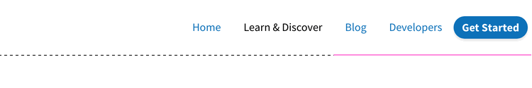
You can see how the pink hides the dashes. In the actual styles, because the #FFF is the same as the design’s page background, those list items’ background gradients are placed over top of (and thus hide) the navbar’s background dash.

I should point out that the color stop on the white solid gradient could have been at 1px rather than 2px and still worked, but I decided to give myself a little bit of extra coverage, just for peace of mind. I should also point out that I didn’t just fill the backgrounds of the list items with background-color: #FFF because the navbar has a semitransparent white background fill and a blurring background-filter, so the page content can be hazily visible through the navbar, as shown here.

The backdrop-blurring of content behind the navbar, not blurring nearly as much as I thought they should, but oh well.

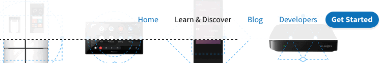
The white line is slightly suboptimal in this situation, but it doesn’t really stand out and does add a tiny bit of visual accent to the navbar’s edge, so I was willing to go with it.

The next step was a little trickier: there needs to be a vertical dashed line “connecting” to the navbar’s dashed line at the horizontal center of the link, and also the navbar’s dashed line needs to be hidden, but only to the right of the vertical dashed line. I thought about doing two background gradients on the list item, one for the vertical dashed line and one for the white “mask”, but I realized that constraining the vertical dashed line to be half the height of the list item while also getting the repeating pattern correct was too much for my brain to figure out.

Instead, I positioned and sized a generated pseudo-element like this:

nav.global ul li.currentPage {
	position: relative;
}
nav.global ul li.currentPage::before {
	content: '';
	position: absolute;
	z-index: 1;
	top: 50%;
	bottom: 0;
	left: 50%;
	right: 0;
	background:
		linear-gradient(180deg,
			currentColor 25%,
			transparent 25% 75%, 
			currentColor 75%) 0 0 / 1px 8px repeat-y, 
		linear-gradient(0deg, #FFFF 2px, transparent 2px);
	background-size: 1px 0.5em, auto;
}

That has the generated pseudo-element fill the bottom right quadrant of the active link’s list item, with a vertical dashed linear gradient running along its left edge and a solid white two-pixel gradient along its bottom edge, with the solid white below the vertical dash. Here it is, with the background pinkishly filled in to be visible behind the two gradients.

That’s the ::before with its background filled in a rosy pink instead of the usual transparency.

With that handled, the last step was to add the dash across the bottom of the current-page link and then mask the vertical line with a background color, like so:

nav.global ul li.currentPage a {
	position: relative;
	z-index: 2;
	background: var(--dashH); /* converted the dashes to variables */
	background-size: 0.5em 1px;
	background-position: 50% 100%;
	background-color: #FFF;
}

And that was it. Now, any of the navbar links can be flagged as the current page (with a class of currentPage on the enclosing list item) and will automatically link up with the dashes across the bottom of the navbar, with the remainder of that navbar dash hidden by the various solid white gradient background images.

An animation of the link styles, only now you know how they work.

So, it’s kind of a hack, and I wish there were a cleaner way to do this. And maybe there is! I pondered setting up a fine-grained grid and adding an SVG with a dashed path, or maybe a filler <span>, to join the current link to the line. That also feels like a hack, but maybe less of one. Or maybe not!

What I believe I want are the capabilities promised by the Anchored Positioning proposal. I think I could have done something like:

nav.global {position: relative;}
nav.global .currentPage {anchor-name: --navLink;}
nav.global::before {
	position: absolute;
	left: 0;
	bottom: 0;
	right: var(--center);
	--center: anchor(--navLink 50%);
	top: anchor(--navLink bottom);
}

…and then used that to run the dashed line over from the left side of the page to underneath the midpoint of the current link, and then up to the bottom edge of that link. Which would have done away with the need for the li ~ li overlaid-background hack, and nearly all the other hackery. I mean, I enjoy hackery as much as the next codemonaut, but I’m happier when the hacks are more elegant and minimal.


Nuclear Targeted Footnotes

Published 3 years, 1 month past

One of the more interesting design challenges of The Effects of Nuclear Weapons was the fact that, like many technical texts, it has footnotes.  Not a huge number, and in fact one chapter has none at all, but they couldn’t be ignored.  And I didn’t want them to be inline between paragraphs or stuck into the middle of the text.

This was actually a case where Chris and I decided to depart a bit from the print layout, because in print a chapter has many pages, but online it has a single page.  So we turned the footnotes into endnotes, and collected them all near the end of each chapter.

Originally I had thought about putting footnotes off to one side in desktop views, such as in the right-hand grid gutter.  After playing with some rough prototypes, I realized this wasn’t going to go the way I wanted it to, and would likely make life difficult in a variety of display sizes between the “big desktop monitor” and “mobile device” realms.  I don’t know, maybe I gave up too easily, but Chris and I had already decided that endnotes were an acceptable adaptation and I decided to roll with that.

So here’s how the footnotes work.  First off, in the main-body text, a footnote marker is wrapped in a <sup> element and is a link that points at a named anchor in the endnotes. (I may go back and replace all the superscript elements with styled <mark> elements, but for now, they’re superscript elements.)  Here’s an example from the beginning of Chapter I, which also has a cross-reference link in it, classed as such even though we don’t actually style them any differently than other links.

This is true for a conventional “high explosive,” such as TNT, as well as for a nuclear (or atomic) explosion,<sup><a href="#fnote01">1</a></sup> although the energy is produced in quite different ways (<a href="#§1.11" class="xref">§ 1.11</a>).

Then, down near the end of the document, there’s a section that contains an ordered list.  Inside that list are the endnotes, which are in part marked up like this:

<li id="fnote01"><sup>1</sup> The terms “nuclear” and atomic” may be used interchangeably so far as weapons, explosions, and energy are concerned, but “nuclear” is preferred for the reason given in <a href="#§1.11" class="xref">§ 1.11</a>.

The list item markers are switched off with CSS, and superscripted numbers stand in their place.  I do it that way because the footnote numbers are important to the content, but also have specific presentation demands that are difficult  —  nay, impossible — to pull off with normal markers, like raising them superscript-style. (List markers are only affected by a very limited set of properties.)

In order to get the footnote text to align along the start (left) edge of their content and have the numbers hang off the side, I elected to use the old negative-text-indent-positive-padding trick:

.endnotes li {
	padding-inline-start: 0.75em;
	text-indent: -0.75em;
}

That works great as long as there are never any double-digit footnote numbers, which was indeed the case… until Chapter VIII.  Dang it.

So, for any footnote number above 9, I needed a different set of values for the indent-padding trick, and I didn’t feel like adding in a bunch of greater-than-nine classes. Following-sibling combinator to the rescue!

.endnotes li:nth-of-type(9) ~ li {
	margin-inline-start: -0.33em;
	padding-inline-start: 1.1em;
	text-indent: -1.1em;
}

The extra negative start margin is necessary solely to get the text in the list items to align horizontally, though unnecessary if you don’t care about that sort of thing.

Okay, so the endnotes looked right when seen in their list, but I needed a way to get back to the referring paragraph after reading a footnote.  Thus, some “backjump” links got added to each footnote, pointing back to the paragraph that referred to them.

<span class="backjump">[ref. <a href="#§1.01">§ 1.01</a>]</span>

With that, a reader can click/tap a footnote number to jump to the corresponding footnote, then click/tap the reference link to get back to where they started.  Which is fine, as far as it goes, but that idea of having footnotes appear in context hadn’t left me.  I decided I’d make them happen, one way or another.

(Throughout all this, I wished more than once the HTML 3.0 proposal for <fn> had gone somewhere other than the dustbin of history and the industry’s collective memory hole.  Ah, well.)

I was thinking I’d need some kind of JavaScript thing to swap element nodes around when it occurred to me that clicking a footnote number would make the corresponding footnote list item a target, and if an element is a target, it can be styled using the :target pseudo-class.  Making it appear in context could be a simple matter of positioning it in the viewport, rather than with relation to the document.  And so:

.endnotes li:target {
	position: fixed;
	bottom: 0;
	padding-block: 2em 4em;
	padding-inline: 2em;
	margin-inline: -2em 0;
	border-top: 1px solid;
	background: #FFF;
	box-shadow: 0 0 3em 3em #FFF;
	max-width: 45em;
}

That is to say, when an endnote list item is targeted, it’s fixedly positioned against the bottom of the viewport and given some padding and background and a top border and a box shadow, so it has a bit of a halo above it that sets it apart from the content it’s overlaying.  It actually looks pretty sweet, if I do say so myself, and allows the reader to see footnotes without having to jump back and forth on the page.  Now all I needed was a way to make the footnote go away.

Again I thought about going the JavaScript route, but I’m trying to keep to the Web’s slower pace layers as much as possible in this project for maximum compatibility over time and technology.  Thus, every footnote gets a “close this” link right after the backjump link, marked up like this:

<a href="#fnclosed" class="close">X</a></li>

(I realize that probably looks a little weird, but hang in there and hopefully I can clear it up in the next few paragraphs.)

So every footnote ends with two links, one to jump to the paragraph (or heading) that referred to it, which is unnecessary when the footnote has popped up due to user interaction; and then, one to make the footnote go away, which is unnecessary when looking at the list of footnotes at the end of the chapter.  It was time to juggle display and visibility values to make each appear only when necessary.

.endnotes li .close {
	display: none;
	visibility: hidden;
}
.endnotes li:target .close {
	display: block;
	visibility: visible;
}
.endnotes li:target .backjump {
	display: none;
	visibility: hidden;
}

Thus, the “close this” links are hidden by default, and revealed when the list item is targeted and thus pops up.  By contrast, the backjump links are shown by default, and hidden when the list item is targeted.

As it now stands, this approach has some upsides and some downsides.  One upside is that, since a URL with an identifier fragment is distinct from the URL of the page itself, you can dismiss a popped-up footnote with the browser’s Back button.  On kind of the same hand, though, one downside is that since a URL with an identifier fragment is distinct from the URL of the page itself, if you consistently use the “close this” link to dismiss a popped-up footnote, the browser history gets cluttered with the opened and closed states of various footnotes.

This is bad because you can get partway through a chapter, look at a few footnotes, and then decide you want to go back one page by hitting the Back button, at which point you discover have to go back through all those footnote states in the history before you actually go back one page.

I feel like this is a thing I can (probably should) address by layering progressively-enhancing JavaScript over top of all this, but I’m still not quite sure how best to go about it.  Should I add event handlers and such so the fragment-identifier stuff is suppressed and the URL never actually changes?  Should I add listeners that will silently rewrite the browser history as needed to avoid this?  Ya got me.  Suggestions or pointers to live examples of solutions to similar problems are welcomed in the comments below.

Less crucially, the way the footnote just appears and disappears bugs me a little, because it’s easy to miss if you aren’t looking in the right place.  My first thought was that it would be nice to have the footnote unfurl from the bottom of the page, but it’s basically impossible (so far as I can tell) to animate the height of an element from 0 to auto.  You also can’t animate something like bottom: calc(-1 * calculated-height) to 0 because there is no CSS keyword (so far as I know) that returns the calculated height of an element.  And you can’t really animate from top: 100vh to bottom: 0 because animations are of a property’s values, not across properties.

I’m currently considering a quick animation from something like bottom: -50em to 0, going on the assumption that no footnote will ever be more than 50 em tall, regardless of the display environment.  But that means short footnotes will slide in later than tall footnotes, and probably appear to move faster.  Maybe that’s okay?  Maybe I should do more of a fade-and-scale-in thing instead, which will be visually consistent regardless of footnote size.  Or I could have them 3D-pivot up from the bottom edge of the viewport!  Or maybe this is another place to layer a little JS on top.

Or maybe I’ve overlooked something that will let me unfurl the way I first envisioned with just HTML and CSS, a clever new technique I’ve missed or an old solution I’ve forgotten.  As before, comments with suggestions are welcome.


Table Column Alignment with Variable Transforms

Published 3 years, 2 months past

One of the bigger challenges of recreating The Effects of Nuclear Weapons for the Web was its tables.  It was easy enough to turn tab-separated text and numbers into table markup, but the column alignment almost broke me.

To illustrate what I mean, here are just a few examples of columns that had to be aligned.

A few of the many tables in the book and their fascinating column alignments.  (Hover/focus this figure to start a cyclic animation fading some alignment lines in and out. Sorry if that doesn’t work for you, mobile readers.)

At first I naïvely thought, “No worries, I can right- or left-align most of these columns and figure out the rest later.”  But then I looked at the centered column headings, and how the column contents were essentially centered on the headings while having their own internal horizontal alignment logic, and realized all my dreams of simple fixes were naught but ashes.

My next thought was to put blank spacer columns between the columns of visible content, since table layout doesn’t honor the gap property, and then set a fixed width for various columns.  I really didn’t like all the empty-cell spam that would require, even with liberal application of the rowspan attribute, and it felt overly fragile  —  any shifts in font face (say, on an older or niche system) might cause layout upset within the visible columns, such as wrapping content that shouldn’t be wrapped or content overlapping other content.  I felt like there was a better answer.

I also thought about segregating every number and symbol (including decimal separators) into separate columns, like this:

<tr>
  <th>Neutrinos from fission products</th>
  <td>10</td> 
  <td></td>
  <td></td>
</tr>
<tr class="total">
  <th>Total energy per fission</th>
  <td>200</td>
  <td>±</td>
  <td>6</td>
</tr>

Then I contemplated what that would do to screen readers and the document structure in general, and after the nausea subsided, I decided to look elsewhere.

It was at that point I thought about using spacer <span>s.  Like, anywhere I needed some space next to text in order to move it to one side or the other, I’d throw in something like one of these:

<span class="spacer"></span>
<span style="display: inline; width: 2ch;"></span>

Again, the markup spam repulsed me, but there was the kernel of an idea in there… and when I combined it with the truism “CSS doesn’t care what you expect elements to look or act like”, I’d hit upon my solution.

Let’s return to Table 1.43, which I used as an illustration in the announcement post.  It’s shown here in its not-aligned and aligned states, with borders added to the table-cell elements.

Table 1.43 before and after the cells are shifted to make their contents visually align.

This is exactly the same table, only with cells shifted to one side or another in the second case.  To make this happen, I first set up a series of CSS rules:

figure.table .lp1 {transform: translateX(0.5ch);}
figure.table .lp2 {transform: translateX(1ch);}
figure.table .lp3 {transform: translateX(1.5ch);}
figure.table .lp4 {transform: translateX(2ch);}
figure.table .lp5 {transform: translateX(2.5ch);}

figure.table .rp1 {transform: translateX(-0.5ch);}
figure.table .rp2 {transform: translateX(-1ch);}

For a given class, the table cell is translated along the X axis by the declared number of ch units.  Yes, that means the table cells sharing a column no longer actually sit in the column.  No, I don’t care — and neither, as I said, does CSS.

I chose the labels lp and rp for “left pad” and “right pad”, in part as a callback to the left-pad debacle of yore even though it has basically nothing to do with what I’m doing here.  (Many of my class names are private jokes to myself.  We take our pleasures where we can.)  The number in each class name represents the number of “characters” to pad, which here increment by half-ch measures.  Since I was trying to move things by characters, using the unit that looks like it’s a character measure (even though it really isn’t) made sense to me.

With those rules set up, I could add simple classes to table cells that needed to be shifted, like so:

<td class="lp3">5 ± 0.5</td>

<td class="rp2">10</td>

That was most of the solution, but it turned out to not be quite enough.  See, things like decimal places and commas aren’t as wide as the numbers surrounding them, and sometimes that was enough to prevent a specific cell from being able to line up with the rest of its column.  There were also situations where the data cells could all be aligned with each other, but were unacceptably offset from the column header, which was nearly always centered.

So I decided to calc() the crap out of this to add the flexibility a custom property can provide.  First, I set a sitewide variable:

body {
	--offset: 0ch;
}

I then added that variable to the various transforms:

figure.table .lp1 {transform: translateX(calc(0.5ch + var(--offset)));}
figure.table .lp2 {transform: translateX(calc(1ch   + var(--offset)));}
figure.table .lp3 {transform: translateX(calc(1.5ch + var(--offset)));}
figure.table .lp4 {transform: translateX(calc(2ch   + var(--offset)));}
figure.table .lp5 {transform: translateX(calc(2.5ch + var(--offset)));}

figure.table .rp1 {transform: translateX(calc(-0.5ch + var(--offset)));}
figure.table .rp2 {transform: translateX(calc(-1ch   + var(--offset)));}

Why use a variable at all?  Because it allows me to define offsets specific to a given table, or even specific to certain table cells within a table.  Consider the styles embedded along with Table 3.66:

#tbl3-66 tbody tr:first-child td:nth-child(1),
#tbl3-66 tbody td:nth-child(7) {
	--offset: 0.25ch;
}
#tbl3-66 tbody td:nth-child(4) {
	--offset: 0.1ch;	
}

Yeah. The first cell of the first row and the seventh cell of every row in the table body needed to be shoved over an extra quarter-ch, and the fourth cell in every table-body row (under the heading “Sp”) got a tenth-ch nudge.  You can judge the results for yourself.

So, in the end, I needed only sprinkle class names around table markup where needed, and add a little extra offset via a custom property that I could scope to exactly where needed.  Sure, the whole setup is hackier than a panel of professional political pundits, but it works, and to my mind, it beats the alternatives.

I’d have been a lot happier if I could have aligned some of the columns on a specific character.  I think I still would have needed the left- and right-pad approach, but there were a lot of columns where I could have reduced or eliminated all the classes.  A quarter-century ago, HTML 4 had this capability, in that you could write:

<COLGROUP>
	<COL>
	<COL>
	<COL align="±">
</COLGROUP>

CSS2 was also given this power via text-align, where you could give it a string value in order to specify horizontal alignment.

But browsers never really supported these features, even if some of them do still have bugs open on the issue.  (I chuckle aridly every time I go there and see “Opened 24 years ago” a few lines above “Status: NEW”.)  I know it’s not top of anybody’s wish list, but I wouldn’t mind seeing that capability return, somehow. Maybe as something that could be used in Grid column tracks as well as table columns.

I also found myself really pining for the ability to use attr() here, which would have allowed me to drop the classes and use data-* attributes on the table cells to say how far to shift them.  I could even have dropped the offset variable.  Instead, it could have looked something like this:

<td data-pad="3.25">5 ± 0.5</td>

<td data-pad="-1.9">10</td>

figure.table *[data-pad] {transform: translateX(attr(data-pad,'ch'));}

Alas, attr() is confined to the content property, and the idea of letting it be used more widely remains unrealized.

Anyway, that was my journey into recreating mid-20th-Century table column alignment on the Web.  It’s true that sufficiently old browsers won’t get the fancy alignment due to not supporting custom properties or calc(), but the data will all still be there.  It just won’t have the very specific column alignment, that’s all.  Hooray for progressive enhancement!


Flexibly Centering an Element with Side-Aligned Content

Published 3 years, 6 months past

In a recent side project that I hope will become public fairly soon, I needed to center a left-aligned list of links inside the sides of the viewport, but also line-wrap in cases where the lines got too long (as in mobile). There are a few ways to do this, but I came up with one that was new to me. Here’s how it works.

First, let’s have a list.  Pretend each list item contains a link so that I don’t have to add in all the extra markup.

<ol>
	<li>Foreword</li>
	<li>Chapter 1: The Day I Was Born</li>
	<li>Chapter 2: Childhood</li>
	<li>Chapter 3: Teachers I Admired</li>
	<li>Chapter 4: Teenage Dreaming</li>
	<li>Chapter 5: Look Out World</li>
	<li>Chapter 6: The World Strikes Back</li>
	<li>Chapter 7: Righting My Ship</li>
	<li>Chapter 8: In Hindsight</li>
	<li>Afterword</li>
</ol>

Great. Now I want it to be centered in the viewport, without centering the text. In other words, the text should all be left-aligned, but the element containing them should be as centered as possible.

One way to do this is to wrap the <ol> element in another element like a <div> and then use flexbox:

div.toc {
	display: flex;
	justify-content: center;
}

That makes sense if you want to also vertically center the list (with align-items: center) and if you’re already going to be wrapping the list with something that should be flexed, but neither really applied in this case, and I didn’t want to add a wrapper element that had no other purpose except centering. It’s 2022, there ought to be another way, right? Right. And this is it:

ol {
	max-inline-size: max-content;
	margin-inline: auto;
}

I also could have used width there in place of max-inline-size since this is in English, so the inline axis is horizontal, but as Jeremy pointed out, it’s a weird clash to have a physical property (width) and a logical property (margin-inline) working together. So here, I’m going all-logical, which is probably better for the ongoing work of retraining myself to instinctively think in logical directions anyway.

Thanks to max-inline-size: max-content, the list can’t get any wider (more correctly: any longer along the inline axis) than the longest list item. If the container is wider than that, then margin-inline: auto means the ol element’s box will be centered in the container, as happens with any block box where the width is set to a specific amount, there’s leftover space in the container, and the side margins of the box are set to auto. This is as if I’d pre-calculated the maximum content size to be (say) 434 pixels wide and then declared max-inline-size: 434px.

The great thing here is that I don’t have to do that pre-calculation, which would be very fragile in any case. I can just use max-content instead. And then, if the container ever gets too small to fit the longest bit of content, because the ol was set to max-inline-size instead of just straight inline-size, it can fill out the container as block boxes usually do, and the content inside it can wrap to multiple lines.

Perhaps it’s not the most common of layout needs, but if you find yourself wanting a lightweight way to center the box of an element with side-aligned content, maybe this will work for you.

What’s nice about this is that it’s one of those simple things that was difficult-to-impossible for so long, with hacks and workarounds needed to make it work at all, and now it… just works.  No extra markup, not even any calc()-ing, just a couple of lines that say exactly what they do, and are what you want them to do.  It’s a nice little example of the quiet revolution that’s been happening in CSS of late.  Hard things are becoming easy, and more than easy, simple.  Simple in the sense of “direct and not complex”, not in the sense of “obvious and basic”.  There’s a sense of growing maturity in the language, and I’m really happy to see it.


When or If

Published 3 years, 7 months past

The CSSWG (CSS Working Group) is currently debating what to name a conditional structure, and it’s kind of fascinating.  There are a lot of strong opinions, and I’m not sure how many of them are weakly held.

Boiled down to the bare bones, the idea is to take the conditional structures CSS already has, like @supports and @media, and allow more generic conditionals that combine and enhance what those structures make possible.  To pick a basic example, this:

@supports (display: grid) {
	@media (min-width: 33em) {
		…
	}
}

…would become something like this:

@conditional supports(display: grid) and media(min-width: 33em) {
	…
}

This would also be extended to allow for alternates, something like:

@conditional supports(display: grid) and media(min-width: 33em) {
	…
} @otherwise {
	…
}

Except nobody wants to have to type @conditional and @otherwise, so the WG went in search of shorter names.

The Sass-savvy among you are probably jumping up and down right now, shouting “We have that! We have that already! Just call them @if and @else and finally get on our level!”  And yes, you do have that already: Sass uses exactly those keywords.  There are some minor syntactic differences (Sass doesn’t require parentheses around the conditional tests, for example) and it’s not clear whether CSS would allow testing of variable values the way Sass does, but they’re very similar.

And that’s a problem, because if CSS starts using @if and @else, there is the potential for syntactic train wrecks.  If you’re writing with Sass, how will it tell the difference between its @if and the CSS @if?  Will you be forever barred from using CSS conditionals in Sass, if that’s what goes into CSS?  Or will Sass be forced to rename those conditionals to something else, in order to avoid clashing — and if so, how much upheaval will that create for Sass authors?

The current proposal, as I write this, is to use @when and @else in CSS Actual.  Thus, something like:

@when supports(display: grid) and media(min-width: 33em) {
	…
} @else {
	…
}

Even though there is overlap with @else, apparently starting the overall structure with @when would allow Sass to tell the difference.  So that would sidestep clashing with Sass.

But should the CSS WG even care that a third-party code base’s syntax gets trampled on by CSS syntax?  I imagine Sass authors would say, “Uh, hell yeah they should”, but does that outweigh the potential learning hurdle of all the non-Sass authors, both now and over the next few decades, learning that @when doesn’t actually have temporal meaning and is just an alias for the more recognizable if statement?

Because while it’s true that some programming languages have a when conditional structure (kOS being the one I’ve used most recently), they usually also have an if structure, and the two sometimes mean different things.  There is a view held by some that using the label when when we really mean if is a mistake, one that will stand out as a weird choice and a design blunder, 10 years hence, and will create a cognitive snag in the process of learning CSS.  Others hold the view that when is a relatively common programming term, it’s sometimes synonymous with if, every language has quirks that new learners need to learn, and it’s worth avoiding a clash with tools and authors that already exist.

If you ask me, both views are true, and that’s the real problem.  I imagine most of the participants in the discussion, even if their strong opinions are strongly held, can at least see where the other view is rooted, and sympathize with it.  And it’s very likely the case that even if Sass and other tools didn’t exist, the WG would still be having the same debate, because both terms work in context.  I suspect if would have won by now, but who knows?  Maybe not.  There have been longer debates over less fundamental concepts over the years.

A lot of my professional life has been spent explaining CSS to people new to it, so that may be why I personally lean toward @if over @when.  It’s a bit easier to explain, it looks more familiar to anyone who’s done programming at just about any level, and semantically it makes a bit more sense to me.  It’s also true that I come from a place of not having to worry about Sass changing on me, because I’ve basically never used it (or any other CSS pre-processor, for that matter) and I don’t have to do the heavy lifting of rewriting Sass to deal with this.  So, easy for me to say!

That said, I have an instinctive distrust of arguments by majority.  Yes, the number of Sass developers who’d have to adapt Sass to @if in CSS Actual is vanishingly small compared to the population of current and future CSS authors, and the number of Sass authors is likely much smaller than the number of total CSS authors.  That doesn’t automatically mean they should be discounted. It’s good to keep CSS as future-proof as possible, but it should also be kept as present-proof as possible.

The rub comes in with “as possible”, though.  This isn’t a situation where all things are possible. Something’s going to give, and there will be a group of people ill-served by the result.  Will it be Sass authors?  Future CSS learners?  Another group?  Everyone?  We’ll see!


Back in the CSSWG

Published 4 years, 4 months past

As you might have noticed, I recently wrote about how I got started with CSS a quarter century ago,  what I’ve seen change over that long span of time, and the role testing has played in both of those things.

After all, CSS tests are most of how I got onto the Cascading Style Sheets & Formatting Properties Working Group (as it was known then) back in the late 1990s.  After I’d finished creating tests for nearly all of CSS, I wrote the chair of the CSS&FP WG, Chris Lilley, about it.  The conversation went something like, “Hey, I have all these tests I’ve created, would the WG or browser makers be at all interested in using them?”  To which the answer was a resounding yes.

Not too much later, I made some pithy-snarky comment on www-style about how only the Cool Kids on the WG knew what was going on with something or other, and I wasn’t one of them, pout pout.  At which point Chris emailed me to say something like, “We have this role called Invited Expert; how would you like to be one?”  To which the answer was a resounding (if slightly stunned) yes.

I came aboard with a lot of things in mind, but the main thing was to merge my test suite with some other tests and input from smart folks to create the very first official W3C test suite.  Of any kind, not just for CSS.  It was announced alongside the promotion of CSS2 to Recommendation status in December 1998.

I stayed an Invited Expert for a few years, but around 2003 I withdrew from the group for lack of time and input, and for the last 17-some years, that’s how it’s stayed.  Until now, that is: as of yesterday, I’ve rejoined the CSS Working Group, this time as an official Member, one of several representing Igalia.  And fittingly, Chris Lilley was the first to welcome me back.

I’m returning to take back up the mantle I carried the first time around: testing CSS.  I intend to focus on creating Web Platform Test entries demonstrating new CSS features, clarifying changes to existing specifications, and filling in areas of CSS that are under-tested.  Maybe even to draft tests for things the WG is debating, to explore what a given proposal would mean in terms of real-world rendering.

My thanks to Igalia for enabling my return to the CSS WG, as well as supporting my contributions yet to come.  And many thanks to the WG for a warm welcome.  I have every hope that I’ll be able to once more help CSS grow and improve in my own vaguely unique way.


Ancestors and Descendants

Published 4 years, 5 months past

After my post the other day about how I got started with CSS 25 years ago, I found myself reflecting on just how far CSS itself has come over all those years.  We went from a multi-year agony of incompatible layout models to the tipping point of April 2017, when four major Grid implementations shipped in as many weeks, and were very nearly 100% consistent with each other.  I expressed delight and astonishment at the time, but it still, to this day, amazes me.  Because that’s not what it was like when I started out.  At all.

I know it’s still fashionable to complain about how CSS is all janky and weird and unapproachable, but child, the wrinkles of today are a sunny park stroll compared to the jagged icebound cliff we faced at the dawn of CSS.  Just a few examples, from waaaaay back in the day:

  • In the initial CSS implementation by Netscape Navigator 4, padding was sometimes a void.  What I mean is, you could give an element a background color, and you could set a border, but if you adding any padding, in some situations it wouldn’t take on the background color, allowing the background of the parent element to show through.  Today, we can recreate that effect like so:
    border: 3px solid red;
    padding: 0.5em;
    background-color: cornflowerblue;
    background-clip: content-box;
    

    Padding as a void.

    But we didn’t have background-clip in those days, and backgrounds weren’t supposed to act like that.  It was just a bug that got fixed a few versions later. (It was easier to get browsers to fix bugs in those days, because the web was a lot smaller, and so were the stakes.)  Until that happened, if you wanted a box with border, background, padding, and content in Navigator, you wrapped a <div> inside another <div>, then applied the border and background to the outer and the padding (or a margin, at that point it didn’t matter) to the inner.
  • In another early Navigator 4 version, pica math was inverted: Instead of 12 points per pica, it was set to 12 picas per point — so 12pt equated to 144pc instead of 1pc.  Oops.
  • Navigator 4’s handling of color values was another fun bit of bizarreness.  It would try to parse any string as if it were hexadecimal, but it did so in this weird way that meant if you declared color: inherit it would render in, as one person put it, “monkey-vomit green”.
  • Internet Explorer for Windows started out by only tiling background images down and to the right.  Which was fine if you left the origin image in the top left corner, but as soon as you moved it with background-position, the top and left sides of the element just… wouldn’t have any background.  Sort of like Navigator’s padding void!
  • At one point, IE/Win (as we called it then) just flat out refused to implement background-position: fixed.  I asked someone on that team point blank if they’d ever do it, and got just laughter and then, “Ah no.” (Eventually they relented, opening the door for me to create complexspiral and complexspiral distorted.)
  • For that matter, IE/Win didn’t inherit font sizes into tables.  Which would be annoying even today, but in the era of still needing tables to do page-level layout, it was a real problem.
  • IE/Win had so many layout bugs, there were whole sites dedicated to cataloging and explaining them.  Some readers will remember, and probably shudder to do so, the Three-Pixel Text Jog, the Phantom Box Bug, the Peekaboo Bug, and more.  Or, for that matter, hasLayout/zoom.
  • And perhaps most famous of all, Netscape and Opera implemented the W3C box model (2021 equivalent: box-sizing: content-box) while Microsoft implemented an alternative model (2021 equivalent: box-sizing: border-box), which meant apparently simple CSS meant to size elements would yield different results in different browsers.  Possibly vastly different, depending on the size of the padding and so on.  Which model is more sensible or intuitive doesn’t actually matter here: the inconsistency literally threatened the survival of CSS itself.  Neither side was willing to change to match the other — “we have customers!” was the cry — and nobody could agree on a set of new properties to replace height and width.  It took the invention of DOCTYPE switching to rescue CSS from the deadlock, which in turn helped set the stage for layout-behavior properties like box-sizing.

I could go on.  I didn’t even touch on Opera’s bugs, for example.  There was just so much that was wrong.  Enough so that in a fantastic bit of code aikido, Tantek turned browsers’ parsing bugs against them, redirecting those failures into ways to conditionally deliver specific CSS rules to the browsers that needed them.  A non-JS, non-DOCTYPE form of browser sniffing, if you like — one of the earliest progenitors of feature queries.

I said DOCTYPE switching saved CSS, and that’s true, but it’s not the whole truth.  So did the Web Standards Project, WaSP for short.  A group of volunteers, sick of the chaotic landscape of browser incompatibilities (some intentional) and the extra time and cost of dealing with them, who made the case to developers, browser makers, and the tech press that there was a better way, one where browsers were compatible on the basics like W3C specifications, and could compete on other features.  It was a long, wearying, sometimes frustrating, often derided campaign, but it worked.

The state of the web today, with its vast capability and wide compatibility, owes a great deal to the WaSP and its allies within browser teams.  I remember the time that someone working on a browser — I won’t say which one, or who it was — called me to discuss the way the WaSP was treating their browser. “I want you to be tougher on us,” they said, surprising the hell out of me. “If we can point to outside groups taking us to task for falling short, we can make the case internally to get more resources.”  That was when I fully grasped that corporations aren’t monoliths, and formulated my version of Hanlon’s Razor: “Never ascribe to malice that which is adequately explained by resource constraints.”

The original Acid Test.

In order to back up what we said when we took browsers to task, we needed test cases.  This not only gave the CSS1 Test Suite a place of importance, but also the tests the WaSP’s CSS Action Committee (aka the CSS Samurai) devised.  The most famous of these is the first CSS Acid Test, which was added to the CSS1 Test Suite and was even used as an Easter egg in Internet Explorer 5 for Macintosh.

The need for testing, whether acid or basic, lives on in the Web Platform Tests, or WPT for short.  These tests form a vital link in the development of the web.  They allow specification authors to create reference results for the rules in those specifications, and they allow browser makers to see if the code they’re writing yields the correct results.  Sometimes, an implementation fails a test and the implementor can’t figure out why, which leads to a discussion with the authors of the specification, and that can lead to clarifications of the specification, or to fixing flawed tests, or even to both.  Realize just how harmonious browser support for HTML and CSS is these days, and know that WPT deserves a big part of the credit for that harmony.

As much as the Web Standards Project set us on the right path, the Web Platform Tests keep us on that path.  And I can’t lie, I feel like the WPT is to the CSS1 Test Suite much like feature queries are to those old CSS parser hacks.  The latter are much greater and more powerful than than the former, but there’s an evolutionary line that connects them.  Forerunners and inheritors.  Ancestors and descendants.

It’s been a real privilege to be present as CSS first emerged, to watch as it’s developed into the powerhouse it is today, and to be a part of that story — a story that is, I believe, far from over.  There are still many ways for CSS to develop, and still so many things we have yet to discover in its feature set.  It’s still an entrancing language, and I hope I get to be entranced for another 25 years.

Thanks to Brian Kardell, Jenn Lukas, and Melanie Sumner for their input and suggestions.


25 Years of CSS

Published 4 years, 5 months past

It was the morning of Tuesday, May 7th and I was sitting in the Ambroisie conference room of the CNIT in Paris, France having my mind repeatedly blown by an up-and-coming web technology called “Cascading Style Sheets”, 25 years ago this month.

I’d been the Webmaster at Case Western Reserve University for just over two years at that point, and although I was aware of table-driven layout, I’d resisted using it for the main campus site.  All those table tags just felt… wrong.  Icky.  And yet, I could readily see how not using tables hampered my layout options.  I’d been holding out for something better, but increasingly unsure how much longer I could wait.

Having successfully talked the university into paying my way to Paris to attend WWW5, partly by having a paper accepted for presentation, I was now sitting in the W3C track of the conference, seeing examples of CSS working in a browser, and it just felt… right.  When I saw a single word turned a rich blue and 100-point size with just a single element and a few simple rules, I was utterly hooked.  I still remember the buzzing tingle of excitement that encircled my head as I felt like I was seeing a real shift in the web’s power, a major leap forward, and exactly what I’d been holding out for.

Page 4, HTML 3.2.

Looking back at my hand-written notes (laptops were heavy, bulky, battery-poor, and expensive in those days, so I didn’t bother taking one with me) from the conference, which I still have, I find a lot that interests me.  HTTP 1.1 and HTML 3.2 were announced, or at least explained in detail, at that conference.  I took several notes on the brand-new <OBJECT> element and wrote “CENTER is in!”, which I think was an expression of excitement.  Ah, to be so young and foolish again.

There are other tidbits: a claim that “standards will trail innovation” — something that I feel has really only happened in the past decade or so — and that “Math has moved to ActiveMath”, the latter of which is a term I freely admit I not only forgot, but still can’t recall in any way whatsoever.

My first impressions of CSS, split for no clear reason across two pages.

But I did record that CSS had about 35 properties, and that you could associate it with markup using <LINK REL=STYLESHEET>, <STYLE>…</STYLE>, or <H1 STYLE="…">.  There’s a question — “Gradient backgrounds?” — that I can’t remember any longer if it was a note to myself to check later, or something that was floated as a possibility during the talk.  I did take notes on image backgrounds, text spacing, indents (which I managed to misspell), and more.

What I didn’t know at the time was that CSS was still largely vaporware.  Implementations were coming, sure, but the demos I’d seen were very narrowly chosen and browser support was minimal at best, not to mention wildly inconsistent.  I didn’t discover any of this until I got back home and started experimenting with the language.  With a printed copy of the CSS1 specification next to me, I kept trying things that seemed like they should work, and they didn’t.  It didn’t matter if I was using the market-dominating behemoth that was Netscape Navigator or the scrappy, fringe-niche new kid Internet Explorer: very little seemed to line up with the specification, and almost nothing worked consistently across the browsers.

So I started creating little test pages, tackling a single property on each page with one test per value (or value type), each just a simple assertion of what should be rendered along with a copy of the CSS used on the page.  Over time, my completionist streak drove me to expand this smattering of tests to cover everything in CSS1, and the perfectionist in me put in the effort to make it easy to navigate.  That way, when a new browser version came out, I could run it through the whole suite of tests and see what had changed and make note of it.

Eventually, those tests became the CSS1 Test Suite, and the way it looks today is pretty much how I built it.  Some tests were expanded, revised, and added, plus it eventually all got poured into a basic test harness that I think someone else wrote, but most of the tests — and the overall visual design — were my work, color-blindness insensitivity and all.  Those tests are basically what got me into the Working Group as an Invited Expert, way back in the day.

Before that happened, though, with all those tests in hand, I was able to compile CSS browser support information into a big color-coded table, which I published on the CWRU web site (remember, I was Webmaster) and made freely available to all.  The support data was stored in a large FileMaker Pro database, with custom dropdown fields to enter the Y/N/P/B values and lots of fields for me to enter template fragments so that I could export to HTML.  That support chart eventually migrated to the late Web Review, where it came to be known as “the Mastergrid”, a term I find funny in retrospect because grid layout was still two decades in the future, and anyway, it was just a large and heavily styled data table.  Because I wasn’t against tables for tabular data.  I just didn’t like the idea of using them solely for layout purposes.

You can see one of the later versions of Mastergrid in the Wayback Machine, with its heavily classed and yet still endearingly clumsy markup.  My work maintaining the Mastergrid, and articles I wrote for Web Review, led to my first book for O’Reilly (currently in its fourth edition), which led to my being asked to write other books and speak at conferences, which led to my deciding to co-found a conference… and a number of other things besides.

And it all kicked off 25 years ago this month in a conference room in Paris, May 7th, 1996.  What a journey it’s been.  I wonder now, in the latter half of my life, what CSS — what the web itself — will look like in another 25 years.


Browse the Archive

Earlier Entries

Later Entries