Posts in the Tech Category

Welcome to the Grid

Published 8 years, 3 months past

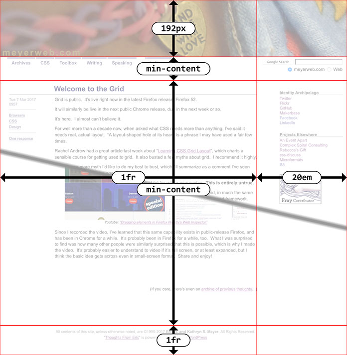
Grid is public.  It’s live right now in the latest Firefox release, Firefox 52.

It will similarly be live in the next public Chrome release, due in the next week or so.

It’s here.  I almost can’t believe it.

For well more than a decade now, when asked what CSS needs more than anything, I’ve said it needs real, actual layout.  “A layout-shaped hole at its heart” is a phrase I may have used a fair few times.

Rachel Andrew had a great article last week about “Learning CSS Grid Layout”, which charts a sensible course for getting used to grid.  It also busted a few myths about grid.  I recommend it highly.

There’s one more myth I’d like to do my best to bust, which I’ll summarize as a comment I’ve seen many times: “Ugh, tables again?”

The underlying assumption here is: grids are just tables with a new syntaxThis is entirely untrue.

I mean, yes, you can recreate 1990s-era table-based layout techniques with grid, in much the same way you can recreate the submit button with two JS libraries and a complex front-end framework.  The ability to do it doesn’t necessarily make it a good idea.

(Though you might, from time to time, find the ability useful.  Here’s what I mean: you can take a bunch of data contained in arbitrary markup someone else is producing, and lay it out in a tabular format.  It would be far preferable to have the data in actual table markup, but if that’s not an option, grid will give you a potential solution.)

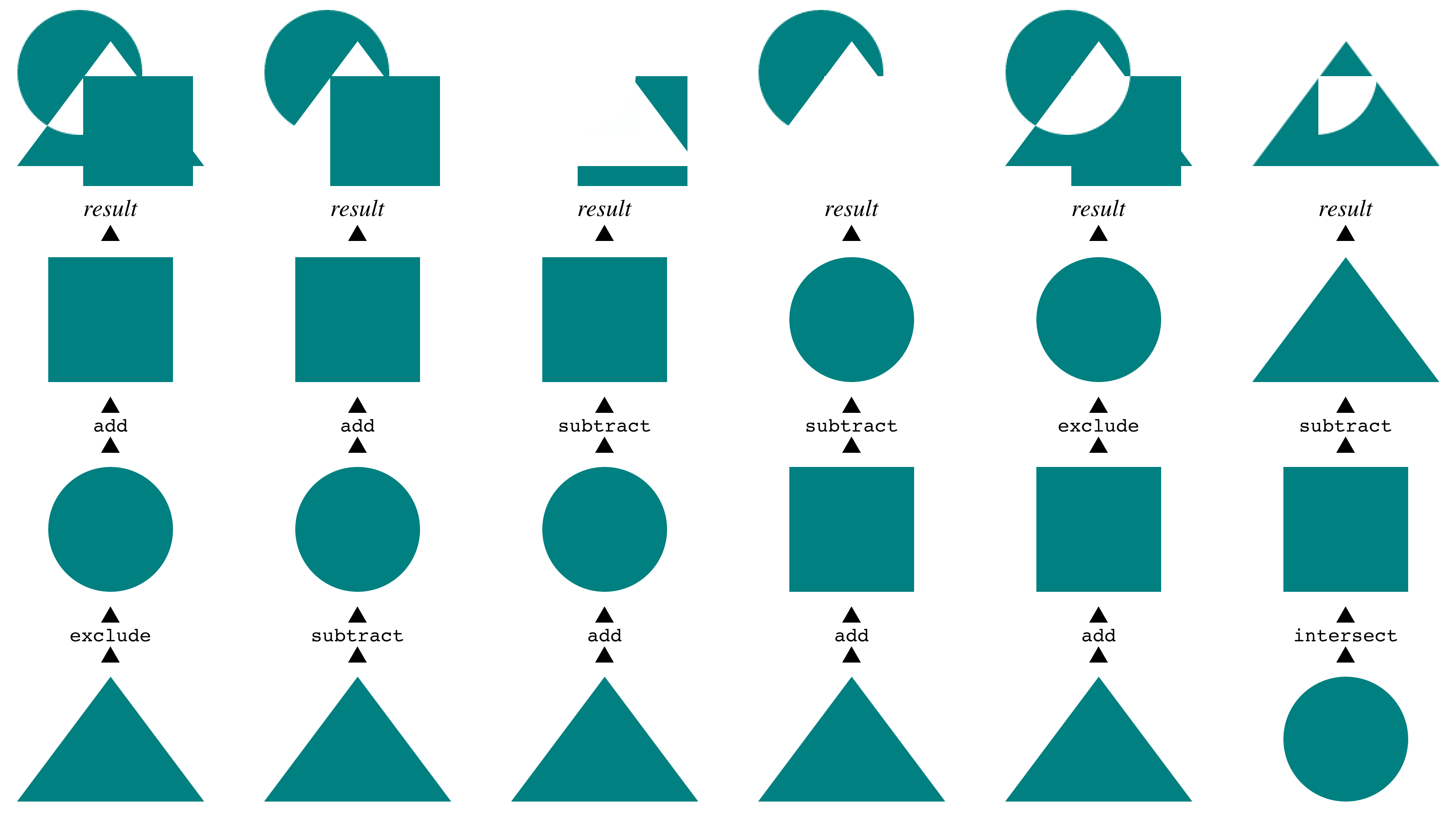
I have an example of just one way grids are different than tables.  I just last Friday finished writing the last chapter of CSS: The Definitive Guide, 4th Edition, covering filters, blending, clipping, and masking.  (I finished the grid chapter late last year, so it’s already available in the early-access title.)  Almost all the figures in the book were created by building HTML+CSS pages, and taking high-resolution screen captures with Firefox’s screenshot command.  Here’s one.

Compositing masks

The way these are displayed is actually the inverse of their source order.  I wanted them to be in document source such that the compositing steps were in chronological order, so that’s how I wrote them.  Once I laid them out that way in the figure, using grid, I realized it made more sense to arrange them visually, with the bottom layer at the bottom of the figure, the next above that, all leading up to the result at the top.

So I just rearranged them on the grid, by assigning grid row numbers.  The document source wasn’t touched.  A bit simplified, the CSS to do that looked something like this:


ol li:nth-child(1) {grid-row: 4;}
ol li:nth-child(2) {grid-row: 3;}
ol li:nth-child(3) {grid-row: 2;}
ol li:nth-child(4) {grid-row: 1;}

Because the compositing examples (the “columns” in the layout) were represented as ordered lists, with the grid set up to place each image with some captioning, I could just change their order.  So yes, it looks like a table, but the underlying structure is anything but table-like.  Just to get each column of examples grouped together with tables, I’d have to nest tables, or accept a one-row table with each cell containing some other structure.  Rearranging the columns would mean doing markup surgery, instead of just reassigning their layout placement via CSS.

Instead, I was able to represent the content in the best available structure (ordered lists) and then arrange them on a grid in the best way I could visually.  For that matter, I could responsively change the layout from a six-column grid to a three-column grid to un-gridded lists as the viewport got more and more narrow.  As, in fact, I did — check it out.  If you make the window narrow enough, Grid is dropped entirely so you can see the base structure and content.

This ability to place grid items without respect to source order is a powerful tool, and like all powerful tools it can be used for good or ill.  It’s possible to assemble a visually usable layout out of the most inaccessible, horrible markup structures imaginable.  It’s also possible to assemble a visually usable layout from clean, accessible markup in ways we’ve never even dared dream.

Combine grids with other CSS features, and you can really create art.  Jen Simmmons has a layout lab site, and her 2016 main-page design is… well, go see it in a grid-capable browser, like today’s release of Firefox.  Realize it’s all text, no images, no scripting.  Just markup and style.

And the style is remarkably simple for what’s being accomplished.  It’s not too alien a syntax, but it will likely take some time to adjust to using it.  It’s taken me some time, as I’ve experimented and written about it.  Unlearning my float habits has taken some work, and I don’t know that I’m completely done.  I do know that it’s been worth it many times over.

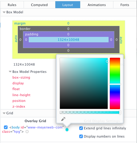
I’ve done a few experiments with the layout of a local copy of meyerweb, and done some frankly goofy things to the design along the way.  I’m hoping to convert what’s up here to a simple grid layout in the next few days, make it a slightly more complex grid shortly after that, and then maybe — maybe — actually do some redesigning for the first time in over a decade, to take advantage of grid more fully.  Jen has a great six-minute video exploring a few features of grid and the grid inspection tool now built into Firefox, which I recommend to anyone curious to know more.

So if you’re thinking of grid as tables 2.0, please, stop.  Table-style layouts are the first one percent of what grid offers.  There are works of art and undiscovered techniques waiting in the other 99 percent.


Scaling SVG Clipping Paths for CSS Use

Published 8 years, 4 months past

I’ve been working a lot with the clip-path property recently, as I write the chapter on filters, blends, clipping, and masking for CSS: The Definitive Guide’s long-delayed 4th edition (available now in early-release format!).  One of the nifty things you can do with clipping paths is define them with percentage-based coordinates.  For example, here’s a hexagon-like clipping path:

clip-path: polygon(50% 0, 100% 25%, 100% 75%, 50% 100%, 0 75%, 0 25%);

That starts at the center top (50% 0), goes to the right edge, quarter-down (100% 25%), and so on.

When I got to SVG-based clipping, which you can use with the CSS pattern clip-path: url(#pathID), I tried and failed with this:

<clipPath id="hexlike">
  <polygon points="50% 0, 100% 25%, 100% 75%, 50% 100%, 0 75%, 0 25%" />
</clipPath>

It didn’t work because, as I discovered to my horror, SVG does not allow percentage coordinates.  I could just strip all the percent signs out, but that would be the same as saying this in CSS:

clip-path: polygon(50px 0, 100px 25px, 100px 75px, 50px 100px, 0 75px, 0 25px);

I didn’t want pixels, though.  I want percentages, darn it all!

So I asked around on Twitter, and Markus Stange pointed me to the solution: converting all the SVG coordinates to the range 0–1 and using the clipPathUnits attribute.  The working version looks like this:

<clipPath id="hexlike" clipPathUnits="objectBoundingBox">
  <polygon points="0.5 0, 1 0.25, 1 0.75, 0.5 1, 0 0.75, 0 0.25"/>
</clipPath>`
A hexlike clipping path.

That yields the same result as the polygon() CSS shape with the percentages I showed before.

All that is great if you’re writing your own SVG shapes and can make sure you set it up properly, but what if someone hands you a shape to be used as a clip path and it’s in absolute coordinates like 100 75?  If you’re really lucky, the shape has a viewbox of 0 0 100 100 (or all the coordinate points are in that range) and you can just divide all the coordinate points by 100 to get the proper values.  But that’s really tedious for any but the simplest of shapes, and besides, what if it has some other viewbox?  That’s where the transform attribute saves the day.

For example, suppose you get an SVG file that looks like this (with the actual path coordinates removed because there are a lot of them):

<svg version="1.1" xmlns="http://www.w3.org/2000/svg"
  xmlns:xlink="http://www.w3.org/1999/xlink" viewBox="0 0 329.6667 86">
  <clipPath id="cloud02">
    <path d="…(coordinates go here)…"/>
  </clipPath>
</svg>

First, add the clipPathUnits attribute to the <clipPath> element:

<svg version="1.1" xmlns="http://www.w3.org/2000/svg"
 xmlns:xlink="http://www.w3.org/1999/xlink" viewBox="0 0 329.6667 86">
  <clipPath id="cloud02" clipPathUnits="objectBoundingBox">
    <path d="…(coordinates go here)…"/>
  </clipPath>
</svg>

Next, look at the viewBox attribute on the <svg> element itself.  The value there is 329.6667 86.  That means 329.6667 coordinate units horizontally, and 86 units vertically.  So all you need to do now is divide all the horizontal values by 329.6667, and the vertical values by 86.  Which would be super tedious, except we have scaling transforms at our disposal:

<svg version="1.1" xmlns="http://www.w3.org/2000/svg"
  xmlns:xlink="http://www.w3.org/1999/xlink" viewBox="0 0 329.6667 86">
  <clipPath id="cloud02" clipPathUnits="objectBoundingBox"
   transform="scale(0.003033 0.0116279)">
    <path d="…(coordinates go here)…"/>
  </clipPath>
</svg>

Those two values are 1/329.6667 and 1/86, respectively, and they effectively scale every point in the d attribute to fit into the needed 0–1 range.  (That’s not precisely what happens, but the outcome is the same.)  Thus we have an SVG clipping path that scales with the element and fits to its dimensions!

This works just as well for other markup patterns.  To return to the hexlike path from before, assume it was written like this:

<svg version="1.1" xmlns="http://www.w3.org/2000/svg"
 xmlns:xlink="http://www.w3.org/1999/xlink" viewBox="0 0 100 100">
  <clipPath id="hexlike">
    <polygon points="50 0, 100 25, 100 75, 50 100, 0 75, 0 25" />
  </clipPath>
</svg>

If that were applied as-is, via clip-path: url(#hexlike), it would create a hex-like clipping path that fits a 100px by 100px box, positioned in the top left of the element (in left-to-right languages, I presume).  The quick fix:

<svg version="1.1" xmlns="http://www.w3.org/2000/svg"
 xmlns:xlink="http://www.w3.org/1999/xlink" viewBox="0 0 100 100">
  <clipPath id="hexlike" clipPathUnits="objectBoundingBox"
   transform="scale(0.01)">
    <polygon points="50 0, 100 25, 100 75, 50 100, 0 75, 0 25" />
  </clipPath>
</svg>

Bingo bango bongo, it will now scale to the element’s dimensions, whatever those turn out to be.

Of course, if you apply that to something like a short paragraph, it will be verrrrry stretched out, but the same would be true with a percentage-based polygon() shape.  The beauty here is that you can scale any coordinate set, so if you have a tiny path that you want to blow up, or a huge path you want to shrink down, you can transform it without using clipPathUnits to stretch it over the bounding box.  Something like this:

<svg version="1.1" xmlns="http://www.w3.org/2000/svg"
 xmlns:xlink="http://www.w3.org/1999/xlink" viewBox="0 0 100 100">
  <clipPath id="hexlike" transform="scale(4)">
    <polygon points="50 0, 100 25, 100 75, 50 100, 0 75, 0 25" />
  </clipPath>
</svg>

That gets you a hexlike shape that fits a 400px by 400px box, for example.

Now all CSS needs is the ability to size and position clipping paths in a manner similar background images, and we’ll be in clover.  I hope such properties are in the WG’s mind, because I’d love to be able to just point an at SVG clipping path, and then say something like clip-path-position: center; clip-path-size: contain;.  That would remove the need for fiddling with SVG attributes altogether.

Thanks to Markus Stange for the technique and his invaluable assistance in proofreading this article.


Proper Filter Installation

Published 8 years, 4 months past

I ran into an interesting conceptual dilemma yesterday while I was building a test page for the filter property.  In a way, it reminded me a bit of Dan Cederholm’s classic SimpleQuizzes, even though it’s not about HTML.

First, a bit of background.  When I set up test suites, directories of example files, or even browser-based figures for a book, I tend to follow a pattern of having all the HTML (or, rarely, XML) files in a single directory.  Inside that directory, I’ll have subdirectories containing the style sheets, images, fonts, and so on.  I tend to call these c/, i/, and f/, but imagine they’re called css/, images/, and fonts/ if that helps.  The names aren’t particularly important — it’s the organizational structure that matters here.

So, with that groundwork in place, here’s what happened: I wrote some SVG filters, and put them into an SVG file for referencing via the url(filters.svg#fragment) filter function pattern.  So I had this SVG file that didn’t actually visually render anything; it was just a collection of filters to be applied via CSS.

I clicked-and-held the mouse button, preparing to drag the file into a subdirectory…and suddenly stopped.  Where should I put it?  css/, or images/?  It clearly wasn’t CSS.  Even if I were to rename css/ to styles/, are filter definitions really styles?  I’m not sure they are.  But then, what is an image that has no visual output?

(Insert “one hand clapping” reference here.)

Sure, I could set up an svg/ subdirectory, but then I’d just end up with SVG images (as in, SVGs that actually have visual output) mingled in with the filter-file… and furthermore, segregated from all the other images, the PNGs and JPGs still hanging out in images/.  That seems weird.

I could establish a filters/ subdirectory, but that seems like overkill when I only planned to have a single file containing all the filters; and besides, I’m not in the habit of creating subdirectories that relate to only a single HTML file.

I could dodge the whole question by establishing a generic assets/ subdirectory, although I’ve long been of the opinion assets/, when it isn’t used to toss in all of your assets classes in their own subdirectories, is just a fancy alias for misc/.  And I dislike tossing stuff into misc/, the messy kitchen junk drawer of any project.

I came to a decision in the end, but I’m not going to tell you what it was, because I’m curious: what would you do in that situation?


Preview Video: What Would a Human Do?

Published 8 years, 4 months past

We’re about halfway through February, he said with some deliberate vagueness, and that means the launch-month special on my Udemy course “Design for Humanity” is also half-done.  If you haven’t taken advantage yet, use the code MW_BLOG to get a nice little discount off the list price.

You may be wondering if this course is really for you.  There are some videos available as free previews on Udemy.  I’m including one here, which is a single “lecture” (as they’re called by the Udemy) from early in the course.  It explores a single concept and also establishes some of the landscape for the course, which is one of the reasons I chose it.

Youtube: “What Would a Human Do?”

Again, the discount code above ends at the end of February, so if you’re interested bu haven’t signed up yet, don’t delay too much longer.  And if you have already taken the course, could you do me a favor and leave an honest review at Udemy?  It will help other people. whether they find the course from me or through Udemy, decide whether the course is right for them or not.  Thank you!


A New Online Course: Design for Humanity

Published 8 years, 5 months past

As longtime readers know, my professional focus has been very different the past couple of years.  Ever since the events of 2013-2014, I started focusing on design and meeting the needs of people — not just users, but complete people with complex lives.  I teamed up with Sara Wachter-Boettcher to write Design for Real Life, and  presented talks at An Event Apart called “Designing for Crisis” (2015) and “Compassionate Design” (2016; video to come).  I’m not done with CSS — I should have news on that front fairly soon, in fact — but a lot of my focus has been on the practice of design, and how we approach it.

To that end, I’ve been spending large chunks of the last few months creating and recording a course for Udemy called “Design for Humanity”, and it’s now available.  The course is based very heavily on Design for Real Life, following a similar structure and using many of the examples from the book, plus new examples that have emerged since the book was published, but it takes a different approach to learning.  Think of it as a companion piece.  If you’re an auditory processor as opposed to a visual processor, for example, I think the course will really work for you.

Who is the course for?  I put it like this:

This course will help you if you are part of the design process for a product or service, whether that’s a website, an app, an overall experience, or a physical product. You might be a product designer or product manager, an entrepreneur or work in customer service or user research, an experience designer or an information architect. If you have been impacted by bad design and want to do better, this course is for you.

I know a lot of courses promise they’re just right for whoever you are, no really, but in this case I honestly feel like that’s true for anyone who has an interest in design, whether that’s visual design, system design, or content design.  It’s about changing perspective and patterns of thinking — something many readers of the book, and people who’ve heard my talks, say they’ve experienced.

If you’ve already bought the book, then thank you!  Be on the lookout for email from A Book Apart containing a special code that will give you a nice discount on the course.  If you haven’t picked up the book yet, that’s no problem.  I have a code for readers of meyerweb as well: use MW_BLOG to get 20% off the sale price of the course, bringing it down to a mere $12, or slightly less than $3 per hour!  (The code is good through February 28th, so you have a month to take advantage of it.)

If you like the course, please do consider picking up the book.  It’s a handy format to have close to hand, and to lend to others.  On the flip side, if you liked the book, please consider checking out the course, containing as it does new material and some evolution of thinking.

And either way, whether it’s the book or the course, if you liked what you learned, please take a moment to write a short review, say something on the interwebs, and generally spread the word to colleagues and co-workers.  The more people who hear the message, the better we’ll become as an industry at not just designing, but designing with care and humanity.


Element Dragging in Web Inspectors

Published 8 years, 5 months past
Yesterday, I was looking at an existing page, wondering if it would be improved by rearranging some of the elements.  I was about to fire up the git engine (spawn a branch, check it out, do edits, preview them, commit changes, etc., etc.) when I got a weird thought: could I just drag elements around in the Web Inspector in my browser of choice, Firefox Nightly, so as to quickly try out various changes without having to open an editor?  Turns out the answer is yes, as demonstrated in this video!
Youtube: “Dragging elements in Firefox Nightly’s Web Inspector”
Since I recorded the video, I’ve learned that this same capability exists in public-release Firefox, and has been in Chrome for a while.  It’s probably been in Firefox for a while, too.  What I was surprised to find was how many other people were similarly surprised that this is possible, which is why I made the video.  It’s probably easier to understand to video if it’s full screen, or at least expanded, but I think the basic idea gets across even in small-screen format.  Share and enjoy!

What Comes Next…

Published 8 years, 6 months past
Spot the geek signifiers!

There is a documentary about the history of the web.  It’s an hour long, and now it’s free to watch.

Also, I’m in it — a fair amount, it turns out.  Please do not let this dissuade you from watching it.

I’m blogging about this because there’s a little bit of a backstory.  Jeffrey and I were backers of the film during its crowdfunding campaign.  At that point, Jeffrey had been already interviewed for the film, but even beside that, we really wanted the film to exist in the world.  So much of the history of our craft has been lost, or simply untold.  So we put some of AEA’s resources into supporting the project, and were glad to see it meet its funding goal.  So, you know, full disclosure and all: I’m a backer of the film, and I’m in it.  Jeffrey, too.

In fact, I wouldn’t be surprised to find out most of the people who appear in the film were also backers of the film.  This probably makes it sound like people paid to be featured, but nothing could be further from the truth.  It’s the exact opposite: the people featured in the film are featured because they’re the kind of people who would badly want to see such a thing exist in the first place, and lend material support to the effort.  They’re all people who truly love the craft and want to see it documented, explained, and shared with as many people as possible.  The kind of people who learned from others, and in turn taught others, freely sharing what they knew.  In some cases, paying out of pocket to share what they knew, in hopes that the sharing would help someone.  I think that ethos comes through bright and clear in the film.

If you want to understand the heart of the web, understand that.  It was designed and built and fundamentally shaped from its earliest days by people who wanted it to be open and free and accessible to anyone, whether as a consumer or a creator.  Those were the founding principles.  They shape every aspect of the web we know, for good or ill or otherwise.

Some time after the film was crowdfunded — about a year and a half, I think — Matt, the film’s director, editor, and all-around prime mover, drove up from his office in Pittsburgh to my office in Cleveland to shoot some of the last segments to be recorded.  So he asked me the questions he still wanted someone to answer, or that had arisen as he’d started editing all the other interviews.  Thus I show up a lot in the first half of the film, talking about the early days of the web, and am mostly absent in the second half, as the younger crowd talks about the great stuff that happened as the web matured.  Which is proper, I think.

But! I hasten to add, there are way, way smarter and better-spoken people in the film than me, all the way through, sketching out the path this field took and what makes the web so incredibly compelling and powerful even today.  It’s company I’m honored and humbled to be part of.  If you can spare an hour, say a lunch break, I highly recommend you devote it to What Comes Next is the Future.


Not On This Day

Published 8 years, 6 months past

Suppose you use Facebook (statistically, odds are at least 1 in 5 that you do).  Further, suppose you have a period of your life, or even more than one, that you’d rather not be mined by Facebook’s “On This Day” feature.  Here’s how to set a blackout for any period(s) of time.

  1. Go to facebook.com/onthisday in a web browser while logged into Facebook.  Said browser can be either desktop or mobile.
  2. In a desktop web browser, click the “Preferences” button in the upper right quadrant of the page, to the right edge of the On This Day masthead.  In a mobile web browser, tap the gear icon in the upper right, then tap “Preferences”.
  3. Select the “Dates” line (on desktop, you have to click the “Edit” link on the right).
  4. Now select the “Select Dates” link that looks like a section heading, but is actually a point of interaction.
  5. Select start and end dates, in that order (see below).  On desktop you can type into the boxes or use the popup calendars; on mobile, you get date wheels.
  6. Select “Done” (desktop) or “Add” (mobile).
  7. If you want to add more date ranges to filter out, go back to the “Select Dates” step again and work forward.
  8. Once you’re done, select “Save”.
  9. To finish setting preferences, select “Done”.

…and that’s it, he said dryly.

Should you want to effectively disable On This Day, you can set up a date range of January 1, 1900 to December 31, 2099.  I couldn’t go past 2099 in my testing — according to the error message, anything from 2100 on is an “invalid date”.  I also discovered that setting a start date will always reset the end date to the new start date, so make sure to set your start date first and your end date second.

You might have seen that you can also filter out specific people.  The process there is similar, except you type names to find accounts to filter out instead of using date pickers.

So that’s it.  The preferences aren’t easy to find, but they are there.  I’d be a lot happier if Facebook let you pick a given date and applied it to all years — thus allowing you to block out the birthday of an ex-spouse, or the wedding anniversary of a now-defunct marriage, for example.  I’d be happier still if they surfaced these preferences more readily; say, prompting you with a date-exclusion option whenever you tell them you don’t want to see a given memory in your timeline.  I don’t mind writing how-to guides to help other people, but I do sometimes mind that their existence feels necessary, if you follow me there.


A note for the future: this guide was accurate as of the date of publication.  If you’re reading it some time later, especially if it’s been several months or years, bear in mind that things may have changed in the meantime.  In that case, please feel free to leave a comment indicating there’s been a change, so I can update the guide.  Thanks!


Browse the Archive

Earlier Entries

Later Entries