Posts in the Tech Category

First-Order Solutions

Published 21 years, 9 months past

While I knew I was staking out a position that was likely to cause some controversy, I’ve been rather surprised at the response to my post on Weblog Weirdness.  I got several e-mailed responses, some in support of and others disagreeing with my views.  Matt Mullenweg went to some length to describe just how wrong I am, and I threw out a few responses in the commentsChris Vincent responded to my post by keeping the reverse-chronological (or, as Michael Hanscom put it, chronoillogical) order for his weblog, but implementing a “Welcome Back” feature which tells you what’s new since the last time you visited the site.  The News Goat put forth some ideas on how to handle chronological posting as well; the ideas are similar to what Chris did and close to what I had in mind (more on that in a moment).  And the aforementioned Michael wrote an entire post in chronoillogical format, with the paragraphs running last to first.  The interesting part is that it made almost as much sense that way as forward, which is either a testament to Michael’s writing skills or else an indication that I’m wrong about the nature of writing.  (Hey, why not give my critics more ammo?)

Speaking of critics, I did have my mental state questioned a few times, and more than one person has wondered why I’m so angry about this subject.  Angry?  Apparently I’ve managed to build up an image so mild and inoffensive that strongly stating my views looks like anger.  Time to start correcting that image.

Other commentary and ideas: Robert Scoble, Bob Congdon, Roger Benningfield, Richard Allsebrook.

Meanwhile, I took a crack at setting up my primary idea, and discovered that I just don’t have the programming skills necessary to make it work in a reasonable time frame.  (Hell, I couldn’t even figure out how to get MySQL running on OS X, and spent a couple of curse-filled hours before giving up.)  So I’ll describe it, and hope that one of you bright coders can make it work.  Although I’m using ordered steps here, this isn’t a flowchart or anything; it’s just the way I envision the system working in my head.

  1. The posts are in chronological order.  (Yeah, I know, that probably seems obvious given what I’ve been talking about.)
  2. When the user first arrives, the site sets a cookie that records the date and time.  This is updated on every subsequent visit so that the cookie always knows the last time the user visited the weblog.
  3. On subsequent visits, any post was previously seen shows only its title and date; the entry text is collapsed (hidden).  Any posts that are new since the last visit are shown in full.  Some sub-thoughts to go with that:
    • The collapsed posts might not be totally collapsed, but show an abstract, or the first sentence of the post, or something that gives a little more context than just title and date.
    • The most recently-viewed post (that is, the post that was most recent the last time the site was visited) could also be shown in full, in order to give some sense of continuity.
    • For those who like to have a ton of posts on the front page, there might need to be a “skip to first expanded” link.  Or else you could offer an option, also set by a cookie, regarding whether old posts should even appear at all.
  4. Next to each of the collapsed posts’ title is a button that lets the user show the text of that entry.  Next to that button is another button that means “click me and I’ll expand this post and all of the posts that follow it.”  No, I haven’t figured out how to turn that into an icon yet, but I bet somebody out there can.
  5. Similarly, expanded posts have buttons that mean “collapse this post” and “collapse this post and all posts that precede it.”
  6. If you visit the page and there’s nothing new, then collapse all but the most recent; in other words, make sure there’s at least one post open.  If all of the posts are new, well then, of course you have them all open.  The system might even indicate that there are archived posts that haven’t been seen, and offer a link to the least recent of them.

In general, this approach allows for a compact display of posts in chronological order while making it easy for the user to get right to the new stuff.  It doesn’t make the page any heavier than normal, either.  I can even envision in my head the general markup and scripting needed to drive this system, but I’m too clumsy with JavaScript to make it work any time this week (or next, I expect).  Maybe one of you can show ol’ gramps how it’s done.

Matt actually proposed a very similar idea to me, except I think what he was envisioning was server-based:  there’s a cookie that records the last visit time, and the server reads that and returns just the content for the new stuff.  Though I see no reason why a server-side plugin couldn’t offer the kind of functionality I just described.  It would require more roundtrips to the server as posts are expanded and collapsed, I suppose.  It would still be worth trying.

Leaping Fish

Published 21 years, 9 months past

As I write this entry, Cascading Style Sheets: The Definitive Guide, Second Edition is #3 on Amazon’s Computers & Internet Bestsellers list, and the book itself has a sales rank of 144.  Sweeeet.


Weblog Weirdness

Published 21 years, 9 months past

Weblogs are temporally broken; the question I have is whether or not they’re temporarily broken, or if we’re going to manage to fix them.  I do not completely exempt meyerweb from this statement, either.  As of this writing, the front page of meyerweb is as broken as every other weblog I’ve ever read.  The archives are not, but the problem is that there’s an inconsistency between the front page and the archives.  That’s a different kind of broken, but I’ll get to that in just a bit.

Here’s what I mean: the most-recent-first format is broken.  No other form of written communication works that way, and in fact almost no form of human communication works like that.  There’s a reason why.  Reading a weblog is like watching Memento, which I agree was a cool movie, except all weblogs are like that so it’s as if every single movie released in the past seven or eight years was structured exactly like Memento.  If conference presentations about weblogs were true to the form, the speaker would start with the conclusion, work backwards through his points, and end with the opening statement.  (I’d love to see someone actually do that.)  If weblog entries were ordered like the weblogs themselves, this would be the next-to-last paragraph, and the one above would be below it instead.

“But Eric,” you cry, “we want to see the most recent information first!  Newer is better!”  Wrong.  What’s most important is catching up with the content you haven’t seen before.  If weblogs could run off of telepathy, the site would determine the most recent post you’d actually read, and then present you with all of the posts since that one, listing them in chronological order.  (It might also show you the most recent post you’d already seen for a sense of continuity, but that would be the very first post you saw.  You could skim through it quickly and get to the new stuff.)

It’s frequently the case that I’ll drop by a weblog and the most recent post will refer back to a two-days-ago post, or maybe to three posts scattered over the previous week.  In some cases, the most recent post makes no sense without having read the older stuff.  So I have to skip to the older material, read it all (making sure I get it in correct order), and then come back to the newest post.  For me, that means opening up the older posts in separate tabs.  Others might open new windows, or just skip around.  Another alternative is to find the least recent post that I’ve read and start reading from there.  And that’s when things get really annoying, because it means scrolling downward to read the post, then scrolling up past what I just read and the entire body of the next post, then scrolling slowly down as I read the newer post.  Lather, rinse, repeat, regret.

None of these solutions are at all intuitive.  In fact, our collective behavior when it comes to reading weblogs is a stunning example of an entire community adopting hugely counter-intuitive behaviors in order to conform to a received truth (that weblog entries should be ordered most to least recent).  I bet many of those people are the same ones that carp about the CSS definition of width being counter-intuitive.  Yet if you read a twenty-chapter book the way you read weblogs, you’d start at the beginning of chapter 20, read it, skip back to the beginning of 19, read that, and so on until you finally worked your way back to chapter 1 and finished the book.  How much sense does that make?  Close to none.

I admit that for weblogs where most entries are two paragraphs or less (*cough*Scoble*cough*), this doesn’t matter as much—you just scroll up instead of down.  But your eyes are doing the same counter-intuitive thing by scanning up, then reading down, up, down, up, down.  After a few minutes of that, my eyes start to get tired, and that makes me grumpy.

It’s also true that in syndication aggregators, you can order the feed entries however you want, but you can get true chronological order only if the posts have a sortable publication date (many don’t), and you can only read chronologically in the aggregator if full posts are being syndicated.  On many sites, that isn’t the case.  I send out a summary feed in both RSS 0.91 and RSS 2.0, and that’s it, because otherwise I’d noticeably increase my outgoing bandwidth consumption.  And yes, bandwidth still matters.  Besides, saying “yeah, weblogs are backward but you can fix them with an aggregator” is in my mind functionally equivalent to saying “yeah, weblogs are broken but with a completely different method of representing the data and a new piece of standalone software, we can hack around the problem.”  So either weblogs are broken and we’ve chosen to invent a whole new branch of technique rather than solve the problem for the Web, or else the Web is not the correct medium for logs/journals and we need to get them off the Web altogether.

I don’t believe the latter is the case, so that leaves me looking hard at the former.  And yes, syndication is incredibly useful for telling you when there’s new stuff on your favorite sites.  I’m talking about the problem with weblogs themselves.  Anyone who’s gone into my archives will have discovered that they’re in chronological order, so you only have to scroll down when reading.  A post is immediately followed by the next-most-recent post.  No up-down-up-down scrolling required.  It’s completely inconsistent with the main page, of course.  People have complained to me that going into the archives messes them up, because they go from the usual reverse-chronological-order posts on the main page to a page of chronologically ordered posts.  I agree that’s entirely too confusing, and things need to be consistent within the site.

So the solution I’m pursuing is to fix the main page to be in chronological order while still being easy to use.  I’ve been toying with ideas on ways to do this, and I hope to test some of them out in the next couple of months.  In the meantime, if anyone knows of a weblog where the author has taken a crack at doing chronologically ordered posts, I’d like to see it, regardless of whether you think they did a good job or not.


Go Blue!

Published 21 years, 10 months past

One has to be careful rooting for the University of Michigan when one lives in Ohio, but I think in this case I can get away with it.  Tantek pointed out that they’re moving the College of Engineering and Computed Aided Engineering Network (love that Tohoscope groove!) sites to standards-oriented design by fall 2004, and exhort their users to get with the times.

Yes, the pages to which I just pointed are rife with tables, images with no alt attributes, and all that funkadelic old-school stuff.  We can expect that to continue until they actually do migrate more towards standards-based design.  I sincerely hope they’ll make a good show of it; I look forward to the day I can list both sites in the “Redesign Watch” sidebar here on meyerweb.

In a similarly Michigander way, I’m hoping to also be able to list MegaTokyo soon, as the man behind the comic recently posted that he’s been delving into CSS-driven design.  Not being a particular anime fan—although I liked Spirited Away, own Cowboy Bebop: The Movie, and am still captivated by the inexplicable FLCL—I’ve still been reading MegaTokyo for a good long while now.  I do get a chuckle every time a representative of the Tokyo Police Cataclysm Division makes an appearance.  Wouldn’t that make a great movie, following those guys around as they cope with and clean up after attacks by giant monsters, demon armies, prepubescent superbeings, and so on?  I’d watch it.


Design Direction Dilemma

Published 21 years, 10 months past

Jason Fried, one of those savvy 37signals guys, posted recently to express some disappointment about the tone of SXSW04i.

I’d like to think I introduced new and different ways to approach common UI quandaries with  my presentation, but I left the conference looking for more. And not necessarily more presentations, but more conversation in the hallways. All I could hear was CSS CSS CSS.

…which would indicate, to me, that the job of convincing developers to use standards-oriented design is not yet complete… unless of course the “CSS CSS CSS” heard was people saying, “Jeez, I’m sick of hearing about CSS CSS CSS all the time.  We get it already.  Why can’t we hear more about X, Y, or Z?”  Which I didn’t hear, but then perhaps I wouldn’t.  If CSS-driven design still has a lot of buzz, then people are still interested in figuring it out how to better use it.

After all, table-driven design is a tool, and CSS-driven design is another tool.  All the talk about CSS is an outgrowth of the continuing effort to show why the shiny new tool is better in many ways than the old, familiar tool.  (“New” is a relative term there.)  Once you’ve figured out that it’s time to upgrade, it’s tempting to think that there’s no reason to keep promoting the new tool.  After all, you’re using it and it should be intuitively obvious to anyone that it’s the right choice.  Sadly, that’s not so.  And it should be said that the limitations in CSS layout help prolong the conversation.  There are some layouts that don’t work well, or at all, without using table markup.  There needs to be a good CSS-G (Grid) or CSS-L (Layout) defined and widely supported before we can really get on to ending all the talk about what design tool to use.

Still, I basically agree with what Jason has to say:

Web standards are great, but people’s own standards include getting things done (and that’s still too hard to do online).

UI designers are making the same old fundamental “forgetting about the human being on the other side” mistakes — except this time their code looks better. Humans — not code validators — use interfaces.

There needs to be more talk about people and goals and scenarios and tasks and clear communication and clear function. More talk about what it’s like to be a human clicking and pointing and struggling to make sense of all this “stuff” that web sites think we need to know and interfaces think we need to do.

Yes!  I was sorry that I had to miss Jason’s presentation at SXSW04i, because I’d like to learn more about making UIs work better.  I’m no usability expert, as I’m sure anyone at 37signals or UIE would be happy to confirm.  There definitely should be more talk about improving usability and design of sites.  The people who know how to do that stuff therefore need to propose and organize such panels for the next SXSW, or whatever conference they’ll be attending.  Jason did that for SXSW04i, but we need more people to do the same.

Because as long as SXSW keeps approving CSS panels, people are going to be talking about it.  If the majority of proposed design panels are about CSS, then it stands to reason that the majority of approved panels will be the same.  In some sense, I’d love to see a conference where there were so many other and more interesting panel proposals that there wasn’t room for Yet Another CSS Is Cool Panel.  Heck, I’d like to attend a conference like that, because I could really enjoy attending it instead of spending half my time and a couple of late nights worrying about what I can say on my panel without boring or confusing the audience.  (Once you count the discussions, false starts, fine-tuning, rewrites, and reworkings of the material, I spent something like ten hours preparing for my ten-minute panel segment.)

If you want the design discussion to be more about people, as I agree it should be, then it’s time to start writing articles, posting to blogs, making newsgroup posts, and presenting conference sessions about it.  It will probably take a huge heap of time, way too much energy, and a near-infinite amount of patience to get the ball rolling in the direction you want.  Of course, you won’t get paid for any of it; hell, you’ll be lucky if you’re thanked for any of it.  That’s what I and a great many other people went through to get things moving toward using standards instead of allowing sites to continue being as heavy and labrynthine as a shelf of Umberto Eco novels.  At no point did the obvious advantages of standards-oriented design sell themselves, lazy sots that they are.  It all had to be done by a group of scattered, largely uncoordinated, individually driven volunteers who took up the effort because they thought it was The Right Thing To Do.  Is it any wonder that, on occasion, we were perceived as being zealots?

I will say, standing where we are today, that for me it was all worth it.  If I’d known ahead of time what would be required, I’d never have started; and I’m sure that if I could clearly remember what was required that I’d swear never to do it again.  (I’m told that parenting is much the same.)  I don’t think the effort can be called complete, but we’re past the hardest part.  Major sites are migrating away from the bloated code of yore and reaping the benefit of simplified, semantic markup.  And it’s true that I do get paid by clients to help in that effort, although I’d like to think that the investment pays off many times over in improved page load times, reduced bandwidth consumption, faster and more efficient maintenance, and so on.  That’s true today.  For a little bit more than half a decade, it wasn’t.

To come back to my point: yes, we need to have more of a discussion about making the user’s life easier.  I’ve done and still do my part, in promoting the use of techniques—tools, if you like—that remove technical barriers to that goal (thanks to reduced page weight, et cetera).  That’s the part I know.  I hope that people in other areas of the Web design space will be willing to expend the time and energy needed to explain the parts they know.  I’d love to learn new ways to make my site better, and that can help my clients make their sites better.  I’m all about that.  I’m ready.  Let’s do it!


Functional Changes

Published 21 years, 10 months past

I’d just like to say that Mac OS X Hints is one of my favorite Web sites.  That’s where I found out how to hack the OS to fix the New Folder/New Finder Window keystroke combinations, for example.  Just a couple of days ago, I was wondering if there was a way to get the function keys to be actual function keys, instead of requiring use of the “fn” key to make them work.  As it turns out, there’s a new preference setting in 10.3.3, and I’ve already toggled mine.  Now I can play Myth again!  Not that I have any time to do so… and if I did, I’d be more likely to keep working toward the end of Metal Arms: Glitch in the System anyway.


Thematic

Published 21 years, 10 months past

CSS seems to be the theme of late, so I’ll keep running with it and bring back the meyerweb themes of old (as several people had e-mailed to ask if I could do).  They won’t be available for the general site; instead, I’ve set up an example page where you can play with them for yourself.  As noted, some images used in the themes are copyrighted, while others are not.  The thematic styles themselves are now explicitly under a Creative Commons license, so do as you please with the styles, assuming you stay within the license terms.  Which shouldn’t be difficult; it’s a straight NonCommercial license.

Two of my favorite movie-and-music moments happen in the same film: The Matrix (which itself inspired one of the old meyerweb themes).  The first is the sparring program scene, where the upbeat video-game-like music goes along perfectly with the video-game flow of the sequence.  The second is the lobby shootout scene, where the video-game-like music goes along… you know.  The music used for the lobby scene is “Spybreak!” by The Propellerheads, albeit an edited version.  In fact, the version on The Matrix‘s soundtrack CD is edited down from the original Propellerheads version, which is almost twice as long, off of the album “Decksanddrumsandrockandroll”.  A while back, I assembled a personal mix called “Der Funkengrüven”, and it ended with the soundtrack version of “Spybreak!”, the only one I had available.

I’ve always wanted to use the album version instead, but I was never sure if it was worth it to buy the CD just for that song.  So I dropped into the iTunes store, called up the album, listened to the high-quality half-minute excerpts available there, and have decided to buy the album.  My only real dilemma now is whether to buy it via the iTunes store for $9.99, or to spring for a couple of extra bucks to get the physical disc in a jewel case and everything at Buy.com.  It’s my first real experience with the iTunes store, and I have to echo what everyone else has been saying: Apple got it right.  The store just works.  I wish the excerpts were a little longer, say 45 seconds or even a full minute, but that’s just picking a nit.  If I didn’t harbor lingering affection for owning albums in a physical form, I’d already have paid to download it, and I still might.  For an oldster like me, that’s saying something.

Sadly, I can’t use the iTunes store to replace my long-lost copy of “The Bobs“, but maybe I could use the store to acquire some Neil Young music…

  • Thematic was published on .
  • It was assigned to the CSS and Mac categories.
  • There have been no replies.

Return of the Fish

Published 21 years, 10 months past

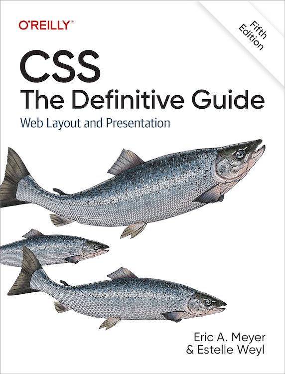
An image of the cover of Cascading Style Sheets, Second Edition I have in my hands a physical copy of the second edition of Cascading Style Sheets: The Definitive Guide, bound with a RepKover lay-flat spine and everything.  So I figure it should be shipping out to folks within the next week or two.  If you’ve pre-ordered, there ought not be long to wait!  (And if you haven’t, then what are you waiting for?)

As I mentioned yesterday, the ‘diagnosis’ favelets I used during my SXSW04i presentation generated a lot of comment, so I now have the underlying style sheets on a “Favelets” page in my “Tools” section.  For those of you who know how favelets work, just grab any or all of the style sheets you want and go for it.  For those who need some assistance, I wrote a “Favelet Creator.”  You plug in the URL of a style sheet you want to have applied to whatever page you’re viewing and the name of the favelet as you want it to appear in your toolbar.  Then you drag the resulting link into your favorites toolbar.

All this really does is create a javascript: link that, when invoked, will dynamically write a link element into the head of whatever document you’re viewing.  That link points to a style sheet, and so the styles are applied.  As an example, you could point it to a style sheet that sets borders for tables and table cells.  When you click on the favelet, all of the tables and table cells in the currently-viewed page become visible.  Figuring out exactly how a table-based page is laid out thus becomes a snap.

So if you don’t like the styles I created, you can write your own (or modify the ones I provided) and create your own diagnostic style sheets.  The favelet creator should make it even simpler.  Either way, I hope these will be helpful.


Browse the Archive

Earlier Entries

Later Entries