Thoughts From Eric Archive

Making Book

Published 21 years, 5 months past

This past weekend, the folks at O’Reilly and I wrapped up the final edits and adjustments to Cascading Style Sheets: The Definitive Guide, 2nd Edition.  The in-stock date is near the end of this month, so it ought to be physically sitting on shelves by the beginning of April, maybe sooner.  The page count listed on the O’Reilly page (as I write this) is an early estimate and too high; the actual page count will be closer to 550 pages.  There are a few reasons for this drop in pages:

  • The support charts have been dropped.  When the first edition came out, it made sense to include that kind of information in an appendix, so we did.  As I recently wrote on www-style, the world is much different now, and the day of nifty support charts may well have passed.  In the CSS realm, anyway.  To even present a simple yes/no support chart for CSS2 would have been a dozen pages long, and a nuanced chart with notes would easily have run five times that long.  I still have notes and warnings about particularly egregious problems sprinkled through the text, though.
  • The “CSS In Action” and “Look Ahead” chapters were also dropped.  There is plenty information available these days on how to actually use CSS, so we decided not to be redundant.  As for looking ahead, even a high-level overview of where CSS3 is headed could be a hundred pages long, and out of date the minute we printed it.  Better to wait and see where things end up than make a lot of ill-informed guesses.
  • By rearranging the way information was presented, I was able to cut a lot of redundancies that bedeviled the first edition.  I also cut out some material that seemed important back in 1999, but has long since become irrelevant (like notes about what IE3 does or doesn’t do).
  • The figure count has been scaled back.  There are still a few hundred figures throughout the book, but I went to some effort to combine several points into a single figure when I could, and not illustrate every little point I made.  You really only need to see so many examples of “boldface text,” you know?
  • The text doesn’t spend time on things that were in CSS2 but aren’t in CSS2.1, and that nobody will likely ever support.  This means that some paged-media properties like marks weren’t described, and I didn’t waste time on the CSS2 marker-styling features since they will almost certainly die out and be replaced by a different approach in CSS3.  I did cover properties like font-size-adjust and text-shadow, but not in major detail.

So the second edition is an update of about 380 pages of the first edition, once you subtract out the stuff that was cut.  Every chapter of the first edition was reviewed and, in most cases, significantly overhauled even if it wasn’t expanded (for example, the Fonts chapter didn’t gain a lot, but it was still reworked to reduce the number of figures needed and to clarify some points).  There are four all-new chapters, five chapters with significant additions or revisions, and five more that were lightly to moderately revised.  So it’s practically a whole new book.

That’s even more true of the book I have coming out in mid- to late April from New Riders: More Eric Meyer on CSS, a sequel to Eric Meyer on CSS.  And when I say “sequel,” I really mean it: this is a collection of ten entirely new projects, so it is not a new edition of the older book.  You can own one without the other, although of course you should buy both!  Baby needs a new pair of shoes, after all.  (Okay, that’s a lie; she’s too little to be wearing shoes.  But you know what I mean.)  I’ll have more details as they become available.


Textual Healing

Published 21 years, 5 months past

I freely admit that I’m kind of a zealot when it comes to words and text—heck, this quiz classified me as a “grammar fuhrer.” (Note: the rating of “M” for the linked quiz may be too weak; “A” might be better.  The results you get may well offend you terribly.  Consider yourself warned.)  I love to read, and wish I could do it more often.  I enjoy writing, for that matter, because there’s a sublime joy in crafting the right sequence of words and creating the right tone as a result.  (Speaking of writing, I’ll have some things to say about that tomorrow.)  In what I regard as an exceedingly rare moment of lucidity on Rush Limbaugh’s part—perhaps he’d been off the drugs for a few days—he once said, “Words mean things.”  I absolutely agree, and not just in the narrow sense.  To me, the right words mean something far more than a string of communicative markers.  They create a meaning that is much greater than the sum of the parts.  The right words at the right time can literally change a life.

I say all that to frame what I’m going to say next.  The Man In Blue recently posted some thoughts on the use of text in Web design—or, more precisely, his opposition to its use for branding purposes.

By utilising run-of-the-mill text to render your identity, it makes it very hard to distinguish yourself from anyone else  delivering a message.  Granted, usage of plain text can itself be an identity, but I think that  Eric Meyer has pretty much cornered the market on that one.

I’m not sure if that’s meant as a compliment or a criticism, but it actually doesn’t matter.  I took it as a compliment, and I think the things I said above help explain why.  Still, I’m going to speak in some defense of using “plain” text for design.  Not a full defense, because Mr. Blue (a.k.a. Cameron Adams) is quite correct: branding is important, and visual identity is an important part of that branding.  As he says, Coca-Cola spends millions every year on branding.  I’m sure Pepsi does the same, as do a great many other companies.  As they should.  He goes on to say:

Although it might pain the purists, sometimes only an image will do.

He couldn’t be more right.  It makes a lot more sense for me to share a picture of Carolyn smiling at her mommy than it does to try to describe the same thing.  Carolyn, reclining in her car seat while in semi-profile, looks up and to the right with a broad grin on her face.  Kat's hand rests next to Carolyn's left shoulder.  If I were in charge of Amazon.com or Wired or some other branded organization, there’s no way I’d replace the logo with plain text.  Besides, an
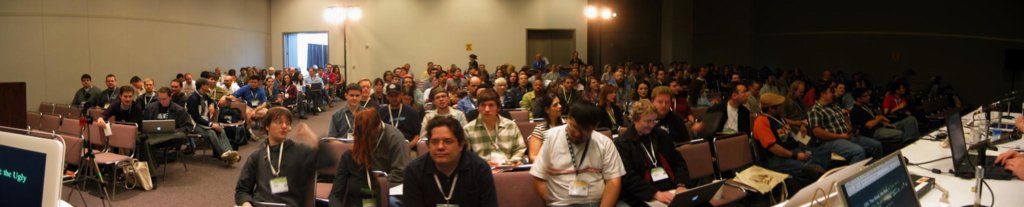
 img with alt text is as accessible as plain text—a little longer to download, but not enough to make a significant difference.

For me, I stick to text because I’m not a visual designer.  I don’t have a CD full of fonts that I can use to make my text look different, graphically or otherwise, and I don’t have the patience to search free font resources to find one.  It doesn’t make sense for me to spend time flailing toward what would probably be an amateurish result when I  can just style some text and move on.

But that doesn’t mean that I settle for the default presentation of text, either.  An example is the “Cut your costs…” text at the top of Complex Spiral Consulting’s main page.  The relevant bits of its CSS are:

font: bold 166% Arial;
letter-spacing: -1px;

Yep, just boldfaced largish Arial—but the negative letter-spacing pulls the letters together just a touch, and significantly alters the visual impact of the text, making it seem weightier than normal.  Conversely, a positive letter-spacing would spread text apart, giving it a more open feel.  Most visual designers grit their teeth over this kind of thing, because it’s the crudest form of kerning imaginable.  True enough, but it still has a desirable effect, and typically one that’s underexploited.

The other reason I stick to text is that it’s almost infinitely more flexible than raster graphics like GIF and JPEG.  If I decide to resize the “meyerweb.com” in the masthead, all I have to do is fiddle with a line of CSS.  For that matter, I do change the size of that text on sub-pages, just as I do the masthead itself.  I can also change the text color to suit the masthead graphic.  For every one of the 26 mastheads I’ve created (this week’s is #6), I’ve changed the text color to blend better with the background.  Doing this was, again, a change of a couple of lines of text.  It would be even better if RGBA color values were widely supported, so I could make the text colored and translucent, but never mind that now.  (Side note to Dean Edwards: how about adding RGBA support to IE7?)

And, of course, the user can resize text, which I regard as a benefit, although a lot of designers regard it with pure horror.  If I had the name of this site as a graphic, then in any browser except Opera, resizing the content display would leave the graphic text unchanged.  That bugs me.  If there were universal vector-graphic support, say for SVG, then I could use it to create any font-and-logo combination I was able to dream up (or hire someone to create for me).  Even with the widespread availability of the Adobe SVG plugin, it’s still not enough.  I know, beyond any doubt, that a Web browser will support text rendering.  I don’t have the same confidence about SVG or even Flash, both of which can be scaled.

So I stick with text.  Realize that this is not what I would tell a corporate client to do.  When I worked with Macromedia, I didn’t tell them that they should replace their logo graphic with plain text stating “Macromedia,” and it wouldn’t even have occured to me.  If I were to work with Adobe or Microsoft or Apple or Red Hat or anyone who’d established a visual identity based around an image, I wouldn’t even consider telling them to replace it with plain text.  I’d agitate for sensible alt text, of course.

But for this site, or for Peter‘s site—both of which are personal sites—I don’t see anything wrong with using text.  (Then again, I guess I wouldn’t, having a corner on this particular market and all.)  In a lot of ways, I think it’s preferable, reducing bandwidth consumption and server hits.

And, y’know… it’s text.  C’mon, everybody, sing it with me:

Text is natural, text is good Not everybody loves it But everybody should

Or, if you groove to an older, smoother beat:

I can tell you, darling, that it’s textual healing Mark up, mark up, mark up, mark up, let’s design tonight Wake up, wake up, wake up, wake up, text will do it right

Thankyew!  Try the veal.


Hack and Slash

Published 21 years, 5 months past

Back in January, I reacted to Peter Nederlof‘s whatever:hover by musing that it would be nice to see behaviors used to extend IE in other useful ways, like adding generated content support and so on.  Dean Edwards, regardless of whether he saw what I had to say, is doing that and more with his in-progress IE7 behavior suite.  Can you say, “will add support for attrribute selectors, multiclass selectors, and adjacent-sibling selectors to IE/Win?”  Oh yeah… I thought so.  And that’s just the beginning.  He has generated content on his list of things that will be supported, and a whole lot more besides.  The behavior is currently alpha, but it’s everything I could possibly have hoped for and more.  I’m going to be keeping a close eye on Dean’s work, and will be putting it to use as it moves out of beta.

In a similar vein, Dean also created an XBL binding to let Gecko-based browsers use Microsoft behaviors.  I think he just might be a genius.  Thankfully, he’s using his powers for good instead of evil.

Hopefully, I can get one of you XSLT gurus to do the same on my behalf.  I have a problem that’s proven beyond my ability to grasp.  Basically, I have a list of events that include start and end dates; here’s the basic markup that drives it.  I can get a list of upcoming events, no problem; I just pass in information about the current date when I run the XSLT and do comparisons.  What I need is a list of recent events, where “recent” is defined as occuring within the past three months, even if those months straddle a New Year.  I also want to get at least the most recent event even if it didn’t happen within the last three months.  And, of course, I want any results sorted in reverse chronological order.  I cannot figure out how to do all that in XSLT.  Any pointers or takers for this one?  I could really use some help.

(Yeah, yeah, doing it with some database or other would be a snap.  I’m trying to do it in XSLT.  Think of it as a creative design constraint.)

On a totally different note, here’s an interesting pair of articles from SF Gate: Gay marriage momentum stuns both backers and foes and Where Is My Gay Apocalypse?  Thanks to Jeff Veen and Simon Willison for the pointers.


Family Leave

Published 21 years, 5 months past

Travel and work have conspired to keep me from updating in a while.  We headed off to New York City (or at least its eastern suburbs) for an extended weekend at Kat’s parents’ house, so Carolyn’s now taken her first two airline flights.  She was really well behaved, which was no doubt a relief to the people seated around us in the ERJ-135s (seating capacity: 37) we took to and from JFK.  Kat’s brother Neil flew in from San Francisco to meet his niece for the first time, and some friends and family in the area gathered on Sunday to meet Carolyn.  It’s a good thing she’s so cheerful and happy to meet new people.

While we were gone, I received some e-mail that hypothesized that last week’s masthead graphic was, um… was… er… let’s just say he wanted to know if it was an extreme anatomical closeup.  In a sense, the answer is “yes.”  It was a closeup from a picture of a giraffe’s eye taken from a distance of about two feet; the same picture, in fact, that I submitted to the Mirror Project.  I’ve been told that I should have an “About the Masthead” area of the site.  Somehow, I find it more fun to leave things a little mysterious, at least for the more abstract masthead images.  After all, if I explained everything up front, I wouldn’t get amusing e-mail.

There should be plenty of opportunities for you to guess.  This week’s masthead is #5 in a series of 26, and I expect I’ll have added even more before #26 goes up at the end of July.


Gathering Stormclouds

Published 21 years, 5 months past

Okay, maybe Tantek’s right and the CSS I devised yesterday wasn’t the greatest (note to self: avoid writing journal entries at 4:45am).  And yes, it would be more elegant, at least on the markup side, to use the href values to determine how to style links.  It feels a touch clumsy, for some reason, maybe because the selectors end up being so long and I’m used to short selectors.  Go check out what he has to say and suggestions for better selectors, and while you’re at it go take a look at substring selectors to get ideas for how to do even better.  (I don’t think anyone supports *= yet, so you’re likely to have to use ^= instead.)

Back in high school, my best friend Dave and I devised a scenario where water shortages in the American southwest became so severe that states literally went to war with each other over water rights and access, fragmenting the United States in the process.  It never really went much of anywhere, just an idea we kicked around, and that I thought about trying to turn into a hex-based strategic wargame but never did.  It’s always lurked in the back of my head, though, the idea of climate-driven warfare.

According to Yahoo! News, a Pentagon report asserts that climate change is a major threat to national security; well, actually, to global security.  And that if the global climate crossing a “tipping point,” the changes will be radical and swift.  In such a situation, economic upheaval will be the least of our concerns—we’ll be more worried about adding to the climate shifts with the aftereffects of nuclear exchanges.

I actually read about this on Fortune.com a few weeks ago, and although now you have to be a member to read the full article at Fortune, there’s a copy at Independent Media TV.  The Fortune article characterizes the report as presenting the possible scenarios if global climate shifts occur, but not claiming that they are happening or will happen.  It also says that the Pentagon agreed to share the unclassified report with Fortune, whereas the Yahoo! News article says the report was leaked after attempts to hush it up.  For that matter, the Yahoo! News article makes it sound like the report claims that The Netherlands will definitely be uninhabitable by 2007, and so on.  According to the Fortune article, that was one aspect of a scenario, not a concrete prediction.  This is probably due to the Yahoo! News article being a summary of an article in The Observer, which is a production of The Guardian and claims to be the “best daily newspaper on the world wide web.”  Uh-huh.

So I guess I’m saying read the Fortune article, as it gives more information and takes a more balanced tone—not that it sounds any less disturbing, really.  The fact that the report was commissioned at all suggests that the subject is being taken seriously at the Pentagon, which is not exactly a gathering place for leftist wackos.  I’ll be very interested to see what reaction, official or otherwise, is triggered by this report in the weeks to come.  My fear is that it doesn’t matter any more, that whatever accusatory words might get thrown around will just be insignificant noise lost in the rising wind.


License To rel

Published 21 years, 5 months past

If you thought XFN or VoteLinks were the last (or only) word on lightweight semantic link annotation, think again.  Tantek writes about the idea of adding a license value to indicate a link that points to licensing terms.  In his post, the expression of this idea is centered around Creative Commons (CC) licenses, but as he says, any license-link could be so annotated.  Apparently the CC folks agree, because their license generator has been updated to include rel="license" in the markup it creates. Accordingly, I’ve updated my CC license link for the Color Blender to carry rel="license", thus making it easier for a spider to auto-discover the licensing terms for the Color Blender.

Tantek also said of the idea of applying CSS to documents that uniquely styles license-links:

I wonder who will be the first to post a user style sheet that demonstrates this.

Ooo, me, me!  Well, not quite.  I don’t have a complete user stylesheet for download, but here are some quick rules I devised to highlight license links.  Add any of them to your user stylesheet, or you can use these as the basis for your own styles.  (Sorry, but they won’t work in Internet Explorer, which doesn’t support attribute selectors.)

/* simple styles */
*[rel~="license"] {font-weight: bold;}
*[rel~="license"] img {border: 3px double; color: inherit;
  padding: 1px;}

/* add a "legal" icon at the beginning of the link */
*[rel~="license"]:before {content: url(legal.gif);}

Here’s my question: should the possible values be extended?  Because I’d really like to be able to insert information based on what kind of license is being referenced.  For example, suppose there were a c-commons value for rel; that way, authors could declare a link to be rel="c-commons license".  Then we could use a rule like:

*[rel~="c-commons"]:before {content: url(c-commons.gif);}

…thus inserting a Creative Commons logo before any link that points to a CC license.  At the moment, it’s highly likely that the only rel="license" links are going to point to CC licenses, but as we move forward I suspect that will be less and less true.  I hope we’ll soon see some finer grains to this particular semantic extension.

If you don’t like using generated content for whatever reason, you could modify the rule to put the icon in the background instead, using a rule something like this:

*[rel~="c-commons"] {background: url(c-commons.gif) no-repeat;
  padding-left: 15px;}

The usual reason to avoid generated content is that IE doesn’t support it, but then IE doesn’t support attribute selectors either, as I mentioned.  So don’t add any of these rules to an IE user stylesheet.  Use Firefox, Safari, Opera, or one of the other currently-in-development browsers instead.

In other news, I was tickled pink (or maybe a dusky red) to see that for sol 34, one of the “wake-up” songs for the Spirit team was The Bobs’ Pounded on a Rock.  My hat’s off to you, Dr. Adler!  I’ve been listening to that particular album recently, mostly to relearn the lyrics.  I’ve been singing to Carolyn when I feed her, and some favorites of ours are Plastic or Paper, Now I Am A Hippie Again, Corn Dogs, and of course Food To Rent.  It’s awfully cute that she smiles at me when I sing to her, mostly because I know one day she’ll grow up, learn about things like “being on key,” and stop smiling when I sing.

In the meantime, though, she’s perfectly happy to rock on! Carolyn, sitting in a chair with her lower half covered by a blanket, raises her left hand above her head with the index and pinky fingers extended, exactly in the manner of hard rockers and head-bangers the world over.


Bonding

Published 21 years, 6 months past

There’s something about this picture that really works for me—there’s joy and hope and melancholy all wrapped up together, and that’s a mix I can rarely refuse.  It’s available as a 16″ x 20″ poster from Cafépress, and I’m seriously considering making the purchase.  If you like the image, or if you support the cause to which all proceeds will go, then get on over there and buy it!

Personally, I do support the cause benefiting from sales of the poster, which is to resist any attempt to amend the United States Constitution to ban same-sex marriages.  I primarily support that cause because in my view, there’s no good reason why the subject of who can or can’t be married should be a part of the Constitution, amended or otherwise.  I mean, if we’re going to start amending the Constitution to prohibit behaviors we don’t like, then when do I get my amendments banning civilian ownership of vehicles that get less than 30mpg on the highway, poorly formed HTML markup, and televangelists?  And if those seem silly, how come my dislikes are less worthy of being Constitutionally enshrined than somebody else’s?

Beyond that, I’m generally supportive of what’s happening in San Francisco, at least in a general sense—I’m not sufficiently informed about the specific legal situation in California to have an opinion about the legalities, but the fundamental purpose is A-OK with me.  Because as longtime readers (all four of you) can probably guess, I see no reason why homosexual couples should have any less ability to marry than heterosexual couples.  I once was friendly with a couple who had been together twelve years, wore marriage bands, and had thrown a ceremony in which they exchanged the bands.  The works, pretty much.  Yet they couldn’t get married, legally speaking.  They were a far better example of loving pair than a lot of hetero couples I’ve known, and yet they could never be spouses.  You might be wondering… were they male or female?  It doesn’t matter.  Which is, I think, sort of my point.  It isn’t original, but I thought it was worth repeating.

Especially since we now have a new federal appeals judge in place, one who said that homosexual acts are comparable to “prostitution, adultery, necrophilia, bestiality, possession of child pornography and even incest and pedophilia.”  I’m sorry, but if you can’t perceive a difference between activities engaged in by consenting adults and, say, an action perpetrated by a person upon a corpse or an animal, then you aren’t intellectually qualified to sweep the floor of the federal appeals court, let alone sit on it.

Deep breath.  Move on.

I guess Saturday was a day for talking about aggregator experiences; in a post made that day, Meryl put forth a different perspective on the topic than I did, and at about the same time.  I agree with Meryl that an aggregator that can present a styled article should provide the option of disabling that behavior, and just delivering the text content.  I just suspect that she and I would have different settings for that preference.


Seeing What’s Out There

Published 21 years, 6 months past

A relatively recent addition to the XFN What’s Out There? page is the XFN Dumper favelet, which lists all the XFN-enabled links in a page along with their XFN values.  I decided that I wanted a different presentation and a little more information, so I hacked up ben‘s XFN Dumper v0.2 and came up with XFN Dumper v0.21, which is currently in beta due to its problems running in both kinds of Internet Explorer.  If you’d like to try it out anyway, you can find it on my new XFN Tools page.  Once it exits beta I’ll move it over to the GMPG site.

I’ve spent the last two weeks (minus repair time, of course) running NetNewsWire Lite, and I’ve discovered that it’s addictive in exactly the wrong way: hard to give up, even though I really want to do so.  This is no reflection on the program itself, which is excellent.  The problem I have is with the fundamental experience.

Allow me to explain.  In order to visit all my favorite weblogs/journals/whatever, I had a collection of home page URLs in a group in my favorites toolbar.  That way I could open it up and go straight to a site, or else command-click on the folder to open them all up in tabs.  The whole group would open up, each site to its own tab, and then I could close each tab as I read what was new, or else determined that there wasn’t anything new since the last time I dropped by.

Now, of course, I have an RSS aggregator that tells me when something new has appeared on a site.  Thanks to NetNewsWire, I’ve become much more efficient about keeping up with all the weblogs I read.  I’m also losing touch with the sites themselves, and by extension, with the people behind those sites.

What I’ve come to realize is that half the fun of visiting all those sites was seeing them, in enjoying the design and experience that each author went to the effort of creating—the personality of each site, if you will.  Sure, I’ve seen The Daily Report a zillion times; who hasn’t?  I still got a bit of an emotional boost from dropping by and feeling the orange, even if Jeffrey hadn’t written anything new.  The same goes for mezzoblue, and stopdesign, and all the others.  Maybe it’s the same impulse that makes me play a record I’ve always liked, or re-read a favorite book for the twentieth time.  It doesn’t matter.  Part of my connection to the people behind the sites seems to be bound up in actually going there.  Using an aggregator interrupts that; it lessens the sense of connection.  It distances me from the people I like and respect.

And yet, thanks to that same aggregator, I can keep up with all those weblogs and half again as many news feeds in one tidy package.  The latest Slashdot Science and Apple news, xlab OS X, the W3C, and more feeds come pouring in.  I don’t have any connection with those sites, so that doesn’t bother me; in the case of Slashdot, I actually prefer getting the feeds because it means I can visit the referenced sites without subjecting myself to the comments.

The obvious solution is to strike a balance:  to use the aggregator for news, and go back to my tab group to read personal sites.  I’m going to give it a whirl, although the raw efficiency of the aggregator is so compelling that I feel a deep reluctance to unsubscribe from the personal-site feeds.

That’s what I mean by the experience being addictive in exactly the wrong way.

I suspect that what I may do is keep all the feeds, but when any personal site is updated, I’ll go visit them all by command-clicking the bookmark group.  That way I’ll catch up with the folks who have something new for me to read, and at the same time visit everyone else—just to say, if only to myself, “You’re still there, and I’m still dropping by to see you, and that’s how it’s supposed to work.”


Browse the Archive

Earlier Entries

Later Entries