Thoughts From Eric Archive

A “Year in Review” Review

Published 8 years, 10 months past

A year ago today, I went onto Facebook and was shocked by what I saw.  After a few moments, I started thinking through what had happened, and why, and decided to quickly blog about it.  Before a week had gone by, that post had become a news story covered around the world, showing up in newsprint and on web sites, leading to interviews and more.  There was a moment where I was sitting in my office with my daughter when she looked over, took in my expression, and asked me if I was okay.  I couldn’t speak for a minute.  The story had just hit TIME Magazine and the New York Times.  It was a truly surreal experience.

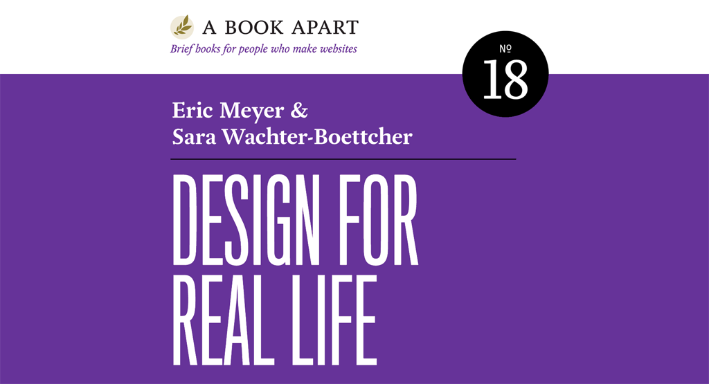
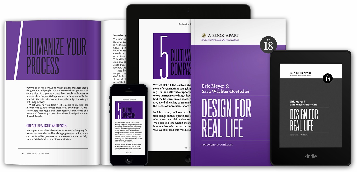
From out of that experience, a lot of things grew.  I realized that “Designing for Crisis” was one piece of a larger topic, started to get a handle on that topic, and teamed up with Sara Wachter-Boettcher to create a book which we just finished writing, title to be announced shortly, and expect to be on shelves within a few months.

In parallel to that, I was asked to talk with the design and content teams at Facebook, which I did in the spring of 2015.  It was an incredibly productive and honest discussion, entirely because the team at Facebook was truly concerned and open to change.  You can see how this has evolved over time in On This Day, whose messaging has become more human and sensitive to the possibility of harm.  And you can especially see it in the 2015 edition of Year in Review.

Year in Review’s timeline ad for 2015.

Whereas last year, the YiR feature was clearly designed around awesome years and happy people, this year’s is a lot more respectful and careful.  It isn’t as dynamic, but when it comes to memories, this seems entirely appropriate.  As Sara and I say in our book, this is “what it looks like when an organization embeds caring into its product, and is willing to own up to mistakes”.

I know the Facebook copy “we care about you and the memories you share” has been derided in some quarters, because people reflexively assume that no company (least of all Facebook) actually cares about you as anything more than a sales unit.  Maybe that’s true of some parts of Facebook — it’s a very large company, after all, with a lot of competing fiefdoms — but the design and content teams were writing from the heart.  They honestly do care about the people who use their products, and they care very much about how their work affects people.  They know they’ll stumble sometimes, but they’re committed to trying anyway and learning from their stumbles.  For that alone, they have my deepest respect.  To forge ahead in front of an audience of well over a billion people takes an incredible amount of courage.

Year in Review will be a part of the talk I’ll be giving in 2016 at An Event Apart, just as it was of Sara’s and my forthcoming book.  In brief, the assessment that you’ll find in both places: Year in Review 2015 is a significant step forward, a great example of compassionate design at scale.  I applaud Facebook for forging a path forward.


The Face of My Daughter

Published 8 years, 11 months past

As Rebecca’s Boardwalk wound down, one of our friends came up to me to say goodbye.  “This was just great, such a tribute,” she said.  “I know it must have been a really hard day for you.”

Instead of replying directly, I thanked her for coming, because I didn’t know how to tell her that it hadn’t really been hard at all.  Not in the way she’d meant, anyway.

It was eighteen months ago today that, in the span of half a day, Rebecca turned six and died.  Although I have tried in various ways, there is really no way to express what that was like.  There is no way I have found to convey the feeling of saying goodbye to your child forever, nor of what it takes to tell her it’s okay to go.  Those who understand have done it themselves.  Those who haven’t, don’t, and I hope for their sakes they never do.

In the time since, I’ve devoted a lot of time and attention to grieving.  Just as Kat and I were with Rebecca’s last weeks, and with her cancer treatment, and as we have been with the raising of all our children, and in most of what we do in life, I have been — for lack of a better term — deeply mindful of my grieving.  I don’t mean to link it to the current fad of “mindfulness”, which I know next to nothing about.  I just mean that Kat and I always try to be present for the present, and keenly aware of the future.  Acting locally and thinking globally, temporally speaking.

What I’m really trying to say is that a couple of months ago, more or less, I realized that I had turned a corner.  The agony of immediate grief has passed.  When I think of Rebecca, and even of her death, it is not a knife in my heart and guts.  Sometimes it’s a dull ache, and sometimes it just…is.

And then sometimes, when I think of her, I think of the happy times and smile.  They are memories very much like those I have for Carolyn and Joshua, when I think back to a special day we shared, or a family trip, or a moment of accomplishment.  The sort of wistful, sweet, I remember-when smile that lightly touches the heart.  And if I then remember that there will be no more such moments, it is often felt as a simple fact of life, neutral in many ways.  I have, in a very real sense, accepted it.

I had imagined that I would one day be able to say this — in fact it was always a goal — but I expected it to take years.  I even wonder at times if I truly loved her, to have let go of agonizing grief so soon.  The rest of the time, though, I know that it is my love of her and her mother and her siblings — and more importantly, all their love of me — that has allowed this.

When I do grieve anew, it is usually for my other children, who must grow up without the sister they love so dearly.  But as Kat and I have showed them how to grieve, honestly and without shame or fear, now I hope to show them how to come to terms with it and find a kind of peace.

So yes, in my experience, time does heal wounds.  To heal is not to completely restore; I am not who I was and never will be.  That is always true, of course.  Every day makes each of us into someone new.  I changed irrevocably the day I first got married, and again the day I got divorced.  So too the day I married again, and the day Kat and I decided to become parents, and each time a child came into our lives.  And the day a child left us.

Deep wounds can weaken us, may even threaten our lives…and when they heal, scars remain.  This is the form of closure I have always sought: the stitching of a grievous wound, to let the ragged edges grow back together, slowly closing up to knit new tissue.  The mark is there, and will be until I finally die — but a mark is not an impediment to living.  Our scars are a part of us, and to deny them is to deny a piece of ourselves.  I know, because I tried.  For a time, I forgot the face of my daughter.  I remember it now.

Of course I still miss her, and of course some days are not so graceful as all this might sound.  Some days my throat still tightens with grief until my breath grows short.  There are not many such days, though, and fewer as time goes on.  Bit by bit, day by day, the pain eases and the fondness returns.  My memories of Rebecca are tinged more with affection than sorrow.

As she would want, really.  Her six-year-old ego, selfish in its unselfish way, would have wanted me to be sad that she went away; but her six-year-old spark, so bright and merry, would have wanted me to stop crying.  And sometimes, when I do feel the edge of grief’s blade come close, I can hear her say, as she did whenever she wanted my attention and wasn’t getting it, in her affectionately amused, slightly exasperated, wryly matter-of-fact tone: “Daddy, you’re getting distracted.”

And then I smile.


A Decade Apart

Published 8 years, 11 months past

It was ten years ago today that Jeffrey, Jason and I stood up in front of a little over a hundred people in an oversized classroom space in the upper back corner of The Franklin Institute in Philadelphia, PA, and kicked off the very first An Event Apart.

Just the three of us, talking throughout the single day of the event, trading off talks until lunch and then throughout the afternoon.  The slides, most of them running on S5, were projected onto a pull-down Da-Lite screen, and we tapped the screen with our hands to draw attention to bits of design (or code).  In the audience, there was an attendee who’d flown in from Tokyo, just to be there.  Another from London.  We were staggered to think anyone had come more than half an hour’s drive.

It was as lo-fi as it gets without paper megaphones, and we made a whole slew of rookie organizer mistakes — but we got the essentials right, the same essentials we’ve kept alive all these ten years: present in-depth, practical, higher-level content to an audience of savvy web folks, and treat them right.  As we’ve grown over the years from one day to two to three, and from three speakers to twelve (and sometimes eighteen), we’ve kept one central goal in mind: to create a conference we’d gladly pay to attend, every time.  And while I’m admittedly biased, I believe we’ve pretty much succeeded at that goal.

Ten years, which is a lifetime ago and then some, and still rolling strong.  We’re calling it A Decade Apart, because why wouldn’t we?  To celebrate, we’ll be doing some fun stuff at all our events in 2016, special giveaways on top of the usual giveaways, the return of some audience favorites…but I don’t want to give away too much just yet.  Suffice to say, we’re planning on making this our best year ever, and everything’s shaping up to deliver on those plans.

If you’ve been to a past Event Apart, thank you — and if you have a memory to share, I’d really love to hear about it in the comments.  And whether you’ve been or not, I hope to see you in 2016!


In Gratitude

Published 8 years, 11 months past

By most measures, I’ve had a pretty damn successful career.  I’m not at “I can retire today” money and nobody’s erecting statues with my visage on them, but only the first of those holds any interest for me, and I’m not expecting it any time soon.  (At current rates of saving and investment return, I should reach that state… right around the traditional age of retirement, actually.)

Of course, I’ve written a bunch of books that earned me some royalties, but books are not a way to become wealthy, unless you’re crazy lucky.  Yes, you have to put in the work to write the book, but in the end, whether your book makes you coffee money or high-end-chrome coffee machine money is down to forces entirely outside your control.  Certainly outside mine.  When I wrote my first CSS book, nobody expected CSS to be more than a slowly dying niche technology.  When I wrote the second, CSS had been declared dead twice over.  When I wrote the third and fourth, it was just starting to revive.

I invested tons of effort and time into understanding CSS, and then to explaining it.  Because I was lucky enough to put that work toward a technology that turned out to be not just successful, but deeply important to the web, the work paid off.  But think of the people who put that same kind of time and effort into understanding and explaining DSSSL.  “Into what, now?” you say.  Exactly.

Similarly, when Jeffrey and I set out to create An Event Apart, there was no assurance that there was a viable market there.  Nearly all the old web conferences had died, and those few that remained were focused on audience very much unlike the one we had in mind.  Luckily for us, the audience existed.  We worked really hard — still work really hard — to find and speak to that audience with the topics and speakers we present, but it would all have come to nothing if not for the sheer luck of having an audience for the kind of show we wanted to create.

For most of my adult life, I’ve been keenly aware of the incredible amount of luck that goes into success, and the awareness only grows as the years pass by.  Just putting in a lot of hard work isn’t enough.  You also have to have the sheer good fortune to have that hard work pay off.  You can sink everything you have, money and soul, into building a place in life, only to have it all sabotaged and swept away by random chance.  You can invest very bit of your life and fortune into an outcome that blind fate renders impossible.

So yes, I worked hard to understand the web, and to explain the web, and to write books and talks, and to create a conference series, and everything else I’ve done over the years — but I was supremely lucky to have that work come to something.  An incredible combination of time and place and interest and birth and a million million other things made that possible.

More to the point, the existence of people interested in what I have to say made that possible.  So I thank you, one and all, for all that and still more.  Thank you for rewarding and redeeming the work I’ve done.  Thank you for being of like mind.  Thank you for your support.  Thank you for listening.  Thank you.

This article was originally published at The Pastry Box Project on 2 December 2015.


Local Ipsum

Published 8 years, 11 months past

Throughout 2015, a few people who’ve seen me present “Designing for Crisis” at An Event Apart have noticed that, on the slides where I have filler text, it’s a localized variant.  In Washington, DC, for example, one section started out:

Andrew ellicott lobortis decima thomas jefferson vulputate dynamicus fiant kingman park sollemnes ford’s theater. Vero videntur modo claritatem possim quis quod est noma howard university consequat diam. Blandit ut claram north michigan park seacula judiciary square william jefferson clinton hawthorne millard fillmore iis…

This was a product of some simple PHP I’d originally written to generate Cleveland-themed filler text a year or so back, which you can find at localipsum.meyerweb.com, and which I’d expanded upon to let me generate text for my presentations at AEA.  The name comes from the original idea I had, which was to provide a list of cities/regions/whatever, so that users could pick one and generate some filler text.  That never quite came together.  I had a semi-working version once, but the UI was horrible and the file management was worse and I got discouraged and rolled back to what you see now.

I kept telling myself that I’d get back to it, do the city-selection thing right, polish it nicely, and then finally release the source.  I’ve told myself that all year, as I manually swapped in city information to generate the filler text for each of my talks.  Now I’ve finally admitted to myself that it isn’t going to happen, so: here’s the source.  I chose a pretty permissive license — BSD-ISC, if I recall correctly — so feel free to make use of it for your own filler text.  I’ll be happy to accept pull requests with improvements, but not package-management or complete MVC restructuring.  Sorry.

I know, it’s a goofy little thing and the code is probably pants, but I kinda like it and figure maybe someone out there will too.  If nothing else, we can look for a few laughs in the output and maybe — just maybe — learn a little something about ourselves along the way.

(P.S. Speaking of “Designing for Crisis”, look for a post about that, and more specifically video of it, in the next few weeks.)


Rebecca’s Boardwalk

Published 9 years, 2 days past

Yesterday was the inaugural Rebecca’s Boardwalk, a fundraiser in support of Rebecca’s Gift.  About two hundred people joined us for soft pretzels, snow cones, bounce houses, carnival games, face painting, and temporary tattoos.  I saw former co-workers and even a high school classmate there.

Between the ticket sales (both admission and activity) and the money raised in the raffles and the silent auction, Rebecca’s Gift raised enough money to send another family on a healing trip.  None of that would have been possible without a huge community of helpers and volunteers, so many that I could never thank them all.  There are a few I’d like to specially note, however.

First, my wife Kat and our friend Karla, who are the co-founders of Rebecca’s Gift and the people who really put the whole Boardwalk event together.  With help, of course, tons of help — but they were the driving forces.  People often think that Rebecca’s Gift is something I put together, but I didn’t.  It’s all them.  The non-profit wouldn’t exist, and the event wouldn’t have happened, without their drive.

Second, David Leslie Johnson, who contributed signed scripts from The Walking Dead, a signed making-of book from Red Riding Hood, and a signed poster from The Conjuring to the silent auction.  If you’re a horror fan, you might recognize David as the screenwriter of Orphan, as well as his involvement in the upcoming re-reboot of A Nightmare on Elm Street and the sequel to The Conjuring.  He’s also one of my best friends, as he has been since late elementary school.

Third, Tattly, which donated a lot of boardwalk-themed temporary tattoos.  For example, this Ferris Wheel design, and this very appropriately-themed set.  If you’ve never seen Tattly’s tattoos, they’re really something.  Vibrant, detailed, and most of all fun.  If you’re looking for temporary tattoos, check them out first.

Fourth, Anshe Chesed Fairmount Temple, for providing us with the right space for the event, for giving us the support (and storage space!) we needed to pull the whole thing off, and for trusting us with both their facilities and their schedule.

And fifth, again, everyone who donated items and sponsored booths and bought tickets and came to have a good time, just down the hall from the preschool classes where Rebecca wowed everyone with her sparkly dresses and impish grin.  It was an afternoon worthy of her name and her spirit.  Thank you all.


(If you’d like to support the mission of Rebecca’s Gift, please feel free to use the Donations page.  And thank you.)


I’m Probably Wrong

Published 9 years, 2 weeks past

If there’s one thing that’s made it possible for me to learn as much as I have, and create as much as I have, it’s that my default attitude about things, especially technical things, is that I’m probably wrong about them.

When I first took up CSS and it didn’t do what I expected from reading the spec, I started creating simple, focused tests of each property and its values, to figure out what I was getting wrong.  Because I wanted to be sure, I built tests for all the properties, even the ones I was confident about understanding — and, in places, found out my confidence was misplaced.  Eventually, those tests became the CSS1 Test Suite.  Since I had discovered that, in a lot of cases, the browsers were actually wrong, I decided to document CSS support in browsers.  That became the CSS Mastergrid (long since gone).  On the strength of that resource, I started writing articles to explain how things worked, or didn’t, which led to writing my first book.  And so on.

But it all started because I assumed I was wrong about how CSS should work, not that the browsers were fundamentally broken.  Simple test cases seemed like the best way to find out.  One thing led to another.  In a lot of ways, you could say that my career was made possible by me assuming I was wrong, and setting out to determine exactly how wrong I was.

It’s not that I want to be wrong; in fact, I dislike being wrong.  But I dislike continuing to be wrong much more, so I try to find out how I’m wrong, in hopes of becoming less wrong.  It’s not even “strong opinions, weakly held” — it’s more “strong suspicion of error, strongly pursued”.  In public, when necessary.  (This is where it helps to be willing to look like a dork, or even a fool, as Kitt wrote about yesterday.)

When asking for help, this is the approach I take.  When I post to mailing lists or forums, it usually comes out as, “Here’s what I think is so, but results don’t match that understanding.  What am I missing?  Please help me get it right.”

How am I wrong?  Because I’m probably wrong.

This article was originally published at The Pastry Box Project on 2 November 2015.


Essential Tool: Firefox’s screenshot Command

Published 9 years, 4 weeks past

The Graphical Command Line Interpreter (GCLI) has been removed from Firefox, but screenshot has been revived as :screenshot in the Web Console (⌥⌘K), with most of the same options discussed below. Thus, portions of this article have become incorrect as of August 2018.  Read about the changes in my post Firefox’s :screenshot Command.

Everyone has their own idiosyncratic collection of tools they can’t work without, and I’ve recently been using one of mine as I produce figures for CSS: The Definitve Guide, Fourth Edition (CSS:TDG4e).  It’s Firefox’s command-line screenshot utility.

To get access to screenshot, you first have to hit ⇧F2 for the Developer Toolbar, not ⌥⌘K for the Web Console.  (I know, two command lines — who thought that was a good idea?  Moving on.)  Once you’re in the Developer Toolbar, you can type s and then hit Tab to autocomplete screenshot.  Then type a filename for your screenshot, if you want to define it, either with or without the file extension; otherwise you’ll get whatever naming convention your computer uses for screen captures.  For example, mine does something like Screen Shot 2015-10-22 at 10.05.51.png by default.  If you hit [return] (or equivalent) at this point, it’ll save the screenshot to your Downloads folder (or equivalent).  Done!

Except, don’t do that yet, because what really makes screenshot great is its options; in my case, they’re what elevate screenshot from useful to essential, and what set it apart from any screen-capture addon I’ve ever seen.

The option I use a lot, particularly when grabbing images of web sites for my talks, is --fullpage.  That option captures absolutely everything on the page, even the parts you can’t see in the browser window.  See, by default, when you use screenshot, it only shows you the portion of the page visible in the browser window.  In many cases, that’s all you want or need, but for the times you want it all, --fullpage is there for you.  Any time you see me do a long scroll of a web page in a talk, like I did right at the ten-minute mark of my talk at Fluent 2015, it was thanks to --fullpage.

If you want the browser --chrome to show around your screenshot, though, you can’t capture the --fullpage.  Firefox will just ignore the -fullpage option if you invoke --chrome, and give you the visible portion of the page surrounded by your browser chrome, including all your addon icons and unread tabs.  Which makes some sense, I admit, but part of me wishes someone had gone to the effort of adding code to redraw the chrome all the way around a --fullpage capture if you asked for it.

Now, for the purposes of CSS:TDG4e’s figures, there are two screenshot options that I cannot live without.

A screen capture of Facebook’s “Trending” panel.
I captured this using screenshot fb-trend --selector '#u_0_l'.  That saved exactly what you see to fb-trend.png.

The first is --selector, which lets you supply a CSS selector to an element — at which point, Firefox will capture just that element and its descendants.  The only, and quite understandable, limitation is that the selector you supply must match a single element.  For me, that’s usually just --selector 'body', since every figure I create is a single page, and there’s nothing in the body except what I want to include in the figure.  So instead of trying to drag-select a region of the screen with ⇧⌘4, or (worse) trying to precisely size the browser window to show just the body element and not one pixel more, I can enter something like screenshot fig047 --selector 'body' and get precisely what I need.

That might seem like a lot to type every time, but the thing is, I don’t have to: not only does the Web Toolbar have full tab-autocomplete, the Toolbar also offers up-arrow history.  So once I’ve tab-completed the command to capture my first figure, I just use the up arrow to bring the command back and change the file name.  Quick, simple, efficient.

The second essential option for me is --dpr, which defines a device pixel ratio.  Let’s say I want to capture something at four times the usual resolution.  --dpr 4 makes it happen.  Since all my figures are meant to go to print as well as ebooks, I can capture at print-worthy resolutions without having to use ⌘+ to blow up the content, or fiddle with using CSS to make everything bigger.  Also if I want to go the other way and capture a deliberately pixellated version of a page, I can use something like --dpr 0.33.

I have used this occasionally to size down an image online: I “View Image” to get it in its own window, then use screenshot with a fractional DPR value to shrink it.  Yes, this is a rare use case, even for me, but hey — the option exists!  I haven’t used the DPR option for my talks, but given the growing use of HD 16:9 projectors — something we’ve been using at An Event Apart for a while now, actually — I’m starting to lean toward using --dpr 2 to get sharper images.

(Aside: it turns out this option is only present in very recent versions of Firefox, such as Developer Edition 43 and the current Nightlies.  So if you need DPR, grab a Nightly and go crazy!)

A closeup of text on a test page.
A snippet of an image I captured using --dpr 5.  On-screen, the page was at 100% zoom, 16-pixel (browser default) text sizing.  The resulting capture was 4000×2403 pixels.

And that’s not all!  You can set a --delay in seconds, to make sure a popup menu or other bit of interaction is visible before the capture happens.  If you want to take your captured image straight into another program before saving it, there’s --clipboard.  And there’s an option to upload straight to --imgur, though I confess I haven’t figured out how that one works.  I suspect you have to be logged into imgur first.  If anyone knows, please leave a comment so the rest of us know how to use it!

The one thing that irks me a little bit about screenshot is that the file name must come before the options.  When I’m producing a bunch of figures in a row, having to drag-select just the file name for replacement is a touch tedious; I wish I could put the file name at the end of the command, so I could quickly drag-select it with a rightward wrist-flick.  But all things considered, this is a pretty minor gripe.  Well, shut my mouth and paint me red — it turns out you can put the filename after the options.  Either that wasn’t possible at some point and I never retested the assertion, or it was always possible and I just messed up.  Either way, this irk is irksome no more!

The other thing I wish screenshot could do is let me define a precise width or height in pixels — or, since I’m dreaming, a value using any valid CSS length unit — and scale the result to that measure.  This isn’t really useful for the CSS:TDG4e figures, but it could come in pretty handy for creating talk slides.  No, I have no idea how that would interact with the DPR option, but I’d certainly be willing to find out.

So that’s one of my “unusual but essential” tools.  What’s yours?


Browse the Archive

Earlier Entries

Later Entries