Posts in the Carolyn Category

Little Bundles

Published 20 years, 7 months past

Oh, sure, Kat and I have a baby and suddenly everybody wants to get in on the act.  I mean, honestly, how unoriginal can you get?

Okay, all kidding aside: our deepest and most joyful congratulations to the Zeldmans and their soon-to-be-larger family.  I can personally attest that, as many people told me, becoming parents is one of the hardest and most amazing things they will ever experience.

Carolyn happily jumps about in her 'bouncy seat', a chair suspended from a door frame and incorporating a spring so that she can bounce up and down even though she hasn't the coordination to stand yet.

Carolyn’s in the range of four and a half months old now, and appears to be developing very nicely.  She discovered her hands a couple of weeks back, and is now busily trying to sample the taste of every object she encounters.  She’s almost to the point of rolling over; she can get onto her side for a minute, and then she rolls back onto her back.  She’s also a stander: she’ll stand upright for ten or fifteen minutes, if someone’s willing to hold her steady for that long.  We put up the “bouncy seat” a couple of months early, and she absolutely loves it.  She doesn’t even sit upright yet.  The pediatrician was actually kind of impressed by the strength and head control she has at her age.

Of course, we know of a baby two weeks older than her who already has two teeth, and another that’s rolling over constantly and getting close to sitting up on his own.  So it’s not as though we have a super-baby (though she is, obviously, a super baby).  She’s just ahead of the curve in some respects, and no doubt behind in others, the same as every other baby.

All I know is, whenever she looks at me with her gray-blue eyes and she breaks into an enormous smile, I can’t help but think she’s the most perfect baby in the history of the universe… the same as any other parent.

Congratulations again to Jeff and Carrie!


Guru By Design?

Published 20 years, 7 months past

You’ve probably already seen the Gurus vs. Bloggers matchup over at Design By Fire; I quite enjoyed it, and not just because it’s funny.  I found it to be gratifying because I took a close look at the designs, and I think there’s very little doubt about it.  meyerweb’s design just screams “guru,” don’t you think?  (David Robarts does.)  I’m kind of hoping that I get into a future round of the matchup, so I can by completely demolished by the likes of Dave Shea or Doug Bowman.

Of course, I can always counter with cute pictures of Carolyn. A closeup of Carolyn lying on the floor and look out of the corners of her eyes toward the camera, with her left hand near her chin and the index finger extended into the corner of her mouth. She’s suffering through another cold, but that doesn’t seem to prevent her from being just too adorable for words.  Now, I know it isn’t the right finger, but I still can’t help thinking, “One billion dollars!”
For some reason, Kat and I like the show $40 A Day, where host Rachael Ray visits a different city each week and goes through a full day without spending more than $40 on all her meals.  One of this past weekend’s episodes had her visiting Cleveland, calling it “one of the most underrated cities in America.”  Kat and I found it fascinating to watch, getting an outsider’s perspective on the city.  We don’t have the time or space for me to enumerate everything great about this city.  Nonetheless, it was still interesting to hear words of praise from a visitor, even one hosting a show that does what are basically puff pieces about the visited cities.

It didn’t hurt that two of the three restaurants she visited were the always-excellent Tommy’s (where the waiter shown on-camera is one of those guys who’s been there forever) and Trattoria Roman Gardens down in Little Italy, not to mention spent some time at the West Side Market.  I thought the show could have done with a few less “___ ROCKS!” jokes—okay, we get it, the only song the rest of the country associates with us is “Cleveland Rocks.”  Thank you.  It’s time to move on.

Of course, I suppose I might be tired of the whole “rocks” thing because it’s a lot like having people always tell you the sky is blue.  After a while, it gets to be a little bit wearying to keep being repetitively told something you already know.


Run Time Errors

Published 20 years, 7 months past

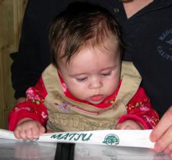
It’s been quite a weekend, and the fun started on Friday.  That morning, we drove down to Mansfield to have lunch with my father, sister, and an aunt and uncle who were up from Cincinnati to visit.  The afternoon was spent with our tax guy, so Carolyn is now known as “Daddy’s Little Deduction.”  For dinner, exhausted by the travel and looking to celebrate both getting our taxes out of the way and the arrival of my author’s copies of Cascading Style Sheets: The Definitive Guide, Second Edition (which means y’all should be getting your copies any day now!), we decided to head over to Matsu and have some sushi. A picture of Carolyn sitting in Eric's laps and gripping a pair of chopsticks in her hand as she looks down at the open menu in front of her. Carolyn sat with each of us in turn, and I’m not sure but I think she was eyeing my escolar nigiri with some interest.  She had fun fiddling with chopsticks, anyway.

Saturday morning, we attended a memorial service for the father (and grandfather) of a family we’ve become close to over the last few years.  They helped us plant fifty daffodils in our front-yard flower beds last fall in honor of Mom—they’re sprouting, and I hope to get some pictures soon—and their pre-teen daughter has already been a babysitter for Carolyn.  Since we had a baby on our hands, we sat in the far back pew and listened to the music and testimonials.  The sanctuary of the Baptist church is beautiful, with sweeping stone arches and wonderful stained glass windows, just like you remember from medieval-romance movies.  It was hard to keep from reflecting on death, as opposed to life, especially since we’d never really known the deceased; he’d had Alzheimer’s ever since we met them.

When his teenaged grandson delivered a eulogy, I looked down at Carolyn and couldn’t help whispering an apology for the day that I leave her forever.  I hope that day doesn’t come for a long, long time, but it won’t be put off forever.  I hope that when that day does come, she’ll be able to smile through the tears, warmed by memories of love and laughter.

As I looked back up, I recalled the recent Papal statement that it’s immoral to let die a person who’s in a vegetative state.  We already know he opposes voluntary euthanasia, along with capital punishment and of course abortion.  Basically, the Pope opposes any premature exit of this life, no matter if it’s an imposed exit or not.  Which forces me to wonder: what does he know about death that the rest of us don’t?  And why is he working so hard to make sure that people avoid it for as long as possible, even when they’ve become mental vegetables?

That same evening, my college friends Bruce and Laura, visiting from out of town, dropped by to see Carolyn and introduce us to their son Dennis, who was born just three days before Carolyn.  They’re currently located in Boise, Idaho, which they find to be interesting despite the political climate.  They were telling us about the “clean movie” video stores that are fairly popular in their area.  These are places that take movies and edit out the “naughty bits” so you can watch a movie without having to see or hear anything that might offend you.  (Unless of course unauthorized alterations of an artistic work offend you, in which case you’re pretty much out of luck.)  We were wondering whether these places would carry The Passion of the Christ at all, and if so, how much of it would be left.  Bruce said he’d guarantee that they’d carry it intact.  While I was over at the Catholic World News site, I saw a banner ad for CleanFilms, and as it happens they list The Passion… as an upcoming movie.  I’m almost tempted to sign up for the free trial service just to get their copy of the movie and see how long it ends up being.


License To rel

Published 20 years, 8 months past

If you thought XFN or VoteLinks were the last (or only) word on lightweight semantic link annotation, think again.  Tantek writes about the idea of adding a license value to indicate a link that points to licensing terms.  In his post, the expression of this idea is centered around Creative Commons (CC) licenses, but as he says, any license-link could be so annotated.  Apparently the CC folks agree, because their license generator has been updated to include rel="license" in the markup it creates. Accordingly, I’ve updated my CC license link for the Color Blender to carry rel="license", thus making it easier for a spider to auto-discover the licensing terms for the Color Blender.

Tantek also said of the idea of applying CSS to documents that uniquely styles license-links:

I wonder who will be the first to post a user style sheet that demonstrates this.

Ooo, me, me!  Well, not quite.  I don’t have a complete user stylesheet for download, but here are some quick rules I devised to highlight license links.  Add any of them to your user stylesheet, or you can use these as the basis for your own styles.  (Sorry, but they won’t work in Internet Explorer, which doesn’t support attribute selectors.)

/* simple styles */
*[rel~="license"] {font-weight: bold;}
*[rel~="license"] img {border: 3px double; color: inherit;
  padding: 1px;}

/* add a "legal" icon at the beginning of the link */
*[rel~="license"]:before {content: url(legal.gif);}

Here’s my question: should the possible values be extended?  Because I’d really like to be able to insert information based on what kind of license is being referenced.  For example, suppose there were a c-commons value for rel; that way, authors could declare a link to be rel="c-commons license".  Then we could use a rule like:

*[rel~="c-commons"]:before {content: url(c-commons.gif);}

…thus inserting a Creative Commons logo before any link that points to a CC license.  At the moment, it’s highly likely that the only rel="license" links are going to point to CC licenses, but as we move forward I suspect that will be less and less true.  I hope we’ll soon see some finer grains to this particular semantic extension.

If you don’t like using generated content for whatever reason, you could modify the rule to put the icon in the background instead, using a rule something like this:

*[rel~="c-commons"] {background: url(c-commons.gif) no-repeat;
  padding-left: 15px;}

The usual reason to avoid generated content is that IE doesn’t support it, but then IE doesn’t support attribute selectors either, as I mentioned.  So don’t add any of these rules to an IE user stylesheet.  Use Firefox, Safari, Opera, or one of the other currently-in-development browsers instead.

In other news, I was tickled pink (or maybe a dusky red) to see that for sol 34, one of the “wake-up” songs for the Spirit team was The Bobs’ Pounded on a Rock.  My hat’s off to you, Dr. Adler!  I’ve been listening to that particular album recently, mostly to relearn the lyrics.  I’ve been singing to Carolyn when I feed her, and some favorites of ours are Plastic or Paper, Now I Am A Hippie Again, Corn Dogs, and of course Food To Rent.  It’s awfully cute that she smiles at me when I sing to her, mostly because I know one day she’ll grow up, learn about things like “being on key,” and stop smiling when I sing.

In the meantime, though, she’s perfectly happy to rock on! Carolyn, sitting in a chair with her lower half covered by a blanket, raises her left hand above her head with the index and pinky fingers extended, exactly in the manner of hard rockers and head-bangers the world over.


Fear The Cute!

Published 20 years, 9 months past

Okay, enough talking about computer repair; it’s time for another picture of Carolyn.  It’s one of the first good ones we have of her smiling, and this is, for her, a relatively understated smile.  When she’s happy, she’ll let loose with grins so wide her eyes scrunch shut.  She actually smiles quite often, but each one is of fairly short duration—and when she does smile, we’re too busy enjoying the sudden rush of dopamine and other neurochemical whatnots our brains start pumping out.  It’s really, really hard not to smile back.  Not that we’re resisting.
I keep meaning to crate an actual picture gallery on her personal page, but other stuff keeps getting in the way.  Heck, I haven’t even created an e-mail account for her, mostly on the grounds that it does her no good until she learns to type.  I just hope that by the time she’s old enough to want an account, Carolyn won’t have to deal with the volume of spam we see every single day.  I’m not holding my breath, though.

Love the haircut, myself.  I think this may well be the first published picture for which she tries to hurt me, a decade or so from now.  Sorry, sweetheart, but it was just too cute not to share.


Love, Feline Style

Published 20 years, 9 months past

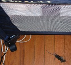
Ever since the day after Carolyn came home, our cat Gravity has mostly ignored Carolyn’s presence.  We’d been somewhat concerned that there would be hostility between them in the months to come, which wouldn’t really end well because Gravity still has claws.  Those concerns are now, for the most part, erased.  This afternoon, we discovered that not only has Gravity gotten used to Carolyn’s presence, but now regards her as a part of the family.

We know this because Gravity left Carolyn a gift—a freshly killed mouse, lying on the floor right next to the bassinet where Carolyn sleeps during the day.  A small mouse carcass lies on the floor next to the bassinet.  From what I understand, this is typically how mother-cats feed their children, and start training them to hunt for their own food.  I wished there were some way to communicate to Gravity that she could have her hunting spoils back, since Carolyn’s fairly well fed even without rodent supplements.  When you think about all this, it’s really rather touching, in a morbid way.  Kat and I both got a pretty good laugh out of it.

Of course, then I had to dispose of the carcass.

So Safari 1.2 is out, and of course was released just two days after I changed designs.  So the fix for the first-letter bug that occurred with “Thoughts From Eric” in the previous design is in place, but you can’t see it working here.  On the other hand, my recently constructed test page demonstrating Safari 1.1’s bugs with :hover and generated content show that 1.2 fixed the problem.  So, that’s cool.

What is even cooler is John Gruber’s in-depth exploration of the OmniWeb beta.  The “tabbed” interface, although not what I personally think of as tabbed, is still a welcome addition; I’ve found that I basically can’t live without tabs.  (I do a sweep of all my regularly read blogs by opening them all in tabs, via a bookmark group.)  What sounds really outstanding, though, is OmniWeb’s workspaces and site-specific preferences.  It’s probably enough for me to tolerate the obsolescence of the rendering engine, which is equivalent to Safari 1.0, but we’ll see.  You should see, too—go read John’s review of the browser, which is comprehensive and detailed.  Truly excellent.

Complete topic shift: back in September, Molly was aghast at the Quizno’s television commercial featuring an adult male human suckling at the teat of a wolf.  Well, their new ad campaign has launched, and if anything it’s more wrong.  Sure, it’s a complete ripoff of the Spongmonkeys, mostly because it turns out the same guy did bothWarning: if you follow the Spongmonkeys link, I am not responsible for any psychological damage you may suffer, but it is very much like the commercial.

Is it just me, or are commercials in general getting a lot weirder of late?


Ephemera

Published 20 years, 9 months past

More and more over the past few days, Carolyn has started smiling—they’re usually quick and fleeting, but more often she’s broken into wide grins that crinkle her eyes and pull her cheeks back.  When I’m holding her and she does it, I can feel a flood of endorphins surging into my body, attempting to get me addicted to her smiles.  There are certainly worse addictions to have.  We don’t have a picture yet, and when we do it will probably show up on her soon-to-be-created page.  Meanwhile, we do have a picture of her getting ready to head outdoors; A picture of Carolyn's eyes peeking out from under a snowsuit hood and over a fluffy blanket, the two of which are surrounding her in an attempt to keep the cold at bay. hopefully that will satisfy people’s picture cravings for a few days.
With the amount of time I’ve been spending in iPhoto these days, downloading new Carolyn pictures from our camera, there’s been a slowly strengthening impulse to publish my favorite pictures as a gallery of sorts.  I was getting pretty close to doing it when, fortunately for us all, Derek Powazek launched ephemera.org.  Five minutes looking through the site woke me up and completely disabused me of any notion that a gallery of the photographs I take would be in any way necessary.  I want to order large prints of several of Derek’s photos and hang them in my office.  The same’s true of many pictures that Heather has taken, and now that the two of them are engaged (for which I humbly offer my very belated congratulations!), I foresee the formation of a photographic powerhouse of previously unimagined proportions.  How do they get their pictures to be so vivid, anyway?  The colors are just so deep and perfect; they make me want to cry when I look at my own pictures.

You’ll still get to experience some small portions of my photography, though.  I’m slowly working through the final steps of a meyerweb redesign, and you can see the wireframe if you’re at all interested.  If you hit major layout errors, you can let me know, but four things to keep in mind:

  • The font size is what it is, or at least will be what it will be.  In other words, I’m going to size fonts as I think appropriate for my site, taking into account everything I know about browsers, users, CSS, and the pros and cons of various font-sizing approaches.  Telling me that I’ve made the wrong choice will not change anything, because there are almost no objectively wrong choices in this area.  There are only tradeoffs.
  • If your browser window is too narrow in the IE/Win series, then the sidebar will likely start overlapping the content.  This is due to the bugs in IE/Win’s handling of width, so try widening or maximizing your browser window to see if any observed overlaps are fixed.  If not (and your resolution is higher than 640×480) then let me know.
  • I know that some of the sidebar content repeats, is badly out of date, or points to non-existent resources.  It’s mostly there as a placeholder so I can resolve layout issues without having to get all the data assembled first.
  • The journal entries aren’t very well laid out yet.  I’ll get there soon.

The new design will let you experience (some would say suffer through) bits of my photography because the masthead will contain slices of pictures I’ve taken.  I apologize in advance.


Too Darned Cute

Published 20 years, 10 months past

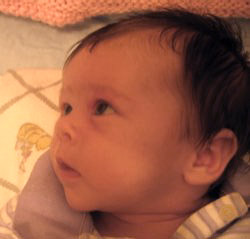
As promised, here’s a picture of Carolyn.  A closeup picture of a baby girl's face in profile, looking off to the left with an expression not unlike wonder.  Or perhaps hunger. She’s six weeks old today, and though the picture is from a couple of weeks ago, she’s no less adorable.  The yellow cast to the picture is due to my penchant of shooting with no flash and a built-in “Vivid” filter on the camera.  I’ve switched it off recently, and although non-flash pictures still come out yellowish, it isn’t as pronounced.  Overall, it’s fine with me.  I like having warmer tones in my photographs.

I noticed a pointer to “What is Mac OS X?” over on Simon’s site, and eventually got around to following the link.  A lot of good information can be found there, there’s no doubt— I particularly enjoyed the startup sequence breakdown, the mere appreciation of which would seem to firmly establish me as a total geek— but as Simon says, the site’s design seems… familiar, somehow.  Almost like I’ve seen something very much like it before.

Actually, a few people wrote to inform me of the “design theft;” apparently the site got some major exposure by being mentioned on Slashdot recently.  I’m flattered that people recognized it as being a design I came up with, and I’m grateful that they took the time to let me know about it.  However, this isn’t really theft, so please don’t report it to Pirated Sites.  As I state in my newly established FAQ, meyerweb designs (but not the images used in them) are freely available for non-commercial use.  Credit is not even required, although it’s always appreciated.  I always meant to get around to explicitly assigning them to a Creative Commons license, but since I’m planning to redesign soon and will retire most of the themes when I do, it may not happen.  Or, then again, maybe when I retire them I’ll license them.

Anyway, I do get some nice namechecks from Amit, the site’s proprietor, on his About page.  One correspondent said he thought Amit was claiming to have come up with the designs himself, and I suppose one could read the text that way, but I didn’t.  As far as I’m concerned, Amit is welcome to use the design for his site so long as he doesn’t try to sell the design or otherwise make money off of the design itself.  And that goes for anyone else.


Browse the Archive

Earlier Entries

Later Entries